Heavy Metal Magazine is Not Punk

By now, everyone knows that Grant Morrison is taking on the role of Editor in Chief for Heavy Metal magazine. As someone who is three years into a complete reread of the entire run of the publication, this is of great interest to me.

My first reaction to this announcement was “again?” I’ve seen this kind of stunt casting for Editors before. When I read Grant Morrison’s comment that “[w]e’re trying to bring back some of that 70s punk energy of Heavy Metal,” I had to wonder if he actually, y’know, read the magazine during the 70s and 80s. Of all the labels that could possibly be laid at the feet of Heavy Metal during that period, punk is the only one I wouldn’t use.

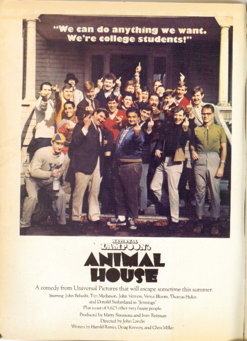
First of all, the magazine was originally published by National Lampoon, a not-inconsiderably-sized company that released movies (Animal House, Vacation) and sold an awful lot of branded merchandise during the 70s and 80s. The pages of early Heavy Metal were packed full of advertisements for National Lampoon stuff. None of that really came across as punk to me at all. As Heavy Metal went on, they became much more obviously commercial, with their own brand of merchandise that was advertised in every issue.
 

tumblr_lxeae05vuM1qjkqk8o1_500

An ad for Animal House from an early issue of Heavy Metal.

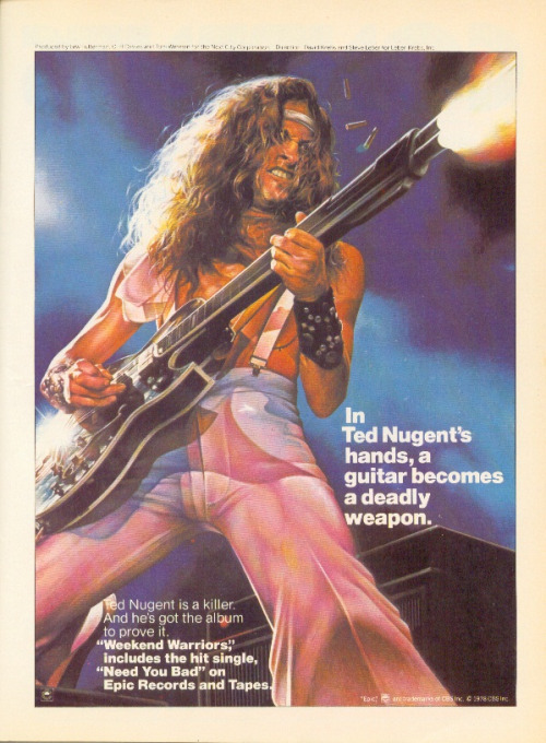
Second, a lot of the early material is very psychedelic and appealed mostly to the aging hippy demographic, which was, if I remember Sid and Nancy correctly, directly antithetical to the ethos of punk. Furthermore, Ted White was a big prog-rock fan and the material that was produced under his guidance leaned very heavily in that direction. If you were an Ultravox fan, Heavy Metal in the early 80s was absolutely the magazine for you.
 

tumblr_m3trgeS18E1qjkqk8o1_500

An ad for a Ted Nugent album, from March of 1979. Tres punk.

Third, the revolution that really drove Heavy Metal was very distinctly French and had a lot more to do with the format of how French comics were serialized than with any kind of musical aesthetic, something that is largely transparent to Anglophones. Instead of serializing stories 22 pages at a time on a monthly basis, French BD magazines serialize their stories half a page at a time in weekly anthologies and have done since the 50s. It was a technique made popular with Tintin magazine, and perfected by Spirou. By the end of the 60s, Pilote (under the editorial guidance of Rene Goscinny, not coincidentally, the writer of Asterix) was the big boy on the block, largely due to this production methodology.

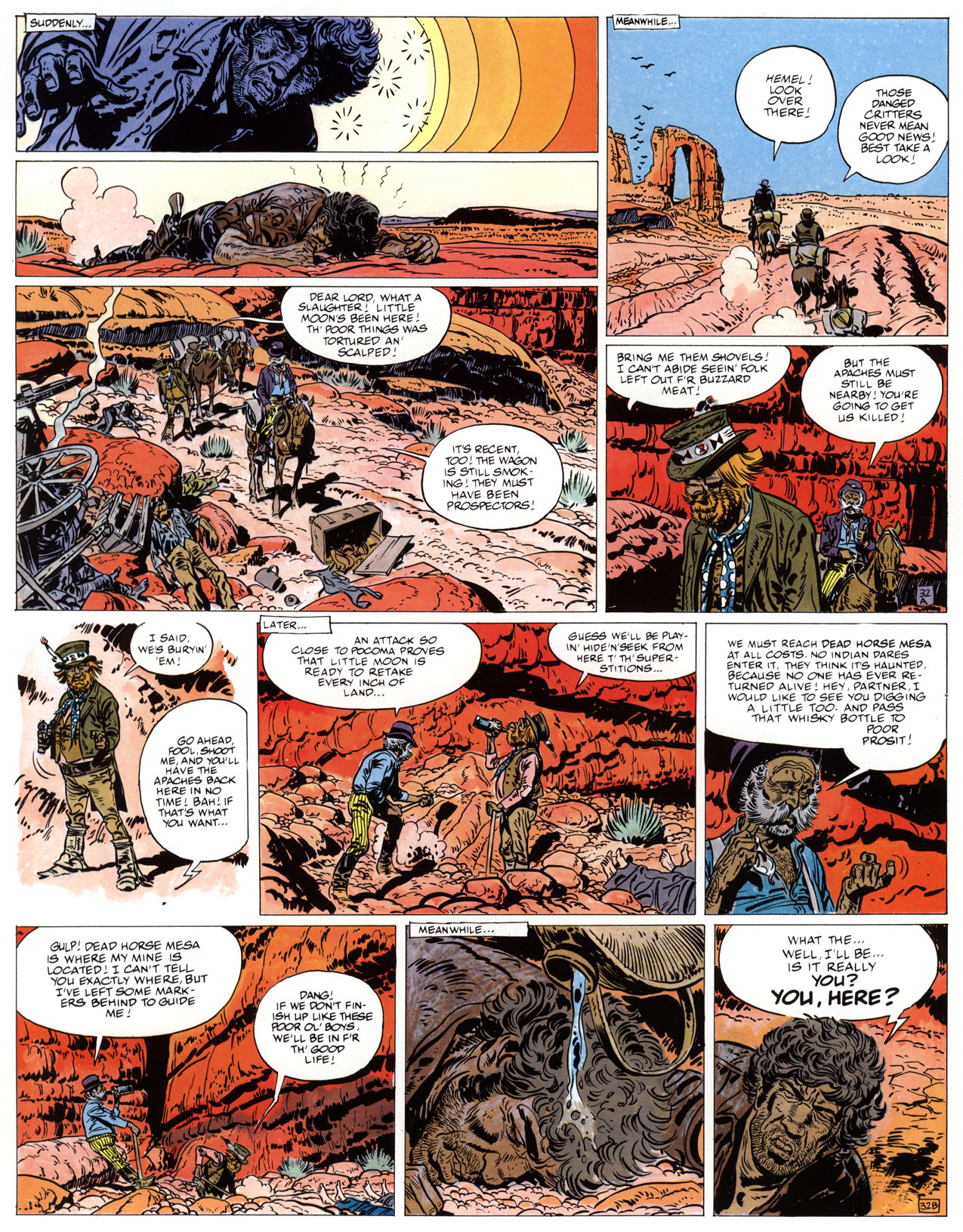
The collected editions of popular stories and characters would stack half-pages together to create magazine-sized albums. Take a look at any French (or European) BD collection produced before 1970 – Asterix, Valerian, Corto Maltese, Blueberry, Philemon, Spirou – and you will notice a white gutter running horizontally through the middle of almost every page in the book. This is a direct artifact of the serialization methodology, regardless of whether the story was actually serialized or not. There were occasional splash pages in these books, but that’s more of an exception than a rule.
 

lost-dutchmans-mine

A page from Blueberry – note the A and B in the bottom right corners of the half pages.

 
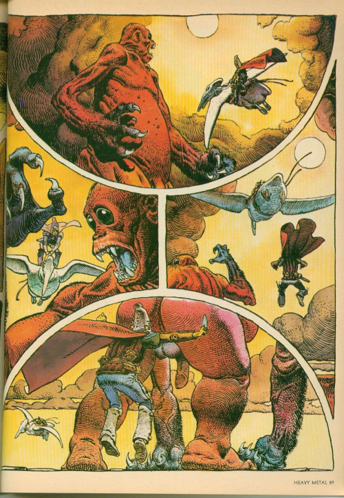
But when you look at the material that Moebius and Druillet were producing in Metal Hurlant, you can really see a massive revolution in format. The pages are not formatted to be chopped in half for serialization – the page layouts are a direct challenge to the old commercial methodology. In addition, the fact that three or four pages were printed at once to present a complete story in a single issue was a major shift.
 

tumblr_ltdw0yqK221qjkqk8o1_500

For contrast, a page from Arzach, also by Moebius

It’s probably not a coincidence that Les Humanoïdes Associés came mostly from the Pilote stable of artists. They pushed against the solid editorial format of the establishment and, when that didn’t get them where they wanted to go, they went out and formed their own magazine – something that just about everyone in the Francophone market did at one point or another. There were many, many anthology magazines on the stands at the time and still are.

The Metal Hurlant revolution can be better understood to an Anglophone comics audience as analogous to the Image revolution – a bunch of artists got together and did their own thing because they wanted more creative control. It’s a shame that this part of the history isn’t better understood, because it would have been more appropriate to compare the Image revolution to the Metal Hurlant revolution because of the order they occurred in. C’est la vie.

After Metal Hurlant proved to be a successful commercial powerhouse, the BD market shifted. Not everything had to be in half-page increments anymore and there were far more experiments in format. By the early 80s, things like Les Cites Obscures by Schuiten and Peeters started showing up in complete albums without serialization and multipage stories by Caza were appearing in Pilote.
When Heavy Metal appeared on American newsstands in 1977, there were already a number of other anthology titles floating around. Not quite part of the underground movement, these were referred to as the “ground level anthologies” (because they were a step above the underground and a step below the mass market) and, to Anglophone eyes, Heavy Metal fit right in.

The granddaddy of these was (in my opinion) witzend, which started in 1966 and was published irregularly through the mid 80s. Star*Reach and Hot Stuf’ were around in the early 70s and provided venues for artists like Howie Chaykin and Rich Corben, who went on to make great material for Heavy Metal.

Interestingly, 2000AD also started in 1977.
By the early 80s, the ground level anthologies business was very popular. Every little (and some not-so-little) publishing house was putting out their own anthology – Eclipse, Epic Illustrated, Warrior, Raw, Weirdo, 1984 (later 1994) all came and went during the heyday of Heavy Metal. There was even a short run of a Scottish anthology in 1980 called Near Myths that featured a strip called Gideon Stargrave by a young up-and-comer named Grant Morrison.

It’s entirely possible that the young Morrison saw Heavy Metal in punk terms because that was what he was immersed in when he was 20, when he was working on an anthology created in clear imitation of Heavy Metal. But that doesn’t mean that Heavy Metal had any kind of real “punk energy” during that period. Maybe we are predisposed to define all future revolutions (including the ones we create) in terms of the first revolution that we live through.

A really revolutionary act would be for Morrison to go back and read those issues with fresh eyes and see what made Heavy Metal distinct (the European material, which none of the other ground level anthologies had in such a high volume). In the Entertainment Weekly article, he is quoted as saying “One of the things I like to do in my job is revamp properties and really get into the aesthetic of something, dig into the roots of what makes it work, then tinker with the engine and play around with it. So for me, it’s an aesthetic thing first and foremost.”

He also plans to write and create original material for the magazine, which doesn’t fill me with a lot of hope that he will, in fact, recapture that original aesthetic – mostly because the most honest way to do that would be to hire revolutionary European creators and give them room to really challenge the status quo. But I don’t see him trawling Angouleme for new creators anytime soon.

One thing is certain: given my commitment to read the entire run of Heavy Metal, I’ll get to his issues eventually. I’m currently on the 1989 issues, so that will be three to four years from now, based on my current reading speed. At this point, though, I really don’t feel a sense of urgency to jump ahead and read them as they are released, based on his remarks.

How do song and speech go together in comics panels?

In my last post, I wrote about simultaneous talk in comics, exploring the way that speech balloons can be positioned in a panel to convey a sense of overlapping talk. This post continues the series on the possibilities of simultaneous discourse. However, this one asks how visual and verbal cues might tell us something about the way readers are supposed to imagine hearing the production of both speech and song in the same panel.

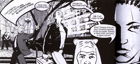
The first example is drawn from Full Color, a graphic novel by Mark Haven Britt. I have taught this book a couple of times, and it is a beautifully designed comic that tells a powerful story. The main character is Boom and her best friend is David. In Figure 1, the two are walking in a park while David sings.
 

Figure 1.

The balloon that contains David’s song is partially obscured visually by Boom’s speech balloon. In this case, I think the example is relatively straightforward. If we follow the principle that overlapping balloons indicate overlapping discourse, then Boom’s directive (’Sing something else’) takes place during the same time that David sings.

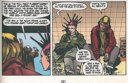
Sometimes, the relationship between song and speech in the same panel is less clear. Two examples from Grant Morrison’s The Invisibles will help illustrate a range of possibilities. Both Figure 2 and Figure 3 come from ’Say You Want a Revolution.’ In Figure 2, we see Dane McGowan (aka Jack Frost) sitting on a sidewalk, in pretty bad shape. In the panel on the left, old Tom O’Bedlam walks by, talking in his enigmatic style. In the panel on the right, Dane/Jack’s question is rendered in a speech balloon that is separate from the others. In fact, none of the balloons even touches in this panel.
 

Figure 2. Dane/Jack asks about Tom.

 
For this post, the central question about this image is the relationship between speech and song. Is the reader expected to hear Tom’s song first, followed by (a short) silence, then followed by Dane/Jack’s turn? Or is the reader expected to hear Tom’s song take up enough time in the panel that Dane/Jack’s turn takes place simultaneously. A third possibility, of course, is that Tom’s song lasts long enough to overlap both speakers’ turns.

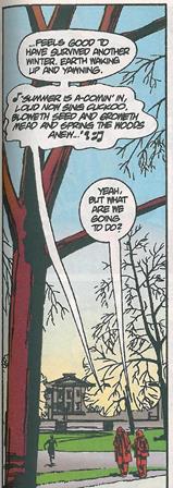
After some time passes, Jack and Tom become relatively stable compatriots, if not friends. In Figure 3, they are shown walking together, and Jack is trying to learn something from Tom.

Figure 3. Tom and Jack talk.

Tom speaks first and then sings, presumably with little or no silence between the end of his spoken words and the beginning of his song. In a separate speech balloon, Jack takes his own turn.

If we follow the principle that separate balloons indicate a complete separation of turns, then at no point in these two examples from The Invisibles is there overlapping discourse. However, my sense is that in some cases at least, we are encouraged to imagine the more expansive nature of song and that it is not only possible but quite likely that speakers can produce regular conversational turns that overlap the lyrics.

How do you hear music and speech in the same panel? What examples are similar to or different from those presented in this post? What other examples of song and speech have you seen mixed in the same panel? How do you imagine we should hear them? As separate? As overlapping? As complementary? As competing?

When Are Two Comics the Same Comic? (Part IV)

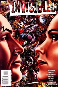
InvisiblesV3#2Cover

At the ‘old’ Pencilpanelpage location I began my contribution to our reign of comic scholar awesomeness with three posts about when distinct versions of a comic are, or are not, really the same comic in the relevant aesthetic/interpretational/etc. sense (see When Are Two Comics the Same Comic Part I, Part II, and Part III, which focus on rearrangement of panels, recoloring, and redrawing ‘lost’ portions of old comics, respectively). Those posts focused on issues having to do with ontology – determining whether or not we have one work of art, or many – with an eye towards how these issues affect our reception of, and overall assessment of, these comics (and comics like them) as works of narrative art. This post is a continuation, of sorts, to that investigation.

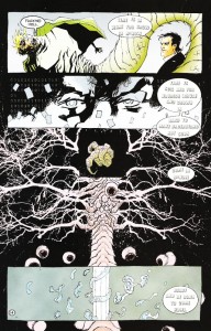
InvisiblesRedoHere, however, I would like to take a slightly different approach to the general question, but one which is motivated by the same phenomenon: multiple, aesthetically distinct versions of the same comic. The instance in question is well-known – Issue #2 of The Invisibles Volume 3, “The Moment of the Blitz” (which is actually the 11th, and second-to-last, issue in this volume – the numbering counts down from 12 to 1). In the original comic, pages 12 – 14 are drawn by Ashley Wood. These (especially page 14) are critical pages, summing up major metaphysical themes underlying The Invisibles in little more than a dozen panels. In the tradepaperback collection, however, Ashley Wood’s pages are jettisoned in favor of a re-drawing of this critical passage by Cameron Stewart, who had also drawn a number of pages of this issue in the original floppy version. I have included scans of the critical page 14 here – first the Wood version, then the Stewart version.

Now, the reason the pages were redrawn is simple enough, and well-known: Morrison felt that Wood had not properly captured his ideas on the page, and Stewart was asked to ‘do it right’ for the trade paperback version. Patrick Meaney described the Stewart pages as follows:

Cameron Stewart deserves credit for redrawing pages originally illustrated by Ashley Wood for the trade paperback version. Those original pages can be quite confusing, obscuring thematic points that Morrison had been building toward throughout the series (Our Sentence is Up: Seeing Grant Morrison’s The Invisibles, 2011, p. 250)

and an entry on comicvine.com described the situation as follows:

The Cameron Stewart pages are considered the true version since they were redone for the Trade. Ashley Wood’s pages are interesting because they were a different interpretation of the same script.

InvisibleOrigThese sorts of descriptions, however, pose a serious issue for comic scholars (and for anyone who wants to understand how comics work as an art form, and anyone who thinks such an understanding might enrich our experiences with structurally rich comics like The Invisibles). Comics scholars like to talk about comics (at least, mainstream comics, as opposed to single-creator auteur works) as a medium of genuine collaboration – the thought is that the distinct artistic visions of writer and artist ‘blend’ somehow into something greater than the sum of the invididual contributions. Regardless of how, exactly, the details of this work, the central idea – that comics are a collaboration between writer and artist (and perhaps others) is almost a truism of work on comics, if anything is.

The redrawn pages of The Invisibles Volume 3, however, suggest that comics is not a collaborative endeavor – at least, it isn’t a collaboration between two creators whose endeavors are equally valued and whose endeavors contribute equally to the identity of the work. Instead, the picture we obtain from this incident is that artists are merely journeymen (or journeywomen) of a sort who toil away in service to someone else’s artistic vision (and whose work can be thrown away, and replaced by the work of another, if it does not fit that vision).

In short: There seem to be two accounts regarding how writer-artist interaction might (and more importantly, should) be viewed. On the first account, writers and artists are equal collaborators on a single artistic work whose final characteristics are determined in roughly equal part by each. The second account of writer-artist interaction is suggested by the use of the word ‘interpretation’ in the quote from comicvine.com. This view has it that the artist is not an equal collaborator, but is instead interpreting the writer’s story (in much the same way that a performing musician might interpret a piece of composed music). Note that we would not usually call a performer interpreting a composed piece of music an instance of collaboration!

Now, on the one hand this seems to be merely a question of how the business of comics works, and in this particular case it is not surprising that a creator of Morrison’s caliber would be allowed so much control over ‘his’ work (the scarequotes are very important, since the appropriateness of this term, rather than ‘their’, is exactly what is at issue). But there are also deep theoretical issues lurking hereabouts – ones deeply connected to the title of this post. If Morrison and Stewart (and hence Morrison and Wood) are genuine collaborators, then replacing Wood’s pages with Stewart’s amounts to replacing one collaborative work with another one entirely. If, however, Stewart and Wood are not creators of the artwork, but are merely interpreters of it, then the situation amounts to replacing one interpretation of the work with another interpretation of that same work.

So the question really is this: Do we have two distinct works here, or merely two different interpretations of a single work of art? Or, alternatively, are artists more like composers, or more like performers interpreting composed music?

Queer Silence and the Killing Joke

Recently, as part of an interview with Kevin Smith, Grant Morrison claimed that all these years no one has gotten the ending of Alan Moore and and Brian Bolland’s The Killing Joke (1988).  Morrison claims that those obscured and silent final three panels are meant to suggest that Batman is finally killing the Joker—breaking his neck or strangling him. In other words, The Killing Joke is a form of final Batman story.  In the interview Kevin Smith reacts to this interpretation as if it were some form of big revelation that utterly changes the framework for understanding the story.  The reaction on the web was mostly similar, just look  here and here and here.  Comment threads on stories reporting this were filled with a lot of speculation about how this killing interpretation holds up in light of the fact that some of the events from The Killing Joke (like the crippling of Barbara Gordon) made their way into the main Batman continuity, because clearly the Joker is not dead.

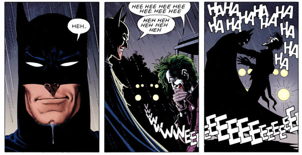
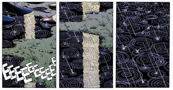
I think it an adequate, but nevertheless anemic interpretation. Sure, the killing exists as a possibility, but other and more sweetly radical possibilities might actually redeem (in part) a great, but flawed book, that Moore himself later repudiated. The Killing Joke is built on the uncertainty inherent to the serialized superhero comic book medium, so we can’t look to what was included or not included from it in the main continuity as evidence of the acceptability of Morrison’s interpretation, because the book itself works to remind us of how the history constructed by long-running serialized properties are incoherent. No. I think the interpretation’s weakness comes from being an unimaginative ending to the Batman story.  The Killing Joke reminds us that as a series of events the Batman story makes no sense, but rather it coheres through the recurring structural variations within that history.  Moore is having Batman and Joker address that structure in a winking and self-referential way.  Violence, even killing, is already a central part of the recurring interactions of these characters (how many times has the Joker appeared to die only to return?), so why give weight to an interpretation claimed as an end that only gives us more of what already explicitly pervades the entire genre—violence?   Instead, a close “listening” to how Moore and Bolland use sound (particularly, the lack of it in certain key panels) to highlight the queerness of the Batman/Joker relationship provides the reader with a different way to interpret those final panels.

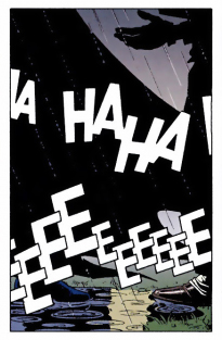
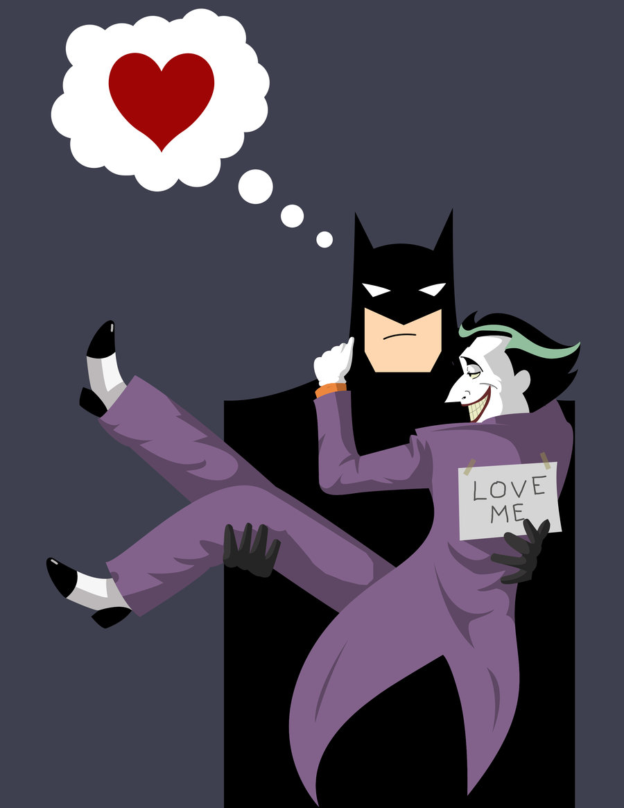
I contend that rather than indicating violence, that final silence is recapitulating an intimacy between the Caped Crusader and the Clown Prince of Crime that is found in several silent panels throughout the work and that echoes the intimacy implicit in the structure of the Batman/Joker relationship.  As such, in the end, when the Joker tells the joke that makes Batman join in the laughter, when the Batman grabs the Joker by the shoulders and the panels shift their perspective to show the Joker’s hand kind of reaching out towards Batman’s cape amid the depiction of their laughter and the approaching sirens, followed by a panel that shows only their feet (and a wisp of Batman’s cape), and then finally just silence amid raindrops making circles in a dirty street, instead of violence, I imagine they are locked in a passionate embrace and kiss.

TKJ-laughter

TKJ-finalpanels

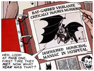
In his book, How to Read Superhero Comics and Why, Geoff Klock does a great job of breaking down how The Killing Joke is structured in a such a way to comment on the contradictions, misprision and re-imaginings that pervade the histories of these characters. While Moore’s comic plays on the idea of the Joker and Batman being two-sides of the same coin—two men playing out their psychotic breaks in different (but dangerously violent) ways after experiencing “one bad day”—the profound similarity between the two is one that emerges from the structures of the serialized medium they appear in (and in the multiple mediums versions of these characters have appeared in over the years). They both have deeply entwined “multiple choice pasts” that outside of their individual encounters of repeated conflict makes for a farraginous and incoherent history. It is the structure of the relationship and the homosocial desire it represents that provides a foundation for understanding their stories regardless of the confusion of how long it has really been going on and what from it may or may not really “count.”

TKJ-scrapbook

The Killing Joke  is an even more brutal and direct indictment of the superhero genre’s state of arrested development than Watchmen (1987) was. Moore’s work seems to want to drain any remaining appeal from their accreted and subsequently problematic histories by appearing to complete the trajectory that Batman expresses concern about in the text itself. Unfortunately for Moore, however, it didn’t quite work. A work built on highlighting the artifice of the comic pastiche becomes something of a lauded lurid spectacle. Even though The Killing Joke seems to consciously want to stand outside of continuity it nevertheless falls victim to continuities’ power to assimilate or exclude narrative events. Thus, the maiming of Barbara Gordon and the suggestion that she’s raped were later rehabilitated into the main continuity of the Batman line (wheelchair-bound, she becomes the superhero dispatcher, archivist and IT-tech, Oracle).   So, in the same vein it is not outside the realm of possibility that Grant Morrison could be right and the death of the Joker has simple been excluded from continuity in the same way that “official” history ignores Bat-Mite or the Rainbow-colored Batman costume.  However, within the skein of The Killing Joke itself, the possibility of a kiss, of a breaching of the limits of their homosocial bonds to transform it into a homosexual one not only fits within the structure of their relationship, but levels a more powerful indictment against the pathologies of repression and violence that pervade the genre.

TKJ-jokershand

Batman killing the Joker may be a suddenly popular interpretation of the end of The Killing Joke because many readers seem uncomfortable with the unresolved ending of the two of them standing in the rain laughing until their laughter fades away under the howl of an approaching siren and then becomes silence. For some, for Batman to laugh along with Joker is too “out-of-character” and/or shows that the Joker is right all along—the world is an unjust and disordered place and for Batman to think he can provide order by dressing up as a bat and beating people up is as crazy as running around performing random and outlandish acts of violence as a way to get a laugh. But I see that shared laughter as indicative of not only an unresolved narrative tension, but also sexual tension. It is a “here-we-are-again-drawn-together-but-at-an-impasse” kind of laugh (which is an echo of the joke itself). Sure, the idea that Batman and Robin had/are having some kind of sexual relationship has long existed, but there is a kind of rough intimacy to the Joker and Batman relationship that makes me agree with Frank Miller that their relationship is “a homophobic nightmare.” Joker can be seen to represent what happens when you allow queerness free reign, Batman when it is closeted.  They are both extreme reactions to a comic book world where queerness is defined as deviancy, and as such deviant behavior is the only way to express the queerness underlying their relationship.  Any chance to express intimacy outside of those confines is engulfed in silence, and it is by seeking out these silences in the text (or how sound and silence interact) that this special bond between them is demarcated.

TKJ-hands

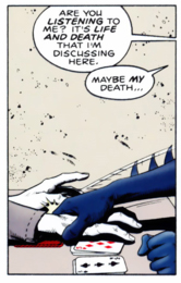
The book opens with three straight pages (22 panels) without a word of dialog and no narration. Instead we have the typical establishing shots that perfectly capture the prison for the insane/sanitarium trope used whenever the Arkham Asylum set piece appears. Batman is not here to solve a mystery or quell a riot. He arrives to pay a personal visit to the Joker. When the silence is finally broken, Batman speaks. “Hello. I came to talk.” This is a profound reversal. The panels here alternate between a normally taciturn Batman doing all the talking—expressing his feelings, seeming almost desperate in his desire to reach the Joker—and the normally boisterous talkative Joker being silent. The scene is punctuated by the the “FNAP” of the Joker putting down cards in a game of solitaire.  The scene has the rhythm of a tense discussion regarding a topic long in the air, but only finally broached by an anxious or disillusioned lover. There is a desperation and emotionalism that seems to emerge from long contemplation on the part of Batman about his relationship to the Joker. The visit suggests that Batman has come to accept that violence will not resolve the conflict between their extreme reactions to a queer identity. When the man in the cell turns out not to be the Joker at all, but a double duped into taking his place while the real Joker escapes, that moment melts back into something like the “typical” Batman and Joker story. Joker has escaped and needs to be captured before he accomplishes some outlandish and murderous scheme.
This time, the Joker’s outlandish plan involves driving Commissioner Gordon mad as a way to get Batman to admit their similarity through madness. The image of the Commissioner stripped naked and made to wear a studded leather bondage collar does a lot to equate madness and queerness run rampant.   The Joker’s desire for Batman to “come out” and admit they are the same echoes a dichotomy between the closeted and the “out” individual. The Batman character is largely about his secret identity, the construction of a hyper-hetero playboy cover for his life in spandex and a mask, tackling, wrestling and binding (mostly) other men in the guise of combating criminal deviance.  He is homophobia turned inward. The Joker on the other hand has no identity outside of being the Joker.  He embraces his mad flamboyance and doesn’t see it as deviant, but as a different form of knowledge about a world that could create him and/or Batman.  The Joker is dangerously queer and that is his allure. He is the manifestation of licentiousness that homophobia conjures when it imagines queerness.
Even the past given to the Joker in The Killing Joke reinforces this idea.  Sure, he is given a pregnant wife in the version depicted, but her death frees him from the yoke of a heteronormative life as much as being chased into a chemical vat by Batman does. It is suggested that losing his wife is just as much to blame for Joker’s particular madness, but the real clincher is Joker’s assertion regarding his past: “Sometimes I remember it one way, sometimes another… If I’m going to have a past, I prefer it to be multiple choice!” Despite the choice between these varied pasts, what remains constant is the centrality of Batman to the Joker becoming who he is, which helps to fuel the Joker’s desire to have their relationship be of primary importance in Batman’s life (as it is in his).  Whatever violence the Joker commits, whatever other desires he may evince, they are subsumed in that primary desire.  In a genre where beginnings and endings are written, erased and rewritten so as to become a palimpest, it is the recurring structure of the characters’ engagements that define them more than any sense of origin or goal.

TKJ-understand

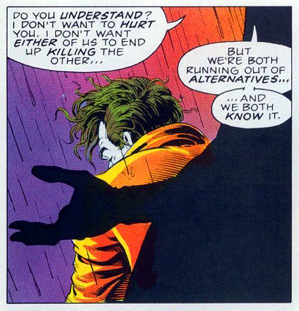
This intimacy explains the uncharacteristically intense tenderness with which Batman seeks to confront the Joker. When he catches the Joker near the story’s end, Batman finally gets to broach the subject, to bring up the issue that precipitated his attempted visit with the Joker earlier.  He says, “Do you understand? I don’t want to hurt you,” and makes the offer: “We could work together. I could rehabilitate you. You needn’t be out there on the edge anymore. You needn’t be alone.”

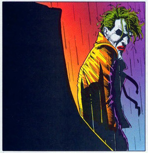
Look at the panel right after Batman makes that offer. There is a vulnerability to how the Joker is depicted. He is slightly hunched as if suddenly aware of the cold rain, his eyes are in shadow as if to hide tears and he is looking at Bats from over his shoulder with a frown that is at odds with his usual exaggerated grin. It is perhaps one of the few (if not only) human moments between these two characters and it is a silence.

TKJ-joker-vul

The strange thing about Batman’s offer that the Joker contemplates in heavy silence is that “out there on the edge” exactly where Batman lives as well. The offer to rehabilitate the Joker is also an offer to rehabilitate himself—to rid them both of the desires that repeatedly and destructively bring them together. This is Batman as Brokeback Mountain. By making this speech, Batman is revealing himself to be something of a hypocrite, unless he means to find someway to admit his own flaws and overcome his own secrets, to really become a part of the “togetherness” that he suggests can help the two of them to avert their fate. The Joker refuses, saying “it is too late for that. . . far too late.”
 

batfamily

 
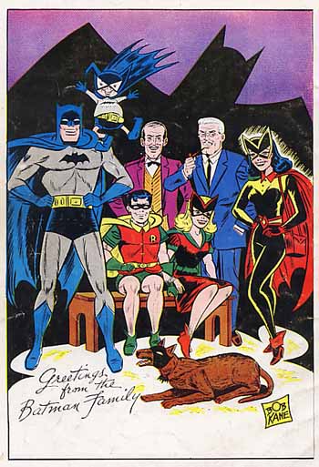
Silence marks several other important panels throughout the work, including Batman’s wistful look at the portrait of the anachronistic “Bat-Family.” The picture (made to emulate a Bob Kane sketch) depicts characters that no longer existed in the main continuity at that time. The original Batwoman and Bat-Girl (not Barbara Gordon) were editor-mandated creations—romantic interests for Bruce and Dick in order to combat the accusation of Frederic Wertham that Batman and Robin are a “wish dream of two homosexuals living together.” The inclusion of the portrait serves to destabilize the notion of coherent history that the whole of The Killing Joke is working at. But it is also a signal of the need in the past for Batman to have a “beard” written into the story to deflect gay accusations. It is a reminder that even the lighthearted era of the (now false) Bat-Family was part of a structure of secrets and lies meant to cover for fear of a repressed desire. The nostalgia of this scene is laid with irony, since the call to a simplistic normative family is belied by the constructed nature of that “family” and the queerness of their life of masks and costumes.

batman_yaoi_time_by_manawua-d1vfftt

Even the most contentious scene in the graphic novel, the brutal shooting of Barbara Gordon, leading to her disrobing, (likely) rape and photographing, is attended to in silence. Now, I think the scene itself is part of what makes The Killing Joke flawed. Its brutal treatment of a beloved female character, who has been shown on more than one occasion to be able to hold her own, is egregious. The sexualization of the violence against her also serves to give the scene just the kind of morbid appeal that plagues a lot of contemporary comics, and distracts from the ways The Killing Joke can be seen as a (re)visionary text. It is completely unnecessary for Moore to make his point. Yet, regardless of its failure, the scene’s silence casts it as part of that unspoken attraction between Batman and the Joker. Like an especially twisted reference to Eve Kosofsky Sedgwick’s Between Men (1985), this is a love triangle, with Barbara playing the proxy for the desire between the “rival suitors.” Sedgwick writes, “in any male-dominated society, there is a special relationship between male homosocial (including homosexual) desire and the structures maintaining and transmitting patriarchal power. . . this special relationship may take the form of ideological homophobia, ideological homosexuality, or some highly conflicted but intensively structured combination of the two” (25). Thus, the maiming and violating of Barbara Gordon is not about her at all, but about the Joker’s desire for Batman. She is the proxy through which this desire is expressed as it literally serves to summon Batman to attend to him so they may take up their “highly conflicted, but intensively structured” relationship. It is this very structure that helps the Batman oeuvre to cohere despite its historical ambiguity.

The silence of those two final panels echoes the silence immediately following Batman’s offer, just as it parallels the silence that attends many of the scenes that highlight their intimacy. The silence is a recapitulation of that moment of tender vulnerability seen in the Joker as he contemplates the offer, and I think that silence is best filled not with violence —violence is loud and obvious and strewn throughout The Killing Joke and the entirety of the Batman canon—but rather with tender love. The silence is the signal for that which cannot be depicted or spoken aloud. It is an actual act of bravery on the part of Batman, proving to Joker that it is not yet “too late.” The Killing Joke’s abundant self-awareness regarding the incoherence of comic history also suggests an incoherent future where anything is possible as long as it can be enclosed in the broad structures of their relation—even Batman and the Joker as lovers. That—not violence, not a killing—would be an end to the Batman story as we know it.

I don’t see the kiss as the definitive action of those panels—I can’t say what really happens in because there is no “really happened”—but find it much more profound than killing. The kiss is a more delightfully radical possibility than the usual violence of the genre. It upends their entire history, but somehow still fits within its skein.  The off-panel action remains unseen because that’d be a real end.  Violence doesn’t change anything in superhero comics, it is a normalizing force that builds routine, and killing is just the beginning of a come-back story.  It is love that transforms. Sure, it would be best if superheroes could move beyond the pathologizing of queerness, but to even have a chance to imagine a world where Batman and the Joker could both be saved from their violent self-destructive spiral through loving each other is too wonderful to dismiss.
________
Osvaldo Oyola is a native Brooklynite. As a kid in the early 80s, in the days before people got the idea that they might be worth something, he would scour flea markets and yard sales for cheap old comics from the 60s and 70s. These days he’s still obsessed with Bronze Age comics, but mostly for how they represent race, gender, and urban spaces. He is currently completing a doctoral dissertation on the intersection of pop culture and ethnic identity in contemporary transnational American literature, writing on Los Bros Hernandez, Junot Diaz and Jonathan Lethem. He still lives in Brooklyn, with his poet wife and cats named for Katie and Francie Nolan from A Tree Grows in Brooklyn. He writes briefish thoughts on comics, music and race on his blog, The Middle Spaces.

Bloody Conventions

I’ve avoided reading We3 for years, in part because I find depictions of violence against animals upsetting, and I was afraid I’d find it painful to read.

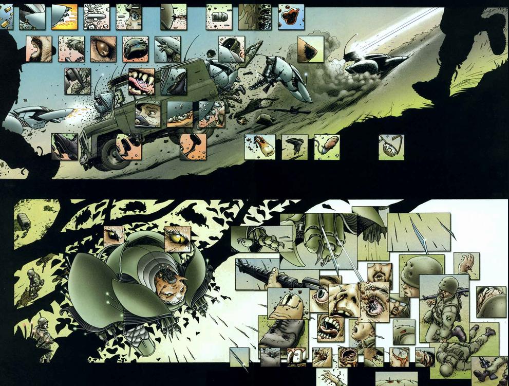
As it turns out, though, I needn’t have worried. We3 does have some heart-tugging moments for animal-lovers — but they’re safely buried and distanced by the towering pile of bone-headed standard-issue action movie tropes. There’s the hard-assed military assholes, the scientist-with-a-conscience, the bum with a heart of gold and an anti-fascist streak…and of course the cannon-fodder. Lots and lots of cannon fodder. We3 clearly wants to be about the cruelty of animal testing and, relatedly, about the evils of violence — themes which Morrison covered, with some subtlety and grace, back in his classic run on Animal Man. In We3, though, he and Frank Quitely gets distracted by the pro-forma need to check the body-count boxes.
 

We3 1

 
The plot is just the standard rogue supersoldiers fight their evil handlers. The only innovation is that the supersoldiers are dogs and cats and bunnies. That does change the dynamic marginally; you get more sentiment and less testosterone. But the basic conventions are still in place, which means that the comic is still mostly about an escalating series of violent confrontations more or less for their own sake. It’s hard to really take much of a coherent stand against violence and cruelty when so much of your genre commitments and emotional energy are going into showing how cool your deadly bio-engineered cyborg killer cat is. To underline the idiocy of the whole thing, Morrison has us walked through the entire comic by various military observers acting as a greek chorus/audience stand-in to tell us how horrifying/awesome it is to be watching all of this violence/pathos. You can see him and Frank Quitely sitting down together and saying, “Wait! what if the plot isn’t quite thoroughly predictable enough?! What if the Superguy fans experience a seizure when they can’t hear the grinding of the narrative gears?! Better through in some boring dudes explicating; that always works.”

The point here isn’t that convention is always and everywhere bad. Rather, the point is that conventions have their own logic and inertia, and if you want to say something different with them, you need to think about it fairly carefully.

Antonio Prohias’ Spy vs. Spy comics, for example, are every bit as conventional as We3, both in the sense that they use established tropes (the zany animated slapstick violence of Warner Bros. and Tom and Jerry), and in the sense that they’re almost ritualized — to the point where in the collection Missions of Madness, Prohias is careful to alternate between black spy victory and white spy victory in an iron and ludicrous display of even-handedness. Moreover, Spy vs. Spy, like We3, is, at least to some extent, trying to say something about violence with these tropes — in this case, specifically about the Cold War.

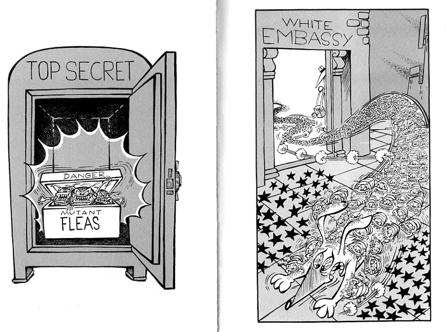
Obviously, a lot of the fun of Spy vs. Spy is watching the hyperbolic and inventive methods of sneakiness and destruction…the black spy’s extended (and ultimately tragic) training as a dog to infiltrate white headquarters, or the white spy’s extended efforts to dig into black HQ…only to end up (through improbable mechanisms of earth removal) back in his own vault. But the very elaborateness and silliness of the conventions, and their predictable repetition, functions as a (light-hearted) parody. Prohias’ spies are not cool and sexy and competent and victorious, like James Bond. Rather, they’re ludicrous, each committing huge amounts of ingenuity, cleverness, malice, and resources to a never-ending orgy of spite. Spy vs. Spy is certainly committed to its genre pleasures and slapstick, but those genre pleasures don’t contradict its (lightly held, but visible) thematic content. Reading We3, you feel like someone tried to stuff a nature documentary into Robocop and didn’t bother to work out how to make the joints fit. Spy vs. Spy, on the other hand, is never anything less than immaculately constructed.
 

spyvsspy004


We3 doesn’t seem to realize its themes and conventions don’t fit; Spy vs. Spy gets the two to sync. That leaves one other option when dealing with genre and violence, which is to try to deliberately push against your tropes. Which is, I think, what happens in Pascal Laugier’s Martyrs.

Martyr’s is an extremely controversial film. Charles Reece expresses something of a critical consensus when he refers to it as “really depressing shit.”

And yet, why is Martyr’s so depressing…or, for that matter, why is it shit? Many fewer people die in Martyr’s than in We3; there are fewer acts of violence than in Spy vs. Spy. Even the film’s horrific finale — in which the main character is flayed alive — is hardly new (I first saw it in an Alan Moore Swamp Thing comic, myself.) So why have so many reviewers reacted as if this is something especially shocking or especially depressing?

I think the reason is that Laugier is very smart about how he deploys violence, and about how he deploys genre tropes. Violence, even in horror, generally functions in very specific ways. Often, for example, violence in horror exists in the context of revenge; it builds and builds and then there is a cathartic reversal by the hero or final girl.

Laugier goes out of his way to frustrate those expectations. The film is in some sense a rape/revenge; it starts with a young girl, Lucie, who is tortured; she escapes and some years later seeks vengeance on her abusers.

But Laughier does not allow us to feel the usual satisfying meaty thump of violence perpetrated and repaid. We don’t see any of the torture to Lucie; the film starts after she escapes. As a result, we don’t know who did what to her…and when she tracks down the people who she says are the perpetrators, we don’t know whether to believe her. As a result, we don’t get the rush of revenge. Instead, we see our putative protagonist perform a cold-blooded, motiveless murder of a normal middle-class family, including their high-school age kids.

We do find out later that the mother and father (though not their children) were the abusers…but by that time the emotional moment is lost. We don’t get to feel the revenge. On the contrary, no sooner have we realized that they deserved it, than we swing back over to the rape. Lucie has already killed herself, but Anna, her friend, is captured and thrown into a dungeon, taking her former companion’s place. There she is tortured by an ordinary looking couple who look much like the couple Lucie killed. Thus, instead of rape/revenge, we get the revenge with no rape, and the rape with no revenge. Violence is not regulated by justice or narrative convention; it just exists as trauma with no resolution.
 

images

 
I wouldn’t say that Martyrs is a perfect film, or a work of genius, or anything like that. Anna’s torture is done in the name of making a martyr of her; the torturers believe suffering will give her secret knowledge. And, as Charles point out, they end up being right — Anna does attain some sort of transcendence, a resolution which seems to justify the cruelty. And then there’s the inevitable final, stupid plot twist, when the only person who hears Anna explain her secret knowledge goes off into the bathroom and shoots herself. So no one will ever know what Anna saw, get it? Presumably this is supposed to be clever, but really it mostly feels like the filmmakers steered themselves into a narrative dead end and didn’t know how to get out.

Still, I think Charles is a bit harsh when he says that the film is meaninglessly monotonous, that it is not transgressive, and that the only thing it has to offer is to make the viewer wonder “can I endure this? can I justify my willingness to endure this?” Or, to put it another way, I think making people ask those questions is interesting and perhaps worthwhile in itself. It’s not easy to make violence onscreen feel unpleasant; it’s not easy to make people react to it like there’s something wrong with it. Even Charles’ demand that the film’s violence provide transgression — doesn’t that structurally put him on the side of the torturers (and arguably ultimately the filmmakers), who want trauma to create meaning?

Charles especially dislikes the handling of the high-school kids who are killed by Lucie. He argues that they are presented as innocent, because their lifestyle is never linked to their parents’ actions. Anna’s torture is mundane enough and monotonous enough to recall real atrocities, and conjure up real political torture — basically, a guy just walks up to her and starts hitting her. But the evocation of third-world regimes, or even of America’s torture regimen, no matter how skillfully referenced, falls flat since it is is not brought home to the bourgeois naifs who live atop the abattoir.

Again, though, I think the disconnection, which seems deliberate, is in some ways a strength of the film, rather than a weakness. Violence isn’t rationalized or conventionally justified in Martyrs — except by the bad guys, who are pretty clearly insane. In a more standard slasher like Hostel, everyone is guilty,and everyone is punished. In Martyrs, though, you don’t get the satisfaction of seeing everyone get theirs, because scrambling the genre tropes makes the brutality unintelligible. The conventions that are supposed to allow us to make sense of the trauma don’t function in Martyrs — which makes it clear how much we want violence to speak in a voice we can understand.

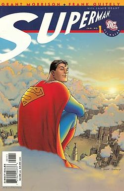
Voices From the Archive: Marc Singer on the Morality of All-Star Superman

A while back I expressed skepticism about All-Star Superman; Marc Singer replied with a long and eloquent defense, which I’m reprinting here. His comment is below.

Thanks for the link and the comments, Noah.

Your point about ideals without content is well taken, but the call for placing superheroes in “some sort of coherent moral framework,” particularly the point about superheroes skirting “political or social engagement,” seems a little musty, a bad leftover (or hangover?) from the eighties. Comics have been doing that for twenty years, and they usually reach the same tired conclusions about fascism (Animal Man being one of the rare exceptions). It’s to Morrison’s credit that All Star Superman largely avoids that well-worn path. With the exception of Luthor, he avoids talking about crime and justice; maybe one or two other criminals appear in the series and they hold absolutely no importance. Decoupling the superhero comic from these serious, meaningful discussions of law and order, most of which end up with a guy in a costume hitting another guy in a costume anyway, is probably one of the freshest moves Morrison makes.

That isn’t to say he avoids the other issues you raise. Issue #9 tackles that hoary old idea, the fascist (or at least cultural imperialist) superman, and finds him wanting. But what superhero comic in the last two decades hasn’t tackled it? This is one of the reasons I was left so cold by the issue, until subsequent ones made it clear that the comic was doing another job as well, motivating Superman to increase his commitment to a different set of ideals.

What are they? As seen in the last four issues in particular: compassion (even for his rivals or enemies), forgiveness (ditto), progress (particularly through scientific research), responsibility for others’ well being, curiosity, creativity, and a commitment to put these other ideals into action. These aren’t tied to any political ideology, but they absolutely are ethical stances (and some of them, like Superman’s commitment to building a better future through scientific progress, imply certain political ideologies, at least in our current cultural moment).

No, this is not a party platform and it doesn’t offer the kind of explicit political engagement you call for. I’m not sure that a Superman comic needs to, for some of the very reasons you list. Superman is a long-lived character with a cultural meaning much larger than any one political ideology (even the two-fisted New Deal liberalism he started out with). Tying him down to a single politics would be both difficult and reductive, especially given the premise Morrison has chosen for his project–synthesizing all prior versions of the character into a seamless whole.

Superman now stands for a kind of general, free-floating concept of decency and inspiration, as seen by all those Obama comparisons I linked to in the previous post (and the many, many more I did not link to). It’s not tied to ideology, but to idealism–Obama’s fans see him as a good guy, as one of the most openly moral figures in liberal politics in decades, as someone who inspires their own hope, so they post a photograph or a video that explicitly compares him to Superman. QED. Superman has become one of the first figures our culture calls to mind when we thinks of these traits. (The other being Jesus, and Morrison does not shy away from Christian references and narrative structures any more than Obama or the Daily Show shy away from manger jokes.) Morrison did not invent this trait, obviously, but he knows the character comes with it and he’s chosen to make it the centerpiece of his comic, building his ethical argument where the character already stands.

The line about having to invent Superman ourselves was a too-cute reference to something that happens in issue #10, which attempts to supply the tradition you say he’s lacking. I have to agree with Nick–I think your post would have been written very differently had you read the last half of the series, especially the last four issues, where all this plays out. Which is not to say you would have liked it, but you would find it hard to say the comic doesn’t articulate any ideals or place anything at stake. Any vagueness in my review is mine, not Morrison’s. But then, an eloquent apologist would say that. :)

Actually, that may be the biggest error in your post–I don’t see myself as an apologist, eloquent or otherwise, because I don’t see All Star Superman as having anything to apologize for.

250px-All_Star_Superman_Cover

Phantom Music

The index to the Comics and Music roundtable is here.
_______________

Forgive me– as if to make this piece as dilettantish as possible, I am going to bring film into a discussion of comics and music.

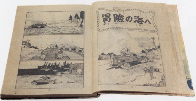
New Treasure Island Page 1 

The first pages of New Treasure Island by Sakai Shichima and Tezuka Osamu, much praised for its cinematic quality

It’s seems to me that when a comic’s flow of panels and pages works ‘musically,’ it also behaves cinematically. The artist’s shifting of perspective and the rhythm of the ‘cuts’ echo filmic sequences that are usually accompanied by a score. Sometimes, when I come across these sequences, it feels like phantom music– like a phantom limb– underscores the comic. It’s a struggle to read along to, or to figure out how the melody goes. Going back to re-read or dwelling on an image too long disrupts the phantom score irrevocably, and forfeits some of the emotional impact of reading the comic. As a teenager, I tried unsuccessfully to hum along or deejay background music while I read comics, hoping to discover total emotional absorption.

Today I better appreciate comic’s more complicated relationship with time and space. I believe I was stupidly hoping to watch– or listen– to comics as opposed to reading them. I wanted to be passively taken in, when I had to stake my own way through a comic book. If watching a film is like having a dream, reading comics is like lucidly dreaming– there’s an exchange of vibrancy and intensity for control and self-awareness.

Cinematic pacing still confuses me. It’s found a natural home in many comics, yet it is a very anti-Greenbergian hold-over from another medium.  Cinematic pacing does not accentuate the qualities that are most fundamental to comics, and instead channels comics’ unique handling of time, space and design into straightforward, uncomplicated narrativity. That’s not to say some overlap hasn’t occurred– cartoonists often work as storyboard artists. I don’t think cinematic pacing should be avoided, or that it poses a threat to ‘native’ comic pacing. But I do feel that the relationship of comics and film is worth examining, especially as the value of comics is increasingly understood in terms of their adaptation into film– where the story is finally told with real-life music.

I’ll clarify what I mean by cinematic comics. Comics are cinematic when they follow established film and cinematographic formulas of conveying time and space in a dramatic, rhythmic, and unambiguously linear fashion.  I am also tempted to add ‘decompressed,’ yet some film conventions are highly compressed, (montages without establishing shots, for example.)

Not all films follow the same cinematographic formulas, and the great ones complicate or invent them. Some formulas are grammatical, like how a bird’s eye view/pan/combination is used to introduce a story, as in American Beauty or Blade Runner. An easily identifiable variation, like Citizen Kane’s No Trespassing sign, is copied intentionally through homages and parodies, and if it becomes prevalent enough, it’s recycled unintentionally.  Another example are the fantasy battleground scenes that flooded theaters  after the run of Lord of the Rings. These formulas are most often accompanied by music to heighten the emotional effect, and the style of the music is included in the formula.

There are many stirring music-less film sequences, yet the connection between music and emotion in narrative is pretty well established, (and necessarily predates the term melo-drama.) To keep things as simply and as overly-generalized as possible, I will vaguely refer to commercial moviemaking scores from the last fifty or so years– think John Williams, Thoman Newman, Elmer Burnstein, Joe Hisaishi and Howard Shore.

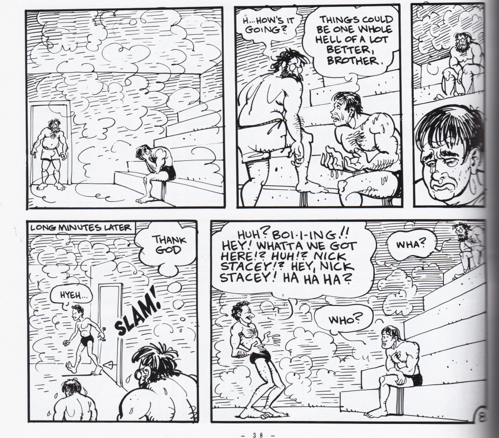
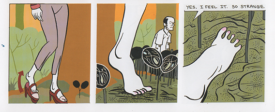
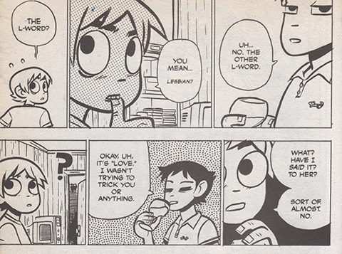
Cinematic comics isn’t a discreet category as much as a collection of traits. Very cinematic comics will more frequently carry more of these traits. Panel proportions offer one example. A panel’s size usually determines the time a reader will stare at it. In cinematic sequences, the panel size will echo the legnth of a cut. Smaller panels dispaly a smaller fraction of time, which is not always the case in comics where the page’s design, or other criteria, are more important than the linearity or pacing of the reading. Small-size, low-content panels allow the eye to ‘bounce’ across the gutter, like a script’s ‘beat,’ without twisting the amount of time the panel naturally represents.

Duncan the Wonder Dog, noncinematic

Non Cinematic– Panel size determined by design, not by the length of the time it represents. From Adam Hine’s Duncan the Wonder Dog: Show One


jim_bathhouse_fragment

Non Cinematic– The third panel is small, but designed to be dwelled upon for some time. From Invisible Hinge by Jim Woodring


>bodyworld_feet

Cinematic — Panels represent one cut, and small wordless panels work like ‘beats’
From
Bodyworld, by Dash Shaw


scottpilgrim_lesbians

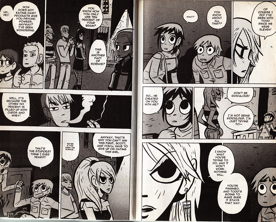
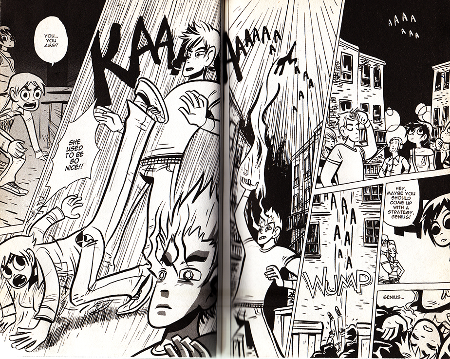
Cinematic — Panels represent one cut, the size suggests the length of time represented, and small wordless panels work like ‘beats’ From Scott Pilgrim Gets It Together by Bryan Lee O’Malley 


In a cinematic comic, a panel’s text to image ratio is usually small, and corresponds to how much dialogue belongs inside one ‘cut,’ or between moments of physical acting. Reading the panel aloud, this is often under thirty seconds. A preponderance of textless panels showcase ‘beats’ of the character’s wordless performances, and occasionally more panographic panels and splash pages demonstrate setting or spectacle. These are sometimes an exception to the rule: splash panels and pages can be three to twelve times larger than an average panel, yet unless there is text they don’t necessarily take that much longer to read. Nevertheless, the moment depicted is mentally understood to last longer, and that it eludes to a build-up and follow-through that wasn’t drawn. Larger, more detailed panels with multiple speech bubbles work like a ‘pan,’ where the camera scrolls across a larger field of vision.

The cartoonist’s perspective choices share commercial filmmaking’s desire for clear communication. If the character is about to step on a rake, a successful cartoonist will most often show the ‘build-up’ and ‘event’(approaching and stepping on the rake,) within the larger environment, and only afterwards show a close-up of the character’s reaction, etc.

The cinematic comic’s cuts are determined largely by dialogue, and by fight-scene and slapstick choreography, and when there is neither, by the comic’s internal rhythm. In film, this rhythm is determined by the score, which needs to match, the pacing of the talking/fighting/comedy scenes as well. As long as the cartoonist obeys cinematic conventions, the more rigorously rhythmic the pacing, the more strongly a phantom score can adhere to it.

Certain comics rhythms/formulas recall certain filmic rhythms/formulas, and by association, inadvertently acquire phantom film scores. Cartoonists are a little helpless– while a filmmaker could pick an iconic or untraditional song to accompany a sequence, a cinematic comic only triggers a super-conventional-hodgepodge-memory of what song ‘should’ go there. Friends hanging out on a summer afternoon demands calls for a low-key, chirpy groove. A troop’s noble suicide mission demands the Lord of the Rings bombast. A sad remembrance cues violins. And if the comic’s pacing is cinematic enough to strongly suggest a score, its absence is distracting. The tingling of a phantom limb is most often painful.

In conclusion, a meandering examination of some cinematic comics:

Scott Pilgrim!

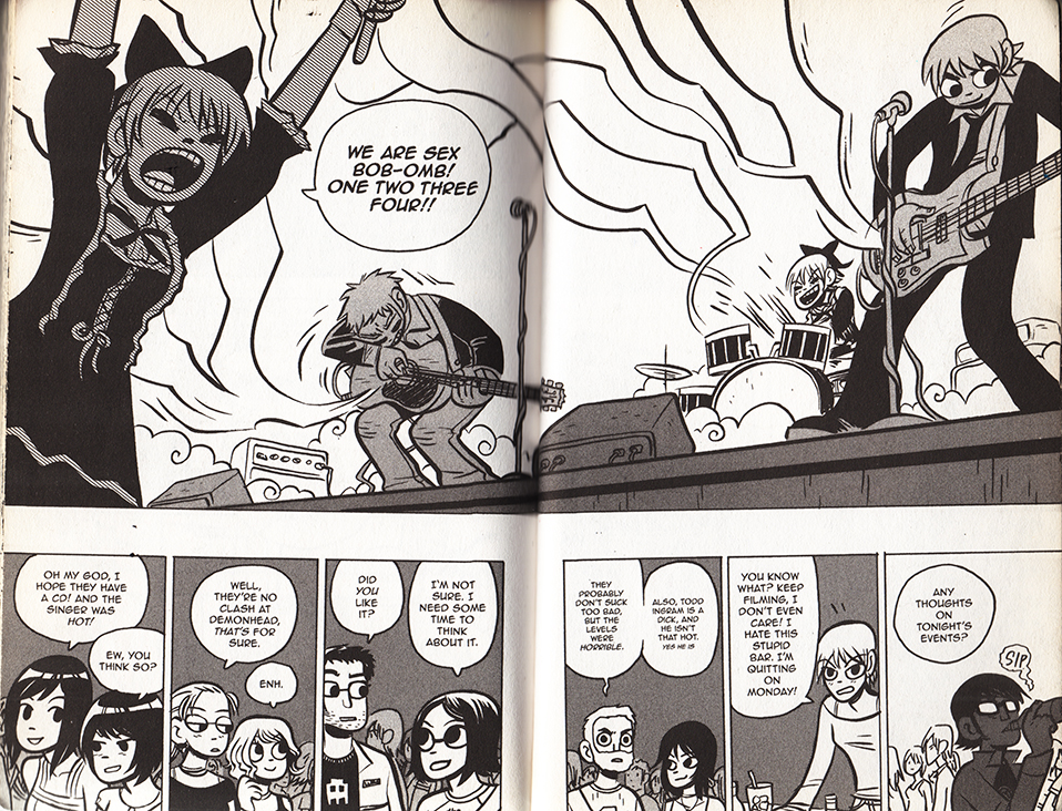
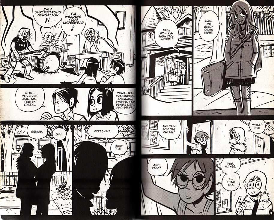
Music plays an even larger role in videogames than it does in film. And when I think of a ‘cinematically paced’ comic, Bryan Lee O’Malley’s videogame-infused Scott Pilgrim series immediately comes to mind. Coincidentally, the characters play, discuss and listen to a lot of music. What does Sex Bob-omb  sound like?


scottpilgrim_boombs


The books toggle with several cinematic genres and conventions. O’Malley showcases a playful mastery of anime and martial-arts cinematoraphic formulas. At two points the comic frames itself with a few vox pops, but I guess that could be as much of a homage to Dan Clowe’s Deathray as  Boondock Saints or Monty Python’s Flying Circus.

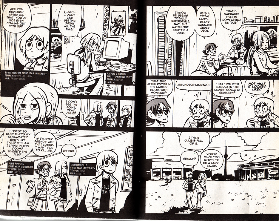
Most impressively, Scott Pilgrim uses hyper-condensed styles of cinematic storytelling, as when a whole relationship is traced over a series of pages. As long as filmmakers establish iconic characters and settings, audiences can easily follow a scattered montage. In comics, the specificity of the background often sacrifices the clarity of the characters, and a drawn interpretations of places are often unfamiliar and stylized. It’s a testament to O’Malley’s craft that this scene (below) is so effortless to follow. O’Malley uses this technique at several points in the series– pointedly never for athletic training ala Rocky, but always for relationships.


Scott Pilgrim 1scottpilgrim2scottpilgrim3scottpilgrim4

 From Scott Pilgrim Versus The Infinite Sadness

Reading comics, I’ve often felt that manga reads more cinematically than American comics, because of the smaller text to panel ratio. I don’t have any hard evidence for this, but manga is thought to be a major influence on the development of decompressed and widescreen comics.

Read Right to Left:


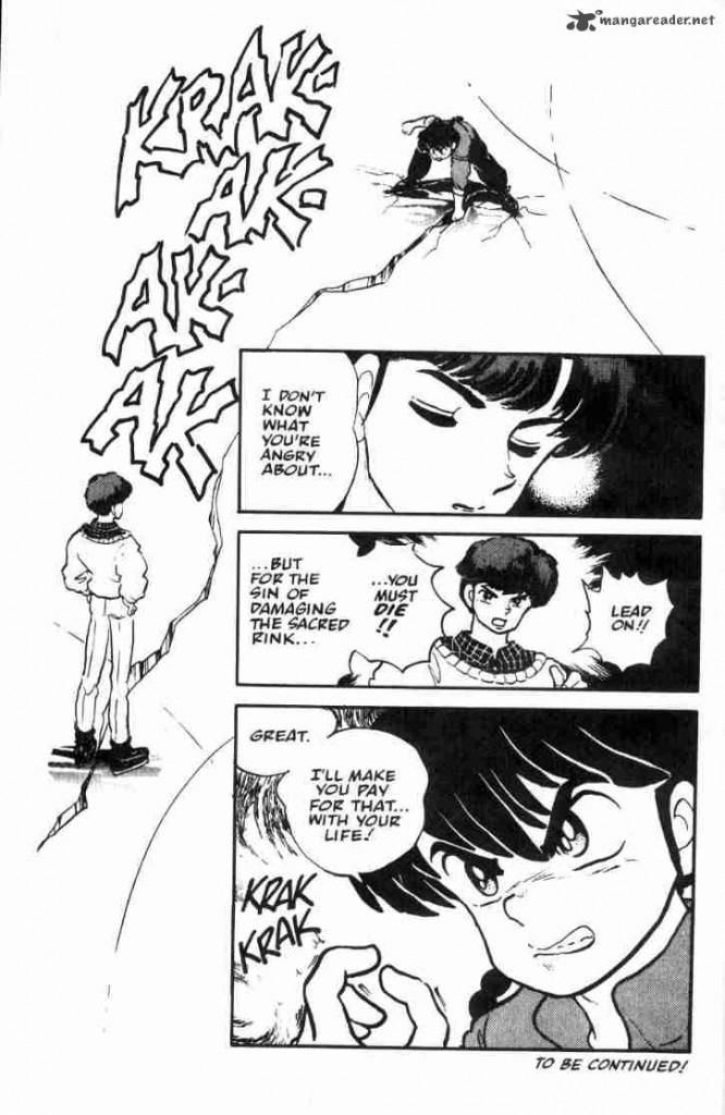
ranma_breaksice

From Rumiko Takahashi’s Ranma 1/2: Volume 3

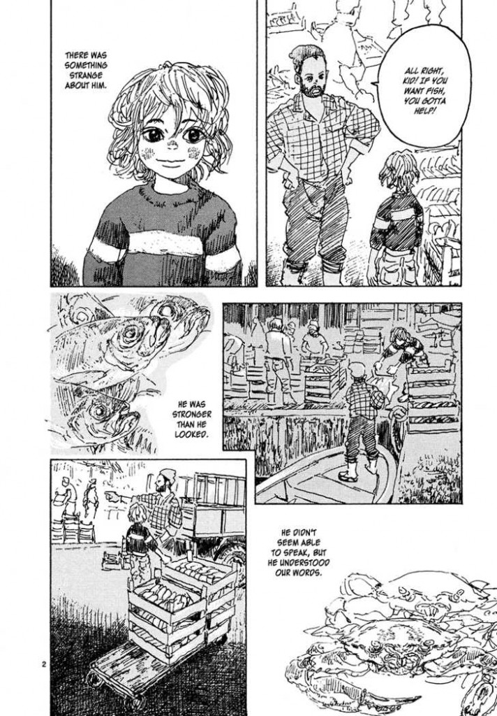
childrenofthesea_page2

From Daisuke Igarashi’s Children of the Sea #8

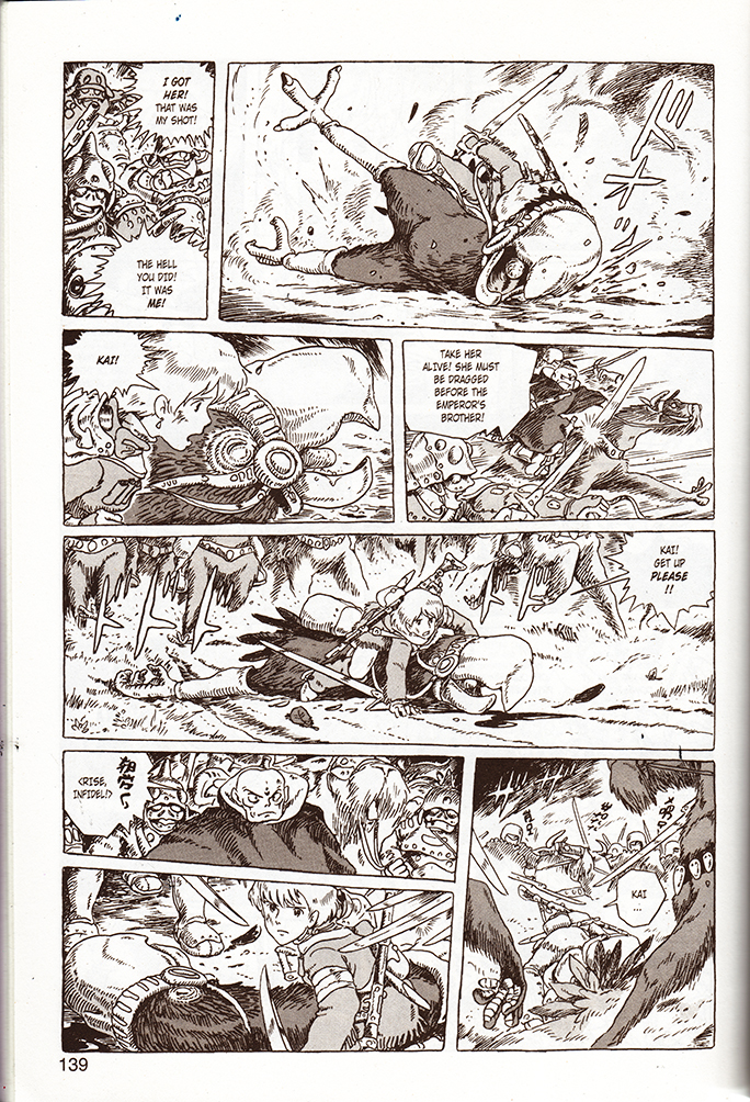
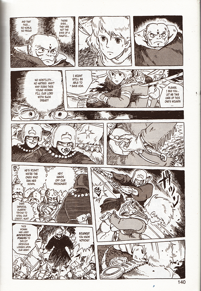
Akira, (the quintessential decompressed comic,) and Nausicaa of the Valley of the Wind are slightly higher brow (and arguably Westernized) examples, and coincidentally are better known for their film adaptations. As comics, both read like gorgeously realized, meticulous storyboards. Reading Nausicaa, I found myself mentally humming pieces of classic Hollywood war and western scores, and occasionally, (appropriately,) a little Hisashi. Yet I’ve never seen the film adaptation with his score.

Read Right to Left:


nausicaa1nausicaa2

From Nausicaa of The Valley of the Wind, Book 3


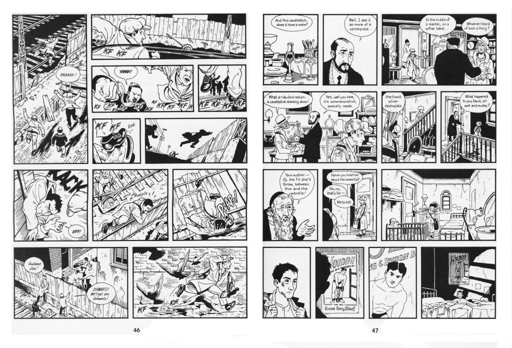
I’ve written a bit about the cinematic quality of Jason Lute’s Berlin: City of Stones here. Lutes comes as close as Miyazaki to making a ‘movie in a book.’ He doesn’t push the boundaries of comics narrativity, and focuses on virtuosically recreating the mis en scene, pacing, and character management of films like Wings of Desire. I’ve complained that Berlin’s ironies alienate readers from the characters, and perhaps a little background music could have sweetened the deal.

berlinhoudini

Skim by Jillian and Mariko Tamaki is an intersting example. While sometimes (unintentionally) dismissed as a teen comic, it is temperamentally aligned with the quieter side of Hollywood epics-  adult coming-of-age dramas like American Beauty, The Shawshank Redemption, A River Runs Through It, and The Cider House Rules, (which are often literary adaptations.) The wikipedia page for The Shawshank Redepemtion contains a great note on Thomas Newman’s score:

…the main theme (“End Titles” on the soundtrack album) is perhaps best known to modern audiences as the inspirational sounding music from many movie trailers dealing with inspirational, dramatic, or romantic films in much the same way that James Horner’s driving music from the end of Aliens is used in many movie trailers for action films.

“End Titles” is probably a good candidate for Skim’s phantom score. Unfortunately, this makes Skim sound heavy-handed, and I’m relieved that “End Titles” doesn’t accompany the book’s heartbreaking, graceful layering of voice and images. Not to say that they don’t sometimes suggest it.

1109 bks best7.JPG


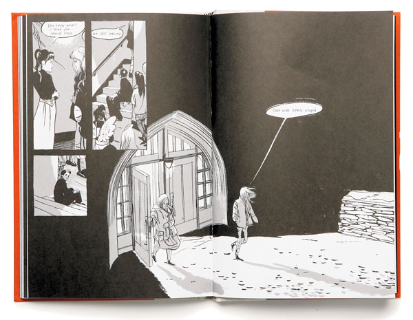
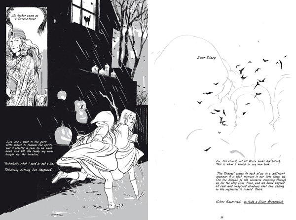
The following pages are in sequence:

skim_buildup

skim_doublepagespread_2

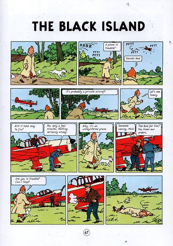
Comics like Tintin are a little more complicated. Herge’s ligne clair extends to the pacing of the comic, and complicated action sequences are detailed moment by moment, like key frames in a storyboard. Yet Herge is so ungratuitous that when he get’s the chance to skip a few key frames, he does.

tintin_blackisland

From TinTin: The Black Island

The phantom score between the last two panels experiences skips like a warped record. Otherwise, I’m not sure why I don’t find Tintin very cinematic– I guess I want to blame the page size. You can pack a lot of panels and text onto an album page, as opposed to the small leaves of most manga books. By the virtue of their size, manga pages automatically resemble dramatic splash pages, and the act of constantly turning pages creates a breathless momentum that exaggerates the cinematic pacing. Tintin is literally less of a page turner.

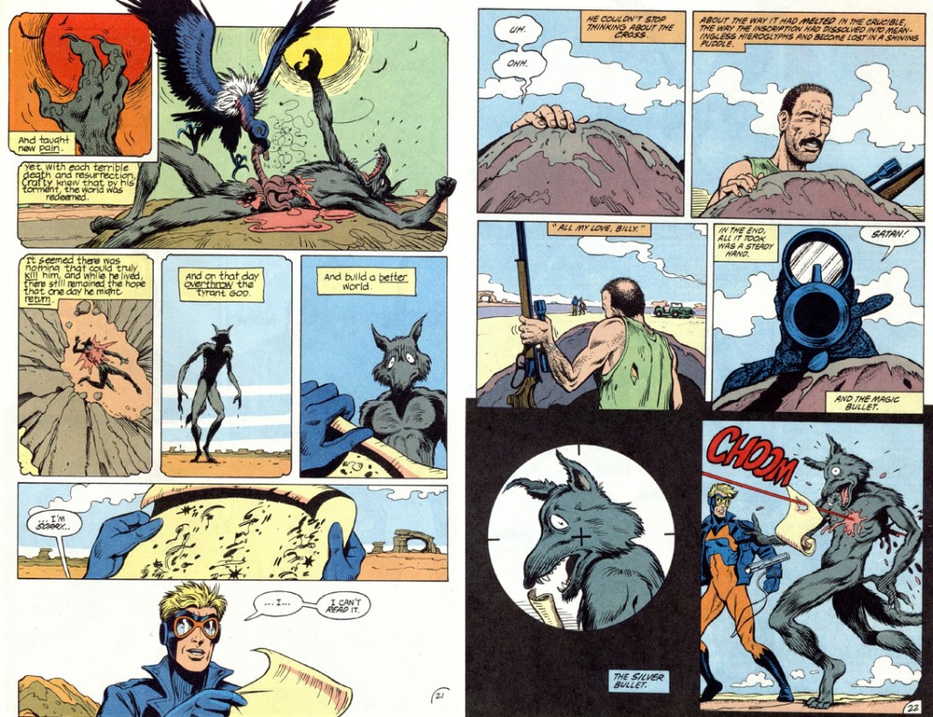
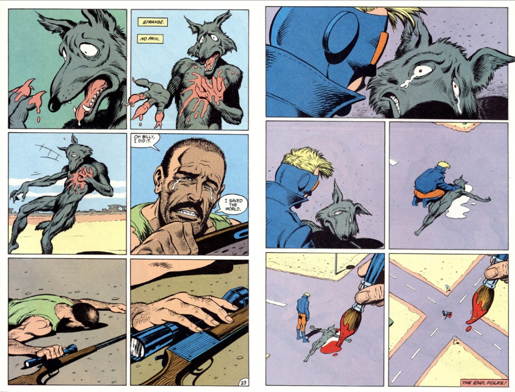
animalman_1

animalman2
from Morrison, Truog, Hazelwood, Costanza and Wood’s Animal Man #5 

My piece is sorely missing examples from mainstream superhero comics. I’ve spent hundreds of hours scanning, assembling and digitally correcting them at Marvel, and have read a decent amount of them myself… but I don’t own any, and I don’t consider myself well-read in them. I’ve enjoyed Alan Moore and Grant Morrison’s work, but I get the feeling that they encourage cinematic pacing more often than other writers. I remember putting pages together on a stunning Hulk comic– it was printed sometime in the fall of 2009, and it opened with panel after panel of the Hulk charging at the viewer in darkness. When I saw the finished book, the whole thing had been slathered with first person captions. I couldn’t bear to keep it. Perhaps I’m being unfair; heavy-handed voice-over is also cinematic in its own special way.