This is the fourth in a five-part roundtable on page layout in comics. I recommend reading the first three here if you haven’t already. And be sure to scroll down to the comments where you’ll find some good discussion about the merits of various approaches (neutral vs. baroque, artificial vs. natural, narratively-driven vs. dream-rebus-like) to layout. It seems the terminology we use to describe different layouts (“rhetorical,” “neutral,” “regular,” etc.) poses some problems, as does the assumption that there is such a thing as “natural” or “easy” reading. This is perhaps the result of the fact that we tend to experience our ingrained reading habits as natural even though they are shaped by the reading culture we were raised in. But there is no such thing as a layout that is not “rhetorical” (i.e. “motivated”) or “artificial” in this sense. The most challenging layouts force readers to confront the cultural constructedness of their reading habits in ways that can feel discomfiting. Comics scholars and artists, in trying to identify an underlying grammar or semiotics of comics, do often conflate pure description with prescription. And we should be suspicious of “pure” description since there cannot be such a thing, rigorously speaking.
In any case, I don’t have much more to add to the debate(s). But, picking up on Adrielle Mitchell’s discussion of rhetorical panel layout experimentation, I thought it might be fun to reflect on the example of Guido Crepax, the Italian comics artist known specifically for his erotic narratives and his surreal McCay-esque experimentations with page layout.
As phallocentric and macho as he appears to readers today, Crepax was a great innovator of narrative and visual techniques meant to delay the reader’s erotic gratification. His experimentation with page layout seems to have been intended to slow time down, to break the erotic moment and the body into endless fragments. Belgian comics scholar and Tintin specialist, Pierre Sterckx, describes Crepax’s work in these terms:
Commençons notre analyse en nous intéressant au retardement par le dessin : Crepax faisait son dessin en noir et blanc, ce qui produit un retardement du plaisir par rapport à un dessin colorisé et en volumes. Faites un dessin en couleurs et en volumes et ça devient du porno. Crepax a un trait extraordinaire, qui oscille entre la caresse et la flagellation.
Il existe un très beau texte de Roland Barthes consacré à l’œuvre de Crepax et dans lequel il dit qu’en parlant, les personnages retardaient leurs actes. Il y a une sorte de contrat qui s’installe entre ses personnages : entre la femme et son bourreau ou entre le maître et l’esclave. Dans ce contrat entre les deux, il y a la parole. C’est une autre manière de retarder l’action, qui est une méthode scénaristique chez Crepax. C’est quelque chose d’assez rare dans la BD. Ainsi, Crepax exalte le masochisme car il sépare le désir du plaisir et il place la douleur entre les deux.
Let’s begin our analysis [of Crepax] by paying attention to the delay [of gratification] through drawing: Crepax drew in black and white, which brings about a delay in pleasure compared to a colored drawing with depth. If you draw something in color and with depth, it becomes pornography. Crepax has an extraordinary line that wavers between a caress and a whipping.
There’s a lovely text by Roland Barthes devoted to Crepax’s work and in which he say that the characters delay their [sexual] acts by speaking. A sort of contract emerges between these characters: between the woman and her executioner or between master and slave. In this contract between the two there is speech. This is [yet] another way of delaying action; it is a plotting method for Crepax. And this is quite rare in comics. In this way Crepax exalts masochism because he separates desire from pleasure and places pain between the two.
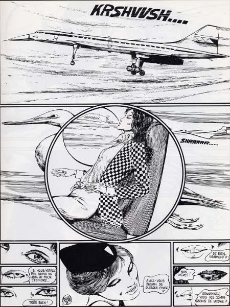
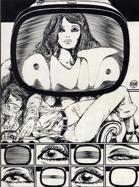
His page layouts are superb and often disturbing. I love how the round panel superposed on the rectangular panel, where a Concord jet is foregrounded by a heron-like bird in flight, suggests an organic erotics of acceleration. The gravity of the page layout centers on Emmanuelle’s pelvis where the reader is compelled to share in her erotic enjoyment of the Concord’s takeoff. More than just delaying gratification, the page layout here mirrors the reader’s body, directs the reader’s corporeal response down to the pelvis. Meanwhile, the bottom of the page opposes three sets of eyes and three sets of lips in two columns of three panels between which we see a single panel that frames the flight attendant’s face as an erotic object caught incommensurably between the scopic and oral drives.
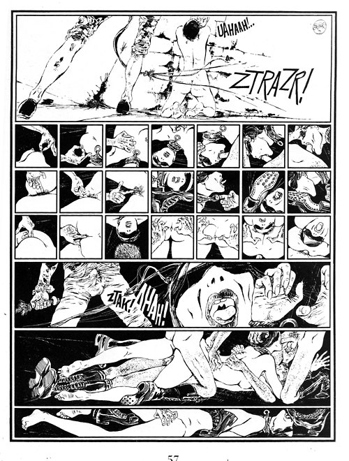
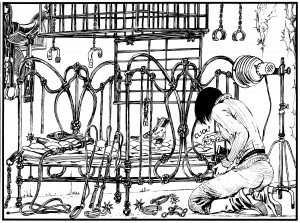
The panel above juxtaposed with the page layout above it (where the proliferation of panels slows the apprehension of even a highly explicit BDSM scene) suggests an interesting rapport between the constraints of panel arrangement and the techniques of BDSM. The cages and intersecting lines in the above panel echo comic book page layouts of various sorts, ranging from the geometrical to the organic. The vegetal art nouveau lines of the bed seem to refer visually to some of the page layouts we see in Windsor McCay’s work while the superposed grids as cages (or decoration?) seem much more autoreferential.
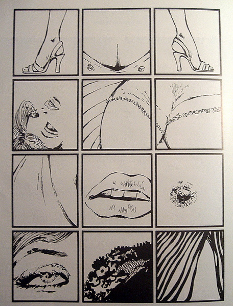
I wanted to conclude with at least one (rare) example of a regular waffle iron type layout in Crepax’s work. The above page layout, composed of twelve evenly spaced cube-shaped panels, is far from neutral. If anything, the geometric regularity of this page layout points to the synechdotal/fetishistic violence of (masculine?) desire and links that violence to the comics art form. More specifically, it links the representational violence of the medium to cadrage, or framing. The top three panels of the above page layout present what looks at first to be a relatively spatially coherent presentation of Valentina’s body (two outwardly pointing high-heel clad feet framing her bust) but the rest of the panels flit from erotic liminal zone to erotic liminal zone, from parted lips to a single erect nipple, from the edge of a lace bra to a hairline. The overall effect is one of scopic violence, as erotically compelling as it is disturbing, but it also reads as experimental and “rhetorical” (or “motivated”) in its imposition of a fetishistic erotic gaze onto a regular grid layout.

