If Aggression Is the New Pink, Does That Mean We All Have to Hit Things?

Yesterday, Chris Gavaler wrote about female superheroes, arguing that they’ve been around for a while, that people of all genders love them, and that it’s about time we got to see a film dedicated to watching female superheroes hit things. Chris cited a study by Kaysee Baker and Arthur Raney that showed that, in superhero cartoons, women and men behaved just about the same — they hit things, they saved people, and so forth. Baker and Raney found this a little disturbing; they were worried that heroes of either gender had to be more masculine and aggressive to be heroic. To which Chris responds, well, who says that aggression has to be masculine? “Because if aggression is now gender-neutral, how can being aggressive also be “more masculine”?”

Chris has a point — and that point is a neat summation of empowerment feminism, which is the feminist perspective which says that women should be able to do everything men do, especially if that “everything men do” includes holding and wielding power. The lean in movement is empowerment feminism, and so (as Chris shows) is the enthusiasm for female superhero movies and the desire to see Hawkgirl bash in some baddie with her mace. America is really into power (we’re a superpower, after all) and so it’s not a surprise that empowerment feminism is generally speaking the most popular manifestation of feminism.

It’s so popular, in fact, that it can be easy to forget that it doesn’t necessarily appeal to everyone all the time. But here, at least, is one dissenting voice.

[Wonder Woman’s] creator had…seen straight into my heart and understood the secret fears of violence hidden there. No longer did I have to pretend to like the “Pow!” and “Crunch!” style of Captain Marvel or the Green Hornet. No longer did I have nightmares after reading ghoulish comics filled with torture and mayhem, comics made all the more horrifying by their real-life setting in World War II…. Here was a heroic person who might conquer with force, but only a force that was tempered by love and justice.

That’s Gloria Steinem, describing her relief at discovering the original Marston/Peter Wonder Woman comics, in which, as she intimates, there weren’t a ton of fisticuffs and violence. Instead, Wonder Woman tied the bad guys up with her rope of love — and was tied up by them. Loving submission and bondage games, yes; bashing people’s heads in with maces, not so much.

Chris rightly points out that there isn’t anything essentially masculine about violence; there are plenty of women throughout history who have enjoyed hurting other folks. And yet, at the same time, you don’t just get out from under millenia of culture by having Scarlet Johansson kick somebody. Violence and aggression and war have traditionally been encoded male. Lots of feminists, from Steinem to Virginia Woolf to William Marston, have pointed out that masculinity is wrapped up in an ethos of force and violence — that being a man means, in many respects, being violent. And while one reaction to that can be, with empowerment feminism, to point out that women can be violent too, another approach is to say that the non-violence which has traditionally been associated with women is not an aberration or a failing, but a resource. Women do not have to be embarrassed or ashamed that they don’t like Captain Marvel hitting people; rather, they can point out that hitting people is possibly not such a great way to solve problems, and that equating goodness manliness and heroism with hitting people is, perhaps, a failure of imagination which can, under the right circumstances, get people needlessly killed.

Along those lines, one of the things that I most enjoy about the new Ms. Marvel series by G. Willow Wilson and Adrian Alphona is how uninterested it is in uber-violence. Three issues in, and our teen protagonist, Kamala Khan, has encountered exactly zero supervillains. After she gains her shape-shifting powers, the first thing she does is to turn her hand giant (embiggen!) and fish a damsel in distress out of a lake. The damsell in question fell in the lake after her boyfriend knocked her in — not in the process of a sexual assault, as you’d think if you’d read too many superhero comics, but simply out of stupidity and drunken horsing around. This is a world in which heroes exist and heroism matters, but it’s not a world in which that heroism is necessarily linked to violence.

In issue #3, Kamala does have her first fight. She sees her friend/sweetie-in-waiting Bruno getting held up at the convenience store where she works, and (after trying to call for help and discovering her cell phone is out of batteries) she transforms into Ms. Marvel and starts swinging with her giant embiggened fist.

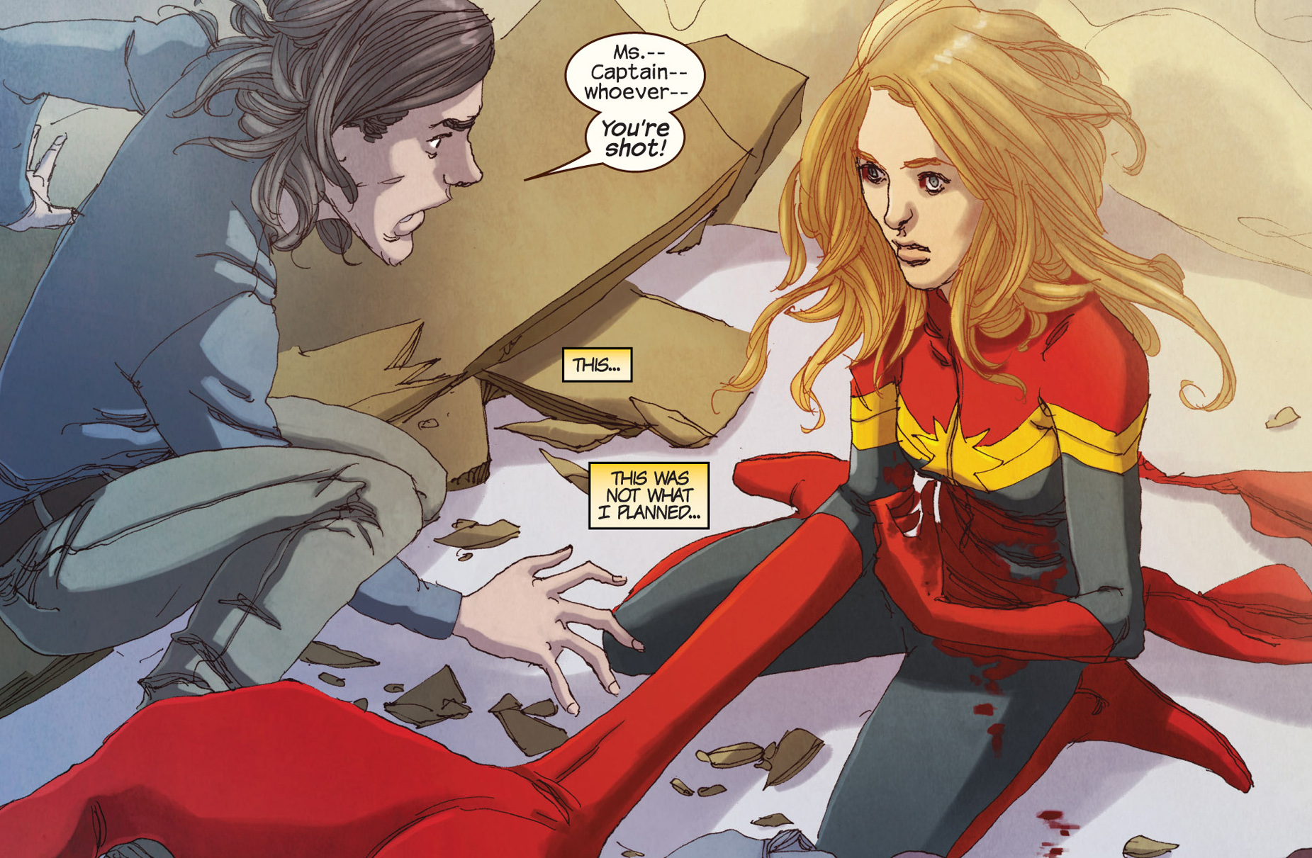
Sort of. The robber is Bruno’s brother, and he’d already given up on the theft before Kamala barged in. She easily defeats him, crushing him in with that fist (“you’re squeezing really hard!”)…but not before she does far more property damage than he ever could have managed by himself. And then, after she lets him go (he’s promised to apologize and never come back) he accidentally shoots her. The last image of the comic is of Ms. Marvel sitting on the ground, her giant hand extended out in front of her, looking shocked and confused, an iconic hero reduced to a confused adolescent girl, as the guy she was saving freaks out and the “villain” sits off to the side looking at the gun in his hand in horror.
 
3768836-ms.+marvel+(2014-)+003-021

My suspicion is that Ms. Marvel is going to discover that her rubbery hide is effectively bullet proof, and hopefully all will end more or less well. But it’s rather nice to have a superhero story where violence ends up being, not a solution, but a complication.

Ms. Marvel, in other words, critiques super-hero violence — and the reason it’s able to do that is absolutely in part because the series is not just a superhero story, but a girl YA coming of age story. The narrative is interested in Kamala having adventures, definitely, but it’s also interested in her figuring out who she is, which means (among other things) working out her relationship with her (shape shifting, sometimes adult Caucasian va-va-voom superhero, sometimes adolescent Muslim girl) body and discovering that her annoying good geeky friend is in love with her. Lee and Ditko couldn’t figure out how to make Spider-Man a man except through violence and trauma and more violence. G. Willow Wilson, though, is drawing on a narrative tradition quite different from boys’ adventure, which means that for her, growing up doesn’t need to mean watching your dad die and beating up his killer.

Ms. Marvel has been exceedingly popular (it keeps selling out at my local comics store) — but, given the low sales of even really popular comics, it seems unlikely that it will be turned into a superhero movie any time soon. Still,it’s worth noting, perhaps, that other superhero stories about women on the big screen — the Hunger Games, say, or Twilight (where Bella gets to be a superhero by the end) are significantly more ambivalent about violence, its effects, and its efficacy than the standard Marvel/DC superhero/supervillain thump-fests tend to be. Maybe that’s because they’re working to appeal to women (and for that matter men) like Gloria Steinem, for whom narratives of violence are alienating rather than empowering.

Wonder Playmate

This first appeared on Comixology.
_________________

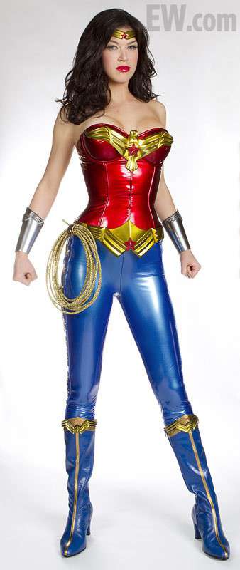
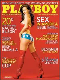
As NBC gears up for its new Wonder Woman series, the internet is abuzz with one burning question. What dastardly villain mugged our heroine with a casino? And does Adrianne Palicki get combat pay if that bustier ruptures and her cleavage assaults her noggin?


Okay, so those are two questions.

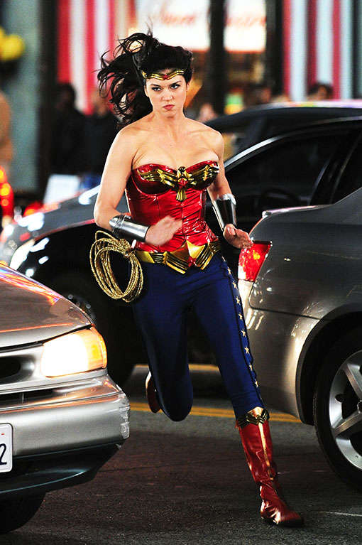
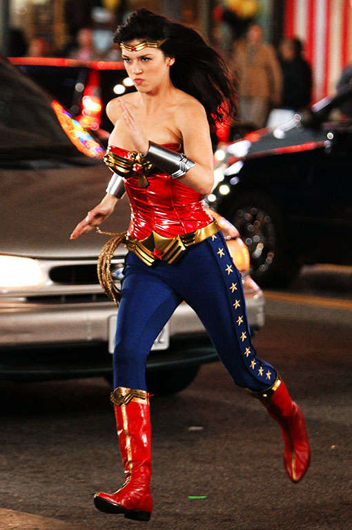
To be fair, NBC has also released pics of an updated (or possibly additional) costume, which isn’t quite as tragically latexy. Here are some action shots:


She looks so darned serious there…and brave! Looking at her face alone, you’d never realize the extent to which her boobs pose a danger to herself and others.

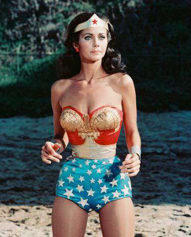
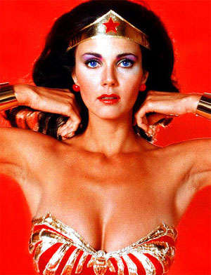
Oh for the days of Lynda Carter!


We miss your shapeless grandma-bottom bathing suit with the hint of camel-toe, Lynda!

Live-action super-hero costumes are often awful (I’m looking at you Styrofoam-muscle Batman), but Wonder Woman seems to bring out the worst in what I suppose, for the sake of brevity, we must call “fashion-designers.” What, in short, the-hell-is-wrong-with-these-people? Why, lord, why?

I actually have a theory. It’s all the fault of William Marston and Harry Peter.

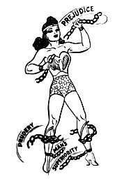
For those not in the know, Marston was the creator of Wonder Woman. Harry Peter was the original artist on the series — hired by Marston himself. And their version of Wonder Woman looked like this:


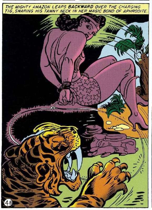
Yes, that’s Wonder Woman with her hands tied behind her leaping backwards to attack a saber-tooth tiger. Which is fairly bad ass.

But the thing to focus on is what isn’t here. Specifically, there is not a whole lot of cleavage visible. Instead, Peter’s supple line dwells lovingly on those back muscles…and on WW’s super-butch shoulders. This was typical: even when the chest is visible in Peter’s drawings, he tends to focus interest on other areas:


Marston and Peter, in other words, put WW in that skimpy bustier so that they could look at her shoulders flexing, not so they could look down her front. Part of the problem with later iterations of Wonder Woman’s costume, then, has been a simple confusion of erotic focus. The costume wasn’t really designed for large amounts of cleavage. When you put a large amount of cleavage in there to propitiate our breast-obsessed culture, the results tend to be more silly than heroic.


Even putting aside the breasts, though, there would still be problems. Wonder Woman’s costume just was never imagined with real people in mind. You could argue that this was true for super-hero comics in general; drawings are different than living, breathing bodies, and Kirby clearly wasn’t thinking too hard about how an actor would look in Thing-face. But with Peter’s Wonder Woman…well, look at this, for example.


That doesn’t look like a drawing of a real woman. It looks like a stiff, posed picture of a doll.

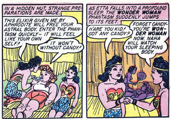
And I think that really was the point. The rigidity and unreality of the drawings is not a bug; it’s a feature. Girls who read those early WW comics were encouraged to see themselves not just as the characters, but manipulating the characters, moving them about like toys. This is part of the pleasure of a sequence like the below, where Wonder Woman’s body is first duplicated (like a reproducible doll) and then inhabited by her friend, Etta Candy.


Etta and WW are both tied up in the picture above too, of course. Marston and Peter were obsessed with bondage. In their stories, WW often gets tied up every three panels or so. For Marston, this was linked to his odd ideas about feminism and submission; he believed women were superior to men because they were more comfortable with submission. Men, he felt, needed to learn submission from women. Wonder Woman was part of his effort to teach boys and girls the joys of “loving submission” to a wise matriarch.

So Marston was kind of a kook. But he was a kook whose kookiness dovetailed nicely with the interests of his audience. Sharon Marcus, in her book Between Women, noted that dominance and submission have long been an important part of literature for children, and particularly for girls. In the Victorian era, in particular, there were many books which featured “Fantasies of girls punishing dolls, and being punished by them appeared regularly in fiction for young readers.”

Whether Marston and Peter were deliberately referencing this type of story is unclear…but what is clear is that their comics worked with a similar dynamic. The frozen postures of the figures and the bondage themes are of a piece.


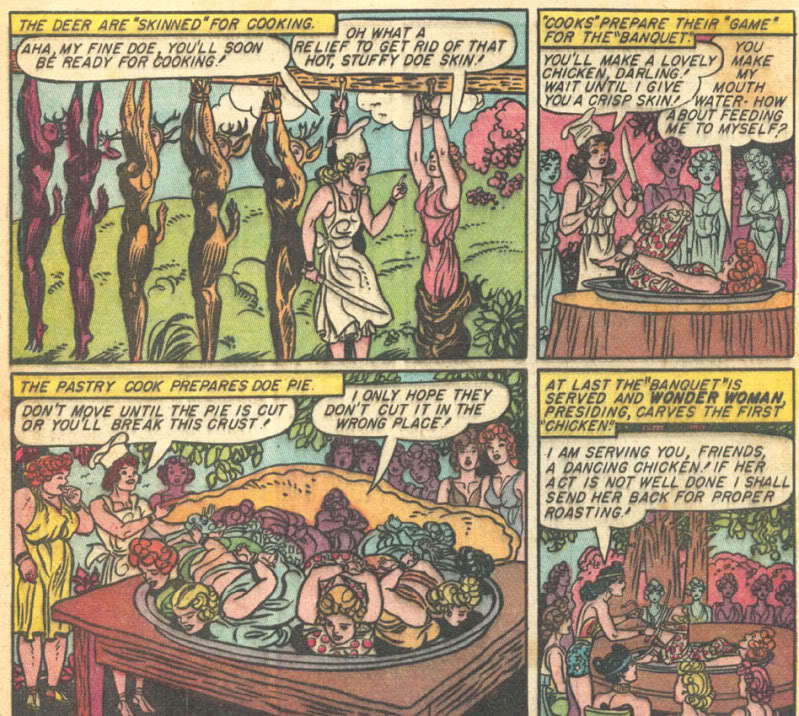
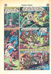
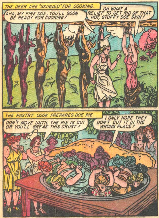
So, for example, the above picture shows the outcome of an Amazon game in which some women dress as deer so that their Amazon sisters can catch them, truss them up, put them on plates, and pretend to eat them. There’s certainly kink here…but it’s not especially focused on a stereotypical male appreciation of scantily-clad, realistically depicted female flesh. Rather, it’s embedded in a narrative of dominance, submission, and play. The kinky frisson is tied (as it were) to the artificiality of the doll-like poses.

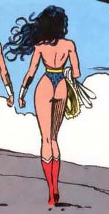
Since Marston and Peter, lots of Wonder Woman artists have tried to rework the costume…to turn it into something that appeals to the typical erotics of older guys rather than to the B&D doll-playing interests of Marston and (Marcus suggests) young girls. As a result you get images like this, by, (I believe) Mike Deodato.


Wonder Woman’s costume was meant to be sexy. But it was meant to be sexy in a particular way and for particular kinks. Those kinks don’t map particularly well onto current mainstream interests or tastes. Efforts to make WW cater to those mainstream interests and tastes tend to be, at best, self-parodic. So if NBC’s costume looks ridiculous (and it does) it’s because they’re trying to squeeze a Playboy fantasy into a costume that was never meant to hold it.
 

_____________

All posts in the series on post-Marston iterations of Wonder Woman are here.

Video Art and Venus Girdle

Bert Stabler pointed out this Dara Birnbaum video to me…because, of course, it’s about Wonder Woman.


Dara Birnbaum – Technology/Transformation… by merzboy

 
So my first reaction to this was fairly intense visceral dislike. The goal seems to be to deconstruct icon and narrative to reveal a subtext of explosive violence, gender dynamics, image making and, most of all, manipulability. The stuttering spin and spin again as Diana Prince turns into Wonder Woman and then turns and turns into Wonder Woman, or runs over the same segment of forest and then reruns over it, makes us see both the narrative and the heroine as constructed and artificial. Like much appropriation art, it’s using camp to destabilize the normal and the normative, so that, for example, when Wonder Woman breaks out of her mirror prison, the rhythm comes not as climax, but as anti-climax — culminating in her stale banter with the inevitable man she saves.

The problem is, this camp undermining of Wonder Woman is significantly less camp than the source material. The intimations of dominance and power from manipulating the tape, for example, or from the connection of WW’s transformation with explosions, are far more muted, and far less sexualized, than the compulsive bondage games in Marston/Peter. The replicated Wonder Womans in the mirrors are less daring, less loopy, and again less sexualized than Marston/Peter’s precocious dabblings in pomo themes of replication and artificiality. The disco double-entendres at the end, rhyming “under” and “wonder”, again seem positively tame compared to Marston’s spiraling fantasies of women dressed as deer eating each other, or giant vulva-flowers consuming men and women alike. Christopher Reed in his book “Art and Homosexuality” argues that the avant-garde always lags behind pulp sources in its use of homosexual and controversial content, and this seems like a painful case in point. Marston and Peter created an incredibly sexually daring, homoerotic, and feminist comic book, and some three decades later the art world comes along and preens itself on “discovering,” in much less confrontational form, all the themes that were there to begin with.

So, like I said, that was my initial reaction. On second thought, though, I probably don’t need to be that harsh. In the first place, the Wonder Woman television show was not the Wonder Woman comic by a long shot. With that in mind, Birnbaum can be seen in part as re-excavating the invention and the sexual charge that the TV writers largely removed. In particular, Birnbaum has rightly figured out that the only part of Wonder Woman the TV show that is really worth keeping is the transformation scene. That explosive (orgasmic?) moment spills out of its original context, as if Marston and Peter’s original erotic vision has shattered the dull genre narrative built to contain it.

Beyond that, it’s probably worth noting that Birnbaum isn’t really part of the avant-garde, at least as Reed discusses it. Feminist art and pop art were both still very much outside the institutional art world in 1978. From that perspective, Birnbaum might be seen not as (or not just as) appropriating Wonder Woman and television, but as identifying with them. Diana Prince’s explosive, exciting transformation into Wonder Woman is also Birnbaum’s accession to the wonderful, gleeful joys of control. Wonder Woman stutters back and forth and spins around and around and runs over the same ground not to subvert her, but because the power over those images, and the power of those images, is just so darned fun. Birnbaum’s video, then, might not be so different, in concept or execution, from those Yourtube compilations of every Lynda Carter transformation ever:


In other words, I like it more as a fan video than I do as avant-garde art — which isn’t necessarily a dis, since part of what it’s doing (especially in retrospect) is anticipating, or forecasting, or helping to bring about the (ongoing) collapse of the walls between fandom and art. I still wouldn’t say it’s great, and it’s still very simple-minded, ideologically reticent, and formally underwhelming compared to Marston/Peter. But I can see its historical importance and appreciate its energy. It’s certainly one of the most inventive uses of the character since Marston died — which may be damning with faint praise, but is praise nonetheless.

Frank Miller Hasn’t Even Seen the Venus Girdle

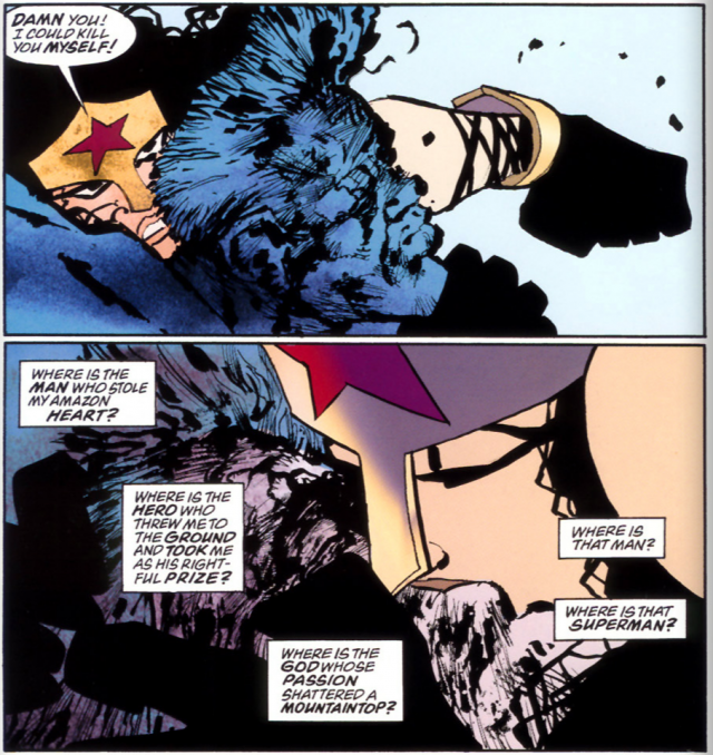
Cameron Kunzelman has a longish post up in which he tries to figure out what’s special about Wonder Woman as a character. Among other things, he talks about this sequence from the mess that was Frank Miller’s DK2.

As this suggests — and as the rest of Kunzelman’s discussion shows — Miller’s WW is largely defined by her relationship with Superman. Sometimes she mocks him, sometimes she fights him, and ultimately (as we see here) she is conquered by him. The whole point of having the strong woman woman there, for Miller, is to make the strong man stronger through his domination of her. Shortly after this scene, Superman grabs her and fucks her and she declares that he’s made her pregnant (“Goodness Mr. Kent, you could populate a planet!”) If you’re feeling flaccid, dominate the castrating bitch and soon you’ll be uncastrated. Wonder Woman’s the phallus which means (a) she can’t have the phallus, and (b) owning her is to own the phallus.

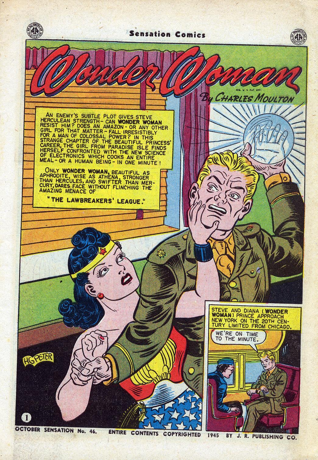
That’s not exactly where Marston is coming from, obviously. For Marston, strong women aren’t there to highlight the dominance of strong men. On the contrary, it sometimes seems like just the opposite is true — strong men only exist to be dominated by strong women.

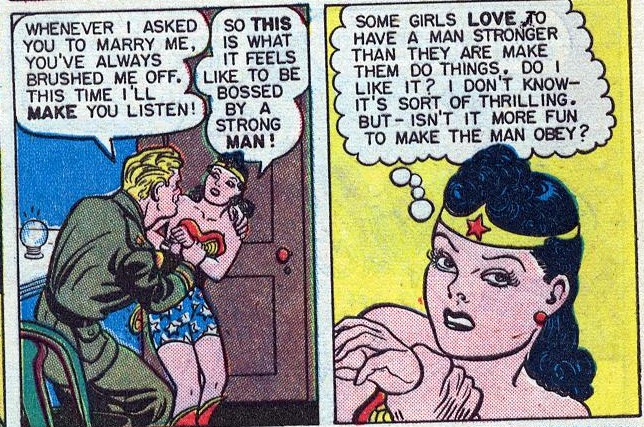
That’s from Sensation Comics #46. In this issue, like the text says, “An enemy’s subtle plot gives Steve Herculean strength!” A scheming female gangster figures that if Steve is stronger than Wonder Woman, he’ll get her to marry him, and then she’ll stay home and cook and clean rather than fighting bad guys. So she gives Steve an electrical (ahem) ball which makes him uberpowerful.

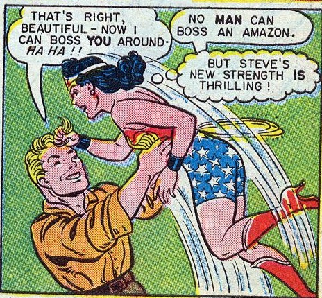
The plot works to some extent; as Wonder Woman says, Steve’s new strength is “thrilling.”


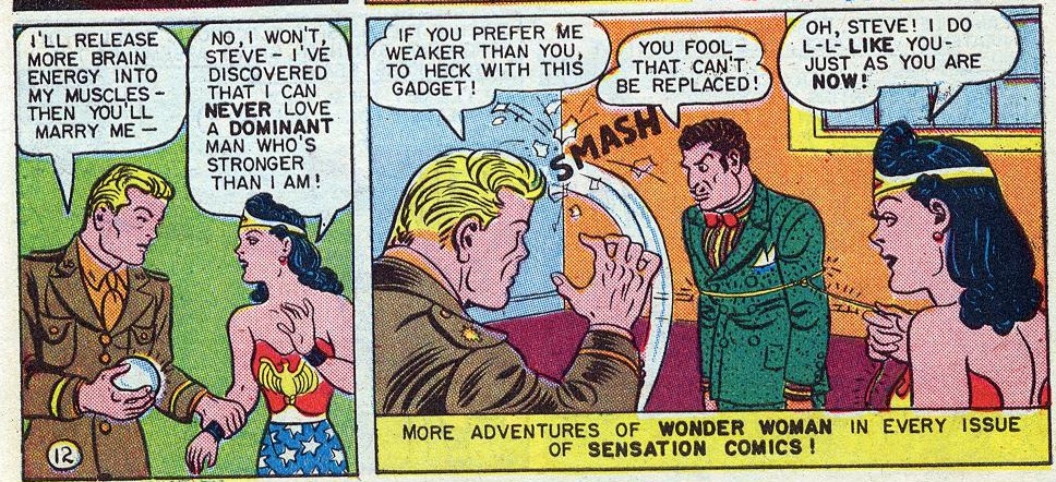
Ultimately, though, Wonder Woman decides that she doesn’t want a stronger man…


and so Steve does the right thing.


In some sense, this is, as I suggested, simply a reversal of Miller — in DK2, the strong woman submits; in Marston, the strong man does. Male/female is not a purely reversible binary, though; the two terms have long histories of meaning and inequity which aren’t simply substituted when you flip them. Men on top and women on top are different in more ways than just the positions of the bodies.

Specifically, Miller’s fantasy of men-on-top is about love as a seizing of power; love and force go together, so that when Superman fucks Wonder Woman, he literally sets off an earthquake. The power of the love is attested by its violence. Men on top express real love by seizing and destroying.

Marston disagreed. “Love is a giving and not a taking” he wrote in his psychological treatise. And so Steve expresses his love not by grabbing Wonder Woman and taking her as his prize, but rather by submitting. With women on top, love is giving up power, not seizing it; embracing weakness, not asserting strength. And where Miller’s version of love involves male dominance and excited female submission, Marston’s version of love-as-renunciation seems more reciprocal. Or, at least, Wonder Woman’s reaction to Steve’s weankness is not a swaggering assumption of mastery, but a blushing admission — “I do l-l-like you, just as you are — now.”

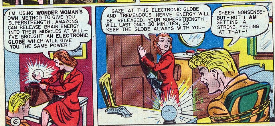
In this regard, I think this image is interesting:


That’s the sequence where Steve first gains his superstrength. The ball is given to him by a woman, obviously. In the first panel, she sits on the desk with her suggestive red dress, her legs spread — and Steve’s gaze seems directed at her crotch rather than at that glowing ball. At the same time, the women explains that the ball will do for Steve what Amazon training does for Wonder Woman. Thus, Steve’s strength is, both narratively and iconically, something taken from women — to be stronger is to be feminized. The point is further emphasized in the next panel, where Peter draws the usually chunky Steve with an almost bishonen grace — his blonde hair poofing out flirtatiously in front, his eyebrows curving eloquently, his lips unusually full.

In Miller, male strength emphatically enforces typical gender norms; Superman’s phallus turns Wonder Woman from battling Amazon to mother, and all is right with the world. In Marston, on the other hand, male strength feminizes…which doesn’t change the fact that when Steve submits out of love, he is also following a feminine ideal. Men on top reads gender straight; women on top, on the other hand, makes everything queer.

It’s probably needless to say that Miller’s version of the character seems to me in just about every way more conventional and less interesting than Marston’s. But more than that, I think Miller’s handling of Wonder Woman really suggests pretty strongly that Kunzelman is wrong when he says at the conclusion of his essay that “Wonder Woman is special.” After all, there’s nothing special about women-as-phallus; there’s nothing special about women as cog in male psychodrama. There’s nothing special (certainly not in Miller’s work) about fetishizing female strength in order to more fully fetishize the strong man who conquers it. Marston/Peter’s version of the character is touched by unique genius, of course. But that genius inheres in their writing and in their art, not in some random corporate property with a particular color scheme and appellation. If creators want Wonder Woman to be special, they need to make her special. Miller — and the vast majority of people who have worked on the character since Marston/Peter — haven’t bothered.

A Peter that Never Existed

The Marston/Peter Wonder Woman roundtable index is here.
________________

I’m not a fan of the superhero genre in general, and, while I do own a volume of the Marston & Peter run of Wonder Woman (henceforth WW), I find I enjoy reading Noah’s posts on the series more than reading the series itself. That’s not a bad thing, I guess, good criticism should increase our enjoyment of a work, right? (And now I’ve set myself up for failure.) So why am I participating in this roundtable: there’s something about I love about Harry Peter’s style. But what does that even mean? What is style in a comic: how do we talk about it, and what is distinctive about Peter’s that appeals to me? That is what I am going to try to address. We’ll see how it goes, as this post is as much an investigative process for me as it is any kind of coherent result. Let’s consider it a kind of close reading.

What constitutes the (visual) style of a comic, and more specifically how can we address the individual’s style? There is surprisingly little written about this subject in regards to comics (or else, I’m just not finding it, suggestions in the comments please). Harvey, in his Art of the Comic Book, lists style as one of the four “distinct graphic threads”, yet punts on the issue saying its “storytelling role” is “too subtle for much elaboration here.” (9-10) McCloud addresses style in Understanding Comics in the form of his big triangle and his charts of panel transitions, but he tends to generalize his discussion into broader groups and effects (and the placement of artists on that triangle often seems pretty random). Wolk writes about style in a very broad way when comparing the “mainstream” to “art” comics, but his discussion tends to over-generalize to make his point. Groensteen offers a decent introduction to comics style in his La Bande Dessinée: Mode d’Emploi, pointing out the inclusion of elements other than just the drawing/inking/coloring in the style of comics and comparing a few different artist’s styles, but it’s an introductory book so he doesn’t go into a lot of detail.

Style in comics is more than just line, tone, color, composition, and the way the images are drawn (realistic, caricatural, detailed, minimal, etc.), it is also the page layout, the découpage (“narrative breakdown” is what Harvey calls it, but I feel that the French word is less specific to narrative comics–not to be confused with shellacking paper onto boxes). All these elements work together to give the comic its style (one could, depending on the work and its context, add other elements, but for the purposes of a comic book like WW, this should do). For a single author work it is easy to attribute all these factors to the stylistic of the author, but this attribution is more difficult for the corporate comics structure that Peter worked in for WW.

Page layout, découpage, and perhaps composition can be partially or wholly attributable to the writer. Some comics writers write detailed scripts breaking down the narrative into panels, pages, even describing specific images and compositions (I’m looking at you, Alan Moore). Without seeing a script it is hard to ascertain this level of credit. Similarly, many of these comics are inked by a different artist than the one who pencilled the images. How can we then attribute the visual style of line, tone, detail? The inker could faithfully or loosely follow the pencils; the inker can add or leave out details; the inker can exaggerate or tone down the penciller’s figures. (Probably the most prominent place to see this addressed in discussions concerns the various inkers of Kirby’s work, though I’ve found it relevant in looking at Toth’s work also.) Color can also be wholly or partially attributable to hands other than the artist. Most corporate comics are colored by someone else (nameless in the days of Peter’s work), and who picked the colors is not always clear. It seems to have been common that newspaper strip artists provided color guides, but I believe that would be unusual for comic books at the time of this work.

The Grand Comics Database credits Peter did his own inks on WW, though Nadel notes that he was “aided by a number of usually female assistant” (28). This calls into question how much of the pencilling and inking we can consider “his.” But for the purposes of this post, I must assume that Marston gets credit for the story and text as well as at least some credit for the découpage, and Peter gets credit for everything else except the coloring (maybe the lettering, but I’m not concerned about that). Much of this is supposition on my part as I have not seen one of Marston’s scripts, and I don’t know the historical details of who did what. These basic assumptions give me some limitations to work within. I’ll start at the broader level and move towards the specific. For better analytical purposes, I will be discussing both issue 28 (Mar/Apr 1948) and issue 3 (Feb/March 1943). Images will be cited as ISSUE: PAGE.PANEL where I am using the page numbers on the art itself (in both cases consisting of a number and a letter (for the parts of the issue)): so the fourth panel on page 2 of issue 28 is “28: 2A.4.”

Page Layout

At first there appears to be nothing unusual or stylistically distinct to note about Peter’s page layouts. Other than the splash pages, every page in Issue 3 has 3 horizontal strips, each divided into 2 or 3 panels (6-8 panels per page). With only 2 exceptions (3: 7B,9B) every page is based on the 9 panel conventional grid layout. Even the splash pages have the single small panel that is basically 1 panel from a 9 panel grid.

Issue 28, 5 years later, shows some development in Peter’s layouts. The splash pages are now just single images. All but two of the remaining pages have between 5 and 7 panels, still quite conventional. Most are still based on a 9 panel grid, but he varies some of the panels in size to fit the composition/content: tall panels for dramatic full body images or vertically-based action, wide panels for large groups or horizontally-based action. The pages are still primarily formed out of three horizontal strips of 1 to 3 panels each, but a number of pages are formed of two strips, most often in what Chavanne calls a “fragmented” layout. For instance on page 3A the top strip starts with one tall panel (a focus on full figures) followed by two stacked panels (horizontally-based action). (For an example see the full page image in the composition section below.)

This use of the fragmented layout is not unusual to contemporary readers, as it is, at this point, a convention. I didn’t think much of it either in the context of Peter’s work until I started looking at other comics I had on hand from the time period (or a bit later, I don’t have many comics from the late 40s). Tarzan No.2 drawn by Jesse Marsh, also dated March/April 1948, proves to be even more conventional with all but 2 pages having 6 panels (3 strips, two panels each). The first three comics (drawn by Lily Renée, Matt Baker, and Warren King) dated in 1949 from Romance Without Tears all have pages with 3 strips and 6-7 panels each. The first few stories in Krigstein: Comics from 1949 also show no use of the fragmented layout. Peter’s own Man o’ Metal comic (found in Nadel) includes a couple uses of the fragmented layout, though I notice that each time it’s used Peter has included little arrows to direct the reading path. This is an another indicator that this particular type of layout has not become convention. So perhaps Peter’s layouts, with the use of these fragmented layouts, are a little more unusual for the times than I thought, though I still don’t think we can consider them a distinctive stylistic element.

More subjectively, it’s hard to say that anything about the layouts are expressive. They are mostly invisible, in the sense that unless you really look at them, they go by unnoticed. They just serve the narrative neutrally, panels placed into the page to fit the content and keep the narrative continuing smoothly. Of course, dividing the page in these ways is also the simplest from a production standpoint, which is important when you’re trying to draw a lot of pages on a schedule.

Panel Composition

Like most comics (especially at the time), characters/figures are the primary focus of the compositions. I count 8 (issue 3) and 6 (issue 28) images that are (arguably) not focused on a character or group of characters, and only 3 and 1, respectively, of those have no figures at all (it’s the monkey changed into a “prehistoric tree fox,” in issue 28 in case you’re wondering). That said, Peter does not neglect the backgrounds (since the figures are the focus, I feel safe calling everything else the “background”). He creates and maintains a sense of the settings, only occasionally eschewing any background at all, usually in cases of crowded figure groups (28: 7A.2), close-ups, and panels with lots of text.

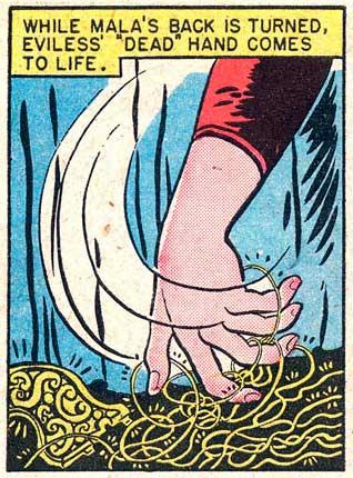
On the whole he uses, to apply filmic terminology, medium and long shots for his compositions. Most of the scenes show the characters at a consistent size (where we can see full or almost full figures) across panels. Peter rarely uses close-ups: a few heads tightly framed with word or thought balloons, and one notable close-up of Eviless’s hand as she surreptitiously steals WW’s lasso (28: 4A.1). This last unusual panel is fittingly also a key narrative turn in the story (without it we really wouldn’t have the rest of the plot). Issue 3 has two close-ups of textual content (a letter and a news story) but otherwise is similar.

Dramatic angles (high or low) are almost never used in these two issues. The view of the characters stays at eye level and shifts only for action that almost requires a high or low angle (28: 10B-11B) or for longshots that show more of the setting.

Peter maintains a surprising sense of depth throughout issue 28. It’s not an extreme depth, we rarely see anything large and close cropped in the foreground, but all the non-close-up images at least retain some semblance of depth: groups of characters shown in deeper space or background elements placing the characters into space. The panels in Issue 3 are less deep as he used a lot of sharp, angular planes in the background that flatten the space (3: 8B.4 is a good example of an outdoor scene).

Many of the compositions in issue 28 have a strong forward (that is, to the right) motion. WW’s (and the other characters’) actions tend to direct her to the right (8A, 11A, 10B, 3C). An exception to this are the chaotic fight scenes that punctuate the story (6B-7B are a good example) where the chaos is emphasized by the composition losing that forward motion. I think this element is one of the highlight of Peter’s style and what makes his style effective for this type of action comic. Notice how everything moves forward/right in the following page with the except of the three central figures (panel 4) how are fighting against WW (also here is one of those fragmented layouts).

Figures

For many people the way figures are drawn is the key index of an comic artist’s style. Since comics are so figure-based it becomes natural that artists can be identified solely by their figure work. In common parlance the “style” of an artist is often used to mean the way their imagery is, or is not, in accordance with ideas of the “realistic.” The “photorealist” style of artists like Alex Raymond, Stan Drake, or Neal Adams as compared to a cartoon/caricatural style of Schulz, Barks, or Segar. This usage of “style” tends to come down to the way the figures (and objects) are shown to be close (or far) from “reality” as far as proportions, shape, and detail, as well as to the actual rendering of line and tone.

I’d rather not attempt to unpack these concepts here, except to note how Peter fits into these general conceptions. Peter’s figures are certainly naturalistic in many ways. They generally have “normal” proportions and move in natural ways (both the bodies and the faces) (a key exception here is Etta Candy, who is far more caricatural). Where the proportions are abnormal is where Peter starts to be distinguished. His characters are large in the shoulders and head, while hips, waist, and legs tend to be much narrower. He also draws men differently than woman, which is so befitting of this series one wonders how much it is a general aspect of his style and how much it is something he took on for the series. His male characters (which are very few in issue 28 and not much more plentiful in issue 3) have really outsized heads and shoulders, with angular, blocky faces with prominent cheeks, jaws, and foreheads. All of which often renders them bit grotesque. Steve Trevor is one weird looking dude (28: 10A.5, below). Peter’s women tend to be more glamour girl-ish, a gender distinction which is not unprecedented in comics. Cliff Sterritt’s Polly and Her Pals featured Polly as a stylish glamour girl while her parents were caricatured figures. The eyebrows on Peter’s woman are also quite pronounced and arced, in a way that is reminiscent of Caniff, while their eyes are often enlarged (more so in issue 28).

Peter’s figures have a strong sense of movement and dynamism to them in Issue 28. His generally curved line adds to this effect as does the way his figures curl in upon themselves. Even in action WW’s legs and arms are often bent in towards her body (leaping with legs bent in at the knee). One could almost read that as working in conjunction with Marston’s bondage themes. The characters’ actions are both freeing and restricted.

I note in comparing issues 3 and 28 that the figures in issue 3 are stiffer, a bit more awkward looking, while in issue 28 they are softer, more rounded. Another example of Peter’s evolving drawing style, though also potentially an effect of changing assistants. Personally, I find the earlier work more distinctive if considerably more rudimentary looking from a pure figure drawing point of view.

Line

Peter’s line work is one thing that really attracted me to his work when I first saw it. There was something vibrant about his lines and the way they curved and bled together that was so unusual in the early issues I read. Issue 28 is a disappointment in this regards. Peter’s inking seems to me really conventional for the issue, though it is technically competent. He has a pretty consistent line weight that tapers at the ends and thickens on the curve and to emphasis volume and shadow (a nib pen, clearly). His characters are drawn with a line that is mostly consistent to that used on the backgrounds. His blacks (most notable in this issue on the some of the villains’ clothing and on the bodies of the half-ape people) tend to be a little messy looking, a conglomeration of feathered strokes. He doesn’t make much use of pattern or texture, with the exception of costuming (stars, leopard spots, prison stripes), and the occasional banal brick pattern. The work does not show the flair that makes you really notice and appreciate him solely for the way he used a pen or brush.

Much of the above seems to work against the distinctive aspects of Peter’s style. In so many ways, his work in these issues seems so conventional for the context. Or perhaps I am missing some aspects by ignoring the color and the découpage or all the other aspects of comics I haven’t even addressed. On the whole Peter is not what you’d call an innovator: he’s not pushing the form, nor is his art particularly ostentatious.

The Idiographic

I steal this usage from Charles Hatfield’s Hand of Fire to label the distinctive aspects of an artist’s style, those that work as signs to identify that particular artist. We might say that it is a combination of all these factors (and more that I’ve surely missed) which work together as a kind of networked sign of “style,” but I think we can draw out certain aspects that veer away from the conventional aspects of the work and those indistinct aspects which were/are shared with many other artists. There is a certain amount of subjectivity to this endeavor. These are the parts of his work that I see as distinct.

The older issues of the series (like issue 3) have this scribbly, curly-cue line that is really distinctive, used in clouds and hair and foliage. The early issue also seems to be more curvy in general, where the folds in clothes, muscles and visible bone structure (knees, clavicles, shoulder blades), and flanks of animals all have a distinctive curve to them. That little bit of excess seems stripped out in issue 28. Is this just a result of Peter changing his style, becoming a little more conventional? Or is this a result of changing assistants (or adding assistants since those early issues)? It is a good reminder that style is variable over time.

I’m particularly enamored of the clouds and puffs of smoke or gas that pepper the series (3: 6D.7; 3: 12A.4):

Or these gowns with their thick, swirling curves (3: 6A.5-6):

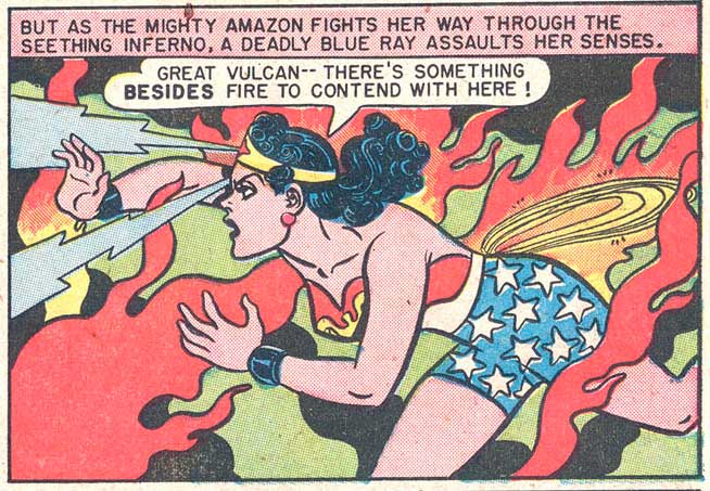
Another aspect that stands out is Peter’s drawings of the materially insubstantial–the flames and power rays–and the non-diegetic (I struggle here for the right term, the elements that are not actually there in the story world)–the motion lines and thought waves. Below is great example with the licks of flame and the “blue hypnotic ray” (28: 11B.4):

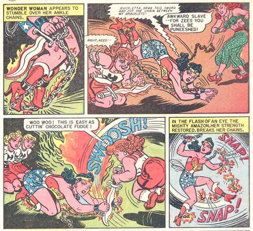
Or these panels (28: 2C.5-6) with the flames, the wavy black lines of smoke or shadow, and the little glow around the sword WW carries. The curly hair in those two panels are also very Peter to me.

The next page (28: 3C.1-4) offers some great Peter motion lines that add such dynamism to the panels (and often counteract the stiff figures in bondage).

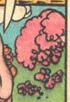
I don’t even know what this little pink puff is (some kind of Paradise Island foliage?), but I love it (3: 10A.2):


(see full panel below)

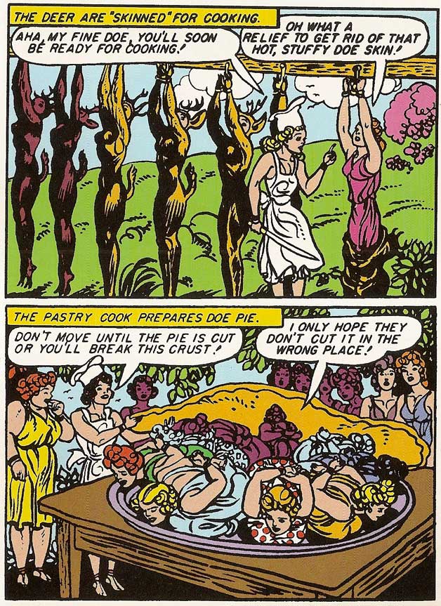
In comparing my “Archive Edition” volume with scans from the original comics (below: the top image is page 102 from the Archive volume, the second is the original), I can also see another factor that affects how one reads a style, the reproduction. The archive edition has a thicker line to it, which causes some of the tighter line work to bleed together. Some may cry foul at that, the scans and printing have changed the work, but I actually like Peter’s work that way (the updated colors are another story). The drawing takes on a bit of a woodcut flair to it because the black becomes more prominent and denser on the page. Am I perhaps then a fan of a Peter that never existed, a creation of modern reproductions, an artist in my own mind?


References

Benson, John, ed. Romance Without Tears. Fantagraphics, 2003.
Chavanne, Renaud. Composition de la Bande Dessinée. Éditions PLG, 2010.
Groensteen, Thierry. La Bande Dessinée: Mode d’Emploi. Les Impressions Nouvelles, 2007.
Hatfield, Charles. Hand of Fire: The Comics Art of Jack Kirby. U Mississippi, 2012.
Harvey, Robert C. Art of the Comic Book. U Mississippi, 1996.
Marsh, Jesse, and Gaylord DuBois. Edgar Rice Burroughs’ Tarzan: The Jesse Marsh Years. Dark Horse, 2009.
Marston, William and Harry Peter. Wonder Woman No. 3. DC Comics, 194
–. Wonder Woman No. 28. DC Comics, 1948.
–. Wonder Woman Archive Edition v.2. DC Comics, 2000.
McCloud, Scott. Understanding Comics. HarperPerennial, 1994.
Nadel, Dan, ed. Art in Time: Unknown Comic Book Adventures, 1940-1980. Abrams ComicArts, 2010.
Sadowski, Greg, ed. B. Krigstein Comics. Fantagraphics, 2004.
Wolk, Douglas. Reading Comics: How Graphic Novels Work and What They Mean. Da Capo Press, 2007.

Loving Authority: Some Thoughts On Wonder Woman #28

“There is no enemy so cruel or so ruthless as a once-defeated criminal who seeks revenge.” With this typically portentous opening sentence, William Moulton Marston lets us know that we can expect to see a few familiar villainous faces over the course of Wonder Woman #28. And sure enough, the story makes enjoyable use of a device that has since become a cliché of the genre: the super-villain team-up. But Marston’s resort to this now standard trick from the hack-writer’s grab bag was probably prompted by something more than the ordinary motivations of a professional comic-book scribe. Having recently received a fatal diagnosis of cancer, he knew he faced the ultimate deadline, and that this story would likely be his swan song. Whereas the standard comic book “blast from the past” is an opportunity to say hello, again, to members of the rogue’s gallery that we have come to know and love, Marston was saying goodbye. Wonder Woman #28 is his fond farewell, then, not only to the character that had finally brought him fortune and fame, after a long search for the spotlight, but also to her entire supporting cast.

Writers such as Ken Alder, Geoffrey Bunn, Les Daniels, and Gerard Jones, among others, have provided a wealth of information regarding Marston’s career prior to the creation of Wonder Woman. Consequently, we now know that Marston’s various previous attempts to convert his academic credentials into money and celebrity had met with a measure of success, but had not provided him with a platform on the scale of his dreams, let alone financial security. From his earliest correspondence with pioneer publisher M. C. Gaines, however, Marston seems to have grasped both the commercial and communicative potential of comic books — seeing possibilities for both profit and proselytizing in a new medium that most members of his generation and class could only dismiss with disdain. His faith proved well placed. He scored big on his first try-out, creating one of the most immediately recognizable and indelible images of female empowerment to emerge from the mass-cultural milieu of 20th century America. But Wonder Woman was no mere lucky strike, or the product of a sudden epiphany. On the contrary, she was in many ways the culmination of more than twenty years of sustained intellectual work on Marston’s part — the comic book incarnation of half a lifetime’s meditation on the subjects of human psychology and sexuality.

Inspired by and at some level perhaps even a partial composite of Elizabeth Marston and Olive Byrne, the two real women with whom Marston lived in a polyamorous relationship, Wonder Woman was without doubt conceived as part of a sincerely feminist vision (which is one reason why she can claim such prominent figures as Gloria Steinem among her fans). But Wonder Woman was also a complex fantasy object for her creator, a projection of and vehicle for the transmission of his erotic and political desires — two categories that were equally inextricably linked in many of the publications he produced throughout his academic and journalistic careers. I’ve written about Marston’s intellectual and emotional investment in Diana at considerable length elsewhere, so I won’t belabor the point here; but suffice it to say that at times Marston seems to have imagined (perhaps only half-seriously, but nevertheless with all the creative energy at his command) that he could change the world through his Wonder Woman comics. Working through her, he believed he could contribute to the reformation of the basic structure of sexuality itself, at least as manifest in 1940s American society.

As Shakespeare’s John of Gaunt hopefully opined from his own deathbed: “He that no more must say is listened more/ Than they whom youth and ease have taught to glose.” Marston surely felt a similar hope when he sat down at his typewriter to enter Diana’s world for the last time; for in Wonder Woman #28 his idiosyncratic liberationist project resurfaces with a fresh urgency and insistence. The resulting three-part tale — “Villainy Incorporated,” “Trap of the Crimson Flame,” and “In the Hands of the Merciless” — is therefore more than just an affectionate backward looking glance at some of the weird and wonderful antagonists from Wonder Woman’s past (though it is clearly that, too). It is also a restatement of many of Marston’s key themes, as they had been sounded throughout his entire tenure on the title. More poignantly, it is his last attempt to lay out a set of principles that he seems to have honestly believed might mitigate some perennial aspects of human suffering.

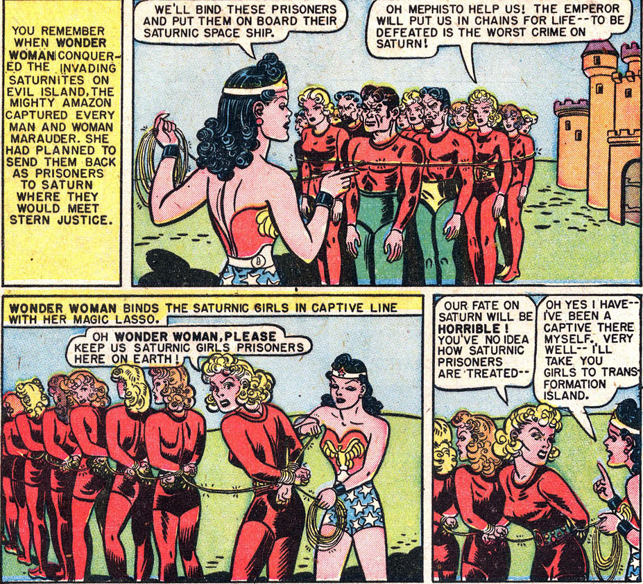
The story begins in media res, reminding readers of Wonder Woman’s recent defeat of an invasion from Saturn. The first illustrated panel (the second on the page, the first being taken up entirely with text) shows Diana having captured a large group of Saturnites in her golden lasso — which seemingly could expand or contract in length as needed, and here must be a few hundred yards long. Interestingly, artist H. G. Peter initially depicts a mixed group of Saturnite invaders, of both male and female genders.

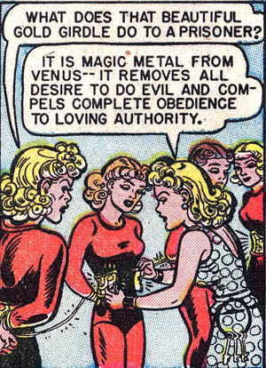
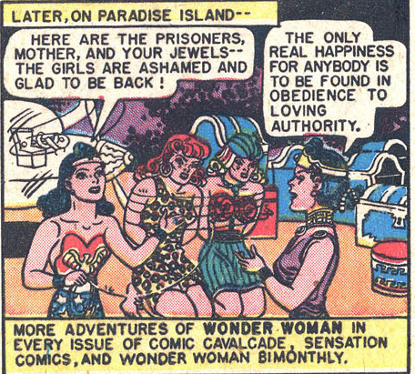
But in what I would regard as a telling slip, by just the second illustrated panel, the men in this group have mysteriously vanished; Diana (and Marston) is apparently only interested in the disposition of the female captive Saturnites, while the fate of the males is simply passed over. Attractively coiffed, and garbed in skintight costumes of bright scarlet, these “evil” young women are bound together in single file with their hands behind their backs, and transported by Diana in her invisible plane to the ominously named “Transformation Island” — the Amazon correctional facility. There, we are told, all prisoners are required to wear Venus girdles, a garment made from a “magic metal” that “compels complete obedience to loving authority.” This last phrase is spoken by the chief Amazonian prison officer in the final panel of the first page of the story; but it is repeated almost verbatim in the final panel of the very last page, by Diana’s mother Hippolyta: “The only real happiness for anybody,” we are assured there, “is to be found in obedience to loving authority.”


“Obedience to a loving authority.” Even for a reader unfamiliar with Marston’s psychological theories about the “primary emotions” of dominance and submission, the bookend status of this recurrent phrase signals the thematic significance of such concepts for the story at hand. And, indeed, the adventures that take place in between this repeated assertion depict several dizzying and occasionally hilarious oscillations between expressions of the impulse towards dominant assertion, on the one hand, and expressions of longing for a life of service, on the other. Thus, over the course of the first few pages, Eviless, a villainous (if rather unimaginatively named) Saturnite, turns the tables on her Amazon captors by forcing them to wear the Venus Girdles they have imposed on their prisoners, and thereby inverting the hierarchical structure of dominance and submission that characterizes the healthy “norm” of Transformation Island. However, while briefly wearing a Venus Girdle herself, even Eviless is momentarily tempted to surrender to the joy of captivity: “Now to remove this girdle … But I want to wear it — I feel so peaceful and happy!” As if to confirm the validity of those swiftly denied feelings with regard to the pleasure of obedience, several of the prisoners that Eviless subsequently attempts to release proclaim that they do not actually wish to be liberated at all. (“No, No! We don’t want our girdles removed!”). Eviless dismisses their desire to remain captive, of course — “You’ve let these Amazons break your spirit,” she declares — but later in the story, when some of these same happy prisoners have their girdles removed anyway, against their will-to-submit, we discover that a more profound change has actually taken place. “Without the girdle I feel dominant — invincible!” a girl named Irene discovers, “But I don’t feel cruel and wicked as I used to — the Amazons have transformed me! I love Wonder Woman and Queen Hippolyte … I must save them!”


At this moment, the regime of Transformation Island would seem to have produced the paradoxical ideal female of Marston’s psychological theories. Irene is “dominant” rather than submissive, but ruled by “love” rather than selfish “appetites.” (Marston’s preferred word in his academic writings for selfish-dominants is “appetitive”; he contrasts the appetitive type with unselfish-dominants, who he thinks can save the world by taking up the role of “Love Leaders.” Seriously. Read the last five or six pages of The Emotions of Normal People if you don’t believe me.)

In other words, the newly liberated Irene is just like Wonder Woman herself. She is an ideal personality type (in Marston’s preferred psychological terms), with a strong will to dominate that is nevertheless somehow conjoined with an equally strong will to love and serve others. We are encouraged to draw this parallel between Irene’s “new” post-Venus-girdle personality and that of Wonder Woman’s when she subsequently (and suddenly) develops Wonder-Woman-like powers: breaking free of her bonds, bending the bars of her cage, and freeing the other “good” prisoners. Irene goes on to lead a second rebellion of submissive-dominant prisoners against the prior rebellion led by Eviless and her dominant-dominant prisoners (the redundancy seems necessary if we are to keep track of who gets to “top” whom in this curious world of dominant and submissive flip-floppers). Irene then frees Wonder Woman (who had also been captured by Eviless), and together they restore order to Transformation Island; by which I mean that aggressively dominant types such as Eviless are once again placed in Venus Girdles, which cause them to happily accept roles of submission and service, while their mistresses (now including the formerly submissive prisoners who had earlier refused liberation at Eviless’s hands) once again dominate over them — lovingly, of course.

The inversions and reversal of the categories of top and bottom that produce this strange and paradoxical notion of order — in which loving-submissives-who-have-learned-to-dominate rule over recalcitrant dominant personalities that have been magically converted into submissives — are head-spinning. But they are also an inevitable consequence of Marston’s attempt to fuse his psychological theories, which assume the fundamental importance of the oppositions of dominance and submission in all human relations, with a liberationist-feminist philosophy of loving kindness.

This fusion should render certain arguments about Marston’s comics moot. For example, Trina Robbins has stated, on this website and elsewhere, that it is male readers (or “boys” as she sometimes calls them) that like to worry the issue of bondage in these comics, while female readers prefer to focus on the message of empowerment. Robbins is a creator and comics historian whose work I respect, but I’m strongly disinclined to accept this dubious gendering of our interpretive responses. (In fact, I can only wonder what Robbins would say to a woman who is interested in the depiction of bondage in these comics; would she accuse her of having more in common with “the boys” than with a woman such as herself, on the basis of such an interest?) But even if I were willing to reduce individual interpretive responses according to such gendered and heterosexist lights, the specific example of Wonder Woman #28 finally suggests to me that the very concepts that Robbins wants to separate — bondage and empowerment — actually cannot be disentangled in Marston’s imagination. As strange as many of Marston’s ideas undoubtedly seem, surely one of the single most frequently reiterated messages of his Wonder Woman stories is that there is no necessary contradiction between taking pleasure in bondage games (which, after all, form part of the regular recreational life of Paradise Island) and a commitment to female empowerment. On the contrary, for Marston, submission — of a very particular kind — turns out to be the best route to liberation. He said as much, prominently, twice, in this last story, so we wouldn’t miss it: “The only real happiness for anybody is to be found in obedience to loving authority.” The bondage sequences of his comics only make sense in the context of that curious philosophy.

Sharon Marcus describes the resultant imagery as “maternalist bondage.” This is a superb locution, in part because it acknowledges the fetishistic dimension of Marston’s scenarios while at the same time providing a strong indication as to the degree to which those scenarios depart from the typically polarized power structures of “traditional” BDSM, as superficially understood. (And yes, it is I think part of Marston’s achievement that a serious discussion of his work will lead one to posit a kind of BDSM that is “traditional,” simply in order to understand what the hell he is doing that is different.) But at the same time, and as Marcus has also clearly recognized, the phrase “maternalist bondage” also suggests some of the limits or problems inherent in Marston’s vision. At bottom (so to speak) the idea of submitting to your loving Mom is probably more disturbing or even icky than it is sexy for most of us. Of course, the reasons why that may be so are the basic stuff of psychoanalysis, and (as Marcus’s hints in her brief expositions of Jessica Benjamin’s work) these questions may even bring us closer to some of the (repressed) origins of the erotic charge present in what I am again forced (with delighted irony) to call more “normal” bondage. In other words, what we have here might have considerable potential as a psychoanalytic allegory — even if it probably isn’t going to bring about Marston’s larger project, which, as I’ve already said, was nothing less than the attainment of world peace through the reformation of sexuality. If we understand Marston’s logic, then, we can perhaps avoid getting caught up in a few older arguments about the politics of bondage — and even generate some newer and more productive ones.
 

_______________
The index to the entire roundtable on Wonder Woman #28 is here.

Wonder Woman vs. Wonder Woman

Sometimes a character feels at odds with the fictional world that houses her. I wish I liked Wonder Woman as much as I like Wonder Woman. I’d like to enjoy the super-heroine’s pluck and good cheer as much as I do her robust curves and lustrous black hair. Does this make me a bad feminist? Maybe. But it’s not that Wonder Woman’s athletic feats leave me cold. It’s her virtue that gets me down, just as her good deeds land her in aircrafts that plummet and boats that sink. Of course, she always pops back up, but it’s precisely that bounciness that feels so leaden.

Wonder Woman’s look promises a touch of evil glamor, but her dialogue is all perky efficiency. Judging solely by the character’s appearance, I’d expect a cross between Emma Peel and Bettie Page, but once Wonder Woman springs into action, she behaves more like Snow White’s love child with Nancy Drew. Unlike Batman, Spiderman, or Superman, Wonder Woman has no secret desires, no ulterior motives, no glint of malice or hint of weakness. Amazon Diana and Nurse Diana are equally cheerful, brisk, and sane. Wonder Woman’s superpowers don’t warp her; they don’t compensate for shameful deficiencies, nor are they shamefully hidden. They just turn her into a Girl Scout on steroids.

Despite her dark hair, Wonder Woman has no dark side. But why read comics if not to get in touch with the dark side? I, at least, have always preferred watching the bad guys and gals in comics and Disney films. Catwoman and Cruella have the best clothes. So in the panel below, though I admire Wonder Woman’s propulsive arms and extended legs, it’s her compressed, distorted shadow that draws my eye, not least because of the care Peter took in drawing it:
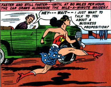
Notice that Wonder Woman is literally not in touch with her shadow in this image, just as throughout #28, “Villainy, Incorporated,” the evil she battles never taints her. Wonder Woman rarely gloats over her defeated antagonists, nor gets carried away subduing them. At one point, Giganta almost makes Wonder Woman lose her temper, but it’s far more typical for our heroine to dash off to get a purple ray machine that will keep villainous ringleader Eviless alive, or to express joy at having saved her from drowning.
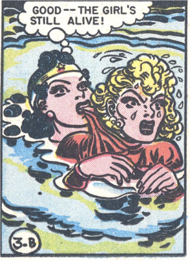
If this were Mystery Men, Wonder Woman’s superpower would be agreeableness: by dint of being really, really nice, and kicking some ass, she’s going to make everyone else really nice too.

So it’s no wonder, ha ha, that my eyes keep straying to the less wholesome pleasures Peter has stuffed into almost every panel, such as the colors — especially vivid in the less authentic reprint of #28 in Wonder Woman: The Greatest Stories Ever Told.

The split between Wonder Woman and Wonder Woman manifests itself as a clash of palettes. Wonder Woman (the character) is red, blue and yellow, black and white; the one jarring note is her flesh, a rich coral beige, but we are encouraged to process that as neutral filler, not a color in its own right. Wonder Woman (the comic) is chartreuse and mauve, turquoise and forest green, and uses primary colors only as jarring accents. Sometimes the villains wear red and the Amazon guards don purple and green, but for the most part, to the villains go the subtler, less wholesome color schemes:
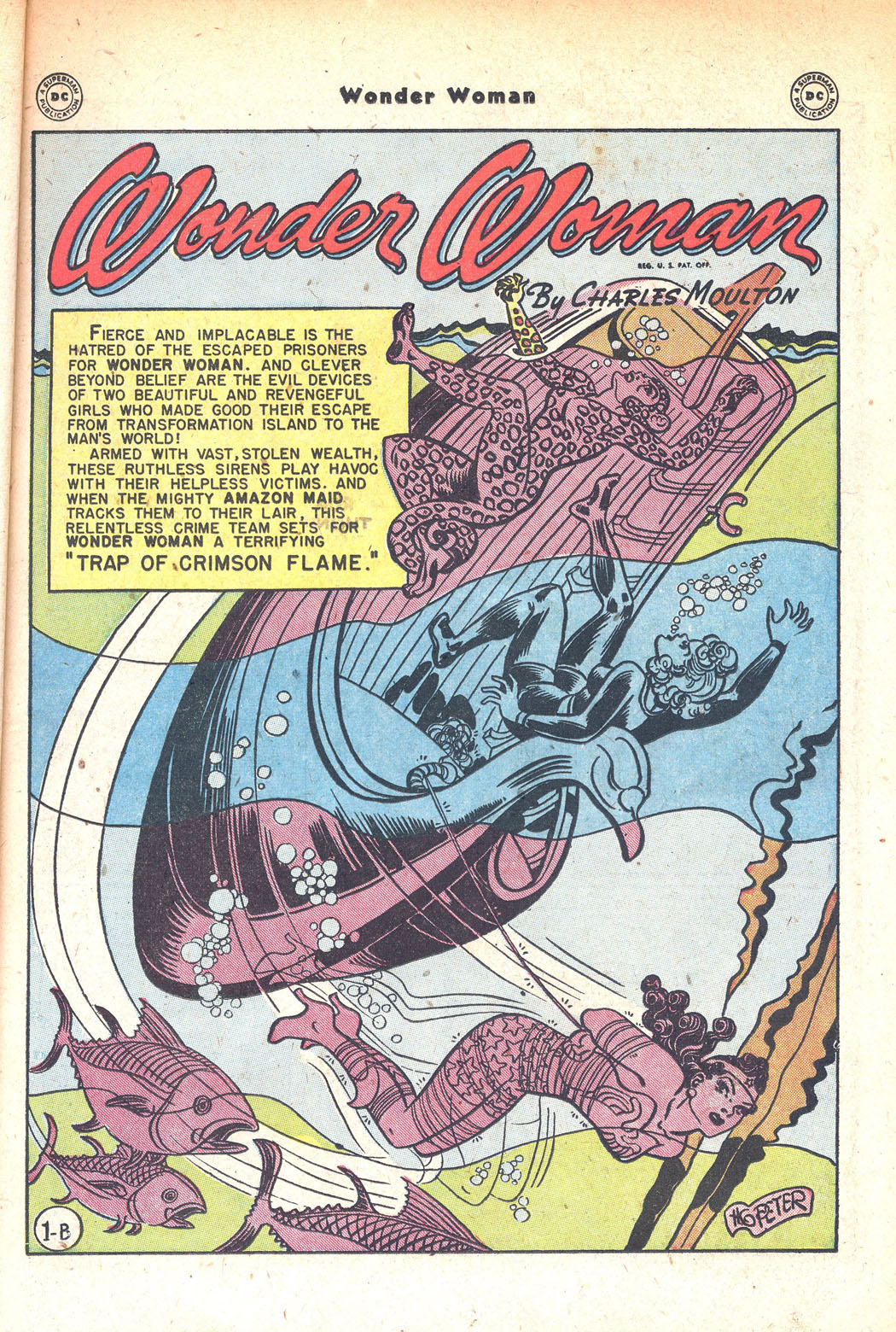
Mauve, turquoise, brown, and a muddy greenish-yellow dominate this panel, overtaking even Wonder Woman herself; her signature red and blue are relegated to the title letters. Only the Cheetah gets to be polychromatic. The color contrast provided by the yellow and brown portion of Cheetah’s arm, seen protruding above the water, gives the panel its depth of field, as do her mauve body parts, especially the sole of her foot, which invades both the print box and the reader’s space.

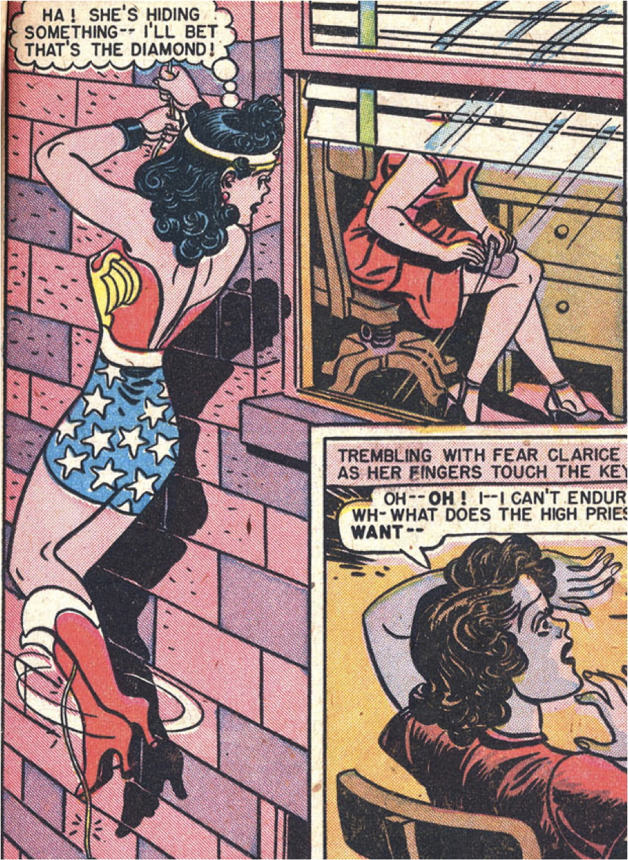
The battle between Wonder Woman and Villainy, Incorporated is a style war: patriotic primary colors versus a decadent, cosmopolitan spectrum; Roy Lichtenstein versus Picasso; Lego pieces versus burnt umber, melon, and periwinkle crayons. The more complex colors are often relegated to secondary characters and panel backgrounds, but precisely because of their outlandishness, they often end up coming to the fore. In this panel, for example, I find myself looking past Wonder Woman, at the bricks tinted pink and purple, at the gratuitously yellow-green strip on the window blinds, at the dab of purple on the spindle of the chair:
Wonder Woman’s costumes similarly pit the fascinations of villainy against the bland simplicity of the good guys. To be sure, Wonder Woman’s signature outfit is burlesque fetish wear — bustier, micro-mini, stiletto boots — but its eagle breastplate and white stars on blue background give an overall impression of wholesome Americana. Stripes are the only thing missing from this flag-like get-up, and are provided by the uniforms that the Amazons impose on their Saturnian prisoners, along with pacifying Venus girdles:
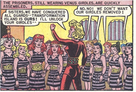
The prisoners on the right, who resist Eviless’s exhortation to resistance, speak as a united collective whose homogeneity echoes the striped pattern of their uniform; the whole ensemble embodies constricting, standardized repetition. Only a handful of prisoners, on the left above, resist the girdles. Once they’ve shed their prison garb, they pull sartorial focus:
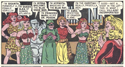
Exchanging conformity for individuality, with stripes now removed from their persons and confined to the prison bars behind them, these figures, who make up Villainy, Incorporated, become a carnival of stripes and swirls, dots and spots, human and animal, butch and femme, West and East, pants and skirts, unitard and hoodie.

Why is Giganta in a wildcat pattern if she used to be a gorilla? Why is Cheetah sporting leopard spots? Why do those spots glow inexplicably green in the negative space between Eviless’s arm and breast? And look at the accessories — the bird headpiece, the sinister goggles, the orange scarf segmenting a red top and yellow pants, the elaborate cat ears, the fedora, the hood, the jewelry. At last, the circus has come to town. I could look at this panel for hours.

Losing oneself in one panel of a strip, or in the details of a single panel, especially in details of costume, is associated with fetishism, the fixation on a part detached from a whole. One way of describing my experience of “Villainy, Incorporated” is that I find it much easier to focus on individual panels and on details of individual panels than to follow the sequence of events, which feels more cyclical than progressive. If I force myself to focus, I see that we have eight villains, and that Wonder Woman first defeats four, then another two, and then the final duo. But tracking this is a chore, because in each of those mini-episodes, protagonist and antagonist keep switching roles: first the villains are bound to submit, then Wonder Woman, then the villains, then Wonder Woman. Often Wonder Woman finds herself having to obey the commands of an opponent who has snagged the heroine’s golden lasso, which allows anyone wielding it to compel obedience:
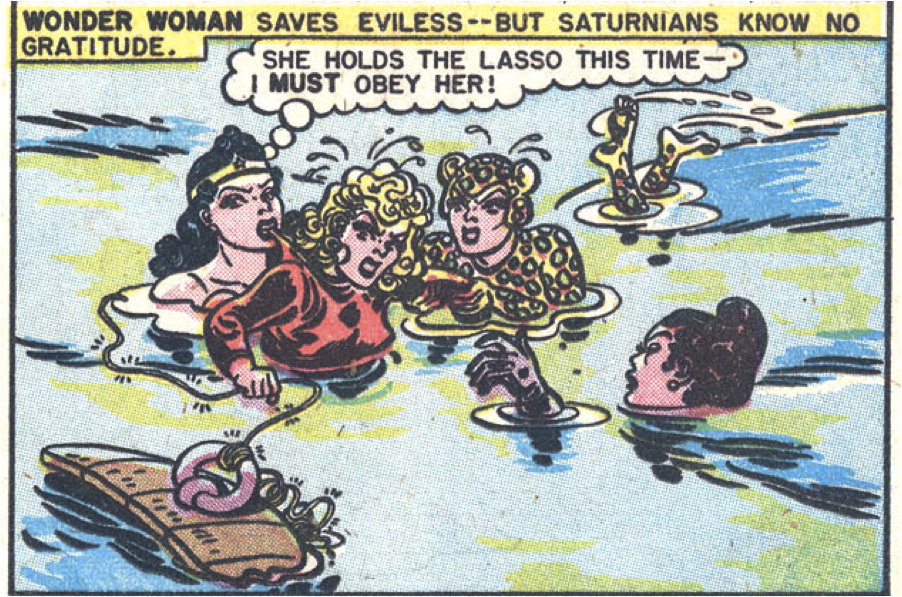
In this panel, I’m more interested in Cheetah’s feet than in what’s going to happen next. It’s hard to care about which particular character is wearing the Venus girdle or bound by the golden lasso at any given moment, because it’s clear that soon she will wriggle free and place it on someone else, who will in turn wriggle free and place it on her erstwhile captor.

Another way of putting this is that throughout “Villainy, Incorporated,” it’s hard to distinguish the tops from the bottoms, and sometimes even the good girls from the bad. Take Mala and Eviless, whose hairdos, like their names, are basically reflections of one another.
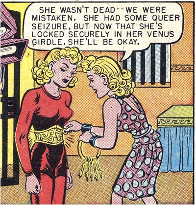
It’s as if the scene of sadism were more important to #28 than the story — as if sadism had itself become subject to the loopy visual tempo of the fetish. What matters most is not generating anxious suspense about what will happen next, but a feeling of secure suspension in a continuous series of images of women tying up women.

Wonder Woman thus seems to challenge the contrast between fetishism and sadism posited by Laura Mulvey in her classic essay on “Visual Pleasure and Narrative Cinema.” Mulvey sees Hollywood cinema as appealing to two types of pleasure that are of course related but look very different and appeal to different elements of our psyches. The first type is a fetishistic pleasure in isolated moments of female display that have no relation to linear plot progression. The second is a sadistic pleasure in narratives of pursuit, punishment, forgiveness, and control, in which men usually drive the action and women receive it. Mulvey sees both forms of visual pleasure as attempts to control castration anxiety, and people have been arguing productively with her schema for decades, which attests to both its insights and to its limitations. As Noah Berlatsky has pointed out in his readings of earlier numbers, the all-female universe of Wonder Woman undoes the identification of men with action and women with passivity and turns both the superheroine and the passive male into feminist fetishes.

Mulvey assumes a specific kind of heterosexual framework that seems less than relevant to the lesbian kitsch world of “Villainy, Incorporated.” This is a universe of female prisons, Amazons swearing by “Suffering Sappho,”and boarding school crushes (“Oh what strength — Princess, you are wonderful!”). Is #28 just a variation on a girlie show, designed by men for men, an appropriation of lesbian pulp? Or does it allow both male and female readers to identify with powerful femininity and vulnerable masculinity? I’d incline to the latter, given how #28 pumps up female agency and bonds between women while downplaying male power. Steve is as apt to be tied up as any of the female characters, and in his last appearance in this episode, though he comes to Wonder Woman’s rescue, he’s rendered as a barely discernible stick figure.

Questions like the ones posed above are fun because they’re impossible to answer. I’ll end with another imponderable. Why don’t I find this egalitarian story line sexy, much as I enjoy the individual panels? Mulvey describes the “destruction of pleasure as a radical weapon,” and for me, #28 has indeed destroyed what Mulvey deems the sadistic pleasures of control and dominance associated with conventional linear narrative. To some, it may seem nonsensical of me to say that #28’s destroys sadistic narrative pleasure. The characters address one another as “slave” and “mistress” and there’s an image of a woman engaged in some kind of bondage on almost every page:
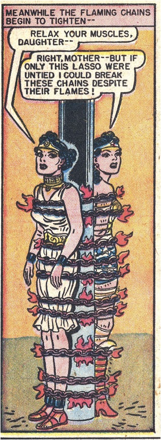
The BDSM imagery isn’t just an effect of the action-adventure plot; the Amazons speak frequently of their desire to compel “complete obedience to loving authority.”

Yet “Villainy, Incorporated” feels to me like it gently thwarts sadism, because while reading it, I find it difficult to sort out who is active and who is passive, who is subject and who is object. You’re dominant if you hold the lasso, submissive if it holds you. Even when captive, Wonder Woman performs feats of strength, like towing a submarine. The most obedient prisoners have also become so strong that by virtue of submitting to their captors they have acquired the power to rescue them:
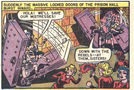
Throughout #28, the captive guards and rebel prisoners trade places, producing the confusion of agent and object, person and thing, masculine and feminine, that Anne Cheng identifies with fetishism in her book Second Skin: Josephine Baker and the Modern Surface.

“Villainy, Incorporated” is obsessed with bondage scenes, but its version of BDSM is a reparative, maternalist one in which difference is dissolved, polarities blur, and rectilinear structure collapses. This relaxation of the more punitive energies that Mulvey links to classically constructed plots seems related to the shift in scene from the heterosexual one typical of Hollywood cinema to the female world of love and ritual that is Wonder Woman. It’s also related to the difference between feature films and comics; it’s as though episode #28 has internalized the seriality of the genre as a whole.

Perhaps “Villainy, Incorporated” frustrates my narrative pleasure because it often feels like it’s trying to reconcile sadism with moralism. In the name of Aphrodite, Wonder Woman practices a kind of radical Christian ethics:
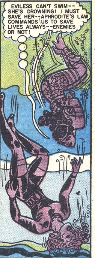
The Amazons claim to be enforcing complete obedience for the good of their captives, with the aim of removing “all desire to do evil” from them. Like the nineteenth-century proponents of criminal rehabilitation analyzed by Michel Foucault in Discipline and Punish, Wonder Woman prefers conversion to physical force, disciplining her enemies’ bodies in order to reform their souls. “‘I don’t feel cruel and wicked as I used to,'” exults Irene after doing time in a Venus girdle. But isn’t moral reform the ultimate invasion? What’s left of a person if she lacks even the desire to do evil? Is the problem with Wonder Woman that she is too sadistic, rather than not sadistic enough?

Or perhaps I have a lukewarm response to Wonder Woman because she dares to expose the soft underbelly that sadistic scenarios aim to protect. Explaining this requires a long detour through feminist psychoanalytic theory. Practitioners of BDSM often describe the core of their sexuality as an ethic of radical care that undoes any strict separation of omnipotence from helplessness. But many people see BDSM scenarios as appealing precisely because they revolve around polarized roles.

Jessica Benjamin has written brilliantly about sadistic fantasies and representations in The Bonds of Love and an essay in Like Subjects, Love Objects. I can’t do justice to her subtle argument here, but here’s the comic-book version of the points I find most relevant to Wonder Woman and its variations on the theme of bondage and submission between women.

For Benjamin, fantasies of erotic domination revolve around splitting. As infants, we feel omnipotent and helpless, destructive and vulnerable. Indeed, our very feelings of omnipotence make us feel helpless, anxious that our own aggression might destroy the external world on which we depend for survival. We find it almost impossible to discern the difference between what is inside us and what is outside us. We also find it almost impossible to discern the difference between the external world in general and our parents in particular, and like most psychoanalysts, Benjamin sees mothers as the prime embodiments of both the external world and parental care.

Engaging with various thinkers, including Donald Winnicott (a key figure in Alison Bechdel’s new graphic memoir, Are You My Mother?), Benjamin sees fantasies of power and submission as resisting erotic intersubjectivity, in which each recognizes the other as “a being outside omnipotent control” (186). Sadistic fantasies manage the universal infantile experience of feeling overwhelmed by both one’s own omnipotence and one’s mothers. They appease “the conflict between recognition and destruction of the other” (183) by creating a strict demarcation between fixed poles of power and submission. Benjamin writes that these are usually “organized by gender,” with men dominating and women submitting. This suggests lack of familiarity with the diverse range of BDSM scenarios in circulation for at least the last two hundred years, but gender is not really the point of her argument.

Benjamin’s key point is that s-m scenarios and erotic intersubjectivity alike are grappling with the same psychic challenge: how to reconcile tensions between sameness and difference, merger and separation, closeness and distance, acceptance and rejection, idealization and recognition. Sadistic fantasies may seem like expressions of cruelty, but in her view they are also working out the fear that the maternal object could not survive one’s aggression (196). In sadistic and masochistic fantasies, “each can play only one side at a time.” Benjamin contrasts this to erotic experiences in which those involved are neither perfectly strong nor perfectly weak. Those experiences emerge most readily when one has been able to recognize the mother as an independent subject, which helps one develop an erotic self that can play with destruction without being extinguished by it (206). Benjamin clearly prefers Eros to sadistic fantasy, but she’s not censorious of fantasy; she sees pornography as a sign of suffering mainly insofar as many people report feeling bad about their responses to it.

Where does this leave Wonder Woman? Benjamin describes sadistic fantasies as a way to cope with the sensation of “encapsulation in omnipotence,” which is an interesting gloss on being bound by a golden lasso and a Venus girdle that compel complete obedience.

I don’t think we need Jessica Benjamin to tell us that Wonder Woman #28 is obsessed with bondage. What Benjamin’s framework helps us see is that Wonder Woman revolves around what we might call maternalist bondage. Certainly, in this comic, you’re either tied up or doing the tying, and each can only play one side at a time. But characters switch from one side to another with such frequency and rapidity that they’re almost occupying both sides at once, yielding oxymoronic beings such as “captive guards” and Amazons bound by their own lassos.
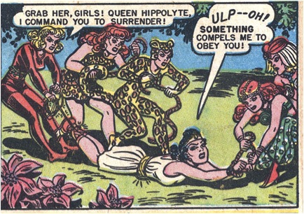
The tender solicitousness Wonder Woman so often expresses for those she’s restraining (“What’s the matter, Eviless?”) makes Amazonian domination a relatively explicit expression of the need to give and receive comfort and recognition (“I hate to pull Eviless under water”). For Benjamin, sadistic fantasies exist to neutralize, even repress, such needs at their most intense and naked. Wonder Woman dares to go where most s-m fantasies don’t — into the turbulent emotional core of neediness and reparation that most sadistic scenarios tie up into neat, well-defined packages. And the vertiginous switch-hitting that results disrupts the controlled progression of plot along with the polarized distribution of power.

Wonder Woman #28 doesn’t give us perfect reciprocity; this is a classic comic, after all, and it’s inconceivable that its blissfully one-dimensional characters would lend themselves to the intersubjective encounters with difference to which erotic reciprocity gives rise.

What Wonder Woman #28 does give us is an obsessive depiction of the reversibility and replication of power between women. That reversible reciprocity is embodied in Wonder Woman’s name. WW: these initials constitute a double mirror image, since the first letter is the same as the second, and each letter consists of twin V’s. The two V’s that make up each W recur in the peaks of Wonder Woman’s boots. We have regular V’s in the back:
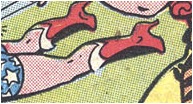
and inverted ones at the front:

WW is also MM upside down — just as adoration is the flip side of rage, omnipotence is the flip side of helplessness, and Wonder Woman is the flip side of Mom. But then, what isn’t?

__________________________
This is part of a roundtable on the last Marston/Peter Wonder Woman. The roundtable index is here.