Giant Monsters seem to be on the cusp of another Big Moment. Amongst those who fly the tattered geek flag, Pacific Rim was the year’s most discussed film, Gamma and Godzilla: Half-Century War were celebrated comics releases, and next summer’s Godzilla film reboot is already being heavily promoted on the convention circuit and buzzed about online. But everything new is old again: big monsters have played a role in our cinematic imagination since 1925’s Lost World, and the current crop of kaiju comics and films do little but pay tribute to the heyday of Japanese tokusatsu from the mid-50s to the 70s.
When Godzilla first appeared in 1954, the film was a metaphor for the devastation leveled on Japan by the Hiroshima and Nagasaki bomb attacks. Since then, giant monster invasions have stood in for our fear of the Soviet nuclear arsenal (Godzilla vs. Mecha-Godzilla, 1974), genetic engineering run rampant (Jurassic Park, 1995), and reckless treatment of the environment (The Host, 2006 ). What does a kaiju attack have left to signify in 2013? In Pat Aulisio’s new mini-comic Xeno Kaiju from Hic & Hoc, the giant lizard kaiju is not the great threat; rather, the monster is the cleansing force that, like Travis Bickle’s “real rain”, washes away the chaos and alienation of city streets. .
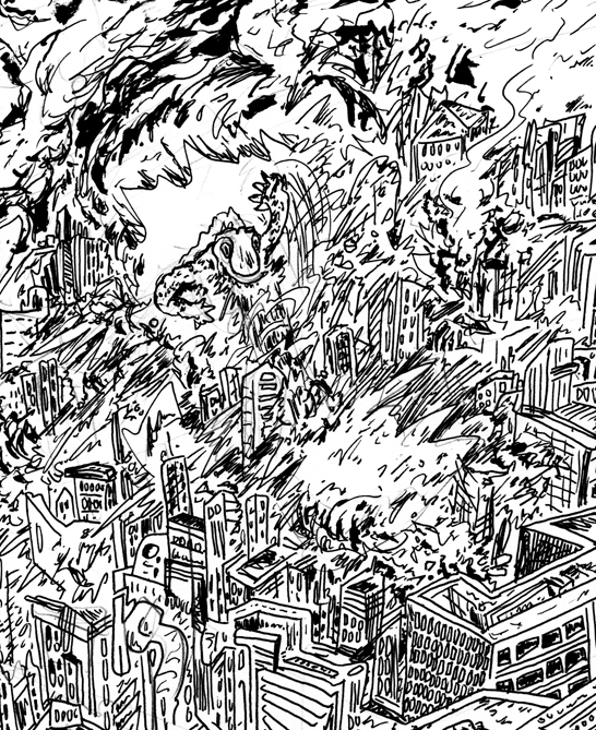
Aulisio’s wordless comic is presented as an oversized tabloid format and printed on heavy newsprint — similar in size and weight to DC’s Wednesday Comics project. Each of the sixteen pages presents a single illustration, giving the artist ample space to work. Most of the pages are filled from corner to corner with loose but richly detailed illustrations of an unnamed city, presented using the same false perspective employed by Ivan Brunetti for his precious New Yorker covers, combining head-on and eagle-eye views into one master view (it’s also the perspective usually employed in Where’s Waldo, a series whose format and density of image bear no small resemblance to Xeno Kaiju). Aulisio’s cities are detailed but rendered in such a way that is impossible to pick out any one building from its surroundings — in other words, it is impossible to see the trees for the forest. Merging elements of M.C. Escher, Dr. Seuss, and Taiyo Matsumoto, Aulisio’s cityscapes are deliberately overworked, confusing, and overwhelming; thus the visual effect of his pages is not unlike the emotional effect of living in a real megacity, the peculiar form of alienation born of an overabundance of people.
When Aulisio’s kaiju begins to tear a path of destruction through the city, the damage is purely architectural; their are no humans fleeing the monster in terror, as there would be in most any Godzilla film. The only living figure on the page is the monster itself; he is the only individual in a city of faceless masses. Though the kaiju is eventually defeated, he is at least able die in an open field of his own making, rather than among the urban jungle — he has carved out a space that is truly his own. In the last image, on the back cover, we zoom out from the site of that kaiju’s death rattle to see that this whole planet is one massive urban area — and alien forces are releasing more kaiju, presumably to carve out some new open spaces in the sprawl.
*****
Not long ago, I asked Hic & Hoc publisher Matt Moses if he had an overarching vision for his nascent comics imprint. “I don’t have any vision, no sense of common themes or uniformity. If anything I want to be the ESP-Disk of comics,” he replied. Still, Moses’ operation tends to attract artists with a certain aesthetic, with an emphasis on cartoonists who celebrate the directness and immediacy of the medium over those whose prize draftsmanship and technical illustration.
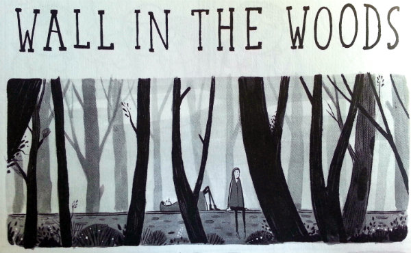
Not all of the comics in The Hic & Hoc Illustrated Journal of Humour Volume Two: The United Kingdom are ‘journal’ comics, but they are all the sort of comics that one might jot down in a journal. The result is something like reading a particularly well-curated tumblr feed. Chuckles and chortles abound, but deep belly laughs are few and far between. The most striking moments are not, as the title might suggest, the funniest, but often the saddest, as in the comics of Joe Decie and Stephen Collins. Both of those artists are more adept at capturing the moments of angst in between the light laughs of friendship; as Collins notes in his sole contribution to this volume, “Wall in the Woods”: “The thing about laughing gas is, it’s not actually that funny. You watch someone do a balloon…and it sort of stops them, for a moment. I mean, its stops them being them. Just for a second.”
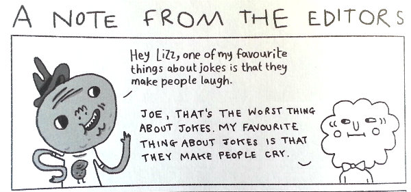
Of course, this is all laid out in the Journal’s illustrated introduction from editors Liz Lunney and Joe List:

And suddenly a humour anthology that seemed like a bit of a jumble comes into focus as a tightly curated, and exceptionally British, document of comics and humo(u)r writing today.
Benjamin Rogers tweets @disastercouch and blogs at disastercouch.com


