Sequential Splortch

I wrote this some years back for a sex toy website. I don’t think they ever published it…so I thought I’d finally run it here.
______________

“You think they [comic books] are mostly about floppy-eared bunnies, attractive little mice and chipmunks? Go take a look.”
—cover flap of Frederic Wertham’s Seduction of the Innocent

Erotic comics first surfaced in the dim dawn of pre-history among cave-dwelling ungulate-fetishists who, in animistic rituals, drew upon the stone walls choice mammoths with whom they wished to have congress. Some time thereafter, in the early 1800s, the Japanese developed…SHUNGA! Which is pretty much what it sounds like.

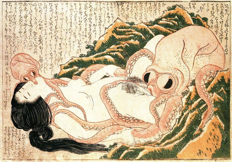
Perhaps the most famous shunga illustration is Hokusai’s The Dream of the Fisherman’s Wife, which, coincidentally, also features a rape-by-mammoth. Ha ha. No, of course it doesn’t. It actually features a rape-by-octopi.
 

800px-Tako_to_ama_retouched

 
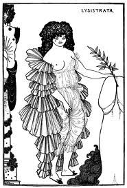
Lascivious, decadent Europeans, inspired by such hot-and-heavy Japanese print-making, erected sophisticated fantastic visions of their own. Here, for example, turn-of-the-century Brit Aubrey Beardsley makes a subtle phallic reference.

images

Can We Get More Animation Down There, Please?

If you studied the pictures above very closely, you probably need to stop and take a deep breath. If you examined them somewhat more cursorily, you probably noticed that they’re not actually comics — just influential genital progenitors, as it were. Comics as we know them coalesced as a form in the early 1900s. At first, of course, they were mostly aimed at kids, so sexual content tended to be muted. Winsor McCay drew the occasional picture of a woman in bed with a warthog, but that was about as racy as it got.

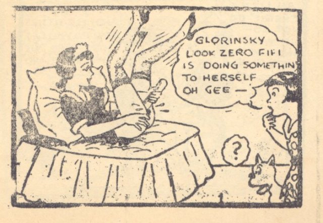
No form can escape filth forever, though. By the 1920s, cutesy childhood icons were frolicking like hardened whores across the pages of crude 4″ x 6″ pamphlets known as Tijuana Bibles. Violating propriety and copyright with equal vigor, these eight-page narratives featured such familiar faces as Popeye, Dick Tracy, Flash Gordon and the eternally underage Little Orphan Annie demonstrating the use of heretofore unillustrated appendages.

Little_Annie_Rooney_and_Zero-1

Tijuana Bibles were most popular during the Great Depression, when most people were too poor to afford orgasms. During the late 50s, though, men’s magazines began to publish real photographic evidence that anatomy existed, stimulating the poor Tijuana Bibles right out of existence.

Balling with Gags

Luckily, the girly mags were a fickle bunch; photos may have been their true love, but they inevitably had a passel of mistresses on the side. These included gag cartoons. From Eldon Didini to Jack Cole (of Plastic Man fame) to Dan DeCarlo (of Archie fame), some of the biggest names in comicdom set their work atop clever captions like “The job is yours, Miss Bigelow, providing you fit just as well on my partner’s lap!” and “Two aphrodisiacs please!” Not that anyone was looking at the captions, exactly.

The pinnacle of men’s magazine cartooning is generally considered to be Little Annie Fanny, a strip cartoon which ran sporadically in Playboy from 1962 to 1988. Written by Mad-magazine alum Harvey Kurtzman and lavishly painted by Will Elder the titular character (in various senses) was an empty-headed naif who kept stumbling into preposterous situations, upon pop cultural tropes ripe for satire, and out of her clothes. Mostly that last one.

Under Where?

Men’s magazine illustrations were aimed at a broad, mainstream audience, and so were fairly tame by earlier illustrational standards; visible penises were a no no, much less octopus rape. With the late sixties underground comix movement, though, more idiosyncratic perversions became available from a head-shop near you. S. Clay Wilson’s raunchy fornicating bikers, satyrs, and pirates led the way, but even more influential was R. Crumb, whose comics indulged his fetish for large, powerful women and their hindquarters.

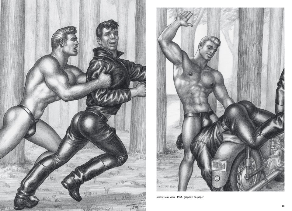
In Europe, one of the most influential underground cartoonists was Touko Laaksonen, better known as Tom of Finland. His well-endowed, pumped-up, and frequently pumping leather-clad, uniform-sporting men were hugely popular through the 60s and 70s, and remain widely recognized and (ahem) utilized today. Laaksonen was even an important influence on the visual style of the Village People. Eat your heart out, Jack Kirby.

page_rc_25_tom_of_finland_comic_ii_03_1111301228_id_523439

The undergrounds opened the way for independent comics in general, and for more sexual and personal material in particular. At the extreme is Johnny Ryan, whose supremely and surreally filthy comics have at various points featured disembodied invisible anuses, severed butt-cracks, quarts of Dracula piss, and sex with midget Hitler. Much more literal is David Heatley’s “My Sexual History” which, like the title says, is a chronicle of every sexual encounter the author has ever had. Other autobio creators, from Jeff Brown, to Julie Doucet, to (my favorite) Ariel Schrag, have also chronicled their sexual lives in detail that veers between the arousing and the more-information-than-I-really-want-to-know-thanks.

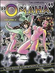
One of the most acclaimed independent adult titles is Reed Waller and Kate Worley’s 80s series, Omaha the Cat Dancer, a sexually explicit soap-opera with funny animals (the title character is actually a feline…more or less.) Equally idiosyncratic is Alan Moore and Melinda Gebbie’s 2006 Lost Girls, which features Wendy from Peter Pan, Dorothy from The Wizard of Oz and Alice from Alice in Wonderland musing on matters philosophical while engaging in a marathon of sexual trysts.
 

images

 
Porn actually played a vital part in the survival of one of the most respected independent comics publishers. Fantagraphics — whose catalog includes Dan Clowes and Los Bros Hernandez — was poised to go out of business in the early 90s. It was saved in part by the launch of its adult-oriented Eros line. It’s kind of funny to think that there would be no Chris Ware as we know him without concupiscence and gushing bodily fluids (though that’s true for all of us, I suppose.)

Foreign Trollops

Influential European comics with sexual themes began to appear in the early 1960s. Guido Crepax’s character Valentina started her erotic run in the Italian comics magazine Linus in 1963; Crepax would go on to work on graphic adaptations of porn classics like Histoire d’O and Justine.

Another Italian, Milo Manera, is perhaps Crepax’s most famous heir. Both artists have had work appear in Heavy Metal, an American offshoot of the early 70s French magazine Métal Hurlant. Heavy Metal’s Europulp-fantasy-smut remains a touchstone in American comics, from Frank Thorne’s Lann to Michael Manning’s ongoing fetish, gender-bending, humidly romantic, paranoid cyberpunk opus In A Metal Web.

The real top in recent foreign-on-American porn, though, has been Japan. Manga, or Japanese comic books have penetrated…er…pushed their way into…um…stickily saturated? Anyway, they’re very popular in America, and porn manga is no exception. For those who want to be taken seriously by your local otaku, Japanese porn is usually referred to as hentai. Hentai can refer to any number of fetishes, some of which (giant breasts) are fairly mainstream, others of which (girls-with-penises, tentacle rape, or sex with underage-appearing girls, known as lolicon) are less so.

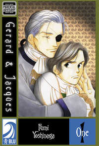
From a western perspective the most unusual hentai genre,is probably yaoi. Yaoi depicts homosexual relationships between beautiful men, but it is created by and marketed mostly to women. In contrast to gay porn for gay men, yaoi tends to feature complex characters and intricate relationships — it is, in other words, a romance with lots of gay sex added. Pundits often like to claim that girls like yaoi because identifying with boys is more distant and somehow safer. Probably the real appeal is more straightforward (ahem) — if you like to look at pictures of hot guys having sex, surely two is better than one? In any case, yaoi has proved quite popular with het- (and not-so-het) female readers in the U.S. Among the most popular titles featuring boy-romance are Maki Murikami’s Gravitation and Sanami Matoh’s Fake. More consistently explicit fare includes Youka Nitta’s Embracing Love and Fumi Yoshinaga’s Gerard and Jacques.

cover

In the Future, There Will Be Only Virtual Sex

Paper publishing is currently in the middle of a death-spiral, and porn comics have certainly taken a hit as well. Yes, a wide array continue to be available for all tastes, from furry-friendly-fare like Richard Moore’s Short Strokes to trans fetish fare like Roberto Baldazzini’s Bayba: The 110 BJ’s and Christian Zanier’s Banana Games to always-popular vampire erotica like Frans Mensink’s Kristina Queen of Vampires . But it seems likely that in the near future most explicitly pornographic comics will be online — like current Indian semi-sensation Savita Bhabi series. Dirty drawings never die…they just digitize.

Excess Meaning

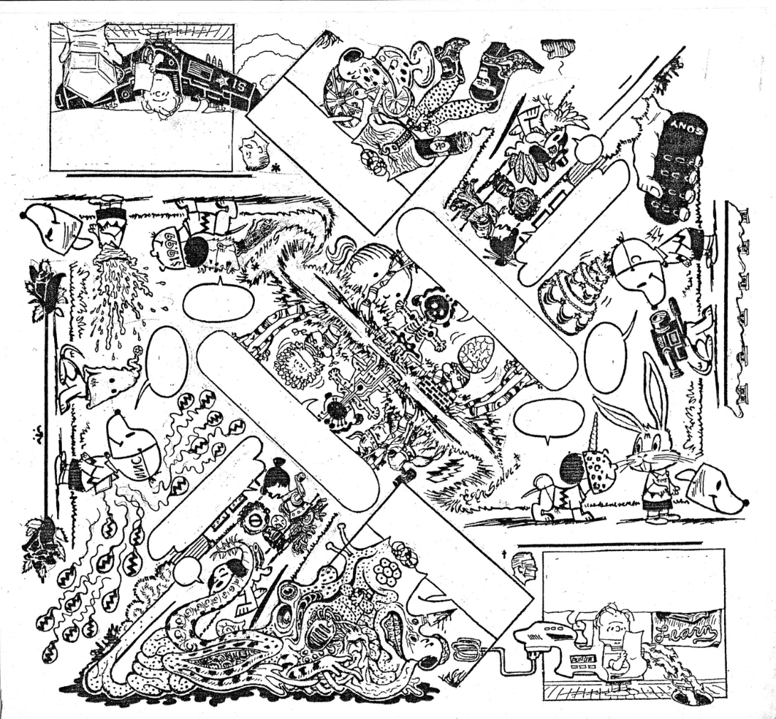
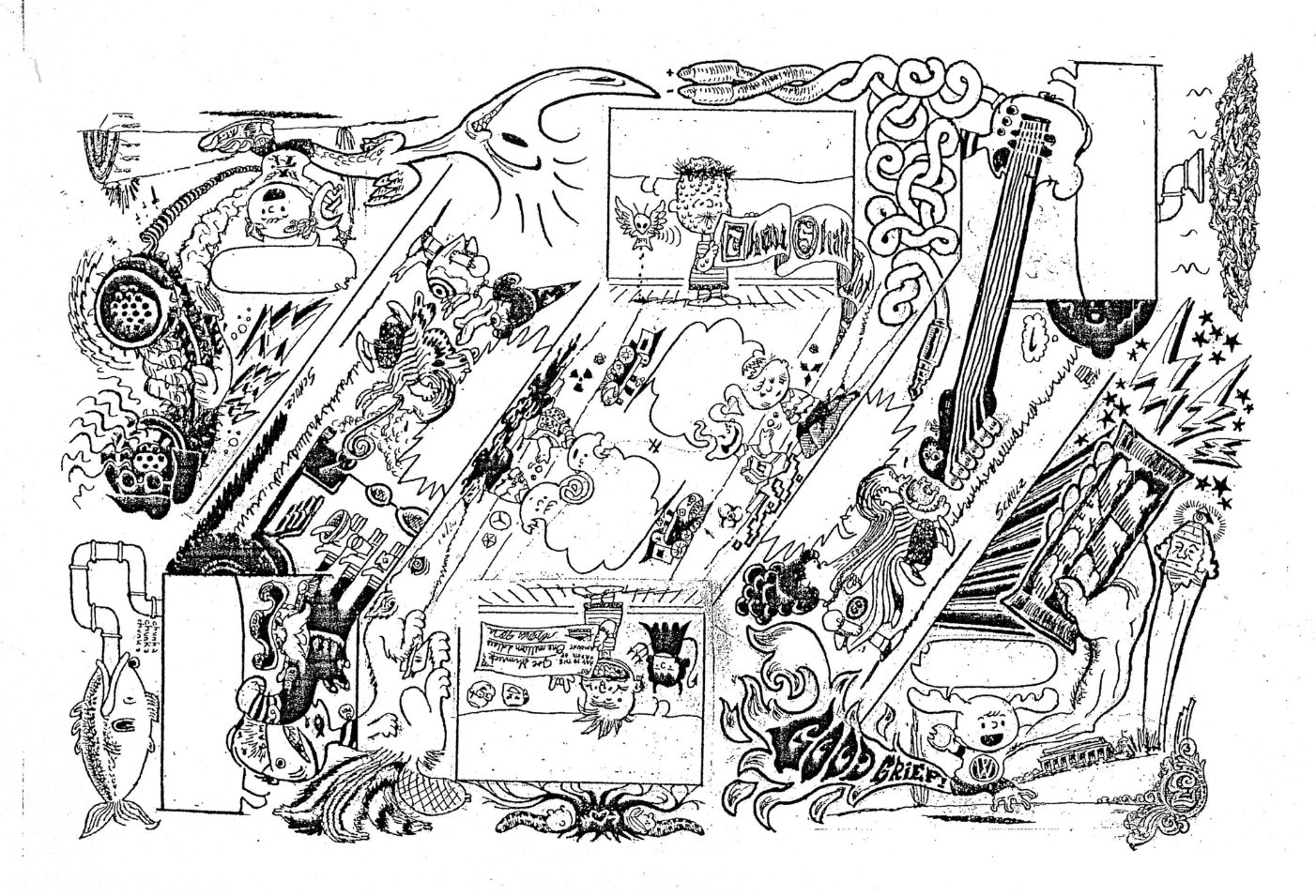
Above is a art project Bert Stabler and I worked on together. I wrote the words and he drew the image.

Except, as you’ve probably noticed, there are no words. When it came down to it, Bert decided that the pictures looked better without the text. So he took them out.

In some versions of comicdom, this could be seen as a cardinal sin. As Joe Matt says, “”I’ve gotta draw minimally to serve the storytelling! The writing always comes before the art!” Similarly, Ed Brubaker argues “I’ve always felt that the writing was far more important than the artwork… As long as the art supports the story…” It’s hard to see how Bert could have more thoroughly violated these precepts.Not only does his art not serve the storytelling, but in the name of the art, he actually went ahead and removed the words altogether!

Of course, in our project, the words were always subordinated to the drawing; Bert did the artwork first, then I provided words…and then he decided the words didn’t fit (in some cases literally — too much text for the boxes.) But that merely underlines the point that art here was not subordinated to storytelling.

Bert’s piece takes several steps towards abstract comics. Appropriately enough, Andrei Molotiu has taken on a lot of these issues at his Abstract Comics blog (from which I pinched the Matt and Brubaker quotes). Specifically, Andrei has argued that art in comics should not be, and often is not, subordinated to the demands of text or narrative. Speaking of the art-must-follow-story meme, Andrei says

This is exactly the logic of illustration–which is a form of logocentrism… And here we can expand the discussion beyond abstract comics, which occupy only the extreme position (like “purely harmonic music”) in a wider range of art that exceeds narrative demands.

In another post, Andrei goes on to look at some examples of non-abstract, art-superfluous comics.

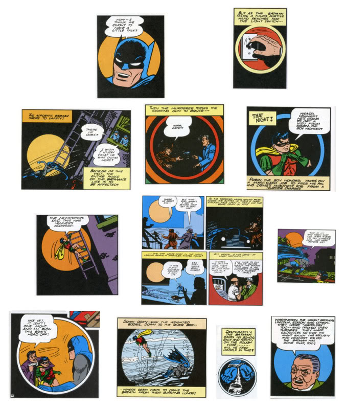
For instance, he talks about a Bob Kane story from 1941, in which Kane used a ton of circular panels, as Andrei shows:

Andrei goes on to say:

Now, what does this mean? Probably nothing. (Which is not to say it’s not significant; just that it’s probably not meant to mean.) One can obviously draw the parallel between the circular panels and the moon–but the resulting interpretation (Batman as creature of the night, etc.), would be generally valid for ANY Batman story: so why specifically this one? Similarly, one can find some connection to the closing words of the story, where Bruce Wayne, with a wink, tells Commissioner Gordon: “I guess the life of Bruce Wayne does depend quite a bit on the existence of the Batman!” There is a kind of circularity implied there, I guess, and we can then claim the circularity is echoed formally in the art… And yet, if that’s the great realization, the theme of the story–again, the Bruce Wayne/Batman dichotomy is a constant throughout the strip. Why this story specifically?

I don’t know. Maybe Bob Kane had a brand new compass he had purchased the day he drew this story, and he was just dying to use it. But my point here is: I’m not so much interested in fully motivated signs, portentous (a la Wagner) leitmotifs charged with meaning as you can find in, say, “Watchmen” or “The Dark Knight Returns”–works in which their creators seem fully in control of their formal language, in which every single (or almost) signifier can be seen as adding something to the story’s theme. Rather, I’m interested in what, at this point, may be called automatisms, tics perhaps, that nevertheless affect our experience of the comic.

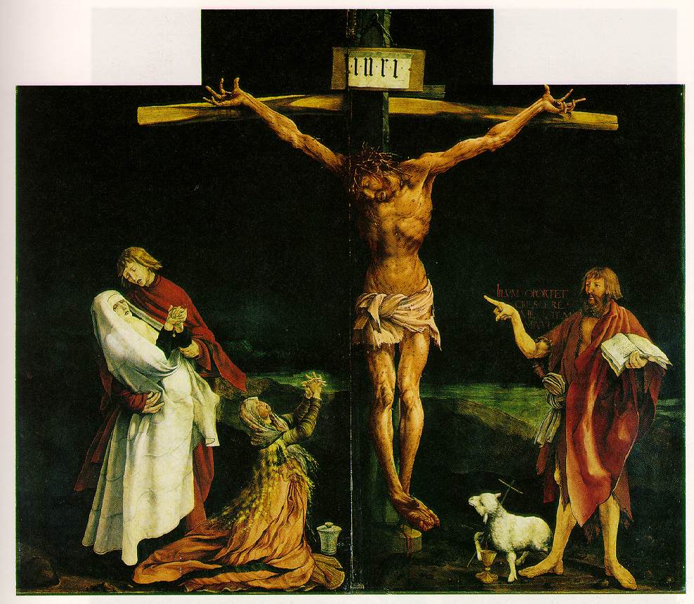
Andrei is drawing a distinction between formal elements that can be collapsed into the theme and formal elements that are tics, excesses over meaning. As an example formal elements linked to theme, you could perhaps take this Gruenwald painting, where the idiosyncratic formal use of scale illustrates the phrase “He must increase, but I must decrease.”

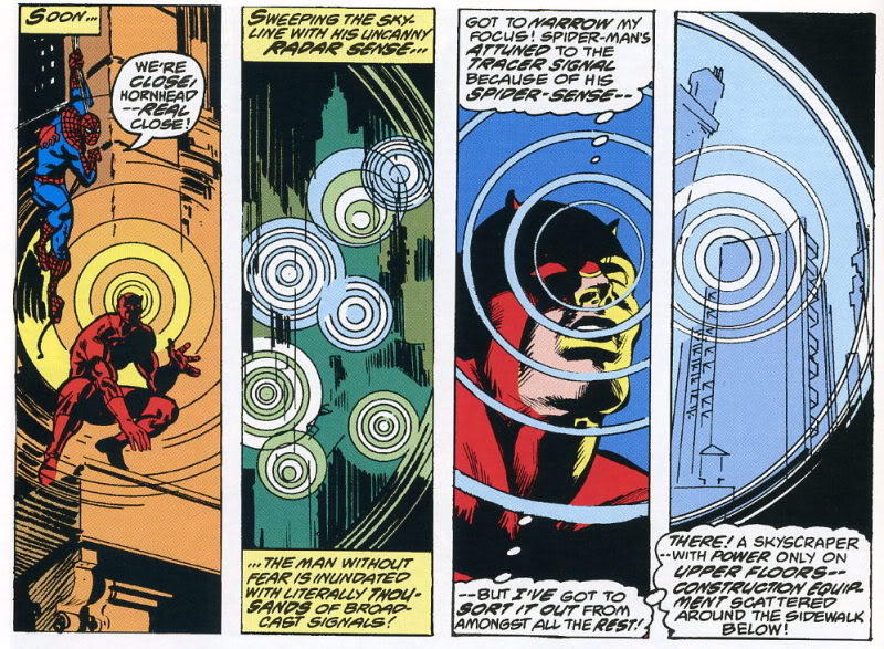
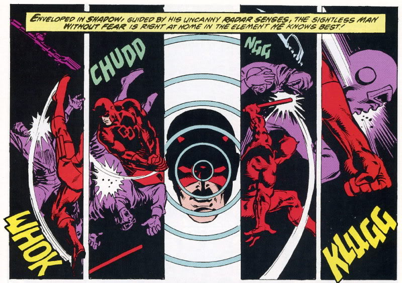
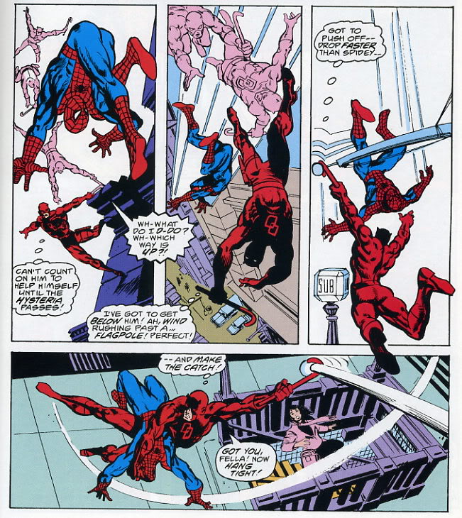
And as an example of formal tics that do not link to theme, you could take the insistent circular repetitions in the Frank Miller Spider-Man/Daredevil crossover which Andrei analyzes.

In Gruenwald, the formal elements relate directly to the spiritual meaning; in the Frank Miller, the circles are just a way of organizing space; an abstract, musical surplus, which contribute to pleasure or experience without, Andrei says, contributing to narrative or meaning.

The question I have here though, is this: are narrative and meaning synonymous? Obviously they aren’t; Gruenwald’s painting isn’t a narrative, but it’s intended as an illustration of a thought or a metaphysical insight. But what about in Miller?

Perhaps one thing that the circular motif does is to insist on its own integrity. It draws a border; looking at those images, it’s hard to avoid the sense of space. In both of the sequences form Miller above, the words are literally pushed off to the edge, allowing the circles to spread — Daredevil’s senses, his “sight”, reaches out across the page, marginalizing the text. Logocentrism is (again, literally) replaced by iconocentrism. This is the case even in instances where the text is more interspersed with the circles, as below.

The spinning multiple figures against the whiteness demand attention. It draws you down into an excessive, vertiginous whirl of motion that makes the banal text (“Got you fella! Hang tight!”) seem like the superfluous bit.

Thus, the image spilling over the words does not exceed meaning. Rather, its meaning (or one meaning) is the excess itself. When Andrei says illustration is excess, he is not illustrating the way in which illustration does not mean; rather, he’s illustrating that very meaning, which is excess. The circle is a hole in narrative — a vortex that escapes the story’s staid linearity and in its place spins out an ever-expanding circumference of pleasure.

Bert’s excision of text can also be seen as a kind of deliberate overtopping, or annihilation, of narrative content.

In Bert’s drawing, the Peanuts characters flow and morph, losing their coherence as they dissolve into a kind of post-modern iconic glop. They don’t cease to mean; rather, their meaning is unanchored from its original context and sent oozing along the chain of signifiers. So Schroeder turns into a guitar which turns into tombstones haunted by a cute little death and Linus and Lucy fuse into a single terrified/terrifying blob of torment and tormenter. It’s a violent detournement — and the violence is not only in the drawing, but in the (lack of) text. The Peanuts characters are all caught in the boiling cauldron of narrative meltdown, and their blank, stunned, failed efforts at speech only emphasize their tortured transformation. The speech bubbles hang emptily in the design — the last, sad trace of the vanished stability of logos, as around them rages the free-associative chaos of the image.

_____________
In the examples so far, Andrei’s conception of the visual as excess (beyond meaning in his formulation, of meaning in mine) has worked fairly well. I think it is possible to find instances that call it into question though. For example:

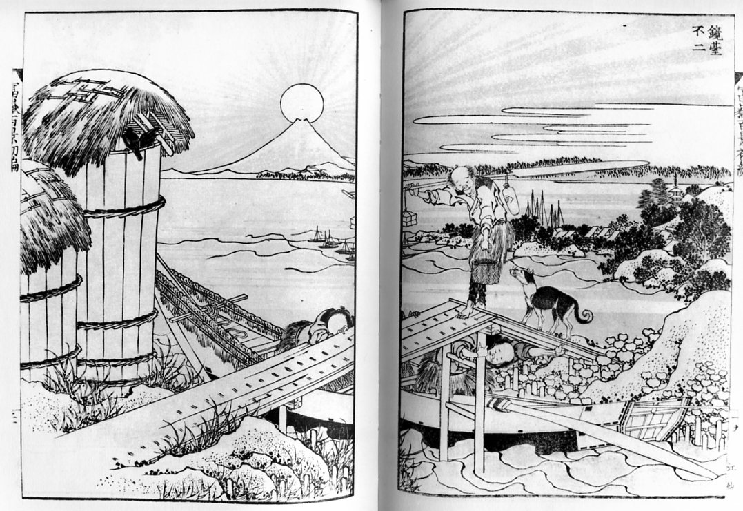
This is one of Hokusai’s One Hundred Views of Mt. Fuji. It’s title of this particular plate is “Fuji as a Mirror Stand.” The point, or meaning, is, then, a kind of visual pun — the image of Fuji in the background with the sun sitting on top of it recalls a mirror sitting on its base.

If that image is what the print is about, though, what to make of all that action in the foreground? The man with his dog crossing over the bridge can be seen as a visual mirror of the mirror, perhaps — but Hokusai makes it very difficult to see the action there as pure formal doubling. Instead, we want to see it as narrative. What (we ask with the dog) does he have in that bucket? Where is he going, and where are those boatmen going under the bridge? Will they speak to each other? Do they see each other? What’s their story?

In this case, we might say that the narrative, or the demand of narrative, acts as an excess; an addition balancing on top of the mountain. Human stories pass over and pull under the image; what you see is disturbed by the demands of what happens. You can look for your reflection in the serene and distant mountain, and you may even see it, but your dog is still beside you, excessively nuzzling, demanding that you move on.

Here’s another view from the same series which works in somewhat similar ways.

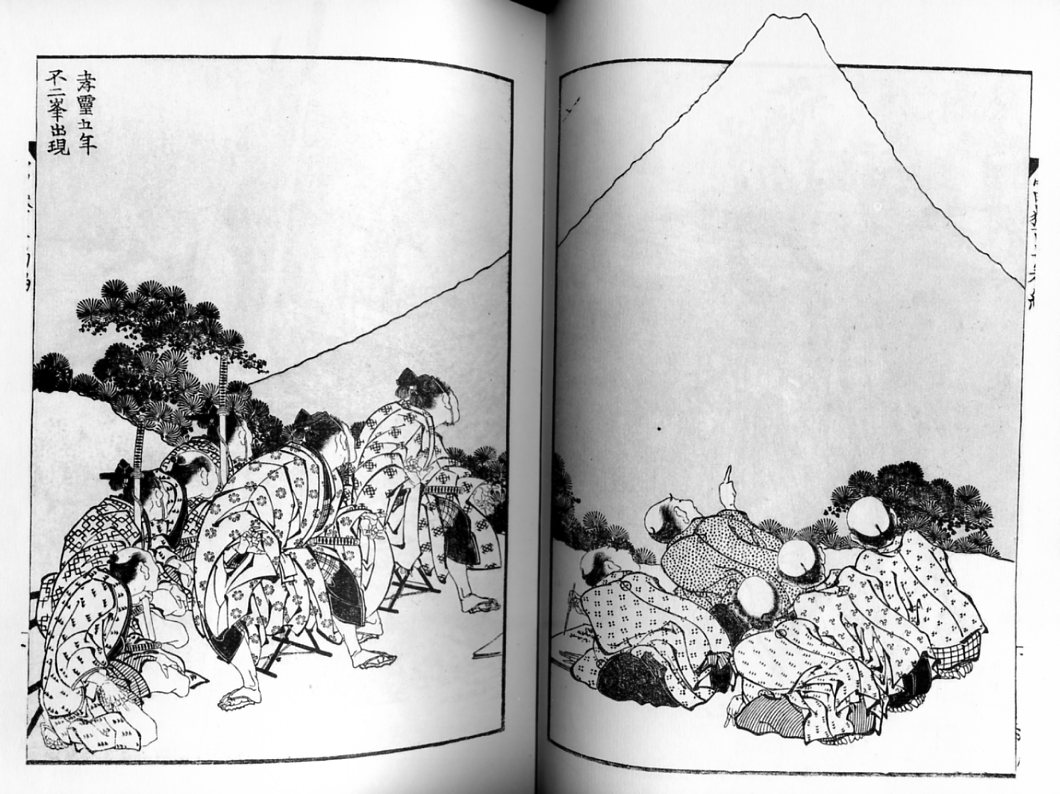
The title is “The Appearance of Mt. Fuji in the Fifth Year of Korei.” It is supposed to show the actual date of the appearance of the mountain. Befitting such a momentous occasion, the figures gathered here are intently focused on Fuji. On the left, government officials stare, their attention riveted — so much so that their hands imitate the curve of the mountain’s top. On the right, a group of villagers gaze with similar single-mindedness…for the most part.

There is one exception though. A single villager has been distracted; he points off to the side at…what? A bird? Falling bird poop? Godzilla?

You could easily read this as in line with the last image. The meaning of the drawing — its purpose and point — is the view of the mountain itself as miraculous and devotional presence. But there’s a story in excess of that image; something has happened, and though we don’t know what it is, it draws us away from the image and on to the next panel, even though, in comic-book terms, there isn’t one.

But while you could read this as narrative excess over the meaning of the image, you could also read it as image excess over the meaning of narrative. The scribe next to the pointing man has been recording the story of the mountain on the day of its new creation. But he is distracted by sight — first of the pointing finger, and then, presumably, of whatever it is over there that we can’t see. For us, the hint of a story is a distraction from the view. But for the writer in the image, the hint of a view is a distraction from the story.

Of course, outside the print, there isn’t really a view or a story — just a mystery waiting to be charged with meaning. Narrative and image both leap at the chance, climbing one on the other, each over each, like Mt. Fuji rising through Hokusai’s frame.