Cursing the Darkness: The Last Horrors of Alex Toth

Fear and suspense can be effectively created by the inference of the unknown. What is shown can be less harrowing than what is implied and then forms in the imagination of the reader. The late cartoonist Alexander Toth disliked drawing explicit horror and violence in the style of E.C., what he called “gore-gulping grind and grunge.” His preferred taste was for adventure fare appropriate for general audiences. However, throughout his career as an interpretive comic artist, he worked mainly on short stories for anthology titles and so he drew many horror stories. The artists of Toth’s generation drew comics primarily for children. When called upon to actually show ghouls and demons, he most often made them as flimsy as the harmless monsters he designed for children’s TV cartoons. Still, Toth is one of the greatest of America’s horror comics stylists because he believably renders the emotions of characters who face shadowy, barely-seen terrors.

As a cartoonist, Toth remains in a league of his own. His succinct, seemingly effortless realism is underlaid with intuitive storytelling and a consummate artistry gained from observation, research, inspiration and dedicated effort. At his best, Toth’s stories fully immerse the reader because he found a way to believe the stories himself. His characters act. Their gestures, movements and expressions are thoughtfully rendered. Everything in his comics is elegantly composed in deep space and insofar as it was in his power to do so, accurately drawn.

Toth’s son Eric recalls that his father “would never use scrap for anything,” that any research he did was committed only to his memory. Toth was like a human camera akin to his primary influence, the brilliant draftsman and graphic journalist Noel Sickles, but with a much more pronounced talent than his idol for dramatic narrative and oblique design. Because of the breadth of his abilities, Toth was highly in demand for designs and storyboards in the much more lucrative field of television animation, but he continued to draw comics because he loved the form.

In the mid-1970s, Toth’s wife Guyla suffered through an initial round of cancer treatments. His general aspect understandably darkened and he had already felt that values were declining in the world. He began to speak and write against the antihero image, which was then becoming prevalent throughout popular culture. He saw it as a negative influence in comics, and in the scripts he was asked to draw. As his wife’s condition worsened, Toth began to withdraw from comics and from the world in general. His work for Warren’s magazines Creepy and Eerie stands as some of the best of his career, but a look at his late works for that publisher also shows the narrowing of his sensibilities.

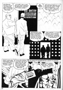
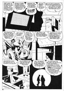
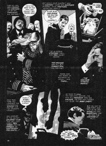
In 1975, a time Toth called an “awful trauma” for his wife and himself, he drew a pair of stories written for Eerie by Steve Skeates about The Hacker, a Jack the Ripper clone. It was impossible for Toth to avoid rendering the bloodletting that the stories demanded. Both episodes also show extensive editorial tampering with Toth’s artwork. During Bill Dubay’s tenure as editor of the Warren magazines, panel borders and lettered captions were often reversed to negative by the production staff. On Tothfans.com in the early 2000s, Toth annotated several of his Warren stories from this period and repeatedly excoriated “damn Dubay” because the alterations interfered with his painstaking orchestration of word and image.

Reversed borders and captions destroy continuity, from The Hacker’s Last Stand.

In his first installment, The Hacker Is Back in Creepy #65, Toth used linear crosshatching to create tonal values, a technique rarely seen in his work. However, the printed story has additional watery grey tones that are clearly applied by another hand. To my eyes, it has the look of a halftoned version of color art. At this time, Warren was running color sections in their magazines and this story might have originally been intended for that purpose. Toth applied tones himself to the second story, The Hacker’s Last Stand in Creepy #67, but the reversed borders and captions muddy his designs and in some places make the work nearly unreadable.

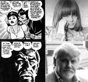
He liked DuBay’s successor, Louise Jones (now Simonson) much better, even though his captions continued to be reversed. Toth wrote his next four Warren stories, all involving subjects of interest to the artist such as U.F.O.s, photography and the early days of film, all without any gruesome spectacle. The artist apparently had something of a phone crush on his editor. In a column written in 1999, his comments about Jones-Simonson are over the top: he calls her “deliciously-irresistibly-sweet,” says he would “walk on hot coals for her” and refers to Walt Simonson as a “lucky devil.” His story Kui from Creepy #79 (1976) features a heroine named Louise, who looks remarkably like Jones (albeit with blackened eyeballs) and becomes caught in a trap-laden pyramid with her explorer lover, who in turn seems to be drawn as a self-portrait.

This is not meant to imply that Jones intended any seduction. She was cajoling work from a notoriously difficult artist, but traumatized people can act oddly and a lonely and obsessive artist might grasp at any sign of appreciation or affection. Perhaps Guyla’s illness and hospitalizations deprived him of his muse, so Toth deflected that role to a friendly feminine voice on the telephone. Regardless, given the end of Kui, Toth seems to have punished them both for his own wayward imagination. Ironically, the same issue of Comic Book Artist that features Toth’s still-enraptured descriptions of his former editor also has an interview with Jones-Simonson, who describes Toth as “brilliant” and as “a very cool guy,” but then claims she had a “long-distance crush” on John Severin. One can only imagine Toth’s reaction when he read this, as he surely did: “damn Severin!”

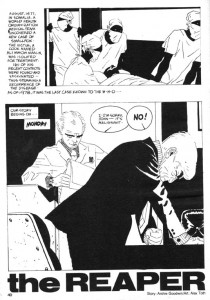
Toth’s comics work ceased for several years, until he finally returned in Creepy #114 (1980) with The Reaper, his last great horror masterpiece. He both drew and lettered Archie Goodwin’s effective story about a biotech lab worker stricken by a tumor. The Reaper is an impressive piece which bookends Toth’s career as a reflection of, and advancement upon, his early masterpiece The Crushed Gardenia from Who Is Next? #5 (1953), which was done just prior to his conscription into the Army. A short crime story by an unknown writer, The Crushed Gardenia is Toth’s breakthrough of high design in psychological comics narrative.

In The Crushed Gardenia, Toth transcends Sickles and Caniff to find his own way.

The spare script inspired Toth’s most plastic, angular drawing and a singular elegance in sequencing and panel structure. He controls all aspects of his pages, lettering the job himself. The distortions of the character drawings reflect the mental state of the sociopathic protagonist. Of Gardenia, Toth wrote to Greg Theakston, “my drawing/storytelling/ characterizations took a new road in this story. I’d found other ways to approach the script-get the feel of it-low key, really–’til action demanded hotting-up–and, design was used more aggressively–so the work wasn’t ‘newsreel-literal’–but had an abstract element in and out of its strung-together continuity.”

The Reaper also features an antisocial lead and throughout, the attenuated oddness of the drawing echoes the idiosyncratic and also somewhat Baltic appearance of the characters that the Hungarian artist drew in Gardenia. However, Reaper pushes farther than Gardenia into the stylization of drawing and page design. It reflects more recent influences: one can see traces of the clear lines of Moebius and the brisk, elegant brushwork of Hugo Pratt, both artists that Toth admired.

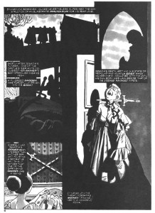
The Reaper, page 2: graphic contrast and othering.

As in all the stories that Toth inked and lettered himself, the incorporation of the text is part of the design of the pages. Throughout his career, he experimented with different forms of lettering and sound effects and tried variations on caption, balloon and tail shapes. In comics, a tail is usually a double line that converges to a point, which hangs from a word balloon and aims at a speaking character. In The Crushed Gardenia, the tips of Toth’s balloon tails hang open and at times converge with the characters’ heads. In The Reaper, the speech balloons have interiorized tails, a single line contained inside the balloon that is inclined in the direction of the speaker. They resemble pressure dials, or clock faces ticking away the progress to disaster. They also contain, quarantine or privatize the confidential conversations taking place in a doctor’s office and a secured laboratory.

In many of his works of the 1960s and thereafter, Toth often subdivides character monologues into multiple balloons, which he distributes in such a way as to lead the reader’s eyes through the narrative and create visual rhythms on the page. In Reaper he does this several times so that the speech balloons multiply into curves across the pages. There are no spaces between the panel borders except to accommodate captions. The panels throughout the story press together or overlap and when overlaid with the staccato clock/dial balloons, form a compositional density that compresses time and adds urgency to the narrative.
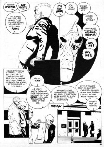
The Reaper, page 3: speech balloons multiply into curves which lead back to the protagonist’s "breast" in panel 1.

Toth renders the main character unsympathetically as effeminate and bitter. Biolab technician John Andrews’ escalating fear and isolation in his disease create a resentment of the masses of “healthy people” who are oblivious to his suffering, and so he takes a vial of smallpox from his job and looses it in the world. John is a compact, well-dressed and sophisticated man who seems modeled on actor Claude Rains, but also apparently wears eyeliner.

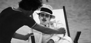
The first time I read this story, John brought to my mind the pedophile played by Dirk Bogarde in the Visconti film Death in Venice, who drains of life on the beach with his makeup running down his face, as the plague closes in.

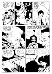
Skater hater: The Reaper, page 6, an interactive patterned composition with nuanced gestures.

Toth’s depictions in this story indulge in some visual “othering.” In the prologue which depicts Egyptians and Africans dealing with plagues from the past, Toth entirely blackened their skin, which is graphically effective but also serves to obscure and flatten these figures. He also feminizes the eyes of Dr. Barnett, the corpulent head of the lab where John works. The story alternates sequences back and forth in time, between John’s doctor visit and his subsequent grappling with his condition, and a tour of the lab facility that Dr. Barnett gives to a visiting Presidential advisor, Syms. Toth artfully reveals the inept security and lax containment of the lab, as well as the integrity of the atypically badly-drawn (read: ineffectual) Syms.

The Reaper, page 8: superlative page architecture, pathetic safety protocols.

The horror of The Reaper is not supernatural but rather is in the realm of the possible, and so the story carries a weight that is rarely seen in Toth’s comics. The artist works here at the height of his abilities, but it was to be his final solo art job on a horror story. Toth tried to draw more comics, but his depression and his perfectionism worked against him. He would be sent scripts and begin to work on them, sometimes drawing multiple versions of the first few pages of the stories, only to abandon them.

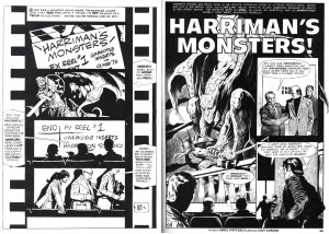
Left: Alex Toth’s self-rejected page. Right: published page by Dan Adkins from Creepy #123 (1980).

It hardly seems fair to hold Dan Adkin’s polished but standard (and unfortunately swipe-laden) effort up against the work of an artist as accomplished and complex as Toth, but a comparison of the two versions of the page above from Harriman’s Monsters is instructive. Toth not only adds a comprehensive design strategy tied to accurate visual references to film production, he also rewrites and refines the captions and dialogue while lettering the story. Still, he gave up and sent the script back to the editor because he felt his art “was too slick and far afield of my usual approach”, a rationale he later could not justify, even to himself. This example of Toth’s inability to complete work emphasizes how terrible his blockage was and how great the loss was to comics as a medium.

Though Jones left and Bill DuBay resumed as editor in 1980, Toth returned to Warren’s pages with his self-written magnum opus Bravo For Adventure (in The Rook #3 and #4, 1980), a fairly straightforward B-movie on paper. He also inked five stories that were pencilled by Leo Duranona, Alexis Romeo, Leo Summers and Carmine Infantino. One can only guess his reasons for doing these. In 1979, Toth had been commissioned by a fan to ink a Jack Kirby drawing. He considered the result to be “inhibited…the whole thing was a mistake,” but perhaps it opened his mind to doing futher collaborations with pencillers. Inking completed pencils might have enabled Toth to avoid the blockage he was experiencing otherwise.

Summers inked by Toth, from the same issue of Creepy as the Adkins page above.

The Toth-inked stories have the feel of experiments and hold clues about his visual thinking. His own sensibilities of light and contrast can be seen in how he chooses to interpret the pencils, especially if one is familiar with the styles of the respective pencillers. Leo Summers’ drawings for an earlier Warren story are clearly influenced by Noel Sickles’ famous illustrations for Hemingway’s The Old Man and The Sea. Perhaps that inspired Toth to ink Summers pages in Kiss of the Plague that are actually far grislier than anything in The Hacker. Several explicitly-drawn impalings are countered by a cartoony but still frightening ghoul at the end. Toth here takes the opportunity to do some unique tonal work, which displays shifts of focus where the artist allowed his markers to bleed.

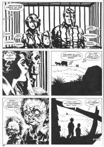
Infantino inked by Toth, from Circus of the Bizarre, Creepy #125 (1981).

The collaboration with his old friend, former DC executive Carmine Infantino is also remarkable in that so much of its loose, expressive cartooning resembles the art of Harvey Kurtzman, and that the caged family on the final page so aptly represent the extinction of Toth’s wholesome American archetypes. This is his last horror comics page. His final efforts for Warren were not in the horror genre, but rather are his two sophisticated Torpedo stories in Vampirella (#108 and #110, 1982). Through 1983 he wrote and drew a few stories for alternative publishers and pencilled several stories for DC, all were in the adventure mode he loved and those were his final completed comics.

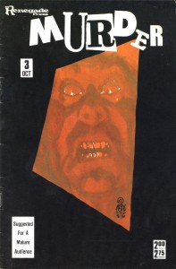
When Guyla died in 1985, he shut down almost completely. He began two decades of letters, mailing a profusion of postcards and sketches to friends and fans until his death in 2006. Toth had written to inker Terry Austin in 1980 that he didn’t want to contribute further to a medium that he believed was destroying itself, “…and so I expectorate, and curse the coming darkness.” Without his wife, for him the world was a bleak and degraded place. His final published horror work was his cover for Robin Snyder’s anthology Murder in 1986. It eloquently embodies his state of isolation. It is a fully rendered color composition of great intensity: a glistening face constricted in a grimace of utmost terror, caught on the tilted, receeding event horizon of a massive black border.

References:

Auad, Manuel. Alex Toth. 1995. Northhampton, Ma.: Kitchen Sink.

Austin, Terry. A.T.T.A. Boy Productions, Inc. Alter Ego, Vol. 3, No. 63, 12/2006.

Cook, David. Alex Toth Biography. 
http://www.tothfans.com/adisplay.php?a=359

Cooke, Jon B. Weezie Jones Simonson. Comic Book Artist #4, Spring, 1999.

Hitchcock, John and Alex Toth. Dear John. 2006. Octopus Press.

Theakston, Greg (Ed.) Alex Toth: Edge of Genius Vol. 1. 2007. New York: Pure Imagination.

Toth, Alex. Before I Forget. Comic Book Artist #4, Spring, 1999.

Toth, Alex. Under The Covers. Jack Kirby Collector #34, 3/2002.

Vandeboncoeur, Jim. Alex Toth: a Comic Art Index. Comic Book Artist #11, 1/2001.

Remembering Alex Toth – Part 2, Transcript of panel discussion with David Armstrong (moderator), Irwin Hasen, Dana Palmer, Eric Toth, Mike Royer, Paul Power, Rubén Procopio, John Hitchcock and Tom de Rosier. San Diego Comic-Con, July 23rd, 2006.
http://www.tothfans.com/adisplay.php?a=368

Muck-Encrusted Mockery of a Roundtable: Clever Is As Clever Does

Reading Richard’s last post I was reminded just how clever Moore was to put his vampires in the water. First of all, it allowed for some incredible visuals…and second it’s just a really smart idea. Vampires don’t need to breathe…so a pond would be a perfect place for them to form a community. Why didn’t somebody else think of that first? (Maybe they did…but even if that’s the case, Moore’s clever for lifting it. (Update: …and he lifted it from Marty Pasko’s earlier Swamp Thing story, according to Alex Buchet in comments — which makes it maybe a little more obvious a lift than I was thinking. Sort of invalidating the whole point of this post. But oh well…that’s blogging for you. Update to the update: no, apparently the idea of having vampires in the lake was Moore. Carry on then.))

One of the things about Moore that’s very unusual for horror writers and for certain kinds of pulp writers is how carefully he thinks things through. He’s got all these ideas about how stuff fits together — if you start here, then that means this, which means you get to that. Steven King, for example, doesn’t do that. His stories make no sense — or they sometimes make sense, but you definitely get the feeling that he’s making it up as he goes along (in Salem’s Lot, for instance, the vampires are sort of solid, sort of not — it just depends on what the story calls for.) Neither do Lovecraft’s, really — it’s all unnameable this and unmentionable that and you know he doesn’t care whether the Yog-shoggoth works or not so long as he can work in a Poe reference. Moore really does care about the mechanics, though — which can end up really badly when he tries to deal with gender anxiety (which Lovecraft, for example, manages to do a lot smarter by being a lot less aware/explicit about what he’s doing). But it can also give you a tour de force like the Anatomy lesson, where everything you think you know about the character gets turned inside out.

Basically, Moore seems like a very deductive writer — which seems like perhaps not the best fit for horror, which tends to work best when it deals with subconscious inklings and anxieties rather than with ratiocination. Moore really hit his stride when he moved towards works which had a greater focus on ideas rather than on the half-formed dream world of horror.

Though those vampire issues are still scary. And the monkey-king was pretty bad ass…. Moore could do horror if he put his mind to it, even if it did work against his strengths in some ways.

Update: The whole swamp thing roundtable is here.

Muck Encrusted Mockery of a Roundtable: Swamp Fear

(Part 1 of the Swamp Thing roundtable can be found here and Part 2 can be found here).

In addition to being part 3 of the Swamp Thing roundtable, this post is also a follow-up to last week’s post where I questioned whether comics could ever be scary.

To recap, I asserted that horror comics could never incite the intense, visceral fear that horror movies so easily manage. Horror comics would be better off if they had more in common with horror novels, which generally have slow-burn stories that exploit common fears and social anxieties. There were a lot of great comments to the post, and I want to go through a couple of them before I get to Alan Moore’s Swamp Thing.

While I argued that the static nature of the comic page undermined any attempt at being scary, Michael DaForge offered a different take:

“Comics can use their “static-ness” to their advantage, I think.
I’m jumpy and easily manipulated by music or loud noises in
a movie. In Anti Christ, the genital mutilation startled me (or
grossed me out or whatever it was supposed to do?) But it didn’t
stay with me the way the scene with the stillborn fawn did from
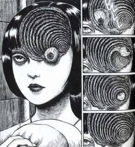
earlier in the film. Or this sequence did from Uzumaki:

… [W]hen it’s 5 am and I’m having a hard time getting to sleep,
I’ll remember stuff like that.”

That’s a good counterpoint, and Uzumaki demonstrates why having the right kind of art is essential for a horror comic. Unfortunately, the art in most mainstream horror comics is simply too indifferent to tone and mood to instill any feelings of fear in the reader.

Aaron Ber commented later that there should be a distinction between “creepy” and “actual fear”. He went on to say:

“Not to keep making this a comics vs. film thing, but horror is one
of the most demonstrable ways I can think of to show how effecting
film can be. People experiencing fear in a film can have physical
reactions on an involuntary level, as if their safety is actually being
threatened. I just don’t think comics can work that directly – to the
point where on some level you are no longer conscious of the fact
that what you are experiencing isn’t actually happening to you.”

I think Aaron Ber is right to the extent we’re discussing heart-racing, hands-over-your-eyes scary. Comics will never be able to provoke that kind of reaction from the reader. However, I don’t think there’s an clear distinction between what people find creepy and what they “actually” fear. Fear encompasses a broad range of emotional responses: sometimes it’s an immediate physical reaction, as when something startles you, but other times it can be a lingering sense of unease or a recurrent anxiety. A comic with a creepy story and disturbing imagery can potentially stay with the reader longer than a movie about a chainsaw-wielding psycho. So perhaps comics can’t be “scary” as the term is commonly understood, but creepy is a good alternative.

And now I’ll finally start discussing the actual topic of this roundtable. Not every issue of Swamp Thing is a gem. Not every issue is creepy (nor were they all intended to be). But Alan Moore could write an unsettling story when he wanted to, and he collaborated with a team of fantastic artists, particularly Stephen Bissette and John Totleben. And one of the best stories during their run on Swamp Thing also happened to be one of the creepiest.

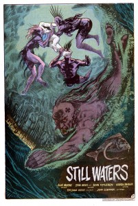
The vampire storyline in issues 38 and 39 was part of a larger arc where Swamp Thing had to run errands for John Constantine (of Hellblazer fame). One such errand took Swamp Thing to Rosewood, Illinois, an entire town submerged beneath a lake. And the only residents of this underwater hamlet were vampires. In Alan Moore lore, running water is lethal to vamps, but the stagnant water of the lake provided the perfect environment to avoid the sun while still hunting dumb teenagers who went for a swim.

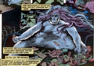
It’s a simple, pulp monster story, but Moore was absolutely committed to making it as creepy as possible. He accomplished this partly through some plot details that were equal parts eerie and gross. The one that immediately springs to mind is the morbidly obese vampire bride.

There’s just something so repulsive about a fat monster that spends her day wallowing in the filth of an abandoned movie theater.

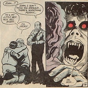
Another way to make a monster story creepy is to be as ruthless as possible. In other words, anyone can die in any number of awful ways. But in an ongoing series like Swamp Thing, it’s nearly impossible to convince readers that the titular character is in any real danger. Moore wisely evaded this problem by introducing lots of supporting characters that could be offed in short order. He had no reservations about killing a teenage boy at the beginning of the story. And it only got worse from there, especially when the undead boy was reunited with his mother.

While Moore may be a great pulp writer, in the hands of a different art team his script would have come across as a nothing more than cheesy monster plot with overripe narration. As the above panels make clear, the unsung heroes behind Swamp Thing‘s success are Bissette and Totleben. Along with Stan Woch in issue 38, they gave the comic a brooding tone with their heavy use of hatching and black space. And the colorist, Tatjana Wood, enhanced Bissette’s and Totleben’s work with murky greens and blues for the underwater scenes.

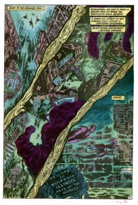
The above page is a great example of how their work set the mood of the comic. Plot-wise, this page is nothing more than the vampires descending into their hidden city, but the depiction of the city is terrific. Readers can recognize the details of any American street, but those details are only partially drawn or deliberately obscured by hatching as well as black and near-black colors. It’s an ugly, lurid mockery of a small town, where light from the surface can only barely penetrate the foul water. And the dead fish designs in the gutters add to the sense of muck and decay. It’s easy to see why young readers in the 80’s found Swamp Thing so affecting.

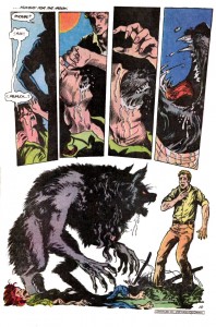
Even when Moore’s scripts aren’t very good, Bissette and Totleben are there to elevate the material. Suat and Noah beat me to the punch with their debate over issue 40, a.k.a. the PMSing-werewolf issue. It’s easily one of the silliest issues in Moore’s run, but it has one of the nastiest werewolf transformations that I’ve ever seen in any media.

To borrow a point from Michael DaForge, the static nature of comics, along with the ability of readers to linger on each panel, actually makes the scene much more effective than a similar transformation in a movie. The intensity and horror of the moment are emphasized by the stillness of each image. And I agree with Noah that Bissette and Totleben draw a great-looking werewolf.

Swamp Thing is never scary in the way a great horror movie is scary, but it doesn’t need to be. Instead, Moore, Bissette, and Totelben created a few short stories with creepy plots and nightmarish imagery. And those stories were, at least for me, far more memorable and affecting than the last few zombie/slasher/haunted house movies that I’ve seen.

______________
Update by Noah: The whole Swamp Thing roundtable is here.

Can Comics Be Scary?

Eric B. doesn’t think so. In response to my post on contemporary horror comics, he wrote:

“How’s this for a random unsubstantiated claim:

I don’t think comics can be scary, period. Too small…
too quiet…too temporally static. Never been scared
by any horror comic I’ve read…not a one. Yet…I
can’t watch horror movies–predictable or not–too scary.”

After thinking over the horror comics that I’ve read, I’m forced to agree with him. Even when I enjoyed a horror comic, such as The Walking Dead or some of the earlier Hellblazer comics, I didn’t find them particularly scary.

There’s certainly no way that comics can be scary in the same way that movies are scary. Comics can’t use mysterious noises or creepy music (textual representation of sound is a poor substitute). Also, since movie-goers instinctively understand that the world of the film extends beyond the view of the camera,  horror films routinely have their monsters lurk just outside the frame. And they can startle the audience by having the monster (or a fake-scare cat) pop out from outside the camera’s view. In comics, establishing clear spatial relationships from one panel to the next is difficult enough without also having to imply that there’s something lurking off-panel. And the “temporally static” nature of comics makes it impossible to startle readers with anything popping out.

But the greatest advantage that horror movies have over comics has less to due with the technical differences between the media, and more to do with how the average person watches a movie. Over the decades, Hollywood and the theater chains trained audiences to watch movies in a certain way: you turn out the lights, ignore everyone else in the room, and stop thinking. Movie-goers become completely immersed in the narrative, and horror films exploit this immersion like no other genre. As an example, when the soon-to-be victim wanders through a dark hall to investigate a strange sound, the camera forces the viewer to follow the victim and vicariously experience everything they see and hear.

Comics simply can’t offer the same degree of narrative immersion. For starters, reading comics with the lights off is rather difficult. Also,  immersion requires a passive mind, and comic readers can never turn their brains completely off. Even the most moronic superhero title still requires some active thought in order to read the text and interpret the narrative flow between panels. None of this is meant to say that comics can’t be engrossing page-turners, but comic readers generally don’t lose track of reality to the same degree that movie-goers do.

So does this mean that comics can never be scary? To the extent that “scary” refers to the visceral, immediate fears that horror movies deliver so effortlessly, the answer is yes. But if “scary” also encompasses the deeply-rooted fears and common anxieties of the readers, then perhaps there is some hope for horror comics.

Novels have many of the same technical limitations as comics, and yet there is a long literary tradition of horror dating back to Frankenstein, and horror writers such as Stephen King continue to enjoy great success. Obviously, a medium consisting entirely of text could never scare readers with startling noises or monsters jumping out of closets. So novelists tend to downplay immediate physical terror and focus on social fears and unnerving concepts, particularly of a religious or existential nature. Frankenstein reflected the major anxieties of the Romantic era, particularly the fear of a godless mankind. H.P. Lovecraft scared his readers by envisioning a universe that was essentially hostile. Most ghost stories exploit the fear of death and the the unknowable nature of the afterlife. There’s no reason why comics couldn’t tap into similar social or religious anxieties (and it’s worth noting that the best horror films already do so).

But horror comics have largely failed to measure up to the standards of horror novels. The earliest horror comics like Tales from the Crypt were designed to offer nothing more than the cheapest and shallowest entertainment. Plus, individual comic issues were simply too short to contain a plot with any complexity. And it was always easier to just add more gore than to write a gripping story. The visual element of comics may have also convinced comic creators that their medium had more in common with film than with literature, leading to futile efforts to re-create the thrills of horror movies on the static page.

Comics have the potential to be scary, but it’s a potential that remains unrealized. There is, however, the possibility that my knowledge of horror comics is too limited, so I’ll pose a question to the commenters: have you ever read a scary comic?

Anything But Capes: Blog of Terror

This week, I’m reviewing five recent horror comics. Unlike barbarian comics, which I discussed back in January, horror comics are not scarce. It seems every publisher has at least a couple horror titles, and in the case of some of the smaller publishers (IDW, Devil’s Due), the majority of their comics are horror. However, as many as a third of these titles are licensed properties (that is, they’re based on movies or video games). I chose to review only original creations, not because they’re inherently good, but because I’m more interested in stories that are specific to comics. These five titles aren’t necessarily the best or the worst, but they are indicative of what American publishers are releasing in 2010.

Reviews:

Hellblazer #264
Publisher: Vertigo
Writer: Peter Milligan
Layouts: Giuseppe Camuncoli
Finishes: Stefano Landini
Colors: Trish Mulvihill

What’s the division of labor between the artist who does layouts and the artist who “finishes?” I assume the layout artist determines the shape and number of panels on each page, and perhaps also the contents of each panel. The finishing artist then adds the necessary details (or is my assumption completely wrong?). This could lead to some awkward, ugly comics if the two artists have different styles. But this is a Vertigo comic, and most of the artists who work for Vertigo tend to use the same semi-realistic, functional style that effectively conveys the story without drawing attention to itself. Camuncoli and Landini work well together, and they produce a comic that’s clear, consistent, and bland.

As for the story, this issue is the final chapter in a storyline within a book that’s been published continuously for two decades, so it isn’t exactly a great jumping-on point (and no recap page, because DC/Vertigo thinks recap pages are for wimps). Still, Peter Milligan is an experienced mainstream comics writer, and he knows that every issue is someone’s first, so he provides narration at the front of the book that helps new readers catch up. The plot, in a nutshell, is about John Constantine fighting a Victorian-era demon in Mumbai. Like the art, the writing is polished and professional, though not particularly memorable.

While it’s also tempting to complain that the story is predictable, predictability is really the whole point. Hellblazer, like most long-running titles, is comfort food for fans, and Milligan knows where and when to deliver the expected beats of a John Constantine story. There are demons, spells, smoking, and British profanity. But the old, reliable formula that makes it good comfort food also makes it terrible horror. Horror works best when it exploits the fear of the unknown and the unexpected. This is why horror film franchises quickly descend into self-parody – once the monster is revealed in the first film, the audience no longer fears it, so the sequels are just the repetition of events that are humorous and comforting precisely because they’ve lost the ability to scare. Milligan’s take on Hellblazer avoids becoming a self-parody by simply abandoning any pretense at being scary. It’s a magic-themed action/adventure that’s indistinguishable from the superhero titles published by DC, except that the characters get to say “fuck” instead of “#&$%.”

The Walking Dead #70
Publisher: Image
Writer: Robert Kirkman
Artist: Charlie Adlard
Gray Tones: Cliff Rathburn

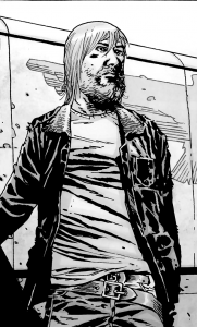
According to the Direct Market sales charts posted at The Beat, The Walking Dead is one of Image’s best-selling monthly comics. Which is bizarre, because if there was ever a comic that should only be read in collected volumes rather than monthly issues, it’s The Walking Dead. Kirkman’s pacing ranges from leisurely to glacial, but that’s not necessarily a bad thing in a longer book. The horror of The Walking Dead has less to do with the zombies than with how their ever-present threat transforms the survivors. Over the course of a trade, readers can appreciate how all the characters (or at least the ones that don’t get offed) slowly change, usually for the worst, in response to the collapse of civilization. But it’s hard to get any sense of that in a typical monthly issue, which has only a small portion of the plot and character development. Issue #70 is a perfect example: the survivors are welcomed into a walled, zombie-free community and meet the community leaders (who will probably turn out to be evil). That’s it. In another six to twelve months this might become an interesting story, but I can’t imagine paying $3 a month for snippets of content.

The art in the issue is easier to discuss. Adlard’s style is thoroughly mainstream, meaning a realistic aesthetic and a simple panel layout that moves the narrative forward. The one unusual aspect of the art (by the standards of mainstream American comics) is that it’s in black-and-white.

This was a clever creative decision, as the black-and-white gives The Walking Dead an earthy, retro vibe reminiscent of the classic zombie film, Night of the Living Dead. But setting aside the pop culture homage, Adlard rarely does anything interesting with the black-and-white format. On occasion, he’ll use dark inks and sharp contrast to evoke a film noir tone, but most of the panels wouldn’t be harmed by the addition of color. In other words, the art does what the story requires of it, nothing more and nothing less.

The Unknown – The Devil Made Flesh #4
Publisher: Boom! Studios
Writer: Mark Waid
Artist: Minck Oosterveer
Colors: Andres Lozano and Javier Suppa

The first thing I noticed about The Unknown is that it has a recap page that efficiently summarized the previous three issues. As a new reader, I liked this feature. I will never understand why DC and a few other publishers refuse to include recap pages. If you insist on publishing monthly issues, then why not throw new readers a bone? Not everyone can jump in on the first issue.

The story centers on Catherine Allingham, a detective who’s slowly dying from a brain tumor. On top of that problem, she’s been dragged into a mystery involving a small town serial killer and a ghost that keeps possessing the townspeople. It ends with a big battle in a cave and some revelations about future storylines, which may involve the Devil (made flesh). Like most contemporary comics, The Unknown has a “decompressed” pace, meaning that the plot and characters are gradually developed over multiple issues. But unlike Robert Kirkman, Waid knows how to squeeze as much content as possible into 22 pages. Reading a single issue of The Unknown feels like reading four issues of The Walking Dead.

But more content doesn’t equal better content. Waid’s writing has always beens mechanical and generic, like he’s working from a genre checklist. Characters do exactly what readers expect of them, and plots resolve themselves in the simplest manner possible. The Unknown is no exception: the central conflict ends with a violent climax, the villains get their appropriate comeuppance, and a sufficient amount of information is revealed to move the larger story forward.

The art doesn’t help matters. Oosterveer attempts a straightforward, mainstream style, but his art comes across as amateurish. Spatial relationships are confusing, backgrounds will be drawn in detail in one panel but disappear in the next, and the characters’ faces frequently go off-model. To put it simply, the entire comic just looks half-assed and rushed.

Devil #1 (of 4)
Publisher: Dark Horse Comics
Writer/Artist: Torajiro Kishi and Madhouse Studios

Someone at Dark Horse decided that they needed a new horror comic, something fresh and original. And where are all the fresh and original ideas coming from? Japan! So Dark Horse formed a partnership with manga-ka Torajiro Kishi (best known for the yuri title Maka Maka) and anime producer Madhouse Studios (Ninja Scroll, Vampire Hunter D: Bloodlust). The fresh and original idea they came up with was a story about cops who hunt vampires … which admittedly sounds like every third comic published in the 1990s.

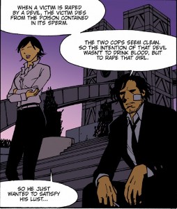
But there are two twists. The first is that the vampires are called devils, because in a post-Twilight world, “vampire” is no longer hardcore. The second twist illustrates why Japanese creators are always the smarter choice. I’ll let the main characters explain:

“When a victim is raped by a devil, the victim dies from the poison contained in its sperm.” And by die, they mean burst like a water balloon.

This is why Dark Horse needed Kishi and Madhouse Studios. Any American hack can write a story about cops who hunt vampires. They might even throw in some misogyny. But when it comes to uncensored depravity, American creators are actually quite timid. You need a Japanese creator to get a story about poison sperm that causes women to explode. It’s not any good, of course, but extraordinary sleaziness has a way of concealing every other flaw.

We Will Bury You #1 (of 4)
Publisher: IDW Publishing
Writer: Brea Grant with Zane Grant
Artist: Kyle Strahm
Colors: Zac Atkinson

Brea Grant plays the character Daphne on Heroes. That’s a red flag: when an actor starts slumming in the funny book industry that usually means they’re pitching a movie script disguised as a comic.

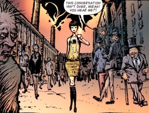
Though perhaps I’m being unfair to Grant, because I can’t imagine a major studio ever producing a film adaptation of this comic. The pitch: in 1927, a cross-dressing Ukrainian immigrant and her taxi dancer girlfriend are planning to flee New York after murdering the girlfriend’s husband, but they get caught up in a (Communist-themed) zombie apocalypse. Now that’s what I call high concept.

As this is only the first issue, it’s hard to say whether it will turn out to be a original zombie story. The zombie sub-genre has been thoroughly explored in every medium, and Grant is hardly the first writer to link zombie scares to the Red Scare. On the other hand, there’s never been a zombie story featuring flappers, and who doesn’t like flappers?

Plus, the comic has some engaging artwork.

Kyle Strahm’s style, with its distorted physiques and bleak backgrounds, is well-suited to horror. And the use of numerous thick lines gives his art a coarse, disheveled look. It effectively captures the grime and poverty of New York City tenements in the early 20th century. Zac Atkinson uses color to great effect too, as key characters are given more vibrant outfits so that they stand out from the darker backgrounds. More than a few panels, however, are rough around the edges in ways that Strahm probably didn’t intend. There’s a thin line between bleak and boring, and Strahm’s backgrounds occasionally step over it, and the facial features of the heroines seem to change on every other page.

Despite some misgivings, I liked the first issue of Brea Grant’s comic. It’s certainly better than her TV show.

State of the Genre

Overall, the horror genre is doing quite well. It has its share of shitty comics, but there are a few decent titles in the mix. And despite the dominance of superheroes in the Direct Market, horror comics have carved out a stable niche. There’s a broad selection of titles available in a variety of sub-genres (though zombies are far and away the most popular). It’s also worth mentioning that there are several genre hybrids that I passed over for reviewing, including Hellboy (horror/superheroes), Locke and Key (horror/fantasy) and the recently released Choker (horror/crime). On a less positive note, there’s an awful lot of licensed properties, but that’s hardly surprising given that an established brand with a built-in fanbase is always the safer bet. Fortunately, the horror genre hasn’t yet become an endless parade of Freddy v. Jason v. Chucky one-shots.