The index to the Comics and Music roundtable is here.
_______________
Forgive me– as if to make this piece as dilettantish as possible, I am going to bring film into a discussion of comics and music.
The first pages of New Treasure Island by Sakai Shichima and Tezuka Osamu, much praised for its cinematic quality
It’s seems to me that when a comic’s flow of panels and pages works ‘musically,’ it also behaves cinematically. The artist’s shifting of perspective and the rhythm of the ‘cuts’ echo filmic sequences that are usually accompanied by a score. Sometimes, when I come across these sequences, it feels like phantom music– like a phantom limb– underscores the comic. It’s a struggle to read along to, or to figure out how the melody goes. Going back to re-read or dwelling on an image too long disrupts the phantom score irrevocably, and forfeits some of the emotional impact of reading the comic. As a teenager, I tried unsuccessfully to hum along or deejay background music while I read comics, hoping to discover total emotional absorption.
Today I better appreciate comic’s more complicated relationship with time and space. I believe I was stupidly hoping to watch– or listen– to comics as opposed to reading them. I wanted to be passively taken in, when I had to stake my own way through a comic book. If watching a film is like having a dream, reading comics is like lucidly dreaming– there’s an exchange of vibrancy and intensity for control and self-awareness.
Cinematic pacing still confuses me. It’s found a natural home in many comics, yet it is a very anti-Greenbergian hold-over from another medium. Cinematic pacing does not accentuate the qualities that are most fundamental to comics, and instead channels comics’ unique handling of time, space and design into straightforward, uncomplicated narrativity. That’s not to say some overlap hasn’t occurred– cartoonists often work as storyboard artists. I don’t think cinematic pacing should be avoided, or that it poses a threat to ‘native’ comic pacing. But I do feel that the relationship of comics and film is worth examining, especially as the value of comics is increasingly understood in terms of their adaptation into film– where the story is finally told with real-life music.
I’ll clarify what I mean by cinematic comics. Comics are cinematic when they follow established film and cinematographic formulas of conveying time and space in a dramatic, rhythmic, and unambiguously linear fashion. I am also tempted to add ‘decompressed,’ yet some film conventions are highly compressed, (montages without establishing shots, for example.)
Not all films follow the same cinematographic formulas, and the great ones complicate or invent them. Some formulas are grammatical, like how a bird’s eye view/pan/combination is used to introduce a story, as in American Beauty or Blade Runner. An easily identifiable variation, like Citizen Kane’s No Trespassing sign, is copied intentionally through homages and parodies, and if it becomes prevalent enough, it’s recycled unintentionally. Another example are the fantasy battleground scenes that flooded theaters after the run of Lord of the Rings. These formulas are most often accompanied by music to heighten the emotional effect, and the style of the music is included in the formula.
There are many stirring music-less film sequences, yet the connection between music and emotion in narrative is pretty well established, (and necessarily predates the term melo-drama.) To keep things as simply and as overly-generalized as possible, I will vaguely refer to commercial moviemaking scores from the last fifty or so years– think John Williams, Thoman Newman, Elmer Burnstein, Joe Hisaishi and Howard Shore.
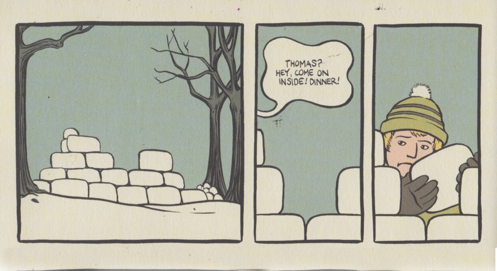
Cinematic comics isn’t a discreet category as much as a collection of traits. Very cinematic comics will more frequently carry more of these traits. Panel proportions offer one example. A panel’s size usually determines the time a reader will stare at it. In cinematic sequences, the panel size will echo the legnth of a cut. Smaller panels dispaly a smaller fraction of time, which is not always the case in comics where the page’s design, or other criteria, are more important than the linearity or pacing of the reading. Small-size, low-content panels allow the eye to ‘bounce’ across the gutter, like a script’s ‘beat,’ without twisting the amount of time the panel naturally represents.
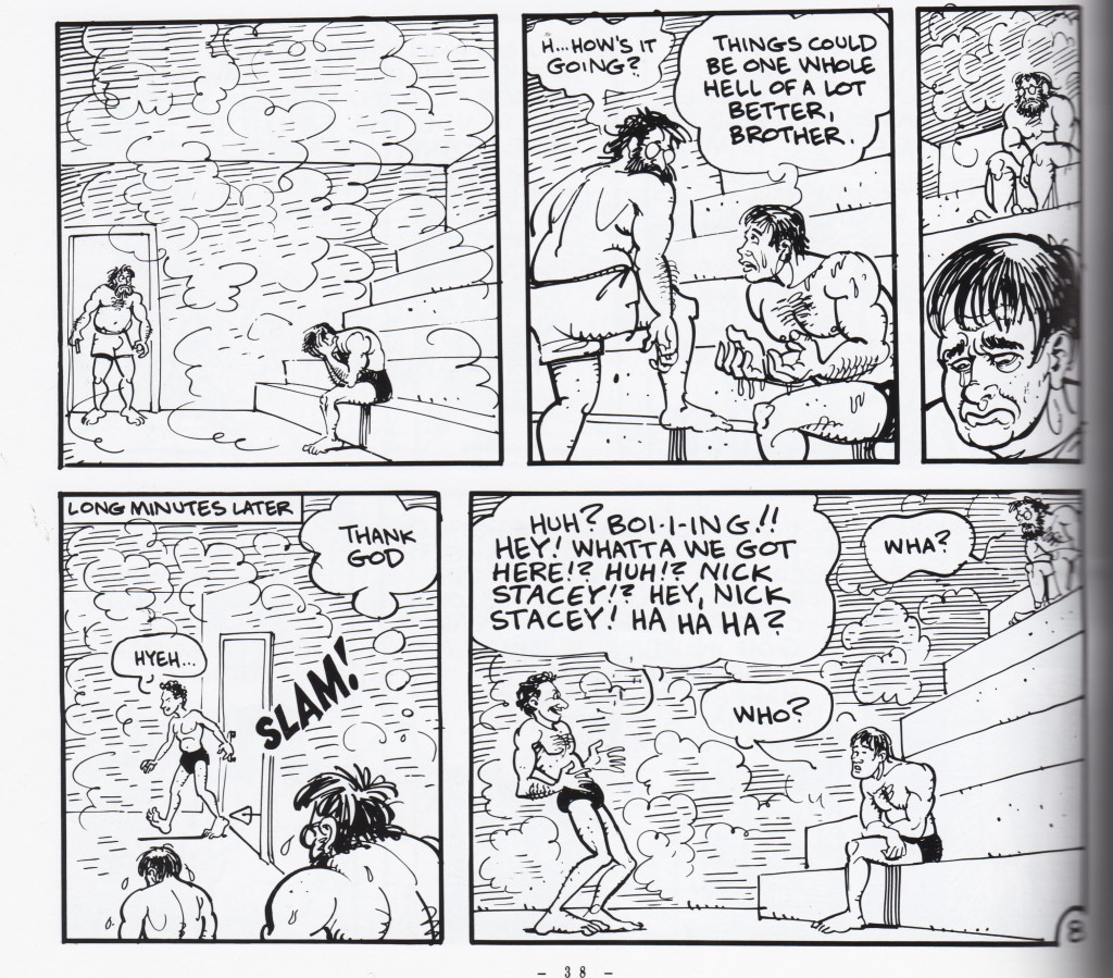
Non Cinematic– Panel size determined by design, not by the length of the time it represents. From Adam Hine’s Duncan the Wonder Dog: Show One
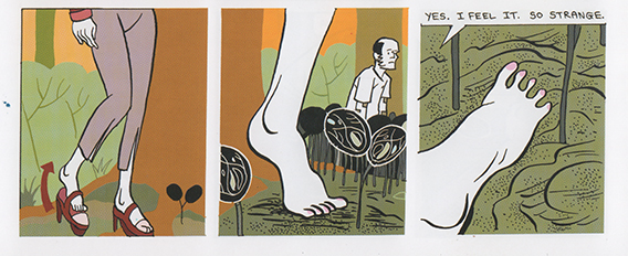
Non Cinematic– The third panel is small, but designed to be dwelled upon for some time. From Invisible Hinge by Jim Woodring
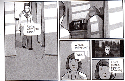
Cinematic — Panels represent one cut, and small wordless panels work like ‘beats’
From Bodyworld, by Dash Shaw
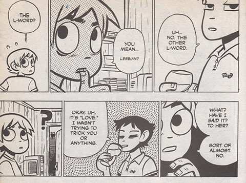
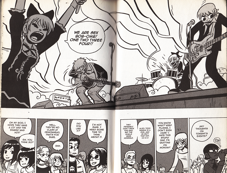
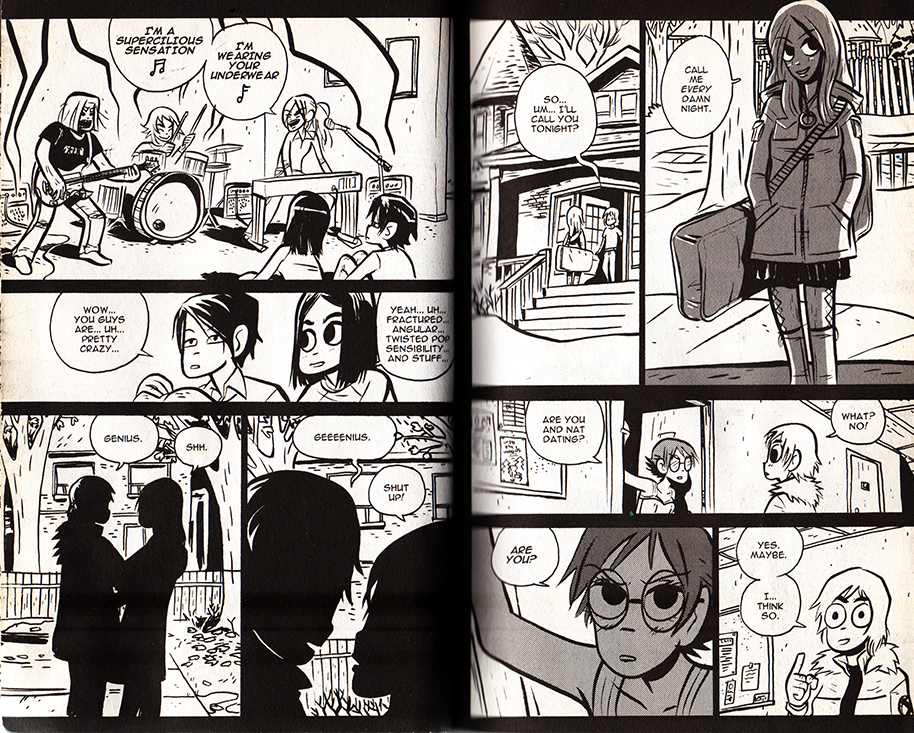
Cinematic — Panels represent one cut, the size suggests the length of time represented, and small wordless panels work like ‘beats’ From Scott Pilgrim Gets It Together by Bryan Lee O’Malley
In a cinematic comic, a panel’s text to image ratio is usually small, and corresponds to how much dialogue belongs inside one ‘cut,’ or between moments of physical acting. Reading the panel aloud, this is often under thirty seconds. A preponderance of textless panels showcase ‘beats’ of the character’s wordless performances, and occasionally more panographic panels and splash pages demonstrate setting or spectacle. These are sometimes an exception to the rule: splash panels and pages can be three to twelve times larger than an average panel, yet unless there is text they don’t necessarily take that much longer to read. Nevertheless, the moment depicted is mentally understood to last longer, and that it eludes to a build-up and follow-through that wasn’t drawn. Larger, more detailed panels with multiple speech bubbles work like a ‘pan,’ where the camera scrolls across a larger field of vision.
The cartoonist’s perspective choices share commercial filmmaking’s desire for clear communication. If the character is about to step on a rake, a successful cartoonist will most often show the ‘build-up’ and ‘event’(approaching and stepping on the rake,) within the larger environment, and only afterwards show a close-up of the character’s reaction, etc.
The cinematic comic’s cuts are determined largely by dialogue, and by fight-scene and slapstick choreography, and when there is neither, by the comic’s internal rhythm. In film, this rhythm is determined by the score, which needs to match, the pacing of the talking/fighting/comedy scenes as well. As long as the cartoonist obeys cinematic conventions, the more rigorously rhythmic the pacing, the more strongly a phantom score can adhere to it.
Certain comics rhythms/formulas recall certain filmic rhythms/formulas, and by association, inadvertently acquire phantom film scores. Cartoonists are a little helpless– while a filmmaker could pick an iconic or untraditional song to accompany a sequence, a cinematic comic only triggers a super-conventional-hodgepodge-memory of what song ‘should’ go there. Friends hanging out on a summer afternoon demands calls for a low-key, chirpy groove. A troop’s noble suicide mission demands the Lord of the Rings bombast. A sad remembrance cues violins. And if the comic’s pacing is cinematic enough to strongly suggest a score, its absence is distracting. The tingling of a phantom limb is most often painful.
In conclusion, a meandering examination of some cinematic comics:
Scott Pilgrim!
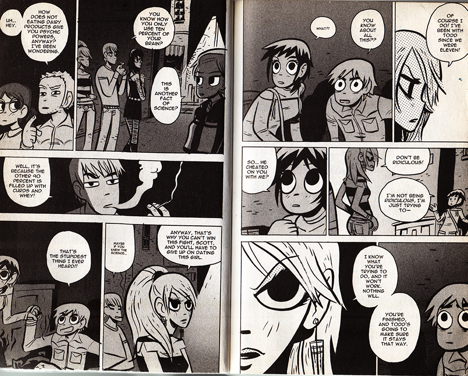
Music plays an even larger role in videogames than it does in film. And when I think of a ‘cinematically paced’ comic, Bryan Lee O’Malley’s videogame-infused Scott Pilgrim series immediately comes to mind. Coincidentally, the characters play, discuss and listen to a lot of music. What does Sex Bob-omb sound like?
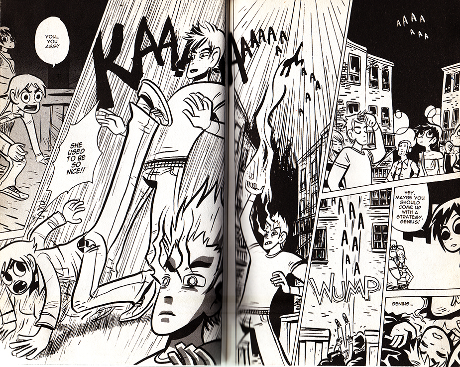
The books toggle with several cinematic genres and conventions. O’Malley showcases a playful mastery of anime and martial-arts cinematoraphic formulas. At two points the comic frames itself with a few vox pops, but I guess that could be as much of a homage to Dan Clowe’s Deathray as Boondock Saints or Monty Python’s Flying Circus.
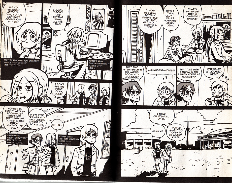
Most impressively, Scott Pilgrim uses hyper-condensed styles of cinematic storytelling, as when a whole relationship is traced over a series of pages. As long as filmmakers establish iconic characters and settings, audiences can easily follow a scattered montage. In comics, the specificity of the background often sacrifices the clarity of the characters, and a drawn interpretations of places are often unfamiliar and stylized. It’s a testament to O’Malley’s craft that this scene (below) is so effortless to follow. O’Malley uses this technique at several points in the series– pointedly never for athletic training ala Rocky, but always for relationships.
From Scott Pilgrim Versus The Infinite Sadness
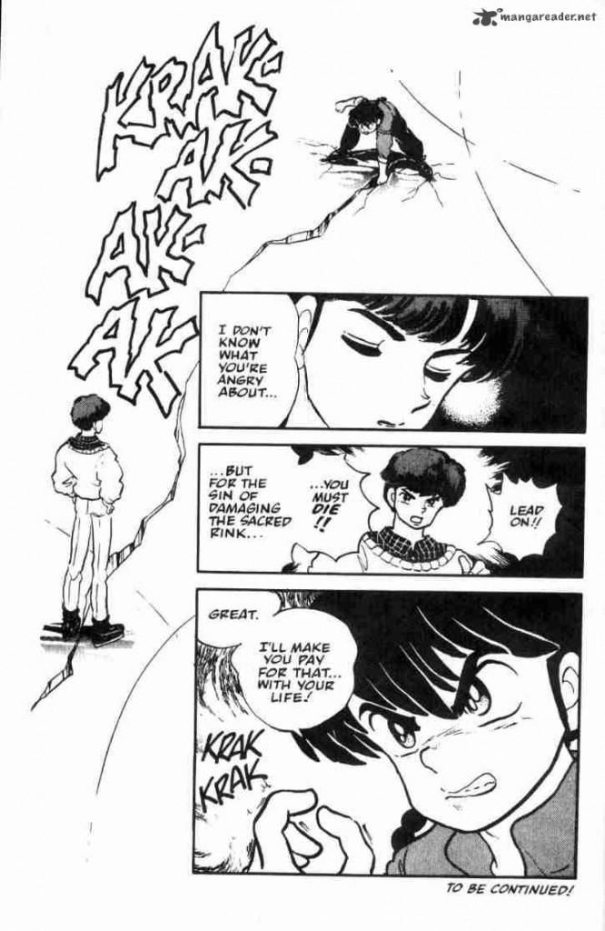
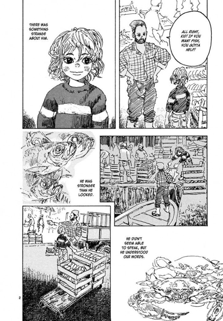
Reading comics, I’ve often felt that manga reads more cinematically than American comics, because of the smaller text to panel ratio. I don’t have any hard evidence for this, but manga is thought to be a major influence on the development of decompressed and widescreen comics.
Read Right to Left:
From Rumiko Takahashi’s Ranma 1/2: Volume 3
From Daisuke Igarashi’s Children of the Sea #8
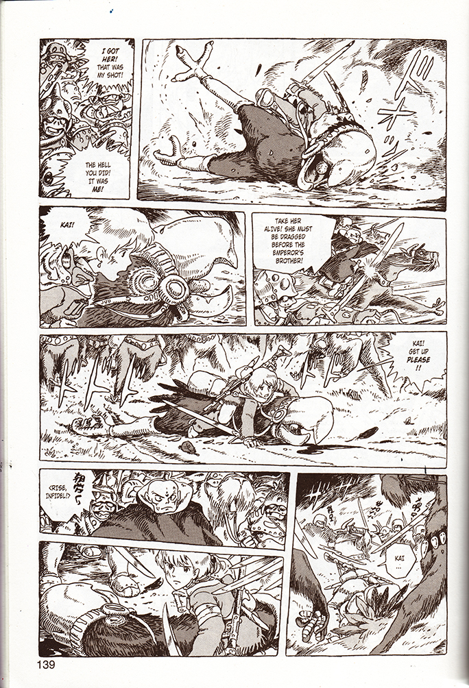
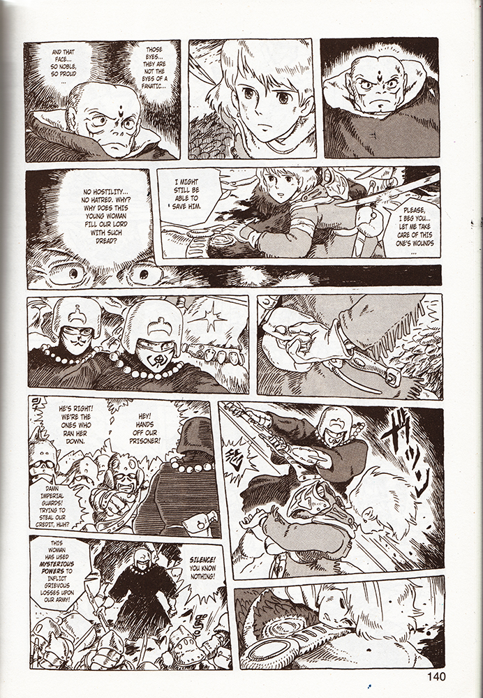
Akira, (the quintessential decompressed comic,) and Nausicaa of the Valley of the Wind are slightly higher brow (and arguably Westernized) examples, and coincidentally are better known for their film adaptations. As comics, both read like gorgeously realized, meticulous storyboards. Reading Nausicaa, I found myself mentally humming pieces of classic Hollywood war and western scores, and occasionally, (appropriately,) a little Hisashi. Yet I’ve never seen the film adaptation with his score.
Read Right to Left:
From Nausicaa of The Valley of the Wind, Book 3
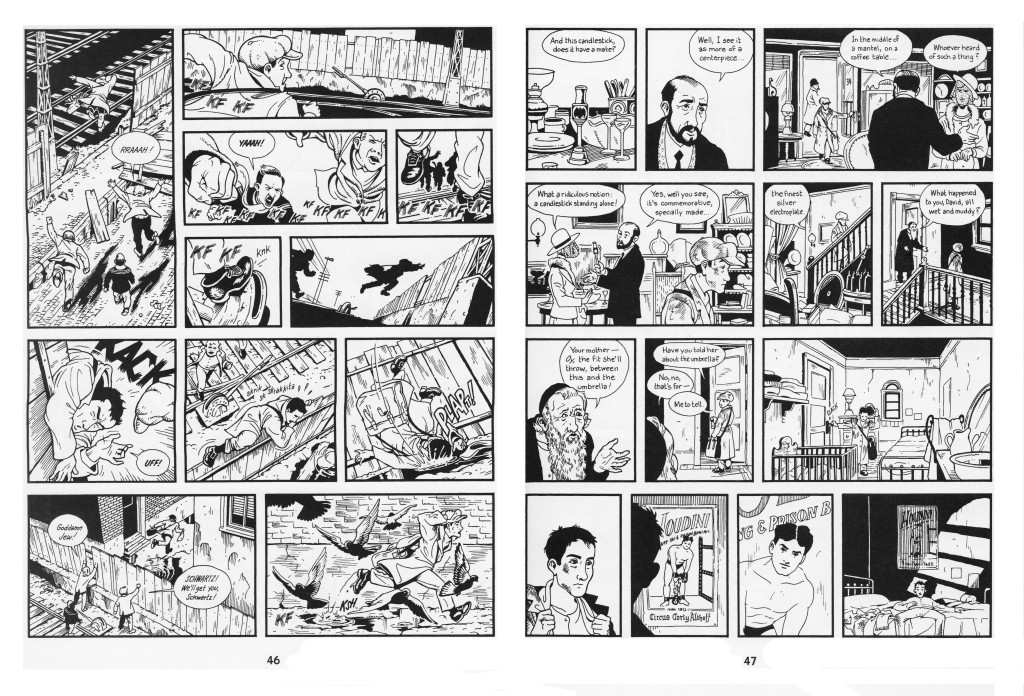
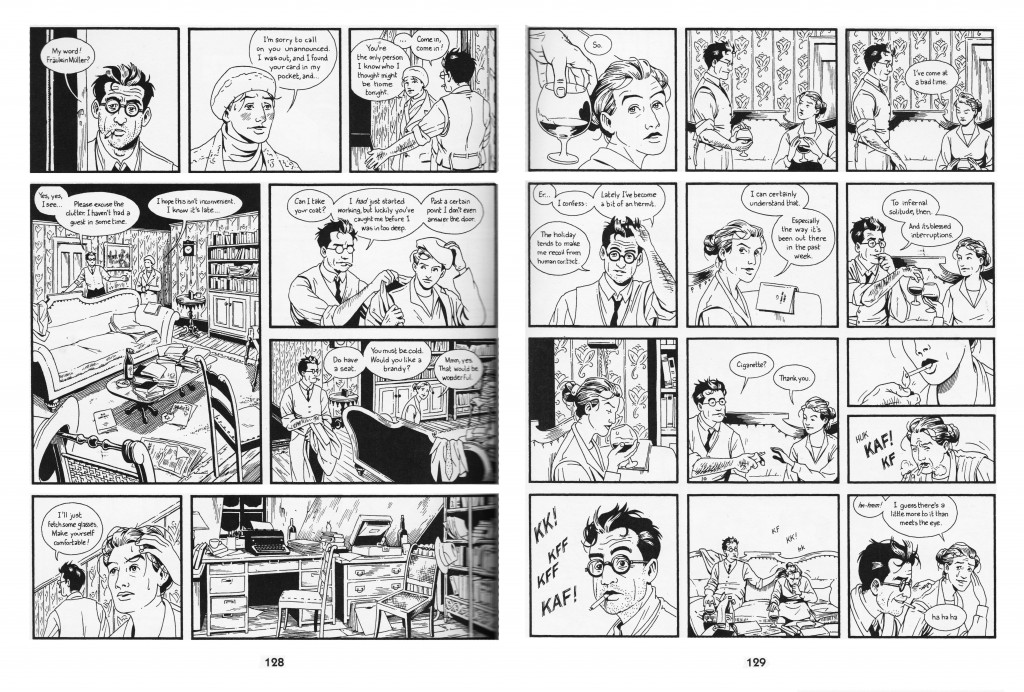
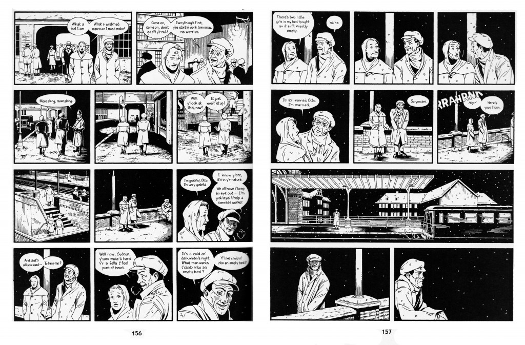
I’ve written a bit about the cinematic quality of Jason Lute’s Berlin: City of Stones here. Lutes comes as close as Miyazaki to making a ‘movie in a book.’ He doesn’t push the boundaries of comics narrativity, and focuses on virtuosically recreating the mis en scene, pacing, and character management of films like Wings of Desire. I’ve complained that Berlin’s ironies alienate readers from the characters, and perhaps a little background music could have sweetened the deal.
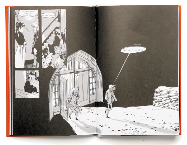
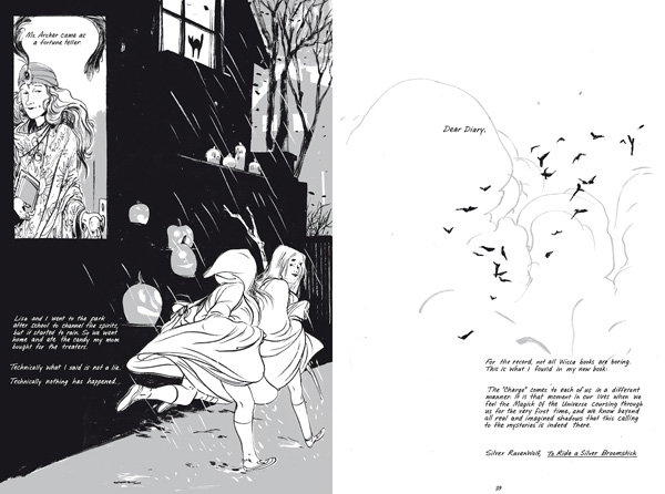
Skim by Jillian and Mariko Tamaki is an intersting example. While sometimes (unintentionally) dismissed as a teen comic, it is temperamentally aligned with the quieter side of Hollywood epics- adult coming-of-age dramas like American Beauty, The Shawshank Redemption, A River Runs Through It, and The Cider House Rules, (which are often literary adaptations.) The wikipedia page for The Shawshank Redepemtion contains a great note on Thomas Newman’s score:
…the main theme (“End Titles” on the soundtrack album) is perhaps best known to modern audiences as the inspirational sounding music from many movie trailers dealing with inspirational, dramatic, or romantic films in much the same way that James Horner’s driving music from the end of Aliens is used in many movie trailers for action films.
“End Titles” is probably a good candidate for Skim’s phantom score. Unfortunately, this makes Skim sound heavy-handed, and I’m relieved that “End Titles” doesn’t accompany the book’s heartbreaking, graceful layering of voice and images. Not to say that they don’t sometimes suggest it.
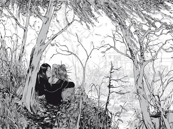
The following pages are in sequence:
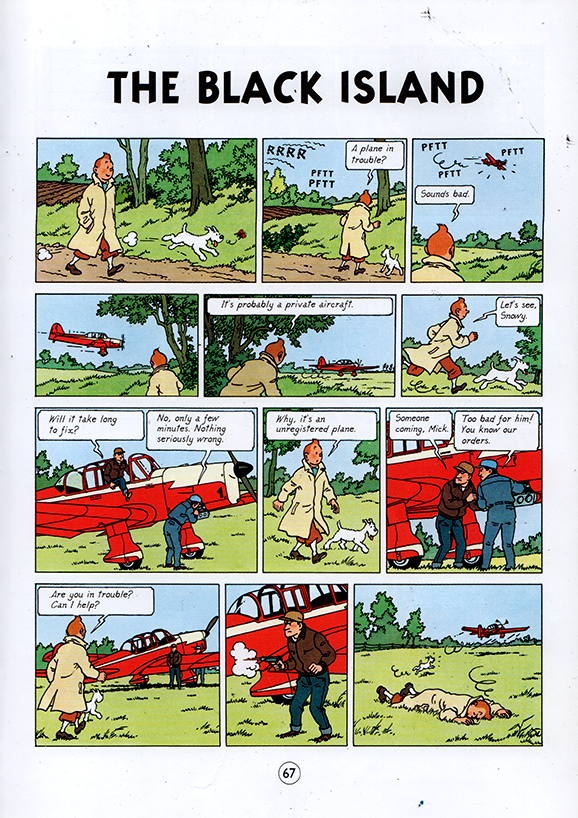
Comics like Tintin are a little more complicated. Herge’s ligne clair extends to the pacing of the comic, and complicated action sequences are detailed moment by moment, like key frames in a storyboard. Yet Herge is so ungratuitous that when he get’s the chance to skip a few key frames, he does.
From TinTin: The Black Island
The phantom score between the last two panels experiences skips like a warped record. Otherwise, I’m not sure why I don’t find Tintin very cinematic– I guess I want to blame the page size. You can pack a lot of panels and text onto an album page, as opposed to the small leaves of most manga books. By the virtue of their size, manga pages automatically resemble dramatic splash pages, and the act of constantly turning pages creates a breathless momentum that exaggerates the cinematic pacing. Tintin is literally less of a page turner.
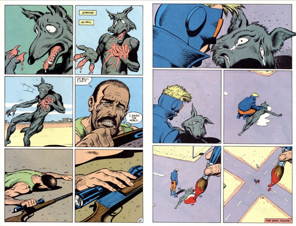
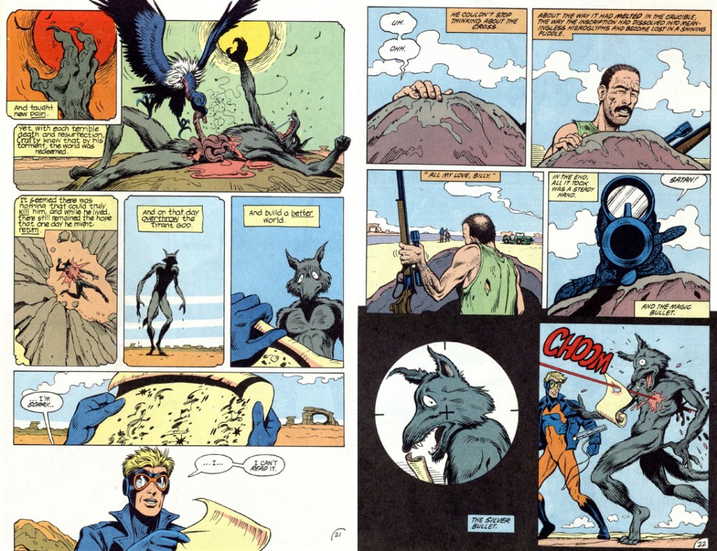
from Morrison, Truog, Hazelwood, Costanza and Wood’s Animal Man #5
My piece is sorely missing examples from mainstream superhero comics. I’ve spent hundreds of hours scanning, assembling and digitally correcting them at Marvel, and have read a decent amount of them myself… but I don’t own any, and I don’t consider myself well-read in them. I’ve enjoyed Alan Moore and Grant Morrison’s work, but I get the feeling that they encourage cinematic pacing more often than other writers. I remember putting pages together on a stunning Hulk comic– it was printed sometime in the fall of 2009, and it opened with panel after panel of the Hulk charging at the viewer in darkness. When I saw the finished book, the whole thing had been slathered with first person captions. I couldn’t bear to keep it. Perhaps I’m being unfair; heavy-handed voice-over is also cinematic in its own special way.


