Odd Superheroine Out

This first ran on Comixology.
_____________________

Female super-heroes can be many things: Amazon warrior, out-of-control telepath, deadly ninja assassin. But whether in swimsuit, bodysuit, fishnets or boob window, they’re almost always cheesecake.

There’s no particular mystery as to why this is. Super-hero comics are male genre literature. Guys like to look at cheesecake. QED. There are some exceptions to the rule — but they’re usually built around genre exceptions as well. For example, the Claremont/Byrne X-Men made some effort to appeal to YA girl readers through the character of Kitty Pryde. Thus, Kitty got to mostly wear civies, rather than the skintight and/or improbably cut-out costumes that were the lot of her distaff teammates. (Not that the internets are above a certain amount of Kitty Pryde cheesecake of course.)

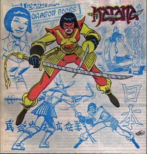
Still, there are a few inexplicable blips. Foremost among them, perhaps, is a minor DC early-80s super-hero who first appeard in Mike W. Barr and Jim Aparo’s Batman and the Outsiders. She was called Katana, and when Aparo drew her she looked, improbably, like this.

That’s a remarkably un-fetishy costume. She’s fully covered, and her blouse isn’t especially tight or revealing: no boob window here. Compared to her teammate Halo, who gets a standard curve-emphasizing form-fitting single piece, Katana seems distinctively to not have gotten dressed with the male reader in mind.

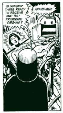
Throughout the series, too, Katana is basically never placed in cheesecake poses or situations. When she gets captured and tied up, for example, there’s none of the bondage imagery you get throughout Wonder Woman’s history. Instead, Katana (or Tatsu, since she’s out of costume in this sequence) is wearing a dowdy hospital gown. She does get stripped down later…but Jim Aparo makes sure we see almost nothing; just a head and shoulders shot from a bizarre ceiling angle, making her look like a twelve-year old boy.

Part of this might be chalked up to Aparo’s particular style; he’s always been more interested in panel composition and shading than in cheesecake for its own sake. But writer Mike W. Barr also played a part in the character’s resolute unsexiness. Katana played the part in the Outsiders that Wolverine played in the X-Men; she’s the bloodthirsty killer with the sharp pointy object, always wanting to dash into danger and slaughter something. While men like Wolverine who play that role are generally just aggressive, the standard script is for women of that type to also be sexually aggressive — a la Elektra, or really anyone else that Frank Miller has ever written. The fact that Katana is Japanese only makes the clichés all the more inevitable; she should be a dragon lady.

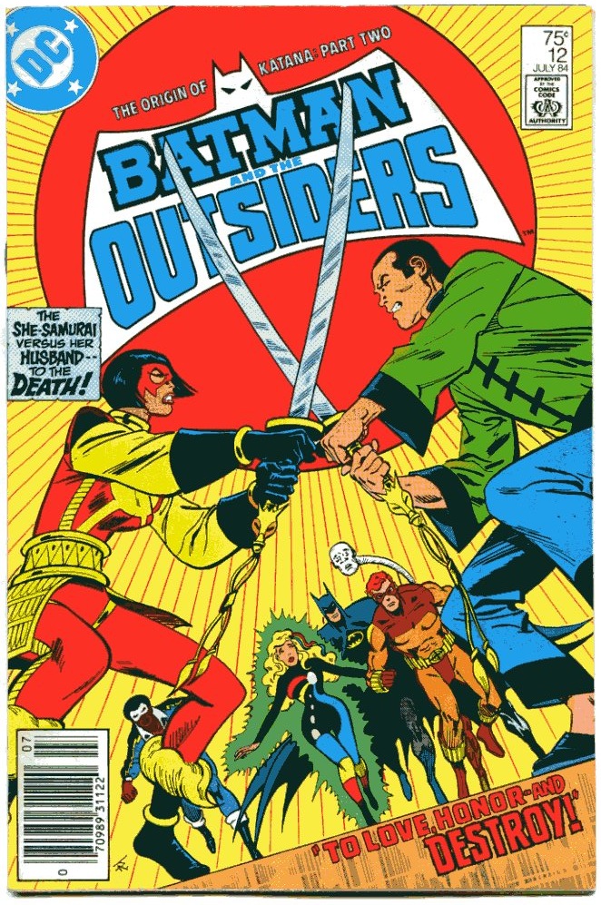
But she isn’t. True, she is, somewhat wearisomely, a samurai, since any superhero from Japan has to be either a samurai or a ninja. But she isn’t at all a sexual fantasy. On the contrary, Barr writes her not as a sexual predator, but as a mother. Her tragic backstory involved the death of her husband and two kids, and her closest relationship in the Outsiders is with the amnesiac, innocent Halo, who Katana treats very much as a daughter — going so far as to become her legal guardian. At least through the first couple of years of stories, Katana, still grieving her husband, has no romantic interest at all. In fact, in the two-part origin revelation where Katana’s husband comes back from the dead, Katana actually re-kills him herself in order to prevent him from hurting Halo. The ridiculous vicissitudes of the plot aren’t really worth describing in detail; the point is, Barr goes out of his way to make sure the reader understands that Katana’s primary emotional commitment is to her surrogate daughter first; any men in her life are decidedly secondary.

So, both narratively and visually, Katana deliberately denied the fanboys the flirty cheesecake they wanted. How did they respond?

As near as I can tell, they liked her fine. As everyone from Han Solo to Wolverine has demonstrated, a tinge of amorality does wonders for a hero’s popularity; Katana’s willingness to occasionally kill people certainly didn’t hurt her standing.In fact, in the letter columns, she quickly became a favorite figure; Mike W. Barr would often answer mail as Katana, threatening to show various letter-hacks their own lungs and/or other bits. Here, for example, she’s responding to Mr. Peckham, a correspondent who initially thought Katana was too much like Elektra, but then provisionally changed his mind.

“Dear Michael:
Tell Mr. Peckham he may rest easy, at least “for a few more issues.” When he arrives at a final verdict as to my role as Katana, I will arrive at a final verdict as to the disposition of his internal organs. Perhaps the next two issues will influence him favorably. In the meantime, it might be wise to lay in a supply of paper towels and sponges. Yours, Tatsu.”

Despite the positive fan reaction, though, Katana never became a major DC heroine. This was probably mostly due to the fact Barr’s letter-column joshing was by far the best writing he did for the series. His actual scripts were watered down versions of the Wolfman/Perez watered down Clarmeont/Byrne X-Men — and, of course, the Claremont/Byrne X-Men were not unwatery to begin with. Batman and the Outsiders was an uninspired teen book melodrama, stuffed with unmemorable villain teams, stiff character interactions, and final page plot twists that didn’t so much twist as sit there blinking feebly in the wan revelatory half-light. Jim Aparo’s art is always worth looking at…but eventually he backed out for a number of less engaging artists, and then there was really no reason to think about the series, much less read it. The Showcase reprint volume is a massive testament to the fact that DC is willing to reprint any damn thing in a Showcase reprint volume.

Katana still pops up on occasion — often with a costume redesigned for slightly more va-va-voom. Stil, that hasn’t made her a marquee character. On the contrary, and counterintuitively, she was most successful at the beginning of her run, when, perhaps through an accidental oversight, she looked nothing like a pin-up.

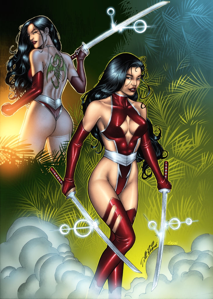
Al Rio reimagines Katana as fanboy wet dream.

Splashy: Drifting Roundtable

This is part of a roundtable on The Drifting Classroom, and also part of the October 2011 Horror Manga Movable Feast.
________________

I haven’t read enough of Drifting Classroom to write my Grand Unifying Theory of Kazuo Umezu. But what I’ve read I’ve liked, especially the art. Panels that are detailed but not cluttered, expressive characters, a layout that guides the narrative — it’s the type of solid, mainstream craftsmanship that’s all too rare on this side of the Pacific. The most memorable feature of Drifting Classroom‘s art (in the first volume at least) is the frequent use of splash pages.

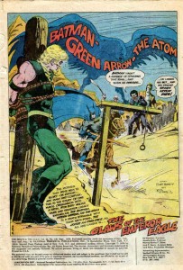
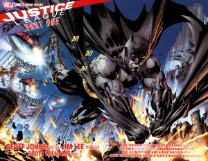
Splash images (whether taking up one or two pages) can serve many purposes. Using a splash as the first page of a comic is a common way to start things off with a bang (and a large image leaves plenty of empty space to squeeze in narration, credits, publishing information, and other corporate boilerplate).

Jim Aparo – Brave and the Bold #129

.

Jim Lee – Justice League #1 (2011)

.

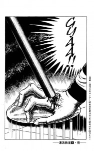
Ending a comic (or a chapter in a larger comic) with a splash is like teaser trailer – the big, flashy image leaves the reader wanting more.

Kazuo Umezu – Drifting Classroom

.

.

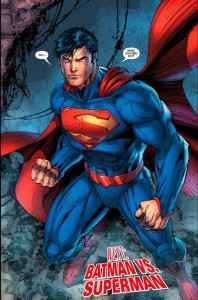
As for aesthetics, I far prefer Umezu to Jim Lee, but the above two images are similar in function. Full page splashes capture the readers’ attention and highlight an event that readers will presumably find interesting/exciting (an attack out of nowhere, or the first appearance of post-reboot Superman). And both images leave the readers in suspense, offering a payoff only if they buy the next installment. Who is crushing the girl’s hand and why?! Don’t you want to see Superman and Batman fight … AGAIN?! Of course, the notable difference is that the suspense in Drifting Classroom arises purely out of the narrative, while Justice League relies on the devotion of superhero fandom.

A splash image in the middle of a comic tends to arrest the narrative, panel to panel progression is put on hold so that the reader can appreciate the big picture (often both literally and metaphorically). There are several examples of this type of splash in Drifting Classroom.


 .

David Mazzucchelli – Asterios Polyp

.

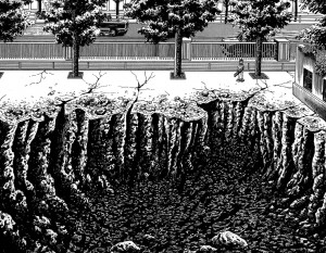
Who doesn’t like craters? These two images illustrate a point that might seem counterintuitive. In most comics, splash pages are “panoramic” images that fully capture some major object or event. But the above image by Umezu is close to the action, so close in fact that the reader can only see a portion of the hole left by the missing school. The enormity is implicit, and the the reader creates a massive crater in their mind using Umezu’s visual cues, such as the little boy (who provides a useful scale for size), the jagged edges, and the contrast between the black pit and the very white surface.

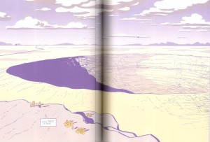
In Asterios Polyp, Mazzucchelli does something similar by cutting off the crater on the right, suggesting (or at least trying to suggest) that it goes on beyond the edge of the page. And he includes tiny people in the foreground to establish the sheer size of the crater. Yet, while Mazzucchelli is an undeniable talent, his crater seems less impressive that Umezo’s. This is because he’s unwilling to leave too much to the reader’s imagination. While part of the image is cut off, Mazzucchelli still draws nearly 75% of the crater. He wants to show AND imply the enormity, but cutting off the far right portion of the crater doesn’t imply much of anything. Rather it seems like Mazzucchelli just ran out of space when drawing his big hole.

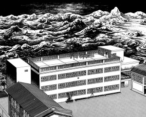
Splash pages are also useful for establishing a place, not just in terms of scale or spatial relationships, but in mood.

.

….

I particularly like the above splash by Umezo. The devastation beyond the school looks like an endless sea about to engulf and drown the tiny children. But the school itself is a bleak haven, the only distinguishing feature of the architecture is its complete lack of any distinguishing features. It seems like the children have only the options of sterile orderliness or complete annihilation.

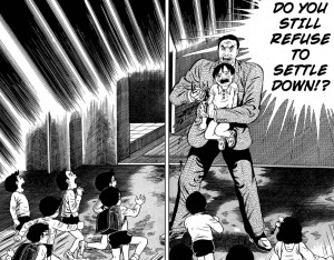
Splash pages can also stop a narrative at a pivotal moment by encouraging readers to “soak in” a larger image rather than breeze through smaller panels. And the very size of the splash can signify importance.

.

….

Prior to this scene, the story had not been violent, but then a teacher stabs a helpless child to scare the other children into behaving. It’s a shocking moment because the violence is so sudden, bloody, and arbitrary. The splash magnifies the emotional impact, and by freezing the plot in that moment, it forces the reader to consider the logic behind the teacher’s action. The school is order and safety, but that depends on a particular relationship between teachers and students. The school functions only when students respect authority, and that authority is based on brute force. On the other hand, the teachers are actually as clueless and desperate as the kids, so I’m curious to see where Umezo goes with this.

On a concluding note, comparing Umezo to American artists leaves me curious as to what artists like Aparo might have done had they worked on longer books. In an American comic (the old-fashioned “floppy”), more than one or two splash pages per issue is excessive, as the progression of the plot slows to a crawl. One advantage of the manga periodical format is the larger number of pages per volume allows for greater use of splashes without disrupting the overall pacing (in Drifting Classroom only a minority of the pages are splashes, but there are still close to a dozen in the first volume). And the same thing could be said of graphic novels in general. But given the current state of mainstream comics, a higher page count might simply mean more splashes of malapportioned Supermen glowering at the reader.

Shapeless

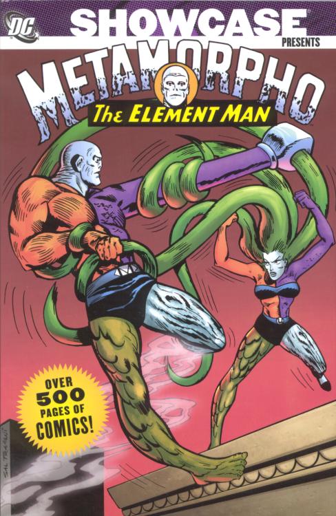
As I’ve said many a time before, I’m a big fan of the Bob Haney/Jim Aparo Brave and Bold. I’ve long been interested in reading Haney’s Metamorpho — it seemed like, if Haney was brilliant with other people’s characters, what would he do with his own? The hints I had seemed good; multi-colored shape shifting hero; bizarrely coiffed quasi-evil-scientist father-in-law; lovesick prehistoric frenemy; bombshell love interest. What’s not to like?

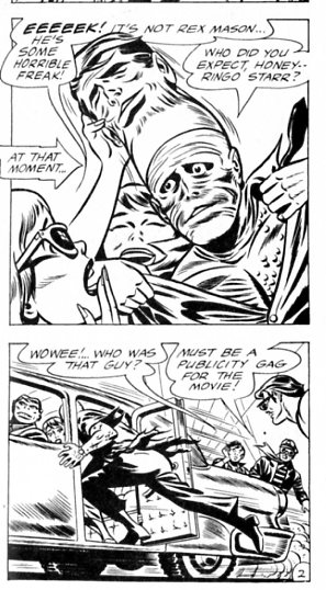
And there are certainly lots of enjoyable moments in the Showcase Metamorpho volume. Haney’s vertiginous blend of garbled patois, not-quite-hip references, and aphasiac plotting is as enjoyable as ever. I love this Beatles tribute for example, complete with crazed fans and artist Ramona Fraden supplying what I want to think, at least, is a subtle Ringo caricature:

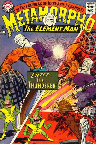
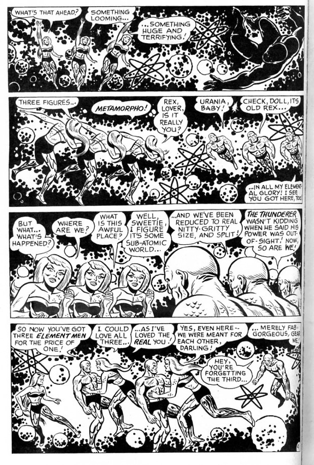
There’s also opportunities for Haney to unleash his mangled Spanglish (Hombre Elemento!) And best of all there’s the Thunderer, the world’s greatest midget one-eyed Galactus parody:

All of which is much appreciated.

And yet…I have to say, while it’s still recognizably Haney in many lovable ways, as a whole it’s not great. I don’t know that I can say that most of it even rises to “good”. Certainly reading the entire thing was more a chore than a pleasure. Even the Thunderer issue wasn’t as much fun as I was hoping.

So what’s the problem? Well, basically, the series is too formulaic — and the formula isn’t that interesting to begin with. In every issue, Metamorpho fights an evil scientist. Occasionally, for variation, he fights an alien threat. Along the way, Metamorpho whines about how he can’t return to human, Java (the prehistoric frenemy mentioned above) whines about how Sapphire Stagg loves Metamorpho instead of him, Sapphire and Metamorpho smooch, and Simon Stagg (the quasi-evil-scientist figure) boasts about how smart he is. During battles, Metamorpho gives a brief lesson in the properties of various elements, presumably to trick parents into thinking something vaguely educational is going on. Then the same thing happens in the next issue. And the next. And…

I don’t want to give the impression that Haney has no ideas. He’s still got bunches of ideas. In one bizarre sequence, Metamorpho plays football against a bunch of element robots; in another, he battles a renegade shape-shifting-building constructed by the gloriously named Edifice K. Bulwark.

The problem, though, is that all the ideas are contained within the same basic narrative structure. The Haney Brave and the Bold issues were great in large part because of genre slippage; Batman kept finding himself unexpectedly in the middle of a noir with Black Canary playing the femme fatale; or horror with Bats himself playing the possessed psychotic antagonist; or politicized sci-fi with the Metal Men in the middle of a robot uprising; or of a boxing story or a war story or whatever. Batman himself veered erratically from friendly crossing guard to murderous vigilante to incompetent doofus to monomaniacal whacko, sometimes in the course of a couple of pages. The strain of writing stories for such a various series of different characters made Haney chuck even minimal vestiges of consistency. He needed to get Batman and one other DC character together in the same story; in the interest of that, he could do anything.

But Metamorpho’s a bit different. The character himself shifts through various polymorphous physical permutations, but his personality is always the same; altuistic, courageous, mildly whiny do-gooder. And the plots, too, stay within definite bounds — superhero adventure narratives. Which are fairly entertaining, but never attain the revelatory insanity of Haney’s best work.

So part of what’s going on is that Haney himself just seems more inspired in his Brave and the Bold scripts. This is an intuition confirmed by the fact that the Brave and Bold’s included in the Showcase volume — a team up with the Metal Men and a team up with Batman — are more focused, and more successful, than almost anything else in the book.

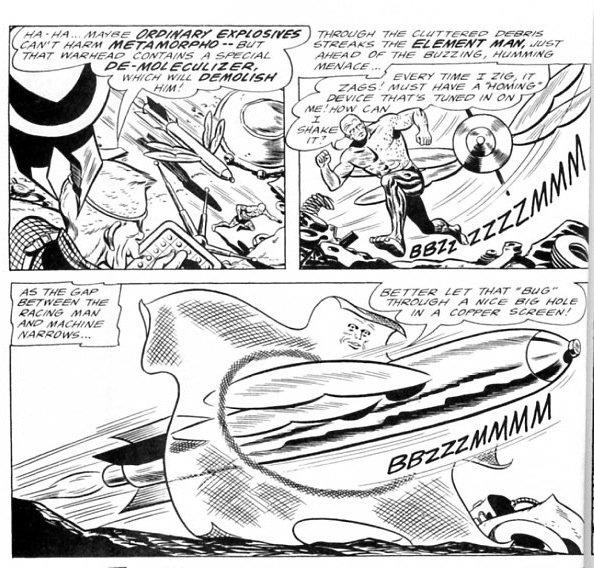
Another reason that the Metamorpho material seems weak, though, is the art. Ramona Fradon, who drew most of the early issues, isn’t horrible or anything — in fact, her Saturday-morning cartoon approach is charming and fits neatly with Metamorpho’s goofy powers.

Despite its virtues, though, the art doesn’t have a whole lot of narrative drive from panel to panel. Instead, you tend to jump from image to image, with Haney’s text gushing along. For example, the tension of the chase in the sequence above is mostly squandered by the wild swings in perspective and camera position. You’re looking down so you can barely see our hero, then you’re right beside him…and then all of a sudden you pull out and swing around and the missiles going through him. It’s energetic and charming, but not particularly suspenseful…and over a whole comic, it ends up seeming like one damn thing after another, rather than like a story with any direction.

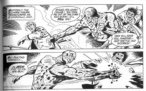
On the other hand, here’s a scene from the Haney/Aparo Brave and the Bold #101, guest starring Metamorpho (included in B&B Showcase #2).

Aparo stays at basically the same perspective for both panels, heightening the spinning impact of that fist as Metamorpho slugs Java.

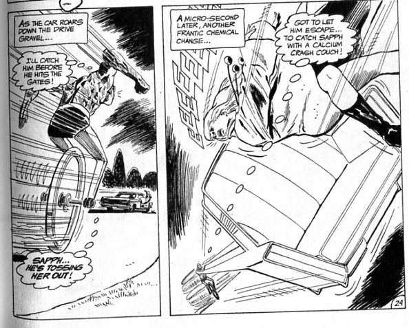
Or in this scene:

The perspective shift here is more like that in the Fradon image, but the deft use of speedlines, the positioning of the sound effect scream, and the real suggestion of terror on Sapphire’s face makes the sequence compelling and kinetic in a way Fradon rarely manages. As a result of the stronger narrative line Aparo puts down, Haney’s nutty ideas (a calcium crash couch? what?) seem like genuinely incongruous flights of insanity, rather than simply woozy meanderings. Similarly, Sal Tripiani adds immeasurably to Haney’s script with this hysterical Kirby pastiche from Metamorpho #16 (the one about the Thunderer).

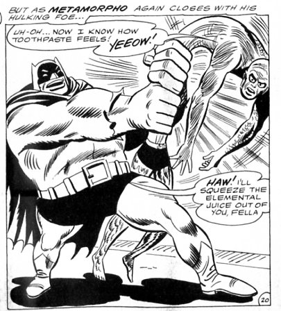
And in the last story in the Metamorpho volume, Mike Sekowsky’s rubbery Bat-Hulk gives the action a squickily solid plasticity, which gives solid form to the utter wrongness of Haney’s writing.

Yes, I said “Bat-Hulk.” I do love Haney.

Last week, Marguerite Van Cook had a post about the problem of assigning credit in the Stan Lee/Jack Kirby team. In comments, Alan Moore was discussed too. For me, I tend to feel like Alan Moore’s work is defined in the greater part by his writing; the story in an Alan Moore comic is not likely to be ruined by bad art — in part because Moore is good at choosing collaborators, and in part because his scripts control pacing and narrative to a very high degree. On the other hand, while I like Lee’s writing okay, it seems clear that he’s extremely reliant on his artists for plotting, pacing, ideas, and tone.

Haney it seems like is somewhere in the middle. His writing is instantly recognizable; nobody else is going to write, “Rex Mason — the Real McCoy; Simon Stagg — the Real McGenius; Sapphire Stagg — the Real McGirl; Java — the Real McApehead”. But at the same time, he doesn’t control transitions and space on the page the way Moore does, and as a result his scripts feel quite different depending on the artist he works with. In particular, it seems like he needs someone to provide a narrative backbone that he can riff off of. Nick Cardy and Jim Aparo gave him that on Brave and Bold, and perhaps that in turn inspired him to some of his best writing. The artwork on Metamorpho fits less well, and so the stories suffer too.

Best Comics, Bleak Vision

Today is the ABSOLUTELY LAST CHANCE TO CONTRIBUTE TO OUR BEST COMICS POLL. THIS IS IT! WHAT ARE YOU WAITING FOR! CLICK THAT LINK AND SEND US YOUR LIST! IT’S THE CHANCE OF A LIFETIME! FREE BUNNIES IN SUPERSUITS WITH EVERY SUBMISSION! DO IT! DO IT NOW!

Ahem. Sorry. Excitement got the better of me.

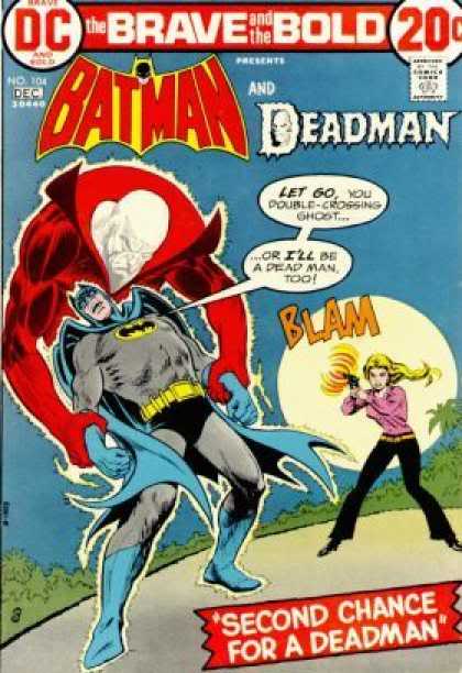
Anyway, to get you in the selecting-best-of-things mood, I thought I’d reprint this short essay from Craig Fischer’s zine project to benefit Team Cul de Sac and Parkinson’s disease research. The zine includes lots of your favorite comics writers ( Jeet Heer! Robert Stanley Martin! Shaenon Garrity! Caroline Small!) writing about their favorite comics. I picked Bob Haney and Jim Aparo’s Brave and Bold #104 featuring Batman and Deadman. Here’s what I said.
__________________
Everybody loves Batman the avenging demon of the twilight, kicking Kryptonian superballs with spiked kryptonite Bat Boots while simultaneously grinding Liam Neeson’s Ras Al’Nose against the inflated manliness of Styrofoam pecs. Me though, I prefer Batman the incompetent patsy and bumbling stooge circa Brave and Bold #104. Written by Bob Haney and drawn by Jim Aparo, this is a stylish noir where Batman is framed at dramatic, improbable angles failing to infiltrate a bridge club and/or successfully allowing everyone around him to be murdered. Deadman’s thrown into the mix so that the great Bat can cluelessly betray him and ruin his — well, not life exactly, but you know what I mean. This is superheroes the way they were meant to be; as woozy police hacks fucking up everything they touch, wandering off panel after the “happy ending” with a concerned glance at their underwear and a cloud of flies rising from the corpses in their wake. Plus, there’s a cameo by God who comes off about as cynically incompetent as Batman himself., randomly tricking Deadman into shooting his lover for no explicable reason. The universe makes no sense, and the guy with the bat ears fighting crime is exactly as ridiculous as he looks, a danger to himself and others. Bob Haney: he had a bleak vision.
________________

And…CONTRIBUTE TO OUR BEST COMICS POLL, DAMN IT.