The Good and Evil Guide to Parenting

To Train Up A Child

In 2006, four-year-old Sean Paddock suffocated in a blanket his mother tied too tightly to stop him from getting out of bed. She’s now serving a life sentence for felony child abuse and first-degree murder. She was a follower of Michael Pearl’s parenting manual To Train Up a Child, which warns never to put a child “down and then allow him to get up…. To get up is to be on the firing line and get switched back down.”

In 2010, seven-year-old Lydia Schatz died after being beaten with a plumbing tube. Her father is serving a minimum of 22 years for second degree murder and torture, her mother 13 for voluntary manslaughter and unlawful corporal punishment. They were following Michael Pearl’s advice: “a plumber’s supply line is a good spanking tool. You can get it at Wal-Mart or any hardware store. Ask for a plastic, ¼ inch, supply line. They come in different lengths and several colors; so you can have a designer rod to your own taste.”

In 2011, 13-year-old Hana Grace-Rose Williams died of malnutrition and hypothermia in her backyard. Her father received 28 years in prison, her mother 37. What do you call these people? Michael Pearl, a fundamentalist pastor and founder of the non-profit organization No Greater Joy, says they are good, Christian parents. “Prove that you are bigger, tougher,” teaches Pearl. “Defeat him totally.”

Frank Miller calls these people “Batman.”

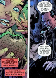
Miller and artist Jim Lee stirred up DC in 2005 with their All Star Batman and Robin and its portrayal of a Pearl-style Bruce Wayne abusing his own adopted child. According to a Sheriff’s report, the Williams deprived their adoptive daughter “of food for days at a time and had made her sleep in a cold barn.” Batman keeps Robin in an empty cave and tells him to catch rats if he’s hungry. If he cries, he gets slapped. When Alfred interferes by supplying the twelve-year-old with a blanket and an order of fast food, Batman threatens his butler physically.

all-star-batman-4-2

Pearl would approve. “It has come to my attention,” writes the evangelist, “that a vocal few are decrying our sensible application of the Biblical rod in training up our children. I laugh at my caustic critics, for our properly spanked and trained children grow to maturity in great peace and love.”And sure enough, Batman’s tough love program quickly transforms Dick Grayson from a whimpering orphan to a power-punching Batman Jr.

Miller is an evangelist too. His God is the Manichean kind of absolute good vs. evil, the one little Bruce Wayne prayed to when he swore “by the spirits of my dead parents to avenge their deaths by spending the rest of my life warring on all criminals.” Miller expanded that dark vision to new depths in the early 90’s with Sin City—while Pearl was self-publishing his parenting manual. The D.A. who prosecuted the Shatz case called To Train Up A Child “truly an evil book.”

In 2009, while the Schatzes were still beating their children with plastic tubing, Pearl was applying his comic book vision of good and evil to an actual comic book titled Good and Evil. He advertises his Bible adaptation as “The Ultimate Superhero Graphic Novel!” and explains that he didn’t want “typical religious art” but “the traditional comic look that is so familiar all over the world.” It’s drawn by Danny Bulanadi, a former Marvel and DC artist whose 1979 Man-Thing is in my attic box of childhood comics. His 80s and 90s credits include Conan, Captain America, Blue Beetle, Hulk, Indiana Jones, Fantastic Four, and The Micronauts. After becoming a born again Christian, Bulanadi, according to the introduction, “was not comfortable with the work he was doing and so quit.” I’m not sure what exactly he was uncomfortable with, since Good and Evil encapsulates the same comic book values as most other superhero stories.

Good and Evil cover

Pearl says it’s “impossible to cover the entire Bible,” so he selects “just that Old Testament background that is pertinent”—which apparently means adding a few supervillain scenes. “The Bible,” according to Pearl, “tells us God created numerous kinds of angelic beings to offer praise around his throne, but one called Lucifer led a third of them in rebellion.” Tales of rebellious angels don’t appear till the Book of Isaiah, yet Pearl needs us to know about them on page one. “But,” he adds, “this is not their story.”

Except it kinda is. We haven’t gotten through the first week of creation before Bulanadi’s sketching evil eyes peering from the blackness of his panels. “On the sixth day,” Pearl declares, “with the evil ones watching, God formed a new creature from the dust of the ground.” They’re there again a page later as God is forming Eve: “Satan, the Evil One, watched.” Two more panels and Bulanadi is drawing a bipedal lizard monster that would look at home in Tales to Astonish: “Satan hated God and wanted to destroy what God was doing, but he needed a way to communicate with Eve, so he entered the body of a beautiful creature and spoke through its mouth.” Pearl and Bulandi disagree about the adjective “beautiful,” but, more importantly, Pearl disagrees with God. According to Genesis 3:1, “the serpent was more crafty than any other beast of the field that the Lord God had made”—Lucifer isn’t a “beast of the field,” and there’s nothing in the Bible suggesting he “entered” it. But Pearl loves to play up God’s arch-nemesis. “Here is promise of a future battle,” he tells us, as Bulanadi’s lizard monster morphs into a snake.  Pearl, like most comic book writers, just wants more fight scenes.
 

Crumb's Genesis

 
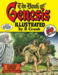
If you’re looking for a faithful adaptation, I suggest Robert Crumb’s The Book of Genesis Illustrated. If you’re also familiar with Crumb’s Bible of Filth (it includes the outrageously incestuous “A Family that LAYS Together STAYS Together”), you’ll assume he’s out to lampoon Christianity again. The prominent cover warning, “Adult Supervision Recommended for Minors,” doesn’t help. But you’d be wrong. Crumb’s drawings are respectful. Yes, he, unlike Bulanadi, forgoes conveniently angled vegetation, so there are plenty of full-frontals of Adam and Eve in the Garden, but no sex, just a little cuddling, all of it in God’s benevolent presence.

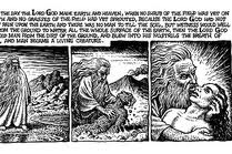
God’s long beard and robe are a cliché, but they bring out the odd thing about Bulanadi’s God. He’s invisible. The tails of his squiggly talk bubbles point at nothing. When he “formed a new creature from the dust of the ground,” Bulanadi draws the dust forming itself.  When “God breathed his own life into the body of clay,” Bulanadi’s  glowing cyclone of holy oxygen swirls from off-panel. But Crumb places God front and center, getting his hands dirty and embracing Adam as he exhales into his nostrils.
 

Crumb's God and Adam

 
Crumb also includes all of God’s words. “Every other comic book version of the Bible I’ve seen,” he writes, “contains passages of completely made-up narratives and dialogue, in an attempt to streamline and ‘modernize’ the old scriptures, and still, these various comic book Bibles all claim to adhere to the belief that the Bible is ‘the Word of God,” or “Inspired by God,” whereas I, ironically, do NOT….” Sure enough, go to the No Great Joy website and you’ll learn that “the sixty-six books of the King James Version, nothing added or deleted, constitute the whole of Scripture ‘given by inspiration of God’ to English speaking people.” Crumb uses the King James too, but unlike Pearl, he includes “every word of the original text.”

Pearl’s selectiveness privileges some ideas over others. His Genesis keeps repeating “obey” and “rebellion,” the same words he emphasizes to such destructive ends in To Train Up A Child. His comic book God demands absolute obedience, and so the obedient Pearl demands absolute obedience from children. Part of a child’s training, explains Pearl, “is to come submissively. However, if you are just beginning to institute training on an already rebellious child . . . then use whatever force is necessary to bring him to bay.” And this is justified because Adam’s “willful and direct disobedience to God resulted in legal estrangement from God and precipitated the curse of death on Adam and all his descendants.”

But don’t worry—a diet of beatings and cave vermin can fix that. Alfred may disagree, refusing to be Batman’s “slave,” but Robin gets with the righteous program. When you live in a comic book world of Good and Evil, choices are easy. Robin’s adoptive father, like Pearl, is a divinely pledged instrument of absolutism. And, hey, who doesn’t want to be Batman?

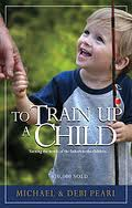
image_1

Splashy: Drifting Roundtable

This is part of a roundtable on The Drifting Classroom, and also part of the October 2011 Horror Manga Movable Feast.
________________

I haven’t read enough of Drifting Classroom to write my Grand Unifying Theory of Kazuo Umezu. But what I’ve read I’ve liked, especially the art. Panels that are detailed but not cluttered, expressive characters, a layout that guides the narrative — it’s the type of solid, mainstream craftsmanship that’s all too rare on this side of the Pacific. The most memorable feature of Drifting Classroom‘s art (in the first volume at least) is the frequent use of splash pages.

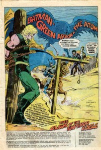
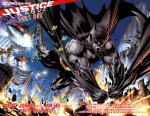
Splash images (whether taking up one or two pages) can serve many purposes. Using a splash as the first page of a comic is a common way to start things off with a bang (and a large image leaves plenty of empty space to squeeze in narration, credits, publishing information, and other corporate boilerplate).

Jim Aparo – Brave and the Bold #129

.

Jim Lee – Justice League #1 (2011)

.

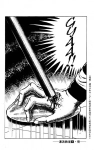
Ending a comic (or a chapter in a larger comic) with a splash is like teaser trailer – the big, flashy image leaves the reader wanting more.

Kazuo Umezu – Drifting Classroom

.

.

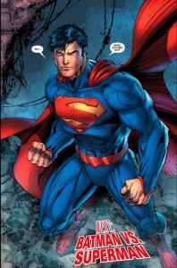
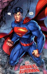
As for aesthetics, I far prefer Umezu to Jim Lee, but the above two images are similar in function. Full page splashes capture the readers’ attention and highlight an event that readers will presumably find interesting/exciting (an attack out of nowhere, or the first appearance of post-reboot Superman). And both images leave the readers in suspense, offering a payoff only if they buy the next installment. Who is crushing the girl’s hand and why?! Don’t you want to see Superman and Batman fight … AGAIN?! Of course, the notable difference is that the suspense in Drifting Classroom arises purely out of the narrative, while Justice League relies on the devotion of superhero fandom.

A splash image in the middle of a comic tends to arrest the narrative, panel to panel progression is put on hold so that the reader can appreciate the big picture (often both literally and metaphorically). There are several examples of this type of splash in Drifting Classroom.


 .

David Mazzucchelli – Asterios Polyp

.

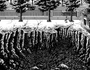
Who doesn’t like craters? These two images illustrate a point that might seem counterintuitive. In most comics, splash pages are “panoramic” images that fully capture some major object or event. But the above image by Umezu is close to the action, so close in fact that the reader can only see a portion of the hole left by the missing school. The enormity is implicit, and the the reader creates a massive crater in their mind using Umezu’s visual cues, such as the little boy (who provides a useful scale for size), the jagged edges, and the contrast between the black pit and the very white surface.

In Asterios Polyp, Mazzucchelli does something similar by cutting off the crater on the right, suggesting (or at least trying to suggest) that it goes on beyond the edge of the page. And he includes tiny people in the foreground to establish the sheer size of the crater. Yet, while Mazzucchelli is an undeniable talent, his crater seems less impressive that Umezo’s. This is because he’s unwilling to leave too much to the reader’s imagination. While part of the image is cut off, Mazzucchelli still draws nearly 75% of the crater. He wants to show AND imply the enormity, but cutting off the far right portion of the crater doesn’t imply much of anything. Rather it seems like Mazzucchelli just ran out of space when drawing his big hole.

Splash pages are also useful for establishing a place, not just in terms of scale or spatial relationships, but in mood.

.

….

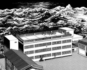
I particularly like the above splash by Umezo. The devastation beyond the school looks like an endless sea about to engulf and drown the tiny children. But the school itself is a bleak haven, the only distinguishing feature of the architecture is its complete lack of any distinguishing features. It seems like the children have only the options of sterile orderliness or complete annihilation.

Splash pages can also stop a narrative at a pivotal moment by encouraging readers to “soak in” a larger image rather than breeze through smaller panels. And the very size of the splash can signify importance.

.

….

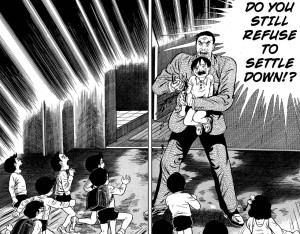
Prior to this scene, the story had not been violent, but then a teacher stabs a helpless child to scare the other children into behaving. It’s a shocking moment because the violence is so sudden, bloody, and arbitrary. The splash magnifies the emotional impact, and by freezing the plot in that moment, it forces the reader to consider the logic behind the teacher’s action. The school is order and safety, but that depends on a particular relationship between teachers and students. The school functions only when students respect authority, and that authority is based on brute force. On the other hand, the teachers are actually as clueless and desperate as the kids, so I’m curious to see where Umezo goes with this.

On a concluding note, comparing Umezo to American artists leaves me curious as to what artists like Aparo might have done had they worked on longer books. In an American comic (the old-fashioned “floppy”), more than one or two splash pages per issue is excessive, as the progression of the plot slows to a crawl. One advantage of the manga periodical format is the larger number of pages per volume allows for greater use of splashes without disrupting the overall pacing (in Drifting Classroom only a minority of the pages are splashes, but there are still close to a dozen in the first volume). And the same thing could be said of graphic novels in general. But given the current state of mainstream comics, a higher page count might simply mean more splashes of malapportioned Supermen glowering at the reader.

Annotated Justice

DC Comics has rebooted its line of superhero comics, beginning with its flagship title, Justice League. Written by Geoff Johns with pencils by Jim Lee, Justice League is supposed to be an entry point for readers unfamiliar with the DC Universe. That’s the theory. But DC Comics are not exactly known for being “new reader friendly.” And Geoff Johns is an acquired taste (one acquires that taste by reading superhero comics, and only superhero comics, for 40 years straight).

As a courtesy to newcomers, I offer this annotated guide to Justice League #1.

Cover

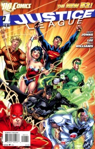
While the line-up of the Justice League has changed many times over the decades, the iconic team has always included DC’s most revered characters plus Aquaman. Starting at the top left and working clockwise, there’s Aquaman, Wonder Woman, Superman, Green Lantern, Cyborg, Batman, and the Flash. Batman is arguably the most famous, but Superman has a TV show (Smallville) and a movie in the works, Green Lantern recently appeared in a movie that most of you didn’t bother to see, Cyborg guest-starred in about two episodes of Smallville, and Wonder Woman almost had her own TV series.

Casual fans might notice that the costumes look a bit different from their classic appearances. Superman no longer wears underwear outside of his pants. Most of the men appear to be wearing armor instead of spandex. And Wonder Woman now has a choker, presumably because her bare neck was drawing attention away from her cleavage.

Page 2-3

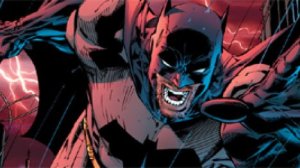
This is a great example of Jim Lee’s artwork. It’s full of dynamic motion, though I’m not sure what that motion is. Is Batman using his cape as a makeshift parachute? Or is he running away on his knuckles? I say the latter, because Batman is just that damn tough.

Batman is pursuing an alien monster while being pursued by the cops, and just when the alien seems to gain the upper hand, Batman is rescued by — Green Lantern.

Page 8 

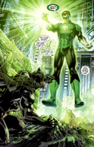
As DC Comics helpfully reminds us, superheroes are modern myths overflowing with allegorical subtext. As this scene makes clear, Green Lantern is not just a guy with a flashlight in his chest. He’s also a metaphor for light, because lanterns provide light. And Batman is a metaphor for darkness, because bats like the dark. So they represent light and dark, the two sides of heroism (and humanity!). Green Lantern hits things in the light and Batman hits things in the dark. Green Lantern is like Zeus and Batman is like Hades. On second thought, Superman is Zeus and Green Lantern is Helios (Aquaman is Poseidon, that’s clearly a given). Or maybe Green Lantern is Jesus if Jesus were a space cop. And that would make Batman … um, let’s say Dark Jesus. The point is these characters are MODERN MYTHS.

Anyway, Batman and Green Lantern pursue the alien into the sewers, where Lantern gives Batman some grief about not having superpowers.

Page 14

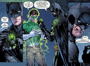
Batman more or less punks Green Lantern and takes his magic ring. Given that Green Lantern has the power to do anything or create anything he wants, some readers may wonder how the unpowered Batman humiliates him so easily. Two reasons: first, Green Lantern is an idiot. Second, while Batman may not have super-strength or magic, he has the greatest superpower of all, one that allows him to win any fight: popularity.

Page 15

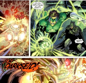
The alien screams “For Darkseid!” and blows itself up. Darkseid was, as every comic nerd knows, the main villain of the “Fourth World” saga, a collection of stories created by legendary comic artist Jack Kirby. Long story short, DC Comics kicked Kirby to the curb and mismanaged his creations for several decades. Darkseid’s last appearance before the reboot was in a recent story called Final Crisis. In the climactic battle, Batman shot Darkseid with a cosmic bullet and then Superman killed him with the power of song (the exact song was not specified, but it was probably soft adult contemporary). The scene was a dramatic celebration of creativity. Too bad actual creative people like Kirby don’t get as much love.

Page 21

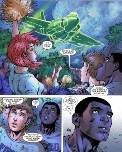
This is the introduction of Victor Stone, the teenager who will eventually become Cyborg. He’s half man, half machine, and all black. That last feature is useful for marketing purposes because the Justice League isn’t known for its diversity.

And interacting with minorities would be a good thing for Batman and Green Lantern, as they have a tendency to engage in racial profiling. They decide that Superman, being an alien, must somehow be involved with the alien monster, so they fly to Metropolis to interrogate him. And Superman, rational adult that he is, punches out Green Lantern and then challenges Batman.

Page 24

Next issue: Superman vs. Batman! Who will win? Superman has super-strength, super-speed, flight, invulnerability, freeze breath, and heat vision. That may sound impressive, but Batman is really, really popular.