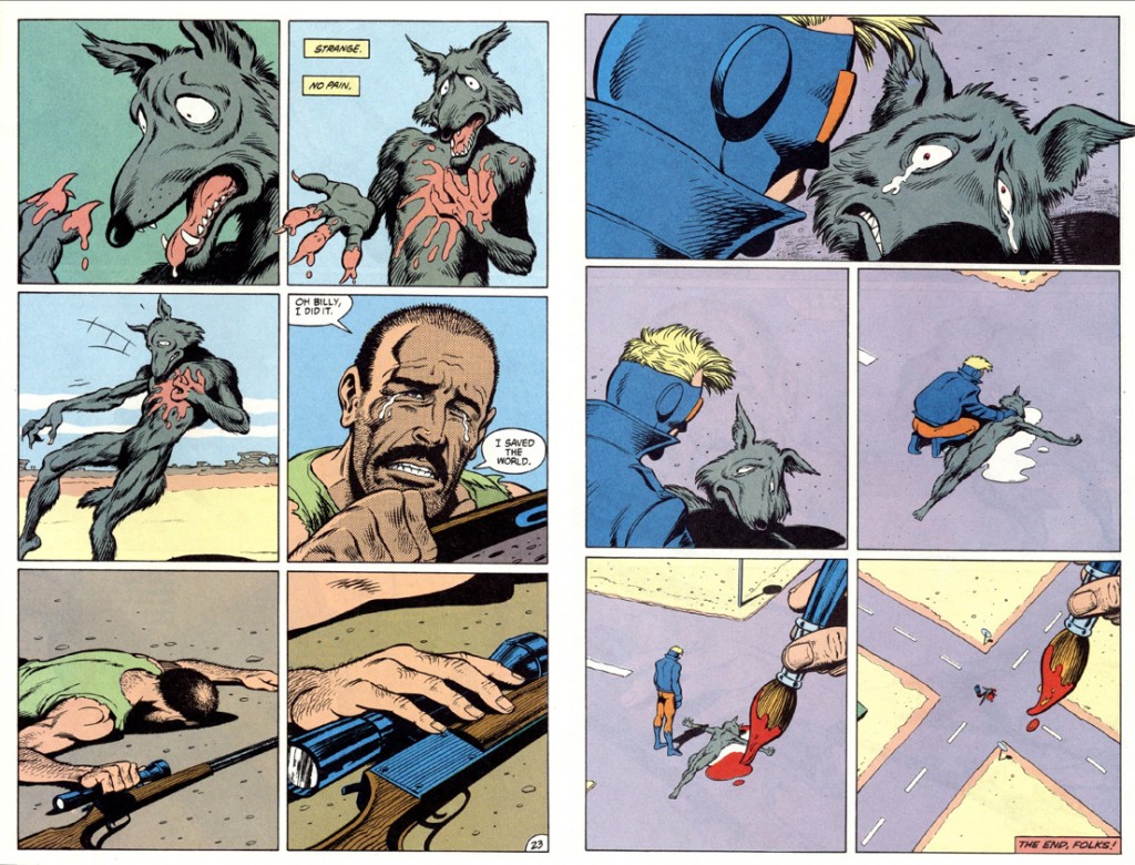
Uncharted Territory: Skim, by Jillian and Mariko Tamaki


For years I have recommended Skim, by Mariko and Jillian Tamaki, as one of my favorite comics. While beautifully illustrated and competently told, I’ve been hard-pressed to explain why I love this book so deeply. I often fall back on biographical justifications— I was once a teenager who romantically pursued someone significantly older, and its rare for me to find a book that accurately captures this experience. I’m tired of this explanation, as it does a disservice to Skim, which is an exceptional work on its own terms. I’m going to try to articulate, here and now, why Skim is a comic I keep coming back to, and shows much more promise for the medium than I see it accorded.

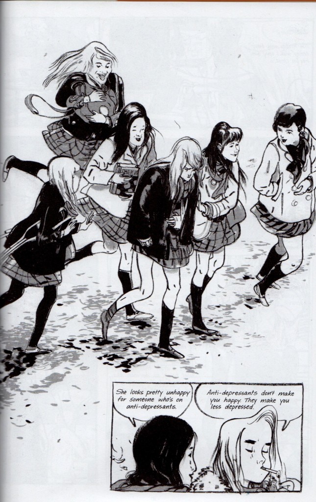
Skim is told from the perspective of a high school junior, Kimberly Keiko Cameron, nicknamed Skim because she is not. Skim chronicles of the fall semester of several young women, who navigate an all-girls Catholic school fixated on the suicide of a local boy. As counselors and students perpetuate an indulgent cycle of hysteria and healing, Kim and Lisa, two best friends, lampoon the faculty and student-body. As they grow apart, Kim falls in love with the young, maverick teacher Ms. Archer. Ms. Archer crosses the line, realizes her mistake, and immediately begins to withdraw from Kim and the school. Meanwhile, Katie, the well-loved ex-girlfriend of the local boy, becomes caught in the hurricane-eye of the school’s morbidity, and eventually enters onto Kim’s horizon.

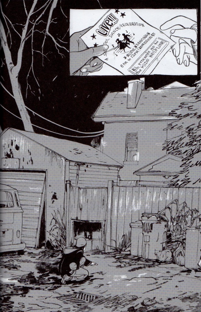
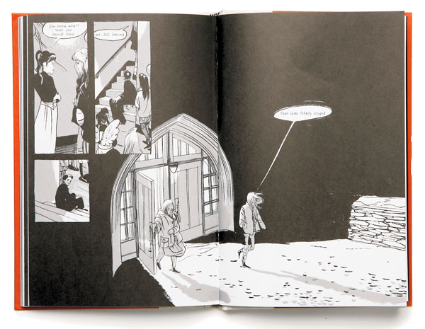
Skim spread 1

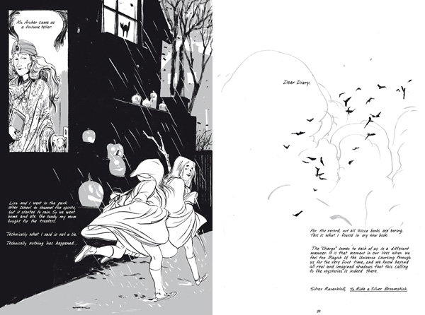
Skim spread 2

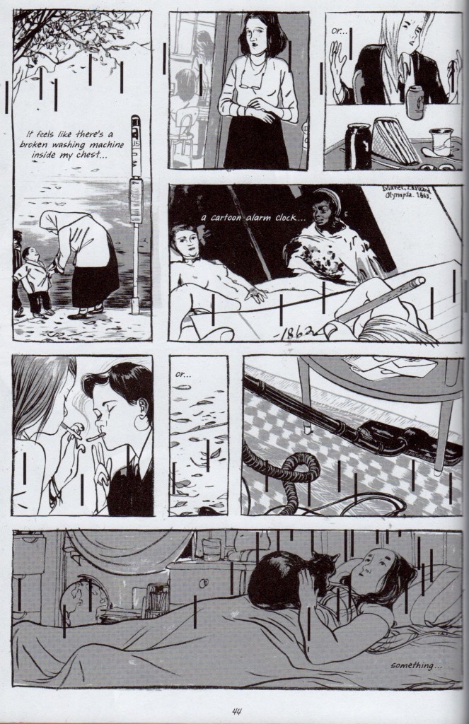
 Skim is darkly comic, though it hits the usual targets—small towns, personal religion, high school, high school girls.  Kim and Lisa visit a Wiccan circle that turns out to be an Alcoholics Anonymous recovery group. Kim receives a kitschy mug from her father’s girlfriend, adorned with a ludicrously ignorant slogan. A group of self-absorbed ‘popular’ girls form a club called ‘Girls Celebrate Life!.’ Etc. etc. Smartly, Kim and Lisa are not cast as the sole bastions of truth. Lisa spouts punk cliché after punk cliché, and while Kim knows better, she can only respond with clichés in turn. There’s comedy to be mined in the pathetic graspings of a group of hypocrites and posers, sure. Remarkably, Skim’s cynicism plays second fiddle to a sense of grace. Dark humor drops like stones through the surface of the narrative—the story is actually formed by the rippled answer to these plunks, a visual whisper that the world is much bigger, stranger and more beautiful and than these ironies suggest. Lingering hands, a telephone pole, or footprints in the snow somehow always get the final say.

Skim thump thump

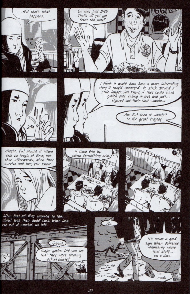
Skim’s attention to its story-world both accentuates and minimizes the scope of Kim’s depression– if there is a world outside black comedy, this world also continues after tragedy. Kim is observant enough to know that she’ll recover from her loss, but she’s lonely. She simply wishes this recovery was more important than the tragedy everyone seems hungry to witness, as she vocalizes below:

Skim Romeo and Juliet

Kim’s yearning for that “something else,” describes Skim’s particular kind of storytelling. The book passes by the iconic moments of adolescence in favor of their lingering aftertaste– the doubt following confident pratter, the assurance found in being abandoned. Its humor can be a bit manufactured, but its nocturnes are feral and strange. Skim‘s characters find their true colors at night. When Ms. Archer quits teaching, Kim follows her at her house after school, where she is reluctantly welcomed inside each time. She quietly absorbs a family photograph, the clutter, the way Ms. Archer lifts her cat with one hand. A heady mood leaks from every dirty teacup and grey corner, leaden with hard decisions. Skim includes  its environment and telling gestures, occasionally at the expense of the conversation they lead to.  Most importantly, we hear Kim’s voice immediately after each incident reeling from or reconciling what happened. I appreciate that Skim judges this moment spent walking home as worthwhile, or even more valuable, than the confrontation itself. This is where Kim slips into uncharted territory. Similarly, Katie and Kim see each other fully one late night, escaping prom. Kim suffers insomnia, which leaves her both exhausted and exalted.

Skim could have easily been a much narrower story without its sinewy brush-work, and the nuance of its characters’ performances. It’s laudable that Mariko Tamaki, the writer, doesn’t overreach her character’s limited voices. Kim’s speech above is about as articulate as anyone gets. It’s an awkward but honest testament for the story. I also appreciate Jillian Tamaki’s figure drawing, which is at times grossly loose, pinched and contorted– tiny misshapen hands and swollen legs abound. They capture the sensual topsy-turvy of confused vision. Skim is a pretty book, but not a stunning one, for the best. If the book had been heart-stoppingly beautiful, the panels might have crystallized the moments, rather than letting them flow into a magpie’s nest of dirty lines, black pools, and wintry negative space.

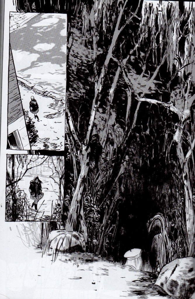
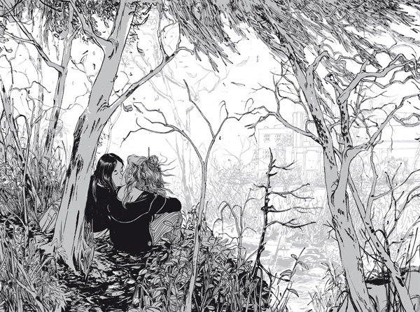
Skim’s perspective is similarly messy, and inconsistently shifts between diary entries and third-person. The clumsy steps back and forth nevertheless give breathing space.  Jillian and Mariko cover several complex transformations over three months. High school dramas often take the symbolic course of autumn to spring. What kind of personal-growth narrative starts in fall and ends in winter? Perhaps its a mistake to classify Skim as a ‘personal-growth’ narrative at all. While the characters seem to be better people by the end, no one acts any differently. Lisa is carried away in love. Ms. Archer flies off for somewhere new. On the final page, Kim goes off to meet Katie. She approaches a woodland very similar to the one which she and Ms. Archer frequented. Only the top of Katie’s head is visible, dressed in its little cap. She’s more a ghost, or a pale echo of Ms. Archer’s body pages before, than a person. Its ambiguous as to whether Kim’s budding friendship with Katie has begun to slide into something else. It’s possible they are all about to repeat the same intimate miscalculations.

Skim final page

 I admire Skim for its brave vulnerability, its tone and message, and also for its independence as a comic work. It doesn’t traffic in wish-fulfillment, overt camp, nor nostalgia– surprising for a comic book about high school. It is self-deprecating without secretly being self-congratulatory, a la Art Spiegelman. It isn’t distracted by its ‘comic-ness.’  It is not epic, nor controversial. It is not drawn in an iconic way. It is also completely about young women, and quite short.  Frankly, there isn’t much cultural currency to be gained by reading Skim, discussing it, or recommending it. American girlhood is undervalued and easily reduced.  Skim is a relatively unambitious book, but this isn’t a bad thing. Unpackaged from the neurotic cultural agendas that reinforce comic’s masculine, canon-mongering, Skim treats comics as a legitimate medium fit for a self-contained story. It doesn’t talk about being a comic, or push the boundaries of the medium for their own sake.  It doesn’t need to prove that ‘comics aren’t for kids anymore.’ It simply tells an adult story. This resistance to being impressive or fantastical, combined with its ‘young adult’ high school setting, deplorably positions it outside the conversation of contemporary comics.

Skim’s comic treatment does justice to, and perhaps deepens, an excellent story. At the end of the day, I believe comics would be more widely attended to if they did just this.

Skim stray cat


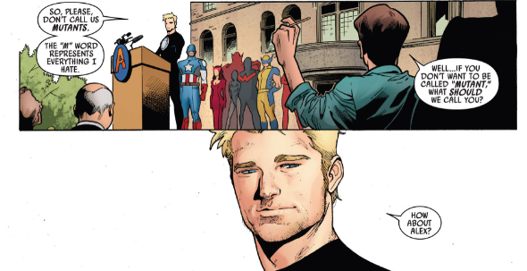
The X-Men as Assimilationist Melodrama

havok-16

 
Osvaldo Oyola and Kailyn Kent had an interesting conversation in comments about the X-Men and policing mutants; I thought I’d reprint it here.

Osvaldo:

I think you hit on something I have been saying for a while about the racial and sexual other in superhero comics – they have to prove their worthiness through violence against and/or policing of others of their kind. The X-Men (esp. early X-men, but definitely into Claremont’s classic run) just reinforces this and is all the more egregious by white-washing the difference to begin with.

Xavier could only be MLK if MLK had armed young black soldiers that went into black communities to violently combat the threats to black middle-class respectability that he cared about above all – in other words, it doesn’t jibe with MLK both ideologically and in practicality.

Kailyn:

Osvaldo, that’s a really good point. X-Men makes it particularly evident, through its use of an ensemble cast of many superheroes and supervillains. But this self-policing, masochism and assimilation seems like a foundational part of the genre. And one that I think comics is congratulated for– the ‘nobility’ of a guardian who loses his ability to ‘be one’ with the society he’s protecting. Or, how pure these fantasies are, coming from the brains of marginalized Jewish teenagers at the turn of the century.

There’s convincing evidence for superheroes stemming out of the stage and dime-novel melodramas (Alex Buchet’s work, for example.) Melodrama, when not fully occupied with sawmills and speeding trains, navigates a weird zone between comedy and tragedy– an unreconcilable schism is presented between the protagonist and society, which the narrative itself can’t solve, and so absolves it through a unifying trauma which stitches everyone back together. This is often the trauma of near death to a female body, the heroine lies freezing on an ice floe speeding towards a waterfall, etc. etc. Once she is rescued, it magically doesn’t matter that she’s still a fallen women, when the society that embraces her hasn’t come close to amending their value system.

To wind back to the central concept– while I’ve heard ‘secret identities,’ and ‘serialized thrills’ spouted as reasons for superhero comics to be melodramas, I’ve never heard them discussed as assimilationist fantasies. But it fits really well.

And melodrama is important! Probably no other narrative mode has had a great as influence on society and politics in the last few centuries, and melodrama increasingly pervades political and campaign imagery. Melodramas are ‘people-movers,’ and make whatever story they’re conveying especially sticky.

The image here is by Rick Remender/Oliver Coipel from Uncanny Avengers #5.

How Can You Hate a Fan?

Kerfuffle, in common parlance, is a “disturbance, commotion, fuss.” Unassumingly rustic and awkward, kerfuffle is an inherently strategic word. Kerfuffle is cute and funny sounding. It’s easy to imagine a kerfuffle as a small sheep-kitten hybrid. It’s a wonder the English language Pokemon games never appropriated it. Not unlike baby-talking, kerfuffle allows the speaker to dismiss whatever battle or disruption she chooses as futile, silly, and beside-the-point, and to seem good natured, good humored and superior while doing so.

Critic Heidi MacDonald opens her article on the recent Jason Karns comments-war at The Comics Journal with the word. She writes, “Indie comics circles don’t have kerfuffles—defined as in depth analysis of the social, racial or gender-based meaning of a certain comic or statement. Those are for nasty old mainstream comics.” Until the site shut the comments down, the ‘kerfuffle’ occurred between one camp who thoughtfully addressed the troubling prevalence of racism, misogyny and violence in comics and in Karns’ work in particular, and an equally passionate camp defending the nostalgic value of racism, misogyny and violence, (at least, that was my take.) Her reduction of this debate makes her sound parental and hokey. I wonder why she works so hard to diminish something the comics community cares deeply about.

MacDonald then shifts and observes the possible use for more study of ‘cultural context’ of independent comics, vacillating with statements like “BTW, I’m not advocating for change here,” and finally concluding,

“Context seems to have less and less inherent value against this backdrop where immediate emotional resonance is the currency. Perhaps it’s this very quality that makes comics one of the most vibrant and relatable mediums of the day.”

Perhaps it’s this very quality that makes comics such a safe haven for deeply offensive power fantasies. Most of the article wanders around without going anywhere. MacDonald hypothesizes that contextual analysis is only of “secondary interest to those consuming and creating comics,” yet its unrealistic to expect any subgroup or population to be motivated to contextualize itself. She also shores up her vision of contextualization with anecdotes from mainstream comics criticism. Tellingly, she relates Todd McFarlane’s rejection of deeper readings of his work, but does not give examples of actual analysis. Critique of a comic’s racial and gender-based meaning does not a cultural contextualization make. According to her definition, it makes a kerfuffle.

It’s unclear whether MacDonald is calling for greater analysis or not, and if the Karns debate doesn’t count for serious analysis, what would do better. MacDonald is a central figure in contemporary comics criticism, and its worthwhile to get to the bottom of what she means by ‘cultural contextualization,’ and why she thinks it could be helpful. What is she advocating for, if weakly? An institutionalized project? A tit-for-tat expose of independent comics’ parallel problems to superhero fare? Does pointing out sexism and racism count as contextualization? Warrant it?

Contextualization isn’t unknown to comics discourse, after all. MacDonald contextualizes Frank Santoro, the writer of the original Karns post, as a heart-of-gold veteran comic lover. How can he be blamed for seeing the best in a vile, racist comic book? He is part of a culture of fandom, a background MacDonald urges her readers to consider before she mentions anything else from the Karns debate. Karns is “one of those energetic and imaginative artists who has so far chosen to work in the gross out genre.” MacDonald typifies most cartoonists as “ethnically homogenous groups of suburban white kids” whose work falls short when they “stray too far away from writing what they know.” This last one deals in some knee-jerking stereotyping—I’d consider that a good part of independent cartoonists are rather open-minded art students living in urban settings.

The comics industry is structured around a cult of individual creators and super-fans. Even outside of autobiographical work, any ‘famous’ cartoonist’s life history and personality will be well-known, and factor into how fans read a work. Cartoonists are fashioned as auteurs, and creator rights seems to be the industry’s de facto high priority topic. Publishers and critics contextualize comics all the time, but always at the level of the creator, who is framed through the culture of fandom and attributed its origin story. Cartoonists are cast as introverted misfits with great imaginations– their particularities and belonging to the ‘brotherhood’ of comics fans rises above whatever culture they are ‘outsiders’ to. Their culture is their comic-making. To use an example Heidi MacDonald skirts around, Craig Thompson’s Habibi is pretty racist, but how can you deny that he’s also a really nice guy? He loves comics so much. Don’t his personal qualities somehow temper the book? Isn’t this all excusable, considering he’s a white guy from a small, Midwestern place? I suspect that ‘cultural’ contextualization is a comfortable go-to, and readily used to reconcile fissures like the Karns debate.

As she stated, MacDonald doesn’t want change. She calls for a future where independent comics can continue to move forward on its vibrant, beautiful trajectory, everybody holding hands and drawing in different styles, in a void, all on board. Emotional resonance is the currency. It is exchanged for the train ticket. The ticket-man accepts empathy, insight and nostalgia equally. He knows the first two are a little harder to come by. The important, unifying thing is that everyone is making comics, and that everybody knows your name. Karns isn’t so bad– he’s a fan just like you. Don’t go and make a fuss.


comiccon

A Secret Room With A View

lucy_honeychurch


In his essay “Secrets and Narrative Sequence,” Frank Kermode relates how a critic accused Joseph Conrad of writing Chance twice as long as it needed to be.  “Conrad replied sarcastically that yes, given a certain method, it ‘might have been written out on a cigarette paper.’”

Books naturally contain more writing than the plot requires. Kermode expands:

“even in a detective story, which has the maximum degree of specialized “hermeneutic” organisation, one can always find significant concentrations of interpretable material that has nothing to do with clues and solutions and that can, if we choose, be read farther than simply discarded, though propriety recommends the latter course.”

Also,

“Good readers may conspire to ignore these properties, but they are relevant to my main theme, which is the conflict between narrative sequence (or whatever it is that creates the ‘illusion of narrative sequence’) and what I shall loosely, but with pregnant intention, call ‘secrets.’”

Kermode’s essay primarily concerns itself with Conrad’s Under Western Eyes, and “the kinds of narrative upon which we conventionally place a higher value… [where] there is much more material that is less manifestly under the control of authority, less easily subordinated to ‘clearness and effect’ more palpably the enemy of order, of interpretative consensus, of message.” A.K.A., more secrets. In this light, ‘high’ literature is less a category than a tendency to problematize, interrupt or discard genre conventions which neatly guide the narrative from trope to trope, and finally to the corresponding take-away (love triumphs over all, crime doesn’t pay, ride off into the sunset, never trust a woman, etc.) Some authors, like James Joyce in Ulysses, conscientiously use secrets to write “a book to keep the professors busy.” Other, more dedicatedly popular writers, (Kermode especially cites Conrad, James Joyce, and E.M. Forster,) are “keenly aware of other possibilities, are often anxious to help readers behave as they wish to; they ‘foreground’ sequence and message. This cannot be done without backgrounding something, and indeed it is not uncommon for large parts of a novel to go virtually unread…”

Like a detective story, or a thriller, love stories demand certain ‘backgrounding’ of insignificant and ‘foregrounding’ of significant material, but by slightly different rules. Engaged readers sift through romance novels for evidence: providential signs, compatibility, the gauge of true happiness. This evidence is all that prevents readers from going insane over misunderstanding upon misunderstanding, obstacle upon obstacle. In mystery novels, there is a pleasure in the ambiguity, and an expectation of a surprise ending. Not so with a romance novel, where readers are encouraged to stake out their preferred ending from the get-go. Every twist is chained to an anticipated conclusion. Failure to get the protagonists together is at best a tragedy, and at worst, an unsatisfactory failure on the part of the author, who could not figure out the ‘true ending’ the characters deserve.  (Endings rife with life-affirming melancholy sit somewhere in the middle, and I suppose have fewer fans, and are remembered less well.)

This makes for a stressful, if rewarding reading experience. When the ending is truly in question, all ‘secrets’ which contradict the lovers’ eventual union must be ignored or under-read—otherwise they are distressing. These secrets are not the villainies of the plot, (a sympathetic third leg to the love-triangle, well-meaning family intervention, yet another innocent misunderstanding,) as these elements promote sequence rather than distract from it. Secrets interrupt and cancel the flow toward eventual togetherness, and cast doubt on its necessity.  E.M. Forster’s A Room With A View is rife with them.

A Room With A View unambiguously champions the union of Lucy and George, two young people who meet as tourists in Florence and are troubled by the repressive strictures of Edwardian society.  The book triumphs in that their relationship is overtly odd, surprising yet recognizable, and quite beautiful; the ‘secrets’ of A Room With A View are not the most interesting part of the book, or what can be said about it. However, like thorns on a rose stem, its secrets cut into the romantic ending with suggestions of frustration, loss and violence. Even more intriguingly, when Forster returned to the characters in an ‘appendix’ epilogue he wrote fifty years later, he chiefly expands upon the existence of these darker elements.

Spoiler alert: this essay mostly concerns itself with the ending of a short and very wonderful book, which is worth reading. It is available all over Kindle and the internet for free, and in most used bookstores for about a dollar. If a book is still too much of a commitment, there is a fantastic and simple, (and again, short,) film adaptation by Merchant Ivory on NetFlix InstantWatch, even though it excises and alters the ‘secretive’ parts of the book, in accordance to what Forster ‘foregrounded.’ Knowing the ending doesn’t completely destroy the pleasure of reading the book. At the same time, I’m afraid that the following interpretation could spoil the goodness of the union of George and Lucy, something I desperately hoped for while reading A Room With A View, even though I had a good idea that it was going to happen anyhow.

A Room With A View is told from third person perspective, with limited access to the internal thoughts of the main characters.  Readers are privileged with the viewpoints of some characters more than others, most often seeing inside the head of Lucy Honeychurch, the conflicted female protagonist, and the Reverend Mr. Beebe. Beebe is Lucy’s local vicar, who she esteems greatly, and who observes Lucy’s ‘progress’ throughout the book. Lucy struggles between worlds—the world of propriety and English manners which she understands and values, and the world of raw feeling, passion and human generosity, which confounds and fascinates her.  She participates in the latter mutely, unconsciously, when she plays the piano. As Mr. Beebe famously observes, “”If Miss Honeychurch ever takes to live as she plays, it will be very exciting both for us and for her.” If Lucy is the site of the book’s conflict, and voices Forster’s own struggles, Mr. Beebe is well-meaning if sardonic witness, and Forster’s observation of his own self.  In Part Two, readers also get access into Cecil, Lucy’s fiancé, a dandyish dupe she eventually leaves. Readers barely glimpse into the workings of George, Lucy’s paramour, until the last few pages, or Charlotte, Lucy’s cousin, another central character.

Lucy creates most of the obstacles in getting together with George—she rationalizes, underplays and represses her feelings for him. A Room With A View is a strange love story where the heroine is not in touch with some great passion she finds impossible to resist—Lucy does a great job of resisting it, and making herself unhappy. Lucy is a brilliant portrait of a young woman caught in the crossfires of her responsibilities to herself and to others, and unsure of the motivations of her unconscious, an idea just formulated at the time of the book’s writing. When George’s father, Mr. Emerson, a philosophic middle class Englishman with poor manners and eccentric habits, declares to Lucy almost out of the blue,

“Now don’t be stupid over this. I don’t require you to fall in love with my boy, but I do think you might try and understand him. You are nearer his age, and if you let yourself go I am sure you are sensible. You might help me. He has known so few women, and you have the time… You are inclined to get muddled, if I may judge from last night. Let yourself go. Pull out from the depths those thoughts that you do not understand, and spread them out in the sunlight and know the meaning of them. By understanding George you may learn to understand yourself. It will be good for both of you.”

Of course there’s wisdom in Mr. Emerson’s observations, but his commentary is impertinent, and agressive even by today’s standards. “Don’t be stupid,” whether said gently or violently, is a rebuff, and Mr. Emerson is only responding to something he believes Lucy has started to say, when she hadn’t said anything at all. Mr. Emerson alludes to their interaction the previous night. If Lucy had been muddled the night before, she had also been observant and open-minded, quietly cheering on the well-meaning Emersons as they navigated a snafu with her cousin Charlotte, when they attempted to do an unasked favor. Mr. Emerson does not just ask for Lucy’s sympathy, which he has, or her understanding, which he solicits, but her allegiance.

A Room With A View is overtly a story about Lucy’s self-realization, dramatized through her admission of love for George.  Underneath this, A Room With A View is also a story about the conquest of a girl’s inner life. As set up by Mr. Beebe in the opening pages. “I differ from [Mr. Emerson] on almost every point of any importance, and so, I expect— I may say I hope— you will differ.” It is not as if one ‘father’ figure has monstrous views about Lucy’s future. Both claim to understand Lucy; both know her very little. Yet the reader accesses Mr. Beebe, the loser of the fight, and Cecil, who also loses Lucy, and Lucy—who arguably loses herself.

A Room With a View has a rather cryptic happy ending. Lucy never admits, “I love George” of her own accord. In the penultimate scene, she finally acquiesces to Mr. Emerson’s relentless insistence that she does, through anger and tears, and finally a humiliated but happy acceptance. Not only does Mr. Beebe witness and play an active role in this argument, he expresses his grief that Lucy will marry George, (as opposed to remaining unmarried forever, which was his expressed preference,) and then is described to have “walked out and left them.” Mr. Emerson then says mystically,

“Ah, dear, if I were George, and gave you one kiss, it would make you brave. You have to go cold into a battle that needs warmth, out into the muddle that you have made yourself; and your mother and all your friends will despise you, oh, my darling, and rightly, if it is ever right to despise. George still dark, all the tussle and the misery without a word from him. Am I justified?” Into his own eyes tears came. “Yes, for we fight for more than Love or Pleasure; there is Truth. Truth counts, Truth does count.”

Lucy replies, consenting, “You kiss me, you kiss me. I will try.” This section completes the strange permeability between George and his father, and the lack of distinction between the two. It is no small wonder that this scene was shortened, fragmented and censored in the film adaptation, to better express the victory of Eternal Love between two young people.

In the final chapter, George and Lucy elope and return to the Florentine pension where they met. The reader is not greeted with a passionate, an exhilarated, or an active Lucy, but a Lucy who is darning George’s sock. For the most part, the reader is locked out of her thoughts. George is repeatedly described as a child, or in danger of contracting rheumatism, like his aged father. Perhaps Mr. Emerson was not recruiting a love for the mother-less George, who knew so few women—perhaps he was recruiting a mother.

Nonetheless, the last chapter is a deeply felt end to a love story. They make each other happy, they kiss, they smile, and share a humble acceptance that they were brought together by powers other than their own. We get access to George’s mind for the first time, and he reflects “All the fighting that mattered had been done by others—by Italy, by his father, by his wife.” Forster is the first to admit that, “When it came to a point, it was she who remembered the past, she into whose soul the iron had entered…”

If the reader’s copy of A Room With A View is cruel enough to also contain the appendix, this idyll is followed by a curt and baffling epilogue, written by a wearied Forster fifty years later. In it we find that Lucy and George enjoy six years of great happiness, which is ruined by the first World War. Lucy never recovers her relationship with her family, damaged by her elopement with George, and then by George’s conscientious objection. Her brother, who the book describes with much sweetness, ends up selling the family home so lovingly documented in the first book. Freddy is characterized damningly as an “unsuccessful yet prolific doctor, [who] could do no other than sell.” The couple struggles, and WWII breaks out.

“George instantly enlisted. Being both intelligent and passionate, he could distinguish between a Germany that was not much worse than England and a Germany that was devilish. At the age of fifty he could recognize in Hitlerism an enemy of the heart as well as of the head and the arts. He discovered that he loved fighting and had been starved by its absence, and also discovered that away from his wife he did not remain chaste.”

Forster goes on—Lucy and George’s flat is bombed, Lucy is said to lose everything, her daughter’s house is bombed, George is injured but at least survives and makes corporal…they are homeless at the end of the war, and the author has no idea where they’ve been living for the last twelve or so years. All in all, one hell of an epilogue.

The fighting quote above is striking, as it resonates so well with the last chapter of the book. Lucy is described as a mother, a domestic, and at times a rebellious player of Beethoven. Beethoven was the thing that distinguished her at the beginning of the book, and according to Mr. Beebe, the only thing that foretold of something greater. Strangely, it is still the only thing that distinguishes her by the end.

Beethoven is echoed at the end of the appendix, in a surprisingly lengthy, tender description of Cecil, Lucy’s spurned fiancé. Forster writes, “Cecil Vyse must not be omitted from this prophetic retrospect. He moved out of the Emersons’ circle but was not altogether out of mine.” He finishes the appendix with an anecdote,

“A quiet little party was held on the outskirts of that city, and someone wanted a little Beethoven. The hostess demurred. Hun music might compromise us. But a young officer spoke up. ‘No, it’s all right,’ he said, ‘a chap who knows about those things from the inside told me Beethoven’s definitely Belgian.’

The chap in question must have been Cecil. The mixture of mischief and culture is unmistakable. Our hostess was reassured, the ban was lifted, and the Moonlight Sonata shimmered into the desert.”

It is the only piece of the appendix that resembles the tone of the book in its poetry and humor.

Cecil was never a real rival for Lucy’s affection. Their relationship is portrayed as nothing but a mistake from the start. Cecil’s unsuitability is most often illustrated through his derision of Lucy’s family and home, which are dear to her and lovingly described—yet she loses these irrevorcably by marrying George. Lucy reiterates George’s attack of Cecil’s character as her justification for ending the marriage—she describes him severely as “the sort who can’t know any one intimately.”

Cecil uncharacteristically receives Lucy’s criticisms with acceptance, kindness and grace. It mirrors a ‘truth’ Mr. Beebe believes of Cecil, but also a truth he believes of Lucy, and at points, a truth that Lucy believes of herself.

Forster’s triangle of intimacy with Mr. Beebe, Cecil and Lucy is doomed. Lucy merges with the Emersons. While Beebe’s aversion for marriage isn’t qualified, Forster betrays no conviction in Lucy’s realization within the marriage, and no vision for how Lucy can acceptance of love without exterior force.  Yet for Lucy to have chosen Beebe’s preference—to remain unmarried and travel abroad with two old spinsters, eventually to turn into her Jungian shadow of a cousin, Charlotte—seems far below her powers as well. (This essay’s negligence of the character of Charlotte is criminal. A great many of the book’s secrets lay in her.)  It’s as if Lucy is eaten alive by the romantic narrative, and Forster is caught between a lady and a tiger. He resists for awhile, but can’t write Lucy out of the dilemma, and so he abandons her. In Mr. Beebe’s words, “[George] is no longer interesting to me,” and Forster writes him in the epilogue as gifted, but selfish and without poetry. Characters only hold interest for Forster in their isolation—leaving, or being left.  Sometimes I wish for a  “Gone With the Wind” option, where Lucy is abandoned by George for her painful indecision, and in which, as a consequence, Lucy never stops being Lucy, muddle and all.

 

Comics versus The Deskillers

Americans have many expectations when they head to an art museum. One is to look at modern and contemporary art, fetishistically exhibited, that they believe their child could do. This ritual would not be complete without their mentioning, even declaring, this opinion to other visitors. This performance persists for a number of reasons. It’s validated through repetition, especially by people who are unsure of how to react to modern art. This reaction is also funny, (I guess,) and so it rounds out the total emotional experience of the visit. Finally, the development of ‘deskilling,’ one of art history’s most central narratives, is not well understood. When taking painting classes in prep school, a supposed bastion of precocious academics, the teacher explained, “They got to paint that way because they had gotten really good at painting realistically,” citing Pablo Picasso’s Blue Period as evidence of a sort of regulating Royal Academy in the sky.

Deskilling isn’t well understood in the comics world either, and sometimes painfully ignored by those who jockey for comics’ acceptance by the art world. It is also notably absent from Bart Beatty’s slyly neutral account of comics-art relations, Comics Versus Art, (which Noah Berlatsky and I have previously reviewed.) Yet deskilling might present the largest obstacle to comics’ admission into the gallery.

Black Square

Kazimir Malevich, Black Square, 1923– not quite monochromatic


Deskilling is hard to pin down. A monochromatic canvas, a bicycle wheel, and a running locomotive dangling above a museum entrance are all valid examples, (and works of art, for those skeptical.) The first eschews the use of painterly skill or representation, the second the use of any artistic manipulation whatsoever, and the third was made by an artist who only ordered the work’s creation– and hired skilled engineers to suspend a purchased train for him. The painting could be Kazimir Malevich’s or Aleksandr Rodenchko’s– each believed to have reached the ‘zero of painting,’ or ‘the end of painting,’ respectively. The bicycle wheel is better known as a type of “readymade,” a prefabricated object that functions as an artwork in a gallery context. It is obviously Marcel Duchamp’s, who is equally famous for his upturned urinal, Fountain.  Finally, its tempting to argue that the final piece, Train by Jeff Koons, involves a lot of skill– look at how much skill it takes to dangle a steam engine over a busy thoroughfare, or to make a steam engine in the first place! And how scary it feels to stand under it. However, the engineers aren’t credited and their contribution is merely an execution of the real work of conceiving the piece. Also, Koon’s showcasing of his factory of art-laborers, often young artists themselves, plays into his identity as a provocateur.

Deskilling partially arose in protest to the institution of art, although the institution of art quickly swallowed the movement through its acceptance, and profiting, from these subversive works. Deskilling also thrived with the expressionists, who wished to tap into more primeval, deeper consciousnesses through savage colors and distorted, deliberately ‘primitive’ or ‘childlike’ representation. Others used deskilling to push the boundaries of art as far as they could go. As championed by critic Clement Greenberg, abstraction rejected representation and technique outright, in pursuit of the truth of painting– making deliberately flat, optical, and material surfaces. Pop-artists who rejected Greenberg’s conclusions also worked in a deskilled style, by incorporating cultural “readymades,” low-brow art, in their factory-like practices. Commenting on the automatization and deskilling in the industrial sphere,  minimalist artists employed artisans to assemble their works, and were concerned more with the physical presence of the work than with the craftsmanship of the pieces. The development of Conceptualism might have delivered the most resounding blow. Sol LeWitt’s “Paragraphs on Conceptual Art” states, “In conceptual art the idea or concept is the most important aspect of the work…the idea becomes a machine that makes the art.” He expands on this in “Sentences on Conceptual Art,”

32. Banal ideas cannot be rescued by beautiful execution.

33. It is difficult to bungle a good idea.

34. When an artist learns his craft too well he makes slick art.

sollewitt

While painterly craft, naturalistic representation and artistic craftsmanship are occasionally resuscitated, it is often by conservative reactionaries, during periods of massive spending, by wealthy collectors who prefer these qualities, (despite what is believed about the taste of the very rich.) This is not always the case, especially concerning feminist artists who seek to restore attention to the human body– abstraction, conceptualism, minimalism and the like derive their power from their disembodiment, which for better or for worse is conflated with male rationality. As traced in Noah’s piece here, comics and art have been locked in a similar, gender-flipping battle for some time. And deskilling isn’t always masculine– the Dadaists subverted gender and sexual tropes through collage, a revolutionary new medium at the time.

Have there been parallel deskilling events in comics history? Cartoons could be taken as a deskilled form of naturalistic drawing, yet caricature isn’t historically understood this way. During WWII, newspaper strips’ decrease in scale encouraged minimalistic, less virtuosic drawing, as epitomized by Charles Schultz’s Peanuts comics.  But this was less a philosophical/artistic choice than a necessary adaptation under pressure. Self-publishing and the internet have allowed artists with less artistic skill to release work, occasionally to fantastic success. Alternative publishers like Picturebox champion artists with deliberately ‘amateur’ styles, which conceptually contribute to the entire meaning of the work, and are not considered limitations.  Interestingly, these comics marry two different deskilling trends, expressionism and conceptualism, through  an often problematized narrative. Alternative publishers have also fostered the cult of the outside-artist. In the art world, outside-artists are fascinating, eerie case studies, somewhat pitied but revered as autodidacts and prophets. In the comics world, extended isolation is a given factor of comics making, and few institutions exist to reward or educate cartoonists. The outside-artist is a heroic model.

Yet for most of its history, comics were an industrial and institutional product, not a commentary, nor a protest of institutions. Rather than problematize authorship, the comics community struggles to recognize the work of artists who were exploited by publishers. Past and present masters are identified by their the craftmanship, demonstrated through draftsmanship, composition, technical ability, interplay with text and narrative, and understanding of the human figure and setting, all mediated through deliberate, auteristic style. This perspective is difficult to reconcile with the narrative of contemporary art, and isolates comics from the ‘mantle of history’ draped over the shoulders of the deskillers.

Comics have a place in an art museum. It’s just the same place devoted to other crafts, like furniture and silverware. “Note the single penstroke that articulates the supple line of Superman’s (c) cape, evidence of great technique…”

Back in high school, it wasn’t surprising that a history teacher provided better insight into deskilling than the art-teacher, busy convincing students to take their still-lives seriously . A few college-level art-history classes later, a trip to MoMA felt like a stroll through the natural history museum of the industrial West, full of emotional/philosophical artefacts of various cafe cultures and art-heroes. The comics world isn’t alone in de-valuing deskilling. Museums have to construct celebrity-artists to anchor the meaning of these works, which seem facile or clumsy or laughable at face value. The most successful art heroes are those whose legends are married to an iconic (and decorative) style– Vincent Van Gogh tragically, Picasso and Andy Warhol with much posturing and self-awareness, and Jackson Pollock somewhere in-between. Roy Lichtenstein’s life may be less memorable, but the cartoon punchiness of his work more than makes up for it– the populist attraction of the comics he ironicized became the best insurance for the durability of his appeal.

Phantom Music

The index to the Comics and Music roundtable is here.
_______________

Forgive me– as if to make this piece as dilettantish as possible, I am going to bring film into a discussion of comics and music.

New Treasure Island Page 1 

The first pages of New Treasure Island by Sakai Shichima and Tezuka Osamu, much praised for its cinematic quality

It’s seems to me that when a comic’s flow of panels and pages works ‘musically,’ it also behaves cinematically. The artist’s shifting of perspective and the rhythm of the ‘cuts’ echo filmic sequences that are usually accompanied by a score. Sometimes, when I come across these sequences, it feels like phantom music– like a phantom limb– underscores the comic. It’s a struggle to read along to, or to figure out how the melody goes. Going back to re-read or dwelling on an image too long disrupts the phantom score irrevocably, and forfeits some of the emotional impact of reading the comic. As a teenager, I tried unsuccessfully to hum along or deejay background music while I read comics, hoping to discover total emotional absorption.

Today I better appreciate comic’s more complicated relationship with time and space. I believe I was stupidly hoping to watch– or listen– to comics as opposed to reading them. I wanted to be passively taken in, when I had to stake my own way through a comic book. If watching a film is like having a dream, reading comics is like lucidly dreaming– there’s an exchange of vibrancy and intensity for control and self-awareness.

Cinematic pacing still confuses me. It’s found a natural home in many comics, yet it is a very anti-Greenbergian hold-over from another medium.  Cinematic pacing does not accentuate the qualities that are most fundamental to comics, and instead channels comics’ unique handling of time, space and design into straightforward, uncomplicated narrativity. That’s not to say some overlap hasn’t occurred– cartoonists often work as storyboard artists. I don’t think cinematic pacing should be avoided, or that it poses a threat to ‘native’ comic pacing. But I do feel that the relationship of comics and film is worth examining, especially as the value of comics is increasingly understood in terms of their adaptation into film– where the story is finally told with real-life music.

I’ll clarify what I mean by cinematic comics. Comics are cinematic when they follow established film and cinematographic formulas of conveying time and space in a dramatic, rhythmic, and unambiguously linear fashion.  I am also tempted to add ‘decompressed,’ yet some film conventions are highly compressed, (montages without establishing shots, for example.)

Not all films follow the same cinematographic formulas, and the great ones complicate or invent them. Some formulas are grammatical, like how a bird’s eye view/pan/combination is used to introduce a story, as in American Beauty or Blade Runner. An easily identifiable variation, like Citizen Kane’s No Trespassing sign, is copied intentionally through homages and parodies, and if it becomes prevalent enough, it’s recycled unintentionally.  Another example are the fantasy battleground scenes that flooded theaters  after the run of Lord of the Rings. These formulas are most often accompanied by music to heighten the emotional effect, and the style of the music is included in the formula.

There are many stirring music-less film sequences, yet the connection between music and emotion in narrative is pretty well established, (and necessarily predates the term melo-drama.) To keep things as simply and as overly-generalized as possible, I will vaguely refer to commercial moviemaking scores from the last fifty or so years– think John Williams, Thoman Newman, Elmer Burnstein, Joe Hisaishi and Howard Shore.

Cinematic comics isn’t a discreet category as much as a collection of traits. Very cinematic comics will more frequently carry more of these traits. Panel proportions offer one example. A panel’s size usually determines the time a reader will stare at it. In cinematic sequences, the panel size will echo the legnth of a cut. Smaller panels dispaly a smaller fraction of time, which is not always the case in comics where the page’s design, or other criteria, are more important than the linearity or pacing of the reading. Small-size, low-content panels allow the eye to ‘bounce’ across the gutter, like a script’s ‘beat,’ without twisting the amount of time the panel naturally represents.

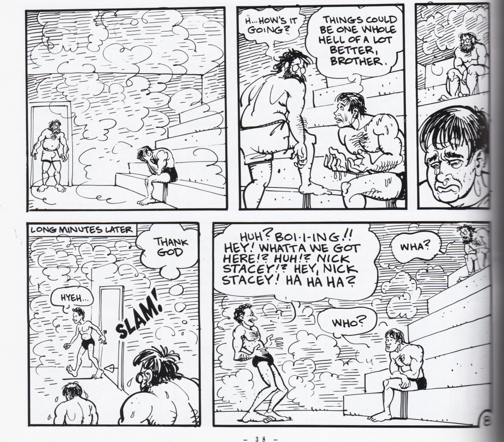
Duncan the Wonder Dog, noncinematic

Non Cinematic– Panel size determined by design, not by the length of the time it represents. From Adam Hine’s Duncan the Wonder Dog: Show One


jim_bathhouse_fragment

Non Cinematic– The third panel is small, but designed to be dwelled upon for some time. From Invisible Hinge by Jim Woodring


>bodyworld_feet

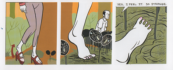
Cinematic — Panels represent one cut, and small wordless panels work like ‘beats’
From
Bodyworld, by Dash Shaw


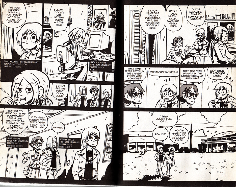
scottpilgrim_lesbians

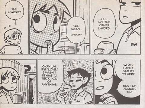
Cinematic — Panels represent one cut, the size suggests the length of time represented, and small wordless panels work like ‘beats’ From Scott Pilgrim Gets It Together by Bryan Lee O’Malley 


In a cinematic comic, a panel’s text to image ratio is usually small, and corresponds to how much dialogue belongs inside one ‘cut,’ or between moments of physical acting. Reading the panel aloud, this is often under thirty seconds. A preponderance of textless panels showcase ‘beats’ of the character’s wordless performances, and occasionally more panographic panels and splash pages demonstrate setting or spectacle. These are sometimes an exception to the rule: splash panels and pages can be three to twelve times larger than an average panel, yet unless there is text they don’t necessarily take that much longer to read. Nevertheless, the moment depicted is mentally understood to last longer, and that it eludes to a build-up and follow-through that wasn’t drawn. Larger, more detailed panels with multiple speech bubbles work like a ‘pan,’ where the camera scrolls across a larger field of vision.

The cartoonist’s perspective choices share commercial filmmaking’s desire for clear communication. If the character is about to step on a rake, a successful cartoonist will most often show the ‘build-up’ and ‘event’(approaching and stepping on the rake,) within the larger environment, and only afterwards show a close-up of the character’s reaction, etc.

The cinematic comic’s cuts are determined largely by dialogue, and by fight-scene and slapstick choreography, and when there is neither, by the comic’s internal rhythm. In film, this rhythm is determined by the score, which needs to match, the pacing of the talking/fighting/comedy scenes as well. As long as the cartoonist obeys cinematic conventions, the more rigorously rhythmic the pacing, the more strongly a phantom score can adhere to it.

Certain comics rhythms/formulas recall certain filmic rhythms/formulas, and by association, inadvertently acquire phantom film scores. Cartoonists are a little helpless– while a filmmaker could pick an iconic or untraditional song to accompany a sequence, a cinematic comic only triggers a super-conventional-hodgepodge-memory of what song ‘should’ go there. Friends hanging out on a summer afternoon demands calls for a low-key, chirpy groove. A troop’s noble suicide mission demands the Lord of the Rings bombast. A sad remembrance cues violins. And if the comic’s pacing is cinematic enough to strongly suggest a score, its absence is distracting. The tingling of a phantom limb is most often painful.

In conclusion, a meandering examination of some cinematic comics:

Scott Pilgrim!

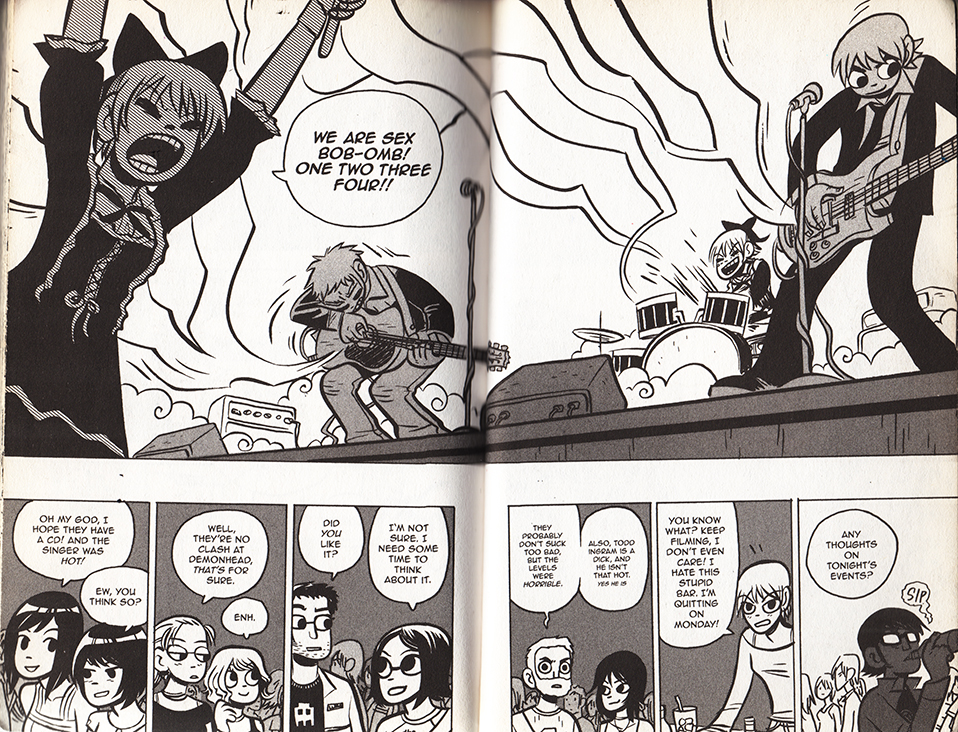
Music plays an even larger role in videogames than it does in film. And when I think of a ‘cinematically paced’ comic, Bryan Lee O’Malley’s videogame-infused Scott Pilgrim series immediately comes to mind. Coincidentally, the characters play, discuss and listen to a lot of music. What does Sex Bob-omb  sound like?


scottpilgrim_boombs


The books toggle with several cinematic genres and conventions. O’Malley showcases a playful mastery of anime and martial-arts cinematoraphic formulas. At two points the comic frames itself with a few vox pops, but I guess that could be as much of a homage to Dan Clowe’s Deathray as  Boondock Saints or Monty Python’s Flying Circus.

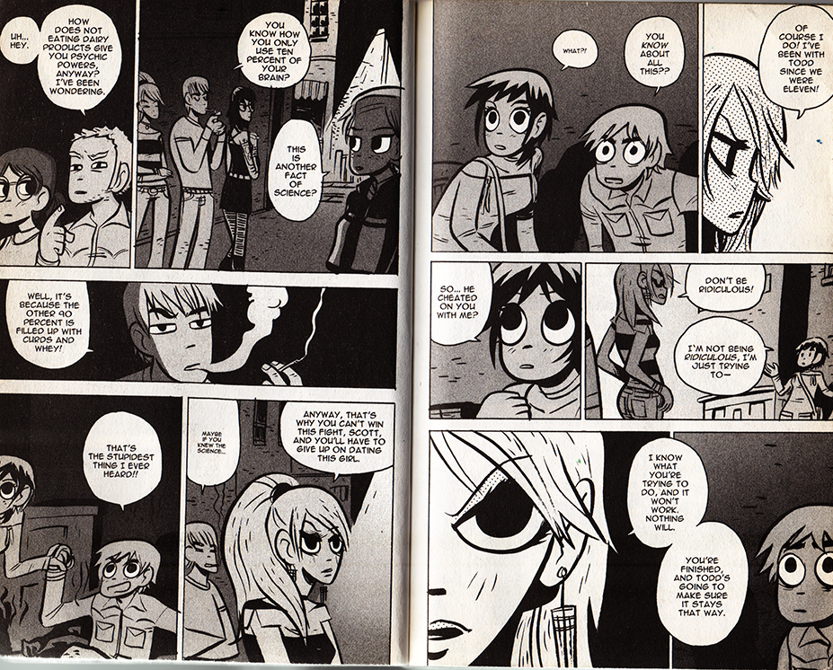
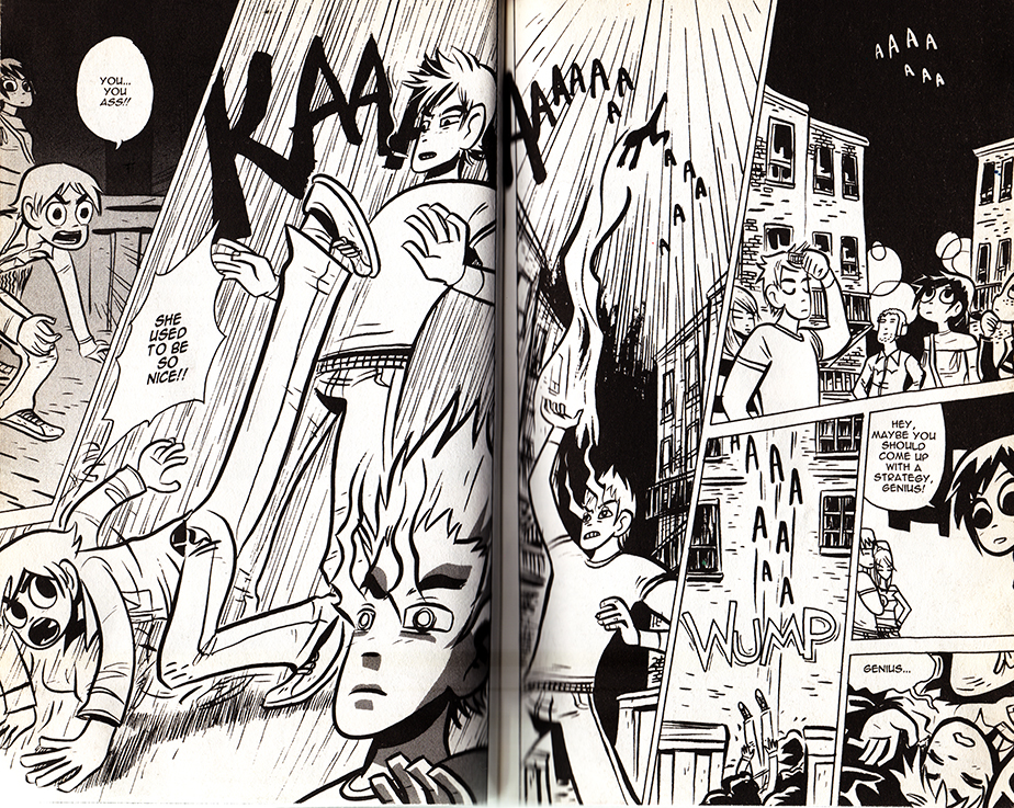
Most impressively, Scott Pilgrim uses hyper-condensed styles of cinematic storytelling, as when a whole relationship is traced over a series of pages. As long as filmmakers establish iconic characters and settings, audiences can easily follow a scattered montage. In comics, the specificity of the background often sacrifices the clarity of the characters, and a drawn interpretations of places are often unfamiliar and stylized. It’s a testament to O’Malley’s craft that this scene (below) is so effortless to follow. O’Malley uses this technique at several points in the series– pointedly never for athletic training ala Rocky, but always for relationships.


Scott Pilgrim 1scottpilgrim2scottpilgrim3scottpilgrim4

 From Scott Pilgrim Versus The Infinite Sadness

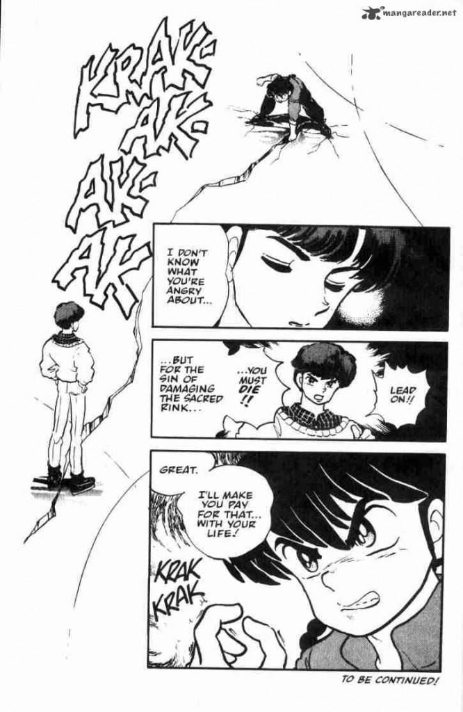
Reading comics, I’ve often felt that manga reads more cinematically than American comics, because of the smaller text to panel ratio. I don’t have any hard evidence for this, but manga is thought to be a major influence on the development of decompressed and widescreen comics.

Read Right to Left:


ranma_breaksice

From Rumiko Takahashi’s Ranma 1/2: Volume 3

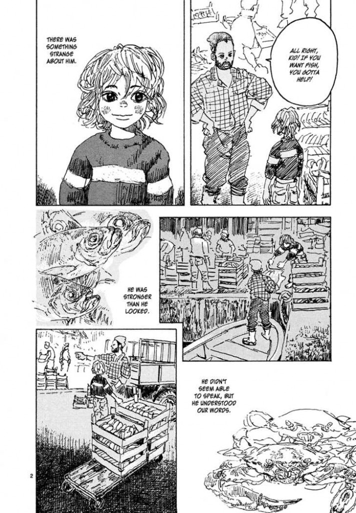
childrenofthesea_page2

From Daisuke Igarashi’s Children of the Sea #8

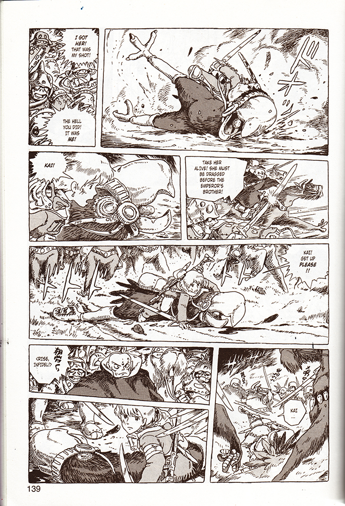
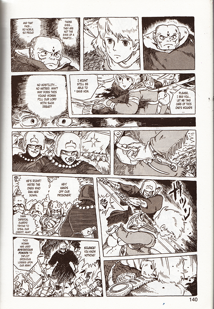
Akira, (the quintessential decompressed comic,) and Nausicaa of the Valley of the Wind are slightly higher brow (and arguably Westernized) examples, and coincidentally are better known for their film adaptations. As comics, both read like gorgeously realized, meticulous storyboards. Reading Nausicaa, I found myself mentally humming pieces of classic Hollywood war and western scores, and occasionally, (appropriately,) a little Hisashi. Yet I’ve never seen the film adaptation with his score.

Read Right to Left:


nausicaa1nausicaa2

From Nausicaa of The Valley of the Wind, Book 3


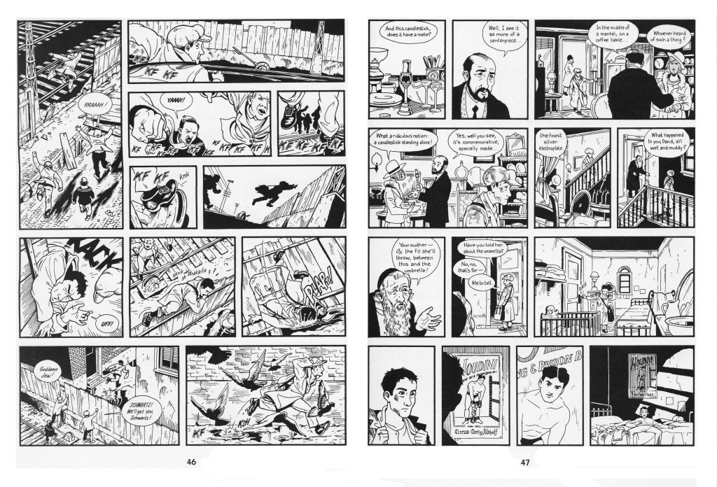
I’ve written a bit about the cinematic quality of Jason Lute’s Berlin: City of Stones here. Lutes comes as close as Miyazaki to making a ‘movie in a book.’ He doesn’t push the boundaries of comics narrativity, and focuses on virtuosically recreating the mis en scene, pacing, and character management of films like Wings of Desire. I’ve complained that Berlin’s ironies alienate readers from the characters, and perhaps a little background music could have sweetened the deal.

berlinhoudini

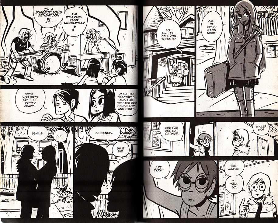
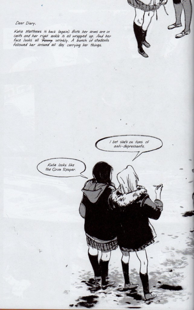
Skim by Jillian and Mariko Tamaki is an intersting example. While sometimes (unintentionally) dismissed as a teen comic, it is temperamentally aligned with the quieter side of Hollywood epics-  adult coming-of-age dramas like American Beauty, The Shawshank Redemption, A River Runs Through It, and The Cider House Rules, (which are often literary adaptations.) The wikipedia page for The Shawshank Redepemtion contains a great note on Thomas Newman’s score:

…the main theme (“End Titles” on the soundtrack album) is perhaps best known to modern audiences as the inspirational sounding music from many movie trailers dealing with inspirational, dramatic, or romantic films in much the same way that James Horner’s driving music from the end of Aliens is used in many movie trailers for action films.

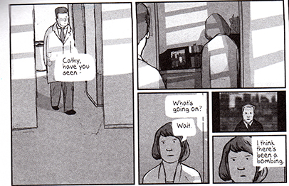
“End Titles” is probably a good candidate for Skim’s phantom score. Unfortunately, this makes Skim sound heavy-handed, and I’m relieved that “End Titles” doesn’t accompany the book’s heartbreaking, graceful layering of voice and images. Not to say that they don’t sometimes suggest it.

1109 bks best7.JPG


The following pages are in sequence:

skim_buildup

skim_doublepagespread_2

Comics like Tintin are a little more complicated. Herge’s ligne clair extends to the pacing of the comic, and complicated action sequences are detailed moment by moment, like key frames in a storyboard. Yet Herge is so ungratuitous that when he get’s the chance to skip a few key frames, he does.

tintin_blackisland

From TinTin: The Black Island

The phantom score between the last two panels experiences skips like a warped record. Otherwise, I’m not sure why I don’t find Tintin very cinematic– I guess I want to blame the page size. You can pack a lot of panels and text onto an album page, as opposed to the small leaves of most manga books. By the virtue of their size, manga pages automatically resemble dramatic splash pages, and the act of constantly turning pages creates a breathless momentum that exaggerates the cinematic pacing. Tintin is literally less of a page turner.

animalman_1

animalman2
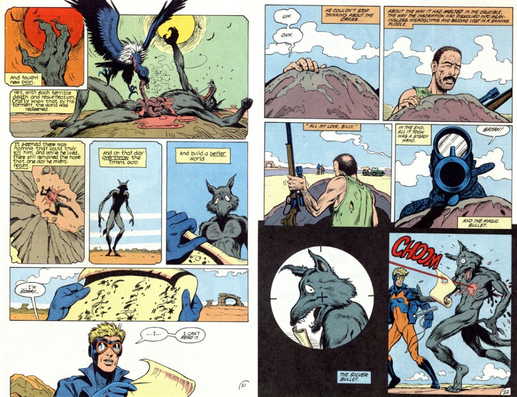
from Morrison, Truog, Hazelwood, Costanza and Wood’s Animal Man #5 

My piece is sorely missing examples from mainstream superhero comics. I’ve spent hundreds of hours scanning, assembling and digitally correcting them at Marvel, and have read a decent amount of them myself… but I don’t own any, and I don’t consider myself well-read in them. I’ve enjoyed Alan Moore and Grant Morrison’s work, but I get the feeling that they encourage cinematic pacing more often than other writers. I remember putting pages together on a stunning Hulk comic– it was printed sometime in the fall of 2009, and it opened with panel after panel of the Hulk charging at the viewer in darkness. When I saw the finished book, the whole thing had been slathered with first person captions. I couldn’t bear to keep it. Perhaps I’m being unfair; heavy-handed voice-over is also cinematic in its own special way.


New Yorker Cartoonist Recycles Gag: No One Notices, Cares

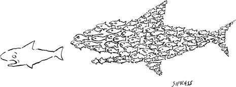
A cartoon grabbed my attention while I was perusing the recent issue of the New Yorker.

sipress_fish


courtesy of The New Yorker– you can find it’s cartoon bank entry here


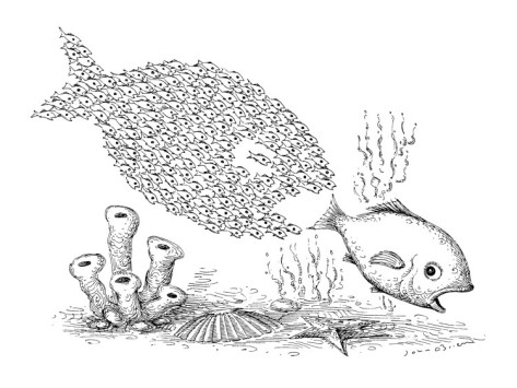
I thought I’d seen this before. The concept itself is pretty generic, but… hadn’t this already been a New Yorker cartoon?

obrien_fish_2

courtesy of The New Yorker– you can find its cartoon bank entry here

I would have been too young to have seen O’brien’s original cartoon, as it was published October 28, 1991. There’s a chance I’ve caught a reprinting of it. More likely, I’m as used to the concept as everyone else, demonstrated by the variety of “small fish eat big fish”  images uncovered on a google image search.

While not ubiquitous,  I’d say that the small-fish-forming-into-bigger-fish-and-chasing-predator is an established visual metaphor. It’s interesting to see that the small-fish-forming rarely occurs without the chasing/eating of the bigger fish (can they eat the bigger fish?) The pressure to group together is always a retaliation to predation. Additionally, while the motif has a satisfying punch line, it doesn’t seem like its primary function is to be funny. Typing in “organize fish,” brings up a decent amount of these cartoons with an anti-capitalist bent, where the concept is put across motivationally or strategically. Most of the fish images look like infographics, and a quick survey reveals their sources to be editorial blogs or stock-photo sites, (perhaps most revealing.)

Perhaps the New Yorker cartoon editor should have paid attention to the fact that this image isn’t very funny. Alternatively, he or she might have liked the fact that the cartoon’s commentary outweighs it’s laugh-factor, even though its message is more hopeful than truthful. Finally, the editor might have approved it because it just seemed like something the New Yorker would publish, which is actually the case.

Comparing the cartoons, I prefer the O’brien image. O’brien’s execution of the little fish is more whimsical, and he doesn’t require plankton or sea-monkeys to fill out the fins. The remorseless ambiguity of the predator’s expression is nice– perhaps he looks surprised, but fish look that way all the time. O’brien’s rendering of the sea-floor makes his cartoon less conceptually clean, but as money managers and Occupiers convert the idea into a truism, a slogan, I prefer it messy and maximalist. His use of stipling reminds me of an old scientific etching. I wish he had pushed that more aggressively– rather than an inspirational ‘au contraire,’ the drawing would have illustrated the absurdity of this metaphor happening in nature. But that’s not really that funny or interesting either. Oh well.