Analyzing Comics 101 (Layout)

The downside to teaching a course on comics is discovering that no textbook quite matches the way you want to teach the material. The upside is writing that textbook yourself. And so here’s the first draft of an intended series of “Analyzing Comics 101” blogs. My actual course is called “Superhero Comics,” but I’m hoping this will be useful to other students, teachers, fans, etc.

So here goes . . .

ANALYZING LAYOUT

Layout: the arrangement of images on a page, usually in discrete panels (frames of any shape, though typically rectangular) with gutters (white space) between them, though images may also be insets or interpenetrating  images. Page layouts influence the way images interact by controlling their number, shapes, sizes, and arrangement on the page, giving more meaning to the images than they would have if viewed individually. Layouts are the most distinctive and defining element of graphic narratives.

Layouts tend to be designed and read in one of two ways, in rows or in columns.

Rows: panels are read horizontally (and from left to right for Anglophone comics, but right to left for Manga). Types of row layouts include:

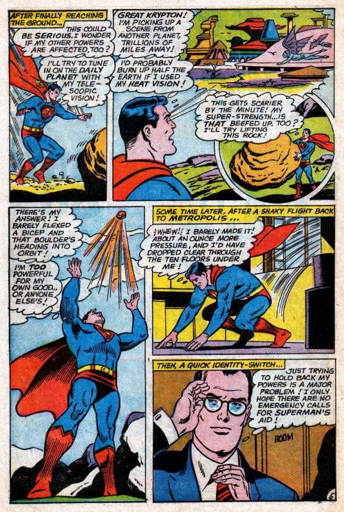
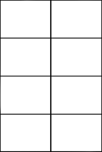
Regular 2×2, 2×3, etc.; 3×2, 3×3, etc.; 4×2, 4×3, etc.: vertical panel edges line-up, creating uniform panels in all rows. 3×3, 3×2 and 4×2 are the most common regular  layouts.

3×3:


3×2:
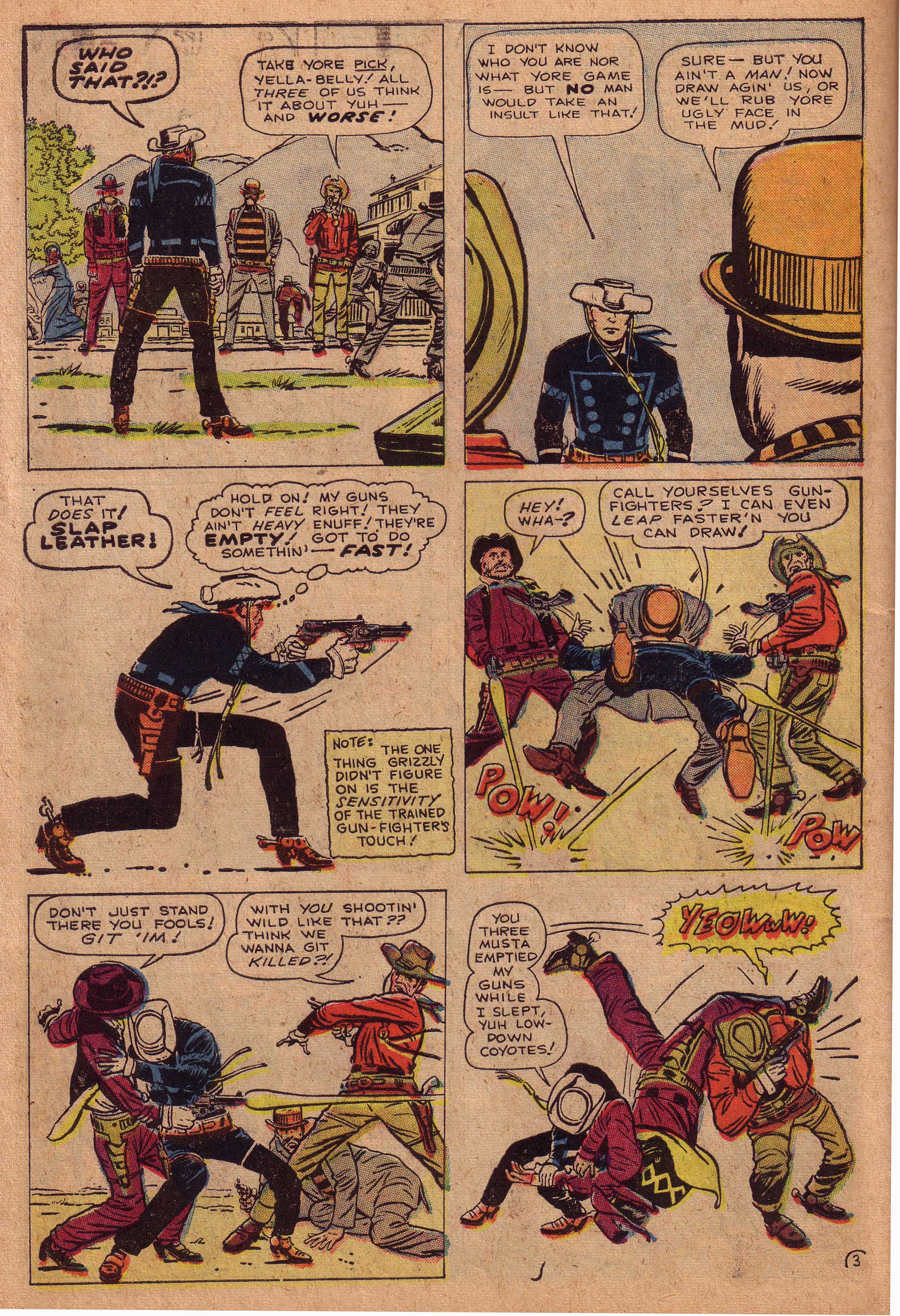
     

Regular 4×2:


2×3:


2×4:

4×3:
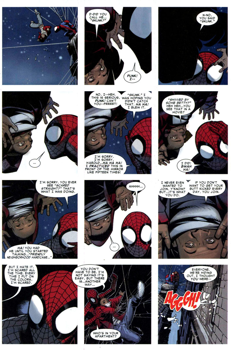
3×4:

4×4:

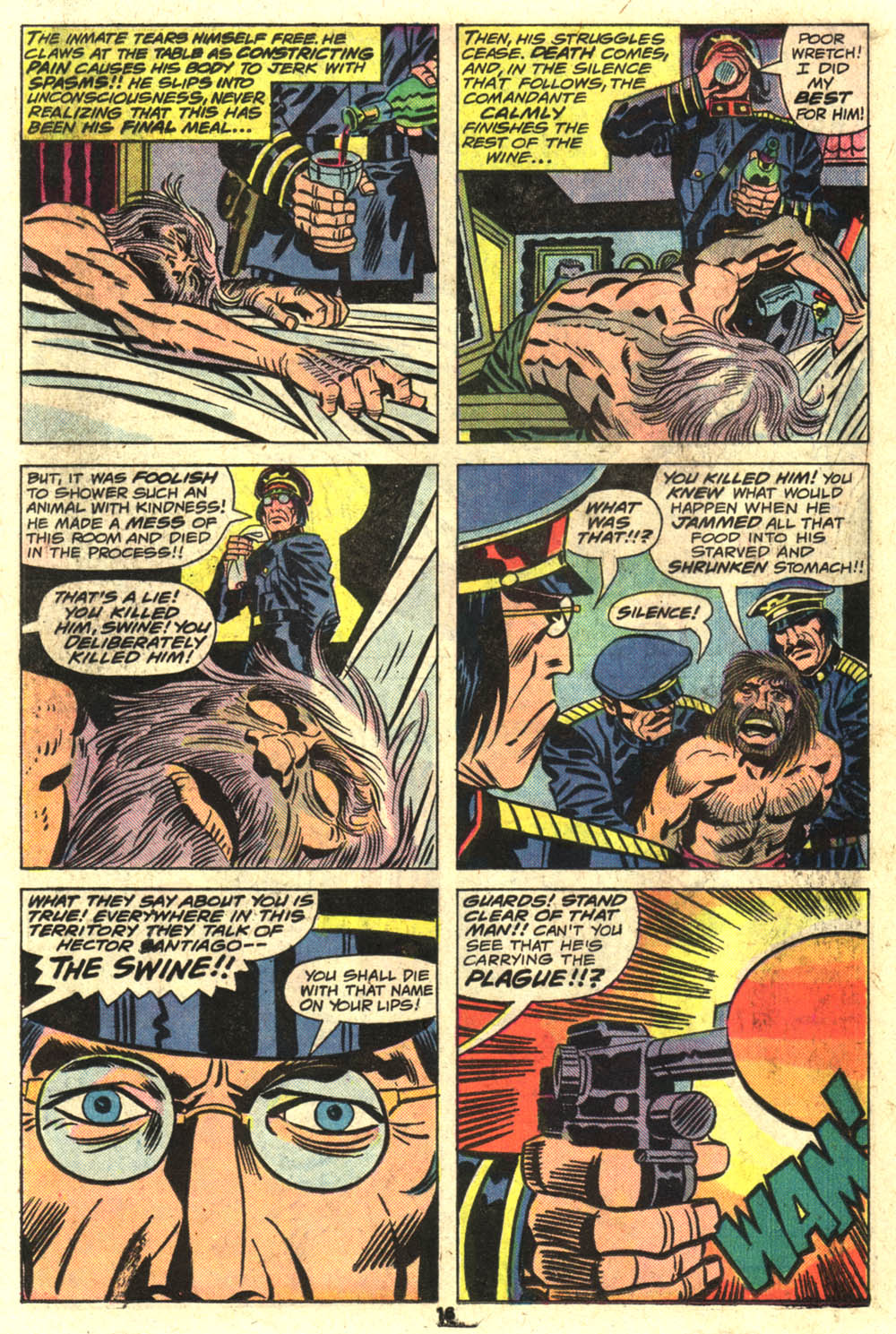
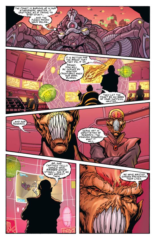
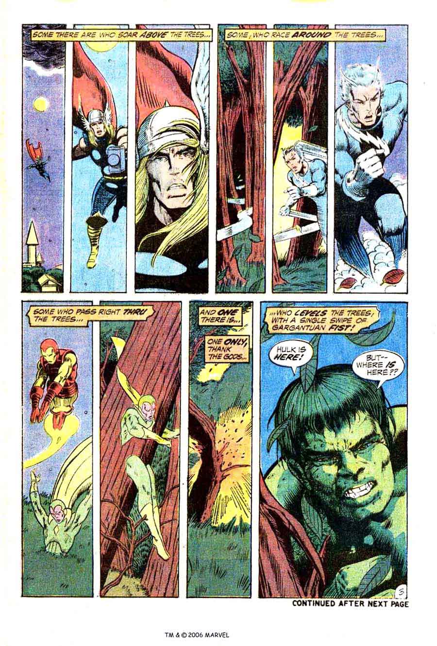
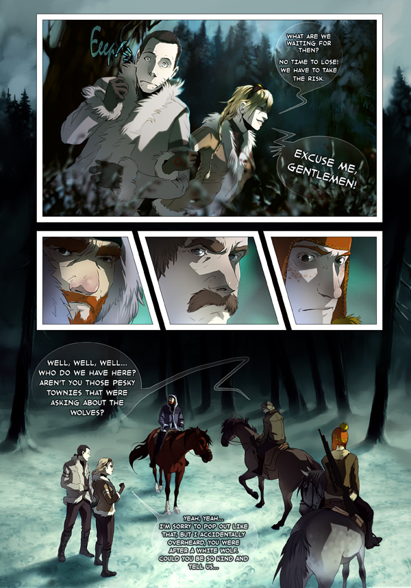
Irregular 2-row, 3-row, 4-row, etc.: vertical panel edges do not line-up, creating a different number of or differently sized panels in one or more rows. The irregularity may include a full-width panel, which extends horizontally across the whole page, or rows divided into 2, 3, 4 or more panels. Irregular 3-row layouts are among the most common layouts in comics, followed by 4-row and 2-row.

3-row:
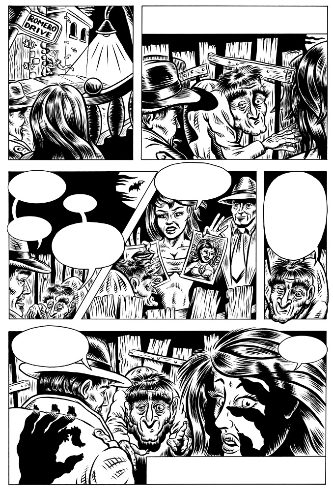


4-row:


2-row:


 Image result for comic book pages

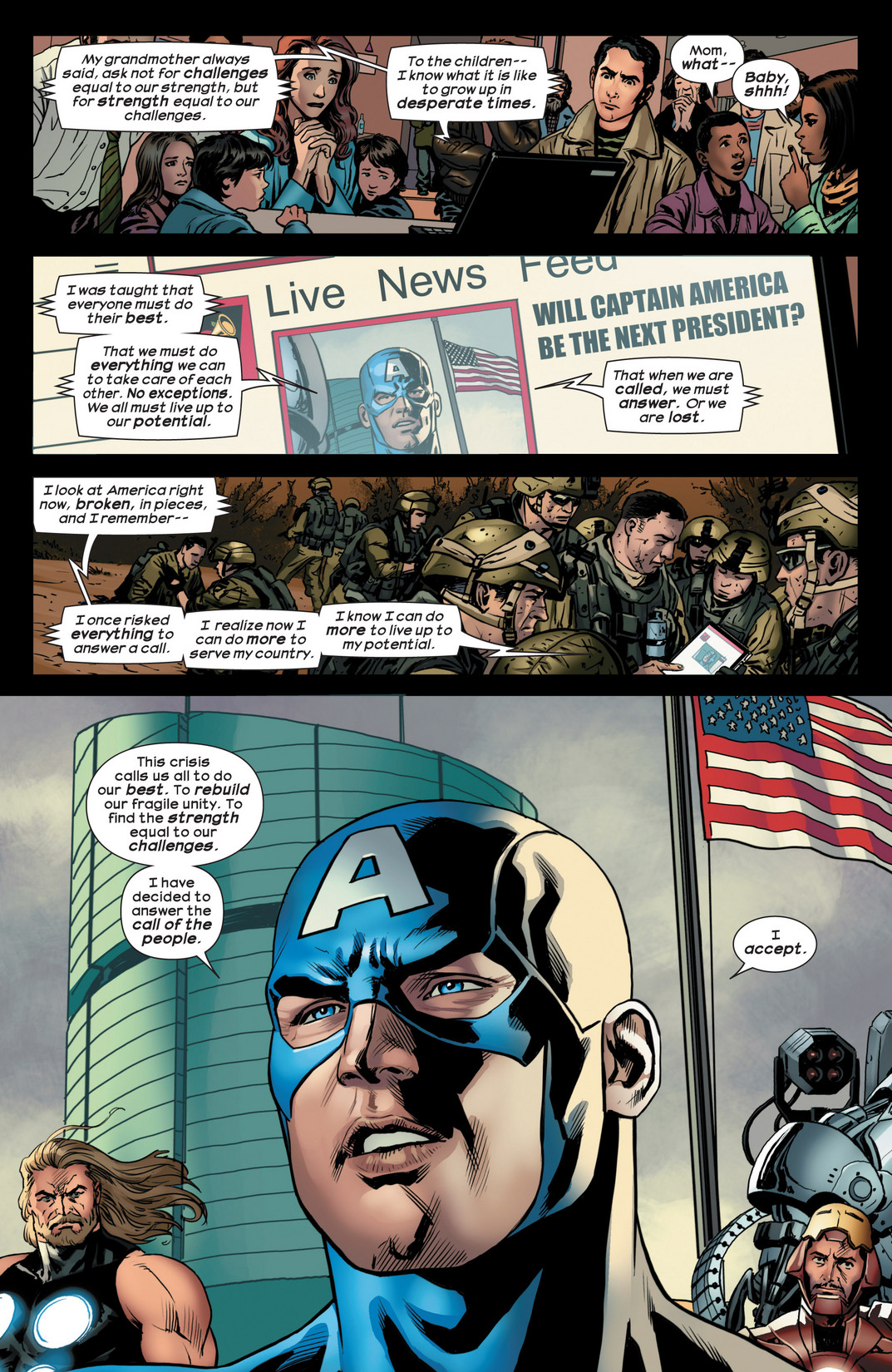
Columns: panels are read vertically, from top to bottom. Because of the Anglophone tendency to read horizontally before vertically, columns are less common in Anglophone comics.  Column layouts include:

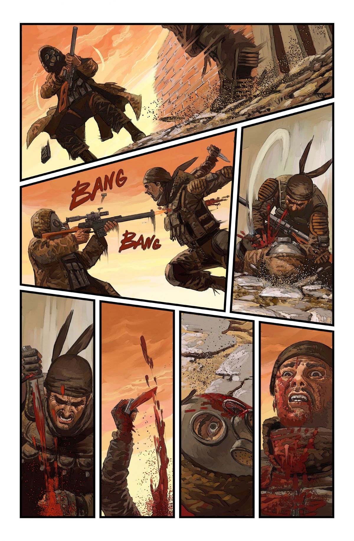
Regular 1×2, 1×3, 1×4, etc.; 2×2, 2×3, 2×4, etc.; 3×2, 3×3, 3×4, etc.: horizontal panel edges line-up, creating uniform panels in all columns. To counter horizontal reading norms, columns often use one or more full-height panels, which extends vertically down the whole page. The absence of segmented panels within a full-height panel column reduces establishes the column layout, preventing a horizontal reading path.

1×4:

1×3:
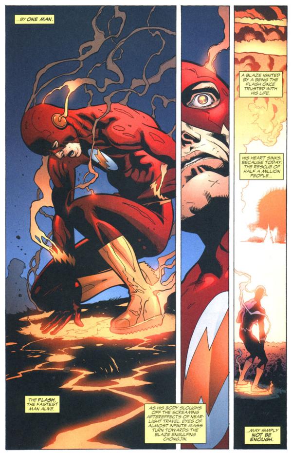
1×2:
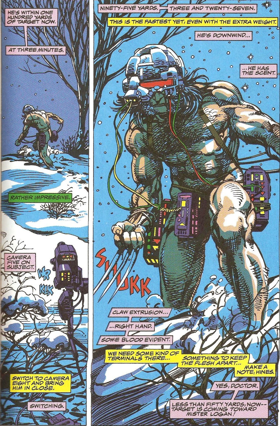
Irregular 2-column, 3-column, 4-column, etc.: horizontal panel edges do not line-up, creating a different number of or differently sized panels in one or more columns. Because horizontal reading is an accepted default, segmented columns tend to be irregular, with one or more taller panels breaking the left to right norm. Often a single, full-height panel establishes an irregular 2-column layout, with the second column divided into multiple panels. Irregular 2-column are the most common column layouts.

2-column (with establishing full-height panel):


Row and column patterns, however, are indistinguishable without content to determine reading direction. A 4×2 layout, for example, may be read as four rows divided into two panels each, or it may be read as two columns divided into four panels each. However, because Z-path reading (first right then down) is the norm for Anglophone comics, 4×2 is typically read as a 4-row layout not a 2-column.
Rows and columns can also be merged by including only full-width panels within a single column. These are irregular 3×1, 4×1, 5×1, and 6×1:

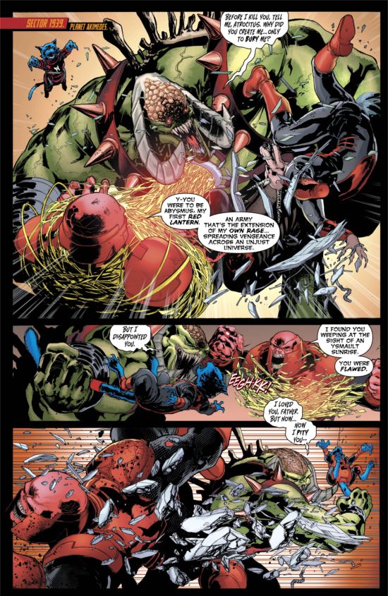


     Image result for comic book pages

Image result for comic book pages

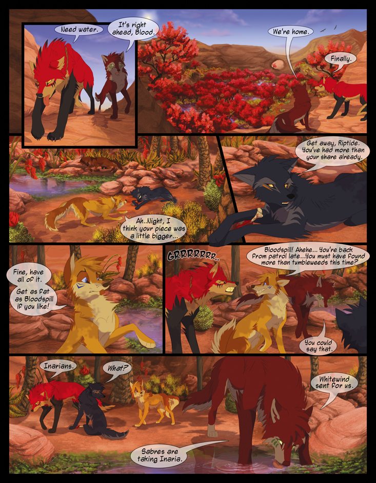
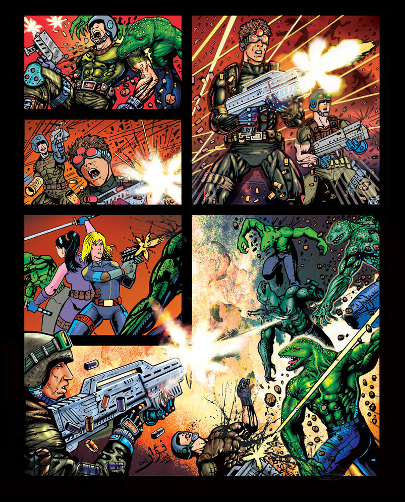
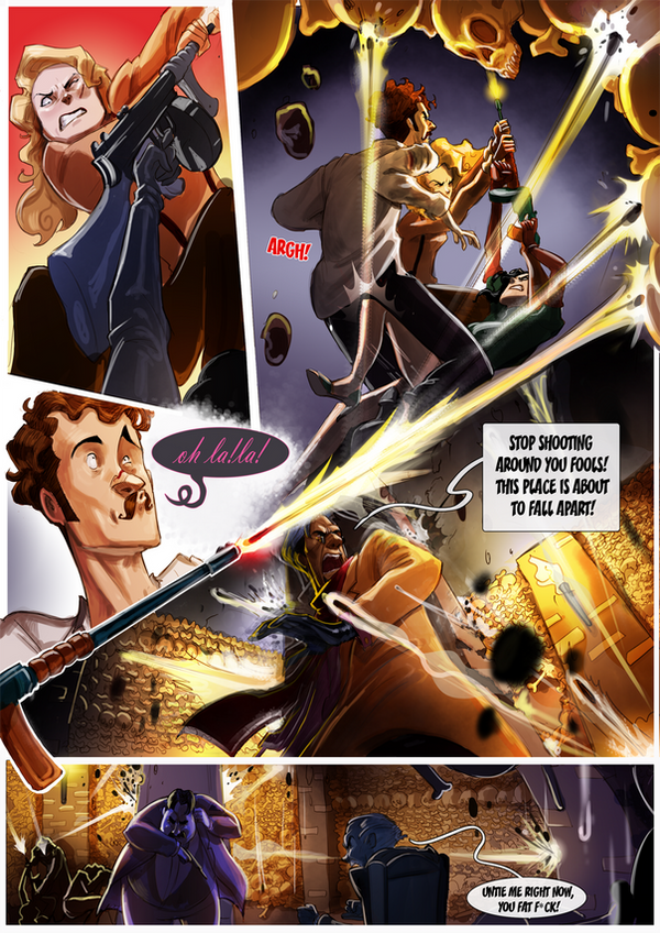
Combinations: panels must be read both horizontally and vertically, combining rows and columns on a single page. In practice, combinational layouts are always irregular. Common combinational layouts feature one or more paired sub-columns (one sub-column divided into two panels, the other the height of those two panels combined, with the two sub-columns sequenced in either order) or a single, full-height column in an otherwise row-patterned layout. 


Image result for comic book pages'

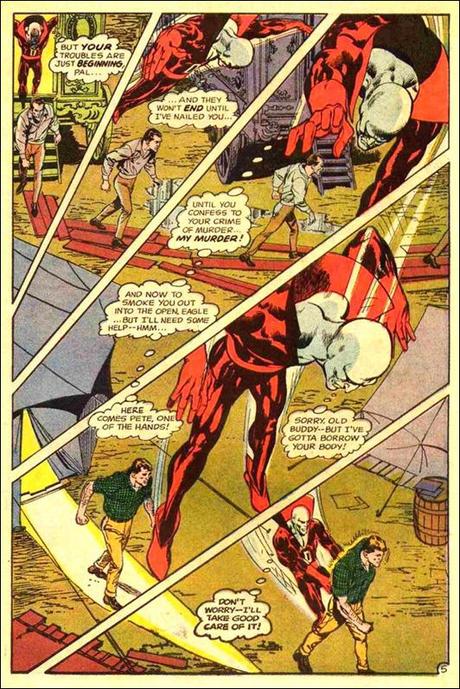
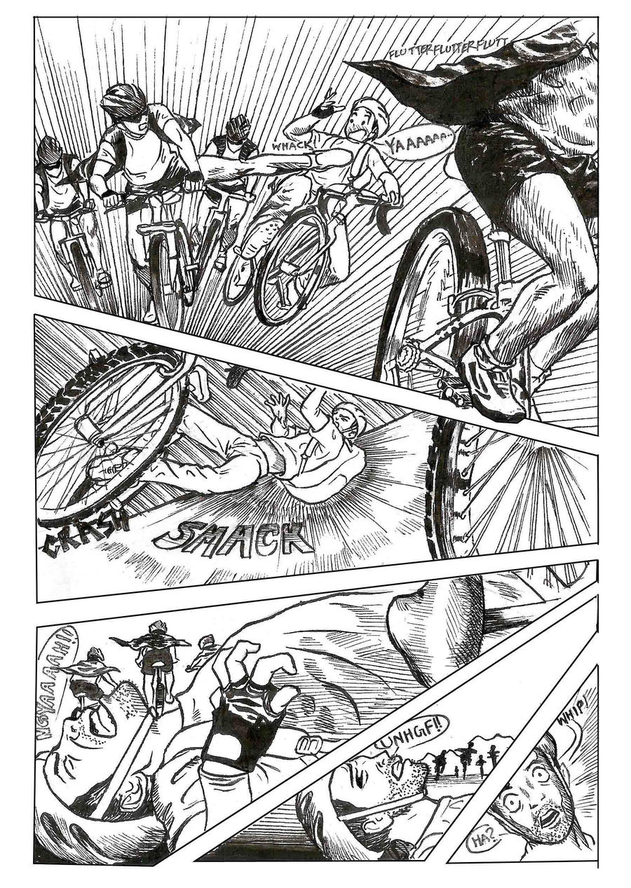
Diagonal layouts: panels do not follow vertical or horizontal divisions, and so are neither clearly rows nor columns:


Caption panel: a panel that contains only words.  These tend to be smaller, subdivided panels.

Inset: a panel surrounded entirely by another image.


Overlapping panels: a framed panel edge appears to intrude into or to be placed over top another framed panel, with not gutter dividing them.


Broken Frames: image elements of one panel extend beyond its frame into the gutter and/or into the frame of an adjacent panel.

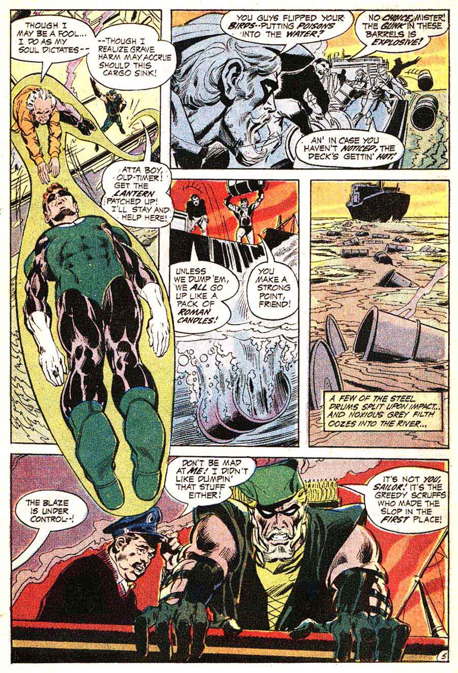
    

    Image result for comic book pages'

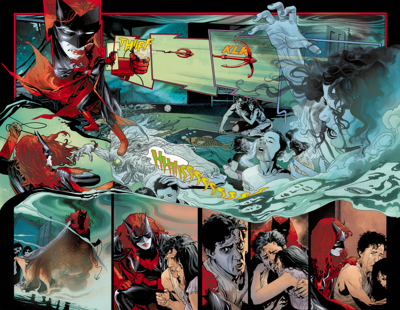
Insets, overlapping panels, and broken frames are often combined:


Interpenetrating images: two or more unframed images with no distinct gutters or borders so that elements of separate images appear to overlap.


Page panel: A page-sized panel, typically visible in the gutters between smaller panels. When white, black, or otherwise uniform, the page panel appears as the page itself and so as a neutral space outside of the actions and events of the drawn images. All other panels are insets superimposed over the page panel. If the page panel includes drawn images, those images should be understood as the underlying and so in some way dominating background element to all other images on the page. If one panel is unframed, its content may be understood as part of the larger page panel.


A page panel with no insets and a single unified image is a full-page panel:

A full-page panel with author credits is a splash page.

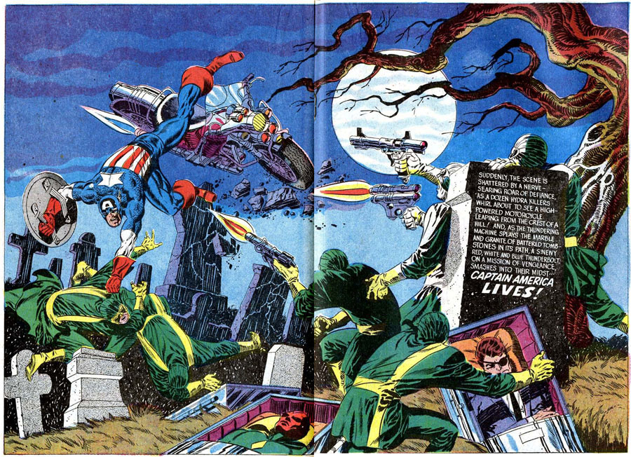
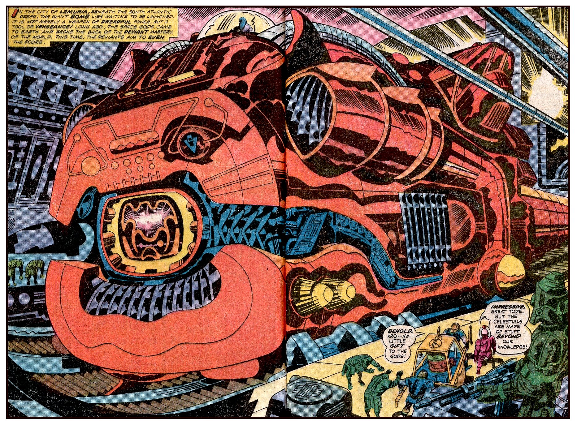
Two-page panel: two facing pages designed to be read as a unit. A two-page spread are two facing pages not designed as a unit.
Panel accentuation: a panel may be formally differentiated and therefore given greater importance by its size, frame (including shape, thickness, and color, and by being unframed) or position on the page (first, center, and last panels tend to dominate).

Panels accentuated by border shapes:


Base Layout Pattern: a panel arrangement repeated on multiple pages.

Strict: repetitions from page to page contain no variations in a base pattern.

For the Superman episode of Action Comics #10, Joe Shuster uses a strict 4×2, as does Fletcher Hanks for “Stardust the Super Wizard” in Fantastic Comics #12:


Flexible: some variations, especially through combined panels and divided panels. Often the base pattern is only implied.

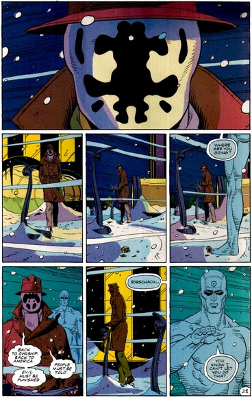
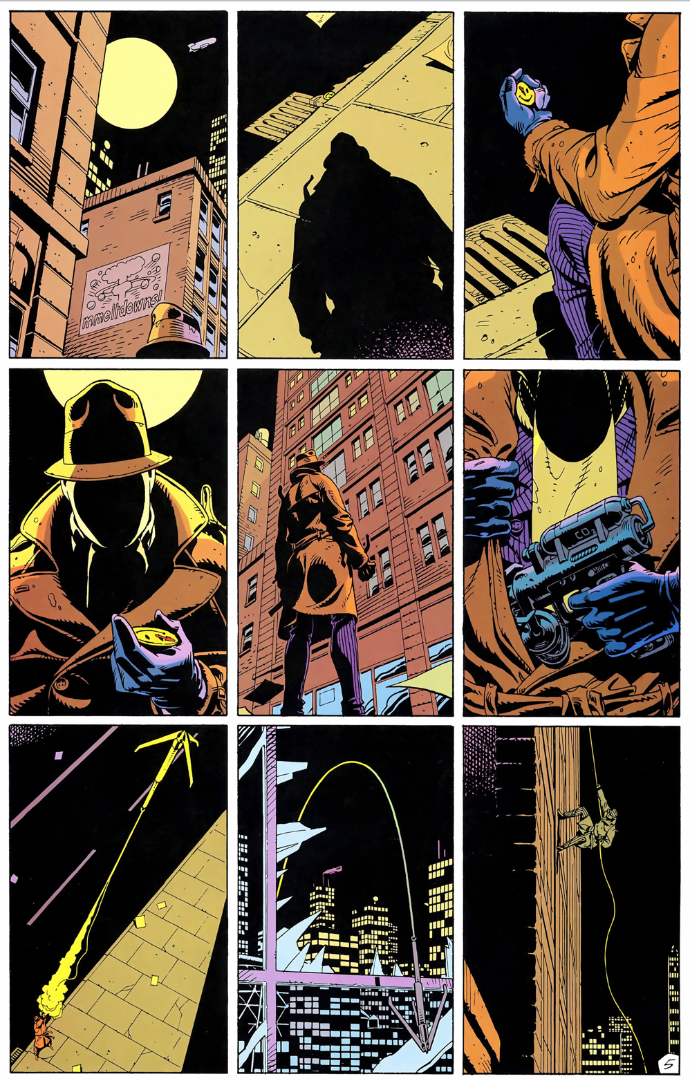
Watchmen is the best known example of a flexible 3×3 base pattern:


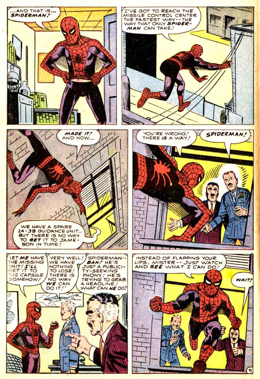
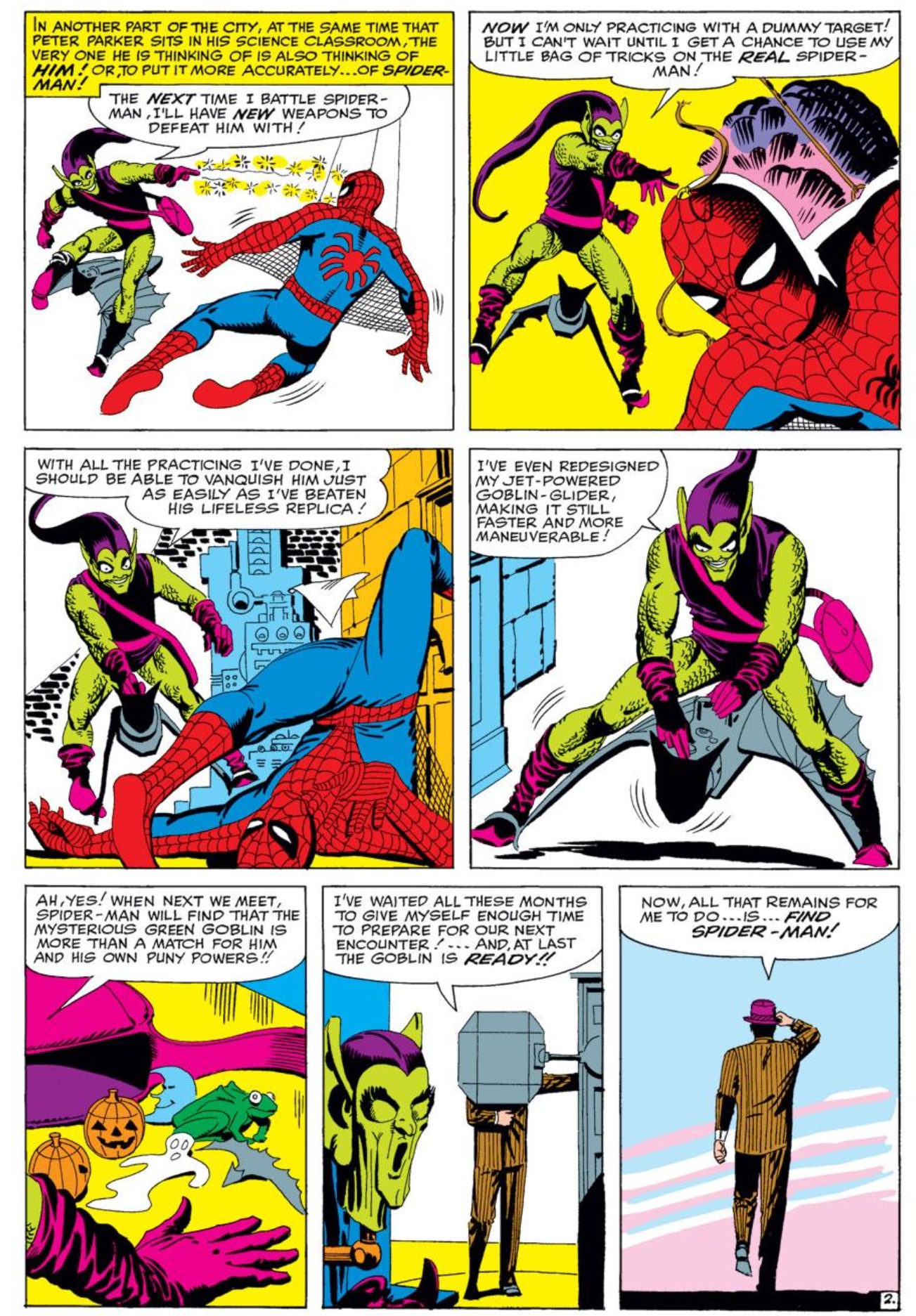
Comics more often use a flexible 3-row base pattern. Steve Ditko fluctuates between rows of three panels and rows of two panels in Amazing Spider-Man:

      .


Irregular: no base pattern.

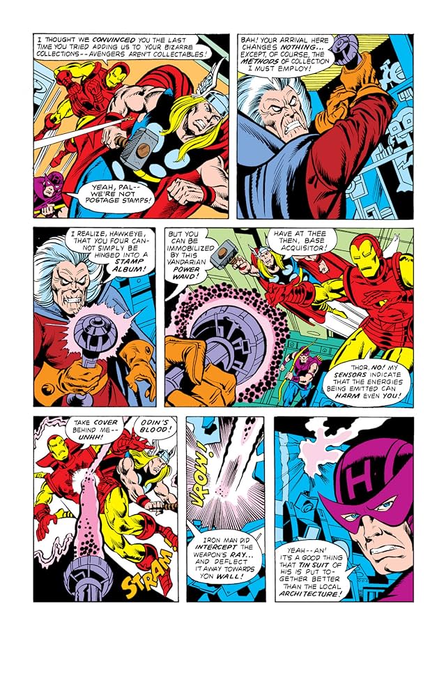
The Avengers #174 fluctuates between 3-row and 4-row layouts:


If more than one arrangement repeats, each pattern may be distinguished descriptively (3×3, irregular 2-column, etc.) or by chronological appearance (layout A, B, C, etc.). Pages that repeat earlier layouts may be said to rhyme.  A comic book’s page scheme may be analyzed for layout repetitions, creating a page scheme. But let’s save that topic for later . . .

Can Rhetorical Layout Modulate Narrative Momentum? (Groensteen and Page Layout Roundtable 1)

The entire Groensteen and Page Layout roundtable is here/


lp everything2


“…[T]he experience of reading a comic is a function not only of what is contained within each panel, but also of the size, shape, and design of the panels themselves as well as the spatial relations among them.” (Joseph Witek, “The Arrow and the Grid,” in Heer and Worcester’s A Comics Studies Reader, 155)

 
I have a foundational question to ask before heading into the first of our five Pencil Panel Page posts responding to Thierry Groensteen’s exploration of page layout and rhythm in his recently translated work, Comics and Narration (Mississippi UP, 2013, trans. Ann Miller), especially Chapter Two, “On a Few Theories of Page Layout.” Are we selling traditional (i.e. non-abstract) comics short by foregrounding them as “sequential narratives” first and foremost? I wonder if, by privileging narrative momentum, that forward-thrusting gesture of story that we are so wired to detect and to favor, we have occluded the equally compelling possibility of nonlinear composition and meaning-making on the comics page. So many discussions of page layout, including Groensteen’s to a great extent, are predicated on propulsion, i.e. asking how the reader’s eye is drawn from panel to panel to make sense of the narrative. This narrative accretes; if the layout is effective, the story is built up (Ware allusion intentional, yes) from its component parts (the panels), and the reader is drawn across the pages, actively cooperating in its construction: “The multiframe lures the reader ever onwards, it designates in advance the images still to come; the reader therefore feels summoned by them and rushes headlong after the forthcoming narrative segments, as if running down a flight of stairs.” (“The Rhythms of Comics,” Comics and Narration, 136)

This underlying metaphor is seductive. Why wouldn’t we favor a formal model that upholds comics as a vigorous, agentic medium that grabs readers visually and verbally and carries them into the story? Why wouldn’t we favor a formal model that applauds the skilled comics reader for his/her ability to catch the wave and move in rhythm with the text? Kinda sexy, no?

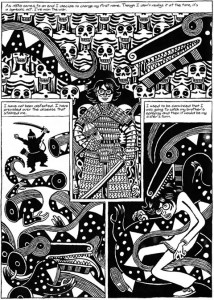
‘Cept maybe it’s not the only game in town. Groensteen’s exploration of the multiframe (the page; in System of Comics, this was sometimes translated as “hyperframe”) in Chapter Two relies on the privileging of narrative thrust, but it does gesture at another possibility, even if it doesn’t explore it fully. This possibility is not limited to abstract or wordless comics, which in a later chapter (Chapter 7) are offered as the [only?] comics forms that escape the regular “beat” of linear progression (“In narrative comic art, rhythm is no longer part of the content itself [as it may be on some pages of abstract comic art] but merely a mode of narration.” 135). The possibility that intrigues me is the page composed of “rhetorical” panels: “the technique that molds the shape or size of the panel to the action that it encloses.” (46). Groensteen attributes this term and concept to Benoît Peeters (Lire la bande dessinée [Reading Comics]) and suggests (too briefly) that interesting tensions can be created when regular patterns are interrupted to visually echo diegetic material (e.g. dialogue that extends beyond a panel border or the occasional use of symbolic panel shapes). Joseph (Rusty) Witek, in his important essay, “The Arrow and the Grid,” (in Heer and Worcester’s A Comics Studies Reader, Mississippi UP, 2009), offers another term–“gestalt” — for such panels, defining this layout process as one in which the “overall shapes of the panels take on narrative or thematic significance” (154). Witek offers early Jack Kirby Captain America pages as an example, and here’s a simple example from David B.’s Epileptic:
 

epileptic_page

 
(Incidentally, these two pieces of criticism work beautifully in conversation with each other, though neither references the theory of the other; perhaps this is one answer to a question posed for the forthcoming Comics/Graphic Narratives Discussion Group MLA 2015 roundtable on comics theory: “Now that many Franco-Belgian works of comics criticism are available in translation—The System of Comics, Comics and Narration by Groensteen, to name two—are we beginning to see a blending of Anglo and French comics theories, or do these seem to be two separate lines of thought?”)

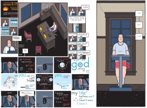
Both Groensteen and Witek see the regular pattern of layout as the basic structure of the comics page (for Witek, it’s a “grid,” for Groensteen it is the “waffle-iron”) and both discern relative degrees of complexity in any disruptions offered by comics creators, beginning with the “easiest,” which is based on the simple “elimination” of vertical or horizontal borders to create larger panels that still adhere to the basic structure, and in a modular form, insert smaller or larger panels into the given space of the grid. Groensteen conceives of this as “nested regularity,” and offers Chris Ware’s work as the quintessential example:
 

U_21_390066527146_ACME_20_sample

 
Interestingly, there is a bit of tension here: on one hand, Ware is acknowledged as tightly controlling the rhythm by disciplining the reader to recognize the basic pattern and then follow it as it shrinks Fibonacci-style, yet readers can and do fight this highly controlled regularity, as Orion Martin did in his June 6, 2014 Hooded Utilitarian post, “I’m Lost: Path-Finding in Comics“:

“Recently, while reading Chris Ware’s Building Stories, I found myself completely ignoring the path that he had imagined. Instead of a narrative progression, I read the pages as clouds of remembered moments, letting each fall into place in due time.”

(Here, Martin has hinted at exactly what I’m hoping for: perhaps we don’t have to stay narratively inclined while reading narratives!)

More sophisticated versions of experimental layout that still do not reach the gestalt/rhetorical stage are other types of play on the regular grid; for example, occasionally altering the expected number of panels (“density”) in an otherwise regular album (book)–splash pages, landscape panels, etc.–, changing the very shape of the page from the usual rectangle to another shape,
 

mouse-guard-v3-the-black-axe-preview-pg11

 
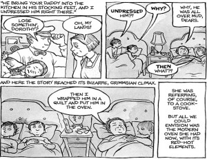
(see David Petersen’s enlightening discussion of why he believes the square page works best for his Mouse Guard), or making the grid slightly irregular– an “offset grid,” offers Witek—as Alison Bechdel uses here:
 

alison-bechdel_fun-home_oven

 
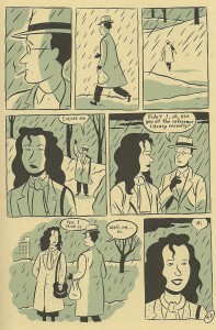
Or how about combining bordered and borderless panels, while also varying the number of panels per line, as Seth does here:
 

scan0011

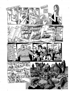
Here’s Joe Sacco doing even more clever things with the offset grid:
 

footnotes_in_gaza_

 
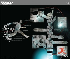
Finally, we approach rhetorical panel layout, which not only takes into account what is happening diegetically, but also assists the reader in exploring thematic and tangential meaning on the page (i.e. keeps us on the page, and perhaps beyond the page/beyond the comic, rather than simply propelled forward in the narrative), as in this fine example from Jason Smith’s The Jumper:
 

20130205-OnTheVerge-TheJumper-38

“…I mean what happens when the story actually calls for some kind of different layout?” Smith wonders in his meditation on the layout choices he made for The Jumper.

“The layout actually gets the reader to do two things that most comics don’t normally ask you to do: 1. read up the page from top to bottom [sic; I think he meant bottom to top], and 2. read from right-to-left.”

Though he doesn’t explore this gesture fully in his blog post, Smith does show how it is possible to significantly break with the grid in order to exemplify something fundamental to the story. I’ll be interested to see what Barbara Postema has to say about this in her chapter, “Concerning the In-Between: Layout in Frames and Gutters,” in the promising Narrative Structure in Comics: Making Sense of Fragments (RIT Press, 2013), which I’m hoping to get to before (*#$^!) the fall semester crashes into me.

Want to hear a comic artist think about rhetorical panel layout experimentation in a complex, legible way, without even once mentioning Groensteen? Read the creator of Dresden Codak, Aaron Diaz’s post, “Advanced Layouts: Paneling Outside the Box,” on his blog, Indistinguishable from Magic. Diaz offers us clear and compelling examples of nontraditional layout in order of difficulty. It’s a far less turgid exploration of the topic than the post you are currently reading, and well worth the jump. Go now.