HU’s been preoccupied with architecture this week. In yesterday’s post, Suat noted that “the building shorn of its façade has long been favored by cartoonists in search of a structure which best encapsulates the comics reading experience in a physically possible form: the rooms and walls acting like panels and borders…” But it’s worth noting that the gridded interior which resonates most efficiently with the conventional comics form is a historically situated architectural shape: the rectangular multi-story urban dwelling, industrial tenement house or modernist skyscraper.
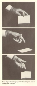
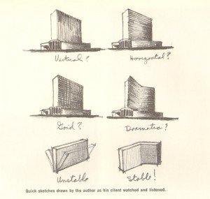
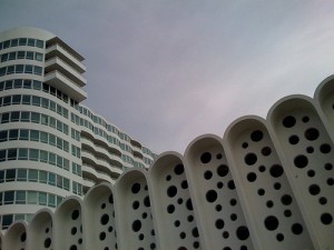
When architect Morris Lapidus was designing the 50-story Americana hotel in New York City in 1960, he needed to save his client the half-a-million dollars it would take to stabilize the high building against wind pressure. Lapidus’ solution was to bend the building so it would stand by itself, without support. First he illustrated the concept for his client using a calling card:
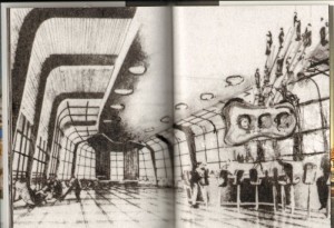
And then through illustrative drawings:
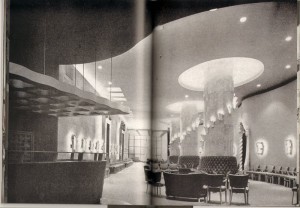
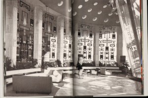
Basically, Morris Lapidus knew the limitations of a straight line. In the 1930s, living in New York and working as a merchandiser, he was already getting customers’ attention through curvilinear ornamental devices that an editor at Pencilpoint magazine described as “bean poles, cheese holes, and woggles.” [Woggles were amoeba-like shapes.] By the early-50s, during his rise to prominence in Miami Beach as the go-to architect for luxurious exotica, these features had become a signature style.
Lapidus himself defended the curves as natural — ”People don’t move in straight lines like an army — they meander. So, my plans meander” — but his protégé, Deborah Desilets, captures the more subjective experience of eschewing linearity: ”Mr. Lapidus knows how to give emotions physical form,” she said. ”His space swirls you; it prompts you to move; it’s an interactive architecture.”
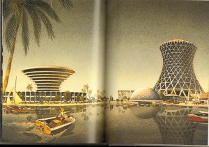
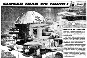
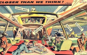
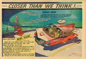
Around the same time as Lapidus was swirling the glitterati through his Miami hotels, The Chicago Tribune was publishing a single-panel “comic strip” by Arthur Radebaugh called “Closer than We Think”, which traded on the same curvilinear futurist aesthetic.
Although explicitly futuristic, both Lapidus and Radebaugh stand in marked contrast to the stark modernism of the International Style and European futurism of the early to mid-century. Theirs is a decadent, utopian futurism, apolitical, indulgent, ultimately more pop psychology and marketing than technology and science. Contrast with the futurism of Metropolis or Marinetti: these spaces are futuristic environments for an affluent bourgeoisie, professional men and women, with an expectation of technological luxury (an expectation not unrelated to our current economic malaise). This is a characteristically American futurism, indicative of “The American Century” and redolant with the capitalist fantasies that propelled America’s mid-century economy as well as American’s mid-century style.
And that’s where Deborah Desilets has a point: those decadent curves really are more immersive, emotional, and interactive than their more starkly linear cousins. This is the fantasy formation that makes it possible for marketing to mask commodification. Decadent futurism feels so postmodern not just because it foregrounds non-linearity as the avant garde would have it, but because it puts that non-linearity in the service of a fluid, imaginative fantasy — an unanchored, forward-looking fantasy of possibilities rather than the nostalgic one of history and memory that’s more characteristic of modernism. It’s that futuristic fantasy that is characteristically postmodern, in contrast with modernism’s fascinations with history, autobiography, and the contours of the past.
Not that a curvy, luxurious, decadent aesthetic is inherently bad or even inherently capitalist; in pre-modernist art, it was certainly put to far more bohemian ends. And non-linearity certainly isn’t associated with capitalist success in literature — it’s remained avant-garde despite 30 years of experiments with it. But in visual culture, decadence has lost those bohemian connotations and become pretty thoroughly bourgeois. That narrowing of signification needs to be challenged.
By the most fully postmodern standards, comics with a few exceptions tend to be quite linear: narrative storytelling through panels, even at its most flexible, is essentially a medium of vectors and lines. Sometimes in comics conversations and criticism there’s a sense that the form of comics – that sequential narrative storytelling through panels – is somehow transhistorical, that it can be endlessly manipulated internally to speak to and resonate with many and any aesthetic paradigms. But that isn’t true for any other artistic form, so it’s probably not true for comics either. Sequential narrative-through-panels is an architecture, and architecture is as historically situated as anything else.

