Uncharted Territory: Skim, by Jillian and Mariko Tamaki


For years I have recommended Skim, by Mariko and Jillian Tamaki, as one of my favorite comics. While beautifully illustrated and competently told, I’ve been hard-pressed to explain why I love this book so deeply. I often fall back on biographical justifications— I was once a teenager who romantically pursued someone significantly older, and its rare for me to find a book that accurately captures this experience. I’m tired of this explanation, as it does a disservice to Skim, which is an exceptional work on its own terms. I’m going to try to articulate, here and now, why Skim is a comic I keep coming back to, and shows much more promise for the medium than I see it accorded.

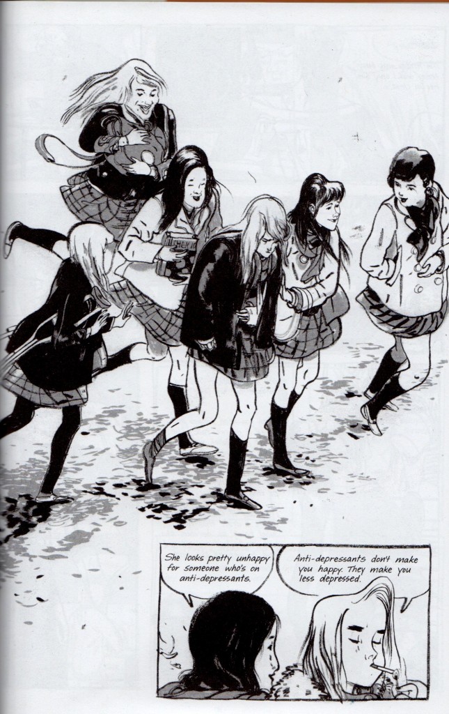
Skim is told from the perspective of a high school junior, Kimberly Keiko Cameron, nicknamed Skim because she is not. Skim chronicles of the fall semester of several young women, who navigate an all-girls Catholic school fixated on the suicide of a local boy. As counselors and students perpetuate an indulgent cycle of hysteria and healing, Kim and Lisa, two best friends, lampoon the faculty and student-body. As they grow apart, Kim falls in love with the young, maverick teacher Ms. Archer. Ms. Archer crosses the line, realizes her mistake, and immediately begins to withdraw from Kim and the school. Meanwhile, Katie, the well-loved ex-girlfriend of the local boy, becomes caught in the hurricane-eye of the school’s morbidity, and eventually enters onto Kim’s horizon.

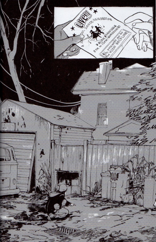
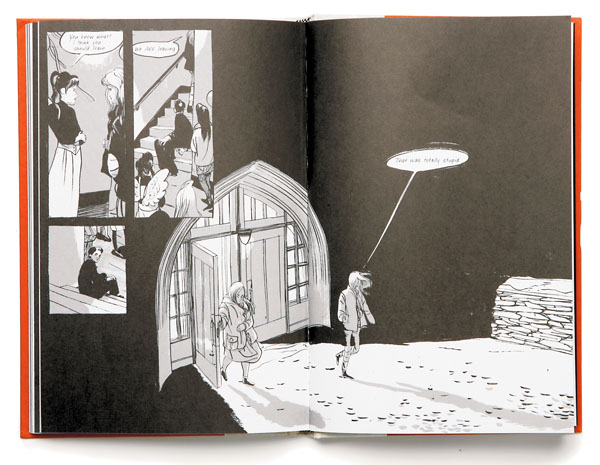
Skim spread 1

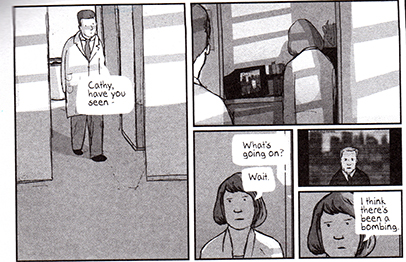
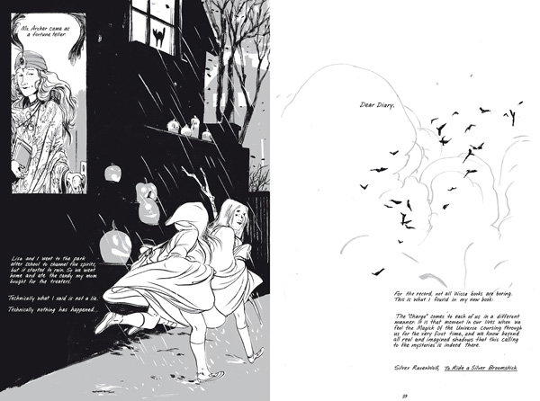
Skim spread 2

 Skim is darkly comic, though it hits the usual targets—small towns, personal religion, high school, high school girls.  Kim and Lisa visit a Wiccan circle that turns out to be an Alcoholics Anonymous recovery group. Kim receives a kitschy mug from her father’s girlfriend, adorned with a ludicrously ignorant slogan. A group of self-absorbed ‘popular’ girls form a club called ‘Girls Celebrate Life!.’ Etc. etc. Smartly, Kim and Lisa are not cast as the sole bastions of truth. Lisa spouts punk cliché after punk cliché, and while Kim knows better, she can only respond with clichés in turn. There’s comedy to be mined in the pathetic graspings of a group of hypocrites and posers, sure. Remarkably, Skim’s cynicism plays second fiddle to a sense of grace. Dark humor drops like stones through the surface of the narrative—the story is actually formed by the rippled answer to these plunks, a visual whisper that the world is much bigger, stranger and more beautiful and than these ironies suggest. Lingering hands, a telephone pole, or footprints in the snow somehow always get the final say.

Skim thump thump

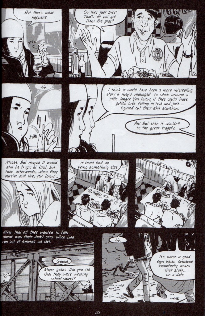
Skim’s attention to its story-world both accentuates and minimizes the scope of Kim’s depression– if there is a world outside black comedy, this world also continues after tragedy. Kim is observant enough to know that she’ll recover from her loss, but she’s lonely. She simply wishes this recovery was more important than the tragedy everyone seems hungry to witness, as she vocalizes below:

Skim Romeo and Juliet

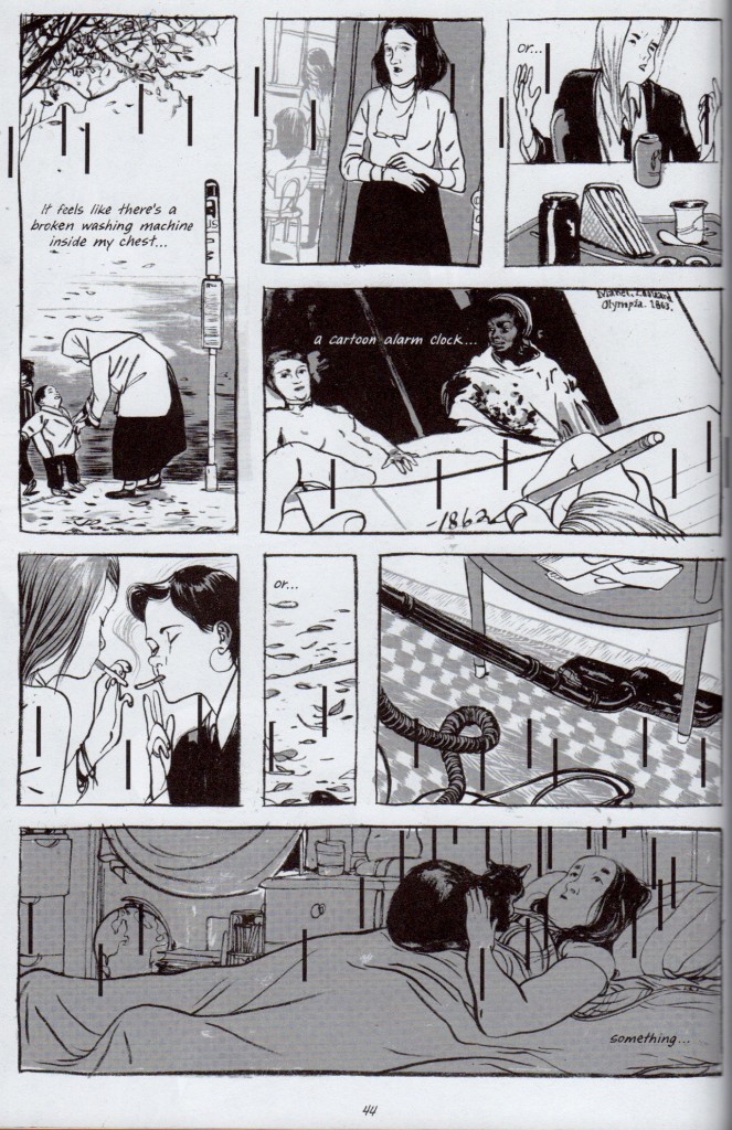
Kim’s yearning for that “something else,” describes Skim’s particular kind of storytelling. The book passes by the iconic moments of adolescence in favor of their lingering aftertaste– the doubt following confident pratter, the assurance found in being abandoned. Its humor can be a bit manufactured, but its nocturnes are feral and strange. Skim‘s characters find their true colors at night. When Ms. Archer quits teaching, Kim follows her at her house after school, where she is reluctantly welcomed inside each time. She quietly absorbs a family photograph, the clutter, the way Ms. Archer lifts her cat with one hand. A heady mood leaks from every dirty teacup and grey corner, leaden with hard decisions. Skim includes  its environment and telling gestures, occasionally at the expense of the conversation they lead to.  Most importantly, we hear Kim’s voice immediately after each incident reeling from or reconciling what happened. I appreciate that Skim judges this moment spent walking home as worthwhile, or even more valuable, than the confrontation itself. This is where Kim slips into uncharted territory. Similarly, Katie and Kim see each other fully one late night, escaping prom. Kim suffers insomnia, which leaves her both exhausted and exalted.

Skim could have easily been a much narrower story without its sinewy brush-work, and the nuance of its characters’ performances. It’s laudable that Mariko Tamaki, the writer, doesn’t overreach her character’s limited voices. Kim’s speech above is about as articulate as anyone gets. It’s an awkward but honest testament for the story. I also appreciate Jillian Tamaki’s figure drawing, which is at times grossly loose, pinched and contorted– tiny misshapen hands and swollen legs abound. They capture the sensual topsy-turvy of confused vision. Skim is a pretty book, but not a stunning one, for the best. If the book had been heart-stoppingly beautiful, the panels might have crystallized the moments, rather than letting them flow into a magpie’s nest of dirty lines, black pools, and wintry negative space.

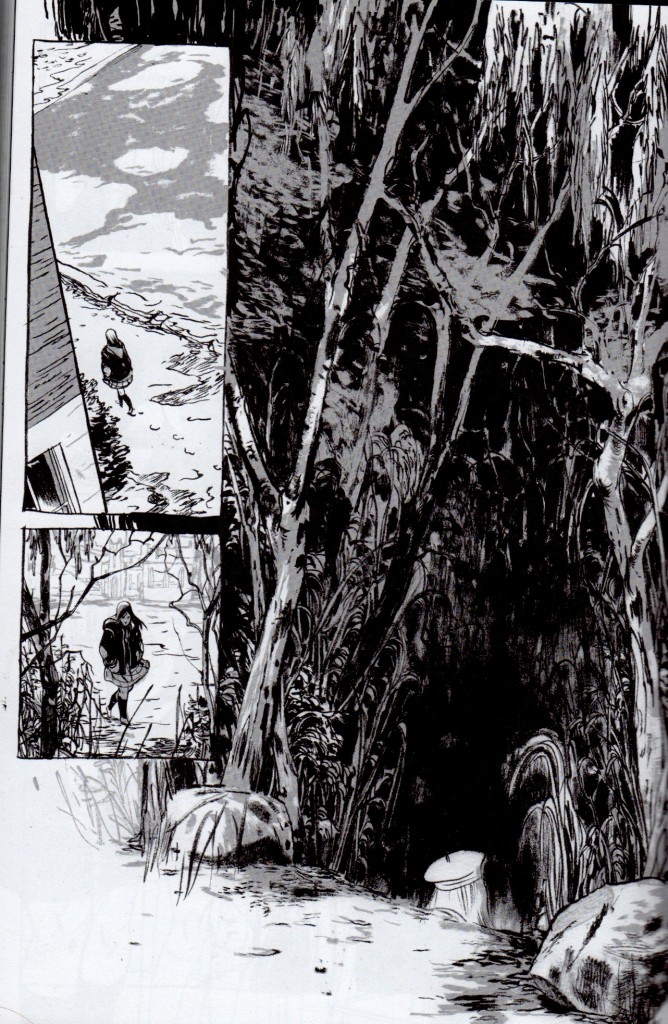
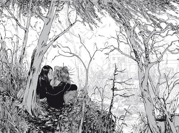
Skim’s perspective is similarly messy, and inconsistently shifts between diary entries and third-person. The clumsy steps back and forth nevertheless give breathing space.  Jillian and Mariko cover several complex transformations over three months. High school dramas often take the symbolic course of autumn to spring. What kind of personal-growth narrative starts in fall and ends in winter? Perhaps its a mistake to classify Skim as a ‘personal-growth’ narrative at all. While the characters seem to be better people by the end, no one acts any differently. Lisa is carried away in love. Ms. Archer flies off for somewhere new. On the final page, Kim goes off to meet Katie. She approaches a woodland very similar to the one which she and Ms. Archer frequented. Only the top of Katie’s head is visible, dressed in its little cap. She’s more a ghost, or a pale echo of Ms. Archer’s body pages before, than a person. Its ambiguous as to whether Kim’s budding friendship with Katie has begun to slide into something else. It’s possible they are all about to repeat the same intimate miscalculations.

Skim final page

 I admire Skim for its brave vulnerability, its tone and message, and also for its independence as a comic work. It doesn’t traffic in wish-fulfillment, overt camp, nor nostalgia– surprising for a comic book about high school. It is self-deprecating without secretly being self-congratulatory, a la Art Spiegelman. It isn’t distracted by its ‘comic-ness.’  It is not epic, nor controversial. It is not drawn in an iconic way. It is also completely about young women, and quite short.  Frankly, there isn’t much cultural currency to be gained by reading Skim, discussing it, or recommending it. American girlhood is undervalued and easily reduced.  Skim is a relatively unambitious book, but this isn’t a bad thing. Unpackaged from the neurotic cultural agendas that reinforce comic’s masculine, canon-mongering, Skim treats comics as a legitimate medium fit for a self-contained story. It doesn’t talk about being a comic, or push the boundaries of the medium for their own sake.  It doesn’t need to prove that ‘comics aren’t for kids anymore.’ It simply tells an adult story. This resistance to being impressive or fantastical, combined with its ‘young adult’ high school setting, deplorably positions it outside the conversation of contemporary comics.

Skim’s comic treatment does justice to, and perhaps deepens, an excellent story. At the end of the day, I believe comics would be more widely attended to if they did just this.

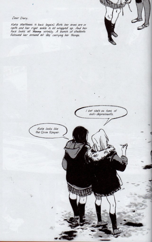
Skim stray cat


Phantom Music

The index to the Comics and Music roundtable is here.
_______________

Forgive me– as if to make this piece as dilettantish as possible, I am going to bring film into a discussion of comics and music.

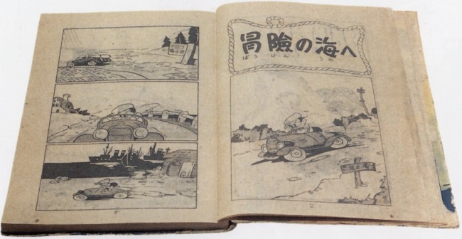
New Treasure Island Page 1 

The first pages of New Treasure Island by Sakai Shichima and Tezuka Osamu, much praised for its cinematic quality

It’s seems to me that when a comic’s flow of panels and pages works ‘musically,’ it also behaves cinematically. The artist’s shifting of perspective and the rhythm of the ‘cuts’ echo filmic sequences that are usually accompanied by a score. Sometimes, when I come across these sequences, it feels like phantom music– like a phantom limb– underscores the comic. It’s a struggle to read along to, or to figure out how the melody goes. Going back to re-read or dwelling on an image too long disrupts the phantom score irrevocably, and forfeits some of the emotional impact of reading the comic. As a teenager, I tried unsuccessfully to hum along or deejay background music while I read comics, hoping to discover total emotional absorption.

Today I better appreciate comic’s more complicated relationship with time and space. I believe I was stupidly hoping to watch– or listen– to comics as opposed to reading them. I wanted to be passively taken in, when I had to stake my own way through a comic book. If watching a film is like having a dream, reading comics is like lucidly dreaming– there’s an exchange of vibrancy and intensity for control and self-awareness.

Cinematic pacing still confuses me. It’s found a natural home in many comics, yet it is a very anti-Greenbergian hold-over from another medium.  Cinematic pacing does not accentuate the qualities that are most fundamental to comics, and instead channels comics’ unique handling of time, space and design into straightforward, uncomplicated narrativity. That’s not to say some overlap hasn’t occurred– cartoonists often work as storyboard artists. I don’t think cinematic pacing should be avoided, or that it poses a threat to ‘native’ comic pacing. But I do feel that the relationship of comics and film is worth examining, especially as the value of comics is increasingly understood in terms of their adaptation into film– where the story is finally told with real-life music.

I’ll clarify what I mean by cinematic comics. Comics are cinematic when they follow established film and cinematographic formulas of conveying time and space in a dramatic, rhythmic, and unambiguously linear fashion.  I am also tempted to add ‘decompressed,’ yet some film conventions are highly compressed, (montages without establishing shots, for example.)

Not all films follow the same cinematographic formulas, and the great ones complicate or invent them. Some formulas are grammatical, like how a bird’s eye view/pan/combination is used to introduce a story, as in American Beauty or Blade Runner. An easily identifiable variation, like Citizen Kane’s No Trespassing sign, is copied intentionally through homages and parodies, and if it becomes prevalent enough, it’s recycled unintentionally.  Another example are the fantasy battleground scenes that flooded theaters  after the run of Lord of the Rings. These formulas are most often accompanied by music to heighten the emotional effect, and the style of the music is included in the formula.

There are many stirring music-less film sequences, yet the connection between music and emotion in narrative is pretty well established, (and necessarily predates the term melo-drama.) To keep things as simply and as overly-generalized as possible, I will vaguely refer to commercial moviemaking scores from the last fifty or so years– think John Williams, Thoman Newman, Elmer Burnstein, Joe Hisaishi and Howard Shore.

Cinematic comics isn’t a discreet category as much as a collection of traits. Very cinematic comics will more frequently carry more of these traits. Panel proportions offer one example. A panel’s size usually determines the time a reader will stare at it. In cinematic sequences, the panel size will echo the legnth of a cut. Smaller panels dispaly a smaller fraction of time, which is not always the case in comics where the page’s design, or other criteria, are more important than the linearity or pacing of the reading. Small-size, low-content panels allow the eye to ‘bounce’ across the gutter, like a script’s ‘beat,’ without twisting the amount of time the panel naturally represents.

Duncan the Wonder Dog, noncinematic

Non Cinematic– Panel size determined by design, not by the length of the time it represents. From Adam Hine’s Duncan the Wonder Dog: Show One


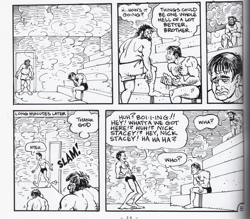
jim_bathhouse_fragment

Non Cinematic– The third panel is small, but designed to be dwelled upon for some time. From Invisible Hinge by Jim Woodring


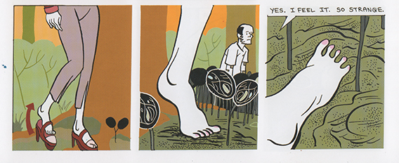
>bodyworld_feet

Cinematic — Panels represent one cut, and small wordless panels work like ‘beats’
From
Bodyworld, by Dash Shaw


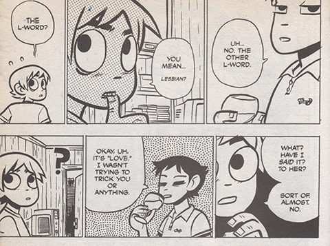
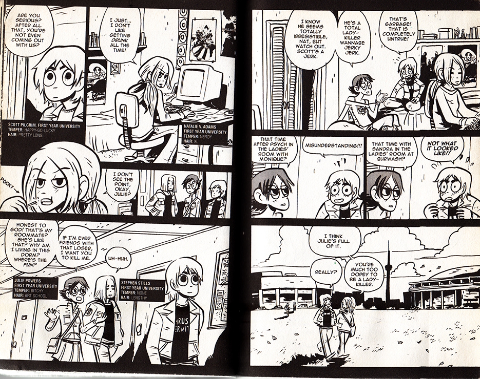
scottpilgrim_lesbians

Cinematic — Panels represent one cut, the size suggests the length of time represented, and small wordless panels work like ‘beats’ From Scott Pilgrim Gets It Together by Bryan Lee O’Malley 


In a cinematic comic, a panel’s text to image ratio is usually small, and corresponds to how much dialogue belongs inside one ‘cut,’ or between moments of physical acting. Reading the panel aloud, this is often under thirty seconds. A preponderance of textless panels showcase ‘beats’ of the character’s wordless performances, and occasionally more panographic panels and splash pages demonstrate setting or spectacle. These are sometimes an exception to the rule: splash panels and pages can be three to twelve times larger than an average panel, yet unless there is text they don’t necessarily take that much longer to read. Nevertheless, the moment depicted is mentally understood to last longer, and that it eludes to a build-up and follow-through that wasn’t drawn. Larger, more detailed panels with multiple speech bubbles work like a ‘pan,’ where the camera scrolls across a larger field of vision.

The cartoonist’s perspective choices share commercial filmmaking’s desire for clear communication. If the character is about to step on a rake, a successful cartoonist will most often show the ‘build-up’ and ‘event’(approaching and stepping on the rake,) within the larger environment, and only afterwards show a close-up of the character’s reaction, etc.

The cinematic comic’s cuts are determined largely by dialogue, and by fight-scene and slapstick choreography, and when there is neither, by the comic’s internal rhythm. In film, this rhythm is determined by the score, which needs to match, the pacing of the talking/fighting/comedy scenes as well. As long as the cartoonist obeys cinematic conventions, the more rigorously rhythmic the pacing, the more strongly a phantom score can adhere to it.

Certain comics rhythms/formulas recall certain filmic rhythms/formulas, and by association, inadvertently acquire phantom film scores. Cartoonists are a little helpless– while a filmmaker could pick an iconic or untraditional song to accompany a sequence, a cinematic comic only triggers a super-conventional-hodgepodge-memory of what song ‘should’ go there. Friends hanging out on a summer afternoon demands calls for a low-key, chirpy groove. A troop’s noble suicide mission demands the Lord of the Rings bombast. A sad remembrance cues violins. And if the comic’s pacing is cinematic enough to strongly suggest a score, its absence is distracting. The tingling of a phantom limb is most often painful.

In conclusion, a meandering examination of some cinematic comics:

Scott Pilgrim!

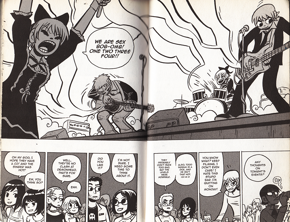
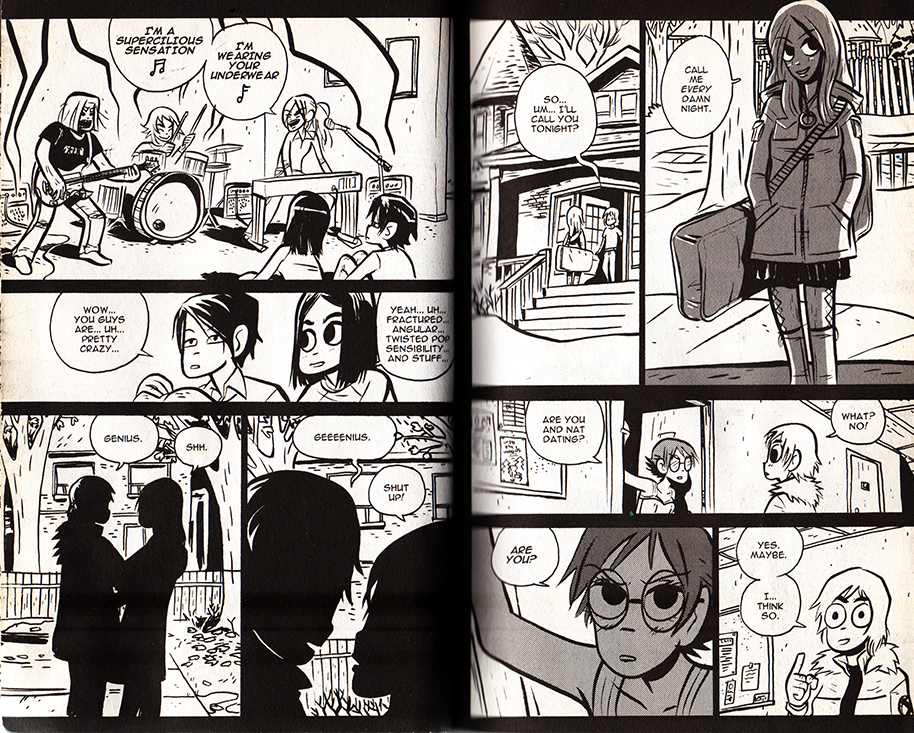
Music plays an even larger role in videogames than it does in film. And when I think of a ‘cinematically paced’ comic, Bryan Lee O’Malley’s videogame-infused Scott Pilgrim series immediately comes to mind. Coincidentally, the characters play, discuss and listen to a lot of music. What does Sex Bob-omb  sound like?


scottpilgrim_boombs


The books toggle with several cinematic genres and conventions. O’Malley showcases a playful mastery of anime and martial-arts cinematoraphic formulas. At two points the comic frames itself with a few vox pops, but I guess that could be as much of a homage to Dan Clowe’s Deathray as  Boondock Saints or Monty Python’s Flying Circus.

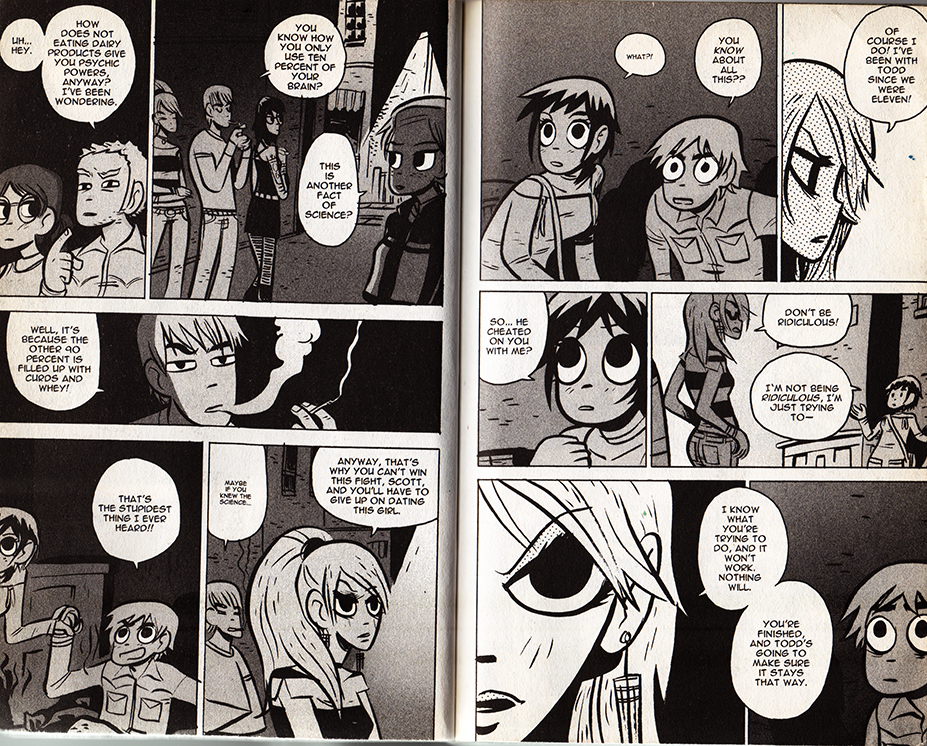
Most impressively, Scott Pilgrim uses hyper-condensed styles of cinematic storytelling, as when a whole relationship is traced over a series of pages. As long as filmmakers establish iconic characters and settings, audiences can easily follow a scattered montage. In comics, the specificity of the background often sacrifices the clarity of the characters, and a drawn interpretations of places are often unfamiliar and stylized. It’s a testament to O’Malley’s craft that this scene (below) is so effortless to follow. O’Malley uses this technique at several points in the series– pointedly never for athletic training ala Rocky, but always for relationships.


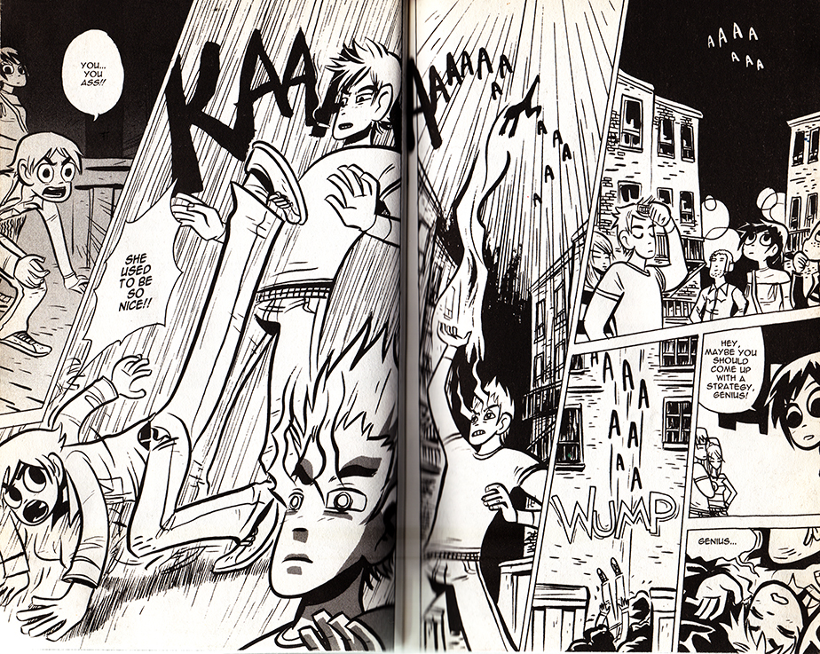
Scott Pilgrim 1scottpilgrim2scottpilgrim3scottpilgrim4

 From Scott Pilgrim Versus The Infinite Sadness

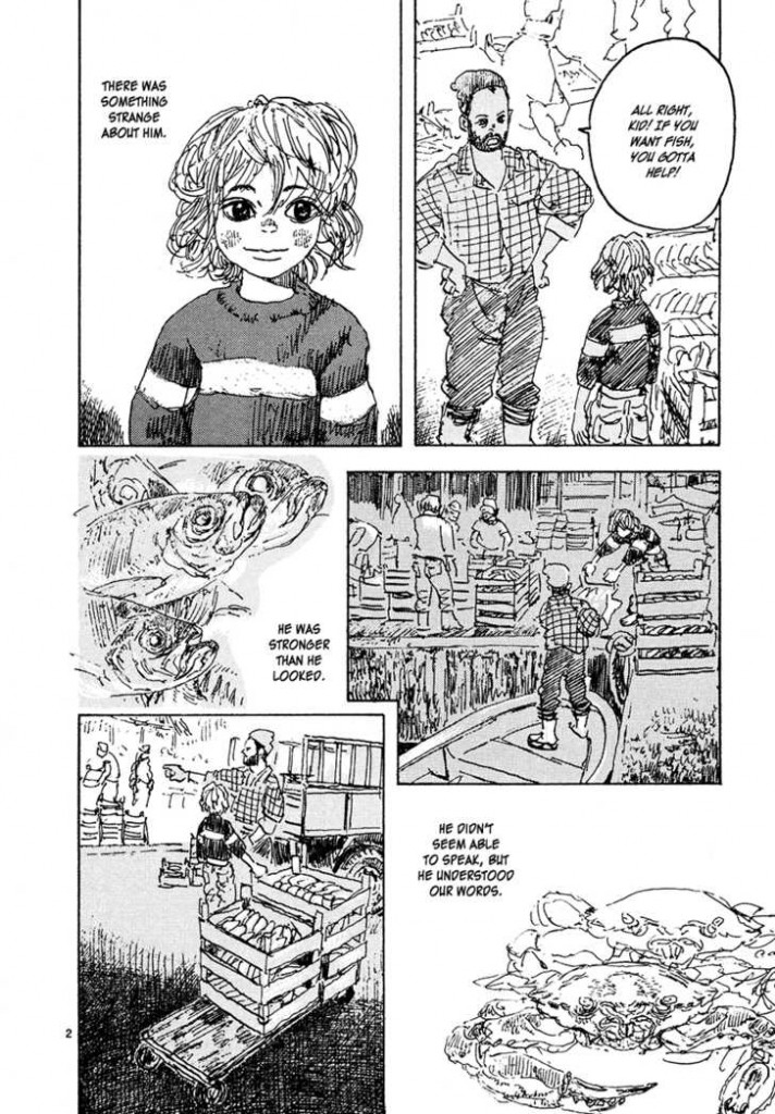
Reading comics, I’ve often felt that manga reads more cinematically than American comics, because of the smaller text to panel ratio. I don’t have any hard evidence for this, but manga is thought to be a major influence on the development of decompressed and widescreen comics.

Read Right to Left:


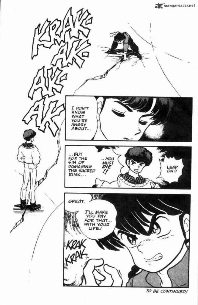
ranma_breaksice

From Rumiko Takahashi’s Ranma 1/2: Volume 3

childrenofthesea_page2

From Daisuke Igarashi’s Children of the Sea #8

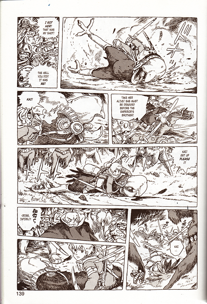
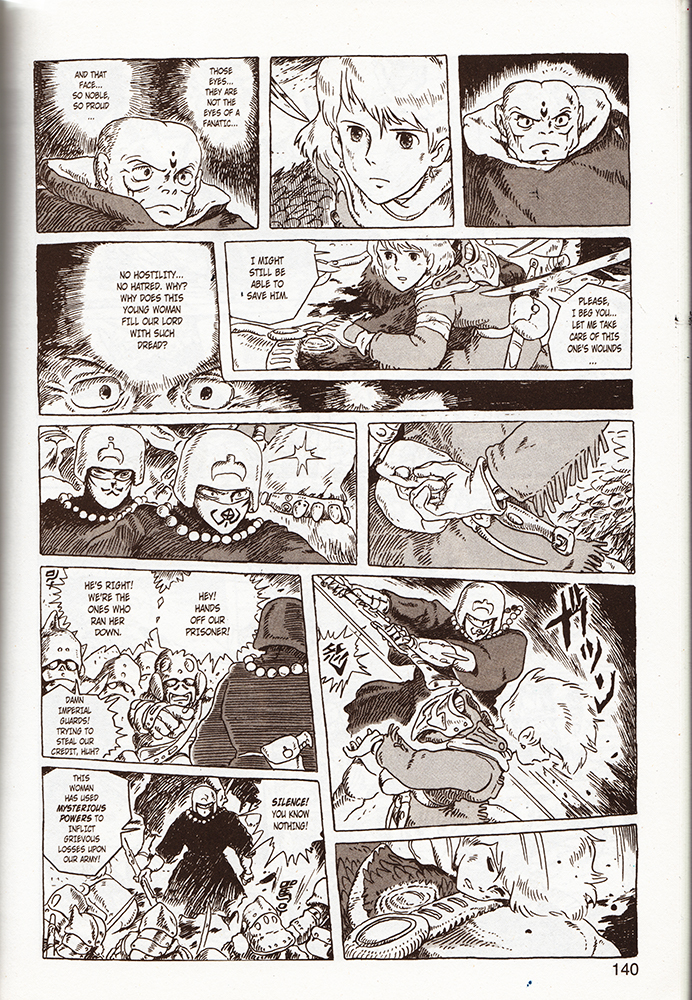
Akira, (the quintessential decompressed comic,) and Nausicaa of the Valley of the Wind are slightly higher brow (and arguably Westernized) examples, and coincidentally are better known for their film adaptations. As comics, both read like gorgeously realized, meticulous storyboards. Reading Nausicaa, I found myself mentally humming pieces of classic Hollywood war and western scores, and occasionally, (appropriately,) a little Hisashi. Yet I’ve never seen the film adaptation with his score.

Read Right to Left:


nausicaa1nausicaa2

From Nausicaa of The Valley of the Wind, Book 3


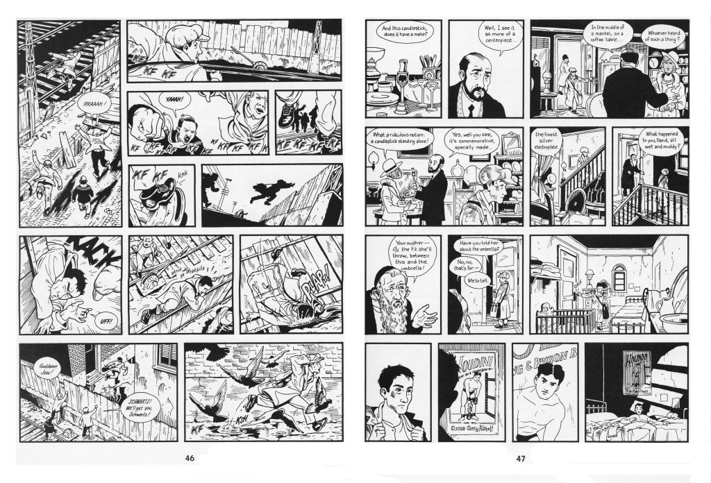
I’ve written a bit about the cinematic quality of Jason Lute’s Berlin: City of Stones here. Lutes comes as close as Miyazaki to making a ‘movie in a book.’ He doesn’t push the boundaries of comics narrativity, and focuses on virtuosically recreating the mis en scene, pacing, and character management of films like Wings of Desire. I’ve complained that Berlin’s ironies alienate readers from the characters, and perhaps a little background music could have sweetened the deal.

berlinhoudini

Skim by Jillian and Mariko Tamaki is an intersting example. While sometimes (unintentionally) dismissed as a teen comic, it is temperamentally aligned with the quieter side of Hollywood epics-  adult coming-of-age dramas like American Beauty, The Shawshank Redemption, A River Runs Through It, and The Cider House Rules, (which are often literary adaptations.) The wikipedia page for The Shawshank Redepemtion contains a great note on Thomas Newman’s score:

…the main theme (“End Titles” on the soundtrack album) is perhaps best known to modern audiences as the inspirational sounding music from many movie trailers dealing with inspirational, dramatic, or romantic films in much the same way that James Horner’s driving music from the end of Aliens is used in many movie trailers for action films.

“End Titles” is probably a good candidate for Skim’s phantom score. Unfortunately, this makes Skim sound heavy-handed, and I’m relieved that “End Titles” doesn’t accompany the book’s heartbreaking, graceful layering of voice and images. Not to say that they don’t sometimes suggest it.

1109 bks best7.JPG


The following pages are in sequence:

skim_buildup

skim_doublepagespread_2

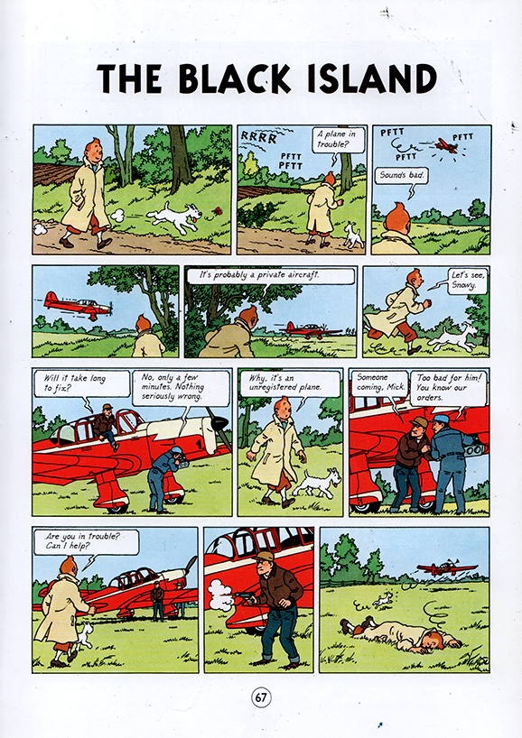
Comics like Tintin are a little more complicated. Herge’s ligne clair extends to the pacing of the comic, and complicated action sequences are detailed moment by moment, like key frames in a storyboard. Yet Herge is so ungratuitous that when he get’s the chance to skip a few key frames, he does.

tintin_blackisland

From TinTin: The Black Island

The phantom score between the last two panels experiences skips like a warped record. Otherwise, I’m not sure why I don’t find Tintin very cinematic– I guess I want to blame the page size. You can pack a lot of panels and text onto an album page, as opposed to the small leaves of most manga books. By the virtue of their size, manga pages automatically resemble dramatic splash pages, and the act of constantly turning pages creates a breathless momentum that exaggerates the cinematic pacing. Tintin is literally less of a page turner.

animalman_1

animalman2
from Morrison, Truog, Hazelwood, Costanza and Wood’s Animal Man #5 

My piece is sorely missing examples from mainstream superhero comics. I’ve spent hundreds of hours scanning, assembling and digitally correcting them at Marvel, and have read a decent amount of them myself… but I don’t own any, and I don’t consider myself well-read in them. I’ve enjoyed Alan Moore and Grant Morrison’s work, but I get the feeling that they encourage cinematic pacing more often than other writers. I remember putting pages together on a stunning Hulk comic– it was printed sometime in the fall of 2009, and it opened with panel after panel of the Hulk charging at the viewer in darkness. When I saw the finished book, the whole thing had been slathered with first person captions. I couldn’t bear to keep it. Perhaps I’m being unfair; heavy-handed voice-over is also cinematic in its own special way.


Reading Between the Lines: The Subversion of Authority in Two Graphic Novels for Young Adults by Ariel Kahn

Editor’s Introduction: This month’s “Sequential Erudition” features Ariel Kahn’s paper originally presented at the IBBY UK/NCRCL Conference last November. We choose it for this month’s column because its use of Laura Mulvey’s concept of the “gaze” fits with Noah’s recent post on Moto Hagio here at HU and a number of comment conversations. Personally, I appreciate the way Kahn combines thematic and formal analysis in combination with theoretical texts to make his point and provide an engaging essay. We’ll still looking for more papers for future columns, so if any academics out there would like to participate, leave a message. -Derik.

Reading Between the Lines: The Subversion of Authority in Two Graphic Novels for Young Adults by Ariel Kahn

Originally presented at IBBY UK/NCRCL Conference, 14 November 2009 at Roehampton University, London.

A recent resurgence in the publication of comics and graphic narratives specifically aimed at young adults raises a range of issues about the nature of authority, and the role of the reader in negotiating the narrative and constructing meaning in and through the interplay of image and text. This paper explores the diverse relationships between image and text, and the implications of the enhanced role they create for the reader.

The Problematics of Children’s Literature

The notions of authority and of the relationship between writer and reader are central to critical discussions of literature for children and young adults. This is evident in the contrasting positions taken by Jacqueline Rose (1984) and Peter Hollindale (1997). Rose argues that ‘children’s fiction is impossible … it hangs on an impossibility, … this is the impossible relationship between adult and child’ (1984: 1). The use of the author’s adult authority to shape and instruct the reader leads Rose to view children’s literature pessimistically as an act of repression. In contrast, in Signs of Childness in Children’s Books, Hollindale defines the divide in critical focus in children’s literature as existing between those who ‘prioritise either the children or the literature’ in the study of children’s literature (1997: 8). He advocates instead a study of children’s literature as a ‘reading event’ (p.30) in a strategy that allows both the child and the text to have a place.

Image/Text Relationships in Picture Books and Comics

The possibility of such a ‘strategy’, and the exploration of the narrative possibilities of such a ‘reading event’ are, I will argue, particularly striking in comic books written for young adults, picture books in which the active engagement with image and text opens up a multiplicity of possible readings, rather than enacting the closure and repression of which Rose warns. In How Picturebooks Work (2001) Maria Nikolajeva and Carole Scott identify ‘a taxonomy of picture book interactions’, which places the interactions of image and text on a sliding scale from Symmetry, to Enhancement, Counterpoint, and Contradiction. The authors are most interested in those picture books that use ‘counterpoint’, i.e., when ‘words and images provide alternative information or contradict each other in some way’ (Nikolajeva and Scott, 2001: 17, quoted in Donovan, 2002: 110).

Continue reading