The index to the Indie Comics vs. Context roundtable is here.
____________
Considering comics in context does not mean simply considering them in the context of social, political, or ethical concerns, but also considering them in the context of cultural relevance, that is, considering them in the context of a set of broader aesthetic developments. Considering comics in context, from this perspective, is simply wondering what a given comic adds to the “conversation”. Of course we’re all good post-modernists round these parts, and we don’t buy into the notion of cultural “narrative” as a properly unifying concept. Whether we think we live in “Late Capitalism” or that we’ve “Revealed an Essential Emptiness” or we think that we “Respect the Play of Difference” or that “People just like different shit, and, you know, everyone has their own opinion, so just leave me alone to do what I want, and anyway, what are you, a fucking censor/fascist/communist?” we can all heartily agree (with smiling tolerance all around) that there is no unquestionable criterion for whether or not a cultural product is worth our time/money. In that light, considering comics in terms of their context, that is, in terms of their relevance, is to consider them in terms of a close reading that takes into account what they do within the vocabulary of the texts that have influenced them. It’s a Bloomian stance, sure, but it’s also minimalist and generous. It acknowledges that there needs to be some context to an object of art for it to even qualify as evaluable (or able to be experienced at all) and it extends a helping hand to the work by saying that the context of the work is context enough.
With this sufficiently vague cultural program in mind, I went into Forbidden Planet by Union Square and searched desperately for new “Small Press” comics on the little shelves that wouldn’t make me cry after I realized that I had spent upward of five dollars on each of them. I shot for visuals that looked dynamic or unique, considering that most of what was on offer looked like a bunch of silly and ugly little people standing around apartments with speech bubbles floating above their heads. I don’t have Santoro money, so I only bought a couple books for this review. It wasn’t scientific, it wasn’t rigorous, it wasn’t even especially practical, but I thought it was as close as I could get to random while still attempting to not feel deep regret afterward. As we’ll see, I wasn’t successful.
ALAMO VALUE PLUS Rusty Jordan from Revival House Press
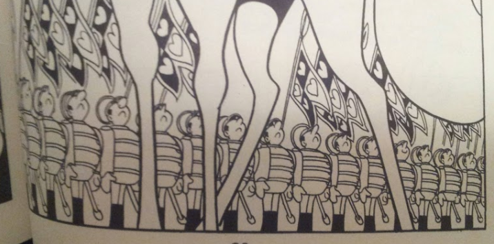
Rusty Jordan’s aesthetic is a mix of Tezuka and the Groening workshop with spruces of Crumb and Mike Judge thrown in. From Tezuka, he borrows a certain Disney sensibility for repetition and caricature of form.
Jordan and Tezuka draw uniformed men. Note the classical cartoon repetition. Neither is afraid of
typology when it comes to stock characters.
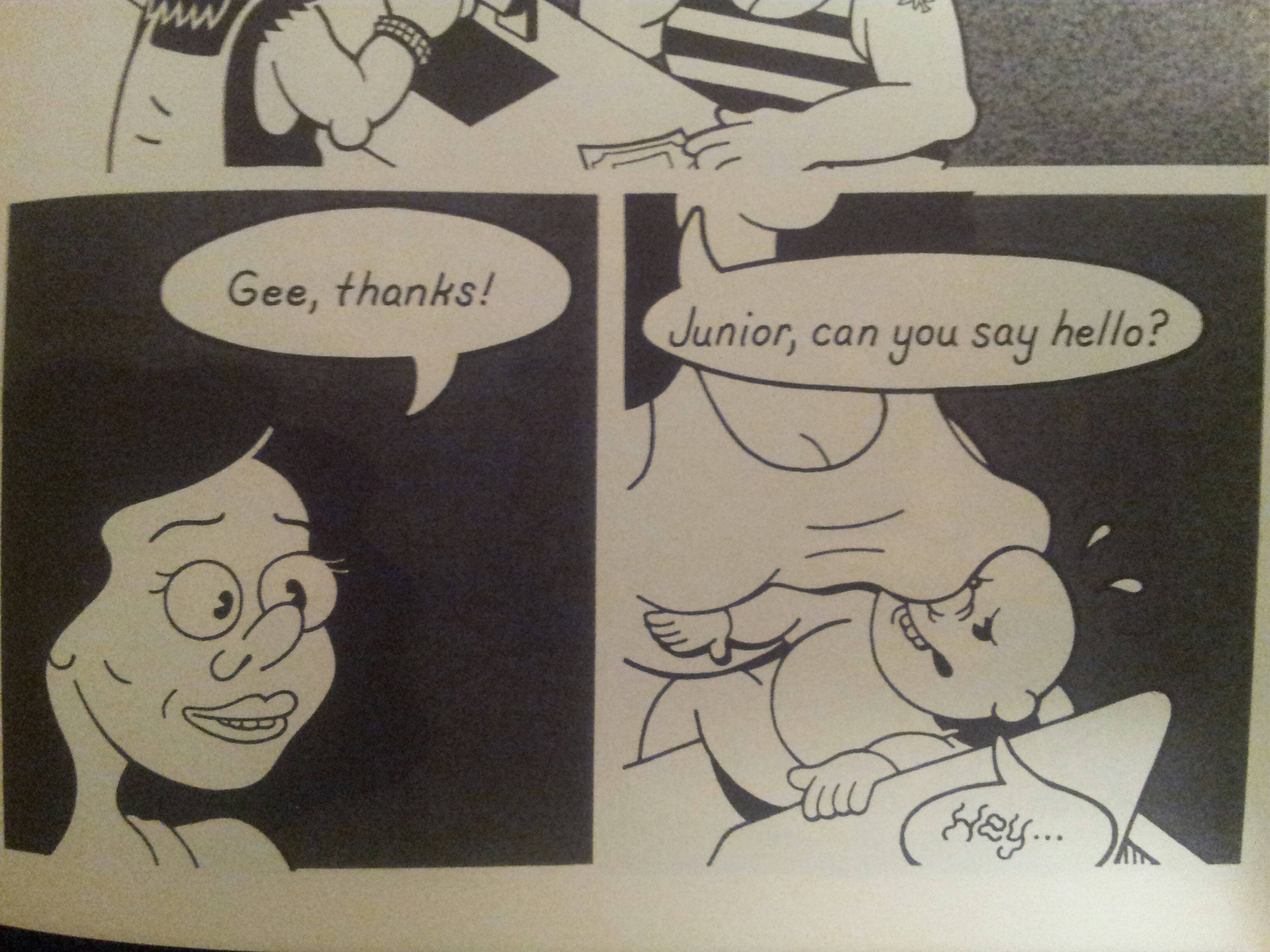
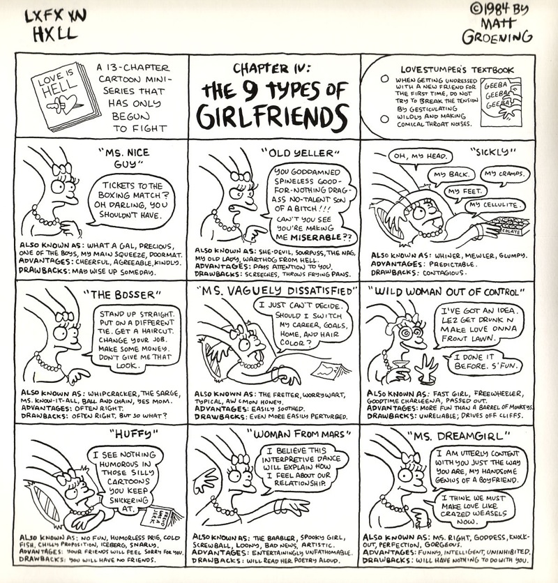
From Groening, he takes faces and physicality.
Jordan character and obvious Groening precursor.
Notice the reference in lips, eyes, and nose.
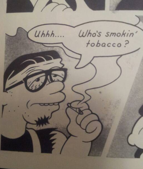
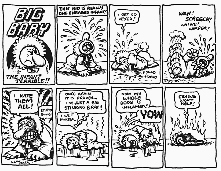
From Crumb, he takes a certain penchant for ugliness (as so many do.)
Jordan and (fairly unexaggerated) Crumb.
Note the ugly, vacant molding of the characters. Griffith is also present.
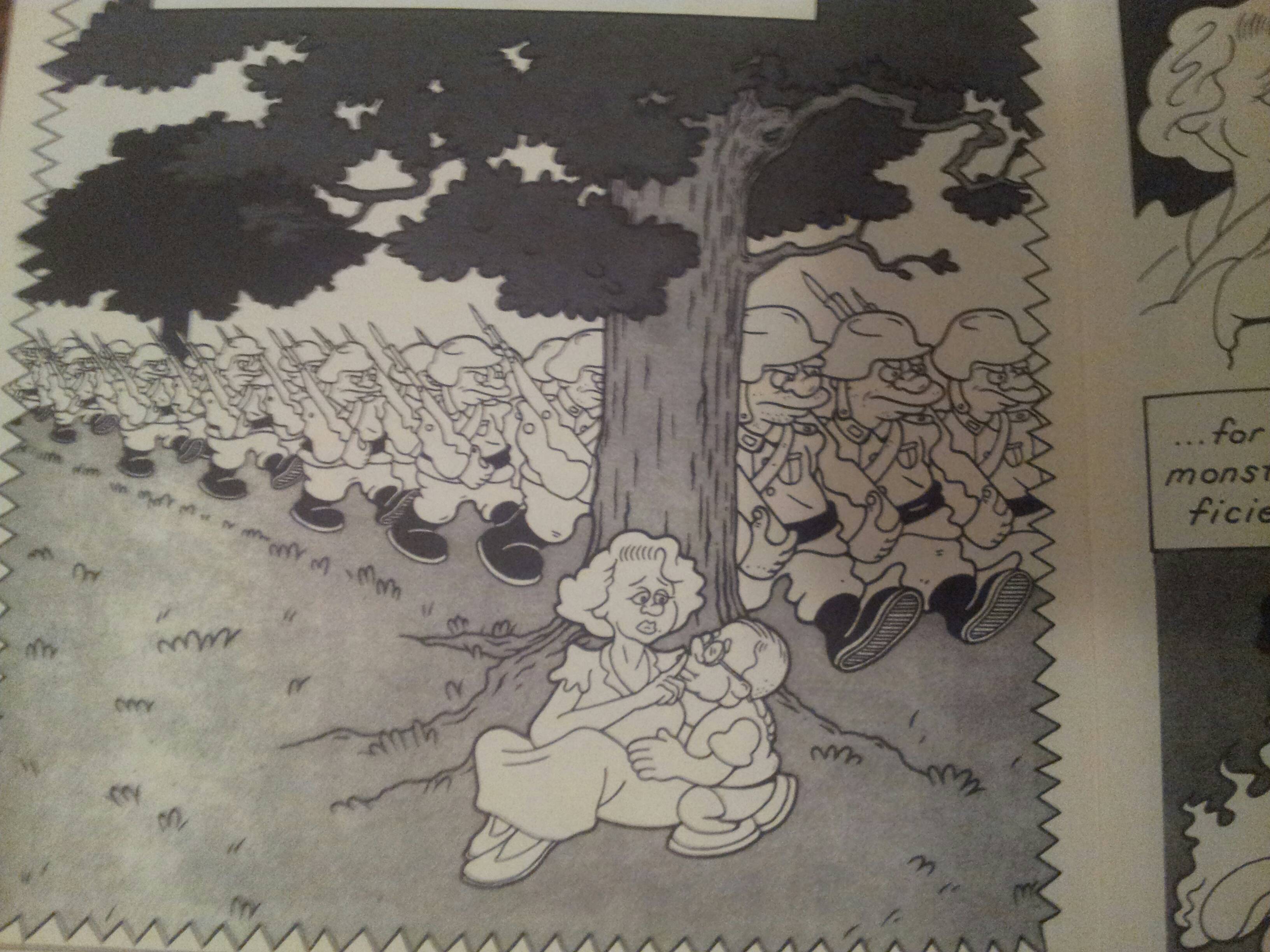
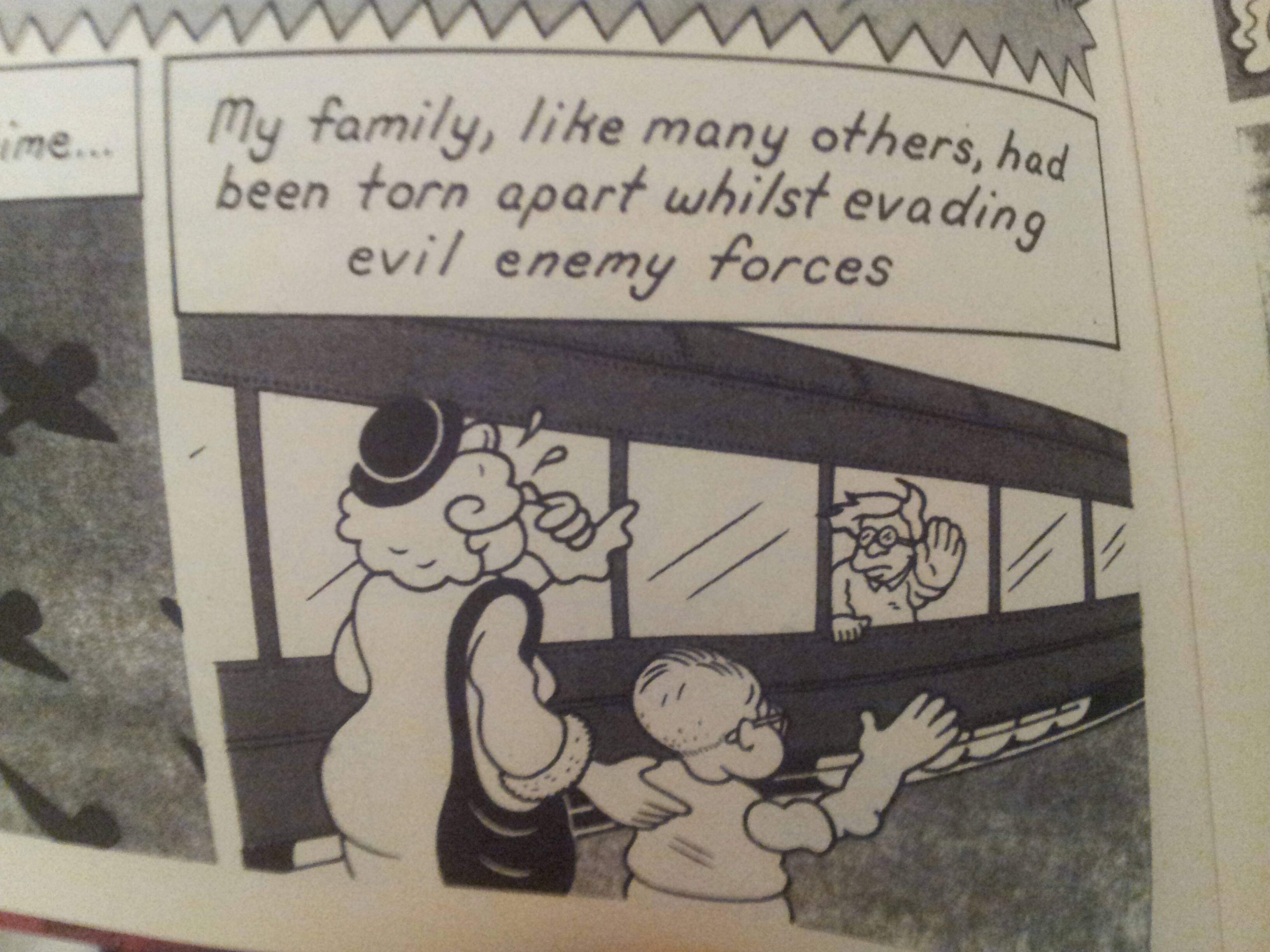
It’s charming, but the charm wears away quickly. The characters are dull; the protagonist, Baldemar, is an old man straight out of Groening cartoon, and the other two characters are ears for his crypto-WWII tale that isn’t even brave enough to label its antagonists Nazis.
Evil Empire. More Groening.
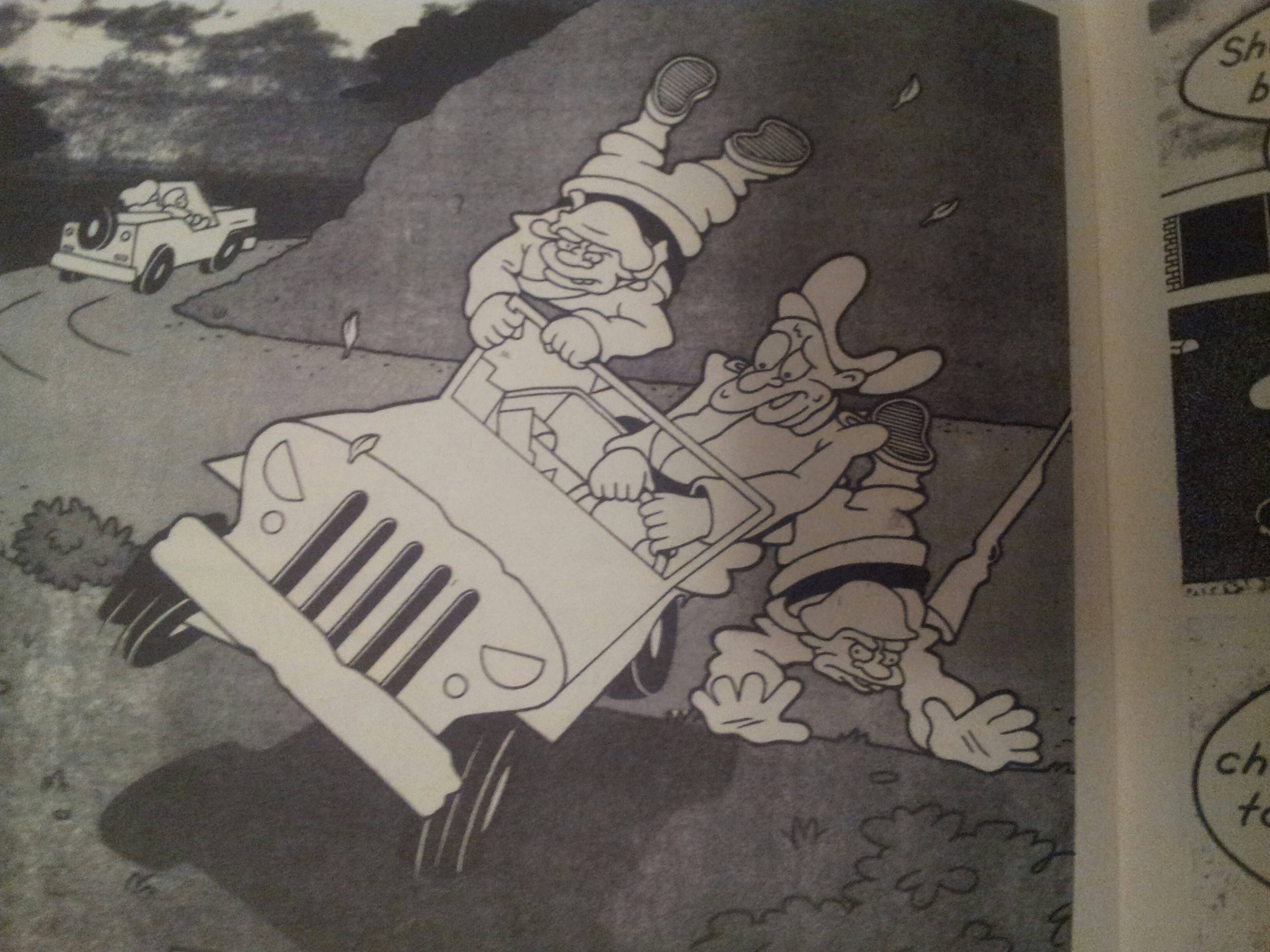
But keeping in mind our critical agenda, does Alamo Value Plus provide us with anything that isn’t already on offer in the source material? The answer is no. The corporate workshop that produces Groening scripts is cleverer (even today), Tezuka books are more perfect executions of sterile formalism, and Crumb, for all of his shitty sensibilities, at least has the decency to put his ugliness on display. The story is plodding and the “action” sequences are wooden.
Not very dynamic at all. Warner Brothers and Groening all over.
If you wanted to read a WWII book, Spiegelman still towers in the background. Alamo Value Plus is a “nursery rhyme” book; it’s there to remind us of all the comfortingly familiar stories that it’s derived from. This is issue #1. I’m not interested in reading issue #2.
PICNIC RUINED by Roman Muradov from Retrofit Comics
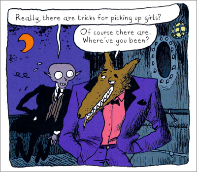
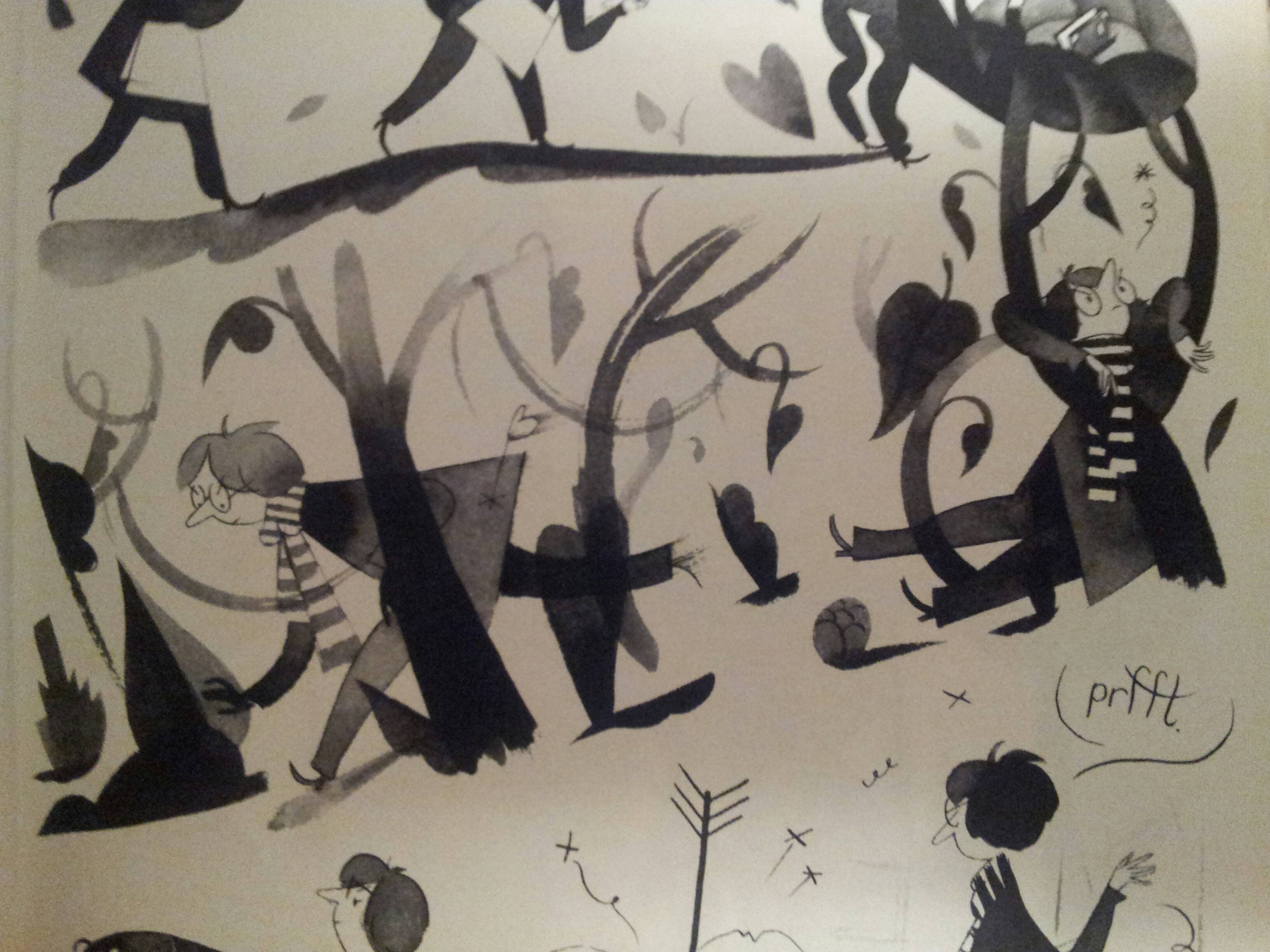
Muradov reminds us that his character is well read and insecure on every page. His characters float around with a long legged and sketchy bourgeois wispiness that I know best from Joann Sfar.
Muradov and Sfar.
Wide eyes, narrow bodies, light touch.
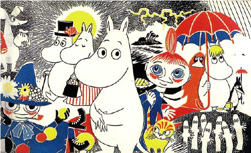
Jansson is explicitly referenced, and it’s not hard to descry her safe and polite influence on the book.
Muradov’s characters and Moomins. Plain, wispy, and vacant.
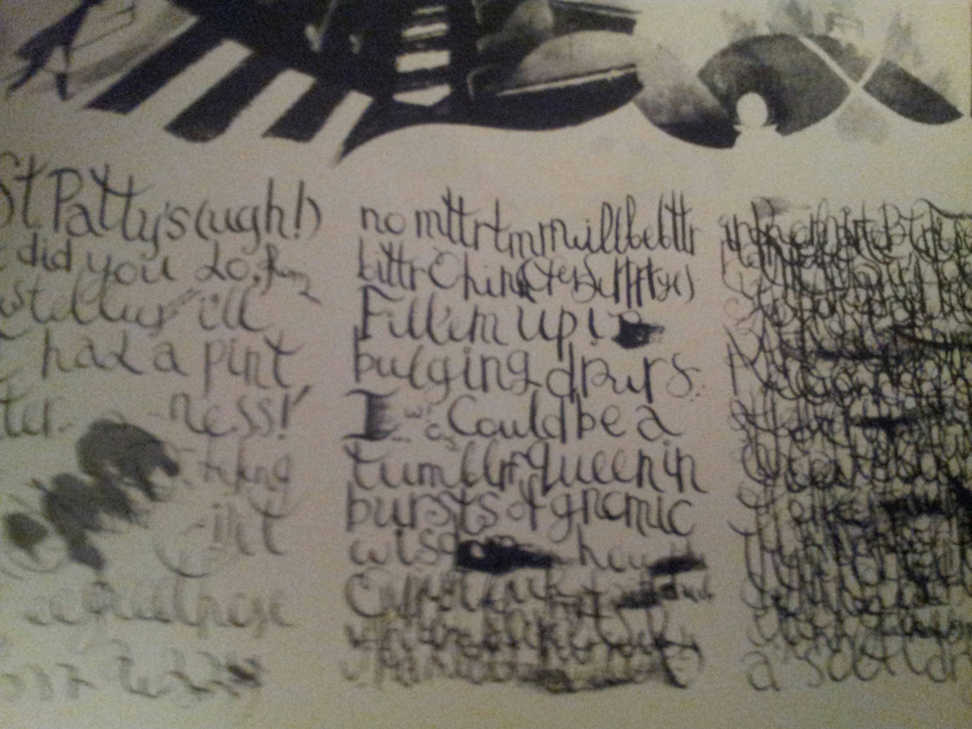
Is the book pretentious? I don’t use the word, myself, but it does betray a certain over-education. It experiments with styles taken from art and literature, from Beckett to Nabokov, from Klee to Picasso, thrown together in a sequence that’s supposed to convey how the “protagonist” of his book is haunted by an overflow of words that overwhelms and distorts him.
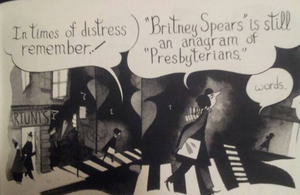
It’s the 60’s again and language writes identities.
You remember last month, when you went to the museum?
So does Muradov.
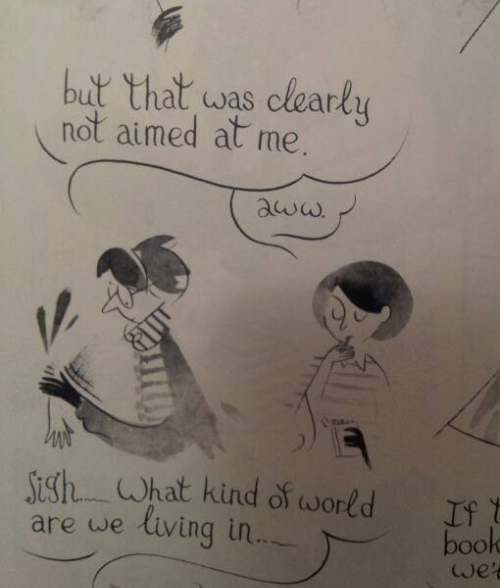
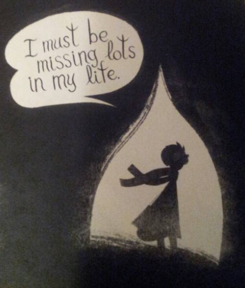
But underneath is a wistfulness and loss of direction that demonstrates the damp humanism behind the experimentation. All throughout the book Muradov is worried that it will come off as a masturbatory whine, including in a sequence where the protagonist talks to his shadow about how pathetic he is.
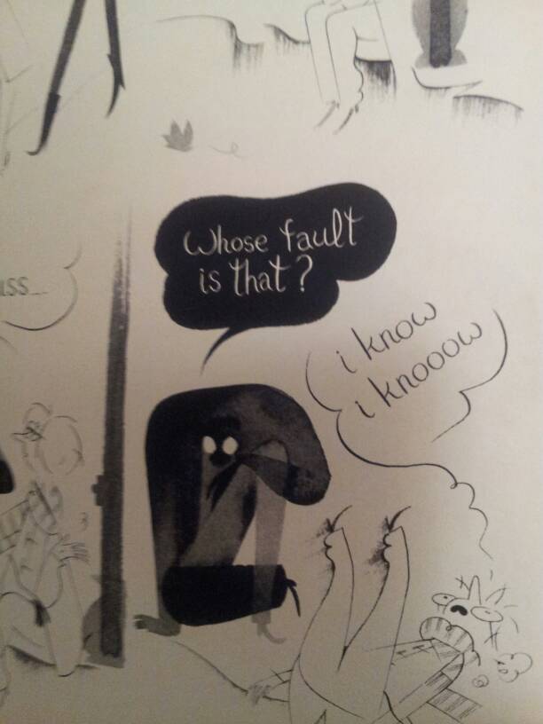
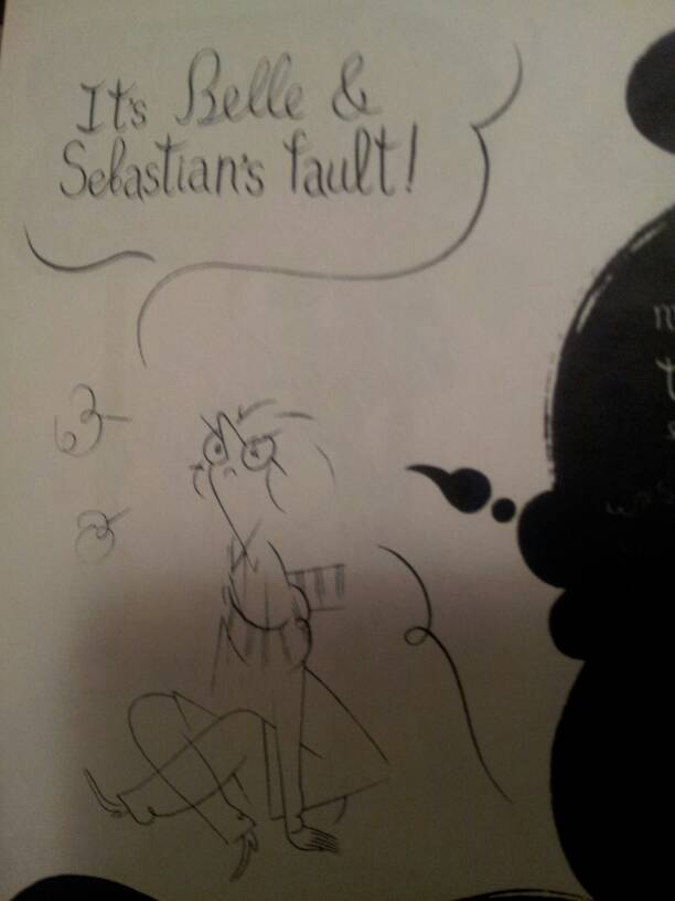
I will die happy if I never read or hear another awkward
and “funny” displacement of responsibility.
The book has nothing at stake but its own circular insecurities. Its most beautiful moments are expressions of the sheer emptiness of its content, but, tragically, they are undermined by its alternation between simpering self-consciousness and self-satisfied intellectualism.
Hearing people say this kind of shit usually drives me crazy.
Reading this makes you remember why you didn’t hang out with the English majors in college (ya zinged, English majors, what about it).
Let’s return to our critical program again; does it add to the discussion that it takes part in? It adds about as much to its illustrious forebears as a poetry jam adds to Crane. The visuals are cute at times (if you understand the references), but once you’ve read it you never have to pick it up again. Maybe go back and pick up Vampire Loves or, if you’re feeling old, some Wodehouse.
You definitely, definitely are.
These comics are inoffensive. They are stable and boring narrative and aesthetic statements. But if we consider the role that they play in their context, they’re simple placeholders. They’re echoes of their source material and repositories for the affect that we have reserved for formative cartoons or the feeling of being in art history class. By sticking to affective scripts, they don’t even risk melancholia. There’s no challenge or development here. There’s just a lot of pleasant memories and reminders that there are people out there that feel just like you.

