Just under a year ago, I started a new gig that I was cautiously excited about: creating editorial comics for the Week in Review section of The New York Times. David Rees was going to write them and I was going to draw them. This seemed like an ideal partnership; David (creator of the satiric comic Get Your War On) has a great skill for walking the fine line between irony and sincerity, and is extremely funny as well. We both wanted to try to do new things with the political strip format, and bring metahumor to the Times.
Already, though, things were not as we’d been promised. The Times had approached David and then myself in April of 2013. After approving us, they told us their master plan: Brian McFadden, the resident comic artist, would be replaced by myself and David alternating with Lisa Hanawalt. This would be a part of the exciting revitalization of the Week in Review section. To that end, they told us to wait while their redesign proceeded.
By September, the redesign seemed to be finished; but the editor in charge decided that something as exciting as this new comic rotation couldn’t be unveiled in a dull month like September. Better to wait until… January! when it could be announced to the world with the appropriate fanfare and excitement.
So we waited seven months in all. And on January 20th, David & I created our first strip for the Times… which was printed with no fanfare or announcement or anything; we were simply dumped into an alternating slot with McFadden, because by then Lisa was simply too busy (drawing Bojack Horseman). The brilliant strategy of waiting all that time had backfired, because in fact it was pointlessly stupid.
Then there was the money. The New York Times– get this- refused to come up from the fee for one artist, which we were to split. We finally got them to come up a little, but only a little. These strips are done in a very short time period- basically between Wednesday night and Friday morning, and I stayed up all night for a couple fo them. We were going to be making very little money, but still, it was an opportunity to do good work, maybe make some statements on serious issues and have them be seen by people. And the Times still stands for something in peoples’s minds, some kind of editorial quality.
Of course, it didn’t work out at all; their nitpicking, antiquated style of editing got more oppressive until they were killing entire strips. And it’s quite clear they were refusing to print them because they didn’t understand them. It was like being edited by hobbits.
The first few went through fairly smoothly; David pays close attention to the news, and the art director mentioned approvingly that she was glad he was tackling issues that the paper wasn’t covering otherwise. The one thing that bothered me was: we would present the script, the editors would make corrections, I’d create a finish. Then, after I’d handed it in, I’d get back a complete different set of corrections, mostly concerned with their antiquated style guide. The Times puts periods in “IRS,” for instance, even though the IRS themselves do not. They also changed the wording of Donald Rumsfeld’s letter to the IRS when we quoted it directly; that seemed wrong to me. And that they couldn’t do all the corrections at once, before I’d done the work, felt to me like laziness and a lack of coordination which ended with me doing unnecessary work at the last minute.
They did start reading the script more closely, though, after our fifth strip. The script mentioned the cartoon character Garfield and tribesmen in native costume in Botswana, so I was less than sympathetic when they were surprised when the art was turned in. “We have to check with our lawyers if we can use Garfield,” the AD said, and “the tribesmen in Botswana are making people uncomfortable.” Soon came the word that the lawyer had said Garfield was okay (luckily they had asked one who understood the first amendment). I hope they would also drop the tribesmen issue, but no. They insisted I make it a different country, and have them fully clothed. I thought about it for maybe five seconds, and then I said something I’d learned to say after a lot of bad experiences with illustrations and comics that turned out mediocre because of meddling editors who thought they were smarter at what I do then I am. I said “I’m not comfortable with that.” And they… backed down. Okay, we’ll print it the way it is.
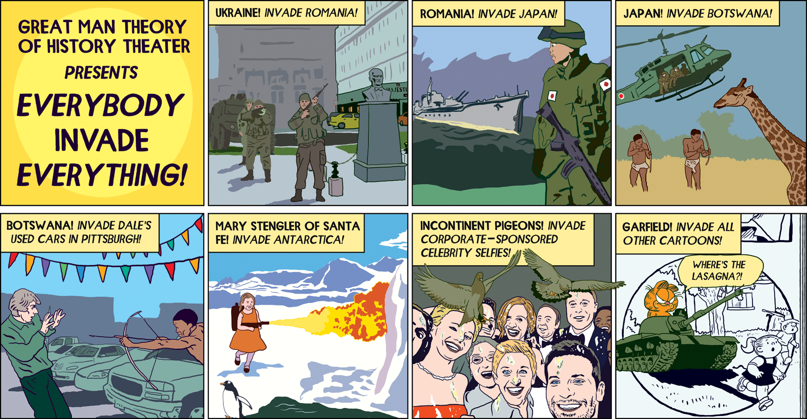
I thought we’d won a small, but important victory. Of course, I was kidding myself. Two strips went by and then it was Easter; David wrote a script parodying floral bouquet ads. It showed several extravagant bouquets before showing a basket with twigs in it, suggesting that maybe the real spirit of Jesus would be served by saving the money spent on bouquets and giving it to a homeless shelter. It was David at his best: sharp, moral, funny & brilliant. (I’ve done a rough of it to show you here).
They hated it. “The editor is asking why are we making fun of religion” came the reply. I couldn’t believe this, and still can’t; it’s the response of someone who can’t read. David was doing the opposite of making fun of religion; he was in fact underlining one of its central tenets, the concept of charity. He felt really strongly about it, and even managed to talk with one fo the editors to make his case. But no amount of arguing would dissuade them. We had to come up with another strip in a hurry.

A sketched-out version of the unpublished strip.
The next strip went through with no difficulty, and then David wrote a strip about male bullying online. That week, the hashtag #yesallwomen had taken over Twitter, following a misogynist’s killing spree in California. The reaction to this was a torrent of abuse from men and boys towards women- and this was before Gamergate, which really took it to another level. As always, David’s strip on the subject was right on. His script had a pair of baby-men (wearing diapers) talking about trolling and threatening women online. I was excited, because I knew this was one that would attract attention, and make a point that deserved to be made. Incredibly, the Times wouldn’t touch it. “So I floated this by the editors, and they all feel that this news story is just too sensitive to be prodded at in a humorous way,” was the way the substitute AD put it.
This was when I had had enough. Too sensitive to be prodded at in a humorous way? Why had they hired us? What did they think we were supposed to be doing? David was busy at that point doing his TV series for National Geographic, so I told the AD that I was not happy with the Times‘s behavior, that we would not be giving them a substitute strip for that week, and then I created a rough version of the strip from David’s script and put it online, with a full explanation of how the Times wouldn’t print it. It got more attention than anything else we’d done for them.
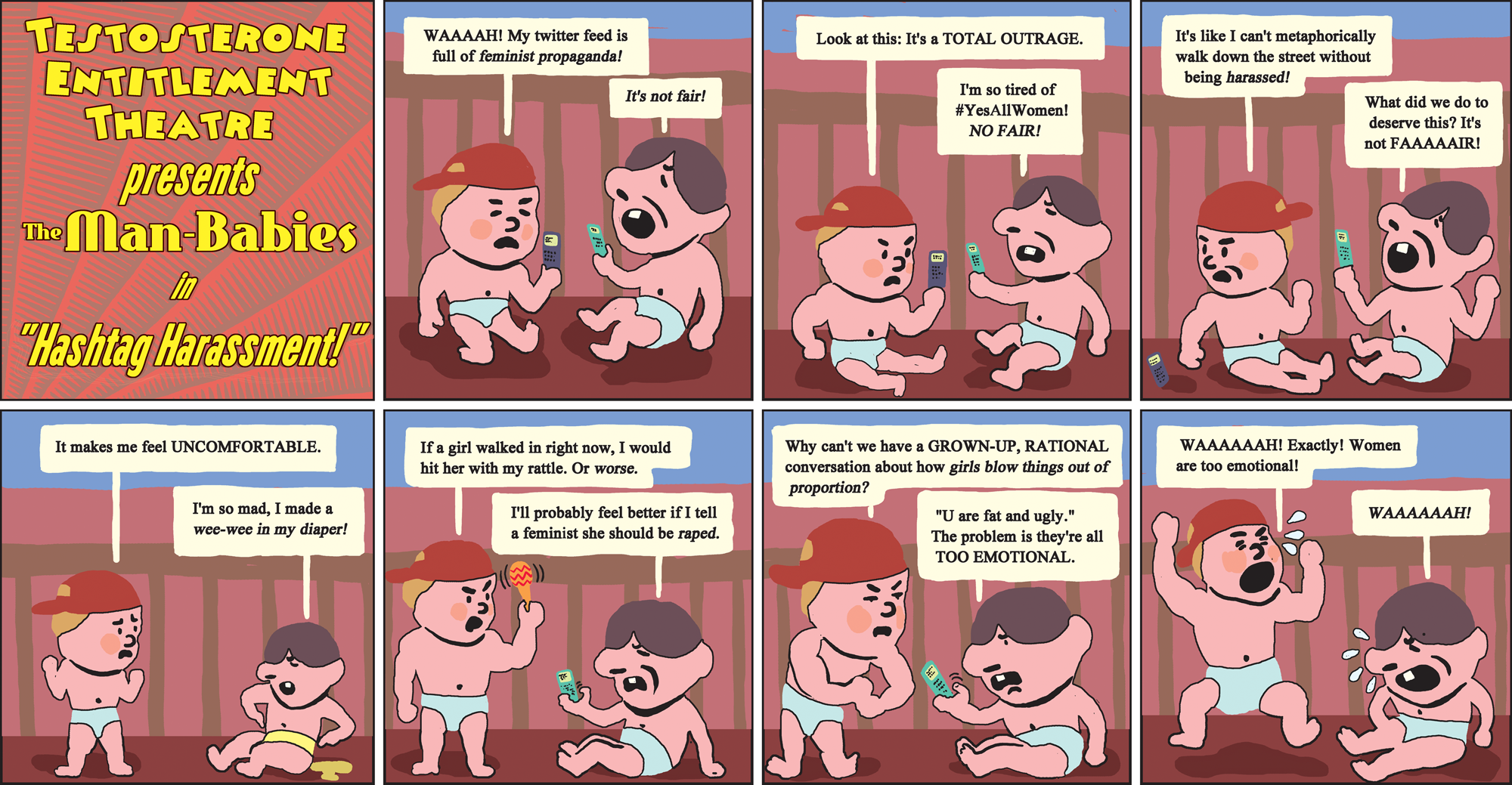
A sketched-out version of the unpublished strip.
We did one more strip after that and then, big surprise, they fired us. But once the Times had made it clear that we were not allowed to offend anyone, or handle any but the safest material, it was all over for us anyway. For me, as a cartoonist, it was another depressing reminder of how bad things have gotten in the print world for people who do what I do. David had a TV show. Lisa had a TV show. I was working in print and I felt like a real loser for it.
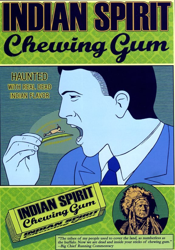
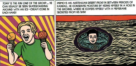
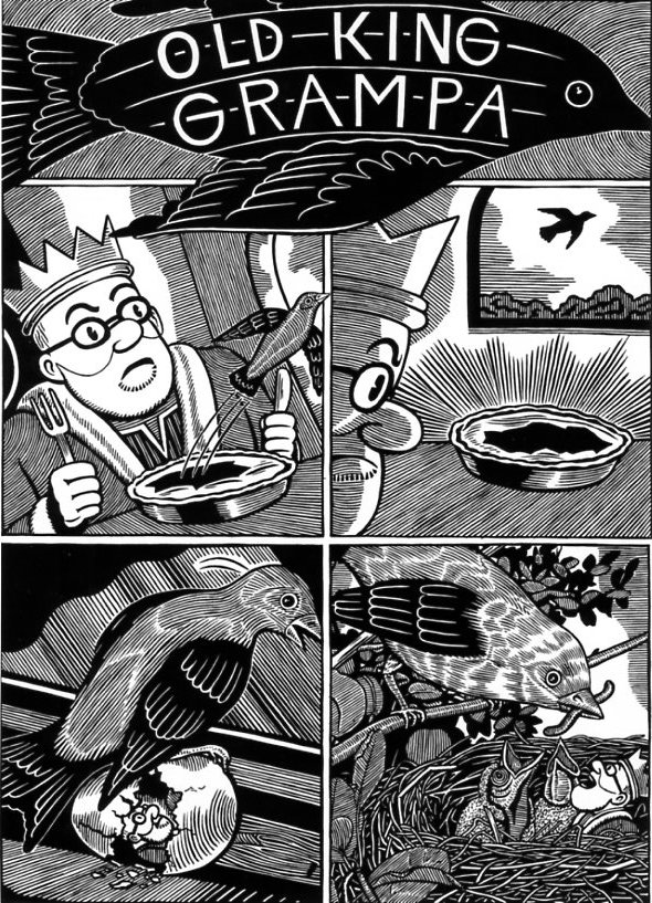
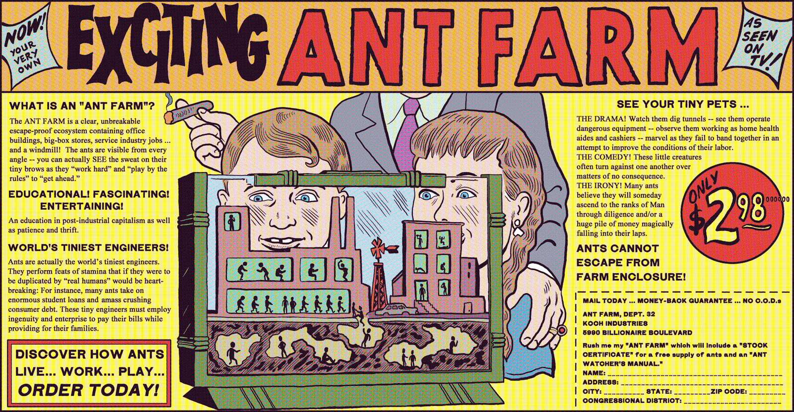
I couldn’t help but think of all this again this week as the images from Paris appeared online. Cartoonists had given their lives for the freedom of speech their work represented. It still means something over there. An edited version of this essay ran in the Chicago Reader a while back. One of the gags in Michael Kupperman’s Tales Designed to Thrizzle Volume 1 is a three panel comic strip featuring “The Head”. As his name suggests, “The Head” is a disembodied…well, head. In the first panel, he announces “Someday I will rule the world!” In the second he admits that “But for now, I have been reduced to flipping burgers with my telekinetic powers! Bah!” And in the third, he sits on a couch watching Three’s Company and muttering “Bah! Such foolish television!” The lurch from comic-book super-villain cliché to boob-tube homage nicely encapsulates Kupperman’s methods and influences. Alt comics creators may be turning for cred to more respected mediums like literature and memoir, and mainstream creators may be praying for a movie contract, but Kupperman has other telekinetic burgers to fry. On the one hand, he’s steeped in the clunky traditions of comics past — the barmy testimonial pitches (“Men! Is your penis a urine-leaking, chronically unreliable threat to your mental well-being?”), the breathless pulp adventure titles (“I Bothered a Big Fish!), the doofy super-powers (“Under-pants on his head man!”) But on the other hand his overall rhythms — the narratives which turn into advertisements, the skits which end with some whacko randomly barging through a window, the gags which get abruptly dropped and then recur out of context only to be instantly dropped again — all of that seems borrowed, not from his print predecessors, but from the least cred-bestowing of all possible sources. Forget literature and forget film: Kupperman takes his cues from Monty Python and the Cartoon Network: the surreal humor of the small screen. Television/comics cross-overs aren’t exactly new: the TV show Buffy is currently being continued in comic-book form, as just one example. But Kupperman may be unique in being inspired as much by TV’s form as by its content. In part, this is due to his source material: Monty Python was, in many ways, meta-television. Each show was cobbled together from a mélange of genres — newscasts, sit-coms, dramas, documentaries, cartoons. The humor wasn’t just in each individual section, but in watching the different modes stagger into and over each other. Thus a drawing-room mystery ends with a scoreboard (Constables : 9; Superintendents: 13) and wildly cheering sports crowds, or the BBC end credits are dropped into the show halfway through. Monty Python, in other words, replicated the heterogeneous feel of television; the sense of switching from show to show and channel to channel; of serialized narratives eternally fractured just because they’d run out of time. This style of humor is fairly familiar now on TV, but it’s still somewhat unusual in comics. In any case, it’s rarely done in any venue with the panache that Kupperman brings to it. In one strip, for example, he segues vertiginously from boy band infomercial to nature special, informing us first that “Tony is the fun one of the group,” moving on to let us know that “Primo is an Australian desert frog!” and concluding that “Alan is too small to be seen by the human eye — but he becomes visible in this close-up view of the human sneeze!” The boy band skit is an honest-to-God television parody: it works off of documentary genres that are rarely seen in American comics, and the jokes are predicated on abrupt shifts between panels that are formally analogous to camera cuts. But many of Kupperman’s jokes work by adapting the style of surreal juxtaposition to a specifically comic-book context. Instead of using time sequence, for example, Kupperman often arranges abrupt shifts through layout and space. A mostly text choose-your-own space adventure is illustrated with random drawings that have nothing to do with the story. An advertisement for 4-Playo, a robot that provides foreplay, takes up most of a page except for an unobtrusive, dark-colored banner at the bottom that announces: “Let’s All Go to the Bathroom! A message from the Bathroom Council.” As in Chris Ware’s early comics, many of the book’s pages are designed not around a single narrative-driven punch-line, but rather as a carefully arranged clutter of fake ads, strips, text blocks and random gags. The result is a clankily retro tribute to the days of comics past when the medium was, like television, a mass art form, and so had more in common with television’s hucksterism and heterogeneity (these days most comics don’t even have outside ads.) Not that every one of Kupperman’s lay-outs looks like those old comics. On the contrary, one of most impressive things about Tales Designed to Thrizzle is the creator’s versatility, as artist, writer, and designer. Kupperman’s art is always instantly recognizable; his drawings are deliberately stiff, and his figures pose oddly against his backgrounds, so that everything looks like collaged clip art. Yet from within those self-imposed limits, he manage to create an enormous range of variation. On some pages, he utilizes a heavily detailed black and white cross-hatch style which almost creates moiré patterns; on others, he uses stencils; on others, he places relatively simplified colored figures against plain backgrounds. His designs too are extensively varied, from full-page splash panels to fake text ads with faithfully reproduced fonts, to the beautiful repetitive wallpaper patterns at the end of each issue. Tales Designed to Thrizzle, in other words, is a monument not only to silliness, but to craft….which is perhaps the way in which it most clearly departs from its television inspirations. Not that there wasn’t a lot of skill and talent involved in creating Monty Python sketches or Adult Swim cartoons. But (with the exception of Terry Guilliam’s segments, of course) television very rarely pays attention to visual aesthetics in the way that Kupperman does here. His ad for Indian Spirit chewing gum, with its patterned background, bizarre conflations of scale (a tiny Indian about to be swallowed by a giant Caucasian) and stark cut-out feel has a constructivist look which flirts perilously with high art. Several of Kupperman’s bizarrely lyrical Cousin Grampa strips do a good deal more than flirt. In one of these, “Old King Grampa”, the titular elderly monarch watches a bird fly out of his pie and then out the window. The bird then hatches an egg, inside of which waits a tiny king. Finally in the last panel the king and two baby birds sit in a nest, mouths gaping open for a worm from their mother. The way in which deferred oral pleasure leads seamlessly to infantile fantasy is queasily Freudian, and the page is entirely wordless, giving it a serene wrongness that Terry Guilliam’s cartoons, with their aggressive muttering and laugh track, never managed. Further, the drawing is in Kupperman’s detailed, cross-hatched style; you can almost feel the baby birds’ beaky cheeks pressed up against the king’s bearded jowls. In the panel where the mother bird is hatching the egg, Kupperman has her beak parted and motion lines behind her head. She’s giving a little silent squawk and jerk of joy as her bearded devourer/child is born. In that little detail, the cheerful violation of Monty Python bleeds seamlessly into the cheerful violation of something like Un Chien Andalieu or Kafka. Not that Kupperman needs to appeal to film or literature. Why would he, when he can just as well make television into art?
_______
________
For all HU posts on
Posted in Blog, Featured, Satire and Charlie Hebdo Roundtable, Top Featured
|
Tagged censorship, David Rees, editorial cartoons, Get Your War On, Michael Kupperman, New York Times, NYT, Satire and Charlie Hebdo Roundtable
The Thrizzle Will Be Televised
___________________________

