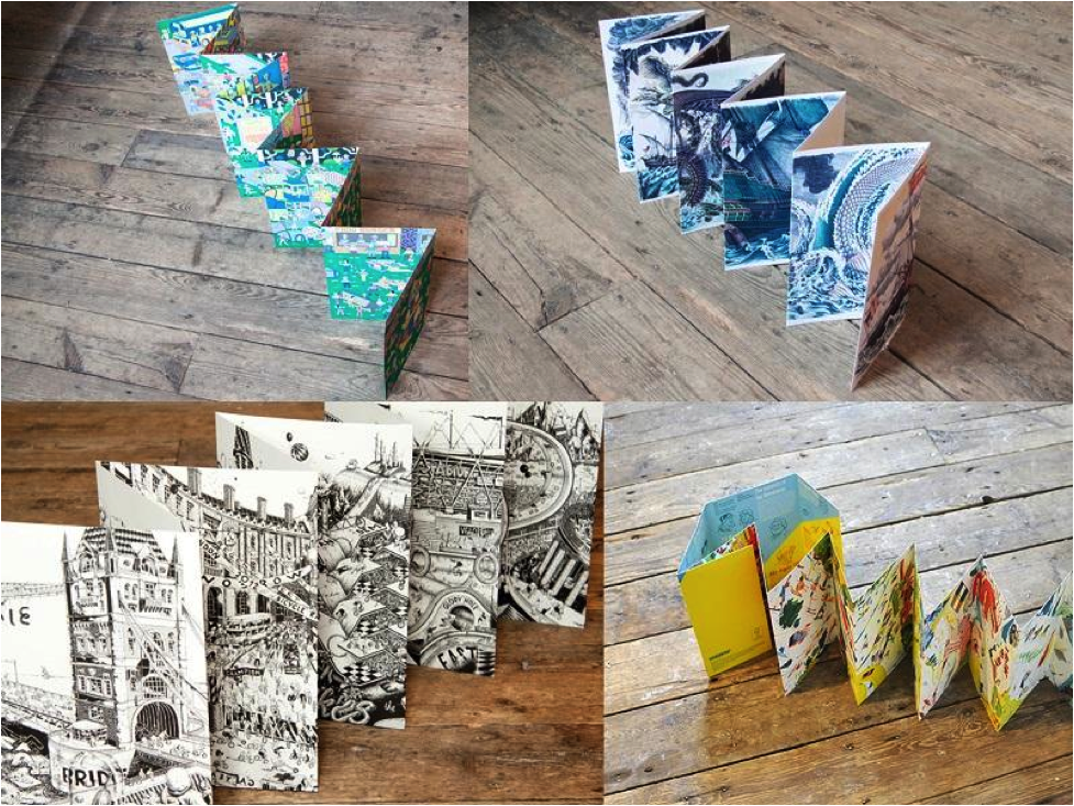
I found this odd little book at CAKE a few weeks ago and I’ve been showing it to everybody. At first I was fixated on the colors — produced with a painstaking chromolithographic technique — but as I watched people unfold the concertina book and take in its panoramic form, I’ve been thinking more about the book’s format.
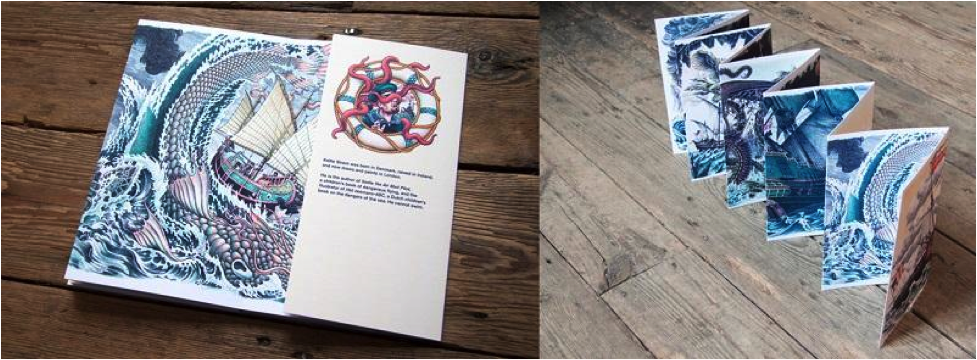
The book in question is Worse Things Happen at Sea by Kellie Strøm, part of Nobrow’s concertina book series1. Concertina books are pleated and unfold like an accordion; the panels can be read in individual segments, like any book, but also fold out to form an interconnected panorama of images. Highly prized by rare book collectors, illustrated concertina books depicting cityscapes or images of local life were popular souvenirs in the 19th and early 20th century.
Worse Things Happen tells the story of the conquest of the high seas, or rather the conquest by the high seas of sailors who would dare to test her. Each segment depicts another development in the history of seafaring vessels (a Viking longship, a Dutch man-of-war, an early submarine–could it be the Nautilus?, the giant steamship Kaiser Wilhelm II) being attacked by a monstrosity of nautical lore (Scylla and Charybdis, the Aspidochelone, a giant narwhal, the Kraken).
The book is 136cm long and 23cm tall, which means each side of the album, once unfolded, provides almost .33 square meters of surface area for artwork. For comparison, a double-page spread in a standard floppy comic is less than a tenth of a square meter (.091m²). The physicality of the concertina changes the nature of the reader’s relationship to it. Although a .33 square meter painting placed on a wall would not seem so big, the concertina book is something that the reader holds and unfolds with their own hands, which puts the viewer up close and makes it impossible to take in the entire image at once.
Instead, one naturally pans across the image, tracking like a camera on a dolly. The continuous nature of the image invites the reader to spend considerable time with it, observing both the detail within each fragment and the way the fragments flow into each other. Though ostensibly a single image, the concertina reads like a sequence of events. In other words, a comic. This got me thinking a bit about the nature of comics and how narrative, or more broadly the passage of time, is presented within them.
How does one convey the passage of time within a static medium? The principle technology for moving time forward in comics is the transition between panels.2 The panel is a static image and the gutter between panels is where motion in time and space can take place. The panel transition in comics serves the same function as the cut in film; the gutter, or cut, represents all that is left out.
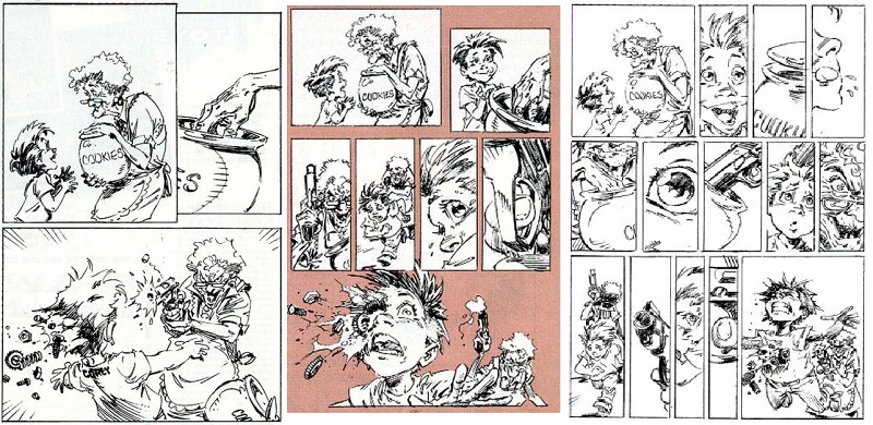
In film, cuts compress the narrative. In comics, they can have the opposite effect. The more ‘cuts’ or panels there are per page, generally, the slower things are moving. Telling a story in a fast-paced style usually means using just three or four panels per page; a page with seven, eight or nine panels is slowing things down, focusing in on more details:3

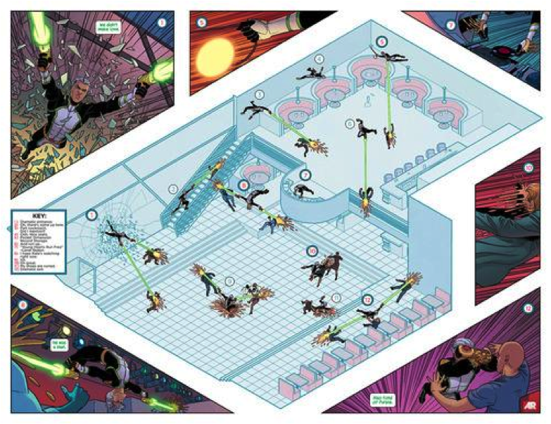
Filmmakers use cuts to compress or speed-up time, but they can also have ways of slowing time down. Slow motion invites the viewer to take in more action than would be visible to the naked eye, to see things that would otherwise be missed. In comics, an effect similar to slow motion video can be achieved by superimposing multiple images of a single subject within the same panel. This allows a single panel to convey a whole sequence of events; it is often used in superhero comics for a character who is faster and more agile than his opponents — how many times have we seen the Flash zooming or Spider-Man flipping through a single panel? A recent Jamie McKelvie page from Young Avengers combines the super-imposed image, the cutaway diagram, and the super-wide-shot to create a dense and complex action sequence within a single panel:

It’s a gorgeous trick but it still runs up against the limits of the comics page. Only formalist experimentation can go further.
We’ve seen how a filmmaker can speed up time with jump cuts, and delay it with slow motion video. But one of the most radical things a filmmaker can do is allow time to pass naturally. Frequent quick cuts are so essential to the language of cinema that we notice their absence more than their presence. Long takes without cuts create psychological tension, emphasizing the relentlessness of time’s passing. A sequence like the final six minutes of True Detective‘s fourth episode, in which Matthew McConnaughey’s character Rust Cohle breaks into a stash house and then makes a daring escape, is effective because the camera, and thus the viewer, is never allowed to turn away from the action; as the shot continues unabated the sense of dread grows, to be relieved only by the final hard cut at the end.
Long takes like this are commonplace through the history of cinema, and there are whole films composed of single shots. Alfred Hitchcock’s The Rope famously takes place in a single apartment in what appears to be one long take, and Alexander Sokurov’s Russian Ark features over 2,000 actors in a single 96-minute Steadicam shot that floats through the many rooms of St. Petersburg’s State Hermitage Museum. In both cases, events unfold within the narrative world of the film in exactly the time it takes to view them. In a movie full of traditional cuts, two hours of screen time can equate to days, weeks or years of diegetic time. Without cuts, diegetic and non-diegetic time are perfectly in sync. Everything on the screen is happening “in real time,” 24-style.
In order to simulate the effect of a continuous tracking shot on the page, a cartoonist must eliminate the traditional borders between panels — but even then the amount of information that can be presented before cutting away is limited by the size of the page. Looking beyond the limitations of traditional rectangular page formats allows for some interesting time dilation possibilities.

As shown above, an accordion-folded book radically increases the amount of horizontal space along which a narrative can be presented. The exaggerated linearity is not unlike a Greek frieze or a Medieval tapestry. The form has proven appropriate for presenting subjects which are both epic in scale and narrow in scope: recent entries in NoBrow’s concertina series have included a crowded musical festival scene, a madcap bicycle race, and the history of exploring. A concertina can be read like a traditional book, in which case each segment is like a double-page spread — but once unfolded, it becomes a spread that never ends. The increased surface area allows for a level of detail that can’t be achieved in any standard rectangular format.
But these concertinas do not achieve the psychological effect of a continuous film shot. Eliminating panel divisions merely means that the cartoonist has removed some of the guide rails. Instead of dictating the pace of events to the reader, the reader takes in the whole work at the pace of their choosing. The passage of time becomes totally subjective, as details are obsessed-over or over-looked according to the reader’s whim. It’s radically different from the experience of reading a traditional comic or a splash page, but it’s also nothing like viewing a long take in a film, because there is no defined point of view (ie, camera) and no defined frame rate.
The unlimited bandwidth of the internet provides opportunities to create sequential narratives that reach not just beyond the constraints of the standard comics page, but beyond those of any physical object. Worse Things Happen at Sea may contain a lot of visual information — 23×272 centimeters worth — but it is still constrained by its physical limitations as an object. A printed book that extended much further would be unwieldy, but the infinite scrolling of a web page has no such limitations.
The best example I’ve yet seen of a cartoonist taking advantage of a web page’s dimensions (or lack thereof) is Boulet’s “The Long Journey.” “The Long Journey” is a departure from the French cartoonist’s usual inky style, instead employing a pixelated look that draws attention to its utterly digital nature. Except for a short framing sequence at the beginning, the entire comic is one extremely long vertical panel, which is read by scrolling down the page. Words and images are placed such that the reader can take in everything without ever taking a finger off the scroll bar or the down arrow. The longer one scrolls, the more absorbing the images become, and Boulet’s narrative takes on additional layers of meaning as the reader approaches the metaphorical and literal bottom of the page.

The length of the work is impressive. On a standard 14” computer screen the comic appears to be around 2,500cm in length — occupying nearly ten times the real estate of Worse Things Happen. And unlike a concertina book, “The Long Journey” can be measured in time as well as space. It takes a full two minutes to scroll through the entire comic (realistically, it takes twice that time if one reads all of the text). Thus the work combines features of the concertina (the panoramic flow of events without panel boundaries) and the long take (the point-of-view mediated by the camera, or screen, and the narrative pace dictated by the frame, or scroll, rate). It’s more like a film than any comic, and could even be described as a rudimentary form of animation. But it’s also much more like a comic than any animated film, emphasizing as it does the static nature of the images that contribute to the narrative whole.
Which returns me to my original contemplation of the concertina book — an object that is so obviously a comic, yet in many ways not. It exists at the edges, and it is only at the edges of a medium that we can most clearly see its defining features. Whether you consider a concertina a comic or an illustrated album or something in between, the contemplation of one, especially such a lavish one as Worse Things Happen, inspires a better understanding of the entire comics form.
_________
1.Concertina books are also called leporello, so named for the character from Don Giovanni and his comically long list of Giovanni’s sexual conquests.
2.I don’t think I’m breaking any new ground here; this is all in Scott McCloud’s Understanding Comics
3.This insight, and the triptych of pages above which elaborate it, comes from Spawn and Batman artist Greg Capullo’s “Storytelling and Pacing” guide in Wizard’s old Basic Training feature; unfortunately I don’t have the specific issue to reference, though all of Capullo’s Basic Training columns are collected in a .pdf here.

