This first appeared on Comixology.
_________________
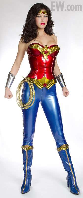
As NBC gears up for its new Wonder Woman series, the internet is abuzz with one burning question. What dastardly villain mugged our heroine with a casino? And does Adrianne Palicki get combat pay if that bustier ruptures and her cleavage assaults her noggin?
Okay, so those are two questions.
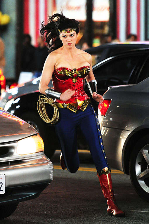
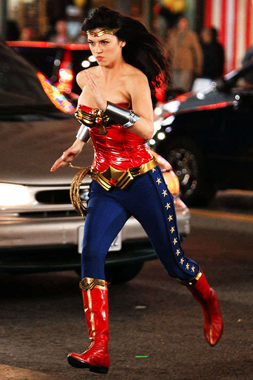
To be fair, NBC has also released pics of an updated (or possibly additional) costume, which isn’t quite as tragically latexy. Here are some action shots:
She looks so darned serious there…and brave! Looking at her face alone, you’d never realize the extent to which her boobs pose a danger to herself and others.
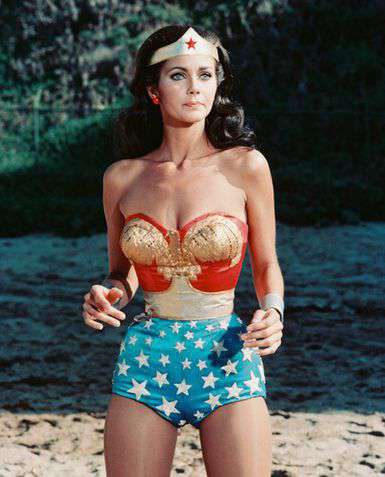
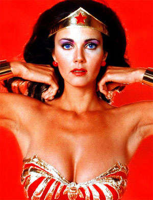
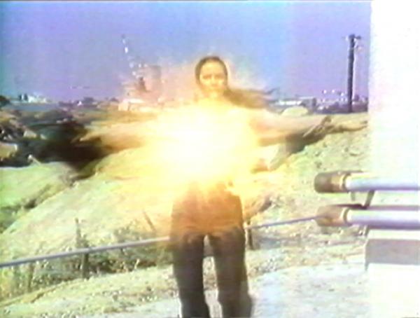
Oh for the days of Lynda Carter!
We miss your shapeless grandma-bottom bathing suit with the hint of camel-toe, Lynda!
Live-action super-hero costumes are often awful (I’m looking at you Styrofoam-muscle Batman), but Wonder Woman seems to bring out the worst in what I suppose, for the sake of brevity, we must call “fashion-designers.” What, in short, the-hell-is-wrong-with-these-people? Why, lord, why?
I actually have a theory. It’s all the fault of William Marston and Harry Peter.
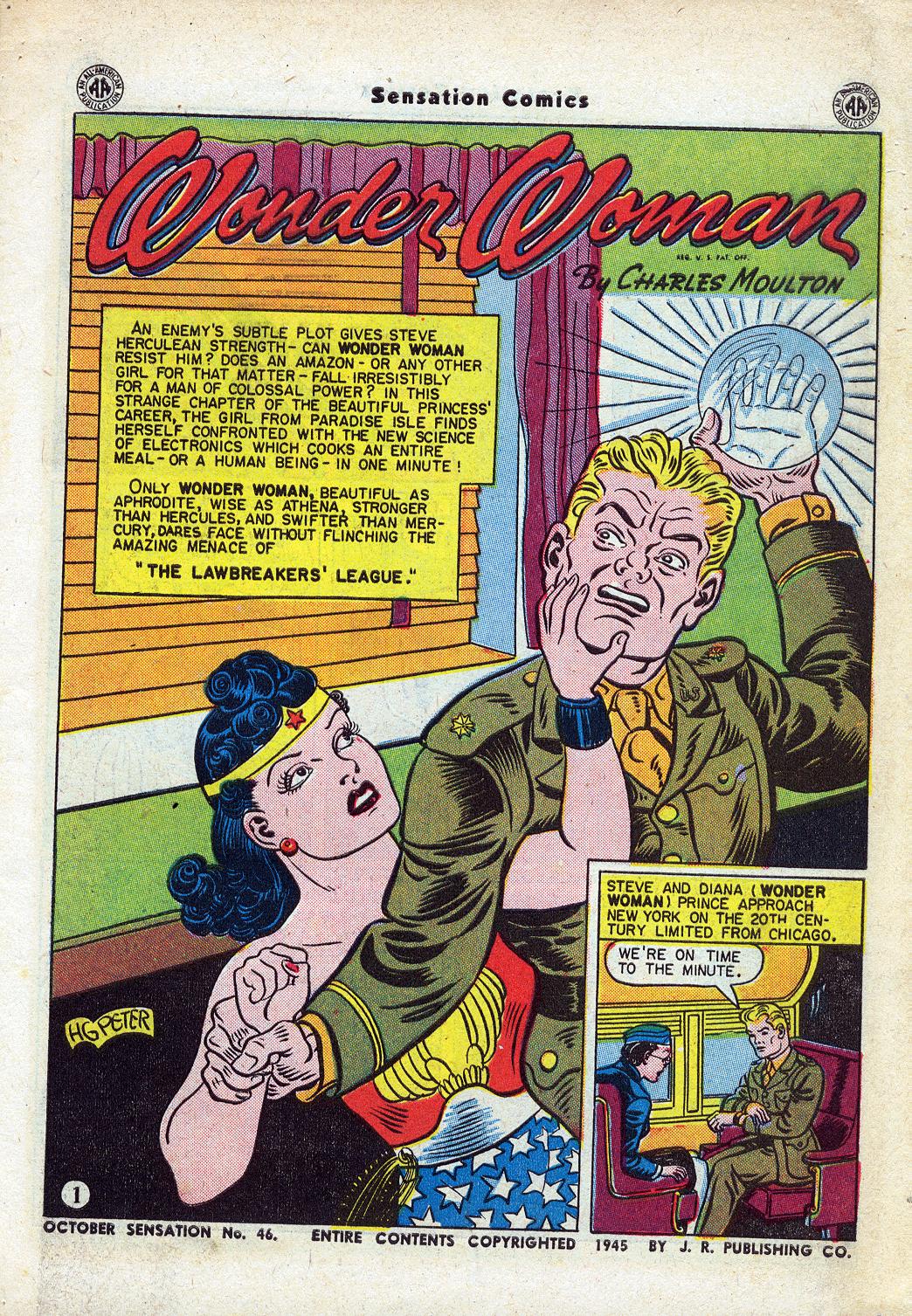
For those not in the know, Marston was the creator of Wonder Woman. Harry Peter was the original artist on the series — hired by Marston himself. And their version of Wonder Woman looked like this:
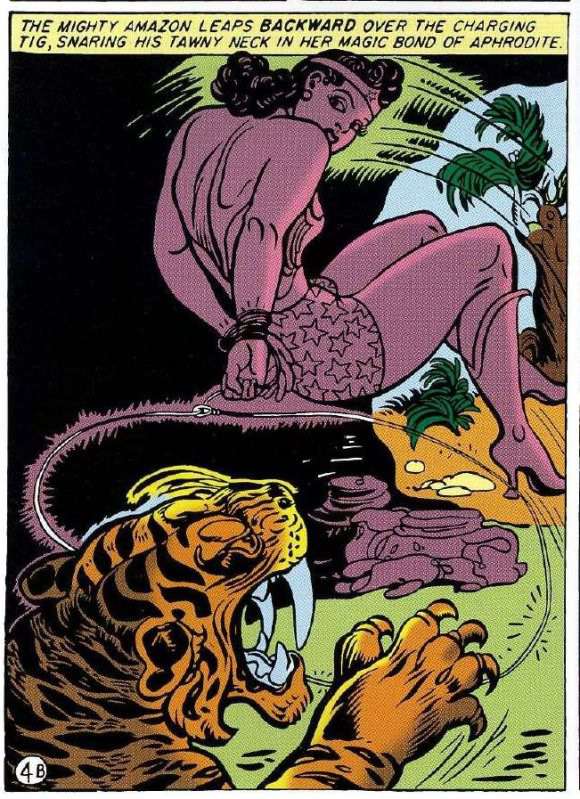
Yes, that’s Wonder Woman with her hands tied behind her leaping backwards to attack a saber-tooth tiger. Which is fairly bad ass.
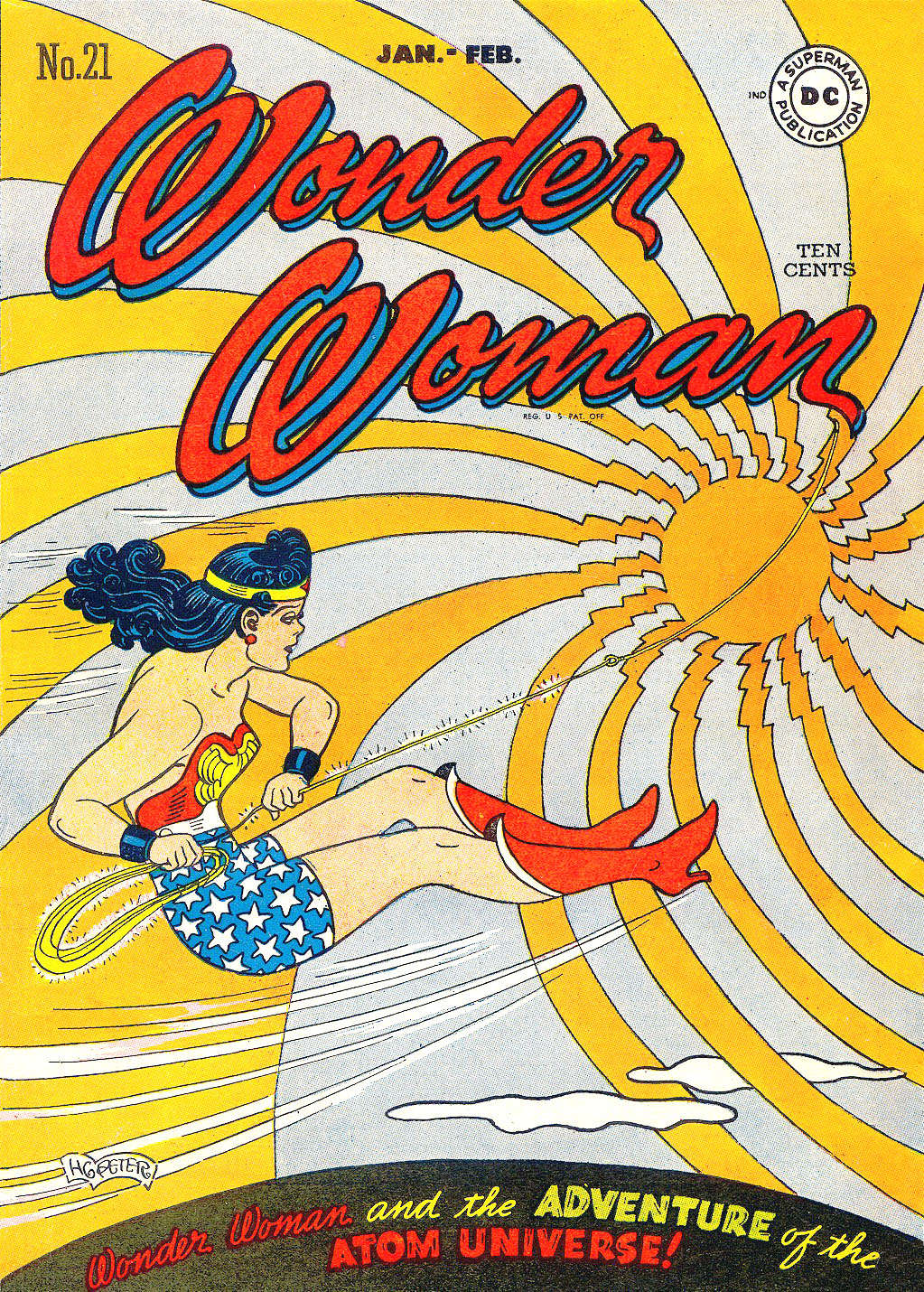
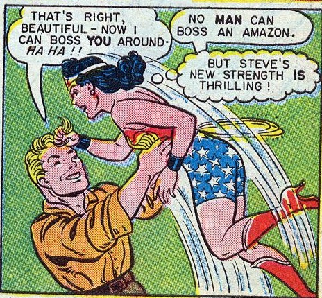
But the thing to focus on is what isn’t here. Specifically, there is not a whole lot of cleavage visible. Instead, Peter’s supple line dwells lovingly on those back muscles…and on WW’s super-butch shoulders. This was typical: even when the chest is visible in Peter’s drawings, he tends to focus interest on other areas:
Marston and Peter, in other words, put WW in that skimpy bustier so that they could look at her shoulders flexing, not so they could look down her front. Part of the problem with later iterations of Wonder Woman’s costume, then, has been a simple confusion of erotic focus. The costume wasn’t really designed for large amounts of cleavage. When you put a large amount of cleavage in there to propitiate our breast-obsessed culture, the results tend to be more silly than heroic.
Even putting aside the breasts, though, there would still be problems. Wonder Woman’s costume just was never imagined with real people in mind. You could argue that this was true for super-hero comics in general; drawings are different than living, breathing bodies, and Kirby clearly wasn’t thinking too hard about how an actor would look in Thing-face. But with Peter’s Wonder Woman…well, look at this, for example.
That doesn’t look like a drawing of a real woman. It looks like a stiff, posed picture of a doll.
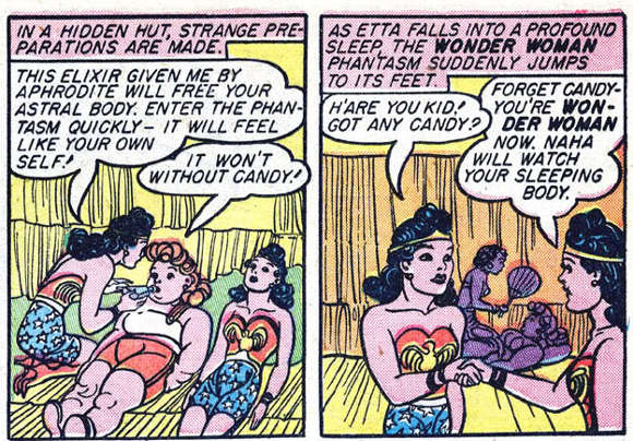
And I think that really was the point. The rigidity and unreality of the drawings is not a bug; it’s a feature. Girls who read those early WW comics were encouraged to see themselves not just as the characters, but manipulating the characters, moving them about like toys. This is part of the pleasure of a sequence like the below, where Wonder Woman’s body is first duplicated (like a reproducible doll) and then inhabited by her friend, Etta Candy.
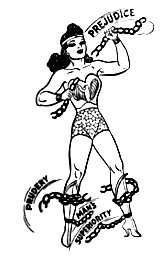
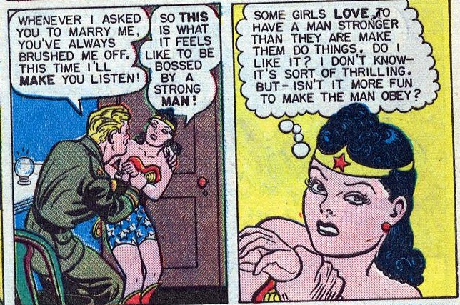
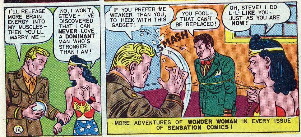
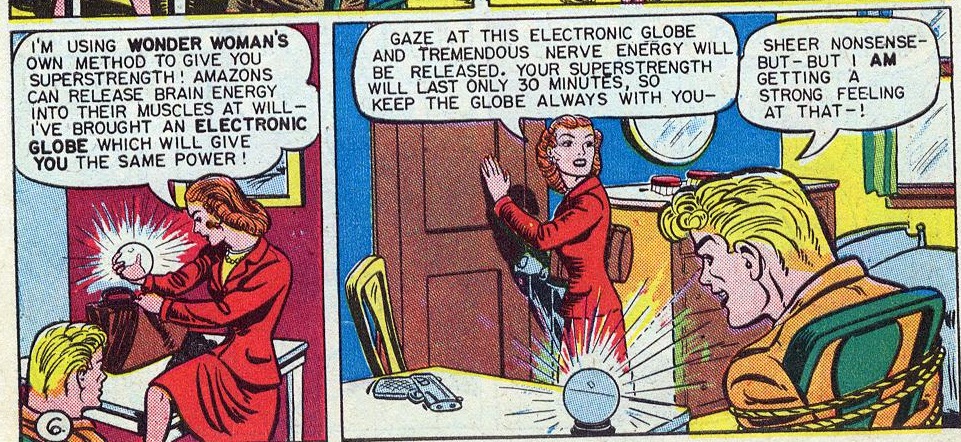
Etta and WW are both tied up in the picture above too, of course. Marston and Peter were obsessed with bondage. In their stories, WW often gets tied up every three panels or so. For Marston, this was linked to his odd ideas about feminism and submission; he believed women were superior to men because they were more comfortable with submission. Men, he felt, needed to learn submission from women. Wonder Woman was part of his effort to teach boys and girls the joys of “loving submission” to a wise matriarch.
So Marston was kind of a kook. But he was a kook whose kookiness dovetailed nicely with the interests of his audience. Sharon Marcus, in her book Between Women, noted that dominance and submission have long been an important part of literature for children, and particularly for girls. In the Victorian era, in particular, there were many books which featured “Fantasies of girls punishing dolls, and being punished by them appeared regularly in fiction for young readers.”
Whether Marston and Peter were deliberately referencing this type of story is unclear…but what is clear is that their comics worked with a similar dynamic. The frozen postures of the figures and the bondage themes are of a piece.
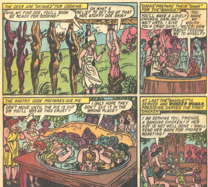
So, for example, the above picture shows the outcome of an Amazon game in which some women dress as deer so that their Amazon sisters can catch them, truss them up, put them on plates, and pretend to eat them. There’s certainly kink here…but it’s not especially focused on a stereotypical male appreciation of scantily-clad, realistically depicted female flesh. Rather, it’s embedded in a narrative of dominance, submission, and play. The kinky frisson is tied (as it were) to the artificiality of the doll-like poses.
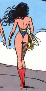
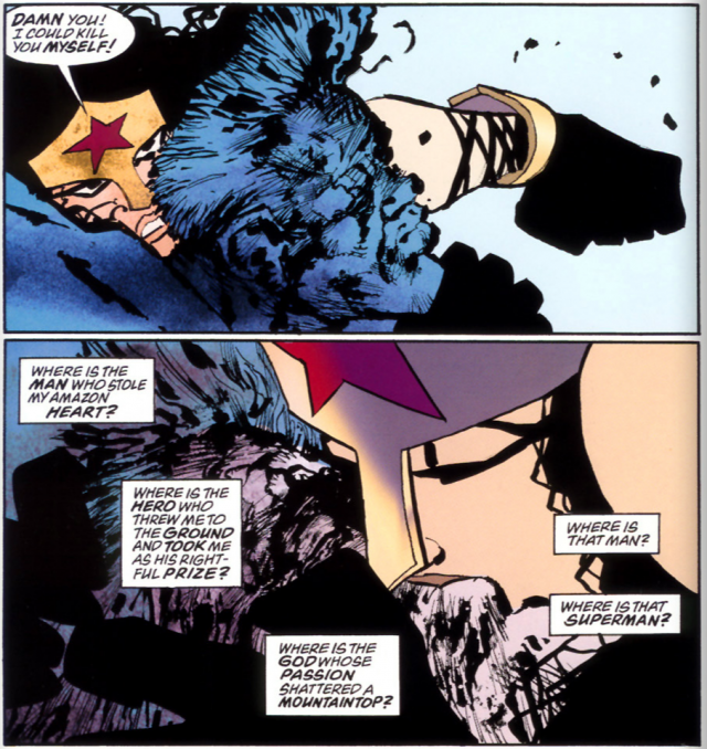
Since Marston and Peter, lots of Wonder Woman artists have tried to rework the costume…to turn it into something that appeals to the typical erotics of older guys rather than to the B&D doll-playing interests of Marston and (Marcus suggests) young girls. As a result you get images like this, by, (I believe) Mike Deodato.
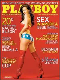
Wonder Woman’s costume was meant to be sexy. But it was meant to be sexy in a particular way and for particular kinks. Those kinks don’t map particularly well onto current mainstream interests or tastes. Efforts to make WW cater to those mainstream interests and tastes tend to be, at best, self-parodic. So if NBC’s costume looks ridiculous (and it does) it’s because they’re trying to squeeze a Playboy fantasy into a costume that was never meant to hold it.
_____________
All posts in the series on post-Marston iterations of Wonder Woman are here.

