Jed Perl very satisfyingly tore into Art Spiegelman over at the New Republic, pointing out that he is incredibly pompous and can’t draw worth a damn. That led to a chat on facebook where I claimed that Spiegelman’s page design was pretty much crap, and was told I was wrong by various folks.
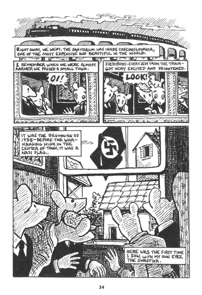
So what the hey, Dan Nadel was gushing over at tcj about the same Jewish Museum Spiegelman show that underwhelmed Perl. Here’s one page Nadel singled out to illustrate his piece.
The train on top of the bridge is bung up against the panels below, so that it looks like some sort of cap perched atop the panels. The sense of motion is really confused too.The train goes from right to left up top, and but in the next row of panels the direction of reading makes it seem to go left to right. Spiegelman tries to fix this by shifting the image leftward in the second panel so you can see the next window, but that doesn’t so much create leftward motion as it just makes the motion of the page even more or a mess, especially since the window borders and the panel borders are exactly parallel, and so tend to visually distract get confused with one another.
I can’t for the life of me think of an explanation for why Spiegelman wanted to make the top of the page look like a decorative hat, or why he’d want to have you thinking about which direction the train is going in. I guess, though, you could argue that the confusion and clutter of the panels at the top is supposed to make the swastika pop. But that ends up feeling cheap; the top doesn’t work by itself, and setting everything up for a big reveal seems manipulative. That’s only intensified by the way the flag folds in such a wannabe but not actually lifelike way — Spiegelman’s melodramatic touch a la the splash of red in Schindler’s List.
Maybe the ham-fisted clutter and the transparent melodrama are supposed to be ham-fisted and transparent, undermining identification and foregrounding the comicness of the comic. Spiegelman deliberately combines incompetence and glibness to show us that this isn’t really a true image of the Holocaust, but a poorly designed and manipulative representation of the Holocaust. Maus is so great because it’s so self-consciously mediocre.

