In the heart of the Palazzo Vecchio in Florence is the Salone dei Cinquecento (Hall of the 500), which, as the name implies, was designed to seat the 500 members of the Grand Council. In the 1560s, Giorgio Vasari was commissioned to create a series of frescoes on the walls and oil paintings on the ceiling of this hall.
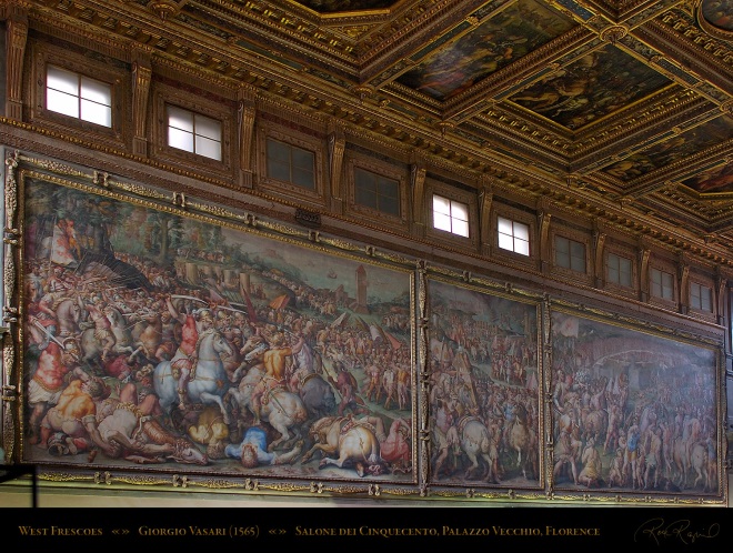
West Frescoes in Salone dei Cinquecento by Vasari
(Photo by Ron Roznick)
The frescoes depict battles and military victories by Florence over Pisa and Siena (in chronological order, no less). These are massive pieces of art that are designed to impress visitors to the Hall, which functioned as the court of the Medicis. It is interesting that they are presented side by side with what look like extremely ornate panel borders. They are too large for the arrangement to be accidental, which means that Vasari (or his patrons) wanted these pieces to be close enough to create an effect larger than the sum of the parts.
It would be possible for a viewer to spend hours examining every detail in each fresco, but it is clear that the intended effect of the presentation is to impress visitors to the hall with both the military prowess and wealth of the city with the visual immediacy of how it has been successful in the past (and, by implication, could be in the future). It may only be because I read comics that this presentation reads as a three panel strip where the middle panel is less important than the two on the ends.
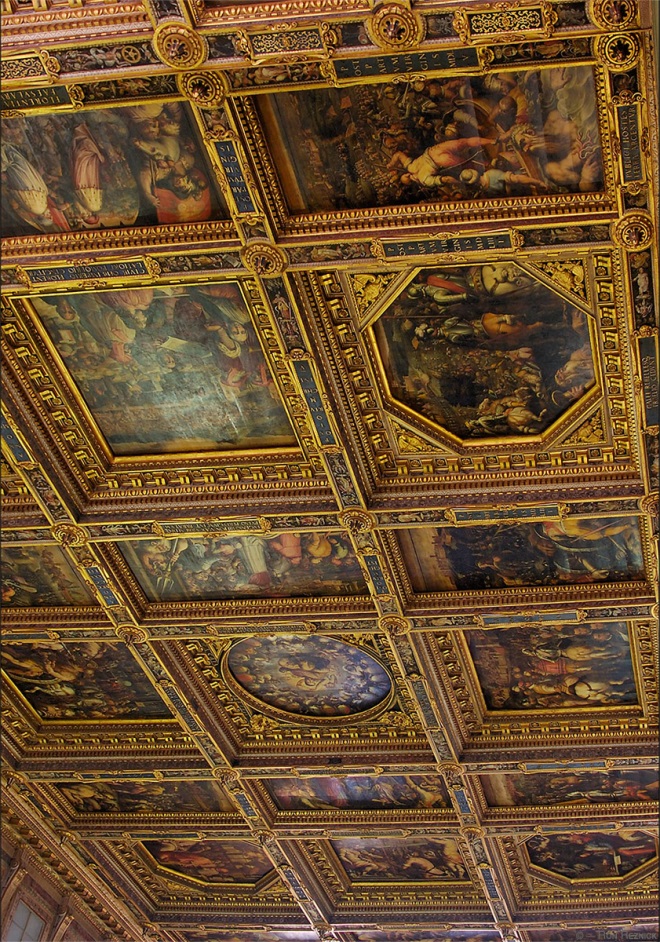
A portion of the ceiling of the Salone dei Cinquecento by Vasari
(Photo by Ron Roznick)
The 39 oil paintings on the ceiling of the same hall represent great episodes from the life of Cosimo I and scenes from the history of Florence. The presentation of these paintings in a massive, ornate grid reminds this modern viewer (and reader of comics) of the carefully arranged panel grids of a comics page – especially since each of the paintings has its own descriptive caption. And there is even an implied order that these are meant to be viewed in; the circular painting in the center, for example, is The Apotheosis of Cosimo I de’ Medici which depicts his coronation by the personification of Florence.
Again, the intended effect is to produce awe at a government that had enough disposable income to commission such a piece. Keeping in mind that thirty feet of open space separates the ceiling and the viewer, the narrative aspect of the arrangement is less obvious on an initial viewing and only becomes evident with time to study the detail. But it is there.
(Better views of these pieces can be found at this site.)
These artworks take advantage of the basic artistic process that enables comics – the implied narrative- sequential connection that comes from placing two pieces of artwork near each other, regardless of whether those pieces are related or not.
The Salone dei Cinquecento is a good example of a narrative-sequential artwork outside of the comics tradition because it contains two distinct examples with very different approaches from the same creative team. It is easy to avoid referring to either work as “comics” because “comics” was not part of the artistic idiom at the time of creation. There are other examples, of course – narrative-sequential artwork is everywhere if you have a broad enough perspective.
And, to be honest, finding examples of narrative-sequential art from before the advent of comics-as-comics is almost too easy. What I find especially interesting are the 20th Century examples of non-comics narrative-sequential art, mostly because they arise outside of an explicitly comic-making tradition but are still contemporaneous with what we think of as modern comics.
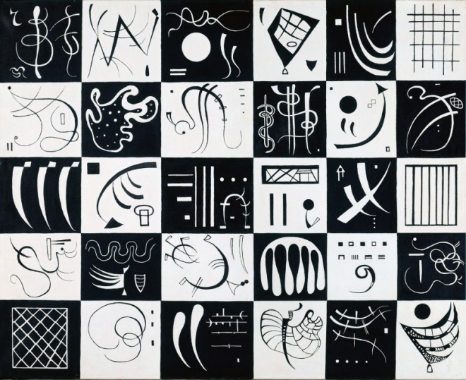
Wassily Kandinsky, “Thirty” (1937)
Kandinsky was living in Paris when he made Thirty, which means that he would have been aware of bandes desinees (BD) as a general cultural phenomenon. It is possible that he might have encountered it earlier in his travels around Europe, but it would have been impossible to miss it in Paris in the 30s. If he had wanted to make comics, there was ample opportunity for him to do so. He didn’t, but this was as close as he got.
Despite the fact that it is an explicitly abstract piece, Thirty still takes advantage of the implied relational connection that comes with arranging discrete pieces so close together. It is an extremely successful grid and provides an overt narrative framework for the viewer to build an interpretation around. If anything, this grid is closer to the effect generated by the ceiling of the Salone in Florence. It emphasizes the overall effect first and rewards subsequent scrutiny.
Lynd Ward Wild Pilgrimage (1932)
There is little evidence that Ward was thinking in terms of comics when he produced his woodcut novels like Wild Pilgrimage. Comics were certainly around at the time, but they were largely regulated to the newspapers and comic books were still in their infancy.
Each page of Ward’s novel only has a single image and there are no captions, so these are comics-like at best. But these absolutely take advantage of the fact that images presented in sequence can be used to tell a story. As allegorical tales, Ward’s novels were tied to the worker’s movements of the times – a very different audience and purpose than American comics of the period.
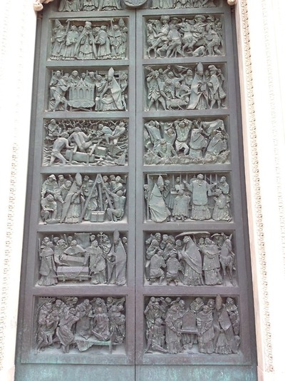
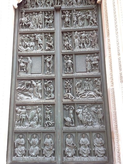
Doors of the Milan Duomo (mid 20th Century)
Because I have taken Frank Santoro’s composition course, these doors remind me of the fixed grids that he teaches in his class. It absolutely makes sense that an artist attempting to produce a narrative in bronze would divide the available space into rectangles of equal size. It is a natural impulse and an obvious design solution. I have no idea who designed these doors or whether that person had a comics background. I’m happy to get more information if someone has it.
Max Ernst, “Une Semaine de Bonte” (1934)
Like Kandinsky, Ernst was living in Paris when he worked on Une Semaine de Bonte, although he actually completed it in Milan. Like Kandinsky, Ernst would have been aware of the BD culture of the time – even if it was only a cursory cognizance.
Like Ward, Ernst’s novel takes advantage of the narrative aspects of art presented in sequential order to tell a story. Like Ward’s work, each page contains a single image and, unlike Ward’s work, these pages have captions more often than not. Despite the fact that they are contemporaries, there are very few other similarities between Ward and Ernst beyond the fact that they both arrived at the same solution (images in sequence) for the same purpose (to tell a story) from very different (non-comics) directions.
It’s tempting to categorize these kinds of explicitly narrative-sequential art as comics that don’t know that they’re comics. I think it’s safer to say that the idea of presenting artwork in sequence for narrative purpose is such an easy conceptual leap that it should not surprise anyone that it shows up so often in so many disparate places; diptychs, triptychs and other polyptychs have been acknowledged art formats in multiple cultures for centuries, if not longer.
Comics, specifically, are a refinement of the concept for a very specific purpose and medium. Rather than trying to shoehorn everything into the comics tradition because that’s the most obvious context for modern viewers, it would make more sense to think of it the other way around – comics are no more and no less than a distinct subset of the larger grouping of narrative art in sequence.
Having said that, it would not be a bad idea for contemporary comics creators to pay attention to these other examples of how past artists have used this technique to good effect. This is no different from telling creators to study how other artists have used color theory, figure drawing or one point perspective.

