When it was released in English translation in 2007, critical interest in Pascal Blanchet’s White Rapids was appropriately complimentary of the book’s glorious visual style: shape-driven vector art and a shifting perspective reminiscent of mid-century travel posters and advertising, washed in a (slightly anachronistic) sepia-hue.
The novel sketches the broad outlines of the history of the town of Rapide Blanc, Quebec from its establishment as a company town supporting a power plant in the 1920s to its demise in the 1970s due to automation of the plant and improved transportation. According to Blanchet, the town itself is the central character – the human characters are rarely identified by name, and their stories play out in the broad strokes of collective experience.
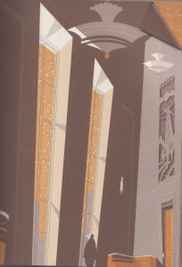
Blanchet synthesizes a number of visual reference points from the town’s lifespan: the angles of Art Deco
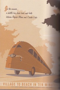
the curves of Streamline Moderne and the romance of travel posters
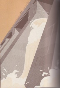
the grandeur of landscape naturalism (with a little social realist flair)
the graphical shapes of Googie and UPA
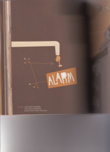
including technical diagrams
and the commercialism of advertising and interior design
The combination of these elements and Blanchet’s terrific choice to eschew a paneled grid in favor of a layout inspired by the period’s commercial art and illustration give the comic extraordinary atmosphere. It’s a delight.
Reading it, though, I experienced a tug-of-war between my immense enjoyment of these visual reference points, which I have particular affection for and which I was overjoyed to see utilized so effectively in this comic, and an ultimate dissatisfaction at Blanchet’s unwillingness to represent more directly the tensions among them. The mid-century here becomes a nostalgia-laced gestalt – viewed through his sepia lens, all its visual touchpoints, no matter what they signified historically, smash together into a signifier for A Good Life.
In Blanchet’s defense, that is to small extent what actually happened in the mid-century – especially in the 1950s in the US, space age design was indiscriminately combined with early American elements, so that in kitschy tract houses from the period you find atomic-styled doorknob backplates and round plastic buttons for light switches right next to heavy wrought iron chandeliers and patterned curtains depicting Minutemen. Proper Googie deliberately mixed futuristic pylons and cantilevers and glossy interiors with rustic flagcrete and natural wood and interior gardens – part of convincing the public that Modernity was indeed stuff of a Good Life.
Blanchet captures this mixing of styles. But the tension of their juxtaposition gets smoothed out in his take. In actual images from the period, the tension remains. It is no accident that when we think of popular mid-century cartoons, two of the first to pop up are The Flintstones and the Jetsons, which kept the aesthetics separate. Mid-century people did not purify the categories – that jumble of styles WAS the aesthetic. But the individual elements of the aesthetic did not surrender their native ideologies: the warmth of rustic materials did not tame the technotopian ideal of futuristic design. And especially in retrospect, the environmental consequences of the mid-century’s technological dreams saturate that style to the point that it appears almost dystopian.
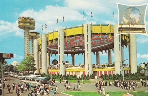
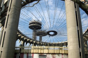
A particularly illustrative case in point is Philip Johnson’s Tent of Tomorrow, the New York State Pavilion at the 1964 World’s Fair.
Now in ruins, Johnson’s futuristic towers in decay symbolize not the promise of “peace through understanding” or the world-uniting potential of atomic power that was the theme of the related “Atoms for Peace” program during the previous decade, but the death of that utopian dream against the realities of world politics and economics and the seemingly intractable environmental costs of progress.
The narrative arc of Blanchet’s story is concerned with progress – the mighty power company (represented in streamline Deco) builds the plant. Then they build the comfortable town for the people to live in. The people live the good life in the town, socializing and fishing and raising their children and putting in an honest day’s work. Then the plant is socialized! And automated! And the roads are improved. And the town is shut down. Reasons are given:
First is the continuous improvement of communication networks and road transportation. Today, one can easily drive from Shawinigan to Rapide Blanc, hold a meeting, and drive back all in the same day. When the village was founded in 1928, travel from Shawinigan to Rapide Blanc was a major expedition.
Second, improvements in the standard of living in Quebec mean that employees, regardless of their position, want to work near commercial centers, schools, and hosptials. In other words, they want access to urban facilities. In a town like Rapide Blanc, providing residents with all the comforts of modern living is simply not financially viable.
That text, quoted in the book, was from 1971, and makes explicit that the plant was shut down due to the culture’s preference for technology and modernity over the idealized small-town life. No matter how Populuxe the small town was, it couldn’t compete.
Blanchet’s images accurately represent the contradiction in the dream of mid-century modernism – nature and technology – but it mostly pins the ominousness of progress to the Deco aesthetic and lets Populuxe off the hook. Saturating that small-town life with nostalgia ends up eliding the actual historical and ideological connections between Streamline Moderne and Populuxe, and thus de-emphasizes the fact that the mid-century dream had within it the kernel of its own destruction: the technological advancement that made mid-century rural life so comfortable would eventually make mid-century rural life economically unfeasible. The taste for modernity reflected in Populuxe design ultimately became unsatisfyable within Popluluxe’s uneasy hybrid of past and future.
I want to point out that nothing in Blanchet’s book outright contradicts these historical tensions. He washes them with nostalgia but he doesn’t actively misrepresent them. I can find them, and with effort I can sustain a more historically sensitive reading. But his narrative focuses almost entirely on the human emotional experience – the sad older couple looking forlornly at their empty house and the gentleman throwing his key into the river — yet it’s a narrative of broad strokes. We don’t really know who these couples are, so their human stories don’t pack a particular emotional punch. I would have been more excited about the book had the broad historical strokes implicated in the design elements also been represented more directly, as well as the history of the town itself. That would have felt better balanced to me. The book is a great pleasure, but the pleasure doesn’t stop me from being cynical about the effect of this nostalgic frame on the book’s achievement overall.
Drawn and Quarterly’s blurb on the back of the book is particularly egregious in promoting the nostalgia over the more nuanced historical story:
Blanchet’s unique, streamlined, retro-inspired aesthetic draws on Art Deco and fifties Modernist design to vividly conjure up idyllic scenes of lazy summer days and crisp winter nights in Rapide Blanc, transporting the reader back to a more innocent time.
There was very little innocent about Deco or Populuxe, and when the two are so baldly collapsed together, as they are especially here in this prose, then put in the service of nostalgic myth making, that does give a bad taste. In the final scene of the book, the mythic “General” – a giant Pike who lived in the river and shook the bridge but could never be caught – swallows the key the 195 Crescent St., which a resident has thrown into the river on his way out of town. The General can signify a couple of things: the romantic nostalgic view of mid-century life — or the reality that mid-century life was always a myth. If it signifies the latter, then it is an elegant ending, signifying the passage of the real “mythic” life into pure myth. But if it signifies the former, as Drawn and Quarterly’s blurb suggests, if the technological tensions of the Populuxe aesthetic are really meant to signify “idyllic scenes of a more innocent time,” with no tension at all, then the General becomes the hero of the story: nostalgia itself, myth itself, is the only thing left.
Practically, though, the nostalgic fantasy that the General represents isn’t the fantasy that won – it isn’t what’s left. The world of technology, the dream of progress, is what we have now. We are left with the reality of the Populuxe dream – dystopian though may be. Nostalgia and myth, no matter how comfortable, don’t change that reality.
Of course, this is not a realistic book, and mid-century life indeed has passed into myth. Perhaps (having grown up in a town about the size of Rapide Blanc) I am just more sympathetic to the technological dream than Blanchet is, and more sensitive to how much the myth of mid-century life was a conservative, highly nostalgic construct from the very beginning, related more to the traumas of the 1960s than the reality of the 1960s (traumas which are hinted at in the book only in the representation of nationalized industry and not explored.) Nonetheless, the choice to allow nostalgia to shape the contours of the visual narrative, rather than providing the visual components and allowing them to shape a nostalgic response in the reader, takes the choice to emphasize the subtleties of the period away from me. I’m forced to engage with Blanchet’s (and Drawn and Quarterly’s) sepia-toned mid-century, a mid-century that just isn’t recognizable against the far more vivid Technicolor clashing percussive ‘50s in my head – a compromise engagement that’s ultimately unsatisfying, no matter how gorgeous this book looks.
======================================================================================
Update, February 11, 2011
Warren Bernard, the polymath collector and political cartoons expert who turned me on to this book (Thank you, Warren!), commented rightly that there’s a lot of tension in the narrative, between technology and the small town. And he’s right that Blanchet represents that very directly, and that the visual aesthetics he references — Deco, Streamline Modern, and Populuxe — are ones strongly are associated with technological advancement.
I don’t want to give the impression that there’s no tension at all within this book — it’s definitely there in the narrative arc. But the visuals follow the binary between technology and the small town in a way that doesn’t acknowledge how much the Populuxe aesthetic itself embodies the myth that technology and small town domesticity are endlessly compatible. But Populuxe doesn’t actually signify either technology or the small town — it signifies the same thing that the town itself signifies, the characteristically mid-century myth that technology and progress will lead to more of the conventional “Good Life.” As the book points out, the result of that technology and progress has in fact been the near destruction of rural and small town life.
Because the town is treated in this book as a character, one who is the victim of technology, it’s resonance as a symbol in its own right is muted. The symbolic texture is put in the service, primarily, of the narrative arc rather than a bigger metaphorical or symbolic point. But the Populuxe-dressed ’50s small town is in fact a pretty vital symbol for the more abstract tensions between technology and humanity or between technology and the environment. There is a sense of romanticizing the time and the Populuxe aesthetic right along with the small town lifestyle. It’s that romanticization that’s too broad of a sweep, because it catches Populuxe in its net, and when Populuxe is romanticized, the tensions inherent to the aesthetic are erased. Blanchet’s novel suggests all of these tensions, abstract and aesthetic, absolutely; he does nothing to shut them down and his sensitivity to the history is sufficient that if you’re paying attention to them, you can see them there. But he also doesn’t bring them out, emphasize them, build on them, to the point that D&Q would instantly realize that their back blurb is nostalgic nonsense.

