Greetings to our old friends at PencilPanelPage, and our new friends at Hooded Utilitarian! We are thrilled that Hooded Utilitarian has agreed to host our comics criticism blog (celebrating two years on the interwebs this autumn), and look forward to your responses to our posts (which, for our new readers, are always framed as questions that are meant to engage you, provoke you, and otherwise prod you into thinking with us about all things comics). We have no distinct agenda, and pose questions that are as likely to be about comics structure, form and technique as they are about content, authorship, or reader reception. Please visit our archive (PencilPanelPage.com) to access earlier posts and comments; you’ll read some interesting pieces, and you’ll get a better sense of our approach and predilections.
Now, let’s begin our promised Krazy Kat foray! This is the first of our five-part roundtable on George Herriman’s seminal comic strip. For the next five weeks, we’ll invite you to join us in re-assessing Herriman’s accomplishment now that Fantagraphics has issued the final volume in its stunning Krazy and Ignatz complete set. I don’t think anyone has gotten his/her head around what it means to have all these strips available to us now in high production-value collections, but there’s no question that Herriman, if he wasn’t already a pulsing blip on your radar, is now a meteor coming at us full-speed. We’ll be interested to hear your responses over the next few weeks; just what does the eternal triangle of Krazy Kat, Ignatz Mouse and Offissa Pupp mean to you? Color or black and white, Sunday or not; is Herriman our great under-appreciated forefather? How does our unprecedented access, via the Fantagraphics republications, to hundreds of Krazy Kat strips alter our sense of the comics canon—its seminal works, its stylistic trajectories, its history and its future?
Here’s what I am thinking about:
In his 1919 essay, “Tradition and the Individual Talent,” T.S. Eliot suggested that masterworks fundamentally alter the chain of related works that precede (and, by extension, follow) them:
No poet, no artist of any art, has his complete meaning alone. His significance, his appreciation is the appreciation of his relation to the dead poets and artists. You cannot value him alone; you must set him, for contrast and comparison, among the dead….[W]hat happens when a new work of art is created is something that happens simultaneously to all the works of art which preceded it. The existing monuments form an ideal order among themselves, which is modified by the introduction of the new (the really new) work of art among them. The existing order is complete before the new work arrives; for order to persist after the supervention of novelty, the whole existing order must be, if ever so slightly, altered; and so the relations, proportions, values of each work of art toward the whole are readjusted; and this is conformity between the old and the new. (Section I, Paragraph 4)
Overlaying a mathematical framework onto this argument helps, I think, so let’s explore Eliot’s assertion as a mathematical postulate. This is not just to say that a new addition to the canon {let T= tradition, or the set of previous masterworks in a given artistic tradition} augments the size or total number of works {T+1}; Eliot seems to suggest that the very properties of T (and thus, by extension, each element of set T, or each of the previous masterworks contained in the set) are fundamentally altered by the new addition. If Herriman’s work is substantial enough—innovative, alert to the unique affordances of the medium, intelligent, taut with momentum—and I do think it is, then a careful, extensive, reading of Krazy Kat ought to change our very perceptions of the comics medium itself, as well as our interpretation of other works in the canon (insert your beloveds here). If I had more space and more time, I’d explore the ways Herriman’s long-running, palimpsestic strip alters my perception of other strips from the early 20th century, but also the ways it changes my perception of newer works, including those that are similarly experimental (in both form and content). If I really had time, I’d want to mount a full-on linguistic study of Krazy Kat’s diction, for never have I seen more virtuoso movement up and down the register scale (informal to formal and back down again), code-switching, regional/literary/archaic/contemporary dialect streaming from the mouths of a gender-bending cat, a dogged pup, and a brick-slinging mouse. I really wanted to do this when I read Ng Suat Tong’s comment on the paucity of true linguistic analysis of comics in his recent (November 4, 2013) post, “Comics Criticism: Even Comics Critics don’t Care about it” on this very site (Hooded Utilitarian): “It’s been some time since I read a detailed analysis of the actual language (structure, style, grammar, whatever) of a literary comic. It might be that these critics don’t often get the chance considering the language skills of most cartoonists.” Herriman is definitely not “most cartoonists!”
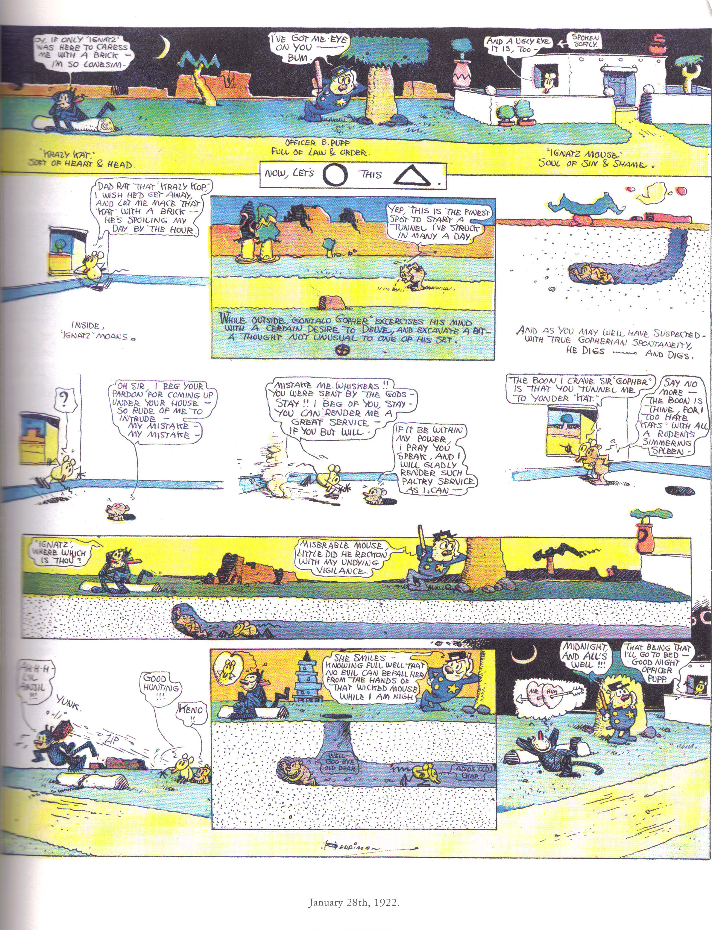
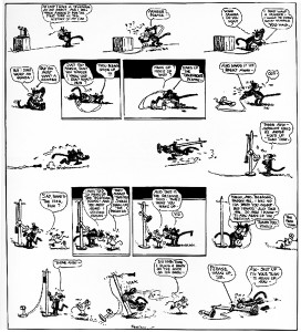
What I do have a little more space and time for is a wee study of space in a single Krazy Kat strip, dated January 28, 1922. This one strip seems to me to be the Krazy Kat world in miniature—a near-perfect example of Herriman’s pictorial and linguistic talents. It is pictured in its entirety at the top of this post, of course, but let’s break the page down a little to examine its notable components:

The top panel takes the space of three panels, offering a rectangular capture of all three of our main characters outside at night, separate but absolutely fixated on each other. Krazy sits on the left, thinking of Ignatz, Offissa Pupp is in the center, body angled toward his beloved, Krazy, but his gaze is directed at Ignatz on our right (“I’ve got me eye on you…..bum”). Ignatz peers out of his adobe window, right back at Offissa Pupp: “And a ugly eye it is, too” (a little floating meta-speech bubble to the side stage directs: spoken softly ). Together they stand, separate but connected.

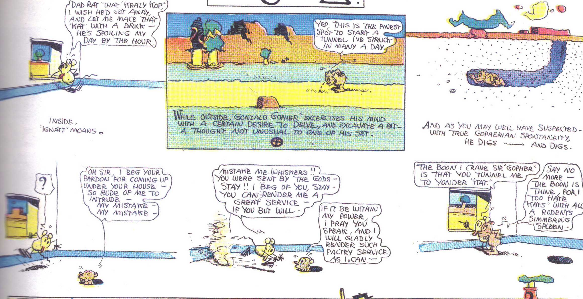
In the center of the page, distinctly forming a unit, the next group of panels (six panels, most borderless with simple white backdrops representing the interior of Ignatz’ house plus one exterior shot with borders) depicts Ignatz’ clever engagement of a local gopher to aid him in bricking Krazy despite the above-ground obstacle of Offissa Pupp who blocks him. Connecting the top panel to this set is a small overlay (see top panel above) that offers this interesting meta-comment:Now, let’s (circle) this (triangle).
I think this is delightful. Not only is space manipulated panel-to-panel, above-ground to below-ground, and as movement of points along a line (Ignatz begins to move from his right-side position to the left), but Herriman also works with borderless panels, carved out groups of panels that form separate scenes, overlay panels, AND the inclusion of meta-references to shape-change that really signal directional shifts in the chasing (who is chasing whom in which direction?).

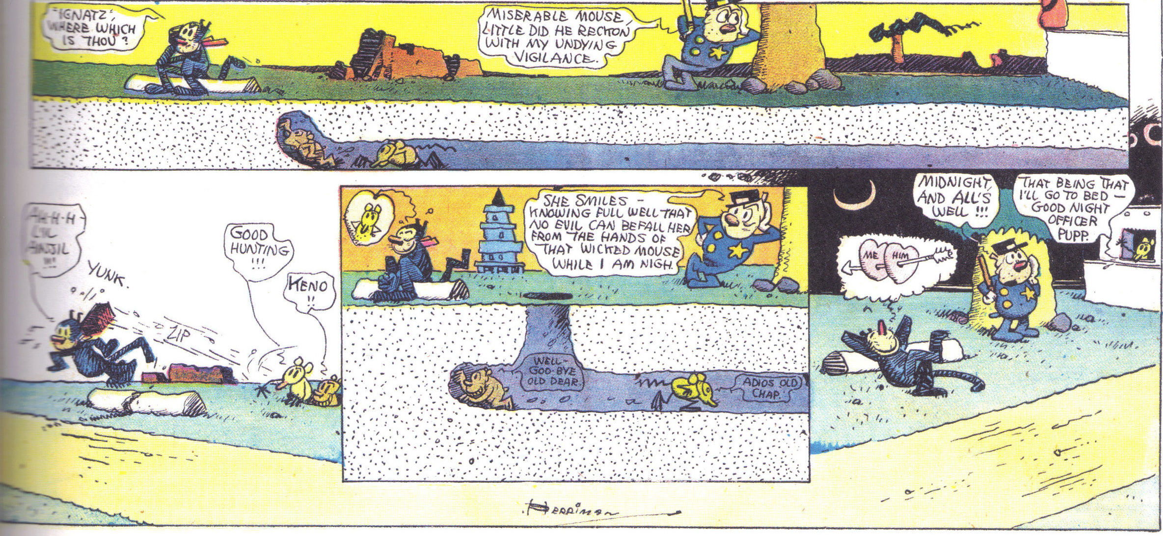
The final set of panels, as you can see, includes a road shaped according to perspective, a tunneling gopher with Ignatz in tow (moving him right to left unseen by Officer Pupp above ground) in a panel that ends just shy of the right margin, and allows the lowest panel –a landscape– to bleed upward.Maybe this is a reach, but it also seems that the tunneling panel (middle, last row) effectively takes Officer Pupp’s “space” if you follow the spatial logic of the top panel (despite the fact that smaller versions of Pupp appear in that panel and the right edge of the landscape panel). Ignatz has triumphed, but as usual, all three characters have had their anxiety relieved via this act (Krazy has had her/his desired bricking, Offissa Pupp believes he is vigilant, and Ignatz is—at least for the moment—sated).
This single compressed scene is extraordinary in that it is the perfect synecdoche for the strip as a whole, and because it showcases Herriman’s ability to stretch three-dimensional space (in both its physical and psychological permutations) across a two-dimensional frame. If this doesn’t exploit the particular affordance of the comics medium, I don’t know what does.
Now, your thoughts on Krazy Kat! Plus, tune in next week for another installment of our Krazy Kat roundtable.
 In an essay on Herriman’s Krazy Kat titled “The Gift”, Douglas Wolk notes that:
 Anyone who has ever read a how-to book on comics – from How to Draw Comics the Marvel Way (Lee and Buscema) to Drawing Words and Writing Pictures (Abel and Madden) – knows that one of the first rules of action is that temporally extended events should be portrayed as moving from left to right. As a result, the different parts of the action – the release of a brick, its trajectory through the air, its impact on a cat’s head – will be read in the temporal order in which they occur (McCloud’s discussion of the passing of time within a panel in Understanding Comics is also of relevance here). So why does Herriman, more often than not, break this rule with Ignatz’s brick?
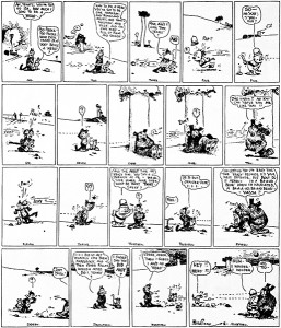 While simple, this explanation seems unlikely. After all, Herriman was certainly a sophisticated enough practitioner of the comics art to realize that the right to left orientation of the flight of the brick would interfere with ‘natural’ reading. So why did he do it?
