Perhaps the best thing about R. Crumb’s Book of Genesis – the best thing, that is, about an adaptation that cleaves so closely to the original text – is that it repeatedly sends one back to the Bible itself. With that in mind, read the following passage, and tell me what you see:
And the waters surged most mightily over the earth, and all the high mountains under heaven were covered. . . . And all the flesh that stirs on the earth perished, the fowl and the cattle and the beasts and all swarming things that swarm upon the earth, and all humankind. All that had the quickening breath of life in its nostrils, of all that was on dry land, died. And He wiped out all existing things from the face of the earth, from humans to cattle to crawling things to the fowl of the heavens, they were wiped out from the earth. And Noah alone remained, and those with him in the ark. (Alter’s translation, 7:19-23)
What we have here is an act not just of destruction, but of un-creation. Step by step, the narration both mirrors and undoes the creative processes of Genesis 1. A separation of waters; a gathering of dry land; plants and swarms of living things; creatures that crawl and fly; cattle and wild beasts; human beings – all that was added, piece by piece, at the opening of Genesis is here subtracted, until nothing remain but chaos, the face of the deep, and one breath of life – Noah and company – hovering over the surface of the water.
The passage also enacts what it describes. The Bible’s paratactic structures and sentences seem to mimic the rising water line, the subtractive deluge. Fowl – gone. Cattle – gone. Beasts and swarming things and, lastly, human beings – gone. It sums up the destruction, in language that recalls the creation of Adam himself: “All that had the quickening breath of life in its nostrils.” And then, just for good measure, the text repeats the process, this time in reverse, from Adam and earth on up to the heavens. It is not just a moving passage; it is a passage in motion – one that guides our eyes and imaginations, both into the slowly accumulating image and outward toward other passages of the Biblical story.
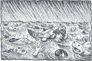
Now here are the central verses, as illustrated by Crumb:

The problem here is not the drawing per se, although it does seem to me more a parody of a mass drowning than an image of real panic. The real problem resides in all that Crumb’s picture strips from the original – all that it fails to embody.
The encroaching waters. The feeling of sequence. The shifts in scale. The “visual” and textual connections to Genesis’ opening chapter. All these are missing in Crumb’s illustration. This is a failure not simply of imagination or vision. In its loss of sequence and motion and connection, it is a failure of comics. It is a failure that did not have to happen.

In previous critiques of Genesis at this site, Crumb was taken to task for a lack of theological and imaginative engagement. Others stepped forward to celebrate the work for its exegetical and psychological complexity, denying that it ever was, to quote the artist, a “literal” rendering of the Bible or a project of “straight illustration.” For me, however, the problem with Genesis is not that Crumb is too literal. The problem is that he is very often not literal enough – failing to see and capture (and thus failing to help his reader to see) all that the text is showing.
To my mind, a successful “literal” adaptation would require more than simply an accurate and inclusive representation of Genesis’ actors and actions. It would demand more than just having (as Crumb puts it) “nothing left out.” To be truly faithful to the letter of the narrative – to be fully and deeply literal – such an adaptation would pursue three objectives.
First, it would be unremitting in its attention to textual detail, reminding us of what even the best-known text actually says and shows. Second, it would be equally committed to “literally” rendering all that the text does not show, reminding us of what Genesis refuses or fails to depict. Third, it would make the reader aware of how the scripture’s isolated events, actions, and verses acquire their form and content in relation to one another and to a larger narrative whole.
This is, ultimately, a threefold commitment to seeing – to seeing what is there, what is not there, and what connects those pieces. When Crumb’s Genesis succeeds, it succeeds on these terms. And when it fails – as it frequently does – that failure stems, in my opinion, from a too-constricted vision of what a literal adaptation might be.
Let’s begin with what works. As many critics have noted, Crumb’s project gives a body – along with face, hair, and clothes – to the words of Genesis. It refuses the world of symbol and metaphor and abstraction, reclaiming the text in the name of the specific, the concrete, and the quotidian. At its best, it pulls the old text back before us and shouts, Look! Look at what this says!
At such moments, Crumb allows us to see anew some wonderful things. We are compelled to imagine exactly what a 130-year-old Adam and Eve would look like upon the birth of their third child (5:3). We are reminded that Abraham did not (contra Rembrandt) sit welcomingly with his three prophetic visitors but stood submissively behind them, standing under a tree while they sat and ate (18:8). We can see explicitly that Joseph spoke to his benighted brothers not in Hebrew, but in Egyptian – a fact that the Bible does not reveal until later in the chapter (42:23).
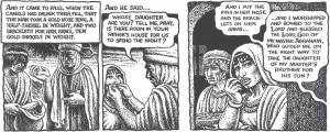
While they may not seem imaginative to some, these are important moments of imagining nonetheless. They cast the world into images. In one particularly powerful scene, Crumb takes what might have been either a forgettable detail or an overwrought symbol and gives it equal status within a material world. Through two gold bracelets and a nose ring, Crumb creates a surprising and touching image, while establishing a memorable connection to a later verse (24:22-3, 47-8):

Crumb makes us see the text (and what it omits or only implies). We see the selection of the items (and the cache that remains). We see their relative weight and size (and the servant as he measures them, considering the import of his gift). And we see the act – both intimate and aggressive – of placing these items onto and into the body of Rebekah, as well as her unconscious reaction when she later recalls the ceremony. These moments of embodiment and repetition demonstrate of what a fully “literal” reading can accomplish.
Nonetheless, as I claimed above, it is on these very terms and in comparison to moments such as these that much of the comic also fails. Indeed, it often falters just when a reader might need a “literal” reading most.
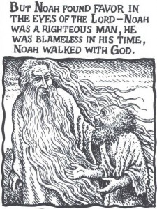
Consider Crumb’s God. As many have noted, Crumb’s deity is almost completely incarnated. This is a God of nostrils, footfalls, and lots of pointing fingers. Each divine action seems to be taken and shown in its most literal form. When Crumb’s Bible says that someone “walked with God” (6:9), they really walked with God – and really walked with God.

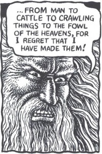
But this project of embodiment only takes Crumb so far. The comic wants us to see what the bible says about God – that he walks, talks, rests, breaths, smells, and (above all) appears. But Crumb only depicts this character (as a character) in a limited number of ways – most of them scowling. Peruse the opening chapters. How many images of God are versions of this expression?

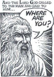
The subtlety of Crumb’s portraiture – seen most clearly in the book’s “begotten” figures – all but disappears when we turn to Genesis’ main persona. The “creating” God (1:1), the “warning” God (2:17), the “calling” God (3:9), the “cursing” God (3:17-9), the “worrying” God (3:22), the “regretting” God (6:6) – they all look like variations on a clichéd visual theme of the stern patriarch.
I am not trying to argue, presumptively, that Crumb should have drawn God differently. Artists can use clichéd or familiar images to great artistic effect. I do believe, though, that Crumb’s professed commitment to drawing what Genesis literally said and showed should have pushed him and his pictures back towards the text.
In other words, if Crumb wanted to humanize God, then why ignore all human expression, emotion, and action that the text itself offers? Look to the panel above. The narrative, taken as translated, is an act of “calling” (3:9). And it is not just a calling out, but a calling “to Adam”: “Where are you?” These words imply many things – an invitation, an expectation, perhaps even confusion. But God’s face here and following does not show surprise or dismay, betrayal or realization. The images all exhibit a barely differentiated scowl.
How far could Crumb have taken his commitment to a literal reading? Well, we could have seen God “making skin coats” for his now cursed creation. We could have seen God not simply handing the garments to Adam and Eve (see Crumb’s version) but physically, perhaps sadly, “cloth[ing] them” (3:21). We could have seen Cain’s God expressing concern for that man’s distress, or Noah’s God feeling “regret” and “grie[f] . . . in his heart” (6:6). Instead:

Now push this embodiment still further. Imagine a humanized God creating the earth, possibly extending the image Crumb develops for Adam’s creation. Moreover, imagine a God who is always talking to himself, who is talking the world into existence, and who is trying, perhaps, to create something worth talking to. But this would require a level of literalness – and literacy – that Crumb’s Genesis is just not willing to entertain. Look, for instance, at Crumb’s God at the end of Day Six. Is that the face of someone who had just bestowed a blessing, finding all that He had made “very good” (1:28-30)?
Sadly, this graphic deficit is not unique to the deity. The problem of caricature and stereotype infects much of the book. For example, a close reader of Genesis might imagine that Jacob would possess the subtlest of expressions, reflective of a man who deceives all those who are closest to him. But beyond one powerful scene (the duping of Laban [30:25-34]), Crumb never accepts the challenge of those chapters – namely, to show a thinking man thinking, a person embodying deceit.
And it is one thing to notice that Noah looks bewildered and afraid when God informs him of His destructive plan. But that insight falls a bit flat when so many of Noah’s expressions evince the same blank-eyed wonder:

One slowly realizes that Crumb is not trying to capture the feelings in Noah’s face so much as to produce variations on a single “Noah face” (just as he gives us variations on his God-face, his wild-brother-face, his good-brother-face, his grizzled-patriarch-face, etc.). Each expression should be an adverb, modifying the often-sparse Biblical phrasing. Instead we get one proper noun after another.
In saying this, I realize that I directly counter the arguments that Matthias Wivel ably presented earlier this week. I can only say that his close reading of the Abraham chapters has helped me to appreciate the subtlety and visual progression of those pages. Indeed, Crumb’s “covenantal blessing” sequence (17:8-17) may be one of the more intriguing and interesting in the book. In the end, though, the volume does not seem able to maintain that subtlety of representation.
My examples, at this point, might seem small relative to the enormity of Crumb’s project. However, such recurrent problems of “showing” are matched by equally significant problems of “not-showing.” Allow me to unpack a few signal examples.
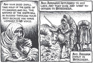
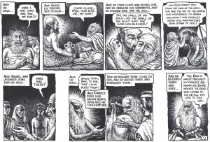
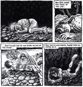
The binding of Isaac. In this chapter, Crumb does give us two images of deep humanity. In the first (visible here), Abraham responds to the booming voice that stays his hand and spares his son. The patriarch looks skyward, worried, stricken, almost childlike, the “cleaver” relaxing in his grip. This is an evocative image for a simple phrase: “And he said, ‘Here I am’”. With it, Crumb also recollects other uses of those words, along with the figures that accompany them. (We see Abraham in a similar posture – complete with gripping hand – at the opening of the chapter [22:2] and when Isaac first questions his father [22:7].) The second potent image comes when Crumb leaves the text entirely, showing Abraham embracing Isaac after the ordeal, the boy resting his head on his father’s chest.
But these moments of emotion are embedded in a scene that seems to keep the story and its possibilities at arm’s length. For most of the chapter, Abraham’s face is all but motionless, registering (to my eyes) no surprise or sadness or resignation. Overall, Crumb’s patriarch looks coolly determined, especially when he is preparing his son for the slaughter. And Isaac seems equally blank, often appearing more drugged than distressed.
To be sure, the sequence could reflect Crumb’s personal understanding of these characters. After all, the text tells us little of Isaac’s reaction to the sacrifice (or to his being exchanged, in the end, for a goat). And perhaps Crumb does find Abraham pathologically cold. But these visual choices make that final image of reconciliation seem more than a little unearned.

However, these panels reveal a bigger problem: they are false to the text. Crumb shows Abraham and Isaac riding back together after the binding. But the Bible doesn’t; it only mentions Abraham’s return. Isaac disappears for two chapters, reappearing as a marriageable man living in a different region (along with an apparently estranged father, who fears that his son might marry a Canaanite and thus fail to maintain God’s covenant).
This is not a reunion story, literally considered. Why then did Crumb make it so? And more importantly, why did he make so little of that choice?
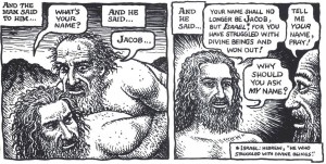
Jacob’s struggle. This scene, too, is already well known: Jacob wrestles with an angel, who eventually blesses and re-names him. But of course, literally, the scripture says no such thing. It tells us that Jacob – who is alone because he keeps sending his people ahead, human shields against Esau’s possible attack – wrestles in the dark with “a man.”
The text focuses on what we don’t know. The man is unnamed; the man is unseen. And in Alter’s translation (but not Crumb’s text), Jacob’s combatant never claims to be divine: “[Y]ou have striven with God and men, and won out” (32:29). Is this figure “God” or just one of those defeated “men”? Is it an angel? Is it Esau? The script remains silently suggestive.
But Crumb’s comic speaks up, (ex)changing the text, making the assailant clearly visible in even the dimmest light, and finally endowing the figure with a placid face and saintly halo. (As the book’s endnotes indicate, Crumb is clearly invested in the divinity of this character, but not for reasons of textual fidelity.) Yes, the comic does present this figure as “a man,” but by veering away from the letter – and, hence, the ambiguity – of the text, Crumb transforms him into far too particular of a man.

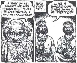
Jacob’s silence. But if the above is a literalist sin of commission, a worse sin of graphic omission occurs two chapters later. Jacob’s daughter, Dinah, has been raped, and her aggrieved brothers take revenge upon the Hivites, using the sacred act of circumcision to gain an odd tactical advantage over their enemies. When Jacob learns of the massacre and pillage, he delivers his first line of the drama. The father worries not about his sons’ potential impiety or his daughter’s violation, but about his own safety in the face of vengeful Canaanites.
Here is how Crumb depicts the chapter’s closing verses (34:30-1):

From one “literalist” point of view, the scene plays accurately, action by action, line by line. What the images fail to depict, though, is the directness of the confrontation and, above all, Jacob’s silence in the face of his sons’ accusation – a silence that echoes his earlier reticence, when Dinah’s rape is first reported (34:5).
What is an artist to do? How does one show silence or inaction? With an extra panel, showing Jacob’s refusal to reply? With an image that contains both father and sons, registering the directness of the charge and the personal nature of the conflict? Might Dinah herself have been included (restoring some of the gender conflict that so interests Crumb)? I am uncertain. Regardless, the most important part of that chapter – its most human, dramatic, and “telling” act – is missing.
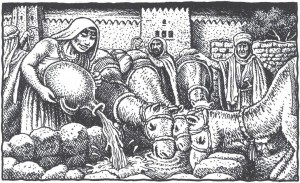
These are, I admit, difficult test cases. To be sure, I could have focused on far “easier” moments when Crumb’s images also fall short from a “literalist” point of view. The testing of Rebekah at the well, for instance, should be filled with activity, with Isaac’s future wife “hurrying” and “running” up and down the hill to bring enough water for ten thirsty camels. This, the text indicates, is a test of both body and spirit! Instead, we get a pastoral set-piece, complete with cuddly critters.

But difficult or not, I submit that any “literalist” graphic illustration of these stories must be up to the task. And an artist of Crumb’s ability – an ability that shines frequently in these pages – demands a strict accounting.
Let me turn, finally and more quickly, to the third characteristic of a strong literal adaptation: the use of imagery to evoke a text’s larger structures and patterns, to connect what is shown here to what is shown elsewhere. Suffice to say that Genesis is threaded with such patterns. As Alter and countless others have noted, the Bible is composed of recurring “story-types” and reiterative rhetorical structures, which build in power and meaning as the reader moves through the scriptures. At the levels of sentence, story, and theme, it is a book of potent repetition: repeated blessings and curses, repeated deceptions and revelations, repeated actions and inactions.
Unfortunately, Crumb’s Genesis does little to visualize these patterns. He often leaves us with a long parade of scenes when he might have used his images to construct a larger visual and narrative network.
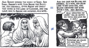
Take the following pair of examples, both scenes of surrogate marriage and childbirth (16:3; 30:4). At the level of text, we encounter phrases and actions that make one scene “rhyme” with another, lending thematic weight to both, teasing out similarities and ultimately highlighting differences. The pictures, though, fail to take creative advantage of these rhyming opportunities – opportunities that might have allowed Crumb to emphasize patterns of progeny, the status of servants, or even the power of Biblical matriarchs:

The point here is not that pictures and words must march in lockstep. The point, rather, is to emphasize the importance of larger patterns in the literal representation of any particular scene.
Indeed, these rhymes and patterns are often central to appreciating the events at all. Recall, for example, how the “stolen blessing” scene of Jacob and Isaac (22:18-30) bookends with Jacob/Israel’s benediction over the sons of Joseph (48:8-20) – one of the final images of blessing in Genesis. The parallel structures could not be more profound. The deceptive son of the former tale is now the blind old father of the latter. In both scenes we find questions of identity, gestures of beckoning and belonging, and concerns about the rights of the firstborn – even as the stories resolve themselves quite differently.
Crumb, however, does little in his staging or composition of the scenes to dramatize those similarities. The passages may be visually adequate in their own right, but they do little to draw the narrative of Jacob to a satisfying and reflective close.

It is not that Crumb is unaware of these connections or the ways in which his pictures can, so to speak, draw upon one another over the course of chapters. In fact, my large-scale concerns about Genesis often make Crumb’s moments of visual connectedness that much more striking for me, as when he creates graphic resonance among separate scenes of despair and abandonment:

This sequence constitutes a strong literal reading on Crumb’s part. But it manifests a strength that, too frequently, does not persist.
To repeat, the ultimate problem of Crumb’s Genesis is not that it is too literal, but that it is not literal enough. I appreciate his aesthetic of embodiment; but he leaves many of these stories and characters incompletely embodied. I have no problem with the task of a “straight illustration job.” But I think that many of Crumb’s illustrations fail to make the stories fully visible.
We get a God of human stature and shape, but not a God that displays a full range of human emotions – at least as related by the text. Crumb gives us a series of types when the job calls for the representation of subtle differences. Crumb gives us a wealth of human details, but just as often fails to embed those details in the larger narrative context, both explicit and implicit. He provides long sequences of scenes, but rarely helps us to see the connections among those scenes – connections that give the scenes their literal shape.
We need help to see the Genesis stories through years of accumulated imagery. We need guidance to see what is on the page, and what isn’t. I suspect that Crumb’s still-powerful Book of Genesis will grow on me with time. But right now . . . well, I just don’t see it.
* * * * *
[Peter Sattler teaches about comics and other literature at Lakeland College in Wisconsin. He recently contributed to Mississippi’s The Comics of Chris Ware. The first comic he bought with his own money was X-Men #112.]
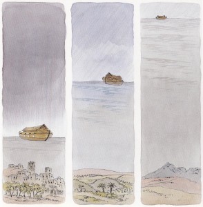
Note: Watercolor image above from Peter Spier, Noah’s Ark (Doubleday, 1977).
________
Update by Noah: The entire roundtable on Crumb’s Genesis is here.

