Voices from the Archive: Crumb, Racism, Satire, and Hyperbole

This is from our R. Crumb and Race Roundtable, in a long back and forth in comments with Jeet Heer and others. I thought it was a good summation of why I don’t think Crumb’s approach to race works, so I thought I’d repost it here.
_______

Jeet, I think I’m going to stop insulting you. It’s fun, but I think there are pretty interesting issues here, and I’d rather focus on those at least for the moment (maybe I’ll get back to the troll-battle if you take another swing at me!)

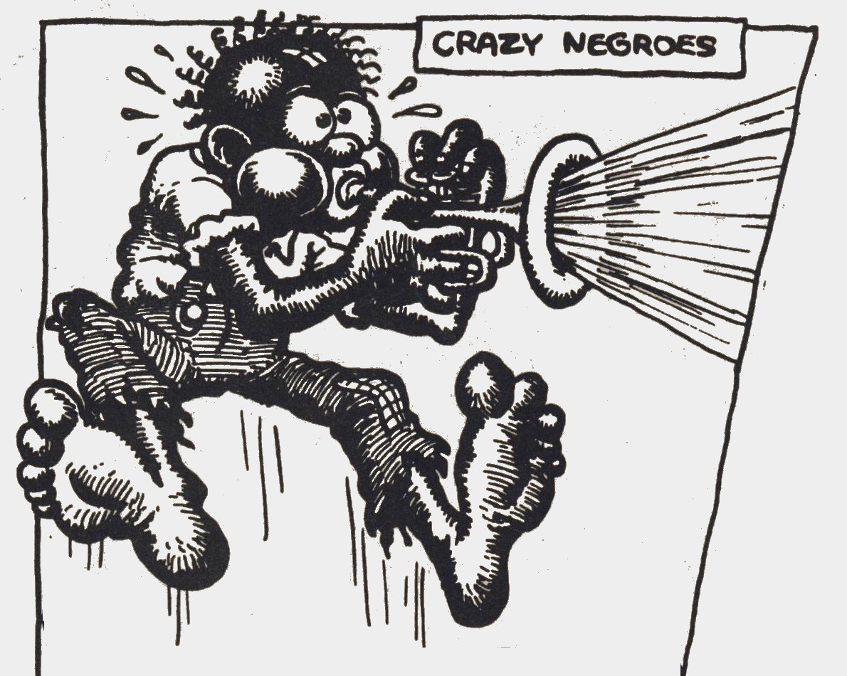
Okay, so first, the Joplin cover. It is possible to see it as a sneer at Joplin. The problem is, it’s equally possible to see it as Domingos says — as a nostalgic use of blackface caricature that is intended not to undermine Joplin, but to humorously confirm her “black” roots. That it’s the second, not the first, is strongly suggested to me by the fact that he uses another blackface caricature elsewhere on the page.

Be that as it may — part of the issue here comes down to this:

“Crumb’s blackface images take a once-pervasive-but-now-taboo style and not only revives it, but intensifies it to the point that it becomes uncomfortable.”

First, it’s worth questioning how taboo blackface caricature was in 60s. Surely it was taboo in some of the circles Crumb moved in. I bet it was not taboo in many communities, however. As Jeet says, overt racism was still widely accepted in many places in the ’60s. I bet there were many people throughout the U.S. who wouldn’t even have blinked at Crumb’s drawing. (And, indeed, I don’t believe that cover caused any particular controversy. It’s widely considered one of the greatest album covers of all time, but I haven’t seen any reports of anger or protests over the imagery at the time — which there should have been if Crumb was actually violating taboos.)

More importantly, it’s worth pointing out that on the Joplin cover, the blackface caricatures are not intensified in any way that I can see. Is Crumb’s drawing more reprehensible than McCay’s Imp? Than Eisner’s Ebony White? It doesn’t seem so to me. In fact, it’s not clear to me that even Angelfood McSpade is more intensely racist than McCay’s mute, animalistic Jungle Imp. I mean, the Imp is really, really, really racist.

And I think that shows up a real problem with Crumb’s method of trying to deal with racist imagery. Racism is not realistic. It’s not something that is grounded at all in any kind of actual fact. As a result, there is no reductio ad absurdum of racist iconography. Racism does not have a point to which you can intensify it and make it ridiculous. Crumb isn’t going to be more intense than the Holocaust. He’s not going to be more intense than generations of slavery. It’s really not clear that he can even be more intense than Winsor McCay’s Imp. Racism and racist imagery— these are not things you can parody just by exaggerating them. They’re extremely exaggerated already, and always eager to be more so. You make it more exaggerated, you just make it more racist. You don’t undercut it.

In that sense, racists who have embraced some of Crumb’s imagery aren’t confused; they’re not stupidly getting it wrong. They’re reacting instead to a failure of his art. Even when his intentions are definitely anti-racist, he hasn’t thought through the issue of racism, or the use of racist iconography, sufficiently for him to communicate those intentions effectively. He isn’t smart about the way racism, or racist imagery works. As a result, he often duplicates the thing that he is (arguably) attempting to critique.

I think it is instructive to look at writers like Faulkner or Crane, or someone like Spike Lee or Aaron McGruder, all of whom confront racism not by intensifying it, but rather by really carefully thinking through how racist tropes work, and demonstrating not only how they diverge from reality, but also how they *affect* and distort reality. There’s a lot of work and thought and genius in dealing effectively with those issues, and I’m not saying I love all those artists all the time, or even that they’re all always anti-racist (Faulkner was avowedly racist at times). But they all seem just a ton more thoughtful, and a ton more committed to understanding how race works, than Crumb does. To me, Crumb (on the most charitable reading) really seems to just hope that throwing unpleasant racial iconography at the wall will somehow be a critique of that iconography.

So, to your historical argument — I don’t think there’s ever been a point in American history where reproducing racist iconography was either especially brave or especially likely to contribute to anti-racism. Crumb’s satire (when it is satire) is neither subtle nor thoughtful…and as a result, his motives and intentions really do come into question. If he’s not willing to think through these issues, why the attraction to the racist iconography in the first place? Does he really want to talk about racism? Or does he just want to reproduce the iconography because he likes it? The way he obsesses over the authenticity of black people in his blues biographies, for example, just makes those questions more pointed. He’s clearly got a fascination with the black culture of the early 20th century — but that can sometimes bleed into a fetishization and even a nostalgia for the oppression of black people.

So…yes, intentions matter. But avowed intentions aren’t the only intentions, and execution matters a lot too. It just seems to me that Crumb’s relationship to racism is a lot more complicated than you’re acknowledging.
 

crumb-header3

So Little Time, So Many TCJ Covers!

Since 1978 I haven’t missed a single isue of The Comics Journal. I won’t go into the many reasons for my devotion, but I’m sure many fellow readers will agree that one of its little pleasures were the numerous lovely, often witty covers it commissioned from some of the best cartoonists and illustrators worldwide.

Below is a small gallery of some of my favorites…


tcj_122

 
This merry drawing by Brian Bolland for #122 graces what is is easily my favorite TCJ cover. Impeccable execution and fine humor, contrasting boozy reveller John Bull with tight-assed Uncle Sam. The British do often like to mock American puritanism; however the illo also comments on the welcome shake-up of U.S. comics brought about by the artists and writers of the early ’80s “British Invasion”. Try to find a copy; the interviews are some of the most entertaining you’ll likely read. The Kevin O’Neill conversation made me laugh out loud.
 

895069

 
One of those Brit invaders was Bolland’s long-time compadre David Gibbons, who truly rocked the comics scene when he and scripter Alan Moore produced the seminal series Watchmen. One of that comic’s recurring motifs was a circular “smiley” face bisected by a blood splatter. The above cover by Gibbons for issue 116, depicting his drawing desk, evokes that image subliminally.
 

2832594-279

 
Two more from across the Atlantic: #279’s crisp composition by Dutch artist Joost Swarte
 

616745

 
…and the incomparable French draftsman Moebius in #118.
 

2352922-bookcover_cj1211

 
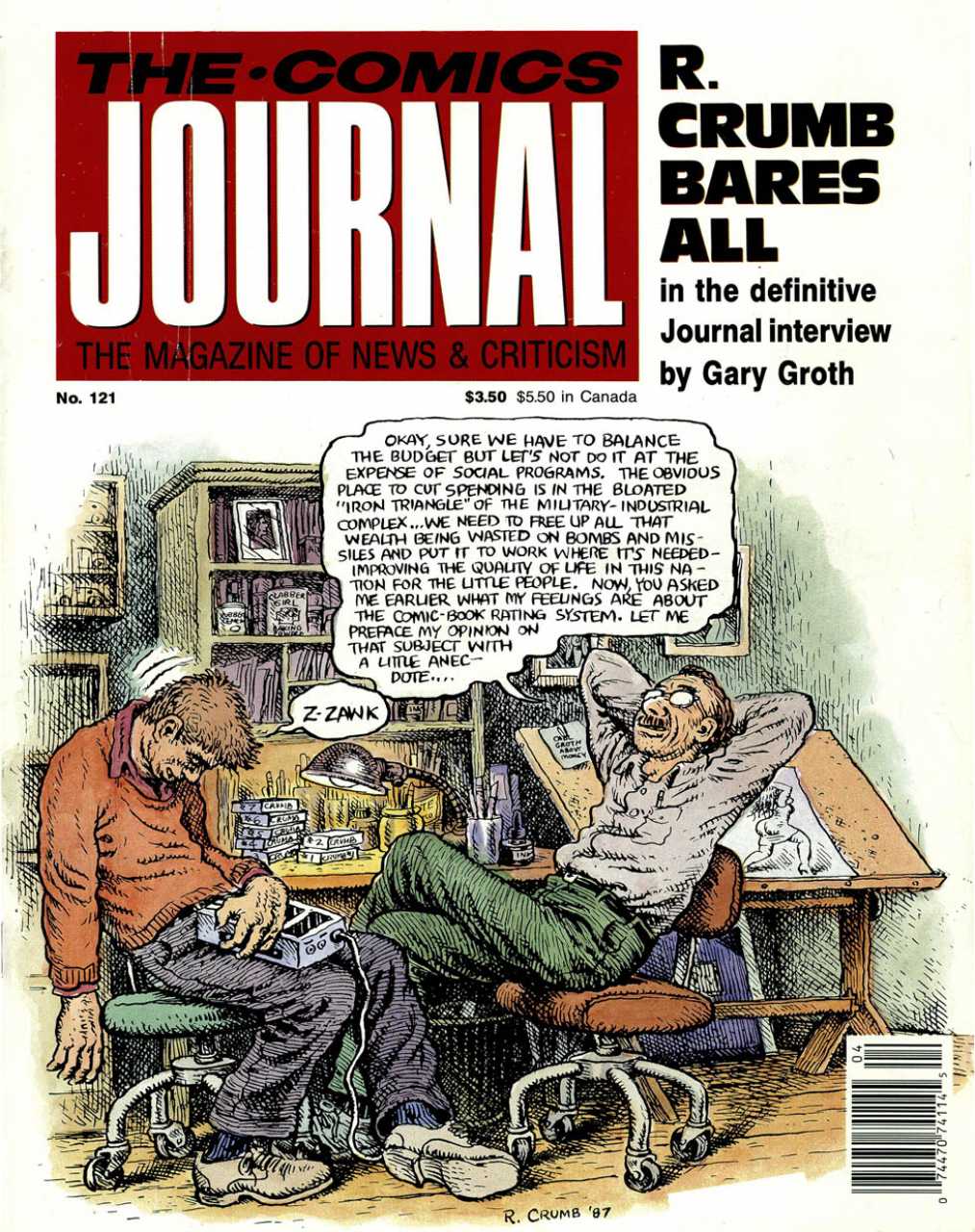
Another very funny cartoon for issue #121 by Robert Crumb. The artist mocks his own pomposity. The chap struggling to stay awake on the left is Journal publisher/editor Gary Groth, who’s made the cover several times — often to be teased… The cover showing the interview process is a recurring theme, one that I enjoy. Three more examples below:
 

2832477-135

 
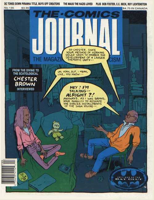
Chester Brown, who drew #135, was indeed a somewhat reticent interviewee faced with a garrulous questioner, as shown.
 

2832503-164a

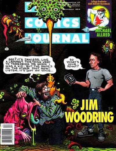
Gary Groth again, drawn by Jim Woodring –another self-satirising artist…


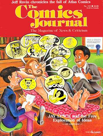
2352802-bookcover_cj114

 
And yet another, the underground comics artist Jay Lynch!
 

1093173

 
We segue to another underground classic cartoonist, the late Spain Rodriguez, whose gritty urban scene with touches of fantasy encapsulates the diversity of his art.
 

1093143

 
Spain was one of the artists who illustrated the naturalistic scripts of Harvey Pekar, as was Crumb, who illoed this slice-of-life for #97. (That’s Pekar in the blue coat, with Crumb next to him.)
 

631627

 
And another Pekar collaborator was the master of grotesque realism Drew Friedman.
 

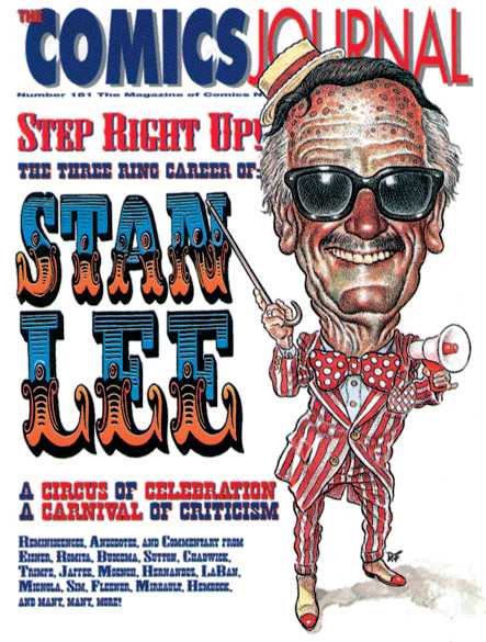
2831702-181

 
Friedman also contributed this caricature of writer-cum-huckster Stan Lee for #181. Now, sometimes the art direction for the covers is frankly not up to the actual illustration; but this time the AD worked in impeccable harmony with the artist. Below are two more exemplary cases of this.
 

954899

 
A terrific character design by Mike Ploog for #274 elegantly set off…
 

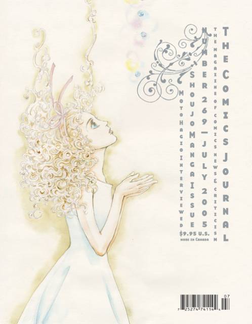
2832003-269

 
…and a lovely drawing by Moto Hagio for #269; apologies for the light scan, but the cover is truly a delicate confection.

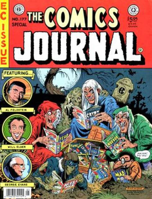
The EC comics from the ’50s were an inspiration to generations of artists.
 

2832505-177

 
Notable among them was Bill Stout, who pastiched their cover format twice for the Journal; above, for issue 177…
 

1093133

 
…and here, for #81. Those three Journal contributors at left? The Critic Keeper is, I presume, Gary Groth; the Old Bitch is probably Marilyn Bethke, one of the most virulent early writers for the mag; but who is the Fault Keeper? Enquiring minds want to know!
 

719287

 
Topping off this EC-themed trio: a Mad magazine pastiche by frequent Mad cover artist Kelley Freas for #225. Two of Freas’ iconic characters meet here: Mad mascot Alfred E. Neumann in the red spacesuit; and the Martian from Freas’celebrated cover to Fredric Brown’s comic SF novel, Martians Go Home. Freas is considered by some the greatest science-fiction illustrator of all.
 

895223

 
I’m frustrated by this one. Don Simpson drew an awesome wrap-around cover for issue 115, featuring literally dozens of comics characters from around the world. Alas, I could only find a scan for half the cover.
 

2352552-bookcover_cj0981

 
Kevin Nowlan drew this Alternative Comics Cadaver Derby for #98. Apart from Fantagraphics and Last Gasp, all the publishers whose characters are here racing off a cliff are in fact extinct: Eclipse, First, Renegade, Kitchen Sink, and Aardvark-Vanaheim…BTW, Howard Chaykin, the creator of American Flagg, stated that Nowlan’s depiction of that character (2nd from the right) was the best he’d ever seen, including his own.
 

1124755

 
I am very fond of multi-panel comics as covers, and above is a magnificent example by the mighty Frank Thorne for #280. Here the aged cartoonist, famed for his porn and cheesecake, laughs in the face of his own mortality: a joyful victory of Eros over Thanatos.
 

895281

 
Another good comics-as-cover by Dan Clowes.
 

895261

 
I simply enjoy the peacefulness of this drawing by Paul Chadwick for #221. The cross-section of snow with burrowing field mouse is a touch typical of the nature-loving artist. Its soothing blues contrast with…
 

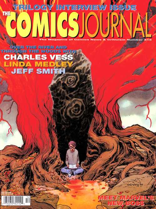
2831728-218

 
…the fiery eldritch reds of this Charles Vess illustration for #210. It’s hard to compose a symetrical picture that isn’t boring; he pulls it off here.
 

1093141

 
Another tranquil illustration by Stephen Bissette and John Totleben. Swamp Thing meditates on a newt for #93.
 

2350516-bookcover_cj052

 
Something of a fanboy guilty pleasure, this. Three stretching superheroes — Jack Cole‘s Plastic Man, Jack Kirby‘s Mr Fantastic, and Carmine Infantino‘s Elongated Man get tied up in knots… The artist is Dennis Fujitake, a prolific contributor to the early Journals and the artist on Journal publisher Fantagraphics” first color comic, Dalgoda, written by Jan Strnad.

So much for attractive covers. What’s the Journal’s ugliest cover? The late Kim Thompson nominated this:
 

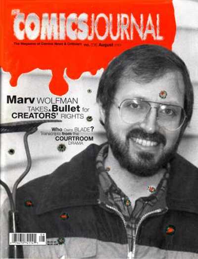
2832577-236

 
I can’t honestly disagree, can you?


697657

 
Let’s finish with a cover from The Comics Journal’s sister publication, Amazing Heroes, by the ever-inventive Bill Sienkiewicz. “Faster than a speedding bullet”, indeed.

Any of your own favorites missing? Browse for them either at mycomicshop or at the Comic Vine.

The Anxiety of Coming Correct

In the beginning, R. Crumb created comics. I didn’t know this was the Word until I went to the Comics: Philosophy & Practice conference in 2012. I just sort of assumed that Art Spiegelman had created comics. Now I know that’s just in academia.

That conference was enormously interesting, but two things particularly stood out to me. The first was that Spiegelman, who was billed as the keynote speaker, transformed his speech into a dialogue with a prominent professor of media. “This was going to be a talk by me but I was too daunted by the audience of fifteen or sixteen peers who were billed as being here with me,” he said. “I couldn’t make myself deliver something that’s called a keynote address.” This was clearly a last-minute change; it wasn’t noted in the program.

Perhaps Spiegelman was just being modest, but on another level, he was absolutely correct: he was not the leader in that room. Over the course of that weekend, it wasn’t Spiegelman’s name that I heard praised again and again and again; it was Crumb’s. It was almost as though people took turns speaking to his influence. As thoughtful artists like Joe Sacco and Alison Bechdel paid him eloquent tribute, Crumb shouted stray observations from the audience like someone’s drunken uncle. I idly wondered if he was dying.
 

tumblr_m4ke9xqUtu1r1gqaco1_500

 
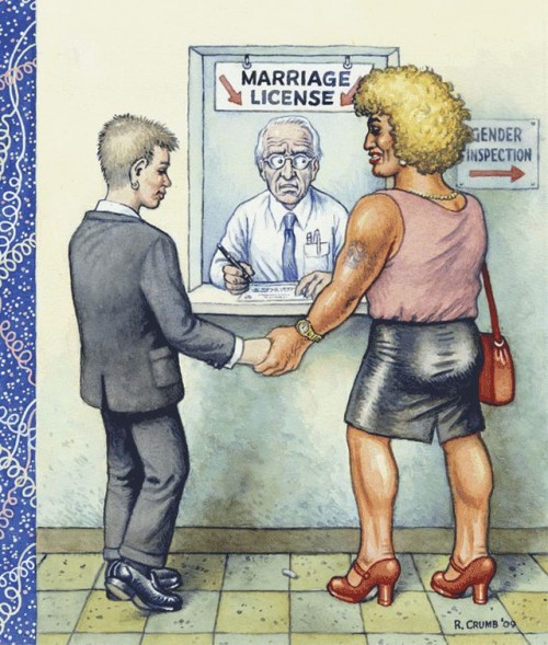
The second interesting thing was a disagreement that Crumb had with Françoise Mouly about his blown cover for The New Yorker. Mouly explained why the magazine rejected the art: it felt out of touch. But this is not the critique that Crumb heard; he preferred to cast himself as a provocateur. “I just realized that you have this loyal readership there that is pretty fucking square,” he said. “When you work for The New Yorker…you have to kind of bend whatever lurid qualities your work might have to fit that sort of lite, L-I-T-E [mentality].”

Characteristically, he was a real jerk about it. But what was most fascinating to me in looking at the cover (which Mouly had projected onto a huge screen) was that it was totally dumb. It had the unique distinction of being heavy-handed without actually making much sense—exactly the kind of “political” work you might expect from an artist who built an empire on drawing his dick.

It’s one thing to feel agnostic towards other people’s god; it’s quite another to find him ridiculous. Crumb’s affectations, his attitude towards women, his dim take on race—I don’t intend to spend a single second of this wild and precious life trying to figure out what other people see in that. Does that mean I’ll never understand comics? The answer is, simply, I don’t care, but I worry that’s arrogant. And on another level still, I feel resentful of that worry.

I find that writing, like life, is a delicate balance of feeling worried and giving zero fucks.

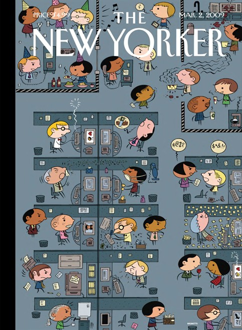
I like paradox. It’s the engine that powers everything interesting. When I started reading comics in a critical capacity, I was startled by the early work of Ivan Brunetti, whose illustrations I had seen in The New Yorker and Real Simple for many years. I hated Misery Loves Comedy. It was nothing like his work I knew and loved. But knowing the same man drew all of those things made me feel very hopeful about the world, where all too often people are afraid to embrace multiplicity. Now I scan every issue of Real Simple hopefully for allusions to murder-suicide. This brings me great joy.
 

brunetti

 
There is a certain type of discourse—or is it a pedigree?—that is highly valued in comics crit. Names of the founding fathers (and let’s face it: it’s always the fathers) are whispered with reverence as a sort of password into that clubhouse. There is also a tendency to value historical perspective over any discussion of the present. Creating a false opposition between then and now (or high and low or this and that) is often done in the name of historical preservation, but it’s always a matter of propagating an opinion. There is no such thing as objective criticism; it is always an extension of the self and what you care about. There is an important distinction between saying these are the things that matter and saying these are the things that matter to me.

Still, some take a cold approach. They equate getting good with growing calloused. They forget that sensitivity is a tool, not a flaw. Men who learn to use that tool are generally praised. Sensitive women are crazy or inexperienced. We’re confused. We OVERREACT. Or so we’re told.

When I wrote the Piece that Shall Remain Nameless, I knew I’d be told all of those things. I felt a lot of doubt. I knew it would take fire that was far more intentional than the smoke the piece itself described. I thought that speaking up was the right thing to do. Now I’m not sure. I never am.

(I give zero fucks. I give zero fucks.)

I closely read a very small amount of material, not because it was in itself momentous, or to catch anyone in a word trap, but to explain how I felt about it, and also how I felt about something larger. The feelings were instantaneous when I read the material; the close reading came later. In response, people closely read my writing back to me. They called it fair, but I would argue it was not in the same spirit as the one in which I approached the project. So it goes.

There’s no one path to understanding. We go about it in different ways, if we go about it at all. In examining an issue from different points of view, it’s necessary to be critical of another vantage. But it’s equally necessary to interrogate your own.
R. Crumb created comics, and it seems to me that comics crit was then made in his image. I see his bad attitude and rude behavior all over this town. I see his petulance and his defensive posturing. I see his unwillingness to absorb a critique. And I also see his growing irrelevance—perhaps most keenly every time another fanboy tries to foist his opinion on the world under the noble guise of History.

Real criticism thrives in doubt, not in certainty. In conversations about comics, there is no right and wrong. There is only coming correct. Under the rock of my lousy long essay, it seems to me that a few people tried. Many others came to conquer. The anxiety of it, as ever, is women’s work.

When is a Grid Not Just a Grid? (Groensteen and Page Layout Roundtable)

pekar

The previous contributions to our roundtable have raised important questions about Thierry Groensteen’s approach to page layout in Comics and Narration. While a rich array of images in Adrielle Mitchell’s post encouraged us to consider how frame irregularities produce meaning, Roy Cook set the stage for an important conversation about the values comics readers attribute to different panel arrangements. Roy’s post really got me thinking about the way Groensteen privileges the layout pattern of the “waffle-iron” by identifying stability, simplicity, and transparency as fundamental attributes of the orthogonal shapes. Groensteen further conceptualizes the grid in the narrative rhythm of comics as the “basic beat” against which the visual and verbal elements of comics can improvise.

From this perspective, it’s not difficult to see how one might characterize the grid as “regular” or “neutral” or “invisible,” but I remain troubled by the relative nature of these terms, who defines them and in what context. To complicate the issue, my first instinct was to seek out comics that delight in the wildly experimental layouts that Groensteen might find “more sophisticated (or more hysterical),” but Adrielle’s post provides several excellent examples already. So I thought I would ask instead about comics that use the grid, but in unexpected ways: how do comics adapt the basic panel layout in order to stray from what Roy described as Groensteen’s “waffle-iron way of truth”? When is a grid not just a grid?

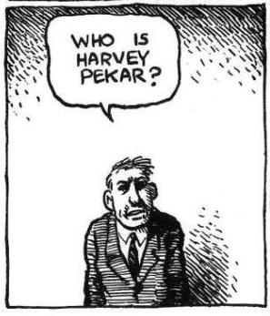
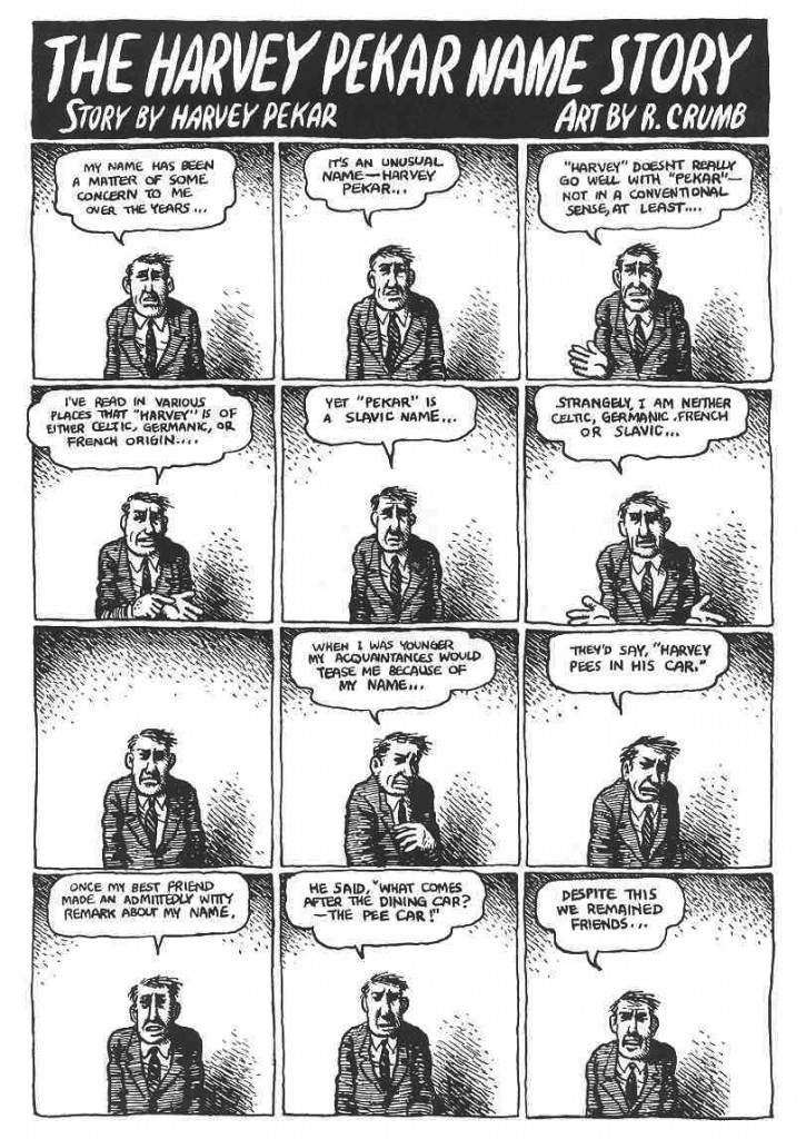
I wonder, for example, how a comic like “The Harvey Pekar Name Story” fits into our understanding of frame regularity and rhythm. Though we may be inclined to make assumptions about its uniformity at first glance, R. Crumb has not simply drawn 48 identical copies of the same man in the squares of this four-page comic about the different Harvey Pekars listed in the phonebook.


PekarNameStory

The text varies and so too do the hand-drawn panels that reveal each frame’s scratchy imperfections. The careful reader’s eye becomes attune to the nuances of Harvey’s expression and posture. It is a “basic layout pattern” and yet it has “irregularity as a common feature” (43) — a fitting contradiction for a story about Harvey Pekar’s search for his own unique identity. It seems to me that a comic like this one actually exposes the illusion of neutrality by calling attention to the grid’s own constructedness.

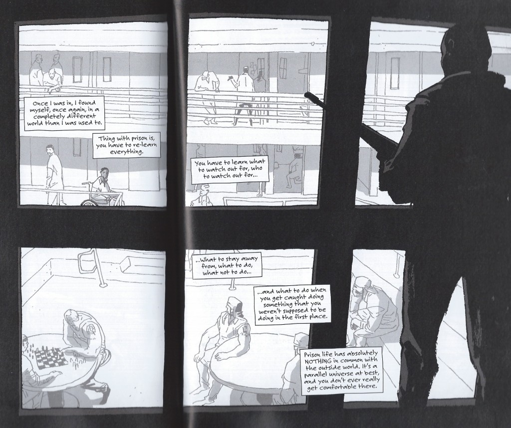
Another example that comes to mind for me is a two-page spread from Percy Carey’s graphic novel memoir Sentences: The Life of M.F. Grimm with art by Ron Wimberly. During Carey’s time in prison on a drug conviction, Wimberly uses the bars of the jail cell to structure the layout of the page, building barriers between us and the detained bodies, the narrative boxes, and the armed guards

sentences

Groensteen describes the thick borders that Chris Ware uses in Jimmy Corrigan as having “an almost carceral appearance” (48) and given the emotional constrictions of multiple generations of the Corrigan family, Ware’s panel choices aid in the production of that meaning. Alternatively, Sentences is a comic that has an unpredictably fluid design with layered panels and splash pages to convey the early days of hip-hop and Carey’s experience with music, drugs, and violence during the 1990s. The waffle-iron pattern is not the norm by any means; when the grid above appears, it actually disrupts a narrative rhythm that the writer and artist have already established. The uniformity of the panels might also be said to reflect the carceral lens that would continue to follow Carey after being released from prison.

Is this frame neutral or invisible? How might the perspectives of these two comics help us to reconsider the notion of the “basic panel layout” in other comics?

The Good and Evil Guide to Parenting

To Train Up A Child

In 2006, four-year-old Sean Paddock suffocated in a blanket his mother tied too tightly to stop him from getting out of bed. She’s now serving a life sentence for felony child abuse and first-degree murder. She was a follower of Michael Pearl’s parenting manual To Train Up a Child, which warns never to put a child “down and then allow him to get up…. To get up is to be on the firing line and get switched back down.”

In 2010, seven-year-old Lydia Schatz died after being beaten with a plumbing tube. Her father is serving a minimum of 22 years for second degree murder and torture, her mother 13 for voluntary manslaughter and unlawful corporal punishment. They were following Michael Pearl’s advice: “a plumber’s supply line is a good spanking tool. You can get it at Wal-Mart or any hardware store. Ask for a plastic, ¼ inch, supply line. They come in different lengths and several colors; so you can have a designer rod to your own taste.”

In 2011, 13-year-old Hana Grace-Rose Williams died of malnutrition and hypothermia in her backyard. Her father received 28 years in prison, her mother 37. What do you call these people? Michael Pearl, a fundamentalist pastor and founder of the non-profit organization No Greater Joy, says they are good, Christian parents. “Prove that you are bigger, tougher,” teaches Pearl. “Defeat him totally.”

Frank Miller calls these people “Batman.”

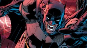
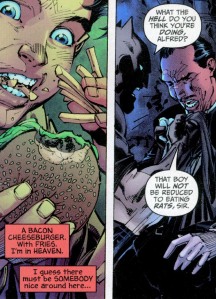
Miller and artist Jim Lee stirred up DC in 2005 with their All Star Batman and Robin and its portrayal of a Pearl-style Bruce Wayne abusing his own adopted child. According to a Sheriff’s report, the Williams deprived their adoptive daughter “of food for days at a time and had made her sleep in a cold barn.” Batman keeps Robin in an empty cave and tells him to catch rats if he’s hungry. If he cries, he gets slapped. When Alfred interferes by supplying the twelve-year-old with a blanket and an order of fast food, Batman threatens his butler physically.

all-star-batman-4-2

Pearl would approve. “It has come to my attention,” writes the evangelist, “that a vocal few are decrying our sensible application of the Biblical rod in training up our children. I laugh at my caustic critics, for our properly spanked and trained children grow to maturity in great peace and love.”And sure enough, Batman’s tough love program quickly transforms Dick Grayson from a whimpering orphan to a power-punching Batman Jr.

Miller is an evangelist too. His God is the Manichean kind of absolute good vs. evil, the one little Bruce Wayne prayed to when he swore “by the spirits of my dead parents to avenge their deaths by spending the rest of my life warring on all criminals.” Miller expanded that dark vision to new depths in the early 90’s with Sin City—while Pearl was self-publishing his parenting manual. The D.A. who prosecuted the Shatz case called To Train Up A Child “truly an evil book.”

In 2009, while the Schatzes were still beating their children with plastic tubing, Pearl was applying his comic book vision of good and evil to an actual comic book titled Good and Evil. He advertises his Bible adaptation as “The Ultimate Superhero Graphic Novel!” and explains that he didn’t want “typical religious art” but “the traditional comic look that is so familiar all over the world.” It’s drawn by Danny Bulanadi, a former Marvel and DC artist whose 1979 Man-Thing is in my attic box of childhood comics. His 80s and 90s credits include Conan, Captain America, Blue Beetle, Hulk, Indiana Jones, Fantastic Four, and The Micronauts. After becoming a born again Christian, Bulanadi, according to the introduction, “was not comfortable with the work he was doing and so quit.” I’m not sure what exactly he was uncomfortable with, since Good and Evil encapsulates the same comic book values as most other superhero stories.

Good and Evil cover

Pearl says it’s “impossible to cover the entire Bible,” so he selects “just that Old Testament background that is pertinent”—which apparently means adding a few supervillain scenes. “The Bible,” according to Pearl, “tells us God created numerous kinds of angelic beings to offer praise around his throne, but one called Lucifer led a third of them in rebellion.” Tales of rebellious angels don’t appear till the Book of Isaiah, yet Pearl needs us to know about them on page one. “But,” he adds, “this is not their story.”

Except it kinda is. We haven’t gotten through the first week of creation before Bulanadi’s sketching evil eyes peering from the blackness of his panels. “On the sixth day,” Pearl declares, “with the evil ones watching, God formed a new creature from the dust of the ground.” They’re there again a page later as God is forming Eve: “Satan, the Evil One, watched.” Two more panels and Bulanadi is drawing a bipedal lizard monster that would look at home in Tales to Astonish: “Satan hated God and wanted to destroy what God was doing, but he needed a way to communicate with Eve, so he entered the body of a beautiful creature and spoke through its mouth.” Pearl and Bulandi disagree about the adjective “beautiful,” but, more importantly, Pearl disagrees with God. According to Genesis 3:1, “the serpent was more crafty than any other beast of the field that the Lord God had made”—Lucifer isn’t a “beast of the field,” and there’s nothing in the Bible suggesting he “entered” it. But Pearl loves to play up God’s arch-nemesis. “Here is promise of a future battle,” he tells us, as Bulanadi’s lizard monster morphs into a snake.  Pearl, like most comic book writers, just wants more fight scenes.
 

Crumb's Genesis

 
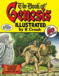
If you’re looking for a faithful adaptation, I suggest Robert Crumb’s The Book of Genesis Illustrated. If you’re also familiar with Crumb’s Bible of Filth (it includes the outrageously incestuous “A Family that LAYS Together STAYS Together”), you’ll assume he’s out to lampoon Christianity again. The prominent cover warning, “Adult Supervision Recommended for Minors,” doesn’t help. But you’d be wrong. Crumb’s drawings are respectful. Yes, he, unlike Bulanadi, forgoes conveniently angled vegetation, so there are plenty of full-frontals of Adam and Eve in the Garden, but no sex, just a little cuddling, all of it in God’s benevolent presence.

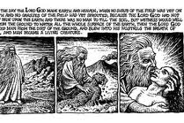
God’s long beard and robe are a cliché, but they bring out the odd thing about Bulanadi’s God. He’s invisible. The tails of his squiggly talk bubbles point at nothing. When he “formed a new creature from the dust of the ground,” Bulanadi draws the dust forming itself.  When “God breathed his own life into the body of clay,” Bulanadi’s  glowing cyclone of holy oxygen swirls from off-panel. But Crumb places God front and center, getting his hands dirty and embracing Adam as he exhales into his nostrils.
 

Crumb's God and Adam

 
Crumb also includes all of God’s words. “Every other comic book version of the Bible I’ve seen,” he writes, “contains passages of completely made-up narratives and dialogue, in an attempt to streamline and ‘modernize’ the old scriptures, and still, these various comic book Bibles all claim to adhere to the belief that the Bible is ‘the Word of God,” or “Inspired by God,” whereas I, ironically, do NOT….” Sure enough, go to the No Great Joy website and you’ll learn that “the sixty-six books of the King James Version, nothing added or deleted, constitute the whole of Scripture ‘given by inspiration of God’ to English speaking people.” Crumb uses the King James too, but unlike Pearl, he includes “every word of the original text.”

Pearl’s selectiveness privileges some ideas over others. His Genesis keeps repeating “obey” and “rebellion,” the same words he emphasizes to such destructive ends in To Train Up A Child. His comic book God demands absolute obedience, and so the obedient Pearl demands absolute obedience from children. Part of a child’s training, explains Pearl, “is to come submissively. However, if you are just beginning to institute training on an already rebellious child . . . then use whatever force is necessary to bring him to bay.” And this is justified because Adam’s “willful and direct disobedience to God resulted in legal estrangement from God and precipitated the curse of death on Adam and all his descendants.”

But don’t worry—a diet of beatings and cave vermin can fix that. Alfred may disagree, refusing to be Batman’s “slave,” but Robin gets with the righteous program. When you live in a comic book world of Good and Evil, choices are easy. Robin’s adoptive father, like Pearl, is a divinely pledged instrument of absolutism. And, hey, who doesn’t want to be Batman?

image_1

The “Last” Outsider Cartoonist and the Ku Klux Klan

I ask Aline…

“Well, he is a sexist, racist, antisemitic misogynist,” she says.

Does he agree? “Oh, I guess all that stuff is in me, sure. I wouldn’t say I’m an out and out racist or proud or amused by the idea of racism but we all grew up in this culture…[…]…Those things are complex, y’know. They were as much about what was going on inside white people as their attitude to black people. I liked the idea when I was doing that stuff of making things that looked as if they were one thing but were actually something else.”

*          *          *

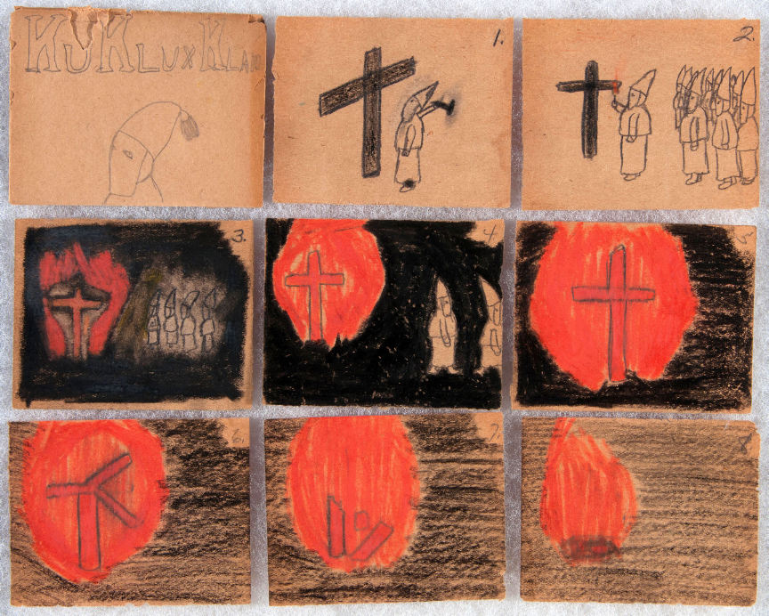
The first comic (c. 1920) by the “last” outsider cartoonist is morally ambiguous.

KKK 01

The artist’s name is Russel Deiner and the comic is presented in an envelope “made of the same folded and glued paper” as the drawings. Each envelope is crowned with a portrait of a Klansman and the title “Ku Klux Klan.” Their similarity with the comics of fandom do not end there. Each is stamped with a mark of ownership and authorship, as would be done by any self-satisfied artist.

The comic itself is almost subdued in its technical transcription if not facility.

The members of the Ku Klux Klan congregate to build a cross and burn it in the course of 8 panels. The wooden planks which make up the cross are depicted studiously but amateurishly in two dimensions as opposed to the attempt at depth in the depiction of the assembled Klansmen in the second panel.  There is a fitful interest in perspective. It seems of secondary concern.

The atmosphere here is not one of fear but of fascination—a deep enchantment with the lighting of the cross and its illumination of the encroaching darkness. Everything suggests an artist engaged in an attempt to record his own testimony or participation in an event which began in the moderate light of dusk before ending in early dawn; the bare backgrounds shifting from the white light of bare brown paper to the light crayon marks of half-daylight. The sixth panel captures the moment of disruption, when the supports finally break through and the cross crumbles to a heap of burning shards before wasting to embers in the final panel.

A “true” story perhaps. Or could this scene be a work of solemn imagination, the work of someone recording an event as one would a nativity scene during a celebration of the Advent?

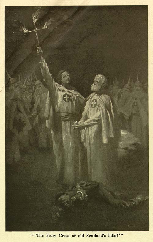
Arthur Keller’s picture of two Klansmen (from The Clansman) standing erect above a fallen black victim is presumably imagined but much more specific in its motivation.

Keller Clansman


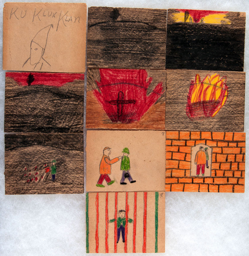
The second story by the “last” outsider artist is more studied in its appreciation of the act of burning crosses.

KKK 02

Much more than in the first comic, it suggests above average powers of observation, beginning first with the yellow flames of initial combustion before simulating the diffuse light of the fire in the crimson night sky. Flames like a geyser of blood pour forth from the redeeming article of the cross.

The members of the Klan are largely absent, two shrouded figures seen considering the cross in the second panel, standing mute and inactive, a testament to the (falsely) avowed purpose of the burning cross as noted in Thomas F. Dixon, Jr.’s The Clansman and D. W. Griffith’s The Birth of a Nation—a call to arms.

Absent of course are the targets of this cross burning. They lie at the edge of darkness, quite unseen, perhaps looking defiantly out at this pageantry like the artist, charting the progress of the ceremony and its denouement. Perhaps cowering in their beds. Perhaps a mass of tangled lines like the mangled heap of brush strokes at the bottom of Keller’s infamous illustration.

Keller-Clansman 01

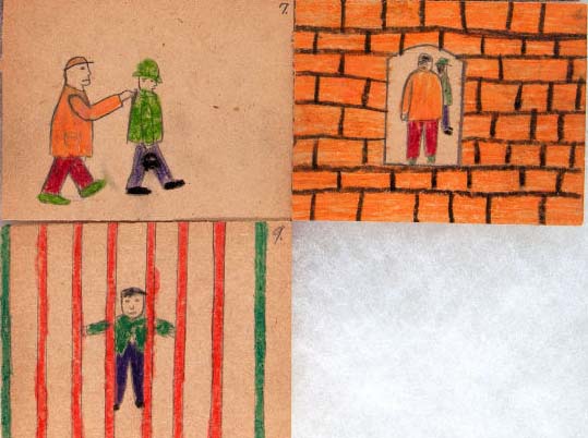
Then the fire is doused by a man dressed in green and the same man sent to prison.

KKK 02b

A seemingly innocuous act rewarded with incarceration.

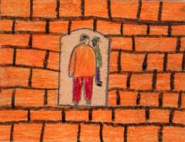
The man is unhooded, perhaps acting against the will of his neighbors and disrupting the carefully orchestrated festivities. Or is this man dressed in green a Klansman, taken forcibly to a brick-lined labyrinth where he smiles placidly back at us with the satisfaction of a job well donethe Minotaur in his lair. Is the man in green the artist himself?

The auction description for these two items is considerably less cryptic:

“As a child of about six, Russel Deiner attended Klan rallies with his father and the scenes he witnessed inspired his child-like, but artful, renditions of what he saw. As an adult he was an influential member in his local Klan.”

Thus casting aside all notions of moral enigma.

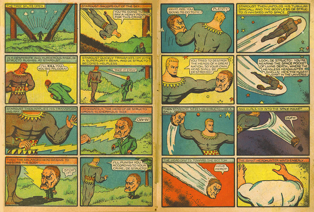
Hanks Stardust

The alcoholic and abusive Fletcher Hanks, Sr. (Stardust, Fantomah) was another outsider of sorts, a neurotic cartooning adept who produced eccentric comics similarly “free” of dubious intentions. Strengthened by biography, the comics have become products of a diseased mind interested in promulgating the concepts of terror, totalitarianism, death, and eternal punishment to his young readers—this once acceptable face of fascism since displaced in our more enlightened times by the charismatic and self-sacrificing leadership of the wealthy vigilante superhero.

KKK 02c

Hanks’ fantasy of justice is transposed to an earthly reality in Deiner’s Klan comics—an adventure in vigilantism which ends in pleasing imprisonment. Some readers will find in the eighth image of Deiner’s tale a portal into the dungeon of his mind; the panels of the comic forming windows into a self-contained reality.

These panels were hung behind a “country store style glass case…with other childhood memories such as jacks, marbles and a cap-gun.” The nostalgia of the true outsider; as uninhibited as any dauntless truthsayer and a premonition not only of the anti-Catholicism and xenophobia of Jack T. Chick but also of the tireless gnawing and prodding of the undergrounds and their adherents. Russel Deiner was the “first” outsider cartoonist; he was the “last” outsider cartoonist.


New Small Press Comics In Context

The index to the Indie Comics vs. Context roundtable is here.
____________
Considering comics in context does not mean simply considering them in the context of social, political, or ethical concerns, but also considering them in the context of cultural relevance, that is, considering them in the context of a set of broader aesthetic developments. Considering comics in context, from this perspective, is simply wondering what a given comic adds to the “conversation”.  Of course we’re all good post-modernists round these parts, and we don’t buy into the notion of cultural “narrative” as a properly unifying concept.  Whether we think we live in “Late Capitalism” or that we’ve “Revealed an Essential Emptiness” or we think that we “Respect the Play of Difference” or that “People just like different shit, and, you know, everyone has their own opinion, so just leave me alone to do what I want, and anyway, what are you, a fucking censor/fascist/communist?” we can all heartily agree (with smiling tolerance all around) that there is no unquestionable criterion for whether or not a cultural product is worth our time/money.  In that light, considering comics in terms of their context, that is, in terms of their relevance, is to consider them in terms of a close reading that takes into account what they do within the vocabulary of the texts that have influenced them.  It’s a Bloomian stance, sure, but it’s also minimalist and generous. It acknowledges that there needs to be some context to an object of art for it to even qualify as evaluable (or able to be experienced at all) and it extends a helping hand to the work by saying that the context of the work is context enough.

With this sufficiently vague cultural program in mind, I went into Forbidden Planet by Union Square and searched desperately for new “Small Press” comics on the little shelves that wouldn’t make me cry after I realized that I had spent upward of five dollars on each of them. I shot for visuals that looked dynamic or unique, considering that most of what was on offer looked like a bunch of silly and ugly little people standing around apartments with speech bubbles floating above their heads. I don’t have Santoro money, so I only bought a couple books for this review.  It wasn’t scientific, it wasn’t rigorous, it wasn’t even especially practical, but I thought it was as close as I could get to random while still attempting to not feel deep regret afterward.  As we’ll see, I wasn’t successful.


ALAMO VALUE PLUS Rusty Jordan from Revival House Press

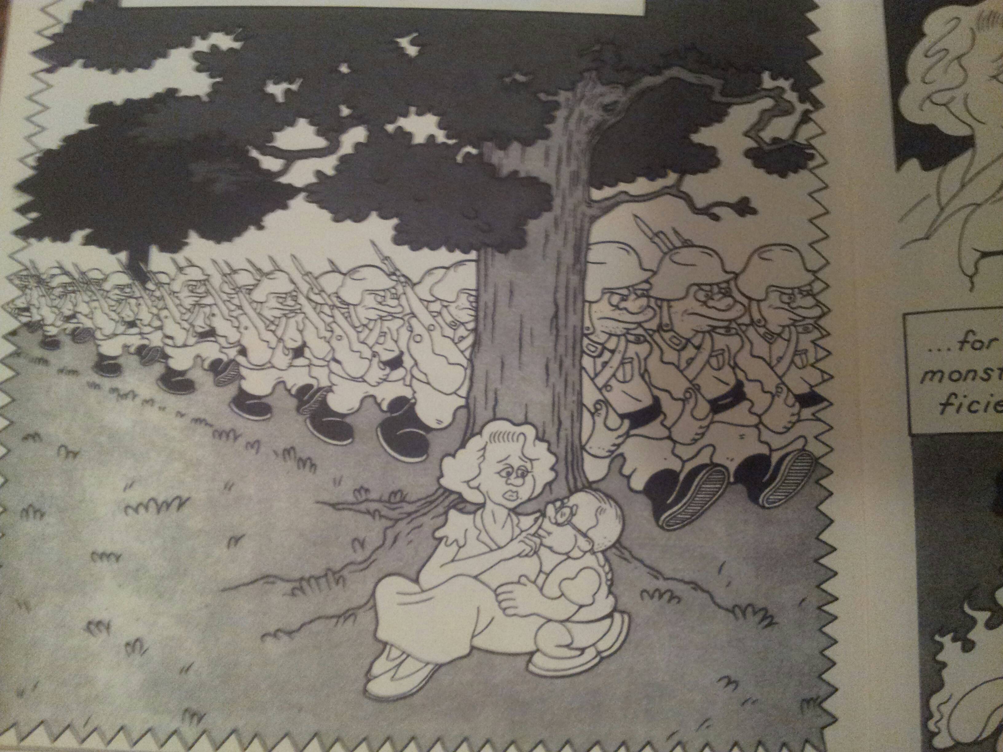
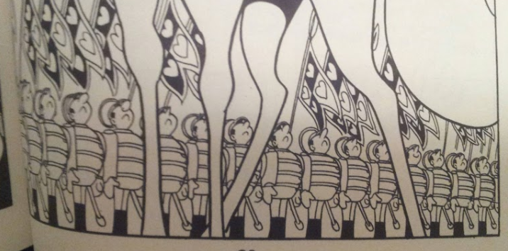
Rusty Jordan’s aesthetic is a mix of Tezuka and the Groening workshop with spruces of Crumb and Mike Judge thrown in. From Tezuka, he borrows a certain Disney sensibility for repetition and caricature of form.
 

tezuka comparison

tezuka

Jordan and Tezuka draw uniformed men.  Note the classical cartoon repetition. Neither is afraid of
typology when it comes to stock characters.

 
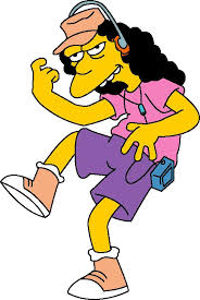
From Groening, he takes faces and physicality.
 

greoning comparison 1

groening for comparison

Jordan character and obvious Groening precursor.
Notice the reference in lips, eyes, and nose.

 
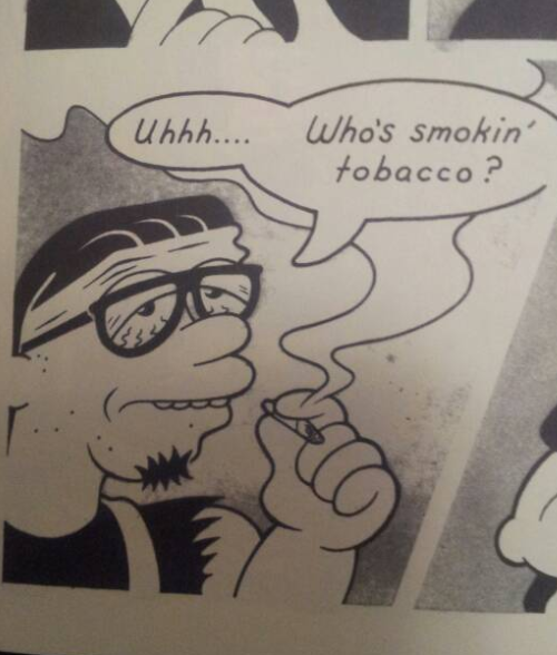
From Crumb, he takes a certain penchant for ugliness (as so many do.)
 

crumb comparison

crumb for comparison

Jordan and (fairly unexaggerated) Crumb.
Note the ugly, vacant molding of the characters. Griffith is also present.

It’s charming, but the charm wears away quickly.  The characters are dull; the protagonist, Baldemar, is an old man straight out of Groening cartoon, and the other two characters are ears for his crypto-WWII tale that isn’t even brave enough to label its antagonists Nazis.
 

evil empire more groening

Evil Empire. More Groening.

But keeping in mind our critical agenda, does Alamo Value Plus provide us with anything that isn’t already on offer in the source material?  The answer is no.  The corporate workshop that produces Groening scripts is cleverer (even today), Tezuka books are more perfect executions of sterile formalism, and Crumb, for all of his shitty sensibilities, at least has the decency to put his ugliness on display.  The story is plodding and the “action” sequences are wooden.
 

action sequence

Not very dynamic at all. Warner Brothers and Groening all over.

 
If you wanted to read a WWII book, Spiegelman still towers in the background. Alamo Value Plus is a “nursery rhyme” book; it’s there to remind us of all the comfortingly familiar stories that it’s derived from. This is issue #1. I’m not interested in reading issue #2.

PICNIC RUINED by Roman Muradov from Retrofit Comics

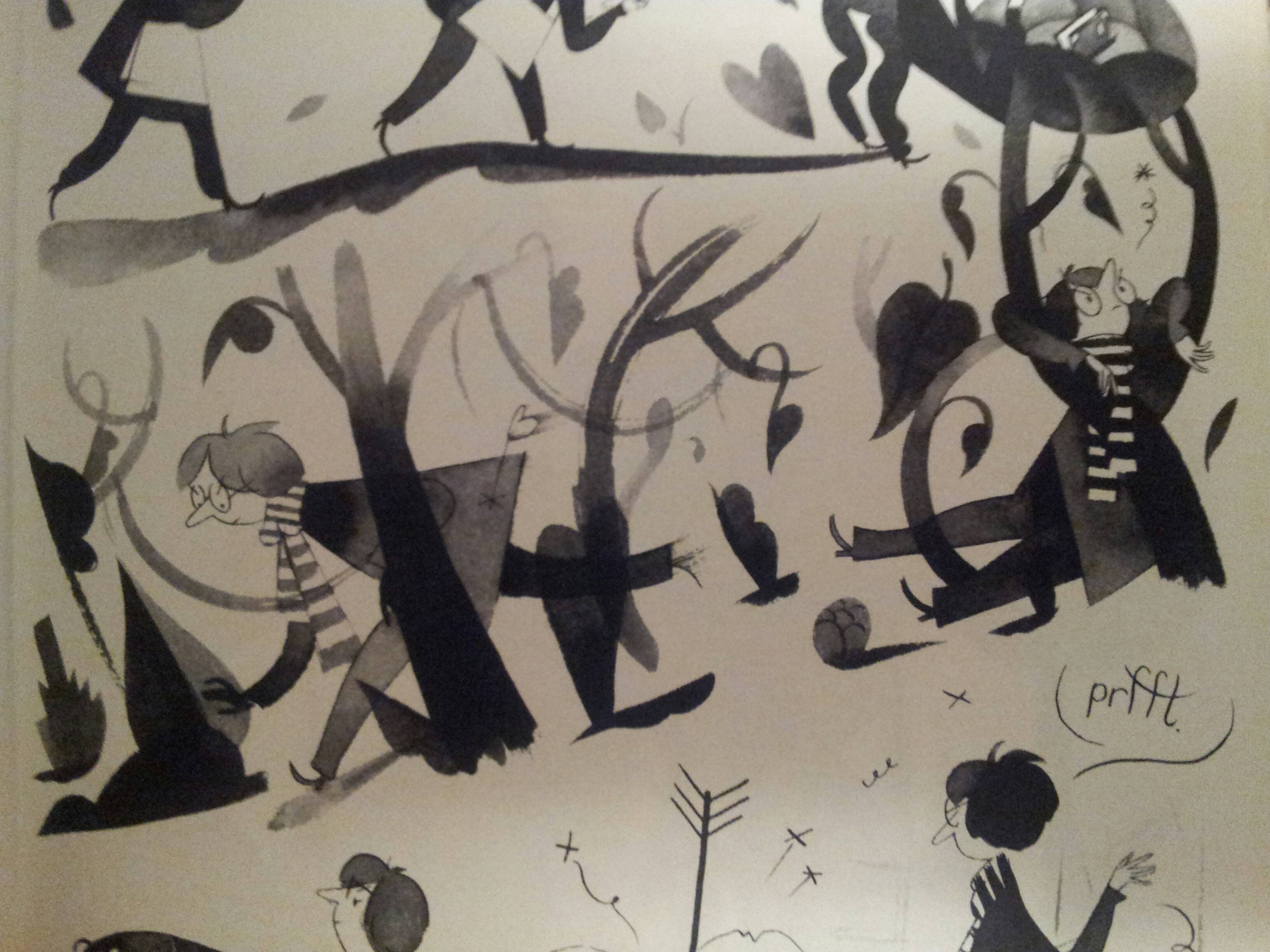
Muradov reminds us that his character is well read and insecure on every page. His characters float around with a long legged and sketchy bourgeois wispiness that I know best from Joann Sfar.
 

sfar

sfar comparison

Muradov and Sfar.
Wide eyes, narrow bodies, light touch.


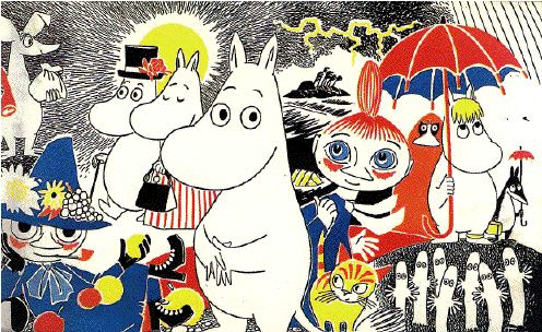
Jansson is explicitly referenced, and it’s not hard to descry her safe and polite influence on the book.
 

moomin comparison

moomin

Muradov’s characters and Moomins.  Plain, wispy, and vacant.

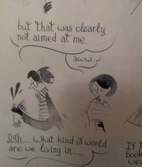
Is the book pretentious? I don’t use the word, myself, but it does betray a certain over-education.  It experiments with styles taken from art and literature, from Beckett to Nabokov, from Klee to Picasso, thrown together in a sequence that’s supposed to convey how the “protagonist” of his book is haunted by an overflow of words that overwhelms and distorts him.

words and identity

It’s the 60’s again and language writes identities.


remember museum

You remember last month, when you went to the museum?
So does Muradov.

 
But underneath is a wistfulness and loss of direction that demonstrates the damp humanism behind the experimentation.  All throughout the book Muradov is worried that it will come off as a masturbatory whine, including in a sequence where the protagonist talks to his shadow about how pathetic he is.
 

funny responsibility displacement 1

funny responsibility displacement 2

I will die happy if I never read or hear another awkward
and “funny” displacement of responsibility.

The book has nothing at stake but its own circular insecurities.  Its most beautiful moments are expressions of the sheer emptiness of its content, but, tragically, they are undermined by its alternation between simpering self-consciousness and self-satisfied intellectualism.
 

self satisfied intellectualism

Hearing people say this kind of shit usually drives me crazy.

 
Reading this makes you remember why you didn’t hang out with the English majors in college (ya zinged, English majors, what about it).


Let’s return to our critical program again; does it add to the discussion that it takes part in? It adds about as much to its illustrious forebears as a poetry jam adds to Crane. The visuals are cute at times (if you understand the references), but once you’ve read it you never have to pick it up again.  Maybe go back and pick up Vampire Loves or, if you’re feeling old, some Wodehouse.
 

you definitely, definitely are

You definitely, definitely are.

These comics are inoffensive.  They are stable and boring narrative and aesthetic statements. But if we consider the role that they play in their context, they’re simple placeholders.  They’re echoes of their source material and repositories for the affect that we have reserved for formative cartoons or the feeling of being in art history class.  By sticking to affective scripts, they don’t even risk melancholia.  There’s no challenge or development here. There’s just a lot of pleasant memories and reminders that there are people out there that feel just like you.