Judging from the pictures from TCAF. This post departs from my courtly ways; apologies in advance.
So more than once I read the many words Brandon from Are You a Serious Comic Book Reader? dropped about the graphic design of Drawn & Quarterly’s Tatsumi reissues. I guess he’s having an off day: gems like “the act of reissuing is a mix of hubris, fan boy exctiement [sic] gone wrong in the best and worst way, and opportunism” and “imperialist takeover” stand in for his not liking the design. Which is “twee and minimalist,” aimed at the “New York Times crowd” and the bad people who enjoy the Shins, Wes Anderson movies, and Neutral Milk Hotel. Those dreaded hipsters lurk in his argument, recalling someone’s glib quip that Tatsumi was hipster manga, when it’s really manga for smoke-cured old men.
Executive summary: Huh?
Anyway, let’s enjoy the graphic design in the Japanese versions of Tatsumi’s work. Maybe they’re twee and minimalist, aimed at those horrible cityfolk who read the Yomiuri, watch Le Pavillion Salamadre, and wear scarves. In the spirit of Tom’s fine series of Golden Age covers.
For context, here’s A Drifting Life, colonized by Tomine and the Canadians:

Here’s the same, pure as the finest vending machine sake:

 Here, Seirinkogeisha’s recent versions of Tatsumi’s short stories:
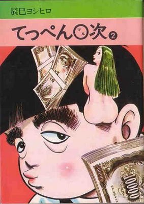
 And here’s a period cover to an ancient series of his I’ve never read and know nothing about save that it’s from around ’78:
Looks awful. Money makes the man.
And an old collection:“The Crowd with the Blues,” more or less, from Napoleon Books. I don’t have a date, but it’s at least 20 years old judging from the design. The only word I can really make out on the blue wrapper is “sex.”
Finally, we’ve got Chip Kidd, who’s really damn good. They’ve got Tadanori Yokoo, who’s a legend. Here he drags Shonen Magazine from the gutter to the gallery:
 Click to see it bigger. These are from the late 60s, early 70s. The cover on the left is from Tomorrow’s Joe, and its design doesn’t strike me as all that different than Tomine’s version of Tatsumi’s work. More garish, still using the source art as springboard for graphic strategies not inherent to cartooning. See also his baseball calligraphy cover, which stunned readers and artists when it hit.
As always, I hope I made some points.
Nicked from all over. Here’s some links:
- Moldy issues of Garo and Shonen Magazine and more
- Moldy jpegs of the greats of the Showa Era, including two Tatsumis and Akira Kawa’s classic Gemini’s Pimple
- Amazon.
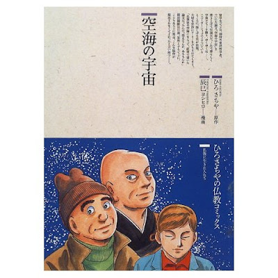
Postscript: Tatsumi did up the great saint of Shingon Buddhism with Sachiya Hiro? Who knew?

