Besides being a major publishing event in comics, Robert Crumb’s comics adaptation of Genesis is an interesting example of the medium’s intersection with literature and its potential to engage fundamental discourse in our culture. It offers itself as something of a lightning rod for the discussion of the suitability both of comics and one of comics’ most respected practitioners to handle such weighty material. Here at Hooded Utilitarian, the book has been hotly debated for over a month now; discussions have largely concentrated on Crumb’s specific qualities or failings, but one cannot help but feel that somewhere more fundamental questions are at stake. In the following, I will attempt to address some of these while offering my own commentary on Crumb’s work.
The book tells us a few things about the critical reception of comics: Crumb has chosen to retain the complete text of Genesis (mostly in Robert Alter’s modern American translation) and has meticulously sought to follow literally it in order to execute what he, with characteristic obfuscation and to the apparent frustration of many critics, calls a “straight illustration job”. The onus therefore is placed primarily on the images and their arrangement to carry Crumb’s contribution to biblical exegesis. But just as importantly, it is placed on the reader—and the critic—who wants to understand and appreciate this contribution seriously to consider these images, not merely to regard them as dressing for the text.
Several commentators on this blog and elsewhere evidently would have preferred a different book, one in which Crumb did not ‘just’ act as illustrator, but offered a literary reading of the text, dealing with theological questions and biblical scholarship. But this is not that book, and Crumb, not being a prose writer, scholar or theologian, was not equipped to write it in the first place. He is a cartoonist, and his five decade-long career should demonstrate that his expertise lies elsewhere, namely in his interest in people, or—if one wants to get all lofty—the human condition. Seeking literary exegesis from a book that in its very premise, ‘straight illustration’, eschews it, will necessarily mean coming up short, but that does not mean that the book does not have another kind of exegesis to offer, namely a visual one.
The fact that the textual narrative is given, forces critics to focus on that much appreciated, but chronically under-analyzed, aspect of comics: the visual. While few, I’m sure, would accept at face value Crumb’s disingenuous claim to neutrality—‘I just drew what’s there’—some seem nevertheless to be asking the wrong questions of his drawings. For reasons still under-examined, and in any case too complicated to go into here, the literary aspects of comics have been, and continue to be, subjected to much greater scrutiny than their visual counterparts in the fledgling field of comics criticism and scholarship. And when you undercut the former, as Crumb does here, it would appear that the critical demands placed upon them tend to be transferred to the latter. The preference, it seems, is for images that mean something fairly specific—‘literary images’, we might call them. Symptomatic of this attitude, critics often compliment or disparage in general terms ‘the art’ of a given comic, while critiquing ‘the story’ much more carefully. The present book has been subjected to a particularly notable short-circuit of this tendency, in which Crumb’s abilities as a draftsman have been praised, while his illustrations at the same time have been dismissed as heavy-handed, rote, and unenlightening.
This raises a number of fascinating questions about comics and cartooning. One is how we address the potential artistic autonomy of an image that simultaneously refers to a text. Another has to do with the specific characteristics of cartooning as a tradition of making images—a tradition to which Crumb clearly belongs. In a key passage of Robert Alter’s erudite and insightful review of the book, the biblical scholar and translator writes:
“Western art is of course rich in paintings that represent specific scenes from the Bible, and many of the stories in Genesis have attracted many painters. The banishment from the Garden, the binding of Isaac, the wooing of Rebekah, Joseph and Potiphar’s wife, Jacob blessing Ephraim and Manasseh: these have all been the subject of memorable and even great paintings. But all paintings isolate particular moments in the narrative for pictorial representation. They do not portray the whole tale, but only that part of the tale that has for some reason engaged them. And they do not tell, they show.”
And further,
“A visual representation of a character or an event is inevitably a specification. When we see Er as a cutthroat who gets his own throat cut, the meaning of “was evil in the eyes of the Lord” and the mechanism of “the Lord put him to death” are strongly stipulated, and other possible meanings are closed off. This foreclosure of ambiguity or of multiple meanings is intrinsic to the graphic narrative medium, and hence is pervasive in the illustrated text.”
Alter attempts to make a distinction between single images, i.e. painting, and ‘the graphic narrative medium’, i.e. comics, and further on he emphasizes that the bible unlike the novel, “does not use minute specification, but its very concision elevates ambiguity to a fine literary art”, making the problem of a comics adaptation doubly problematic. But the distinction he makes in both cases remains undefined, and ultimately is one of degree rather than kind, resulting in an absolutist statement that images ‘inevitably flatten’ the ambiguity of text. Although it presumably is not Alter’s intent, this argument ultimately asserts that language, somehow, is superior to images, in extreme consequence espousing iconoclasm.
His basic observation, that visual representation is more concrete than text, is clearly true; the mere fact that Genesis would need his translation for it to be intelligible to the English reader, while anyone would be able to recognize at least the basic forms and figures of, and to experience an emotional response to, say, the 6th-century mosaics illustrating it in San Vitale, Ravenna, bespeaks this. However, this has not prevented artists from illustrating the bible and other texts for millennia, nor has it prevented people from appreciating them without feeling hampered by their alleged ‘flattening’ of the source. Images, it would seem, have something to offer that language cannot deliver.
Where language is linear and unfolds over time, an image is much more immediate in effect, unfolding less logically. In terms of analysis, the coding of language demands a more specific kind of foreknowledge and a more logical approach than images, which—at least when mimetic—have a more immediately recognizable correlation to phenomena. Because of its more abstracted coding, language on one level is more ambiguous than images, which are forced to show their hand. However, because this coding to a large extent is symbolic, generally with no recognizable link between signifier and signified, its grasp on reality is determined more firmly. Images, while also coded, are less constricted in this respect, and therefore attain a different level of ambiguity unavailable in language. We experience this when trying to put into words something seen: how do you describe, for instance, exactly the facial expression or gesture of a person? Or how do you explain in words how an image just ‘works’, whether in terms of surface or space, color or line? These are essentially non-linguistic qualities, which makes putting them into words a difficult, inevitably inexact endeavor, which often requires great poetic skill satisfactorily to achieve, and even then it often ends up seeming to pin down and attempt to control something much less definite about the image, indeed ‘flatten’ it. This does not mean we should not try—the interplay of language and visuality is essential to us, but the problem of ekphrasis, is clearly a two-way street.
Returning to Crumb, what is interesting in this context is that he works in the tradition of cartooning, an approach to design that combines the observational with simplification and, often, exaggeration. It is more coded than more mimetic forms of image-making and is in this respect closer to text: it has, for example, developed certain types of shorthand more easily to suggest invisible phenomena or emotional states: speed-lines indicate movement, serpentines evoke smell, beads of sweat jumping off the brow of a character denote nervousness, etc., just as it has means of integrating graphically sound and language through sound effects, varied calligraphy, speech balloons, etc. Crumb makes plentiful use of this sophisticated vocabulary and in doing so situates himself in a tradition going back to the beginnings of written language, which itself evolved partly from pictograms. Hieroglyphics are the most obvious example: when we see Anubis or Hathor holding the ankh in an Egyptian mural, we are dealing essentially with the same synthesis of text and image that takes place in this modern vocabulary of cartooning.
Despite concerted attempts to break with it over the last century, naturalistic visual representation remains the dominant paradigm. Just like the separation in high art of text and image, however, it is a fairly recent, initially Western phenomenon, originating in the early modern period. The majority of world art throughout history shares with cartooning the simplification and codification of mimetic form. Indeed, as I have argued recently, even the lofty classical ideals that underlay the empiricist-naturalist approach to art of the renaissance are concerned with basic principles very similar to those of cartooning.

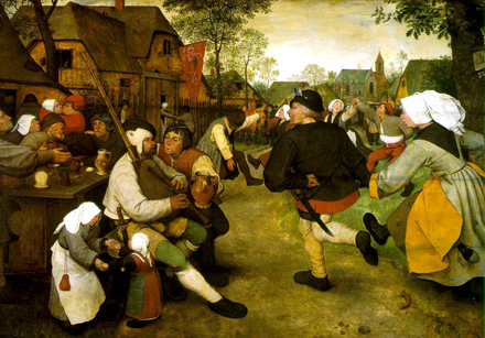
Pieter Bruegel the Elder, The Village Kermis, c. 1567, oil on panel, 114 x 164 cm., Vienna, Kunsthistorisches Museum
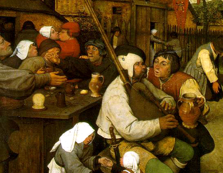
Crumb’s efforts to synthesize naturalism and simplification descend directly from the renaissance. The great paragon, and one of Crumb’s stated favorites, is the Flemish draftsman, printmaker, painter and, yes, cartoonist before the fact, Pieter Bruegel the Elder (c. 1525/30-69). When he paints a Village Kermis (c. 1567), he gives us an acutely realistic rendition, in that it evokes a specific place and time better than just about anything else from the period, but it is not strictly naturalistic. Rather, it is possessed of a broadening of form and physiognomy, and a slight and humorous, but never mocking, exaggeration of same, which capture with remarkable acuity the gesture, expression and sheer life of people in the Flemish countryside in the second half of the 16th century. And indeed at any time—the people are recognizable not merely in historical or ethnographic terms, but as human beings. Their behavior is sufficiently if not fully consonant with our own experience: shouting drunkenly across a table for your mate’s attention, ebulliently pulling the girl you’re sweet on from whatever she’s doing to dance, losing contact with your inebriated dance partner, trying to communicate something profound to a sloshed friend taken with the music… We all know it.

Bruegel might not have achieved the same level of basic recognition if he had gone with more individualized characters, not to mention straight portraits, because these would introduce information in surplus of what he wanted to communicate, making them harder to process—especially today, four-and-a-half century later. Although such representations carry their own interest, this dissonance is evident in the donor portraits inserted into so many religious and allegorical scenes of the period. Instead, Bruegel is channeling the archetypes that modern neuroscience has posited as a model for how we understand the world, with scrupulous attention to the naturalistic detail that makes the scene real to us.
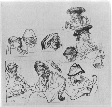
Rembrandt (1606-69) is another major artist who shared these basic concerns and worked analogously, if less broadly, with distilling his observations into potent, calligraphic form. His searching, selflessly confident hand works with abbreviation to suggest the world. His work with archetypical physiognomy can be seen, for example, in his character studies, probably drawn without reference—like a true cartoonist—but retaining a lifelikeness that derives from observation.

Rembrandt, Figure Studies, c. 1635, pen and brown ink, 178 x 184 mm., Berlin, Kupferstichkabinett
His drawings were rarely preparatory of works in other media, though types similar to the ones in the cited sketch often populate his narrative drawings, many of which are biblical. In addition to his substantial production of religious paintings and prints, the bible was an inexhaustible source of human interest for Rembrandt the draftsman throughout his life. Almost 700 sheets, or roughly one third of the surviving corpus, are devoted to biblical subjects. Unrelated to any commissions, this was a sustained, personal creative endeavor. He evidently had no ambition to cover the entirety of the bible, choosing instead to focus on the passages that interested him the most, to some of which he returned again and again over the years. This extended work is clearly more sophisticated, dedicated and emotionally complex than Crumb’s Genesis, but it is nevertheless instructive to compare the two, because of the intersection of their methods and goals.
Like Bruegel and Rembrandt, Crumb is a humanist (in the modern as opposed to the renaissance sense of the word), observant of human behavior and—as his richly varied sketchbooks demonstrate—clearly attentive to the world around him. At the same time he is a comics geek, who internalized the cartoon idiom of his idols at a very young age and has largely remained faithful to it, albeit increasingly implementing his observational insights to create comics with a rich texture of life.
To be sure, there is a misanthropic strain running through his work, which has occasionally approached the nihilistic, but his immersive preoccupation with the more problematic aspects of his psyche has a healthy, almost wholesome feel about it. Plus it is rendered with a genuine curiosity and interest both in the complex psychological issues involved and the physical reality of it, almost as if he were actualizing the cliché of art as exorcism. Add to this the interest in other people, how they live and behave, which was apparently catalyzed by his collaboration with Harvey Pekar in the mid- to late 70s through the 80s, and which surges through his work of the last few decades, through his biographies of blues musicians, his more sedate autobiographical comics, and his adaptations of Philip K. Dick, Charles Bukowski, James Boswell and, yes, Genesis.

The latter is his most extended actualization of these interests to date. It is intensely preoccupied with imagining the human reality of these stories, not just in the clearly perceived material terms, but also psychologically. By sustained effort, his imagery reminds us in a way that the text could not, lest it become repetitive, of the arid environment, the dependence on livestock, the toil of the fields, of the people who populate the pages in all their individualized glory, acting within the framework of this foundational narrative. Never a mere ‘illustration job’, Crumb’s Genesis is a work of visual exegesis. While the text is the text, the drawings are his specific interpretations of the events, experiences, and emotions of Genesis, and as thus place themselves comfortably in a lineage of bible illustration dating back almost two millennia.
Jeet Heer has already sketched out the imposing physicality of Crumb’s interpretation, while Ken Parille has emphasized its lack of idealism—both important aspects of it. And Alan Choate’s sensitive essay provides a closer reading, amply demonstrating its originality, while also pointing out some of the undeniable weak points. In the following, I will therefore limit myself to a partial reading of his take on the life of Abraham, which exemplifies beautifully his subtle visual exegesis. I apologize in advance for the inevitable flattening of the visual ambiguity of Crumb’s drawings, but will do my best to render them justice.
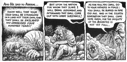
Spanning a human lifetime, the story of Abraham offers Crumb ample opportunity to examine the growth of a person in physical, psychological and spiritual terms. We first meet him in virile adulthood, setting out with slight trepidation written on his face, after a shocking but inspirational nighttime vision (12:4). Crumb poignantly mirrors this formative experience at the start of chapter 15, when Abraham, now an aging man, once again is called by God to venture forth, humble and with an air of resignation, feeling a creeping despair at his destiny. Misery awaits in the wilderness, and the ordeal he goes through at God’s command marks his face and body. Particularly moving is his broken, watery glare as God wakes him from his fitful slumber, telling him that his seed shall be enslaved and oppressed for four hundred years. Even if Abraham’s personal state at this point renders him incapable of pondering their meaning fully, God has made him internalize his words physically (15:10-15).

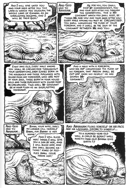
Then, later, in chapter 17 we have the covenant, the details of which God lays out with care to a much more sharply focused Abraham.

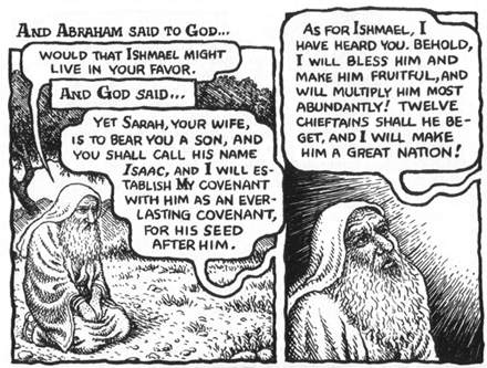
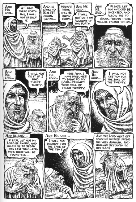
Crumb zeroes in on the prostrated patriarch, conveying his thoughts through changes in his facial expression. The page narrating 17:8-17 is particularly arresting in its flickering portrayal of alternating disbelief, doubt, anger, surprise, and contemplation of the ramifications of God’s words, ending the page with an image that, in seeming contradiction of the text’s description of Abraham laughing to himself, shows him staring out at the reader, as if addressing us, not in disbelief but rather with a dawning awareness of his position in God’ plan. He puts this awareness to immediate use when pleads for Ishmael in presumed humbleness, which gives way to genuine relief when God hears him.

There is humor in this passage. Crumb seems to be expressing his own incredulity at God’s stipulations, but also manages to convey a more genuinely existential feeling of sensing your destiny. After this, Crumb’s Abraham is clearly emboldened and ends up negotiating with the Lord about the fate of Sodom, exhibiting a craftiness akin to the one he showed much earlier in his encounter with Pharaoh (12:11-20), but simultaneously aware of the risk. When it (seemingly) works, he wipes his brow in typical cartoon fashion, beads of sweat leaping from his head (18:22-33).

A fitting payoff to the pedagogical gesturing of the preceding conversation, this is typical of Crumb’s synthesis of subtle expression and cartoon breadth. To some, this might be off-putting in much the same way as his choice of a consolidated visual archetype—the white-bearded patriarch—for God, instead of something more original. But Crumb is working in a tradition of biblical illustration that predates modernist notions of originality and the concomitant, almost pathological fear of cliché. The old masters had no compunction about stating the obvious when necessary, having God point at his subjects when giving them instructions, or having the latter point to the sky when invoking His name. These are tried and tested conventions for conveying vital information—for storytelling—that may be used to enhance the power or resonance of an artwork, just as well as they might diminish it.

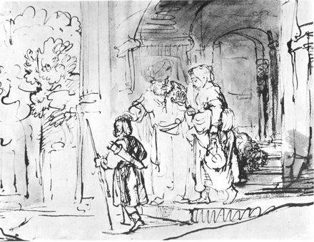
Rembrandt, Abraham Dismissing Hagar and Ishmael, c. 1642-43, pen and brown ink, brown wash, 184 x 23.5 mm., London, British Museum
Rembrandt provides an illuminating example. His c. 1642-43 rendition of Abraham Dismissing Hagar and Ishmael employs a number of such loaded shortcuts: the patriarch placing his hand on young Ishmael’s head in blessing, Hagar drying her eye, the instigating Sarah peeking from behind the door in the background. And yet, this does not undercut the emotional charge of the scene—the tender, trembling weight of the hand on the boy’s head, itself turned from the viewer in emphasis of the child’s youthful impeccability. He is dressed for the road ahead, perhaps grasping only vaguely its ominous significance. And at the center is Abraham, clearly torn.
Of course, such things are subjective and our tolerance of expressive gesture surely varies. To my mind, Crumb’s resort to cliché is a problem especially when accompanied by lack of imagination: Suat has already pointed out, for example, how his slightly ironic depiction of the Garden of Eden as a sort of rustic Disneyland would have been better served by a more evocative interpretation (plus Crumb kind of sucks at drawing animals).

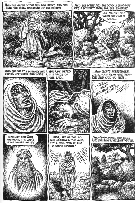
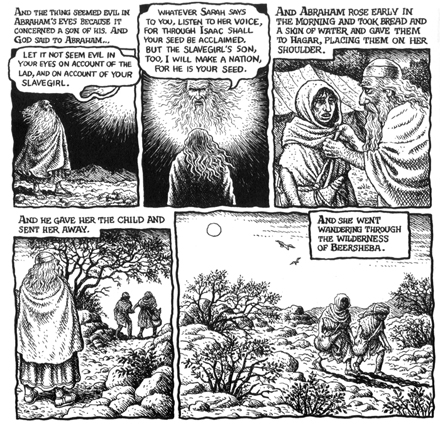
And the portrayal of Hagar also has its problems, especially in the instances where the use of cartoon shorthand clashes with a subtler approach: the thick, gelatinous tears sliding down her cheeks, for example, disrupt Crumb’s attentive work with body language and framing in an otherwise effective sequence; though it may not carry the resonance of Rembrandt’s depiction, his version of Abraham’s dismissal is nevertheless quietly powerful.

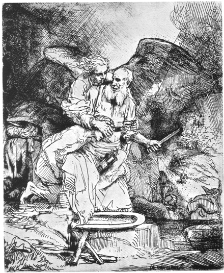
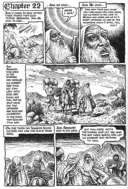
Crumb’s rendition of the scene in chapter 22 of Abraham’s sacrifice has understandably been the object of special scrutiny. Comparison with one of Rembrandt’s versions, his 1655 etching, elucidates how comics offer a different set of possibilities to single illustration.

Rembrandt, The Sacrifice of Abraham, 1655, etching, 156 x 130 mm.
Working for public consumption here, Rembrandt is less abbreviated than in his drawings, but he still works with distillation, condensing the whole story into one situation, unifying the figures into a Trinity: Abraham’s profane and sacred love are embodied in his right and left hand, respectively—one carefully but firmly shielding the eyes of his son, who is propped rather harshly against his knee, the other resolutely wielding the knife (it should be noted that it is contested whether Rembrandt deliberately designed the composition with the print process’ reversal in mind). The angel’s intervention releases softly the hardened despair written in Abraham’s face, drawing a beginning tremble.
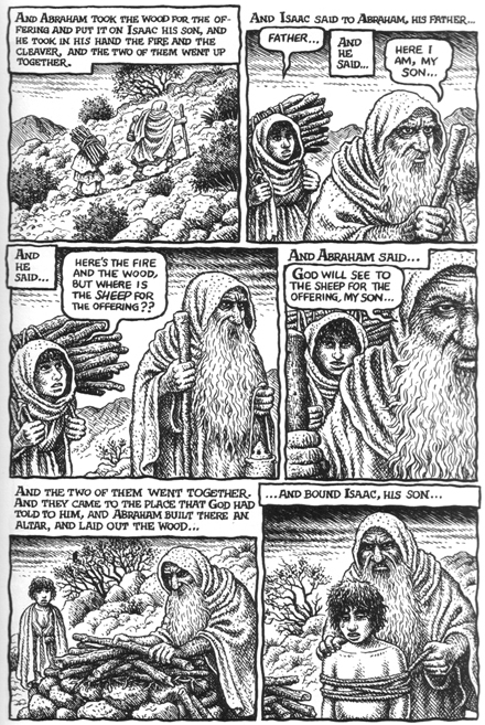
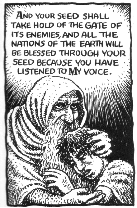
Though not a Rembrandt, Crumb brings his own affecting interpretation to this story of faith and love, narrating sequentially the emotional and spiritual trial of Abraham. The punctuation of his three responses, “Here I am”, given by Alter’s translation (22: 1, 7, 11) and organized by Crumb at one to a page, takes us through his transformation from old-age contentment and confidence through the threat of loss of faith to spiritual tremor when it is upheld.


While the portrayal of Isaac is erratic—his youthful enthusiasm as they leave the servants is touching, his teardrop when being tied unnecessary—the inner turmoil experienced by Abraham is sensitively handled: the doubt creeping in as his son calls him, making him stop and ponder, is empathetically observed, as is the resigned guile in the following panel. With this in mind, the rage clearly gripping him in the last panel of the same page seems in part a way for him of tempering and controlling his doubt.

Lastly, the expression on his face as he hugs his son after God’s intervention is rich in conflicted emotion, while strong in faith. God’s words about how his seed shall bless all the nations of the earth recalls the earlier scene of misery in chapter 15, emphasizing the growth of Abraham’s insight and the resolution of his covenant.
With the story of Abraham, Crumb thus provides an involved interpretation of man’s relationship with God and his negotiation of the sacred and profane in himself. Crumb draws from the text profane implications of self-interest and -awareness, highlighting the issue, central to Judeo-Christian theology, of personal agency in the interaction with God. Crumb’s Abraham retains a dominantly profane position through most of this narrative of power and responsibility, but the shock he experiences at the sacrifice, and especially that moment of insight at its end, he ends up acknowledging, if perhaps not exactly embracing, the transience of these concerns and the meaning of faith.
Crumb gives lends all this further context through his very different accounts of the other such constellations in Genesis: Noah’s frank, almost innocent trust in his course of action, Isaac’s softer, more placid acquiescence, Jacob’s self-awareness and determination, Joseph’s troubling inspiration and his increasing control of it, etc. The result is a wonderfully rich response to the text.
Crumb’s visualization of Genesis actualizes a set of potentialities in the text that points our reading of it in certain directions. Ultimately, this has less to do with its form than it is a condition of all interpretations: Kierkegaard’s multiple retellings of Abraham’s sacrifice in Fear and Trembling, previously cited here by Noah (B.), also spin their source, emphasizing and making more concrete certain aspects, thereby opening us to new ways of understanding it.
From an art historical point of view, Crumb’s treatment is interesting in that it self-consciously and unabashedly employs a visual vernacular—cartooning—for a purpose to which it has only rarely been used in the modern era, as well as a form—comics—which has only recently started embracing this kind of material, and being transformed by doing so. Although this is all part of a revolution in the medium to which he himself helped laying the foundation, the work inscribes itself in a tradition much older than that, finding the new in the old. Crumb’s Genesis is, to paraphrase Chris Ware’s oft-quoted line, an attempt to express human complexity with the tools of jokes, but like his younger colleague he is simultaneously recalling that this might have been its purpose all along. Emblematic of comics’ current state of evolutionary flux, it is a compelling demonstration of some of the central issues with which cartoonists are increasingly dealing these days, surely with fascinating developments to come. A masterful piece of cartoon exegesis, it makes inky flesh of the bible’s word that encourage us to return to the source with new questions.
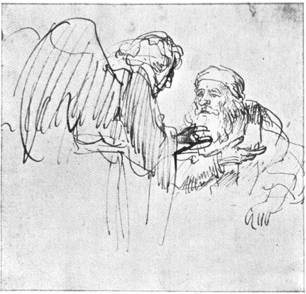
The image at the top is: Rembrandt, Abraham Conversing with the Angel, c. 1636-37, pen and brown ink, 108 x 114 mm., formerly London, private collection.
___________
Update: The whole Genesis roundtable is here.
