I don’t think antibiotics are going to help

Parasyte (vol. 1)
By Hitoshi Iwaaki

Slowly but surely, I’m moving my way up the ranks from manga-noob to manga-novice. For this week, I decided to read Parasyte, a title that is well-regarded by many a manga critic. But you can’t trust the judgment of critics (unless they’re Utilitarians), so I approached this title ready to nit and pick.

It had a simple premise: alien parasites invade Earth and infect the brains of an unknown number of people. But teenager Shinichi Izumi manages to trap a parasite in his right arm before it can enter his head. Now, I’d read enough manga and seen enough anime to know that Shinichi was going to use the parasite in his arm to fight other parasites. The set-up seemed so predictable, and I was considering whether to try out a different book. But then …

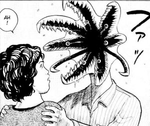
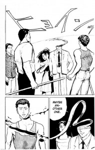
On most pages, the art isn’t particularly noteworthy, though it manages to convey the story in a clear manner. But when the parasites reveal themselves, realism gets thrown out the window and the character designs become wonderfully surreal and grotesque. Heads and arms morph into impossible shapes, inflicting gory deaths on a few unlucky humans.

A story about murderous parasites that infect human brains naturally lends itself to horror, but Hitoshi Iwaaki has a gruesome sense of humor. Parasyte gleefully shifts from horror to comedy to action and back to horror in every chapter. The one constant factor is freaky visuals.

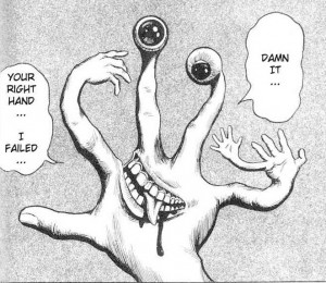
At the core of this weird story is the complex relationship between Shinichi and his parasite, Migi (meaning “right”). The textbook definition of a parasite is an organism that benefits at the expense of its host. But in Shinichi’s case, the relationship between host and parasite is almost symbiotic. Migi can’t survive without Shinichi as a host, and so Migi defends Shinichi from all threats, ranging from bullies to other parasites trying to kill him. But co-dependency doesn’t equal friendship. Migi is completely amoral and will do whatever it takes to survive, and Shinichi is not exactly pleased to have a shape-changing parasite in his right hand.

Over time, their symbiosis changes both of them. Migi starts to exhibit human characteristics, and may even care about Shinichi for reasons besides self-preservation. On the other hand, Shinichi begins to wallow in homicidal thoughts.

While I was correct in assuming that the chapters would mostly be about Shinichi and Migi fighting other parasites, the tension between the characters and the ambiguous nature of their relationship keeps the fights from becoming repetitive. Migi defends Shinichi and kills other parasites only because it’s in Migi’s own interest to do so, and it’s quite willing to use innocent people as human shields. Yet when given the choice to abandon Shinichi for a better body, Migi refuses. Shinichi is far more altruistic than Migi, as he doesn’t want innocent people to get hurt. But he also fantasizes about becoming a hero by killing the other parasites.

Overall, a very compelling first volume. Of course, it’s possible that this manga will go completely off the rails in the next volume, but I’ll take my chances.

xxxHOLiC Roundtable: A Rambling Review in Four Points

The roundtable round-up: Vom Marlowe posts a favorable review, Kinukitty is less kind, Adam Stephanides follows up, Ng Suat Tong goes on the attack, but he also posts examples of Ukiyo-e for comparison.

1. That is a very misleading title.

When you read a title like “xxxHOLiC,” what’s your first thought? Porn addiction!

When Noah first proposed a xxxHOLiC roundtable, I was a little surprised that we were starting off the new year with a discussion of Japanese porn (I don’t know why I was surprised, as this blog is all about the Japanese man-love). But apparently the “xxx” is silent, and the manga is appropriate for teens. That is false advertising.

2. The art is fantastic.

A great deal of manga art leaves me cold. The common style (large eyes, angular features, spiky hair, etc.) doesn’t repulse me, but at the same time I’ve never been drawn to it. This is less an aesthetic judgment than my cultural prejudices, as I grew up reading comics with (relatively) more realistic art.

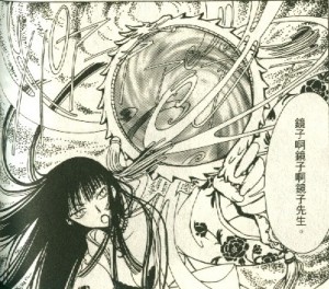
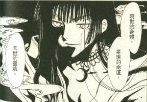
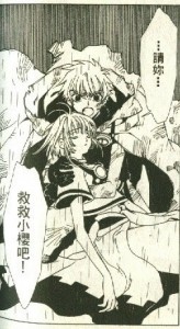
But strangely, the art in xxxHOLiC appeals to me precisely because it frequently veers further away from realism. The story is set in a universe that’s superficially similar to our own, and the use of the typical manga style for the majority of each chapter reinforces that. But the existence of magic provides a contextual excuse for surreal deviations from the typical. Sometimes these are obvious, as when Yuko is casting a spell.

Other times, the surreal touches can be more subtle, such as Yuko’s cat-like pupils or the heavy use of black.

This panel is reminiscent of a noir-ish crime comic, but the darkness is purely thematic; the other panels on the page establish that the conversation takes place in a well-lit room. In a different context, these artistic flourishes might come across as tedious, but within the world of xxxHOLiC they seem appropriate and are arguably necessary for the story and characters to have the desired effect on the reader.

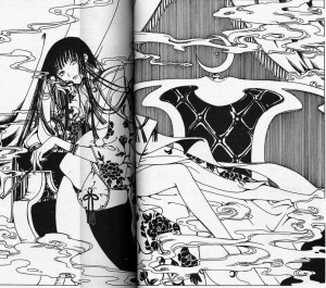
The surreal elements mix well with the influence of Ukiyo-e, which Vom Marlowe discussed (and Ng Suat Tong generously provided examples of). Yuko frequently lounges about in traditional Japanese (and occasionally Chinese) clothing decorated with intricate patterns.

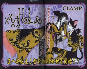
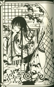
But while the interior art is impressive, the chapter covers (or whatever they’re called) were the highlight for me. Characters and environment merge, and patterns on costumes shift into the background as aesthetic harmony trumps reality.

3. Add a laugh track and xxxHOLiC would be a sit-com.

The writing left me unimpressed. Other posters have commented on the anticlimaxes, the one-dimensional characters, and the contrivances that are conveniently explained away as “destiny.” When Yuko stated that coincidence does not exist, I was reminded of Star Wars. Enjoyment of the series is dependent on your willingness to just accept that characters will always be in the right place at the right time for the plot to advance. That’s just the way the Force (or hitsuzen) works.

But easily the weakest element of the story was the setup. Sad-sack teenager Kimihiro Watanuki stumbles upon a shop owned by the one woman who can solve his ghost problem. And as payment, he agrees to work for her. Yuko turns him into a maid (but he’s a guy!), and he complains about it, but the two clearly enjoy each others company. And wacky hi-jinks ensue. You can practically hear the creaking of the plot as it gets all the pieces in place.

But the pieces never quite fit. Watanuki’s whining never feels genuine, because he has so little to whine about in this situation. A gorgeous woman wants to spend her day with you, solve your biggest problem, and teach you about magic, and all you have to do in return is some housework? That is not a bad deal. And why does Yuko take so much interest in Watanuki at all? Other than his issue with ghosts, he’s a fairly boring kid, and yet he seems to be at the center of Yuko’s world. Perhaps later volumes will explain her motivations, but I’m not interested enough to find out.

4. Crossovers aren’t just for superheroes anymore.

The crossover with Tsubasa and the references to Cardcaptor Sakura surprised me. I know all those books are produced by CLAMP, but I tend to think of manga as stories operating in self-contained universes, as opposed to the shared universes of American superheroes. Perhaps I’m mistaken, and there are actually a lot of manga crossovers. If anyone wants to list some examples in the comments, I’d appreciate it.

Is it a big deal? I suppose you could characterize the crossover as fairly insubstantial. As far as I can tell, it doesn’t have any long-term consequences on xxxHOLiC, and it only factors significantly in one chapter of volume 2. And while I haven’t read either Cardcaptor Sakura or Tsubasa, I wasn’t confused as to what was going on. We’re still a far cry away from the never-ending, ‘bleed our customers dry’ crossovers that characterize DC and Marvel publishing.

On the other hand, the crossover is more than just a ‘blink and you’ll miss it’ moment. It serves as the climax to volume 1, a way to entice readers, who are presumably fans of Tsubasa and Cardcaptor Sakura, into reading the next volume of xxxHOLiC. And it ties Yuko to the prominent characters of the Tsubasa storyline, leaving the door open for more crossovers in the future.

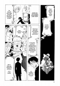
And then there’s this page, where Yuko explains that the concept of alternate realities to Watanuki.

This explanation could have easily come from a DC comic in the 1960s. In fact, the classic story “Flash of Two Worlds” (1961) first introduced the idea that events in a one world might be recorded as fiction in a parallel world. I would be surprised if the CLAMP creators weren’t at least aware of the DC multiverse.

So what does this mean for CLAMP’s output in the future? Perhaps this crossover is just an aberration. Or maybe CLAMP is prepping its readers for more crossovers. Like the superhero publishers, CLAMP owns several properties that appeal to roughly the same demographic. And given the popularity of crossovers in the U.S., it’s not a stretch to imagine that there are loyal readers in Japan who would be happy to see the characters of various CLAMP titles interact more frequently. Maybe 2010 will be the year of CLAMP United.*

*as dreadful as that sounds, it couldn’t possibly be as bad as that thing Image publishes.

_____________
Update by Noah: You can read all posts in the xxxholic roundtable here.

Action-Packed Buddhism

Saiyuki (vol. 1)
By Kazuya Minekura

In my last manga-related post, I received more than a few reading recommendations in the comments. I plan to give them all a try (eventually), but for this week I took Vom Marlowe’s advice and read the first volume of Saiyuki.

For those of you unfamiliar with the title, Saiyuki is a *very* loose adaptation of the classic Chinese novel, Journey to the West. Rather than a monk traveling West to obtain authentic sutras, Saiyuki depicts the adventures of a monk tasked with preventing the revival of a demon lord, Gyumaoh. As in the novel, the monk is accompanied by three companions, including the Monkey King, Son Goku. Also, the monk is given a dragon that serves as his mount. But instead of transforming into a horse, as it does in the novel, the dragon in Saiyuki transforms into a Jeep (it’s a joke that worked for me precisely because it’s so random).

The story is set in the mountainous fantasy realm of Tougenkyou, (which I presume is like Shangri-la). In Tougenkyo, humans lived peacefully alongside a race of demons called Youkai, but the recent efforts to revive Gyumaoh have caused most of the Youkai to go feral. The monk, Genjyo Sanzo, and his three companions are Youkai as well, but their powers are controlled so they can serve the interests of humanity. The conflict with the Youkai serves as a convenient excuse to include plenty of action, which often takes up the lion’s share of each chapter.

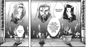
While the plot is simple, I was often confused as to exactly what was going on. Some of this is due to my own ignorance of Eastern myth. For example, when I first read the volume I didn’t understand why Sanzo was taking orders from three giant heads.

After doing a little research I learned that they were the Sanbutsushin, the three aspects of Buddha. There were numerous references to Buddhist mythology (even during the fight scenes), most of which probably went right over my head.

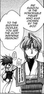
A good deal of my confusion was also due to the amateur translation. I read Saiyuki using Mangafox.com, because I am cheap. But you get what you pay for, because a manga that’s translated for free by fans tends to have numerous spelling errors and grammatical mistakes. While I can’t say for sure, I also suspect that the translation didn’t capture the nuances of the original Japanese prose. Quite of few lines of dialogue felt stilted, and some even bordered on nonsensical.

In the above panel, I can make out the gist of what’s being said, but those lines are pretty damn terrible (and did I mention the spelling mistakes?). Of course, that might be how the manga actually reads in Japanese, but I’m going to give Kazuya Minekura the benefit of the doubt.

Setting my confusion aside, initially I was not very impressed with Saiyuki. The quality of the art (which I discuss below) was uneven. The main characters lacked depth, even by the end of the volume. Now, I understand that this is a shonen manga, heavy on action, light on characterization. But everyone was just so damn archetypal: Sanzo is the stoic leader, Cho Hakkai is the nice guy, Sha Gojyo is the womanizer, and Son Goku is the bratty kid.

About halfway into the volume, however, my opinion started to change. It wasn’t that the characters became substantially more interesting, but that Minekura provided just enough hints that there was more to the story and characters than was immediately evident. There were a few scenes that suggested that the Sanbutsushin are not the flawless embodiment of good, nor are the villains purely evil. There were also brief moments that promised deeper characterization for the heroes. Son Goku, for example, was noticeably hurt when a human girl expressed hatred for the Youkai. Also, the last chapter highlighted that Sanzo is indifferent to the teachings of Buddha, despite the fact that he’s technically a high-ranking monk. I’m not ecstatic about her writing, but Minekura has piqued my curiosity, and that’s enough to get me to try out the next volume (though I’ll probably look for a version that’s been translated by a professional).

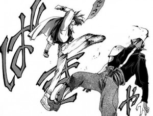
The art is hit and miss. Saiyuki adheres to a style that seems (to my admittedly inexperienced eyes) to be the mainstream of manga and anime: big eyes, angular features, spiky hair, lots of speed lines during fights. I don’t find this style repulsive by any means, but it’s never really appealed to me either. It’s more like something I tolerate if I happen to enjoy a story. Even if I was more appreciative of the basic style, there are a few problems with Minekura’s storytelling. Panel layout during the fight sequences can be bewildering, and spatial relationships are not easy to figure out. And big splashy images are sometimes used at the expense of narrative clarity. On the plus side, Minekura doesn’t hold back on the violence, and she knows how to draw a kick that looks like it hurts.

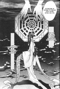
The best moments in Saiyuki are when the book deviates from the typical manga look and instead draws inspiration from traditional Chinese and Japanese artwork. The art becomes much more distinctive, and I get the sense that Minekura is more enthusiastic about these infrequent pages than she is about the lengthier fight scenes.

I particularly like the ethereal quality of the kimono, and the way the hands blacken as they touch the … whatever the hell that is (unless corrected, I’ll call it the evil, octagonal web thing).

To sum up, Saiyuki is a deeply flawed title with the potential to become much better in subsequent volumes. Hopefully, the next volume will read less like a generic shonen story and more like an idiosyncratic blend of Buddhist mythology and road-trip adventure.

Anything But Capes

Alternate Title: Barbarians at the Blog!

Back in 2000, the world was a better, simpler place.* The American comics market exemplified this simplicity. It consisted of Marvel superheroes, DC superheroes, Image superheroes, a few dark fantasies from Vertigo, and those Star Wars comics that Dark Horse keeps churning out. Not exactly a broad selection, but perfect for aging nerds who grew up reading superhero comics and watching Star Wars.

But something happened over the past decade. Publishers started producing more comics that had nothing to do with superheroes. Suddenly, there were a lot more horror comics, crime comics, science fiction comics, war comics, and even Westerns (you know something big is going down when Westerns make a comeback). If the comics industry didn’t grow much in size, it at least grew in variety.

Over the next couple months, I plan to see what the American comics market has to offer that doesn’t involve capes and tights. Because I’m interested in what the comics industry is producing at the beginning of the new decade, I’ll only be looking at recent titles, not reprinted material. To keep myself focused, I’m going to organize the books into genres and review a sample of titles. I have no intention of reading and reviewing every title of every genre, so instead I’ll rely upon a complex scientific formula to select titles that are most representative of each genre. The explanation of my method is provided in footnote **. After the reviews, I’ll summarize the state of each genre, looking at both its size in the market and the overall quality of its titles.

I’ll begin with a genre that has had its share of ups-and-downs in the comics market … barbarians! For the sake of clarity, barbarian comics are fantasy stories about muscular men in loin clothes killing shit with swords and axes. Of course, there’s room for variation on this basic model. For example, woman in chainmail bikini can be substituted in for man in loin cloth. But barbarian stories are not simply high fantasy tales; there needs to be a significant amount of violence, sex, and characters who never wear pants (as a counterexample, The Lord of the Rings has some violence but no sex and way too many pants). Also, comics about fantasy strongmen who arrive in the present day and fight crime are not barbarian stories. They’re superhero stories that steal the surface appeal of barbarian stories.

I looked hard for recently published barbarian comics, but I found only about half a dozen titles, four of which I chose to review below. None of these titles were selling well in the Direct Market, but all of the titles had prior storylines collected and sold as trades, so presumably the DM isn’t the only source of sales. Now, onto the reviews…

Conan the Cimmerian #16
Writer: Timothy Truman
Artists: Timothy Truman and Tomas Giorello
Colorist: Jose Villarrubia
Publisher: Dark Horse Comics

Fact: The Cimmerians were a real people who inhabited the region around the Black Sea in the 8th and 7th centuries B.C.

Fact: They didn’t look like Austrian bodybuilders.

Of course, the Conan story has nothing to do with history and everything to do with Robert E. Howard‘s testosterone-fueled fantasies. But Conan isn’t just another masculine power fantasy. He pretty much is THE masculine power fantasy, the epitome of violence, sex, and rugged individualism. And no survey of barbarian comics would be complete without covering the latest iteration of the muscle bound brute who started it all.

I lucked out with Conan the Cimmerian #16, because it’s the beginning of a new storyline. There’s no recap page, but I had no problem figuring out what was going on. Conan somehow landed himself a sweet gig as the military adviser to a hot princess named Yasmela. Conan’s in love with her, but she only has eyes for an exiled prince named Julion, who’s girly compared to Conan. We know he’s a girly man because he does girly things, like giving flowers to girls and using multisyllabic words.
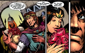
So Conan decides to impress her by doing something stupid, which results in his war band getting ambushed, and then Conan almost gets eaten by a velociraptor (it’s fantasy, not history).

As Conan stories go, this isn’t bad. It has character-driven conflict, Conan is a badass but not infallible, and there’s violence and (implied) sex.

The comic falters on the art. Tomas Giorello does the first seven pages and the final page, and his work is perfectly suited to a Conan book. His backgrounds are lush, and he uses numerous small lines to give more detail to his characters, which would be annoying in a different context, but in a barbarian book it gives the characters a distinctly savage look.  But the majority of the comic is drawn by writer Timothy Truman, and his style is far less detailed and far more cartoonish. It isn’t terrible art, but the transition from Giorello to Hutton and back again is jarring, especially in a comic that’s only 24 pages.

Overall, a decent barbarian comic, but not one that entices me to follow the series.

Hercules: The Knives of Kush #1
Writer: Steve Moore
Artist: Cris Bolson
Colorist: Doug Sirois
Publisher: Radical Comics

Reading Hercules, I couldn’t help but take pity on the Nemean Lion. The Nemean Lion was just doing what lions do when a violent Greek showed up and killed him, skinned him, and decided to hear the Lion’s head as a hat.
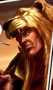
I spent a lot of time thinking about the Nemean Lion because this comic wasn’t very interesting.

The plot is serviceable: Hercules and his band of misfits arrive in Egypt during a civil war. They decide to work as mercenaries for the legitimate pharaoh, who’s losing the war to his half-brother. It seems that the would-be-usurper has formed an alliance with a sorcerer who leads the titular Knives of Kush.

Unfortunately, nothing else about the comic is the least bit engaging. Most of the characters, including Hercules, lack a distinguishable personality or voice, and in any case they spend spend the entire issue delivering page after page of exposition and occasionally engage in non-witty banter.

The art is also pretty bad. Cris Bolson puts a lot of detail into his panels, but his characters look stiff and plastic. As a result, the fight scenes resemble action figures posed in mid-attack, which robs the violence of any excitement. His sexy women aren’t very sexy either.

Hercules is a hard character to screw up. But he’s also been so extensively ripped off and parodied that creators need to bring something more to the table than just a standard sword and sorcery plot. That’s about all you get here.

Warlord #9
Writer/Artist: Mike Grell
Colorist: David Curiel
Publisher: DC Comics

Warlord follows the adventures of Travis Morgan, a man from the regular world who somehow got trapped in the barbarian world of Skartaris. But other than the occasional war, being trapped in Skartaris doesn’t seem like such a bad deal. Morgan has a hot princess girlfriend named Tara and a hot pseudo-girlfriend named Shakira who can turn into a cat. In fact, hot, scantily-clad women are as numerous as trees in Skartaris. And Morgan seems to have embraced the local dress-code because his outfit consists of boots, a helmet, and armored underwear.

Not much happens in this issue, but that may not be a failure in the writing so much as the fact that this is a “down-time” issue. In a superhero comic, down-time issues are normally where characters sit around and whine about their relationships, but in Warlord the characters just have sex. And there is a lot of sex in this issue. Nothing too racy, of course (this is still a DC comic), but Grell manages to include some nice cheesecake. Though the guitar as phallic symbol is a little too obvious.
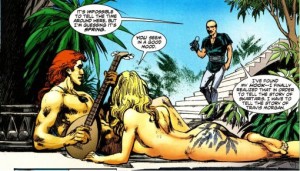
As an artist, Grell has his share of strengths and weaknesses. His backgrounds are well-designed and his characters can be quite attractive. But his fight scenes lack any real sense of impact, his characters often seem disconnected from the panels they occupy, and panel layout can occasionally be rather confusing.

Problems with the art aside, of all the barbarian comics I read, this seemed the most polished and one with the most depth to its characters and universe. Not surprising, given that Mike Grell created Warlord, and he clearly knows what he’s doing with this book. Unfortunately, this comic has some dense continuity, not just with the previous 9 issues but also with prior Warlord comics. To be fair, there’s a quite a bit of exposition that’s intended to help new readers catch up, but knowing what happened previously isn’t the same as caring. Like so many comics that have been around (off-and-on) for years, Warlord proceeds with the assumption that its readers are already fans, and there’s only minimal effort to show new readers why they should care about any of this.

But I’m curious enough about Warlord that I’ll probably look for the first trade paperback and see whether my opinion changes.

Queen Sonja #1
Writer: Joshua Ortega
Artist: Mel Rubi
Colorist: Vinicius Andrade (*that is an awesome name*)
Publisher: Dynamite

Don’t let the title fool you. This is not a Female Force bio-comic about Queen Sonja of Norway. Rather, this is the sequel to Dynamite’s Red Sonja comic, but there’s no evident continuity with the previous title. As someone who never read a Red Sonja comic, I can appreciate the fresh start.

As the title makes clear, Sonja is now a queen (of Made-up Land), and the comic is mostly a flashback about how she ended up on the throne. Sonja agrees to avenge an old woman’s late husband and recover a family heirloom, and along the way she’s clearly going to come into conflict with an evil empire. There’s also plenty of violence and gore in this comic, in the best barbarian tradition. But the plot and the action (not to mention the one-dimensional characters) are completely overwhelmed by the massive amounts of cheesecake. Every other panel focuses on Sonja’s perfect body and the chainmail bikini that seems perpetually about to fall off.
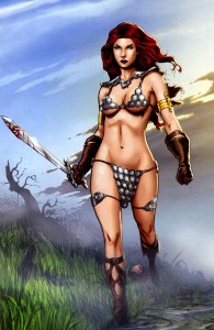
Now, I don’t have a problem with cheesecake, I just wrote a paragraph praising the cheesecake in Warlord, but in this title the cheesecake was ridiculously excessive. But when I stopped to think about it, the cheesecake is ultimately what this comic is all about. Let’s be honest: the selling point of Red Sonja is not really the violence and it certainly isn’t the plot. It’s a comic about a hot red-head in a chainmail bikini. Either you want to look at a hot red-head in a chainmail bikini, or you don’t. Giving her a more tasteful outfit would only take away the one thing that makes Sonja memorable. And there’s no point in pretending that readers, especially women, are going to be won over by Sonja’s “personality,” or the slim bits of dialogue.

Admittedly, my interest in barbarian comics is that of a casual reader, not a fan, but a monthly comic seems  like an expensive way to indulge a fetish for barbarian pin-ups. Still, the current Red Sonja franchise has lasted for over 4 years, so there must be plenty of people out there who like this. And unlike superhero comics, barbarian comics aren’t (or shouldn’t be) marketed towards children, so the cheesecake here isn’t age-inappropriate.

_

State of the Genre: meager. Very few titles to choose from, and most of them lack truly distinctive features  that set them apart from the rest. They all satisfy the basic expectations for a barbarian comic (fantasy setting, violence, cheesecake, lack of pants), but only Warlord suggests that it might have something more in content.

The next time I appraise a genre, I’ll try one that’s a bit more robust, maybe horror.

_________________________

*This is not true.

Xmas Samurai

Lone Wolf and Cub: The Assassin’s Road (Vol. 1)

Writer: Kazuo Koike

Artist: Goseki Kojima

I never read any manga as a kid. The closest I came to it was watching manga-based anime like Akira, so my impression of manga was that it was mainly about teenagers screaming at each other as they fought to the death (depending on the series, these battles might involve giant robots and/or cat-girls). And the manga digests were alien and weird, these thick, little books with black-and-white artwork.

Now I’m older and a little bit wiser, so I’ve decided to let go of my prejudices and see what all the fuss is about. But the sheer size of the manga industry, along with my total unfamiliarity with the major titles, has made it difficult to find a clear point of entry. And while I try to keep an open mind, I’m not quite ready to jump into yaoi. I’m sticking close to my comfort zone, which just so happens to include samurai.

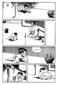
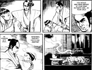
Lone Wolf and Cub proved to be a great starting point. Set during the Tokugawa era, it depicts the adventures of the assassin Ogami Itto and his infant son Daigoro. The chapters in the first volume are episodic. Other than Itto and Daigoro, characters do not carry over from story to story. Also, each chapter tends to follow a simple formula: Itto arrives in some town or village pushing his son around in a cart, he toys with his target for a while, his target ineffectually tries to get rid of him, and Itto then kills his target and everyone who gets in his way. And occasionally, hot women remove their clothes.

Of course, there’s a downside to the episodic approach. Even having just read the volume, it’s hard to remember the specific details of any one story, and all the chapters feel vaguely indistinguishable. Like every procedural on television, enjoying Lone Wolf and Cub is contingent upon enjoying the repetition of particular themes and events. As someone who enjoys reading about samurai, I found the stories entertaining, but it’s easy to imagine someone with different tastes finding it to be a repetitive bore.

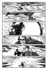
The art is actually the bigger selling point. Goseki Kojima’s style is heavily influenced by traditional Japanese artwork, and it’s absolutely perfect for the subject matter. He’s also a capable storyteller. Panels are attractive and uncluttered, spatial relationships are clear, and the panel layout ensures that the narrative is easy to follow. His talents are particularly evident during the fight scenes. Many Western comic artists have trouble creating the illusion of motion in a medium comprised of static images. Kojima is one of the few artists I’ve seen who can plot a fight scene so that  actions that occur between panels are just as obvious as those depicted in the panels.

As these pages make clear, Itto is a sneaky bastard.

The various chapters touch upon themes that will be instantly familiar to fans of samurai stories (honor, self-sacrifice, bravery, etc.). But the most prominent theme throughout the entire volume is the devotion between father and son that survives even as Ogami Itto follows the “assassin’s road.” Itto clearly loves Daigoro, but at the same time Itto is an essentially violent man, and he chooses to work as an assassin as he plots his revenge on the men who disgraced him. His love for Daigoro is conditional on Daigoro being worthy to follow in his footsteps. In practice, this means that Itto frequently risks Daigoro’s life just as he risks his own life. The potential conflict between Itto’s profession and his love for his son never arises, however, because it’s clear from early on that Daigoro truly is his father’s son.

But for all its high-minded pretentions about honor and family devotion, Lone Wolf and Cub is overflowing with violence and sex. At first glance, the book seems to be an uneven combination of high-brow Eastern philosophy and low-brow exploitation. This is partially deliberate. Kazuo Koike no doubt intended to explore the contradiction between bushido ideals and the harsh reality of feudal Japan. But the book is also clearly nostalgic for an era when men were men. Ogami Itto is Koike’s ideal man: strong, relentless, sexually virile, and honorable in his own way (and ignoring all the times he risks his son’s life, he’s a loving father too). In Koike’s vision of feudal Japan, there is a natural coexistence of philosophy, ideals, violence, and sex because only in this era could men achieve both physical and spiritual perfection.

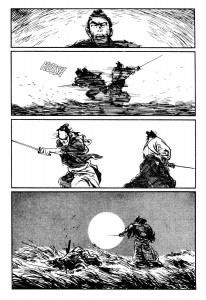
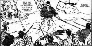
So Lone Wolf and Cub is retrogressive and occasionally quite sleazy. But I couldn’t help but enjoy it. I may be a bleeding heart, but I appreciate action stories with great art and clever plotting. Here’s my favorite panel of the entire volume:

A part of me is offended by how Itto is so unconcerned about Daigoro’s safety. But a much bigger part of me admires the badassery of killing 10 men while giving his son a piggyback ride.

Ghost World: Pander to Me (Ghost World Roundtable)

Editorial Update: This is the third post in a roundtable on Ghost World. The first two can be found here and here.

________________________

I read “Ghost World” for the first time last week, and my initial reaction was fairly positive, though it was hard for me to explain why. As I thought more about it, I realized that my appreciation for the comic had little to do with the art. Nor did I care much for the episodic stories, which ranged from mildly amusing to kinda dull. The most appealing aspect of “Ghost World” was the main characters, Enid and Rebecca. And much of their appeal is due to how effectively Daniel Clowes panders to a specific demographic that I belong to: geeks.

It’s easy to see why geeky comic readers love this book. Enid and Rebecca are both social outcasts. They’re alienated, unmotivated, but seem cleverer than everyone else. They’re constantly looking for ways to relieve their boredom (which is difficult when living in an ugly suburban sprawl). Enid, in particular, has mastered the ironic appreciation of pop culture detritus. I can see Enid and Rebecca as the type of kids who would go to a comic convention just to make fun of the fat guys dressed like Green Lantern. And like all teenagers, they’re obsessed with sex but uncomfortable with the idea of adulthood.

If I had read “Ghost World” when I was 18 it would have probably been my favorite comic of all time. I was a typical Gen X’er nerd, an insufferable combination of self-pity and intellectual arrogance. Maybe Daniel Clowes went through a similar phase, because that also sounds like a good description of  Enid. And that’s why I found it odd when Kinukitty argued that Enid was unrelatable, because my inner geek had no trouble relating to her. Admittedly, there’s an underlying narcissism in Enid’s appeal, and that can be very off-putting to some readers. My appreciation for the character of Enid is connected with a nostalgia for my late teens. Clowes makes this easy for me, because Enid is not some unique gem of a character, and there isn’t much that gets in the way of my identification with her. She’s an archetype of geeky disaffection, a bundle of adolescent hangups and amusing idiosyncrasies.

Much of the comic is devoted to exploring the ennui of middle class geeks, and the story is constantly on the verge of succumbing to a navel-gazing sigh. Clowes is a better writer than that, however, which is why “Ghost World” ends the way it does. But even the ending, where Enid gets on the bus to Anywhere but Here, feels calculated to deliver maximum satisfaction to grown-up geeks. In Enid, geeks find an avatar who breaks free of her post-adolescent stasis and embraces maturity. But it’s a maturity without content, which invites that the reader fill in the blanks with their own experiences. In short, “Ghost World” gives comic readers the best of both worlds: a wistful look back on their awkward teen years followed by the endorsement of their adulthood.

My opinion of “Ghost World” is mixed. The jaded, grown-up part of me can recognize that, beneath all the hype, “Ghost World” is nothing more and nothing less than well-crafted pandering to the core demographic of indie comics.  On the other hand, my inner geek is easy to please.