Deep Red

This is the second part of my discussion of Italian giallo films. The first part can be found here.
_______________________

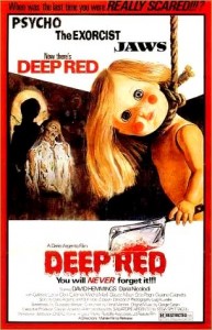
Deep Red a.k.a. Profondo Rosso (1975)
Directed by Dario Argento

Movie reviews usually begin with a summary of the plot. Which is a problem in this case, because the plot of Deep Red makes no fucking sense. It begins in Rome at a conference sponsored by the European Congress on Parapsychology. It may sound far-fetched, but it’s every bit as scientific as phrenology or evolutionary psychology. The marquee attraction is a German psychic named Helga Ulmann (Macha Meril) who entertains the crowd by reading their minds. But someone in the crowd is a murderer, and Helga stupidly announces this to the audience even though she fails to identify the killer. And so the killer tracks Helga home and chops her but good with a cleaver.


The first person to discover the body is English pianist Marcus Daly (David Hemmings). Marcus decides to solve the murder all on his own because he apparently has nothing better to do, and pianists are naturally gifted as criminal investigators (and since this is a giallo, the police are worse than useless). Marcus is helped by a reporter, Gianna (Daria Nicolodi), but is warned to drop the matter by his friend Carlo (Gabriele Lavia). Marcus enlists the aid of a parapsychologist, Dr. Giordani (Glauco Mauri), and uncovers a clue to the killer’s identity by reading a book on urban legends. The book conveniently (and implausibly) identifies a house once owned by the killer, which leads to several more fortuitous discoveries, eventually revealing that the killer is none other than Carlo’s crazy-ass mother, Martha (Clara Calamai). Back when Carlo was a little boy, Martha murdered her husband when he threatened to send her to an asylum. Martha tries to cover her tracks, first by killing Helga, then by stalking Marcus and killing everyone that he drags into his investigation, including the author of the urban legends book and Dr. Giordani.

If I were to judge the film on its merits as a mystery, it would be a failure. No amount of gore can cover up a preposterous plot and mediocre acting. And yet I liked this movie.

About two-thirds of the way into the story, Carlo attempts to kill Marcus so his mother’s actions will never come to light. Carlo even accuses Marcus of being responsible for all the deaths. If only he had minded his own business, no one except the psychic would have died. It sounds like the standard villain monologue, blame the hero for everything, etc., etc. … except everything Carlo says is true. Martha is crazy, but she only killed to hide her identity and cover up the earlier murder of her husband. Psychic Helga was doomed, but Martha killed the other victims only after Marcus got them involved with his amateur sleuthing. Is the viewer supposed to agree with Carlo and condemn Marcus? Not likely. Carlo suffers his own violent death just a few minutes later, which illustrates the primary appeal of the film. Marcus is an idiot, but he’s an idiot who moves the plot forward. And the plot provides a simple framework for the death scenes.


While the entire film is visually attractive, the death scenes are labors of love by Argento. They’re gratuitous, elaborately staged, and almost dream-like. When Dr. Giordani is killed, he isn’t just stabbed. There’s a robotic (?) puppet charging at him, and a shot from the killer’s POV as she grabs Giordani, and a close up of his mouth being jammed into several sharp corners, then a close up shot of the gleaming knife that tracks it’s motion, followed by the actual stabbing. And this mayhem is accompanied by a funky rock soundtrack courtesy of Goblin. Carlo’s death scene is even crazier. While escaping from the police he wanders into the street just as a garbage truck approaches. Any other director would simply have the truck hit Carlo, but Argento allows Carlo to barely evade being hit only to get caught by a hook that for reasons unknown is hanging from the back of the truck. So poor Carlo is dragged through the streets, and the truck makes every turn as sharply as possible so that Carlo will careen into the curb. His physical destruction is capped by a car running over his head.

The death scenes feel disconnected from the slow-paced mystery that contains them, as if a completely different movie takes over when the point-of-view shifts from Marcus to Martha.* But then Marcus is a drearily sane character who inhabits a sub-par crime thriller, while Martha is this delightfully insane monster who thinks she’s in a slasher film. Marcus lives in a world of clues and motives, Martha lives in a world where the violence is obsessive, unlimited, and always viewed from the best angle. Her blood is too red to be real, but who cares? It’s better than real.

Friday the 13th, Prom Night, Terror Train, Scream – countless slasher films have followed in Deep Red’s trail, combining the violence of grindhouse horror with the “whodunnit” mystery plot. And like Deep Red, most slasher films fail as mysteries. The first Friday the 13th, for example, resembles a giallo murder mystery, including shooting the murders from the killer’s POV to hide her identity. but the film doesn’t even introduce the villain until the final act, and since all the other characters (minus the heroine) are dead by that point, there’s no mystery as to who the killer is. Even the half-way clever Terror Train, which at least has a red herring or two, suffers in comparison to traditional mysteries such as Murder on the Orient Express.

It shouldn’t be impossible to produce a decent mystery that also happens to have gory deaths, but why would a mystery writer bother with extreme violence? It adds nothing to the plot and more than likely will become a distraction. And from a commercial perspective, it will almost certainly drive away a portion of the target audience. In contrast, slasher filmmakers lack the subtlety and restraint that mystery requires. The adolescent love of gore, a desire to scare the audience (or at least startle them), and an inexperience with the mystery genre collectively produce barely coherent plots that string together a few gruesome murders.

But in the hands of Argento, at least those murders will look good.

.

_________________________

* Carlo’s death scene is the one exception, because no other character is present to observe his demise.

Splashy: Drifting Roundtable

This is part of a roundtable on The Drifting Classroom, and also part of the October 2011 Horror Manga Movable Feast.
________________

I haven’t read enough of Drifting Classroom to write my Grand Unifying Theory of Kazuo Umezu. But what I’ve read I’ve liked, especially the art. Panels that are detailed but not cluttered, expressive characters, a layout that guides the narrative — it’s the type of solid, mainstream craftsmanship that’s all too rare on this side of the Pacific. The most memorable feature of Drifting Classroom‘s art (in the first volume at least) is the frequent use of splash pages.

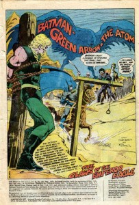
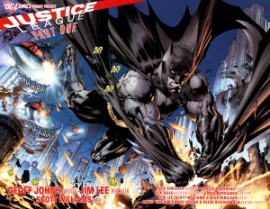
Splash images (whether taking up one or two pages) can serve many purposes. Using a splash as the first page of a comic is a common way to start things off with a bang (and a large image leaves plenty of empty space to squeeze in narration, credits, publishing information, and other corporate boilerplate).

Jim Aparo – Brave and the Bold #129

.

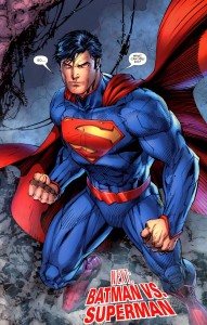
Jim Lee – Justice League #1 (2011)

.

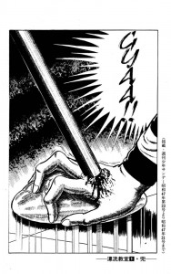
Ending a comic (or a chapter in a larger comic) with a splash is like teaser trailer – the big, flashy image leaves the reader wanting more.

Kazuo Umezu – Drifting Classroom

.

.

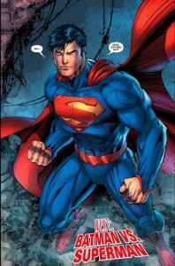
As for aesthetics, I far prefer Umezu to Jim Lee, but the above two images are similar in function. Full page splashes capture the readers’ attention and highlight an event that readers will presumably find interesting/exciting (an attack out of nowhere, or the first appearance of post-reboot Superman). And both images leave the readers in suspense, offering a payoff only if they buy the next installment. Who is crushing the girl’s hand and why?! Don’t you want to see Superman and Batman fight … AGAIN?! Of course, the notable difference is that the suspense in Drifting Classroom arises purely out of the narrative, while Justice League relies on the devotion of superhero fandom.

A splash image in the middle of a comic tends to arrest the narrative, panel to panel progression is put on hold so that the reader can appreciate the big picture (often both literally and metaphorically). There are several examples of this type of splash in Drifting Classroom.


 .

David Mazzucchelli – Asterios Polyp

.

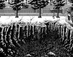
Who doesn’t like craters? These two images illustrate a point that might seem counterintuitive. In most comics, splash pages are “panoramic” images that fully capture some major object or event. But the above image by Umezu is close to the action, so close in fact that the reader can only see a portion of the hole left by the missing school. The enormity is implicit, and the the reader creates a massive crater in their mind using Umezu’s visual cues, such as the little boy (who provides a useful scale for size), the jagged edges, and the contrast between the black pit and the very white surface.

In Asterios Polyp, Mazzucchelli does something similar by cutting off the crater on the right, suggesting (or at least trying to suggest) that it goes on beyond the edge of the page. And he includes tiny people in the foreground to establish the sheer size of the crater. Yet, while Mazzucchelli is an undeniable talent, his crater seems less impressive that Umezo’s. This is because he’s unwilling to leave too much to the reader’s imagination. While part of the image is cut off, Mazzucchelli still draws nearly 75% of the crater. He wants to show AND imply the enormity, but cutting off the far right portion of the crater doesn’t imply much of anything. Rather it seems like Mazzucchelli just ran out of space when drawing his big hole.

Splash pages are also useful for establishing a place, not just in terms of scale or spatial relationships, but in mood.

.

….

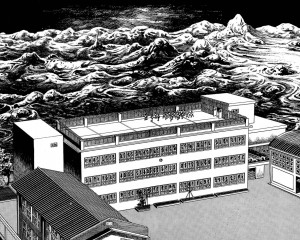
I particularly like the above splash by Umezo. The devastation beyond the school looks like an endless sea about to engulf and drown the tiny children. But the school itself is a bleak haven, the only distinguishing feature of the architecture is its complete lack of any distinguishing features. It seems like the children have only the options of sterile orderliness or complete annihilation.

Splash pages can also stop a narrative at a pivotal moment by encouraging readers to “soak in” a larger image rather than breeze through smaller panels. And the very size of the splash can signify importance.

.

….

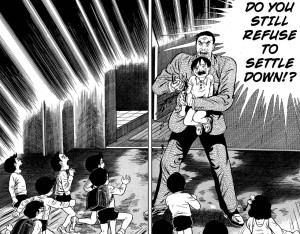
Prior to this scene, the story had not been violent, but then a teacher stabs a helpless child to scare the other children into behaving. It’s a shocking moment because the violence is so sudden, bloody, and arbitrary. The splash magnifies the emotional impact, and by freezing the plot in that moment, it forces the reader to consider the logic behind the teacher’s action. The school is order and safety, but that depends on a particular relationship between teachers and students. The school functions only when students respect authority, and that authority is based on brute force. On the other hand, the teachers are actually as clueless and desperate as the kids, so I’m curious to see where Umezo goes with this.

On a concluding note, comparing Umezo to American artists leaves me curious as to what artists like Aparo might have done had they worked on longer books. In an American comic (the old-fashioned “floppy”), more than one or two splash pages per issue is excessive, as the progression of the plot slows to a crawl. One advantage of the manga periodical format is the larger number of pages per volume allows for greater use of splashes without disrupting the overall pacing (in Drifting Classroom only a minority of the pages are splashes, but there are still close to a dozen in the first volume). And the same thing could be said of graphic novels in general. But given the current state of mainstream comics, a higher page count might simply mean more splashes of malapportioned Supermen glowering at the reader.

Annotated Justice

DC Comics has rebooted its line of superhero comics, beginning with its flagship title, Justice League. Written by Geoff Johns with pencils by Jim Lee, Justice League is supposed to be an entry point for readers unfamiliar with the DC Universe. That’s the theory. But DC Comics are not exactly known for being “new reader friendly.” And Geoff Johns is an acquired taste (one acquires that taste by reading superhero comics, and only superhero comics, for 40 years straight).

As a courtesy to newcomers, I offer this annotated guide to Justice League #1.

Cover

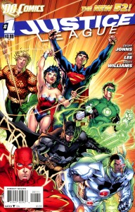
While the line-up of the Justice League has changed many times over the decades, the iconic team has always included DC’s most revered characters plus Aquaman. Starting at the top left and working clockwise, there’s Aquaman, Wonder Woman, Superman, Green Lantern, Cyborg, Batman, and the Flash. Batman is arguably the most famous, but Superman has a TV show (Smallville) and a movie in the works, Green Lantern recently appeared in a movie that most of you didn’t bother to see, Cyborg guest-starred in about two episodes of Smallville, and Wonder Woman almost had her own TV series.

Casual fans might notice that the costumes look a bit different from their classic appearances. Superman no longer wears underwear outside of his pants. Most of the men appear to be wearing armor instead of spandex. And Wonder Woman now has a choker, presumably because her bare neck was drawing attention away from her cleavage.

Page 2-3

This is a great example of Jim Lee’s artwork. It’s full of dynamic motion, though I’m not sure what that motion is. Is Batman using his cape as a makeshift parachute? Or is he running away on his knuckles? I say the latter, because Batman is just that damn tough.

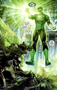
Batman is pursuing an alien monster while being pursued by the cops, and just when the alien seems to gain the upper hand, Batman is rescued by — Green Lantern.

Page 8 

As DC Comics helpfully reminds us, superheroes are modern myths overflowing with allegorical subtext. As this scene makes clear, Green Lantern is not just a guy with a flashlight in his chest. He’s also a metaphor for light, because lanterns provide light. And Batman is a metaphor for darkness, because bats like the dark. So they represent light and dark, the two sides of heroism (and humanity!). Green Lantern hits things in the light and Batman hits things in the dark. Green Lantern is like Zeus and Batman is like Hades. On second thought, Superman is Zeus and Green Lantern is Helios (Aquaman is Poseidon, that’s clearly a given). Or maybe Green Lantern is Jesus if Jesus were a space cop. And that would make Batman … um, let’s say Dark Jesus. The point is these characters are MODERN MYTHS.

Anyway, Batman and Green Lantern pursue the alien into the sewers, where Lantern gives Batman some grief about not having superpowers.

Page 14

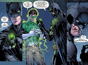
Batman more or less punks Green Lantern and takes his magic ring. Given that Green Lantern has the power to do anything or create anything he wants, some readers may wonder how the unpowered Batman humiliates him so easily. Two reasons: first, Green Lantern is an idiot. Second, while Batman may not have super-strength or magic, he has the greatest superpower of all, one that allows him to win any fight: popularity.

Page 15

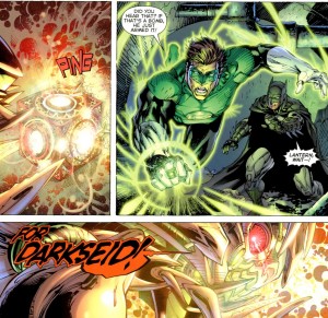
The alien screams “For Darkseid!” and blows itself up. Darkseid was, as every comic nerd knows, the main villain of the “Fourth World” saga, a collection of stories created by legendary comic artist Jack Kirby. Long story short, DC Comics kicked Kirby to the curb and mismanaged his creations for several decades. Darkseid’s last appearance before the reboot was in a recent story called Final Crisis. In the climactic battle, Batman shot Darkseid with a cosmic bullet and then Superman killed him with the power of song (the exact song was not specified, but it was probably soft adult contemporary). The scene was a dramatic celebration of creativity. Too bad actual creative people like Kirby don’t get as much love.

Page 21

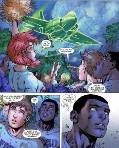
This is the introduction of Victor Stone, the teenager who will eventually become Cyborg. He’s half man, half machine, and all black. That last feature is useful for marketing purposes because the Justice League isn’t known for its diversity.

And interacting with minorities would be a good thing for Batman and Green Lantern, as they have a tendency to engage in racial profiling. They decide that Superman, being an alien, must somehow be involved with the alien monster, so they fly to Metropolis to interrogate him. And Superman, rational adult that he is, punches out Green Lantern and then challenges Batman.

Page 24

Next issue: Superman vs. Batman! Who will win? Superman has super-strength, super-speed, flight, invulnerability, freeze breath, and heat vision. That may sound impressive, but Batman is really, really popular.

Ten Types of Stupid


Stupidity Type I: The Thoughtless Consumer

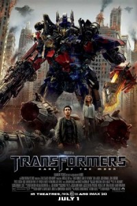
Last Saturday I purchased a ticket for Transformers 3: Dark Side of the Moon. I admit that I did this of my own free will, even though I knew the movie was about robots that turn into overpriced toys, and even though I was supporting the career of Michael Bay. I was bored, my friends were bored, and we had disposable income that must be spent.

.

Stupidity Type II: Jingoism

The Autobots (good Transformers) are apparently working for the U.S. government, which includes destroying an “illegal” nuclear weapon site in “The Middle East.” I’m fairly certain there’s more than one country in “The Middle East,” but the movie doesn’t specify which one. Nor does it specify under which law the nuclear site is “illegal,” but I’m going to assume its the Muslims Can’t Have Anything Unless We Say So Act (MCHAUWSSA). But all that really matters is that the Autobots blow up some uppity brown people, proving that they’re the good guys.

.

Stupidity Type III: Pathetic Male Fantasies

Shia LaBeouf returns as Sam Witwicky, who’s in a serious relationship with The Girl (I can’t remember the character’s name, and it doesn’t really matter). The Girl is insanely gorgeous, gainfully employed, and quite wealthy, given that she can afford a building (not just an apartment, an entire fucking building) in the heart of Washington, D.C. Sam is average-looking, unemployed, and spends the first hour of the movie constantly complaining that the world does not appreciate his awesomeness. Naturally, The Girl is crazy about Sam. She allows him to live rent free in her palace, props up his ego by getting herself captured (so he can rescue her), and she spends the entire movie reassuring him that he is, indeed, awesome, despite the overwhelming evidence to the contrary.

.

Stupidity Type IV: Infantile Nostalgia

Leonard Nimoy does the voice of Sentinel Prime. Or maybe it was Spock Prime, I can’t remember. More importantly, Nimoy also did a voice in the animated Transformers movie back in 1986. Do you know who else was in it? Robert Stack! And Judd Nelson! And Eric Idle! And Casey Kasem! And Orson Welles! And the soundtrack had a song by Weird Al’ Yankovic! That shit was cool. Oh, and one of the characters actually said “shit,” which was also cool. Best. Transformers movie. Ever.

.

Stupidity Type V: Homophobia

The last Transformers movie was racist. But mocking black people through jive-talking robots is no longer acceptable. It’s okay to mock gay people though, because queerness is funny. Like the scene where the crazy Chinese guy drops his pants and rubs up against Witwicky in the workplace bathroom, and then his boss (John Malkovitch!) walks in, and he thinks Witwicky is gay! It’s funny because Witwicky is a supermodel-dating straight dude. And there’s the character named Dutch (played by Alan Tudyk, for all you Browncoats), who’s the very exemplar of the mincing queer stereotype. The movie doesn’t overtly acknowledge that he’s gay though, because that would make people uncomfortable.

.

Stupidity Type VI: Enthusiasm for Mass Destruction

I’m glad that Chicago got fucked up. Every alien invasion movie takes place in either New York or Washington. America has plenty of great cities, and they deserve to be devastated too.

.

Stupidity Type VII: Music Videos

Michael Bay began his career doing music videos, which is where he learned that no shot should last more than three seconds. Who needs pacing or spatial relationships when you have rapid-fire editing to remind you that every scene is just as exciting as the last one? One hour into this extended music video and I started to feel dizzy. Another hour in and my eyes felt like they were popping out of my skull. And there was still another half hour to go. By the end of the movie my brain was leaking out my ears but at least it no longer hurt.

.

Stupidity Type VIII: Bill O’Reilly

Bill O’Reilly has a cameo.

.

Stupidity Type IX: Anthropocentrism

In a movie called Transformers, you would think that the big climax would involve the titular Transformers. But actually, the big climax is a fight between Witwicky and McDreamy (a.k.a. Patrick Dempsey). Someone thought that the audience actually wanted to see that rather than more scenes of giant robots smashing Chicago. I find that doubtful, but maybe people hate Grey’s Anatomy so much they want to see McDreamy beaten up by the crappy lead character? I’ve never watched Grey’s Anatomy so I can’t say I hate it, but I do hate the nickname McDreamy. The point is humans always have to be the center of the story, even when they all suck.

.

Stupidity Type X: It’s Not Evil When Good Guys Do It

At the end of the film, Optimus Prime kills Spock Prime. And it isn’t “heat of battle” killing. It’s “busting a cap in Spock’s head while he’s injured and begging for mercy” killing. But it’s okay, because Optimus is the good guy. And after 157 minutes of mind-numbing idiocy, would it really be appropriate to include an ending with taste, decency, and a modicum of intelligence? This was the only way Transformers 3 could end and remain true to its principles.

Snap Judgments: Five DC Reboots

The comics blogosphere can’t stop talking about the DC Comics reboot in September. Some bloggers are cheering. Others are jeering. But anyone can offer a general impression. A true comics blogger explains why something sucks, and then explains how everything would be better if said blogger was in charge.

.

Action Comics #1
Written by Grant Morrison
Art by Rags Morales and Rick Bryant

Pros
Grant Morrison has written great superhero comics.
And lots of people seem to really like Morrison’s All-Star Superman.

Cons
The unbearable Modern Myth/Super Jesus/Underwear Messiah garbage.
And All-Star Superman was incredibly overrated.

Odds That It Will Suck
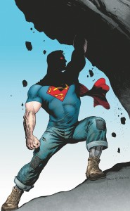
High. In his 70+ year history, Superman has starred in about 5 good comics. The rest are about why the world “needs” Superman and his crappy merchandise.

How I Would Make It Better
Superman is an escapist fantasy about male potency, which is why Action Comics should be an adult comic. Every issue should be 22 pages of hardcore sex where Superman fucks his way through Lois, Lana, Lex, Jimmy Olsen, Martha Kent, Krypto, and consequently saves the world. Superman isn’t Jesus Christ. He’s Ron Jeremy-meets-Arnold Schwarzenegger.

.

Wonder Woman #1
Written by Brian Azzarello
Art by Cliff Chiang

Pros
Azzarello has written some good (crime) comics.
I like Cliff Chiang’s artwork, if for no other reason than it doesn’t look like everyone else’s artwork.
The new costume is a slight improvement over the last new costume.

Cons
Azzarello has written some terrible (superhero) comics.

Odds That It Will Suck
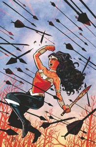
Super high. When it comes to crappy comics, Wonder Woman has an even worse track record than Superman. Nobody at DC knows what to do with this character.

How I Would Make It Better
I’m tempted to just write “make it porn” for each these. But in all seriousness, the only way that Wonder Woman would ever be good again is if William Marston came back from the grave. The next best alternative would be to find a writer who has a similar personality to Marston: feminist, polygamist, BDSM enthusiast, lesbian fetishist, furry, all-around pervert and political visionary, etc.

.

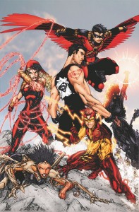
Teen Titans #1
Written by Scott Lobdell
Art by Brett Booth and Norm Rapmund

Pros
Lobdell has experience writing teen superheros, going back to Generation X.

Cons
Generation X was actually kinda boring.
Superboy is not and will never be badass, no matter how many ‘tats he has.

Odds That It Will Suck
Very high. Teen Titans was tolerable for about 3 years in the early 1980s. Everything before and after was a miserable failure.

How I Would Make It Better
The core problem with Teen Titans is that it’s never been about teenagers, but rather what adult writers want teenagers to be. Superboy, Robin, Wonder Girl, Kid Flash – these kids revere their elders and try to emulate them. Fuck that noise. Adults don’t deserve reverence. Plus, teenagers don’t want to read about obedient, law-abiding teens, and adults reliving their youth don’t want to read about obedient, law-abiding teens. They both want sex, drugs, and rock n’ roll (or substitute in hip hop). The Titans shouldn’t be fighting crime, they should be fighting for the right to party, and generally reminding adults how much they suck.

.

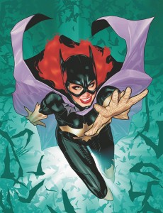
Batgirl #1
Written by Gail Simone
Art by Ardian Syaf and Vicente Cifuentes (cover by Adam Hughes)

Pros
Having a writer with an actual sense of humor never hurts.

Cons
Barbara Gordon can now walk again, which means DC eliminated one of the tiny handful of disabled heroes.
That Adam Hughes cover freaks me out. She keeps smiling at me with her cold, dead eyes…

Odds That It Will Suck
Medium. Batgirl is a fairly straightforward character who stars in straightforward adventures. No history of greatness, but no history of terribleness either.

How I Would Make It Better
Comics starring solo heroes often tend to be a dreary reads because the protagonist rarely has anyone to interact with. This leads to page after page of mind-numbing narration just so the writer can justify their wage. This book needs a big supporting cast, preferably other superheroines who accompany Batgirl on her adventures. So it would essentially be Birds of Prey with Batgirl. And like Birds of Prey, there should be plenty of lesbian subtext, because lesbian subtext improves everything.

.

Swamp Thing #1
Written by Scott Snyder
Art by Yanick Paquette

Pros
I’m drawing a blank here…

Cons
Mediocre writer, mediocre artist, a character who is ill-served by being dragged back into mainstream superhero comics.

Odds That It Will Suck
Certainty. Alan Moore is a tough act to follow. And outside of Moore’s run, Swamp Thing doesn’t have a rich history to draw from.

How I Would Make It Better
Well, I probably wouldn’t make it at all. But if I had to, I’d shamelessly rip off the best parts of Moore’s run. At minimum, the comic should have purple prose, leftist politics, and psychedelic yam sex.

X-Men: First Class Grades on a Curve

X-Men: First Class
Directed by Matthew Vaughn
Starring…
James McAvoy (Prof. Charles Xavier)
Michael Fassbender (Magneto)
Kevin Bacon (Sebastian Shaw)
January Jones (Emma Frost)
Rose Byrne (Moira MacTaggert)
Jennifer Lawrence (Mystique)

[Spoilers ahead, you have been warned]

Another weekend, another superhero movie. No magic hammers or wishing rings in this one. Instead, there are mutants, Soviets, and Kevin Bacon. The story is a jumble of three loosely related plots: the origin story of Prof. Xavier and the X-Men, the efforts by Xavier and company to foil Sebastian Shaw’s genocidal plans, and (by far the best storyline) Magneto’s quest for vengeance against Shaw (a Nazi collaborator). All that, plus a sexist homage to the Forgetfulness Kiss from Superman 2.

I’ll note that X-Men: First Class (XMFC) was better than Thor, though that’s setting the bar fairly low. And it was better than X-men Last Stand, though that’s setting the bar so low one has to be careful not to trip over it. Thor had a tedious moral about humility, but at the end of the day the movie was about nothing more complicated than Chris Hemsworth’s abs. XMFC is a movie that wants to express an opinion on important topics, including vengeance, intolerance, and minority rights. Like the comic it was based on, XMFC explores these topics through metaphor, but the results leave much to be desired.

Since it’s introduction, the X-Men comic has relied upon metaphor to imbue the concept of mutants with social relevance. In the early 60’s, the X-Men were a metaphor for the civil rights movement. Mutants were “hated and feared” by the rest of the world, but the X-Men fought to protect humanity and demonstrate that mutants could be loyal, tax-paying citizens. Mutants were black people … except that all the mutants were white. The comic celebrated tolerance, equality, and the loftier goals of the civil rights movement, but without ever acknowledging the movement’s existence. I’ll revisit this problem below.

Over the course of the 80’s and 90’s, the mutant metaphor shifted from race to queerness (this change was most evident in the Legacy Virus storyline, an HIV-like disease that only targeted mutants). The change may have been driven in part by a genuine commitment to LGBT rights, even at a time when public hostility to queerness was overt and widespread. But the shift was also necessitated by the success of the civil rights movement. In popular media, black characters were no longer relegated to the role of servant or comic relief. Even in the backwoods that is superhero comics, black heroes were becoming more numerous and prominent. The most prominent of all was the X-Men’s Storm, who led the team for nearly a decade. In a world with black heroes, addressing race issues primarily through metaphor is difficult to justify.*

The X-Men have always been a metaphor for teen alienation. While all teenagers occasionally feel hated or oppressed, most comic readers are nerds (also, geeks, dweebs, and dorks) who feel especially awkward and unappreciated. So what better escapist fantasy than a world where all the misfits have superpowers that they use to save the world? Plus, they get to hang out with their fellow (improbably attractive) misfits at a posh school called Hogwarts Xavier’s School for Gifted Youngsters. The makers of XMFC clearly understood the teen alienation metaphor, which was why all the mutants bitched and moaned about being freaks and outcasts. Then they went to the School for Gifted Youngsters, and they suddenly realized that they’re young, beautiful, and have awesome superpowers.

Yet for a film that’s set in the 60’s, there were surprisingly few references to the civil rights movement. Perhaps acknowledging the African American struggle for equal rights would raise too many questions, such as how would the emergence of a superhuman race affect relations between normal blacks and whites? Would race relations improve when faced with a common evolutionary threat? Or would ancient prejudices persist even within the mutant community? These are interesting questions to explore, but that would require a very different kind of movie (one where fewer things blow up).**

While it largely ignores race, XMFC takes full advantage of the queerness metaphor. Because mutants are hated and feared, they must find ways to blend in with the “norms,” though they do so only by denying who they truly are. Mystique’s character arc is largely an “out and proud” storyline. As a shapeshifter, she can easily blend in, but only by constantly hiding her natural, blue form. By the end of the film, she’s embraced her gorgeous blue self. There’s also a moment where Prof. Xavier accidentally “outs” another mutant who works for the CIA, which leads to a humorous dig at “Don’t Ask, Don’t Tell.” And there’s an obvious overlap of the queerness metaphor with the teen metaphor. After all, what subset of teens feels more hated and misunderstood than those struggling with their sexual identity?

But metaphor only goes so far. As I mentioned above, the X-Men comic largely abandoned the civil rights metaphor as broader cultural attitudes changed and black characters entered the mainstream. Similarly, attitudes regarding the LGBT community have changed enormously over the past few decades. “Don’t Ask, Don’t Tell” will (probably, eventually, hopefully?) be repealed, and a majority of Americans now support gay marriage. So instead of veiled references to queerness, why not include an actual queer character in the ensemble cast? Hell, the film could have gone the safe route by including a lipstick lesbian. Not exactly freaking out the norms, but it’s better than nothing. I’ll also point out that  filmmakers can’t fall back on the excuse that the source material gives them nothing to work with. There are at least a handful of queer X-Men that I can name off the top of my head. Why not use Northstar? He’s gay … and Canadian! Who doesn’t like Canadians? But just as blacks were nonexistent in the early X-Men comics, so queers are nonexistent in XMFC. In all likelihood queer characters were excluded because of the fear that a sizable minority of consumers would refuse to see a movie that promoted “alternative lifestyles.” So the (presumably liberal) filmmakers expressed their support for LGBT rights, but only in a way that wouldn’t hurt profits. Using the mutant-as-queer metaphor seems less a subversive or daring act than a cowardly one.

X-Men: First Class reveals the limits of political expression in the current crop of big, summer blockbusters. Movies can toy with political views, but even the least controversial opinions must be expressed in a vague or indirect manner. It’s far safer, and more profitable, to pretend that you have no opinion at all.


________________________

* There are thoughtful ways to use the mutant-as-minority race metaphor in the 21st century, and Grant Morrison did so during his X-Men run. But it requires an intelligent writer with an appreciation for how racial identity and race relations have evolved since the 60s.

** Even if the metaphor was present, it’s hard to overlook that, of the two mutants of color, one gets killed and the other goes evil. Celebrating racial equality in the abstract doesn’t mean much when characters of color are still thrown under the bus.

Thor: God of Thunder … God of Lightning!

Thor
Directed by Kenneth Branagh
Starring:
Chris Hemsworth (Thor)
Natalie Portman (Jane Foster)
Tom Hiddleston (Loki)
Anthony Hopkins (Odin)
Kat Dennings (Darcy)
Stellan Skarsgard (Erik Selvig)
Jaimie Alexander (Sif)
Rene Russo (Frigga)

Thor has always been the odd-man-out in the Marvel Universe. He was, quite obviously, inspired by Norse mythology, but most of his fellow superheroes originated in shitty sci-fi stories. Iron Man is a guy in a robotic suit, Spider-Man was bitten by a radioactive spider, the Fantastic Four were exposed to cosmic radiation, the X-Men are the next step in human evolution, etc. These sci-fi characters are more fantasy than science, but they’re rooted in a set of genre conventions that American nerds, long accustomed to questionable science in their fiction, accept without notice. But Norse mythology is this weird, funky thing over in the corner. It’s magical, and pagan, and rooted in a dead religion. And to make matters worse, the Norse gods don’t have the name recognition of their Greco-Roman counterparts. In a movie season already saturated with nerd bait, how would Marvel sell such an unusual character?

Marvel Studios and director Kenneth Branagh (a.k.a. that Shakespeare guy) never answer the above question, possibly because they never decided what kind of film they wanted to make. It’s one part high fantasy, one part parody of high fantasy, one part standard superhero film, and one part infomercial for upcoming superhero films. Mix it all together and you get a concoction that isn’t terrible, but it’s never as good as it could be.

First, the good. Thor has an actual sense of humor about itself. This title character does not brood atop rooftops while contemplating the delicate balance between civil liberties and costumed law enforcement. Thor prefers to hit things with his hammer, exclaims how awesome he is, and flirt with Natalie Portman (which seems a pretty sensible way to go through life if you’re a Norse god). And the film freely acknowledges the absurdity of space gods. The special effects look expensive but fake, and the armor and weapons look like toys. But that’s not a flaw, it’s a feature. After all, what the hell are Norse, techno-magical weapons supposed to look like? This is superhero-space god fantasy, not archaeology. Thor is shiny, plastic adventuring in the tradition of Flash Gordon. If only Branagh could have gotten Queen to do the soundtrack …

And the film isn’t exclusive about boys and their toys. There is plenty of action and several gorgeous women to gaze at, but the the filmmakers also threw in some light comedy and a genuinely sweet romance. And there is a gratuitous shirtless Thor scene that elicited several coos and whistles from the female half of the audience I was in.

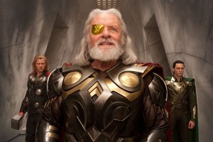
Now, the bad. While Thor is goofy, it’s never as goofy as it could and should be. Why is Anthony Hopkins required to play such a somber Odin? There are a handful of glorious moments when Hopkins gets to chew the scenery, but the script demands that Odin be the voice of reason. Too bad, because a reasonable patriarch is a boring turd. Plus, while Asgard is garish and weird, it’s never used in an imaginative way. There are no surreal moments or logic-defying architecture. Despite being a fantasy setting, Asgard seems rooted in a tedious realism. But that’s because Thor is still a mainstream action movie, and it has to adhere to the expectations of a mainstream audience. That means action, hero learns a valuable lesson, hero gets the girl, some more action, the end.

The film is also chock full of references to previous and future Marvel films. SHIELD Agent Coulson (Clark Gregg) from Iron Man has a prominent supporting role. And there are brief cameos by Hawkeye and Nick Fury, plus set-up for the upcoming Avengers film. In themselves, these glorified shout-outs do not ruin Thor … until the moment when they become the point of the film. That moment comes during the film’s climax, when the main conflict ends on an anti-climactic note because certain plots must be left unresolved until the next Marvel installment.

So that’s Thor. An entertaining, silly, uneven mess. For all its flaws, I enjoyed it far more than I thought I would.