Anything but Capes: Crime Time

So many crime comics, so little time. Vertigo alone must publishes half a dozen pulp crime monthlies, and that doesn’t even include the Vertigo Crime imprint. I already reviewed one of the Vertigo Crime graphic novels here, so I’ll limit this post to monthly titles.

Reviews

Choker #1
Writer: Ben McCool (that can’t possibly be his real name)
Artist: Ben Templesmith
Publisher: Image Comics

Crime and horror are an unlikely pairing. They may share an appreciation for violence and brooding scenery, but the primary appeal of the genres are at odds. Crime stories are generally empowerment fantasies, whether the focus is on the criminal (empowerment against authority) or the detective (empowerment in service to authority). Horror is more about powerlessness, and the thrills and scares that come from being vicariously helpless. These are two genres that just don’t mix well. (Now, some of you will argue, “What about Seven? That had detectives and it was scary up until the moment the killer was revealed to be Kevin Spacey.” But Seven wasn’t really a crime story, because the detective scenes with Brad Pitt and Morgan Freeman were not critical to the film’s appeal. They just filled in time between the big gross-out moments). All of this is a roundabout way of explaining why Choker is not a good comic.

Set in the future, the plot follows a lowly private detective named Johnny Jackson. Formerly a cop, he’s given an opportunity to get his old job back if he can capture a drug dealer. About as basic a crime plot as they come, but the story quickly veers towards horror because the drug in question transforms its users into something akin to vampires.

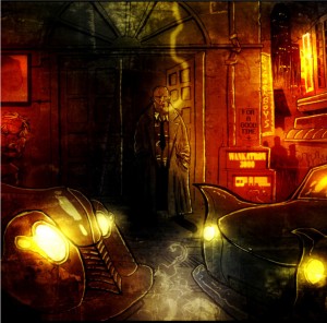
The horror factor is also emphasized by the artwork. Ben Templesmith is best known for his work on several popular horror comics, particularly 30 Days of Night. His art in Choker looks very similar: distorted bodies, the heavy use of black, grimy backgrounds. Though in Choker, he also uses lurid red and orange coloring to highlight the corruption and decadence of the future.

It looks very cool, but the flashy art can’t hide the fact that the comic doesn’t function well as either horror or crime. The horror aspect is undermined by the concepts inherent in a crime story. For example, by focusing the plot on the hard-boiled detective, McCool deflates any anxiety that the reader might have, because we all know that the chain-smoking tough guy isn’t going to die. At the same time, the crime story is diminished by the comic’s awkward attempts at being scary. The vampires in the story are meant to be creepy, but they’re really just super-powered junkies. It’s impossible to take the central conflict seriously. The book has a lot of ideas, but they remain incoherent and poorly executed.

Criminal – The Sinners #1
Writer: Ed Brubaker
Artist: Sean Phillips
Colorist: Val Staples
Publisher: Icon (Marvel)

Criminal is one of the least innovative comics being produced by any mainstream publisher. Ed Brubaker writes stereotypical crime stories: square-jawed protagonists, femme fatales, and endless monologues. Sean Phillips and Val Staples illustrate the comic in the most predictable manner possible: dark colors, thick black lines, a general impression of an overbearing world. We’ve seen this all before.

The plot of this issue is also familiar. Tracy Lawless (a character from an earlier story arc) is stuck working as a hitman for a mob kingpin. He’s offered a chance to walk away, but only if he can figure out who’s murdering the mobster’s lieutenants. It’s a typical anti-hero plot, with the obligatory sub-plot involving the mobster’s sexy wife.

Brubaker and company aren’t doing anything new or original – and that’s okay. So what if they don’t re-invent the wheel? Wheels already do exactly what they’re supposed to do. I suppose I should laud innovation, but to be perfectly honest I’m only interested in innovation when it produces a great story. If creators tell a great story by inventing an entirely new genre of entertainment, then I’m happy. If creators tell a great story by relying on familiar tropes from a well-worn genre, then I’m happy.

Brubaker may not be an innovator, but he’s a reliable craftsman. The characters are all archetypes, but they’re enjoyable archetypes that fit perfectly into the world that Brubaker and Phillips have created. The plot is predictable, but it plods along with the implicit assurance that the payoff will be worth the wait. And while Phillips isn’t a daring artist, his pencils and inks effectively conveys both story and tone.

Criminal is nothing more and nothing less than the work of professionals who are doing exactly what they want to do.

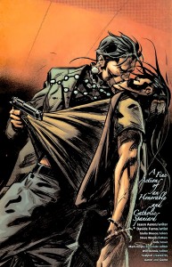
Scalped #36
Writer: Jason Aaron
Artist: Davide Furno
Colorist: Giulia Brusco
Publisher: Vertigo (DC)

I’m not a regular reader of Scalped, but from what I’ve seen of the series I’m pretty sure it’s about Native American gangsters who run a casino. I think I read a review that described it as Sorpranos on an Indian reservation (hopefully without the pretentious dream sequences), or maybe it was Goodfellas on a reservation. But since it involves a casino, perhaps it should be Casino on a reservation. Scalped readers need to help me out here. What is the proper analogy? And is there an Indian Joe Pesci?

The first thing that came to mind as I read this issue: Scalped is a remarkably exploitative comic. A team of white creators produced a story about violent, lusty ethnic minorities who kill and fuck each other for the amusement of the predominantly white audience. And they even throw throw in a nod to Indian spirituality (one character actually narrates from beyond the grave). I suppose I should find all this offensive, but I’m actually impressed that Vertigo published a comic about Indians that didn’t involve Jonah Hex shooting them.

And once you get past the Indian-sploitation, it isn’t half bad. It has all the elements readers would expect from a gangster comic: sleazy casino owners, brutal violence, macho men. And there are a few things readers wouldn’t expect, such as the fact that the macho men enjoy gay sex.

The art is okay, in the way that art in Vertigo comics is always “kind of,” “sort of” okay. Davide Furno deserves some small praise for his character design, because at least Native Americans don’t look like white people with tans. But the art isn’t memorable in any way, which is the harshest thing I can say about it.

So this is a comic about gay, Native American gangsters, and (lackluster art aside) it truly is the best damn comic about gay, Native American gangsters that I’ve ever read.

_____________

State of the Genre: For a genre that was once almost completely absorbed by superheroes, crime has made a massive comeback. In itself, the success of the crime genre is hardly surprising. Stories of crooks and heists and square-jawed detectives have remained popular in every other media for decades.  What is surprising is just how long it took for crime to recover as a prominent genre of American comics. Blame Wertham, the Comics Code, superhero fanboys, etc., etc.

But over the last couple decades the comics market has evolved to the point where it can sustain a significant number of crime comics. And given the size of the genre, it deserves an extra post, which is why I’ll be reviewing Peter Milligan’s Bronx Kill next week.

Muck Encrusted Mockery of a Roundtable: Swamp Fear

(Part 1 of the Swamp Thing roundtable can be found here and Part 2 can be found here).

In addition to being part 3 of the Swamp Thing roundtable, this post is also a follow-up to last week’s post where I questioned whether comics could ever be scary.

To recap, I asserted that horror comics could never incite the intense, visceral fear that horror movies so easily manage. Horror comics would be better off if they had more in common with horror novels, which generally have slow-burn stories that exploit common fears and social anxieties. There were a lot of great comments to the post, and I want to go through a couple of them before I get to Alan Moore’s Swamp Thing.

While I argued that the static nature of the comic page undermined any attempt at being scary, Michael DaForge offered a different take:

“Comics can use their “static-ness” to their advantage, I think.
I’m jumpy and easily manipulated by music or loud noises in
a movie. In Anti Christ, the genital mutilation startled me (or
grossed me out or whatever it was supposed to do?) But it didn’t
stay with me the way the scene with the stillborn fawn did from
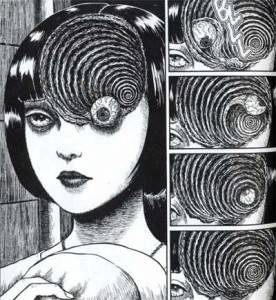
earlier in the film. Or this sequence did from Uzumaki:

… [W]hen it’s 5 am and I’m having a hard time getting to sleep,
I’ll remember stuff like that.”

That’s a good counterpoint, and Uzumaki demonstrates why having the right kind of art is essential for a horror comic. Unfortunately, the art in most mainstream horror comics is simply too indifferent to tone and mood to instill any feelings of fear in the reader.

Aaron Ber commented later that there should be a distinction between “creepy” and “actual fear”. He went on to say:

“Not to keep making this a comics vs. film thing, but horror is one
of the most demonstrable ways I can think of to show how effecting
film can be. People experiencing fear in a film can have physical
reactions on an involuntary level, as if their safety is actually being
threatened. I just don’t think comics can work that directly – to the
point where on some level you are no longer conscious of the fact
that what you are experiencing isn’t actually happening to you.”

I think Aaron Ber is right to the extent we’re discussing heart-racing, hands-over-your-eyes scary. Comics will never be able to provoke that kind of reaction from the reader. However, I don’t think there’s an clear distinction between what people find creepy and what they “actually” fear. Fear encompasses a broad range of emotional responses: sometimes it’s an immediate physical reaction, as when something startles you, but other times it can be a lingering sense of unease or a recurrent anxiety. A comic with a creepy story and disturbing imagery can potentially stay with the reader longer than a movie about a chainsaw-wielding psycho. So perhaps comics can’t be “scary” as the term is commonly understood, but creepy is a good alternative.

And now I’ll finally start discussing the actual topic of this roundtable. Not every issue of Swamp Thing is a gem. Not every issue is creepy (nor were they all intended to be). But Alan Moore could write an unsettling story when he wanted to, and he collaborated with a team of fantastic artists, particularly Stephen Bissette and John Totleben. And one of the best stories during their run on Swamp Thing also happened to be one of the creepiest.

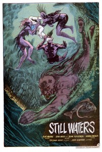
The vampire storyline in issues 38 and 39 was part of a larger arc where Swamp Thing had to run errands for John Constantine (of Hellblazer fame). One such errand took Swamp Thing to Rosewood, Illinois, an entire town submerged beneath a lake. And the only residents of this underwater hamlet were vampires. In Alan Moore lore, running water is lethal to vamps, but the stagnant water of the lake provided the perfect environment to avoid the sun while still hunting dumb teenagers who went for a swim.

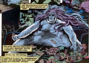
It’s a simple, pulp monster story, but Moore was absolutely committed to making it as creepy as possible. He accomplished this partly through some plot details that were equal parts eerie and gross. The one that immediately springs to mind is the morbidly obese vampire bride.

There’s just something so repulsive about a fat monster that spends her day wallowing in the filth of an abandoned movie theater.

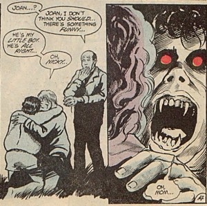
Another way to make a monster story creepy is to be as ruthless as possible. In other words, anyone can die in any number of awful ways. But in an ongoing series like Swamp Thing, it’s nearly impossible to convince readers that the titular character is in any real danger. Moore wisely evaded this problem by introducing lots of supporting characters that could be offed in short order. He had no reservations about killing a teenage boy at the beginning of the story. And it only got worse from there, especially when the undead boy was reunited with his mother.

While Moore may be a great pulp writer, in the hands of a different art team his script would have come across as a nothing more than cheesy monster plot with overripe narration. As the above panels make clear, the unsung heroes behind Swamp Thing‘s success are Bissette and Totleben. Along with Stan Woch in issue 38, they gave the comic a brooding tone with their heavy use of hatching and black space. And the colorist, Tatjana Wood, enhanced Bissette’s and Totleben’s work with murky greens and blues for the underwater scenes.

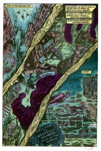
The above page is a great example of how their work set the mood of the comic. Plot-wise, this page is nothing more than the vampires descending into their hidden city, but the depiction of the city is terrific. Readers can recognize the details of any American street, but those details are only partially drawn or deliberately obscured by hatching as well as black and near-black colors. It’s an ugly, lurid mockery of a small town, where light from the surface can only barely penetrate the foul water. And the dead fish designs in the gutters add to the sense of muck and decay. It’s easy to see why young readers in the 80’s found Swamp Thing so affecting.

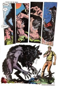
Even when Moore’s scripts aren’t very good, Bissette and Totleben are there to elevate the material. Suat and Noah beat me to the punch with their debate over issue 40, a.k.a. the PMSing-werewolf issue. It’s easily one of the silliest issues in Moore’s run, but it has one of the nastiest werewolf transformations that I’ve ever seen in any media.

To borrow a point from Michael DaForge, the static nature of comics, along with the ability of readers to linger on each panel, actually makes the scene much more effective than a similar transformation in a movie. The intensity and horror of the moment are emphasized by the stillness of each image. And I agree with Noah that Bissette and Totleben draw a great-looking werewolf.

Swamp Thing is never scary in the way a great horror movie is scary, but it doesn’t need to be. Instead, Moore, Bissette, and Totelben created a few short stories with creepy plots and nightmarish imagery. And those stories were, at least for me, far more memorable and affecting than the last few zombie/slasher/haunted house movies that I’ve seen.

______________
Update by Noah: The whole Swamp Thing roundtable is here.

Can Comics Be Scary?

Eric B. doesn’t think so. In response to my post on contemporary horror comics, he wrote:

“How’s this for a random unsubstantiated claim:

I don’t think comics can be scary, period. Too small…
too quiet…too temporally static. Never been scared
by any horror comic I’ve read…not a one. Yet…I
can’t watch horror movies–predictable or not–too scary.”

After thinking over the horror comics that I’ve read, I’m forced to agree with him. Even when I enjoyed a horror comic, such as The Walking Dead or some of the earlier Hellblazer comics, I didn’t find them particularly scary.

There’s certainly no way that comics can be scary in the same way that movies are scary. Comics can’t use mysterious noises or creepy music (textual representation of sound is a poor substitute). Also, since movie-goers instinctively understand that the world of the film extends beyond the view of the camera,  horror films routinely have their monsters lurk just outside the frame. And they can startle the audience by having the monster (or a fake-scare cat) pop out from outside the camera’s view. In comics, establishing clear spatial relationships from one panel to the next is difficult enough without also having to imply that there’s something lurking off-panel. And the “temporally static” nature of comics makes it impossible to startle readers with anything popping out.

But the greatest advantage that horror movies have over comics has less to due with the technical differences between the media, and more to do with how the average person watches a movie. Over the decades, Hollywood and the theater chains trained audiences to watch movies in a certain way: you turn out the lights, ignore everyone else in the room, and stop thinking. Movie-goers become completely immersed in the narrative, and horror films exploit this immersion like no other genre. As an example, when the soon-to-be victim wanders through a dark hall to investigate a strange sound, the camera forces the viewer to follow the victim and vicariously experience everything they see and hear.

Comics simply can’t offer the same degree of narrative immersion. For starters, reading comics with the lights off is rather difficult. Also,  immersion requires a passive mind, and comic readers can never turn their brains completely off. Even the most moronic superhero title still requires some active thought in order to read the text and interpret the narrative flow between panels. None of this is meant to say that comics can’t be engrossing page-turners, but comic readers generally don’t lose track of reality to the same degree that movie-goers do.

So does this mean that comics can never be scary? To the extent that “scary” refers to the visceral, immediate fears that horror movies deliver so effortlessly, the answer is yes. But if “scary” also encompasses the deeply-rooted fears and common anxieties of the readers, then perhaps there is some hope for horror comics.

Novels have many of the same technical limitations as comics, and yet there is a long literary tradition of horror dating back to Frankenstein, and horror writers such as Stephen King continue to enjoy great success. Obviously, a medium consisting entirely of text could never scare readers with startling noises or monsters jumping out of closets. So novelists tend to downplay immediate physical terror and focus on social fears and unnerving concepts, particularly of a religious or existential nature. Frankenstein reflected the major anxieties of the Romantic era, particularly the fear of a godless mankind. H.P. Lovecraft scared his readers by envisioning a universe that was essentially hostile. Most ghost stories exploit the fear of death and the the unknowable nature of the afterlife. There’s no reason why comics couldn’t tap into similar social or religious anxieties (and it’s worth noting that the best horror films already do so).

But horror comics have largely failed to measure up to the standards of horror novels. The earliest horror comics like Tales from the Crypt were designed to offer nothing more than the cheapest and shallowest entertainment. Plus, individual comic issues were simply too short to contain a plot with any complexity. And it was always easier to just add more gore than to write a gripping story. The visual element of comics may have also convinced comic creators that their medium had more in common with film than with literature, leading to futile efforts to re-create the thrills of horror movies on the static page.

Comics have the potential to be scary, but it’s a potential that remains unrealized. There is, however, the possibility that my knowledge of horror comics is too limited, so I’ll pose a question to the commenters: have you ever read a scary comic?

Girls are welcome too … if they have money

Fact 1: there are women working in the comics industry!

Fact 2: no matter how successful these women are, Marvel will always refer to them as girls.

Girl Comics #1 (of 3)

Girl Comics is the latest anthology mini-series published by Marvel. The last one, Strange Tales, was a collection of short stories produced by independent creators and featuring Marvel characters. This time around, the gimmick is that everyone (writer, artist, letterer, and editor) involved in the comic’s production is a woman. At first glance, this seems to be a clever move indicating that Marvel is no longer a (fan) boy’s club. Though I can’t resist noting that the bosses of all these women, including the editor-in-chief and the publisher, are men. And I’m not sure assigning all these women to a niche market anthology series qualifies as a great step forward in gender equality. But everyone starts with baby steps. Maybe in a few more years, Marvel will let a girl write X-Men.

I’d also point out that Girl Comics is part of a broader effort by Marvel to attract female readers. 2010 is supposed to be the year of Marvel Women (they have their own calendar), and several new female-focused series are debuting over the next few months, such as Heralds, Black Widow, and the horrendously named Her-oes. What are potential female readers supposed to make of all this? Honestly, I’m not sure. If they’re not already Marvel fans, I doubt women are going to start flocking to comic shops to buy Girl Comics just because it has half a dozen female pencilers. And they’re definitely not going to buy Her-oes, regardless of how loudly Marvel hypes its C-list heroines.

But I’ll stop being such a downer, because the content in Girl Comics is halfway decent. In my review of Strange Tales, I complained that the shortness of each tale (about 4 pages max) left little room for storytelling. As a result, most the entries were just one-note joke strips ranging from awful to mildly amusing. The average length of a story in Girl Comics is about 7 pages, which doesn’t sound like a huge increase, but it actually does make a difference. The stories are still brief, but they contain actual plots. In between the main stories there are shorter gag strips as in Strange Tales, as well as double-page biographies of women who’ve worked for Marvel over the years (including Stan Lee’s secretary!).

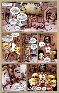
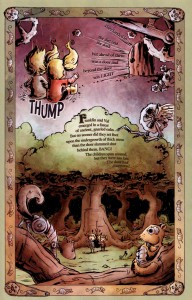
As with most anthologies, the quality of  each story varies. Easily the best of the bunch is “Clockwork Nightmare,” by Robin Furth and Agnes Garbowska. The story is an homage to both “Alice in Wonderland” and “Hansel and Gretel,” with Franklin and Valeria Richards (the children of Mr. Fantastic and the Invisible Woman) in the roles of the lost children. The plot is simple: Franklin and Valeria are playing with one of Mr. Fantastic’s inventions and become trapped in an alternate dimension. But it’s embellished by art that’s equal parts charming and brilliant. Garbowska toys with the basic mechanics of a comic in ways that I would never expect to see in a Marvel title. For example, when Franklin and Valeria are in the real world (that is, the superhero world) their dialogue is presented in standard word balloons, and the panel layout is thoroughly conventional.

But once the two children get sucked into the clockwork universe, the word balloons disappear and all the text, including dialogue, is presented as prose within the image itself. The clear lettering by Kristen Ferretti ensures that the text remains legible, even on pages where the script is too dense for its own good. Traditional panel layout also vanishes, and instead the story progresses vertically downward on each page, in a manner deliberately reminiscent of an illustrated children’s book.

When the children escape the clockwork universe, “reality” is restored, along with word balloons and panel gutters. The shifting between two different formal approaches highlights the breadth of the comics medium and the ease with which form can be altered to match the nature of the story.

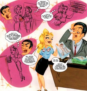
Another great entry is the Venus story by Trina Robbins and Stephanie Buscema. For those of you who aren’t comics historians, Venus, the literal Goddess of Love, was the star of a romantic adventure comic that Marvel (or back then, Timely) published in the 1940s. Trina Robbins’ script is suitably outlandish, with Venus engaging in a wager with Hercules to prove that love can conquer all. So naturally she disguises herself as a mortal woman and gets a job at a beauty magazine but her boss only wants to produce ultra-violent fashions so she helps a model from an oppressive Middle Eastern regime find love and escape satyrs dressed as ghosts and … it’s just fantastically bizarre. Buscema’s artwork, which is influenced by commercial art and design from the 1960s, is charming in its own right, and it captures the zany, retro spirit of the plot.

Unfortunately, the other main stories in the anthology are nowhere near as entertaining. G. Willow Wilson and Ming Doyle turn in an action story featuring the X-Men’s Nightcrawler in a German cabaret. It’s an amusing concept for readers who are familiar with the character, but Wilson’s script never goes anywhere with the idea, and instead she focuses on an insubstantial fight. And while Doyle’s artwork is attractive, fight scenes are not her strong point.

Devin Grayson and Emma Rios tell a story about Cyclops, Jean Grey, and Wolverine, the premier love triangle of the X-Men. Grayson’s script has some decent ideas. It playfully explores Cyclop’s insecurity regarding Jean’s affection for Wolverine, and how that insecurity continuously ruins the psychic dream world that Cyclops and Jean could otherwise share. But the story probably won’t make much sense, or have any emotional effect, unless the reader is already familiar with the characters and their history. Plus, while Emma Rios has an appealing mainstream style, there’s nothing particularly noteworthy about the art.

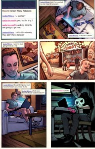
The weakest entry was a brief Punisher story written by Valerie D’Orazio (best known for her blog, Occasional Superheroine). I would describe the plot as a mix between a typical Punisher comic and “To Catch a Predator.”

Obviously, the joke is that the Punisher is masquerading as a young girl online so he can lure sexual predators into a trap. The story is a little creepy, and seem out of place alongside the more light-hearted content in the rest of Girl Comics. But the real problem with D’Orazio’s script is that it just goes on for too long. At best, it works as a single page strip, but it’s extended for three more pages until finally lurching to the predictable conclusion. Nikki Cook’s art conveys the narrative in an clear manner, but there’s so little content to the story that there isn’t anything else for the art to do.

The main stories in Girl Comics #1 are a mixed bag, but I enjoyed a couple of them far more than I expected, and when judged together they’re superior to the stories in Strange Tales. While the creators in Strange Tales were content to throw together a few gags that mocked popular superheroes, at least some of the creators in Girl Comics were trying to produce great short stories that happened to feature Marvel characters. As I mentioned above, there are also short comedy strips between the main stories and biographies of women who worked for Marvel. The former are forgettable, the latter might be of interest to historians of the comic book industry. Overall, Girl Comics is a very uneven book, but parts of it are good enough that I’ll give the next issue a try.

Katrinasploitation

Nola
Publisher: Boom! Studios
Creator: Chris Gorak
Writer: Pierluigi Cothran
Artist: Damian Couceiro

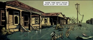
Hurricane Katrina was one of the worst natural disasters in American history, killing over1,800 people and flooding the city of New Orleans. But despite the scope of the disaster, there are surprisingly few comics about Katrina or its aftermath. Perhaps comic writers, who tend to be white, northern, and middle class, are simply indifferent to a disaster that mostly affected people who are black, southern, and poor. Or if I were to be more charitable, perhaps comic writers are trying to be respectful, given that Katrina is still a very recent tragedy from the survivors’ perspective. But if I’ve learned anything from my years of consuming pop culture, it’s that somebody will eventually find a way to turn even the worst disaster into a frivolous pulp thriller.

Which brings me to Nola, a 4 part mini-series created by Chris Gorak (an art designer for several big films) and written by Pierluigi Cothran (writer of several Heroes graphic novels). The story is about the oh-so-cleverly named Nola Thomas, an attractive African American woman who falls for a married man. Who’s rich, white, and named Chevis, so obviously he’s an asshole. In fact, he’s an asshole of Kennedyian proportions, because when he drunkenly flips his car off the road with Nola inside, he sets the car on fire and flees rather than get caught having an affair with a black woman. Of course, Nola survives but she’s badly burned.

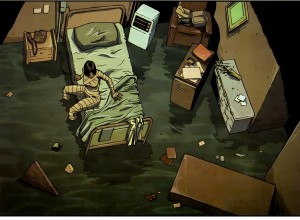
Hurricane Katrina finally factors into the story while Nola is in the hospital. Abandoned by the medical staff, Nola wakes up in a flooded room, bandaged like a mummy in the tradition of horribly scarred noir heroes. After she discovers that her mother died in the hurricane, Nola decides it’s time to set the plot in motion and get her revenge. So she travels around the ruins of New Orleans, killing the doctor who left her to die, killing a few cops (it’s okay, they were jerks), and eventually hunting down Chevis. Along the way she also uncovers a rather convoluted murder mystery involving her long-lost father and another evil, rich white guy.

Ignoring the presence of Katrina, Nola is just an old-fashioned pulp crime story. It does occasionally touch upon race, but only in a shallow manner that helps advance the plot. And the colorful setting of New Orleans (pre-Katrina) is never used to its full potential. None of this is to say that Nola is awful, so much as it isn’t notably ambitious or original. Damien Couciero’s artwork, best described as generic, reinforces my impression of Nola as a by-the-numbers crime comic.

But the use of Katrina can’t be casually set aside. The plot hinges on the disaster in a number of ways: Nola is abandoned in the hospital because of the hurricane, her mother dies during the flooding, and she’s able to sneak around the city and get away with murder because law enforcement is already overwhelmed. The flooded landscape of New Orleans also give Nola a few memorable scenes, even if Couciero’s art is rather boring.

Most importantly, Katrina is a massive tragedy, and real-life tragedies can impart the illusion of relevance on otherwise irrelevant stories. Is it crass and shameless to use a real disaster to elevate low brow entertainment product? Yup, but Gorak and Cothran would probably insist that the personal tragedy of Nola is deeply interwoven with the larger tragedy that befell New Orleans. Because you see, Nola is scarred, just like New Orleans, and … um … Nola will never be the same again (after all the murdering and what not) and the city will never be the same again! It all makes sense, as long as you don’t think about it.

But if you do make the mistake of thinking about it, you’re left feeling dirty. It’s bad enough that so many people died while the government dithered, but Nola adds insult to injury by treating that catastrophe as a plot device for a trite revenge story.

Anything But Capes: Blog of Terror

This week, I’m reviewing five recent horror comics. Unlike barbarian comics, which I discussed back in January, horror comics are not scarce. It seems every publisher has at least a couple horror titles, and in the case of some of the smaller publishers (IDW, Devil’s Due), the majority of their comics are horror. However, as many as a third of these titles are licensed properties (that is, they’re based on movies or video games). I chose to review only original creations, not because they’re inherently good, but because I’m more interested in stories that are specific to comics. These five titles aren’t necessarily the best or the worst, but they are indicative of what American publishers are releasing in 2010.

Reviews:

Hellblazer #264
Publisher: Vertigo
Writer: Peter Milligan
Layouts: Giuseppe Camuncoli
Finishes: Stefano Landini
Colors: Trish Mulvihill

What’s the division of labor between the artist who does layouts and the artist who “finishes?” I assume the layout artist determines the shape and number of panels on each page, and perhaps also the contents of each panel. The finishing artist then adds the necessary details (or is my assumption completely wrong?). This could lead to some awkward, ugly comics if the two artists have different styles. But this is a Vertigo comic, and most of the artists who work for Vertigo tend to use the same semi-realistic, functional style that effectively conveys the story without drawing attention to itself. Camuncoli and Landini work well together, and they produce a comic that’s clear, consistent, and bland.

As for the story, this issue is the final chapter in a storyline within a book that’s been published continuously for two decades, so it isn’t exactly a great jumping-on point (and no recap page, because DC/Vertigo thinks recap pages are for wimps). Still, Peter Milligan is an experienced mainstream comics writer, and he knows that every issue is someone’s first, so he provides narration at the front of the book that helps new readers catch up. The plot, in a nutshell, is about John Constantine fighting a Victorian-era demon in Mumbai. Like the art, the writing is polished and professional, though not particularly memorable.

While it’s also tempting to complain that the story is predictable, predictability is really the whole point. Hellblazer, like most long-running titles, is comfort food for fans, and Milligan knows where and when to deliver the expected beats of a John Constantine story. There are demons, spells, smoking, and British profanity. But the old, reliable formula that makes it good comfort food also makes it terrible horror. Horror works best when it exploits the fear of the unknown and the unexpected. This is why horror film franchises quickly descend into self-parody – once the monster is revealed in the first film, the audience no longer fears it, so the sequels are just the repetition of events that are humorous and comforting precisely because they’ve lost the ability to scare. Milligan’s take on Hellblazer avoids becoming a self-parody by simply abandoning any pretense at being scary. It’s a magic-themed action/adventure that’s indistinguishable from the superhero titles published by DC, except that the characters get to say “fuck” instead of “#&$%.”

The Walking Dead #70
Publisher: Image
Writer: Robert Kirkman
Artist: Charlie Adlard
Gray Tones: Cliff Rathburn

According to the Direct Market sales charts posted at The Beat, The Walking Dead is one of Image’s best-selling monthly comics. Which is bizarre, because if there was ever a comic that should only be read in collected volumes rather than monthly issues, it’s The Walking Dead. Kirkman’s pacing ranges from leisurely to glacial, but that’s not necessarily a bad thing in a longer book. The horror of The Walking Dead has less to do with the zombies than with how their ever-present threat transforms the survivors. Over the course of a trade, readers can appreciate how all the characters (or at least the ones that don’t get offed) slowly change, usually for the worst, in response to the collapse of civilization. But it’s hard to get any sense of that in a typical monthly issue, which has only a small portion of the plot and character development. Issue #70 is a perfect example: the survivors are welcomed into a walled, zombie-free community and meet the community leaders (who will probably turn out to be evil). That’s it. In another six to twelve months this might become an interesting story, but I can’t imagine paying $3 a month for snippets of content.

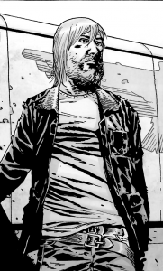
The art in the issue is easier to discuss. Adlard’s style is thoroughly mainstream, meaning a realistic aesthetic and a simple panel layout that moves the narrative forward. The one unusual aspect of the art (by the standards of mainstream American comics) is that it’s in black-and-white.

This was a clever creative decision, as the black-and-white gives The Walking Dead an earthy, retro vibe reminiscent of the classic zombie film, Night of the Living Dead. But setting aside the pop culture homage, Adlard rarely does anything interesting with the black-and-white format. On occasion, he’ll use dark inks and sharp contrast to evoke a film noir tone, but most of the panels wouldn’t be harmed by the addition of color. In other words, the art does what the story requires of it, nothing more and nothing less.

The Unknown – The Devil Made Flesh #4
Publisher: Boom! Studios
Writer: Mark Waid
Artist: Minck Oosterveer
Colors: Andres Lozano and Javier Suppa

The first thing I noticed about The Unknown is that it has a recap page that efficiently summarized the previous three issues. As a new reader, I liked this feature. I will never understand why DC and a few other publishers refuse to include recap pages. If you insist on publishing monthly issues, then why not throw new readers a bone? Not everyone can jump in on the first issue.

The story centers on Catherine Allingham, a detective who’s slowly dying from a brain tumor. On top of that problem, she’s been dragged into a mystery involving a small town serial killer and a ghost that keeps possessing the townspeople. It ends with a big battle in a cave and some revelations about future storylines, which may involve the Devil (made flesh). Like most contemporary comics, The Unknown has a “decompressed” pace, meaning that the plot and characters are gradually developed over multiple issues. But unlike Robert Kirkman, Waid knows how to squeeze as much content as possible into 22 pages. Reading a single issue of The Unknown feels like reading four issues of The Walking Dead.

But more content doesn’t equal better content. Waid’s writing has always beens mechanical and generic, like he’s working from a genre checklist. Characters do exactly what readers expect of them, and plots resolve themselves in the simplest manner possible. The Unknown is no exception: the central conflict ends with a violent climax, the villains get their appropriate comeuppance, and a sufficient amount of information is revealed to move the larger story forward.

The art doesn’t help matters. Oosterveer attempts a straightforward, mainstream style, but his art comes across as amateurish. Spatial relationships are confusing, backgrounds will be drawn in detail in one panel but disappear in the next, and the characters’ faces frequently go off-model. To put it simply, the entire comic just looks half-assed and rushed.

Devil #1 (of 4)
Publisher: Dark Horse Comics
Writer/Artist: Torajiro Kishi and Madhouse Studios

Someone at Dark Horse decided that they needed a new horror comic, something fresh and original. And where are all the fresh and original ideas coming from? Japan! So Dark Horse formed a partnership with manga-ka Torajiro Kishi (best known for the yuri title Maka Maka) and anime producer Madhouse Studios (Ninja Scroll, Vampire Hunter D: Bloodlust). The fresh and original idea they came up with was a story about cops who hunt vampires … which admittedly sounds like every third comic published in the 1990s.

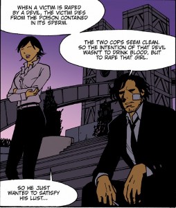
But there are two twists. The first is that the vampires are called devils, because in a post-Twilight world, “vampire” is no longer hardcore. The second twist illustrates why Japanese creators are always the smarter choice. I’ll let the main characters explain:

“When a victim is raped by a devil, the victim dies from the poison contained in its sperm.” And by die, they mean burst like a water balloon.

This is why Dark Horse needed Kishi and Madhouse Studios. Any American hack can write a story about cops who hunt vampires. They might even throw in some misogyny. But when it comes to uncensored depravity, American creators are actually quite timid. You need a Japanese creator to get a story about poison sperm that causes women to explode. It’s not any good, of course, but extraordinary sleaziness has a way of concealing every other flaw.

We Will Bury You #1 (of 4)
Publisher: IDW Publishing
Writer: Brea Grant with Zane Grant
Artist: Kyle Strahm
Colors: Zac Atkinson

Brea Grant plays the character Daphne on Heroes. That’s a red flag: when an actor starts slumming in the funny book industry that usually means they’re pitching a movie script disguised as a comic.

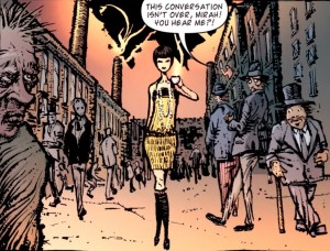
Though perhaps I’m being unfair to Grant, because I can’t imagine a major studio ever producing a film adaptation of this comic. The pitch: in 1927, a cross-dressing Ukrainian immigrant and her taxi dancer girlfriend are planning to flee New York after murdering the girlfriend’s husband, but they get caught up in a (Communist-themed) zombie apocalypse. Now that’s what I call high concept.

As this is only the first issue, it’s hard to say whether it will turn out to be a original zombie story. The zombie sub-genre has been thoroughly explored in every medium, and Grant is hardly the first writer to link zombie scares to the Red Scare. On the other hand, there’s never been a zombie story featuring flappers, and who doesn’t like flappers?

Plus, the comic has some engaging artwork.

Kyle Strahm’s style, with its distorted physiques and bleak backgrounds, is well-suited to horror. And the use of numerous thick lines gives his art a coarse, disheveled look. It effectively captures the grime and poverty of New York City tenements in the early 20th century. Zac Atkinson uses color to great effect too, as key characters are given more vibrant outfits so that they stand out from the darker backgrounds. More than a few panels, however, are rough around the edges in ways that Strahm probably didn’t intend. There’s a thin line between bleak and boring, and Strahm’s backgrounds occasionally step over it, and the facial features of the heroines seem to change on every other page.

Despite some misgivings, I liked the first issue of Brea Grant’s comic. It’s certainly better than her TV show.

State of the Genre

Overall, the horror genre is doing quite well. It has its share of shitty comics, but there are a few decent titles in the mix. And despite the dominance of superheroes in the Direct Market, horror comics have carved out a stable niche. There’s a broad selection of titles available in a variety of sub-genres (though zombies are far and away the most popular). It’s also worth mentioning that there are several genre hybrids that I passed over for reviewing, including Hellboy (horror/superheroes), Locke and Key (horror/fantasy) and the recently released Choker (horror/crime). On a less positive note, there’s an awful lot of licensed properties, but that’s hardly surprising given that an established brand with a built-in fanbase is always the safer bet. Fortunately, the horror genre hasn’t yet become an endless parade of Freddy v. Jason v. Chucky one-shots.

I Smash … Planet Hulk

Over the past couple months my comics reading has mostly consisted of manga with a handful of American titles that have nothing to do with superheroes. I stopped following mainstream superhero comics some time ago, on account of the bad art, endless crossovers, etc., etc. But there is a part of me (the foolish, masochistic part) that would like nothing better than to sit back and read a truly enjoyable superhero story.

That’s why I’m returning to first principles. And by first principles, I mean Hulk smash. Originally, I planned to read the popular Planet Hulk storyline by writer Greg Pak and artist Carlo Pagulayan. But then Marvel did me a favor by adapting the story into a cartoon, so now I don’t have to read anything!

For those not familiar with the story, it begins with the heroes of Earth, led by Iron Man, deciding that they’ve had enough of the Hulk and his smashing. So the heroes come up with a perfectly sensible, if not exactly heroic, plan: they load the Hulk onto a rocket and shoot him into space. To be fair, the heroes intended for Hulk to land on a verdant paradise uninhabited by intelligent beings. Of course, things don’t go as planned and Hulk crashes on a barren world called Sakaar. He’s immediately captured by slavers and forced to fight as a gladiator for the amusement of the evil Red King. After some success as a gladiator, the Hulk reluctantly takes charge of a rag-tag team of slaves and rebels struggling to overthrow the tyrant. It’s basically Gladiator with the Hulk instead of Russell Crowe, which I consider an improvement. The plot is predictable, but that’s not necessarily a terrible thing in an action flick.

But there are problems with adapting a fairly long comic storyline into an 80 minute movie. First, there’s a painful amount of expository dialogue, and yet most of it seems unnecessary given the simplicity of the plot. Another problem is that there are at least half a dozen major supporting characters that need to be introduced, and several of them get substantial flashbacks. But the characters still feel like strangers by the end of the movie because there simply isn’t enough time to show viewers why anyone besides the Hulk matters. The 80 minute runtime produces a movie that is, at once, too long for its simple story and yet too short to effectively establish its universe and characters.

The time crunch is further exacerbated by some incredibly misguided fan-service. One of the flashbacks consists of aliens fighting Thor for what feels like half an hour. To call it tangential to the plot would be generous. Now, I’m sure there are plenty of Marvel fanboys who squeal whenever Thor shows up, but the scene wasted precious time that should have been devoted to the Hulk. But at least a fair number of non-fanboys actually know who Thor is. In an even stranger decision, the movie includes a lengthy fight sequence with Beta Ray Bill of all people. Again, I’m sure there are a couple fanboys out there who think that everything is better with Beta Ray Bill. They are wrong. His appearance feels awkward and the Hulk come across as a guest star in his own movie.

Also, the dialogue is really bad. Obviously, this is a Hulk movie, and I wasn’t expecting Hamlet. But there’s no reason why all the characters have to speak in the same insufferably earnest manner. There’s no humor, no enthusiasm, no personality, not even the little character ticks that Stan Lee would throw in.

The animation is better than the writing, though it has its share of flaws. Rather than attempting a highly detailed style, Planet Hulk rips off the character design style introduced by Bruce Timm and used extensively in DC animation. This is actually a good thing; if you’re going to steal, steal from the best. The characters have a sleek, minimalist look that works well in action-driven animation. The backgrounds are given more detail, though they’re rather generic sci-fi.

But the animators can’t hide the fact that they’re working on a tight (direct-to-video) budget. During the action scenes, it often seemed like “frames” were missing from the film. The animators probably didn’t have enough time or resources to draw a sufficient number of cells so that the movements would appear quick and fluid. Instead, The action is often choppy, characters move sluggishly, and frequent edits are used to hide these faults. The cumulative effect is that the fights feel small and disconnected from their environment. The action sequences are presumably the main selling point of the movie, but they’re not much of a selling point, unfortunately.

Despite my panning, I know some people might still want to watch Planet Hulk with their kids, so I’ll comment on the age-appropriateness. Way back in the good-old-days, Noah criticized the Wonder Woman animated feature for being too violent for young kids and yet limiting that violence in rather obvious and cowardly ways (probably so that the movie wouldn’t be completely inappropriate for younger viewers). Planet Hulk is also too violent for young kids, but it doesn’t half-ass it. There’s a stunning amount of graphic violence for a PG-13 movie, and it’s far more gory than either Wonder Woman or the live-action Incredible Hulk (I’m not exaggerating, if you don’t like blood, this isn’t the movie for you). So it’s probably not appropriate for the youngest viewers, but teenage boys will love it.

If I were to rank Planet Hulk in comparison to  recent DC animated features, I’d say it’s better than the profoundly stupid Superman/Batman, but it lacks the technical polish of Wonder Woman (flawed as the story was, it had great animation) or Green Lantern: First Flight.