Some Closing Thoughts on the Poll

We’re going to be taking it easy at The Hooded Utilitarian this week. Apart from this post, we’re just going to be publishing the remainder of the lists. We’ll be back with more to engage, enlighten, and outrage next Monday.

My original goal with this post was to discuss the poll results and the comics canon. However, it seems a rather odd undertaking, largely because the notion that the results are indicative of the canon is a conceit. The top ten and Top 115 lists we compiled are indicative of nothing more than the consensus views of the 211 people who submitted lists, and even that is somewhat filtered (i.e., skewed) at points through the perspective of the poll’s editor (myself). Another thing to remember is that those who submitted lists prepared them with different motives. The question they responded to is, “What are the ten comics works you consider your favorites, the best, or the most significant?” A list of “the best” is different than “the most significant,” and both are distinct from “favorites.” Perhaps the best way to proceed is to acknowledge that most of what follows is presumptuous, and if readers want to reject it on that basis, my feeling is they are right to do so. However, I hope they consider the thoughts put forth at least worth considering to a degree.

A few observations about our list:

This project is in some ways a continuation of, and in others a response to, The Comics Journal’s ranked 1999 list of the 100 Best Comics. The Journal list was restricted to English-language material, and relied on opinions from the magazine’s editors and columnists (eight people altogether) rather than on a broader poll. You can see the Journal list here, and a discussion of the thinking behind it here. I’ll talk about some differences between the Journal’s list and ours in the points that follow.

The major newspaper strips are still seen as the most important comics works. We’re supposedly in the graphic-novel era. However, the top three vote getters–Peanuts, Krazy Kat, and Calvin and Hobbes–outpaced the number-four work (and by extension, the rest of the list) by the quite large margin of 14 votes. As far as the poll participants appear concerned, these three strips are the crown jewels of the comics medium. The importance of the great newspaper strips was further reinforced by Little Nemo in Slumberland’s sixth-place ranking, as well as by Pogo coming in eighth. When half the top ten is from a particular mode of comics, I think it’s safe to say the field considers that mode where the most important work has been done.

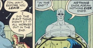
The two most highly regarded graphic novels are Watchmen and Maus. I haven’t come across anyone questioning Maus’s placement yet, but I’m incredulous that some would be surprised—even shocked—at Watchmen’s high ranking in the poll. When it comes to graphic novels, these two works have by far the largest readership constituency outside of the comics community. Maus has sold at least in the high hundred thousands, andWatchmen has sold in the millions. There is no reason for readers to feel they are slumming with Watchmen; the book’s inclusion in Time’s 100 Best Novels and Entertainment Weekly‘s 100 Best Reads lists are reasonable signs that it enjoys the broader culture’s respect. If the larger world holds the book in high regard, it makes sense that this view would be reflected in the comics world as well. Those taken aback by its placement generally strike me as those who have a prejudice against superhero material, or at least the work done in the genre over the last 40 years. I suppose they are like those who turn their noses up at Ian McEwan’s Atonement because of its similarities to category romance fiction, or at Kazuo Ishiguro’s Never Let Me Go because it is a science-fiction novel. Saying a certain work or genre isn’t to one’s taste is one thing; we all do it, and we’re all entitled to that opinion. Treating a work as inherently inferior because it comes from a particular genre is quite another. Watchmen is not just one of the most important graphic novels; it’s one of the most important contemporary novels, period. To act as though the situation is otherwise is at best myopic. I’m not for a moment saying anyone has to like Watchmen, but it should be acknowledged that the book is far bigger than any one person or group’s opinion of it.

The Fourth World will soon eclipse the reputation of Jack Kirby’s Marvel work, at least in comics circles. This is more of a prediction than an observation, but it has its foundation in the poll results. The Fantastic Four’s better showing in the poll was due to all of one-third of a vote. If just one more participant had voted for The Fourth World, it would have been the Kirby work that made the top ten. The Fourth World’s reputation has been increasing over the years, and I doubt it has peaked now. No slight intended against Andrew Farago, but posting The Fantastic Four piece so soon after the Kirby family’s loss in their lawsuit against Marvel was painful. A list in which The Fourth World outranked The Fantastic Four might have been a consolation of sorts. Well, maybe next time.

R. Crumb’s counterculture material is his most important contribution to comics. Noah Berlatsky has wondered if Crumb’s star is falling given the placements of his work in the poll. Noah has pointed to the fact that while Crumb’s Weirdo work made the top ten in The Comics Journal’s Best 100 a dozen years ago, nothing by him made the top ten this time out. I don’t agree with Noah’s speculation. When the Journal’s editors put together the magazine’s Best 100, it apparently didn’t occur to them to create a counterculture-era umbrella entry to cover his works of that period. If they had, I think it would have made their top ten. (And given the material’s ubiquity in the six of the eight contributor lists that were published, it should have.) Judging from those contributor lists and the Journal’s traditional idolatry of Crumb, the Weirdo material’s high placement didn’t reflect the work’s consensus status so much as it did the desire to get something—anything—by Crumb into the top ten. When it comes to Crumb, our poll results likely reflect two things. The first is that the consensus view of Crumb, while one of high esteem, is more measured than the Journal’s. The second is that we did a much better job of giving the counterculture material its due when interpreting the votes. The counterculture work is where Crumb had by far his biggest impact and influence, and I believe this poll’s rankings reflect that it is asserting its proper place in estimations of his career.

Dave Sim is indeed one of the best cartoonists North America has produced. I’m not a fan, and his gender and religious blarney sets my teeth on edge, but there’s no denying his achievements in Cerebus. He is one of the most technically accomplished cartoonists to ever work in the field, and few have managed, much less surpassed, his expansions of the form’s language. Sim did not make the Journal’s Best 100 list. This was despite the fact he and selections from Cerebus were mentioned on at least three and possibly four of the eight voters’ lists. It is hard not to see Sim’s exclusion from the final one as a deliberate snub. I’m glad to see him get a fairly high level of acknowledgement in this poll.

Yes, good English-language adventure comics have been published since 1970. The Journal’s Top 100 list reflected publisher Gary Groth’s view that virtually all adventure comics of the last 40 years (i.e., every one published since he turned 16) are beneath notice. Watchmen, The Fourth World, and V for Vendetta were the only contemporary adventure works acknowledged, and they were kicked to the bottom of the list. (A look at Groth’s personal Top 100 shows he didn’t vote for any of them. Click here.) I’ve already discussed the first two works, and I note that V for Vendetta made our list as well. However, there’s also Batman: The Dark Knight Returns, The Sandman, Bone, Daredevil: Born Again, The Invisibles, and over a dozen others that received listings in our Top 115. Ignoring these efforts while lionizing similar (and to many eyes less accomplished) material from before 1970 was an injustice, and I’m happy we were able to redress it.

The consensus view of The Hooded Utilitarian’s regular contributors both converges and diverges with the consensus of the field. Here are the top 13 vote-getters among this website’s contributing writers:

  • 1. Peanuts, Charles M. Schulz [8 votes]
  • 2. Krazy Kat, George Herriman [5 votes]
  • (tie) Watchmen, Alan Moore & Dave Gibbons [5 votes]
  • 4. The Alec Stories, including The Fate of the Artist, Eddie Campbell [4 votes]
  • (tie) From Hell, Alan Moore & Eddie Campbell [4 votes]
  • 6. The Locas Stories, Jaime Hernandez [3.5 votes]
  • 7. Calvin and Hobbes, Bill Watterson [3 votes]
  • (tie) A Drunken Dream and Other Stories, Moto Hagio [3 votes]
  • (tie) The Fourth World Stories, Jack Kirby, with Mike Royer, et al. [3 votes]
  • (tie) Hi no Tori [Phoenix], Osamu Tezuka [3 votes]
  • (tie) Die Hure H [W the Whore], Katrin de Vries & Anke Feuchtenberger [3 votes]
  • (tie) Journal, Fabrice Neaud [3 votes]
  • (tie) The Sandman, Neil Gaiman, et al. [3 votes]

On the basis of this, I’d say we agree with the rest of the field at least half the time.

There’s a lot more to be said about this poll, and a lot more to be said about the comics canon in the future. The canon is a synopsis at a given time of a never-ending dialogue, and lists like the one produced by our poll provide an enjoyable snapshot of where that dialogue stands. They also allow us an opportunity to sit back and take stock. I think Sight and Sound magazine is right to do this just once a decade with movies. The time between polls is neither too great nor too little. It allows people to see the shifts in the consensus view without the overall picture getting too expansive or narrow. And by reserving a special time for judgments, it implicitly puts the emphasis on criticism where it belongs, which is with discussion. Criticism isn’t about being right or wrong; it’s about helping people see work in new and more insightful ways. That can and should go on forever.

Best Comics Poll Index

Robert Crumb: Survivor

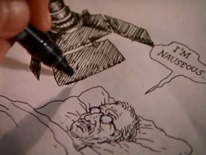
I was a teenager the first time I saw a drawing by Robert Crumb, and I had an immediate, visceral reaction, a feeling of nausea, a slightly floating, psychic displacement from my physical self. I don’t remember now what the specific image was, nor does it really matter at this point—it wasn’t the content that repulsed me, but the neurotic, shaky, compulsive lines, invading every form, erratic, descriptive of the hand that made them as much as the subjects themselves.

My disgust deepened after my first exposure to his comics—they seemed so tightly drawn, so cluttered and cramped that I felt anxious, trapped in neurosis. And when I did, finally, make it past the surface to the actual content, I found nothing to reassure my trembling stomach—even in the less overtly challenging short stories, I found the neurotic aggression overwhelming, overpowering. I moved on and found work to read that didn’t make me physically ill.

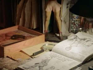
A few years later, a film about the cartoonist himself changed all of this. Crumb, a 1994 documentary directed by Terry Zwigoff, transformed Robert Crumb’s work permanently for me, by providing context, nuance and even ambiguity to work that had up to that point seemed alien and severe. The movie opens with gentle upright piano music and a close-up shot of a sculpted, hand painted statue of a woman’s muscular butt, and in a slow, shaky pan takes in row after row of wooden spools to which faces have been elaborately, lovingly drawn, remarkable objects that, it slowly becomes clear, seem to have no practical or commercial purpose. From the very first shot the film suggests that Crumb creates because he must. His artwork is a need, the spools say, open-mouthed, eyes agog. The shot continues, and lap dissolves into a pile of sketchbooks and records, and finally Robert himself, back to us and facing his stereo, knees to his chest, rocking slowly to the music.

Cut to a drawing, and a hand with brush moving rapidly across the surface of the paper. “If I don’t draw for a while I get really crazy. I start feeling really depressed, suicidal.” These are Crumb’s first words in the film, delivered in a quiet, distant voice. “But sometimes when I’m drawing I feel suicidal too.”

“What are you trying to get at in your work?” someone, presumably Zwigoff, asks off-mic.

“JESUS,” Crumb says, suddenly animated. “I don’t know.”

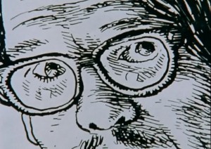
Robert Crumb’s drawings are unflinching in their taut, sweaty grotesquerie, but the man himself flinches—he laughs nervously, stutters, cringes, equivocates.

He continues. “I don’t work in conscious messages. I can’t do that. It has to be something that I’m revealing to myself when I’m doing it, which is hard to explain. Which means that while I’m doing it I don’t know exactly what it’s about. You just have to have the courage or the… to take that chance. What’s gonna come out of this? I’ve enjoyed drawing, that’s all. It’s a deeply ingrained habit, and it’s all because of my brother Charles.”

Because of the powerful presence of his brothers, particularly Robert’s older brother Charles, the movie almost inevitably focuses on Crumb’s childhood, seemingly the source of both his obsessions and prodigious skill. By both their accounts Charles forced Robert to draw comics with him from a very early age, and was a domineering and seemingly crazed and competitive presence in young Robert’s life. Despite appearing for what probably amounts to about twenty minutes of screen time, Charles dominates the film, an intelligent, witty and doomed ghost of a man who seems in a way to have already passed on. So much of his life seems to be over, so many of his desires extinguished, that it seems inevitable that he will not last the duration of the movie.

We see examples of Charles’ and Robert’s comics from their childhood and teenage years, and get a glimpse at how these two remarkable young talents developed in parallel. Robert discusses his interest in other forms of art, and how it was his brother’s dogged persistence that kept him making comics, that in fact, it’s his brother who he still thinks of as his audience when he’s creating comics.

Young Charles’ work is truly remarkable, the work of someone who’s internalized at a very young age a whole host of cartooning skills and already developed his own visual style. But as Robert narrates the work chronologically, we slowly see that something seems to have gone awry in Charles’ mind. His style blossoms slowly into a collection of strange, grotesque visual tics, and pictures give way to more and more words, at first a rush, and then a torrent, panels and finally pages dissolving into microscopic scribble. And then, finally, his marks are nothing but scribble at all—content-less, without thought, finally, just tic. We watch as Robert flips through page after page of his brother’s illness made physical via pen and paper.

In the movie Charles serves as a harrowing parallel to his younger brother, a brilliant young cartoonist turning ever more inward, until there’s no communication left, no outside at all. He is the brother that could not escape the orbit of his childhood, who was unable to find a way to free himself from whatever it was that held him in thrall for so long.

What type of shared experiences shaped these three brothers? The movie hints at the edges—an abusive, withholding father, a mother who was either mentally ill, a drug user, or possibly both; but it presents no easy answers to these questions. What it does do, however, is provide a context for even the most extreme of Crumb’s works, and present a compelling argument for a man being saved by his art. Is it possible, the movie invites us to ask, that the difference between Robert and his brothers is that Robert found both release and escape?

Context also comes from the aesthetic decisions by Zwigoff himself. An early sequence of some of Crumb’s most violent, arguably mysogynistic drawings is accompanied by a haunting, keening voice, backed only by a circular, searching guitar and a blanket of hiss and pops. It is a song of “calamitous loss,” as Robert said earlier, and to hear such a song as the camera slowly pans and zooms across the twitchy surface of the drawings changes the experience of the drawings themselves from one of naked animal aggression to one of bewildered, pained loss. Where have these thoughts come from? the music seems to suggest. What has happened to this man?

Through its use of music and its austere, uncluttered editing and cinematography, the movie has great rhetorical power, great enough to reframe and even change the art that is ostensibly at the center of the film itself. A sequence mid-film presents an Angelfood McSpade strip with no narration, accompanied solely by a jaunty piano ditty that helps create a satirical tone that might be more arguable or problematic without the aural reinforcement.

The film also gives significant screen time to Crumb’s detractors, a strategy that defuses some of the uncomfortable edge of the work presented, which has the curious effect of allowing the viewer, or more specifically this viewer, to take his side again. Objections stated, points duly noted, we can return to the man himself and his obvious, almost palpable, need to create his work.

And that naked need, and the remarkable story of his brother Charles, are the reasons I’ve returned to Crumb so often, why despite a host of reservations, I showed the film, admittedly highly-edited, to my high-school cartooning class. Because Crumb is, in a winding, fractured, way not just the story of an artist, but a portrait of a survivor.
______________
Update by Noah: This post is loosely affiliated with an ongoing roundtable on R. Crumb and race.

Cheap Thrills

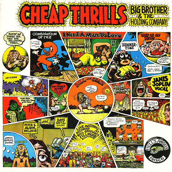
Yesterday, Robert Stanley Martin argued that there was satirical intent in R. Crumb’s Cheap Thrills album cover.

Contrary to Noah Berlatsky’s reading of the second panel in his “Crumbface” essay (click here), I don’t feel any of it is gratuitous. It’s a pointed rebuke that did not flatter its ostensible targets. Telling Joplin that’s she’s engaging in a “Mammy” routine, as well as identifying her audience in part with an Al Jolson figure, is not something that would be calculated to endear Crumb to either. And given the avowedly anti-racist liberal politics of the San Francisco counterculture scene that Joplin and her early audiences belonged to, Crumb also pointed the way for their political enemies to cluck at them for hypocrisy. It didn’t cause offense because Joplin and her audience were sophisticated enough to both recognize and at least tacitly acknowledge the failing Crumb was highlighting.

It’s a thoughtful defense. I’m still not convinced though.

First, Robert says that Joplin and her fans would not have found Crumb’s satire of their black appropriations comfortable.

However, Drew Friedman’s account seems to contradict this:

Interestingly, Crumb’s original intention was for this art to run on the back cover and a portrait of Joplin to run on the front. But Joplin loved the the comic strip art so much, (she was an avid underground comics fan, especially the work of Crumb, and already at that point in her escalating career, had the power to hire her own cover artist), she decided to run it on the front.

That certainly doesn’t sound like Crumb’s satire made Joplin at all uncomfortable. I haven’t been able to find anything online suggesting that fans were put off either. Maybe Joplin’s just kind of dumb of course…or maybe, as Robert suggested, she was self-aware enough to find a pointed reference to her black roots amusing. Still, if satire doesn’t cause its targets even the least discomfort — if they in fact want to put it on the cover of their product — does it make sense to call it satire?

More important than intention or audience reaction, though, is the image itself. And I don’t think that image sustains a claim of satire.

Look at the rest of the album cover; the images other than the blackface caricatures. None of those images is satirical, or pointed. Instead, they’re silly and/or sexy and/or energetic. Many of them rely on goofy puns (“Piece of My Heart”, “Combination of the Two”) The center top image shows a woman (probably meant to be Joplin) in a sultry pose with prominent nipples clearly visible through her top. On the left hand side, there’s a drawing of a goofy, stereotypical Indian with traditional headdress. On the bottom, there’s a caricature which seems to conflate Jesus and Eastern mysticism.

Robert argues that the blackface caricatures are different. Instead of an expression of high-spirited high-times and easy irreverence, he argues, the blackface caricatures are a critique. In them, Crumb is showing Joplin’s connection to and reliance on a black musical tradition, and linking her to earlier white performers who relied on that tradition, like Al Jolson.

But, as an alternate reading…couldn’t Crumb just be more or less thoughtlessly using blackface iconography because it’s funny and energetic? Couldn’t the images just be examples of high-spirited high-times, and of Crumb’s irreverent refusal to bow to the 60s equivalent of political correctness? Couldn’t his use of blackface be like his use of prominent nipples or his use of a sacrilegious Jesus caricature? That is, couldn’t the blackface caricatures be used because they are fun, and because they are (at least somewhat) shocking, rather than because they skewer Joplin and her fans?

Intent is hard to parse, of course. But I think if you’re going to argue for satire, you need to explain what Crumb has done to distinguish between blackface-as-critique and blackface-as-nostalgic-scandalous-good-times. If the cover can be read as fun good times, and the blackface can be easily incorporated into the idea of fun good times, and Joplin and her fans embraced it, presumably as an icon of fun good times, it’s really not clear to me why I should give Crumb credit for making a pointed political statement. On the contrary, it seems to me that he’s using blackface like he’s using nipples and silly puns — as a cheap thrill. And, as I said before (to Jeet Heer’s annoyance)using blackface as a cheap thrill still makes Crumb, to my mind, kind of a shithead.

I have to say too…even if Robert is right, and it’s a satirical take, I still find it pretty dumb. As I note in that Comixology article, “Summertime” is one of the great interracial collaborations in American song. Written by George Gershwin about the black experience, it was based on Eastern European folk melodies and adopted by many of the greatest American performers of various races. It’s a song whose history challenges the usual narrative of white appropriation of black music. George Gershwin didn’t don blackface to become a pretend black person; he collaborated with black people over decades in order to interpret an American experience through an American art that was neither white nor black.

The usual narrative of blackface appropriation— applied to Elvis, or Janis Joplin, or whoever — is itself part of our racist past. It assumes that blacks are the authentic creators of music, the magical Negroes, to whom whites must go to draw upon true musical genius. And I think you can actually see Crumb’s cover as plugging directly into this; his use of black caricatures does not so much critique Joplin’s music as light-heartedly validate it. The caricature in the center bottom panel, the black man digging Joplin’s music, is not a sneer at Joplin — it’s a goofy thumb’s up. See! Whoohoo! Even black people dig this music! Similarly, the shouting baby, all gusto and throat, is not a critique, but a funky wink. Joplin gets her lungs from that true source. And that true source is a stereotypical black mammy.

American music is, and has always been, both black and white, with performers of every race borrowing and learning from each other. The reason blackface is racist is not because white performers were inspired by blacks, but because they gilded their black influences with invidious racist stereotypes. Crumb’s use of blackface caricature is, therefore, neither fun nor, even in the most generous interpretation, insightful. It perpetuates simplistic images of black people and of race in the U.S. The Cheap Thrills cover is an ongoing testament to Crumb’s great illustration and design skills, and to the extremely limited intelligence with which he often employs them.

____________
Update: This post is part of an ongoing roundtable on R. Crumb and race.

Monthly Stumblings # 10: Alan Dunn

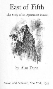
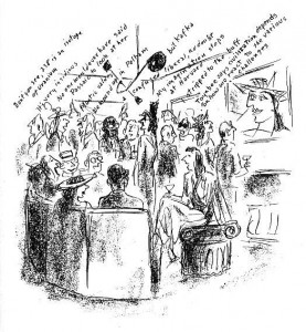
East of Fifth by Alan Dunn

Fredrik Strömberg wrote Black Images in the Comics (Fantagraphics Books, 2003). In the foreword of said book Charles Johnson stated:

[…] while the cartoonist and comics scholar in me coolly and objectively appreciated the impressive archeology of images assembled in Black Images in the Comics, as a black American reader my visceral reaction to this barrage of racist drawings from the 1840s to the 1940s was revulsion and a profound sadness.

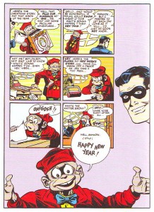
Jumping to page 86 we can find the inevitable Ebony White (the family name has to be a joke) accompanied by Will Eisner’s (the character’s creator) comment:

I realize that Ebony was a stereotype because I drew him in caricature – but how else could I have treated a black boy in that era, at that time?

Well… Eisner could have asked East of Fifth ‘s author Alan Dunn

Title page of East of Fifth.

 “Will Eisner’s Almanack of the Year” [December 26, 1948] as published in DC Comics’ Will Eisner’s Spirit Archives Vol. 17 (July 4 to December 26 1948), 2005.

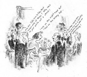
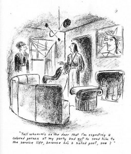
As you can see above both “Will Eisner’s Almanack of the Year” and East of Fifth were published in 1948. Sacred cow defenders usually utter the same excuse that Will Eisner used above. Basically: he’s not to blame, he lived in less enlightened times, etc… On the other hand the Eisner (or McCay or Barks, etc…) critics say something like: that’s true, nevertheless other creators didn’t fall into the trap of racist imagery. The latter’s problem is that they never give any example… Until now: clearly belonging to the second group I believe that great art gives us a complex view of the world, hence: it has no place whatsoever for the simplistic and offensive imagery of racists. See below how Alan Dunn portrayed black people in East of Fifth and compare the depiction with Will Eisner’s pickaninny.

 East of Fifth, page 95.

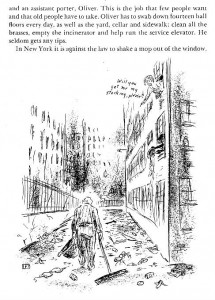
 As we can see above, it’s not that difficult. Alan Dunn just needed to caricature black people in the same way as he caricatured everybody else. What he couldn’t change was black people’s role in society. In this image, as housemaids in a party. Even so, he didn’t resort to job stereotyping either. In the second image below the fourth character in the background row (counting from the left) is a middle class black person (a poet) attending a white people’s party. In this sequence racism is clearly viewed as embedded in 1940s society (also: on page 92 an employee says: “Cab for Mrs. Eelpuss – white driver”). (Even if they appear here together the two images are 30 pages apart. Braiding is the formal device that links East of Fifth the most with comics. The book is also an example of what I call a locus .)

East of Fifth, page 59.

East of Fifth, page 89.

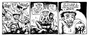
 Some cartoonists praise stereotypes because, according to them, it’s an immediate way of conveying ideas. Looking at the image above I can see why: not that it really matters, of course, but without the usual short cuts (and forgetting page 59) it’s not immediately obvious that the gentleman depicted is indeed black. My question is: is this offensive immediacy really worth it? I don’t believe that Will Eisner was a racist. As Robert Crumb famously put it on the backcover of his comic book Despair (1970): “It’s just lines on paper, folks!” (before that Crumb depicted a character named Nutsboy tearing apart a woman and saying “it’s only a comic book, so I can do anything I want” – see below).

Robert Crumb, “Nutsboy”, Bogeyman # 2, 1969, as published in The Complete Crumb Comics # 5, Fantagraphics Books, July 1990.

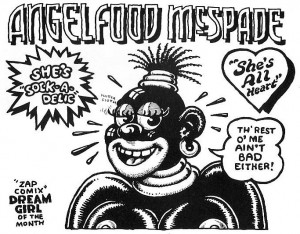
I’m not denying Robert Crumb or any other artist, for that matter, the right to draw “anything [s/he/they] want,” but drawings have consequences as we have seen at the beginning of this post. In the story “Angelfood McSpade” (see below) Robert Crumb shows his camp tendencies exploiting a racist imagery that, I suppose, Crumb sees as his cultural trash heritage. As I see it Angelfood is marijuana (the character is an allegory), but that’s irrelevant for this post. The point is that kitsch or no kitsch, camp or no camp, it’s a racist depiction and I can’t decide who to blame more: Will Eisner who uncritically swallowed his times’ imagery or Robert Crumb who reveled in it.

“Angelfood McSpade”, Zap # 2, June 1968, as published in The Complete Crumb Comics # 5, Fantagraphics Books, July 1990.

John Crosby (1912 – 1991) was a media critic. In one of those happy circumstances that happen once in a blue moon one of his columns “Radio in Review” fell in my hands. It was published in the New York Herald Tribune (July, 1948) and it’s about East of Fifth. Sharp as a knife Crosby understood (with Göethe, looking at Töpffer’s drawings, many years before) that this book had an unnamed form: the graphic novel. Here’s what he said in his column “Radio in Review: East of Fifth, West of Superman” (New York Herald Tribune, July, 1948):

[…] “East of Fifth,” by Alan Dunn, a cartoonist who is also a subtle and polished writer, is the story of twenty-four hours in the life of a large, fashionable Manhattan apartment house and, of course, of its occupants, told in cartoons with an accompanying text.

I bring it up here because Mr. Dunn’s book may well be a brand new art form, a sort of sophisticated, literate extension of the comic books, rather horrifying in its implications to writers unable to draw. This isn’t the first book in which cartoons and text tell a complete story but, to my knowledge, it’s the first time anyone has attempted serious literature in this field. In this unreading age, when all the arts and much of journalism tend towards pictures, Mr. Dunn’s comic book for adults is certainly significant, just a little distressing and thoroughly captivating.

Alan Dunn juggled with three forms: literature, comics, but above all, cartoons (he was a New Yorker cartoonist). While printed words carry the load of the narrative cartoons are lively comments on the little events that occur in the building (see below).

Alan Dunn was an architecture cartoonist. He was as interested in the machinery of the building and the personnel running things as in bourgeois life inside it. The tone is a bit too breezy (it reminds Ben Katchor’s cool and detached, if poetical, remarks, sometimes).  A suicide occurs, in a masterful ellipse, nevertheless. It barely disrupts the hustle and bustle of city life though… and, maybe, that’s the whole point: the book ends with a drawing and a phrase alluding to “the cold metropolis of the north.”

East of Fifth, page 38.

Going back to Will Eisner it seems to me that, at least in the 1970s, he was influenced by Alan Dunn’s work. It’s a shame that, by then, it was too late to avoid Ebony…

East of Fifth, page 5.

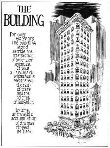
Will Eisner, The Building, Kitchen Sink, 1987, as published in The Will Eisner Companion by N. C. Christopher Crouch and Stephen Weiner, DC Comics, 2004. 

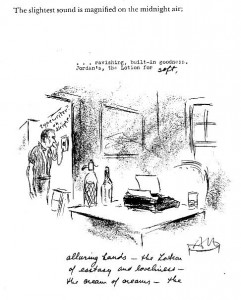
I end this post with page 134 of East of Fifth. It’s now the wee hours and someone complained about the noise of a character’s typewriter. He then switches to handwriting in a great visual device that will be used, years later, by Charles Schulz.

East of Fifth, page 134.

__________
Update by Noah: This post inspired a roundtable on R. Crumb and race, all of which can be read here.

Robert Stanley Martin on Paying For It

Robert Stanley Martin wrote about the harshest piece I think I’ve seen on Chester Brown’s Paying For It in our comments. It seemed wrong to let it languish there, so I have given it it’s own post.

It’s three parts, actually. Here’s the first.

This book really makes me embarrassed for the comics world. If Chester Brown wants to make a creepy, crackpotted spectacle of himself, I suppose that’s his business. But did everybody have to go whole-hog to identify themselves, and by extension, the field with this thing? Judging from the comics-media sites, it’s the book of the year so far. It’s Chester Brown week over at TCJ, for pity’s sake.

Anja Flower then asked Robert what was so embarrassing about prostitution, anyway. Robert responded:

I don’t consider the discussion of prostitution and its prospective decriminalization embarrassing. I don’t think it’s particularly worthwhile, except as an intellectual exercise. The reason is that with, for lack of a better term, morals laws, I don’t believe they get changed unless people feel that one is or could be unfairly deprived of something. Obscenity laws began being undermined by people not feeling it was appropriate to legally deny them the opportunity to read writers like Joyce, Lawrence, and Henry Miller. Laws barring gay marriage in the U.S. are now taking a beating that I expect will end in their repeal. Homosexuality is increasingly acceptable in our society, people are more likely to have social relationships with people who are openly gay, and people are seeing that gay partnerships are in practice identical to heterosexual marriage. They increasingly don’t think its appropriate for gay couples not to have the legal prerogatives of straight ones.

I don’t think that’s going to happen with prostitution because I don’t see the stigma of being on either end of the transaction going away. I think lax enforcement of the laws is probably the most that can be hoped for.

What I find embarrassing relates to North American comics and their community of artists and readers.

North American comics are invariably unconscious allegories of male potency anxiety that stink up the field like a miasma. (The comic-book efforts that have broken through to success in bookstores–where the customers for memoir and fiction material are overwhelmingly female–either eschew this altogether or interrogate it with such sophistication that people are able to get past the ick factor.) What Chester Brown has produced is an intellectually pretentious acting-out of his fantasies of himself as a porno stud.

Brown has demonstrated exhibitionist tendencies in his work almost from the beginning. A minor example was an autobiographical piece that featured an extended sequence of him picking his nose and eating the half-dried mucus. The major one is The Playboy, a memoir of his experience with pornography that featured several bluntly explicit scenes of him masturbating. Brown obviously has a compulsion to publicly show himself engaging in activities that most people would just as soon stay private. Paying for It is his latest venture with this tendency.

What the comics community has never been able to get through its head is how repellent mpa material largely is to people in the outside world, who at best just consider it adolescent. Show Paying for It to a halfway reasonable person outside the comics world, and they’re going to see a rather pathetic crank flaunting his emotional shortcomings and grody personal behavior, which he then tries to portray as virtues. Any other field would marginalize this, such as the literary community did with Mailer’s misogyny. But not the comics field. The message of “Hey, everybody! Isn’t being a socially stunted dweeb who’s into hookers and wants everyone to share the joy fun and cool!” blares like a civil-defense alarm from tcj.com and other comics-press mainstays. The field has had more (much, much more) than its share of embarrassing spectacles, but the reception accorded this book just takes the cake.

And finally this.

Let me add that in general I hold Chester Brown in very high regard as an artist.

Ed the Happy Clown, which I read during its initial serialization, was my entry into alternative comics. It set a standard for cartoon surrealism that all subsequent works in that mode must be measured against, and none have yet to meet. I Never Liked You is an outstanding memoir of adolescence. I’m putting together a list of my top-ten all-time favorite/best/most worthwhile comics for another project, and one or both will likely make the final ten.

As for his other major efforts, what I’ve seen of Underwater shows it to be an interesting and admirable misfire. I have yet to read Louis Riel, but by all accounts it’s a strong piece of historical fiction, and I look forward to reading it. And his Gospel adaptations show just how tepid Crumb’s Genesis effort is by comparison.

I want to add that I think he’s a nice person. I encountered him once at a Barnes & Noble signing with Seth and Adrian Tomine in New York a few years back. He’s a friendly–if very reserved–fellow face-to-face.

However, we all have our unfortunate sides, and Paying for It is the worst aspects of Chester Brown’s work writ large.

_______________________
Other posts in what’s turning into a slowly evolving roundtable on Paying for It here.

Strange Windows: Keeping up with the Goonses (part 5)

This is part five of our look at comics, cartoons and language– today focusing on the comic book

Art by Don Newton and Alfredo Alcala

“Jeff and Tom are an item? Isn’t that cradle-robbing?”

“Oh, total Batman and Robin, you know.”

That same online gay and LGBTglossary consulted in part 4 gives the following definitions:

BATMAN AND ROBIN
(n., adj.)

1. Inseparable.
2. A leader and his sidekick.
3. Daddy-Son relationship; an older man with a younger lover.

This last usage chimes with Dr Frederick Wertham’s warnings about the Caped Crusader and the Boy Wonder.

Dr Wertham, struck speechless by the sheer depravity of comic books

Continue reading

Strange Windows: I Was A Teenage Cartoonist

Bliss was it to be alive in that dawn,

But to be young was very heaven!

Wordsworth

A house in Launceston Place, Kensington, London; we were a couple of doors down.

In 1969, my family moved to London; in December of that year, I turned 15.

London– 1969– 15 years old?

Yesss!!!!

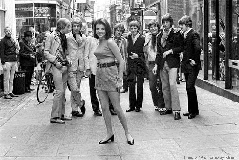
“Swinging London” was still very much roaring along. Behold Carnaby Street, luv:

I’d come from a deeply repressive Swiss all-boy Jesuit school the year before, where tracts against masturbation were solemnly handed out, and attending a party featuring ‘impure’ pop music was grounds for expulsion.

And here– just in time for my puberty– was I introduced to this carnival, this opportunity to blossom!

Soon I’d ditched my staid flannel tartans and chino trousers for paisley scarves, ruffled pink shirts, and bell-bottom pants…

That’s me, age sixteen, literally rising above my peers at school.

The Beatles, Led Zeppelin, Jimi Hendrix (who died in the hospital next door to our first house — for some reason that spooked me at the time), The Mothers of Invention, The Rolling Stonesthey furnished the soundtrack to my life.

Ah, but this is a column about comics, is it not? So what was the scene like at the dawn of the ’70s?

It was glorious.

Current wisdom holds that comics of the ’70’s were in a particularly dire patch of their history; but this sad state of affairs came about essentially after 1973, and there were bright spots even so until the end of the decade.

The  comics Underground was at the apex of its short history; Crumb, Shelton, Deitch and co. Their comics were hard, but not impossible, to find in London; generally in the funkier record shops like Cheapo Cheapo Records off  Picadilly, or in the patchouli-scented head shops.

Mostly, though, they were reprinted in underground newspapers like the International Times (IT):

click image to enlarge

The British Underground comics scene was pretty underdeveloped, though there were promising exceptions. Here, from IT, is Michael Moorcock‘s Jerry Cornelius, as rendered by Mal Dean:

click image to enlarge

An all-comics offshoot of IT was Nasty Tales, edited by the musician Mick Farren. More Crumb than you can shake a stick at:

… and it was a Crumb spread of an orgy that caused the publisher to be prosecuted in the sensationalised trial that set a precedent for freedom of the press. A benefit comic was published, with early work by Dave Gibbon:

Meanwhile, across the Channel, French comics were enjoying something of a golden age; magazines such as Pilote and Charlie were moving to more adult content.

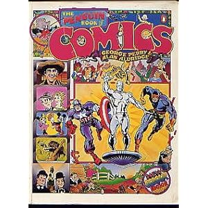
That 1969 Christmas, my father gave me a book that was a touchstone for an entire generation of fans: The Penguin Book of Comics, by George Perry and Alan Aldridge:

My collecting centered mostly on the American mainstream: Marvel, DC, Warren.

At first, American comics were distributed in the UK in a very haphazard manner.

They were mostly unsold copies from the USA that were shipped across the Atlantic as ballast. You never knew what you’d find: that ensured the thrill of the hunt all collectors know.

It was a rich period in the mainstream. The old-guard cartoonists– Kirby, Adams,Wood, Severin, Kubert, Heath, Kane and so on– were at the top of their powers, and were joined by a crew of young Turks of remarkable talent– Barry Smith, Mike Kaluta, Berni Wrightson, Frank Brunner, Ralph Reese, Howard Chaykin.

Popular genres other than the super-hero were still flourishing: war, mystery/horror, romance, fantasy. There was still a plethora of humor books.

And an innovation that foretold the future of comics as we know it was coming into being: the comics shop.

click image to enlarge

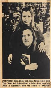
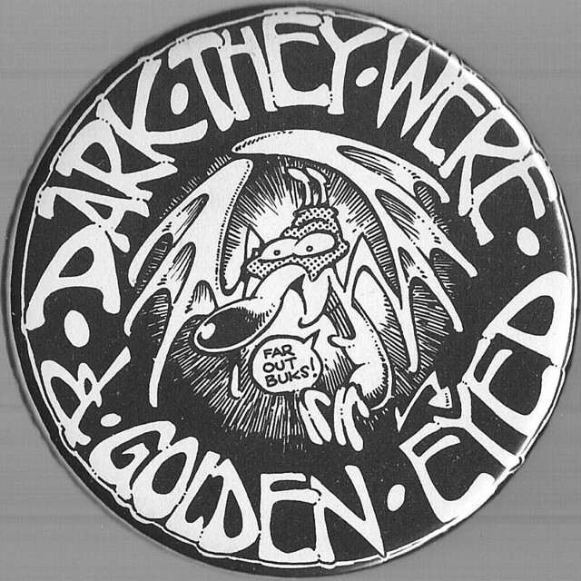
When I first opened the door of ‘Dark They Were and Golden-Eyed’, Britain’s first comics store, I thought I’d died and gone to heaven. A shop given over entirely to comics? Was it possible? Was it even legal? It was indeed.

Derek ‘Bram’ Stokes and Diane Lister…for ten years the priests of London’s comics temple

And for the first time, I was meeting other comics lovers there: I had discovered fandom. And with fandom, fan publishing.

In those pre-Internet days the main medium of communication for comics lovers was the fanzine. Britain had its fair share of ‘zines, such as Rich Burton’s Comic Media News or Frank Dobson’s and Dez Skinn’s Fantasy Advertiser.

Yes, breathes there a fan with soul so dead that to himself has never said, ‘I think I’ll start a little fanzine’?

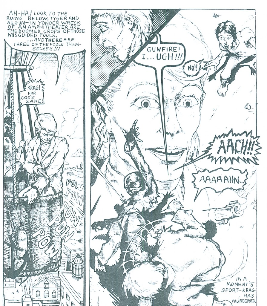
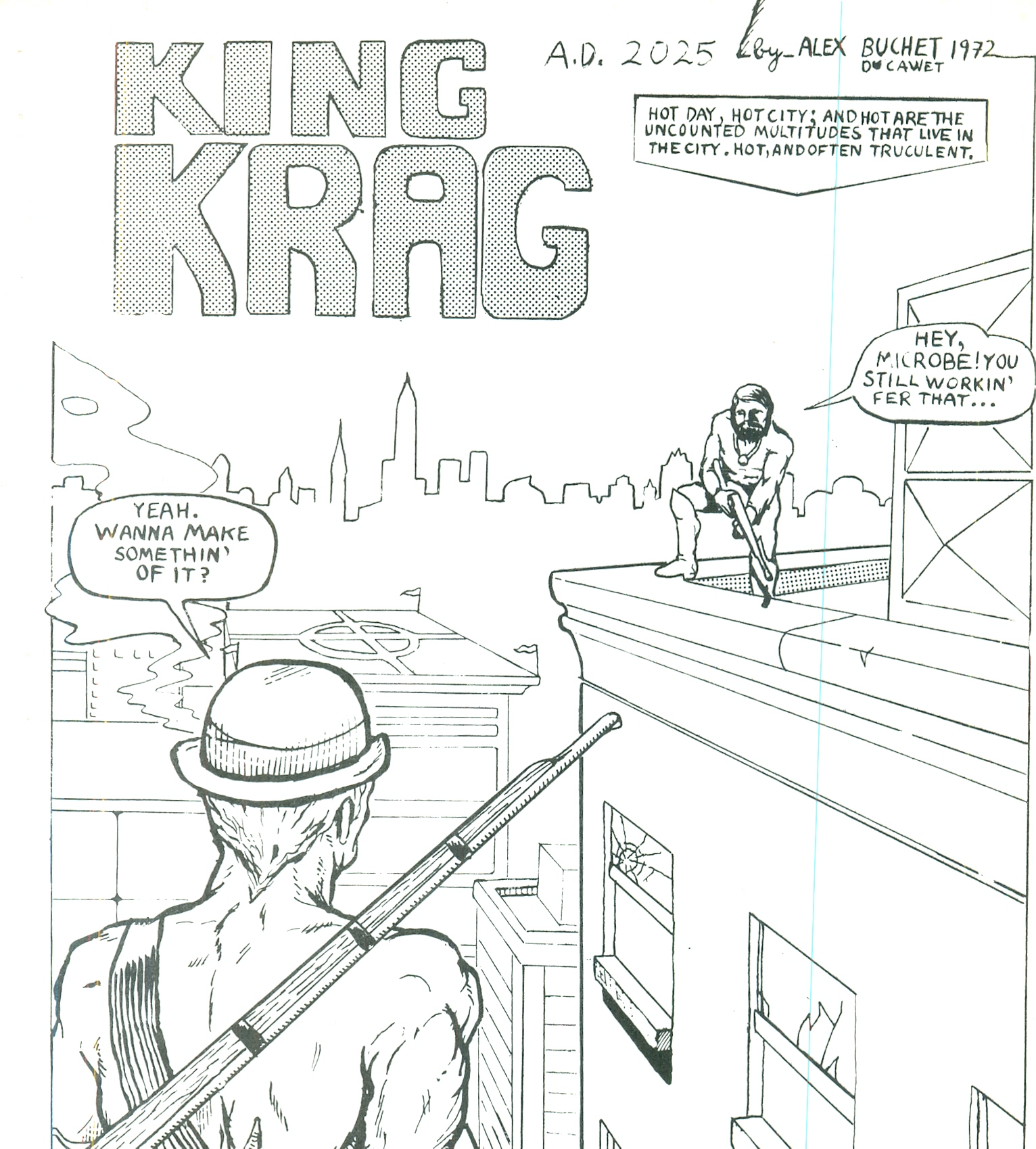
And indeed that was my thinking when, aged sixteen, I started drawing a comic strip with the alliterative title ‘King Krag.’

Now, printing options were fairly limited in those days. Mimeograph was still widespread; photocopies were becoming available, but they couldn’t reproduce solid blacks and needed a special paper. Offset printing was expensive.

This last limitation, though, was swept away by a new business model.  The Instantprint chain offered printing in small runs at a reasonable price. Not free, though, and I struggled to get together the twenty-five pounds needed for a print run of 200 fifteen-page pamphlets.

I took a decision that I regretted deeply at the time: I sold most of my comics collection.

In retrospect, I’m very glad I did. It broke the anally-retentive hold collecting had on me: thenceforth I would buy to read only. I would no longer obsess about completing runs of series and throw away money on stuff I didn’t even like to close gaps in my collection.

I teamed up with my friend Ahmed Sehrawry, who took the impressive title of Managing Editor; really, I just wanted someone to talk to– I did all the actual work. Another friend, Chris Lomax, provided the strange back-up strip ‘Milkman.’

I drew the strip same-sized (A5). Never again. You don’t save any time. In fact, the six pages took me over a year to finish.

I remember bringing the package of printed pages back to my school — the French Lycée in London — to the art department, where my art teacher gave me a room and a bunch of tables: yes, we were collating and stapling by hand– we couldn’t afford machine collation or binding. No worries, my friends and I had a good time; a collation party is much like a corn-shucking bee, an undemanding communal activity, interrupted by the odd tea break.

(Tea is one addiction I picked up in England.)

By God, the first time you see your work in mass reproduction is a trip and a half! And the first copy of a finished work…does that feel good in your hands.

I was seventeen and a publisher.

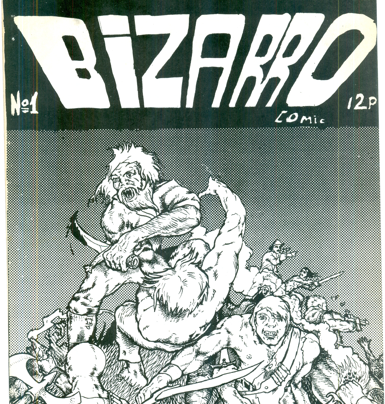
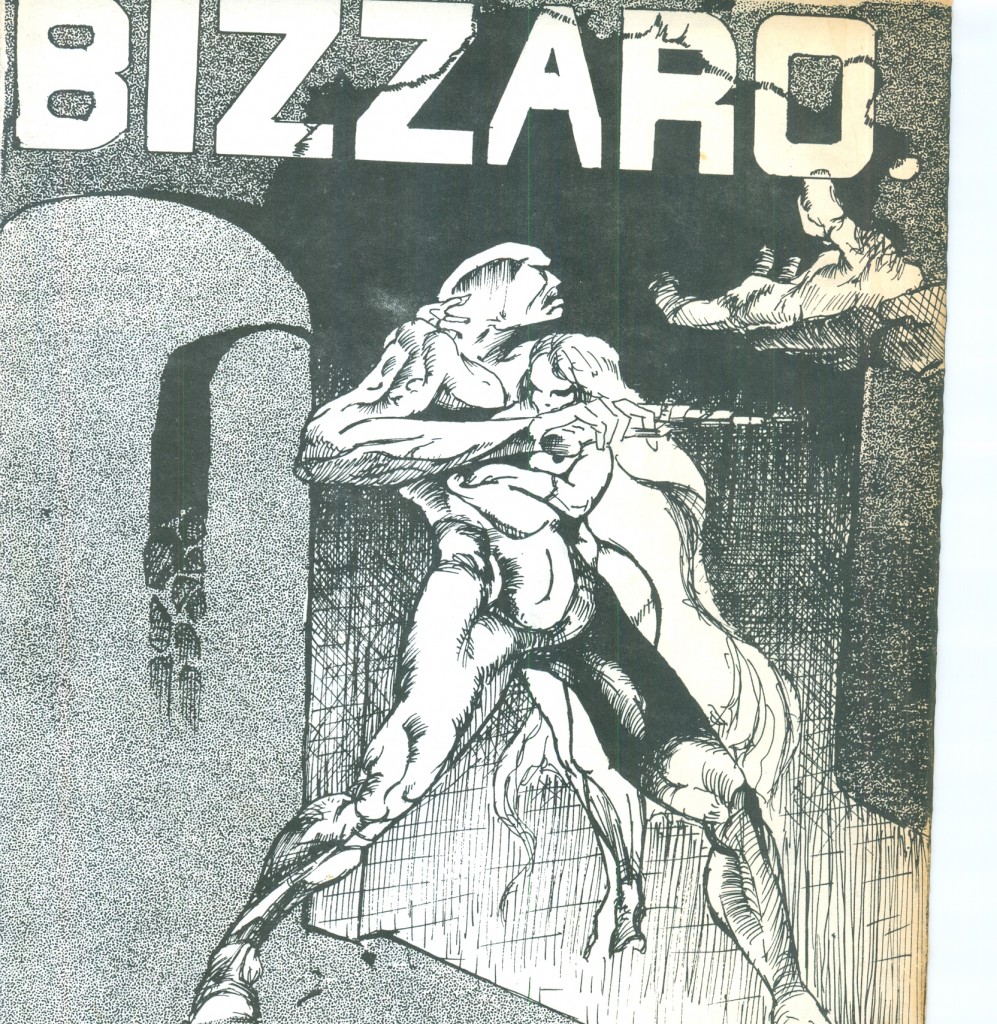
Now, I will beg your indulgence for the artwork shown. It was produced by an immature young fellow who wore his influences all too prominently; I’m harder on that boy than you could ever be. Still, as an artifact of a past 38 years gone, it repays arm-length study. Here is the cover of Bizarro #1:

What strikes the 55-year-old me about the seventeen-year-old me’s drawing above is the level of violence. True, the culture was moving that way; this was the age of films like The Wild Bunch, Straw Dogs and A Clockwork Orange. But looking at that cover, I can only ask in dismay: was I that full of incoherent rage? More than another typical teenager? Apparently, yes.

Influences are embarrassingly obvious: Frank Frazetta, Barry Smith. A less obvious influence is Géricault‘s Le Radeau de la Méduse:

…which explains why so many of the figures therein rudely turn their back on the reader.

Also irritating are the visual tics picked up from Berni Wrightson: the ‘saliva ropes’ in the shouting character’s mouth, the ‘twisty hair’ on his forearms.

Note the patterned background: I had just discovered Letratone, and like so many neophytes was inclined to abuse it, as the luckless readers of this blog shall soon confirm.

On the plus side, the composition holds together fairly well (you can’t go far wrong with triangles) and there’s a real sense of depth.

But that sloppy logo is unforgiveable.

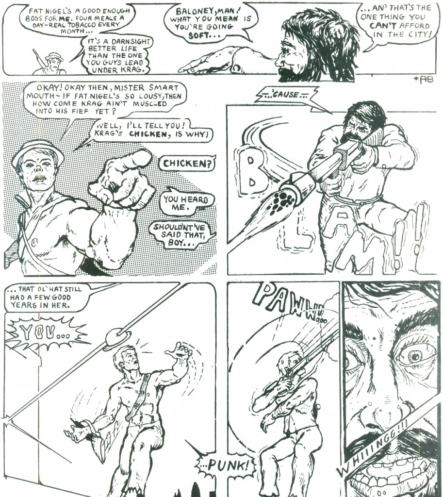
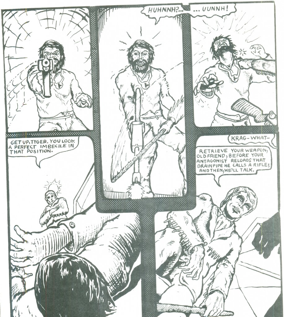
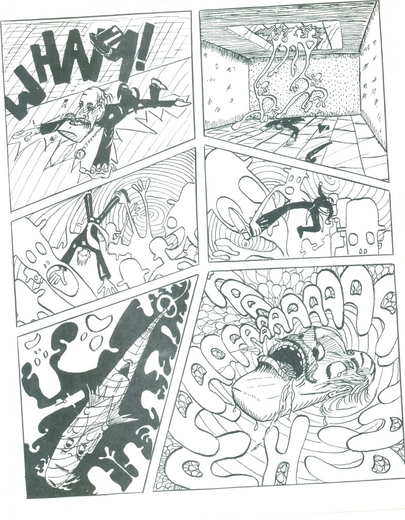
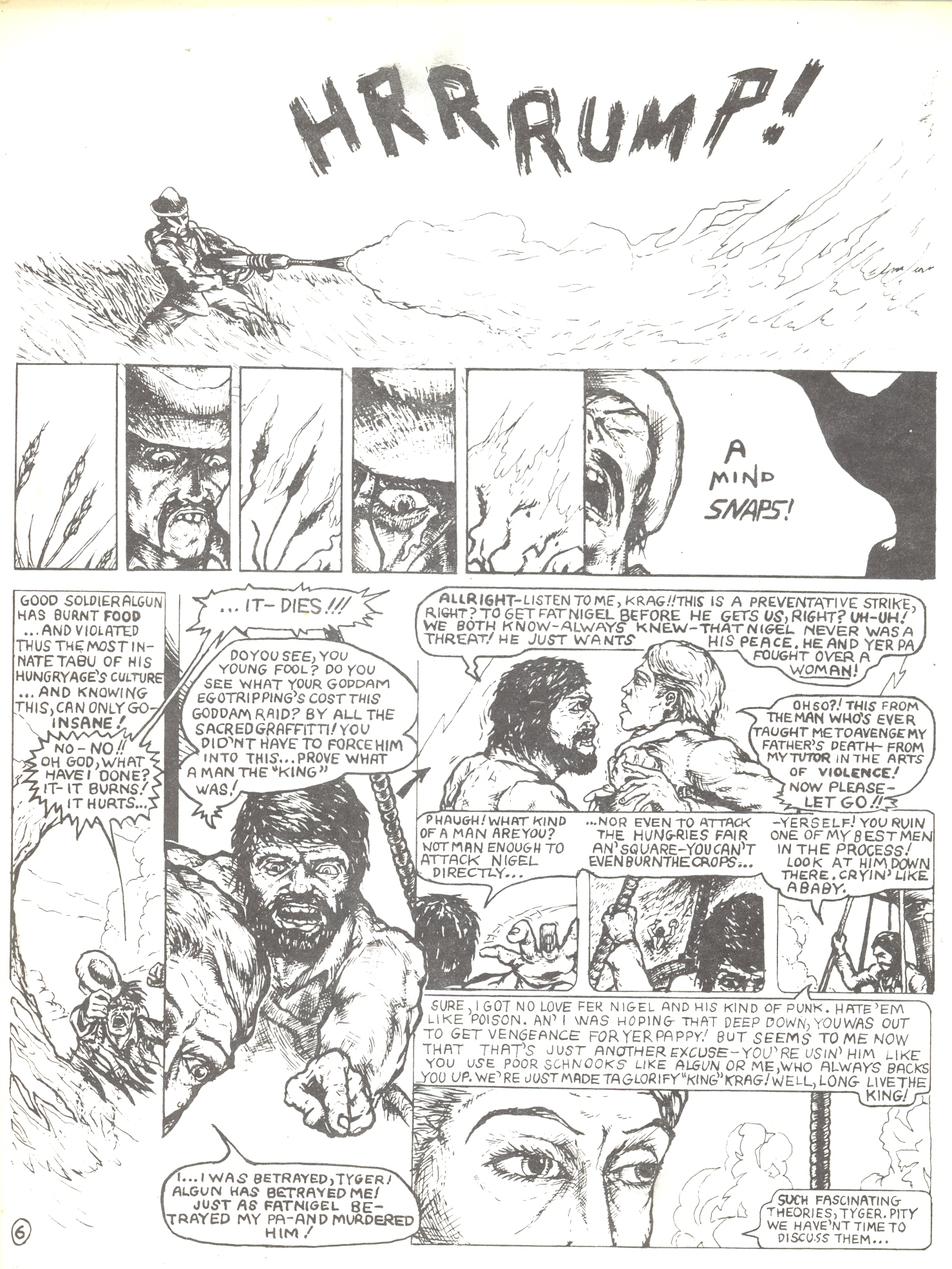
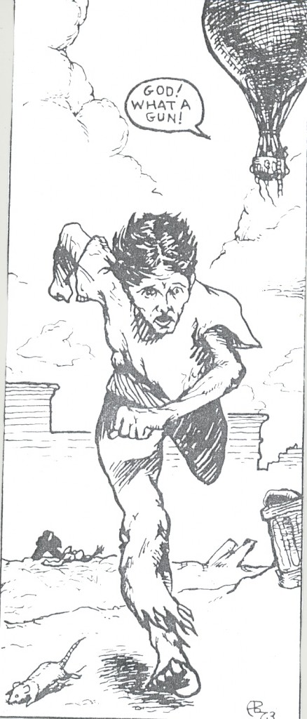
On to the strip. It’s a nightmare of incompetence.

Note on this splash page how I avoided heavy blacks: at that time, I was intending to produce this via photocopy.

Apparently, in the year 2025, for some reason they revived flintlock muskets…

It’s the standard post-apocalyptic fun future, inspired by Roger Zelazney‘s novel Damnation Alley and, oddly, Jack Kirby’s early Jimmy Olson comics. A bit over-tidy for after the apocalypse

I’m surprised to see how competent the perspective is: I don’t recall having studied perspective at that age (16), but I guess I had.


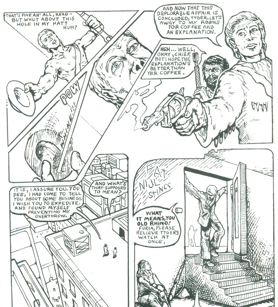
I’m afraid lousy dialogue and worse lettering are the hallmarks of my writing here. I was a nice white middle-class boy, so of course I tried to talk tough. Guns are by definition cool at that age.

Not the fishbowl-lens perspective on the guy’s hand in panel two. I was probably imitating Neal Adams.

The fussy, unnecessarily confusing odd panel shape was a disease of the time. I guess I was following in the footsteps of Jim Steranko and of Neal Adams. Note the last panel: you won’t see another woman in this macho world for macho men.

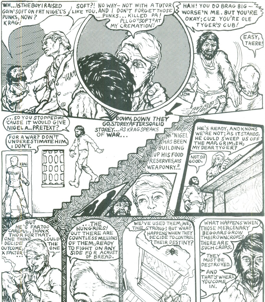
More weird layouts, odd angles, arbitrary cropping. The guy walking downstairs looks like he’s about to fall on his hairy face. I learnt that the real challenge in drawing isn’t in detailing giant space armadas– it’s in showing someone walking downstairs or opening a door.

So endeth chapter one.

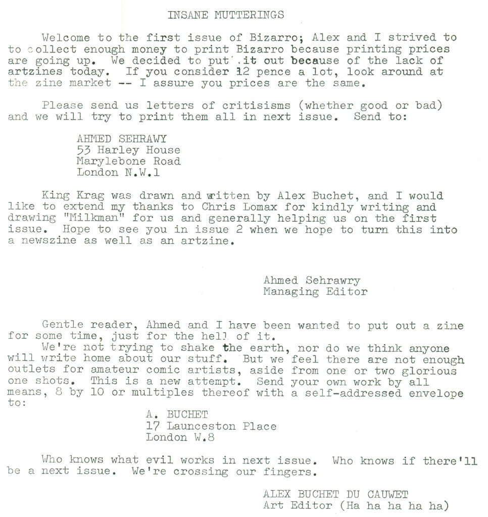
There followed a mimeographed page of messages from the editor. I’m relieved to note that neither Ahmed nor I took himself very seriously. It was typewritten: word processors didn’t exist, and typesetting was expensive.


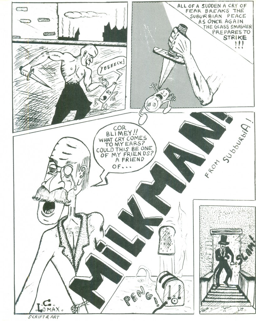
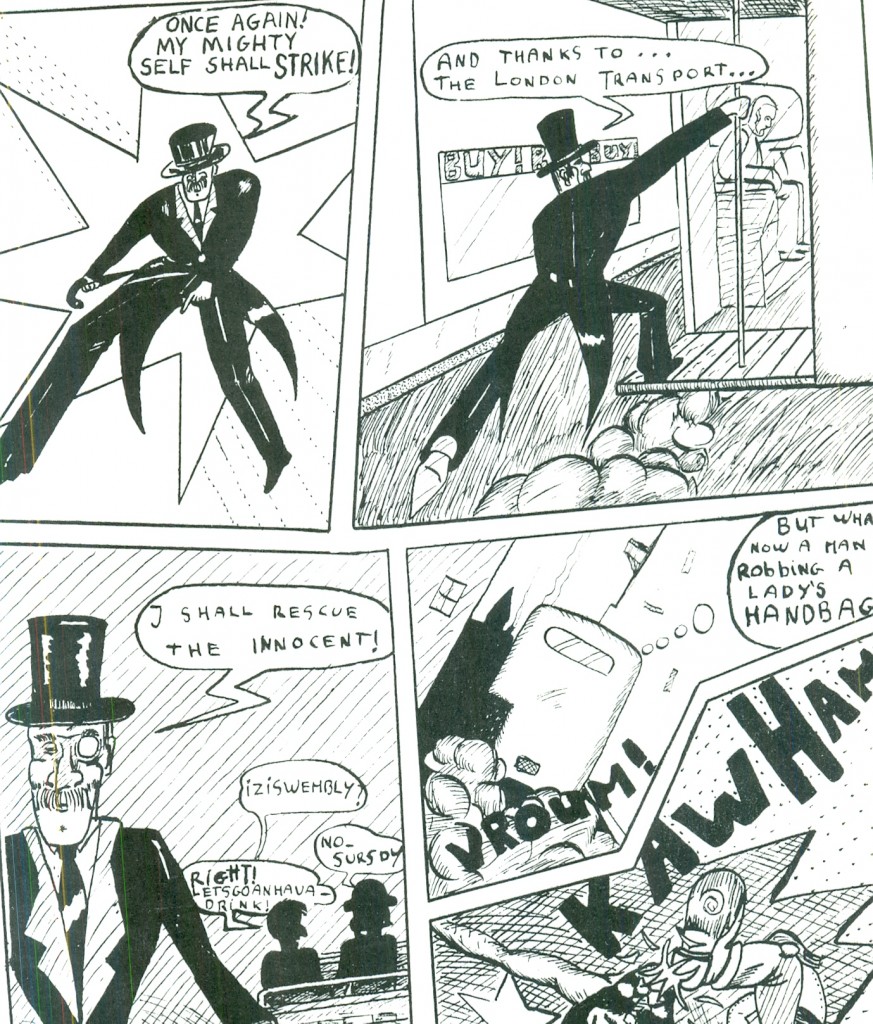
Rounding out the book was Chris Lomax’s ‘Milkman’. Its primitivism and absurdity have stood the test of time better than my overblown strip. Chris went on to be a successful stage and set designer in Paris, working on films such as Betty Blue.


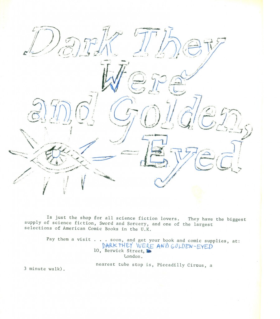
We return to the horrors of mimeograph. Bram at ‘Dark they Were and Golden-Eyed’ let us drop off some copies on consignment if we’d run a free ad for his shop.

Well, Bram, you get what you pay for. And this is what ‘free’ pays for:


Ahmed took fifty copies to sell at his school; I took the remaining hundred and fifty to sell in mine. I recruited my brothers Philippe and Gérard, as well as friends like fellow comics- fan Sanjit, to spread out through the school and tout my inky baby.

We sold out within 24 hours.

It seems that publishing a comic in high school is like giving a rock concert in the gym or acting in the school play. The kids’ll support you just because you’re one of them. (Our principal was something of an arsehole about it, as I hadn’t asked for his permission; fuggim, I was out of there anyway.)

Issue 2 came out over a year and a half later. Now I’m a terribly slow artist, but this was ridiculous.

I had gone to Paris to study art at the Faculté des Arts Plastiques et des Sciences de l’Art of the Sorbonne. I was studying electro-acoustic music under Yannis Xenakis, screenwriting under Eric Rohmer, conceptual art under Journiac, comics under Jean-Claude Mézières.

I had outgrown my adolescent strip. It frankly embarrassed me.

Why didn’t I just give it up, then? A misplaced puritanism– I had vowed to break my bad habit of starting projects and not ending them; and I didn’t want to let Ahmed down.

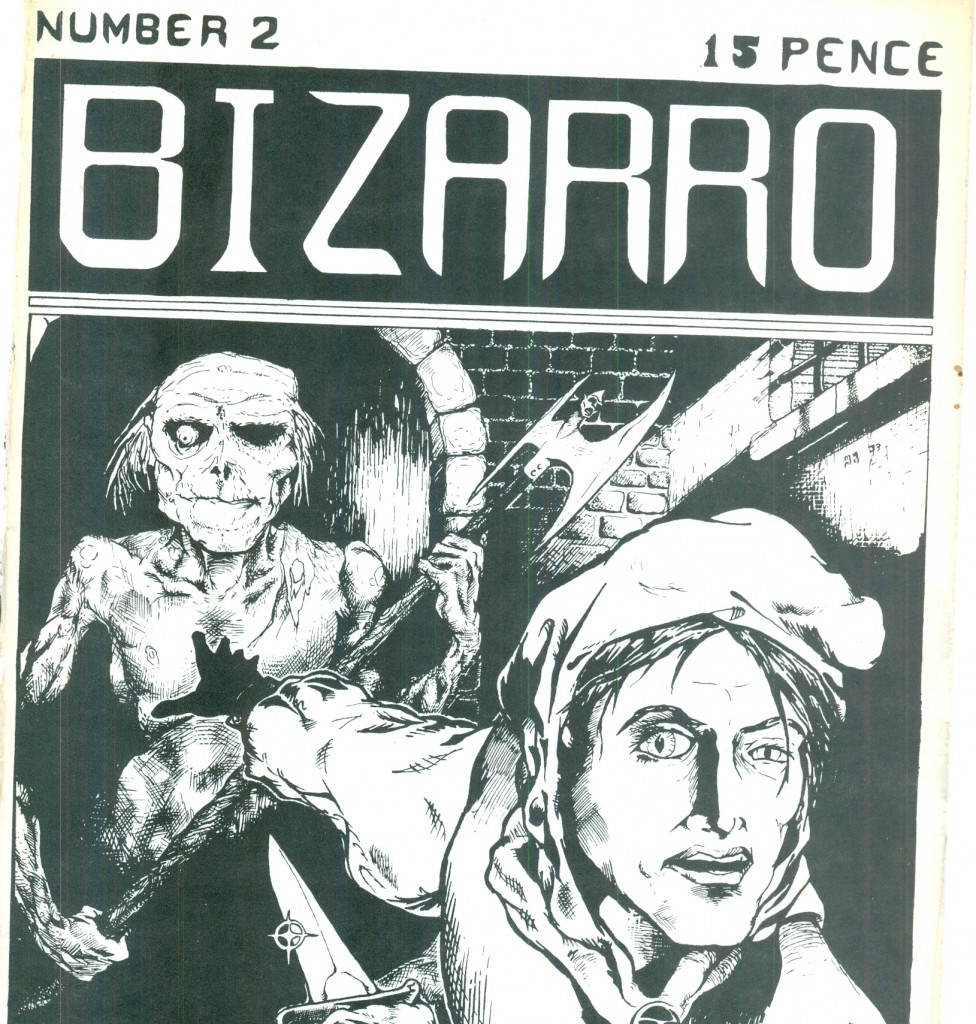
The second issue boasted another odd cover, replete with clichés taken from Frazetta, Ploog, and Gustave Doré. I like the poor sap in the foreground’s expression. “I gotta turn around…but I really don’t wanna turn around…but I gotta…”:


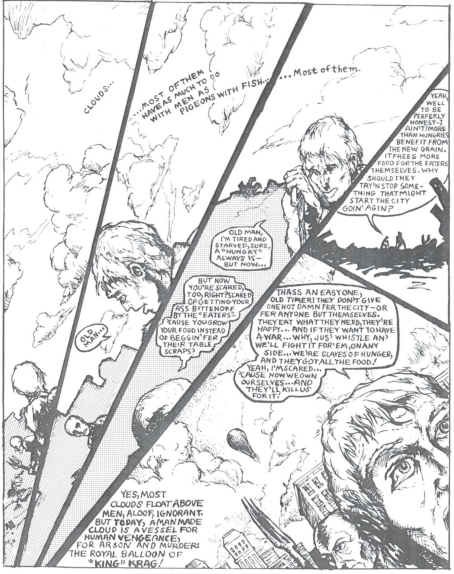
Page one– more arbitrary panel noodling, fatuous captions, and peasants dutifully giving us an “infodump”: a massive exposition of stuff they already know and shouldn’t be repeating.


God, the inflation of those speech balloons.

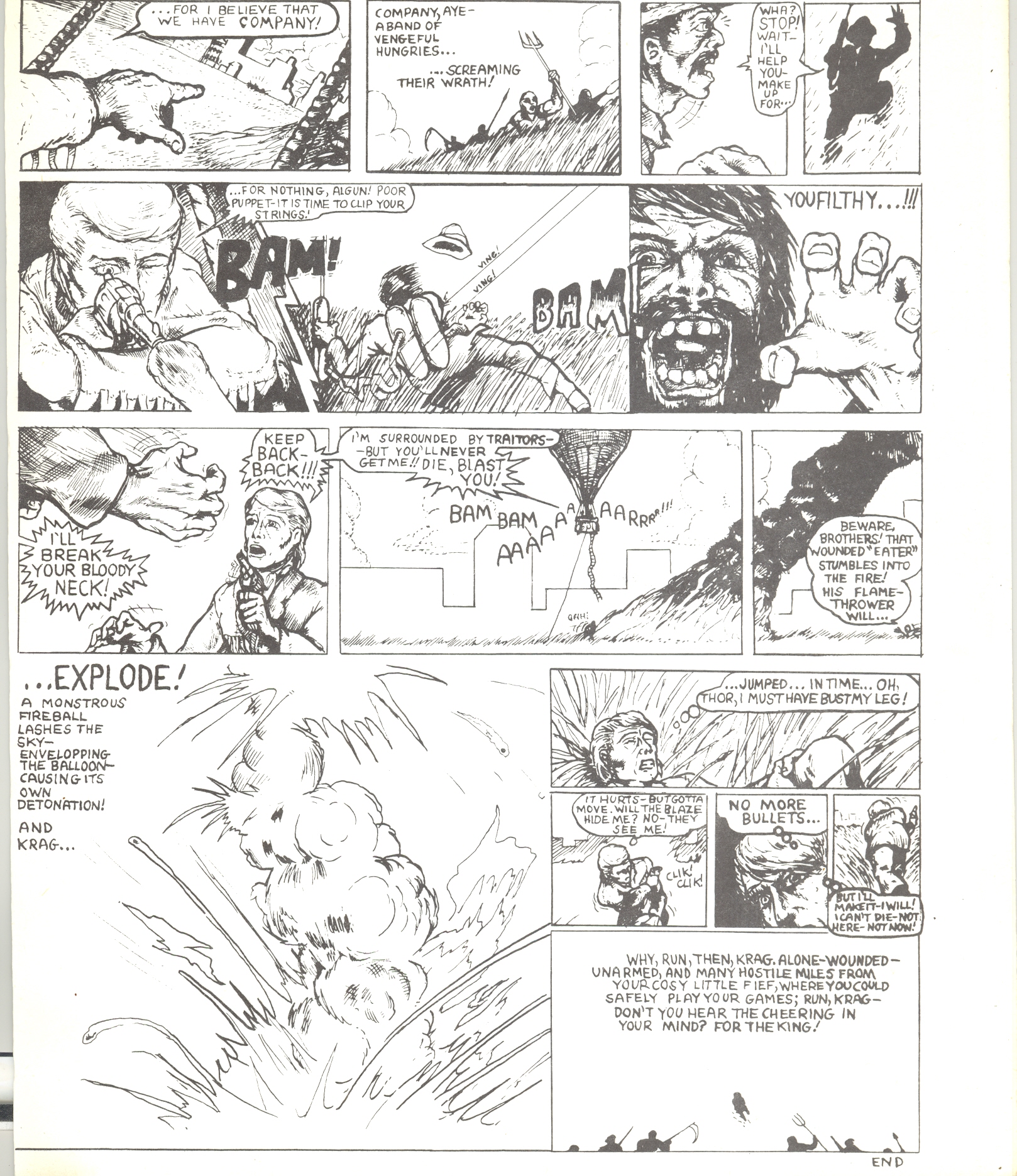
More gratuitous violence follows. (I give myself some credit for actually researching hot-air balloons.)

From here to the end, you’ll note that the panel-per-page ratio goes up, to as much as fifteen. Was this innovative structuring for more intense beats? No, it was bad planning. I leave the rest of the story to the masochistic blogreader. It depresses me to read it myself.


For the second issue I had simply mailed the pages to Ahmed in London and let him do it all himself. A bit cowardly of me.

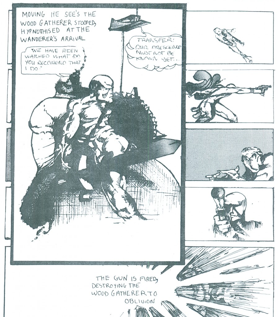
Ahmed found a 15-year-old artist named Marcelo Anciano to fill out the rest of the book:


When I finally met Marcelo the next summer, I remarked how his characters’ weapons were such blatant phallic symbols (see above). He nearly died laughing.

(Marcelo is now a film director and producer, working with Quentin Tarantino and other luminaries.)


Note in Marcelo’s back cover how he spells ‘Bizzaro’ for ‘Bizarro’. We were all over quality control, weren’t we?

The second issue was a sales disaster, as it probably deserved to be. I didn’t care; I’d purposefully disengaged myself from it, which was unfair and a betrayal to Ahmed and to Marcelo.

Today, Ahmed is known as Ahmed Shawki, the editor of the International Socialist Review. I wonder if our failed little business venture soured him on capitalism? He’s certainly grown since this first foray in the publishing business.

(One 13-year-old fan, an architect’s son, who used to come to Ahmed’s place where we’d discuss comics, was definitely not a business failure. He went on to found the Forbidden Planet chain of bookstores, the dominant direct-market distributor in Britain, and Titan Books. His name was Nick Landau.)

For years after, though, I’d take copies of issue 2 to the comics marts off Tottenham Court Road and vainly try to flog’em. This led to an embarrassing incident (and a good lesson.)

After one mart in 1975 I was hanging around while the organisers dismantled the set-up. A fellow dropped by the table where I sat and asked to see some of my purchases; we got to talking. It was Dave Gibbons, then known to me as a very prolific fan artist. He said he was working on superhero comics for an African publisher and was about to do ‘Dan Dare’ for an upcoming IPC mag called 2000 AD.

I passed him a copy of my issue 2 and awaited his opinion.

Now, Mr Gibbons is a gentleman, and I’m sure he didn’t wish to hurt my feelings. He pointed to one panel and said: “I like this one”:

As it happens, that panel is the only swipe I’ve ever done– stolen from Swamp Thing # 4.

” God sees the truth, but waits” goes the old Russian proverb.

So does Dave Gibbons! I’ve never swiped a drawing since. Never.
(“What, never?”

“No, never!”

“What, neverrrrrrrrrrrrrrrr….?”

“Well…

…hardly everrrrrrrrrrrrrrr…!!!

W.S.Gilbert, ‘HMS Pinafore’)

1973 was a watershed year for comics. And not in a good way.

The Underground smashed into a brick wall: anti-obscenity Supreme Court decisions, anti-paraphernalia laws that destroyed headshops, a general change in the culture away from perceived ‘hippie dippie’ values, all nearly killed this once-vibrant sector.
The great paper shortage of 1973 and the oil embargo of that same year put crippling pressure on the mainstream comics companies.
They also were losing quickly their traditional retail outlets, and the nascent direct market wasn’t yet strong enough to take up the slack.

Britain headed into a decade-long economic slump, putting paid to ‘swinging London’ (and birthing Punk.) ‘Dark they Were and Golden-Eyed’ went out of business in 1981.

promotional button by Hunt Emerson

Still, in those old crude fanzines of Britain’s early seventies are the seeds of future accomplishment. It was here that the young Dave Gibbons, Brian Bolland, Kevin O’Neill and so many others took their first stumbling steps.

Bram, Diane, Rob, Des– I just want you to know that the whiny, loud, obnoxious fanboy 15-year-old you knew as Alex is now a whiny, loud, obnoxious fanboy 56-year-old, and he’d like to buy you all a jar so we can lament how comics have gone to the dogs since our day. ‘When I were a lad…”

As for me, I never published again, and remain a dilettante in comics. Looking back, I regret that I didn’t pursue an entirely different talent I had for caricature; it would’ve borne more interesting fruit.

Ah, nostalgia just ain’t what it used to be…mais où sont les neiges d’antan? Where are the snows of yesteryear?

Below is a recent bit of foolery, done for an online ‘exquisite corpse’ jam comic:

That’s about the limit for me nowadays.

Yet, hard as I’ve been on my adolescent self — still I’d give up everything I have to relive those days, those golden years gone forever, when I was teenage cartoonist.

****************************************************************************************************

For a good overview of the British fanzine movement, check out
Dez Skinn’s entertaining take.
An incredible resource:
the International Times archive.
Lastly, that jam I contributed to:
Good fun, check it out