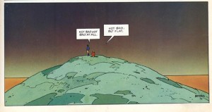
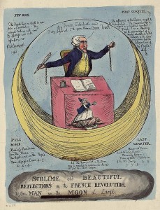
The sublime is slippery. Theorists of the sublime all agree at least on the “wow” of it, but can never decide where it resides, let alone come to agreement on the “what” of it. Jack Kirby for example offers plenty of “wow,” but at times as in Captain Victory’s “Fighting Foetus” there is confusion over the “what” of it. Moebius, likewise, later discussed here, gives “wow,” but opens doors for inquiry into the “what” of his work, as narratives such as The Incal bring one into proximity with transcendent images. In the following series, I propose to look into the sublime. No, I will not be climbing any mountains, visiting an ashram, or performing Cartesian gymnastics, but I will be examining the many theories of the sublime and looking at a variety of comics where I hope to find the WOW of it all. Moreover, I will peer into the theoretical abyss between images and words to seek answers to some of the questions that arise between the elder theorizations of the sublime and the most recent.
The Sublime, writ large, is frequently compared with the Beautiful, whose sound effect might be OOOh. More recently, since the post-modern secularization of the sublime, scholars like Caroline Walker Bynum attempt to slide Wonder into the mix so that the AAAh of the stained glass window and medieval religiosity can surreptitiously and seductively make an aesthetic entrance to recall the forgotten awe of the Gothic, which rightly belongs to the sublime. Nor can one forget that the “ridiculous” is often brought into proximity with the sublime as if it were obviously at the other end of an aesthetic spectrum. Since I cannot attribute a patently obvious sound effect invoked by “ridiculous,” it probably means that it deserves additional attention. Especially because it is self-evident that the ridiculous can be found in comics, though unannounced by any “Blargh” or the like.
But before we go further into the WOW, OOOh and AAAh of aesthetics, allow me to give the 50 floor elevator definition of the sublime and its problems.
For the early Western aestheticians the sublime was that which produced fear, awe and pleasure, in roughly that order. Concepts of the sublime appear in the first century academic treatises of Dionysus Longinus, who thinks about its oratory uses and writes how to create a sublime response in the hearer through rhetorical ravishment or even aural rape. His sublime finds expression in sights of grandeur, heroic deeds and the uncontainable idea of the infinite. Longinus believes that power is the essence of the sublime style, as it literally moves or transports its hearers, and he offers among many examples a rare reference to the Hebrew scriptures, Genesis 1:3, “And God said, Let there be light; and there was light.” Word and the power of the word are unified. Along the way in the seventeenth century, Thomas Burnet and Despereaux Boileau rediscover him and write about the sublime in apocalyptic terms of divine power and grandeur. The rationalists of the Enlightenment reframe the discourse to help theorize and classify the various categories of aesthetics (how they would have loved Chris Ware).
For the eighteenth century theorists, the sublime is of interest as a parallel to beauty, in that it gives pleasure, but arises out of the appreciation of the fearful forms of nature. After visits to the Alps, John Dennis and Joseph Addison talk about the way the terror of nature becomes agreeable. The vastness of awe-inspiring vistas of mountains connects emphatically to the experience and synthesis of ideas as to what constitutes the sublime. Addison comprehends the sublime as a primarily visual affect and not one of language. It is seen “out there.” It is objects that possess the qualities of the sublime; vastness and unimaginable scale, and not the man who merely responds to the stimuli. Inspired by their start, Edmund Burke notes the conflicting emotions of fear and attraction, and of the resultant pain taking a pleasurable form before the awe of the mountains. A ground shift occurs when Edmund Burke brings the sublime into the body through the eye. For him when terror is mitigated by distance, the human mind intervenes to supply language to what is seen and one is able to articulate the grandeur of nature, for example. He realized that the experience was an epiphany-of-self that could be transmitted through language and rhetoric and that it allowed for the expression of individuality in the personal experience of the sublime. However, his idea that the sublime was somehow a tension resulting from eye strain left him open to criticism, while his empirical approach held its ground.
When Immanuel Kant approaches the topic in the “Critique of Judgment,” his ordered mind delineates two forms of the sublime, the mathematical and the dynamical. In Kant’s sublime the unbounded and the limitless overwhelm the senses to such a degree that one is unable to grasp the scope of the experience. The human form is used as a measure against the scale of the object before it and when the imagination is blocked and at its limit, it starts to stall. Gilles Deleuze later identifies this moment as the “bend.” The mind is unable to find its ground and in the face of the unbounded or limitless, it then checks itself and the supersensible rallies to supply language that finally allows for pleasure to take place in the body, as one is now able to integrate the experience. Here, one must recall that the sublime does not happen outside of the individual; it is not in the external world. It occurs in the mind of the person for whom a set of stimuli are made apparent and which are unbounded in their scope so that they are at first impossible to grasp. Kant sees the sublime as a struggle as between the evidence of the senses, or the empirical domain as against reason and the supersensible mind. More significantly, the sublime is no longer “out there” in the grandeur of external creation. Now, it is internal as man’s mental mastery of his fears and his recognition of self in relation to the unbounded sublime introduce ideas of will and autonomy into the equation. For Kant, beauty has boundaries and form, while the sublime is formless and unbounded. Another of Kant’s criteria in the sublime experience is of a far less esoteric nature: one can only experience the sublime from a physically safe position.
Johann Wolfgang von Goethe follows on this path into the unbounded poetic mists of the transcendent imagination, as Friedrich Wilhelm Joseph Schelling stages a tragic sublime of dialectic problems as a catharsis for his audience. Schelling influences Samuel Coleridge, who in turn influences the British corpus of poets. Coleridge’s partner William Wordsworth manages to think through his own spectacular version of the sublime as he concludes that the sublime is within his imagination and memory and not up the mountain at the Simplon Pass or on Mount Snowden. Coleridge, a sublimist extraordinaire, in addition to theorizing a symbolic sublime, nails down an arguably loose Kantian point in the last half of this commentary:
I meet, I find the Beautiful-but I give, contribute, or rather attribute the Sublime. No object of Sense is sublime in itself: but only so far as I make it a symbol of some Idea. The circle is a beautiful figure in itself; it becomes sublime, when I contemplate eternity under that figure. The Beautiful is the perfection of, the Sublime the suspension, of comparing Power. Nothing not shapely …can be called beautiful: nothing that has a shape can be called Sublime except by metaphor.
(Coleridge 1995:597)
Excited sidebar: we can look forward to thinking about panel borders through both the Kantian and Coleridgean ideas of definition and metaphors and all of this in terms of the bounded and unbounded.
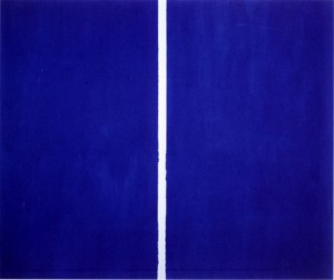
Rushing forward to point to the modernist and post-modern arena of the sublime, one finds Derrida’s quasi-transcendental concepts of divided order and chaos, Lyotard’s notion of the sublime as an instant that denies the mundanities of time and sensibility, and Barnett Newman’s spatial interrogation of the divine found in the illimitless meditation of the zip.
The end for now is with Peter de Bolla, Jacques Lacan (the thing), and Slavoj Žižek. De Bolla works with language, drawing from Foucault and Derrida to suggest that everything is the “text.” For him, ideas of the impossible and possible and the extension of the infinite become immanent in thought, rather than transcendent as the Sublime is relieved of its Judeo–Christian concepts of the divine. Žižek is interested in the “lack” discovered as the desire for the sublime creates an ironic vacancy, as the search for “things” beyond mortal control slap us in the face and alert us to our ridiculousness.
In short, there is an unbounded divergence of ideas that proliferate like the mathematical sublime, which attempt to deal with the anxieties of our world both physical and metaphysical through a portal of aesthetics.
The same might be said of comics. Although at times they border on a Žižekian ridiculous as the superheroes, and yes, Superman heads this group, reach beyond our limits into other dimensions, while the question is always what does it mean to be human? Clearly, comics engage the question of what constitutes humanity directly and indirectly. Often, super abilities and zoomorphic transmutations stretch the notion of human to sublime limits.
The Problem of the Gendered Sublime.
Humanity comprises of numerous genders, I hazard there are some yet unidentified. But the Beautiful typically is gendered as feminine, while the male is housed in the unbounded terror and awe of the Sublime. Only when women become unruly, or become the mythological “hag” is the (deformed) female forced into a sublime figuration. The attribution of feminine characteristics as an aesthetic quality comes through the heritage of Greek aestheticians, who conflate beauty with truth. Together, these attributes are represented in the forms of symmetry, proportion, and harmony. Later, for Burke, these perfections of balance become unimportant. According to him, the qualities that comprise beauty include lightness, mildness, clearness, smoothness, gracefulness and gradual variation, and beautiful objects may be delicate and small. Burke writing at the age of nineteen concludes:
THE passion which belongs to generation, merely as such, is lust only; this is evident in brutes, whose passions are more unmixed, and which pursue their purposes more directly than ours. The only distinction they observe with regard to their mates, is that of sex. It is true, that they stick severally to their own species in preference to all others…The object therefore of this mixed passion which we call love, is the beauty of the sex. Men are carried to the sex in general, as it is the sex, and by the common law of nature; but they are attached to particulars by personal beauty. I call beauty a social quality; for where women and men, and not only they, but when other animals give us a sense of joy and pleasure in beholding them, (and there are many that do so) they inspire us with sentiments of tenderness and affection towards their persons; we like to have them near us, and we enter willingly into a kind of relation with them, unless we should have strong reasons to the contrary. But to what end, in many cases, this was designed, I am unable to discover; for I see no greater reason for a connection . Sect. X: Of Beauty.
Kant and Burke both “relegate” the beautiful to a feminine position, which until recently remained unchallenged. The affect of beauty is less powerful than that of the sublime in this understanding. Kant’s rational runs thus:
Finer feeling, which we now wish to consider, is chiefly of two kinds: the feeling of the sublime and that of the beautiful. The stirring of each is pleasant, but in different ways. The sight of a mountain whose snow-covered peak rises above the clouds, the description of a raging storm, or Milton’s portrayal of the infernal kingdom, arouse enjoyment but with horror; on the other hand, the sight of flower-strewn meadows, valleys with winding brooks and covered with grazing flocks, the description of Elysium, or Homer’s portrayal of the girdle of Venus, also occasion a pleasant sensation but one that is joyous and smiling. In order that the former impression could occur to us in due strength, we must have a feeling of the sublime, and, in order to enjoy the latter well, a feeling of the beautiful. Tall oaks and lonely shadows in a sacred grove are sublime; flower beds, low hedges and trees trimmed in hedges are beautiful. Night is sublime, day is beautiful; the sea is sublime, the land is beautiful; man is sublime, woman is beautiful; …The sublime moves, the beautiful charms. The mien of a man who is undergoing the full feeling of the sublime is earnest, sometimes rigid and astonished. On the other hand the lively sensation of the beautiful proclaims itself through shining cheerfulness in the eyes, through smiling features, and often through audible mirth… Deep loneliness is sublime, but in a way that stirs terror. Hence great far-reaching solitudes, like the colossal Komul Desert in Tartary, have always given us occasion for peopling them with fearsome spirits, goblins, and ghouls. (46-7).
Even as women claim their aesthetic autonomy, the gendering of space, objects and even mood seem to escape any strenuous reappraisal.
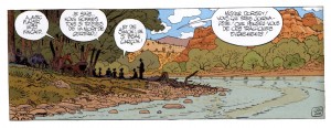
Moebius, whose body of work has at its heart the question of the human condition, works with gendered landscapes to locate the Querelle des Anciens et des Modernes, understood respectively as literatures of order and chaos, which almost counterintuitively represent Beauty and Harmony as female forms, while the male is the infinite, unbounded Sublime (I set aside “order” as in “law and” for the moment). In “Dust,” a recent book of the “Lieutenant Blueberry” series, which is largely situated in a masculine narrative of the Old West, Moebius sites a picnic in a bucolic landscape where women are present.
In the image women sit with men shortly after a funeral and discuss issues of mortality. The setting ties to the transformative presence of the female in the archetypically male Wild West. The civilizing presence of the female is signaled by the taming of nature as a gently flowing river points to a path forward into a beautiful future. It is a progressive vision as the female (Beautiful) figures interact with the male (Sublime) cowboys to modify the wild landscape. One might say that the image of the picnic as an institution is as American as apple pie and there are thousands of comics, strips and one-liners on the topic to bear this out. Their existence might lead one to conclude that the beautiful landscape is inherent in the social experience of the picnic and that there is no other suitable locale. However, the reason the picnic in the feminized landscape draws so many humorous and romantic attacks, is precisely because the picnic is a site of erotic anxiety, with fears of regulation and constraint supported by the gendered landscape. The picnic occurs in a female terrain with the aesthetic of beauty as its marker. The transformation of the sublime through the aegis of beauty represents an emasculation of sorts as the wild and free domain is brought into abeyance by the tame and ordered.
Compare this image with the early nineteenth century painting The Cornfield by John Constable and one sees a similarly controlled vision of nature.
Although for Constable the image points to the anxiety of change and of nature threatened by progress. The narrative of the picture finds its currency in the political tensions between the land open and free, and the land bounded and restricted with enclosures. Moebius with his version of a late nineteenth century American picnic image mirrors similar anxieties. He references stresses between town and country where cattlemen distrust the town’s people and the backdrop to the period is the ongoing sheep and cattle land usage debate. What is less evident is the strange connection between domesticated land usage and the female as a constraining figure.
In contrast, in “The Ballade” in Arzach and Other Fantasy Stories, when the male (human) presence enters the female domain, Moebius sets as a backdrop a strong mountainous ridge behind an unbounded field of yellow savannah grasses. The huge scale of the space is indicated by the unending horizontal plane.
In the final image of the sequence, the dead female faun’s presence is replaced by a male presence made visible and supported in the sublime landscape. We never see the soldiers up close, but Moebius uses a gendered landscape to support a political juxtaposing of male and female energies. He insinuates the male in the terror of the advance. We as readers are able to experience a Kantian sublimity, since we are safely able to observe the scene from outside of the images. As the tanks roll forward having killed the female faun, the (Pooh) boy and his animal, pleasure taken in nature and poetry is obliterated by military progress and this sublime experience additionally codifies our assumptions of gender.
The text in the narrative only gives that the advancing troupes are human; one never sees or hears their gender.
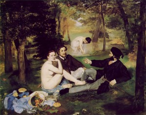
In the image of the picnic, the unseen forces of capitalism assume a bourgeois guise. This is not Manet’s unrepentant le dejeuner sur l’herbe, but the domestication of an aesthetic that ties the female to false consciousness and consumerism. My point here is not to linger over these instances, but to alert the reader to the unspoken gendering manifest in aesthetic choices brought forward in any examination of image or text through the lens of the sublime.
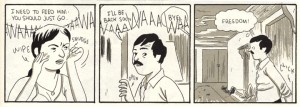
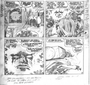
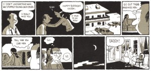
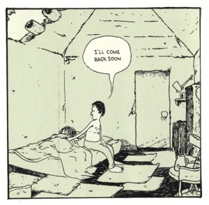
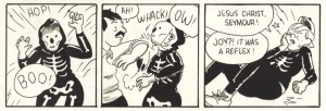
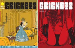
Indeed, one might find this tension of constraint and repression repeated as a response to panel borders and the contained image in many comics. It can appear in direct representation, as Seymour in Sammy Harkham’s Crickets #3 escapes from the domestic space only to find himself societally constrained by the landscape of backyard walls or one finds the imagination of Jack Kirby fighting the repressive impulse of the panel border as his images dissolve and reform in unbounded expression.
In this series of images, the viewer is invited to peer into boundless, hazy depth that frees him from the two-dimension surface and allows him to enter into the deep space of Kirby’s imaginary realms. The Enchanter’s face emerges, or coalesces from a formless space beyond the security of the formal space of the interior, outside the window, only to inexplicably enter the domestic space. While the reader enjoys the pleasure of the sublime, Thor responds by hurling his hammer into the abyss, which is also out of the panel, though literally abutting the panel border, which suggests that Thor is not as functional in this oddly informal domestic space.
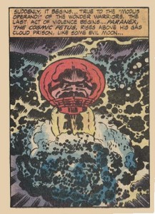
As I said earlier, to operate within the confines of two genders seems to me to be intellectually stifling and erroneous, but for the moment I will remain within this rather binary opposition. Though Kirby messes this up as he births Paranex the Fighting Foetus, a story which causes many to wonder (not AAAH wonder) about Kirby’s sanity at the time of its creation. To me it is an inspired act, in which we see the sublime alternately gendered as female as a maternal source, or wait…was that more of a classical gesture, where the Gods spring fully formed from their father? All of this offers fertile grounds (or absence of them) from which to think about the pressing issues of Jack Kirby’s works of sublimity and to test his sanity or transcendence. In a sense it points to the central thesis here—the Sublime is a useful tool to interrogate a medium that engages multiple texts with multiple images in numerous panels, in unlimited configurations, in spreads, pin-ups and grid pages.
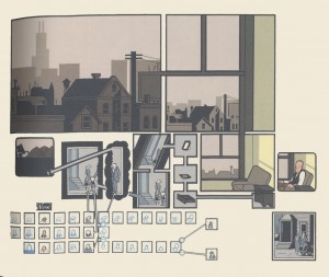
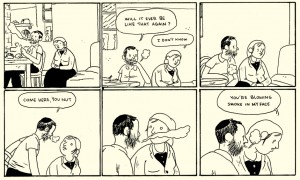
The compound image page in Chris Ware’s “The Smartest Kid on Earth,” also speaks to the anxiety of formal space in relation to gender. He multiplies the possible forms and panels and unifies the individual in domestic space as the proliferating dialectic of the smallest panels alerts the reader to the seemingly boundless possibilities for repression in relations between men and women.
Ware perhaps gives us a version of Frederic Jameson’s postmodern sublime:
…a distorted figuration of something even deeper, namely the whole world system of present-day multinational capitalism…in terms of that enormous and threatening, yet only dimly perceivable, other reality of economic and social institutions” (79, 80 Jameson cited in Redfield).
In the use of the window as a meta-panel within a panel, Ware, like Kirby, plays with the unbounded and bounded and raises interesting points about space implicated in gender. Ware energizes the problems of memory in respect to gender relations as the male protagonist lingers in his room, unwilling to engage the world. Ware’s ongoing resistance to the limitation of the panel forces an mathematical sublime of a Kantian order.
While Sammy Harkham offers us an inescapable domestic narrative of the female as repressive force, both for himself and his partner, Kirby gives us a sublime which invades the domestic space. In our consideration of the landscape as gendered and with respect to the anxieties of the contained as emblematic of authority, Kirby’s narrative rebels against the domestic space to destroy and overpower its constraints. For Moebius, the use of organic panel borders instead of the ruled lines of his work as Jean Giraud raises questions about gendered spaces that confront Kant’s idea of form as an attribute of beauty and the potential endlessness of panels without corners. I’ll leave this point for Coleridgean meditation and to contemplate what other genders and sexualities we might find in the pages of comic books.
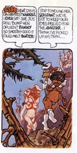
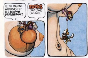
Further, just as for marginalized or constrained viewers, an issue of not seeing oneself reflected in characters poses problems, the representation of an environment that either excludes or represses their presence is equally troubling. The problems of self-recognition in a gendered landscape are demonstrated intuitively by transgendered Vaughn Bodé in his book “Erotica Vol. 1.” Bodé negotiates his sense of ill-ease in the a world of gender-assigned geography though the aegis of his sexually and violently driven characters. In Bodé’s world, lizard men constantly strive to master unfriendly sublime, though softened landscapes. They are either accompanied by, or riding females who precisely meet the round and smooth Burkean criteria of beauty, while they confront the challenges of the alien landscape. The backgrounds are soft, the words are hard. The lizard and the female are almost invariably twinned in conflicts of desire and denial.
Elsewhere, a theme in Bodé’s work is to make the female form stand in for the landscape and this points to his personal dichotomy with respect to self and his attempts to establish parameters of gender, either within himself or in the external world.
For Bodé, despite a constant verbiage of erotic innuendo and stated desire, the images remain in a constant state of tension in an unyielding landscape of denial. One might infer from these images that the transgendered individual is not accommodated in the masculine sublime or the female realm of beauty. If we continue to gender landscapes, given that this gendering carries offensive political implications, then why not inclusive Gay, Lesbian, Bisexual and Transgender landscapes? Landlocked, out at sea, up a mountain, whichever it is, we are historically caught up in this western system of aesthetic values and its signs. As I type this, round and smooth in my chair, I am not Kantian smiling and bright, however I will share an ironic laugh at the ridiculous place where we find ourselves, and reflect upon the sublimity of the Fighting Foetus.
Bibliography.
Burke, Edmund. A Philosophical Enquiry.Oxford, New York: Oxford Press, 1998.
Boileau-Despréaux, Nicolas. Oeuvres de Boileau-Despréaux, d’après l’édition de 1729. Coulommiers: Paul Brodard, 1905.
Kant, Immanuel. The Critique of Judgment. Trans. J. H. Bernard. New York: Prometheus Books, 2000.
Kristeva, Julia. “Powers of Horror: An Essay on Abjection”. Trans. Leon S. Roudiez. New York: Columbia UP, 1982.
Longinus, Dionysus. “On Sublimity.” Classical Literary Criticism,‘. Eds, D.A. Russell & M. Winterbottom. Oxford, New York: Oxford Press, 1989.
Newman, Barnett. “The Sublime Is Now.” Tiger’s Eye 1.6 (1948): 51-3.
Redfield, Marc W. “Pynchon’s Postmodern Sublime.” PMLA, Vol. 104, 2. March: 1989. p. 152. Print
Shaw, Philip. The Sublime. London & New York: Routledge, 2006.
Smith, Daniel W. “Excerpt.” Francis Bacon The Logic of Sensation. Trans and with an introduction by Daniel W. Smith, Minneapolis, MN: University of Minnesota Press, 2003. 1-12.
Walker Bynum, Caroline. “Presidential Address,Wonder.” American Historical Review February. 1997: 1-26.Print.
Wordsworth, William. The Prelude [1799-1805, as printed in The Complete Poetical Works. London: Macmillan and Co., 1888]. Bartleby. July 1999. Sept 2003.
Thor pencils courtesy of Rand Hoppe, Jack Kirby Museum.

