Blood in the Gutters

Editor’s Note: This is part of a series of student papers from Phillip Troutman’s class at George Washington University focusing on comics form in relation to Scott McCloud’s theories. For more information on the assignment, see Phillip’s introduction here.
__________________

Scott McCloud is quick to introduce the concept of closure as the defining aspect of comics and is nearly as quick to locate it as existing in “the gutter”, the blank space between the panels in comics.  This is a useful shorthand, but as he further develops these ideas it becomes clear that closure is actually a continuous involuntary act on the part of the reader that does not rely on the panel or gutter at all.  In fact, closure occurs within panels quite frequently and is the result of time being represented, usually implied by sound or motion.  As McCloud explains, in a purely visual medium like comics, time, or the motion and sound that implies time, can only be represented through the space on the page.  In comics, space and time are the same.  This reduces the panel and its negative space, the gutter, to icons that indicate that time and space is being divided.  In effect, the panel and gutter have less to do with the actual process of closure, that is, perceiving the whole from parts, and more to do with indicating what is a part.


So as this image from McCloud’s Understanding Comics demonstrates, closure can occur without the use of intervening gutters to indicate the passage of time.  As McCloud explains, the movement of our eye across the page is enough for us to understand that time is passing and to make sense of what is happening.  Gutters are not necessary.  This leads me to conclude that it is the act of scanning the page that generates closure.  By scanning I mean the almost involuntary movement of our eyes across the page and the unconscious synthesis of the images on the page into a narrative.

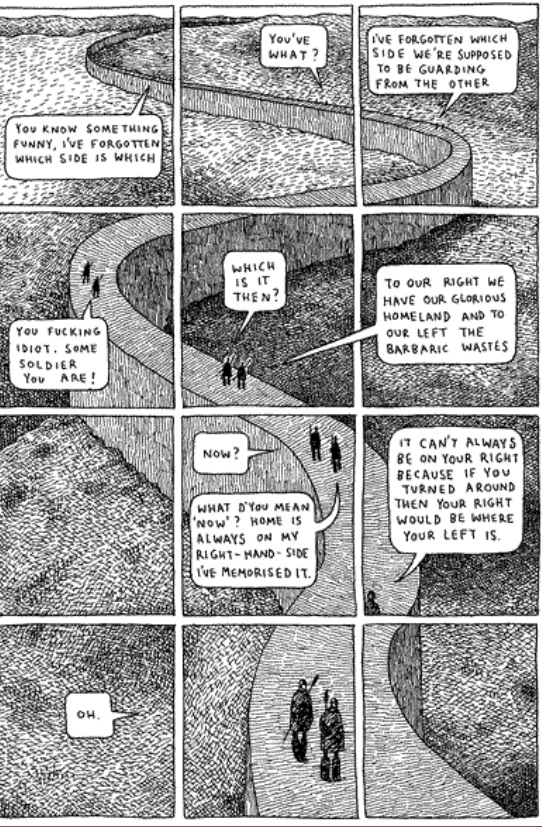
Consider the polyptych, a technique used in Guardians of the Kingdom by Tom Gauld.  A polyptych in the comics world is where “a moving figure or figures is imposed over a continuous background” (McCloud pg 115).  The polyptych provides an example of closure occurring in one setting, likely with one subject or a small group acting or talking (that is, providing sound or motion to imply time and generate closure), but it is a technique that requires the use of panels as an organizational framework, despite the fact that all the closure-generating action of a character occurring within one setting could only logically be explained as a passage of time.  Otherwise it would appear as the sudden multiplication of one character into many copies, something I think it is safe to say could easily be ruled out through context.


For example, this polyptych from Gauld’s aforementioned work uses one scene and only two characters, both moving and speaking and thereby implying the passage of time.  It also has a very basic set of panels dividing the image which helps to emphasize and clarify the passage of time.  The panels help to organize the image on the page, but they are not necessary to understand the image, which is to say, to generate closure.  If there is some doubt about this assertion, imagine the page without the panels.  Although it might be momentarily confusing, reading the whole page would provide the necessary context for closure to occur.  In fact, in this particular instance, even that much probably wouldn’t be necessary, as the reader would be aware that there are only two characters in this book. Nonetheless, the panels do help and McCloud’s characterization of them as icons for the division of time seems to make sense, although they might be more accurately described as indices.  An icon bears a visual similarity to the thing it represents, whereas an index does not necessarily resemble anything, but indicates that what it represents is occurring. As panels and gutters can’t be said to visually resemble the passage of time, but instead indicate that it is happening, they are indices.

Why, if they are not necessary, do we see panels and gutters so often in comics?  The answer is that while they are not necessary for closure, they are necessary for comics as a format.  They help us to organize the page and are the author’s means of steering our scanning of the images.  Imagine, once more, the page above without panels.  But this time imagine that it is huge, far larger than any book would allow, so large that it would take some time to scan the whole image from top to bottom.  In that case, the winding wall and real time needed to scan the page would provide all the indication of the passage
of time necessary.  Closure would certainly occur without the panels.  In essence, panels are not necessary for closure; they are an accident of the format that has been developed by authors as a means of directing the process of closure, thereby shaping the meaning we draw from the comic.

There is further evidence to suggest that while closure doesn’t strictly require panels, comics do.  More broadly, any visual narrative art requires panels and if those panels are not explicitly drawn, they are implied.  The Bayeux tapestry, an 11th century embroidery depicting William the Conqueror’s successful invasion of England, although clearly not a comic in the modern form, works just like one.  It combines images, definitively on the iconic side of the spectrum, and words to tell a story.  It scans from left to right and is
broken down into a number of scenes, although none are explicitly numbered or
otherwise differentiated.  But the fact remains that the panels are implied.  The need for organization in the images was still present and panels, or in this case scenes, are apparently the instinctual way to depict this.

It is my contention that closure occurs constantly through our scanning of the images and the involuntary creation of meaning out of the juxtaposed images on the page.  The panels and their negative space, the gutters, act only as a way of organizing these images for, no doubt according to the author, more meaningful scanning.  Further, I would argue that panels are actually just a formalization of our natural scanning and is due mostly to the physical format that comics take.  The fact that comics generally come in books, that
is on pages read left to right, top to bottom, has necessitated the use of panels. Specifically it solves the problem of moving down the page, something the Bayeux tapestry doesn’t have to deal with and consequently didn’t create a system like explicit panels to direct the reader.  I do not disagree with McCloud that “closure is comics”, indeed any visual narrative must have closure because that’s how we make sense of them. And I would go farther, perhaps, than McCloud by stating that comics are panels, whether those panels are implied or explicit, because the format demands it.  But, as I believe I have shown, there is no transitive property at work here; panels and their gutters are comics, comics is closure, but panels and gutters are not closure.

The Color Question

Editor’s Note: This is part of a series of student papers from Phillip Troutman’s class at George Washington University focusing on comics form in relation to Scott McCloud’s theories. For more information on the assignment, see Phillip’s introduction here.
_______________________
 
Color remains a question rather than an answer in comics: Some artist’s embrace it, while others continue to ignore it. Whatever its use, color plays an important role in forwarding the message of the artist. Yet such a message is ambiguous. In his analysis Understanding Comics, Scott McCloud notes that color promotes comics by reaching toward reality, making a panel appear to be a much more relatable image to the reader, who lives in a world beyond black and white. Mirroring life itself, which is far from flat, colored images add an extra dimension to the page. But is this the true purpose of color in comics? McCloud suggests otherwise; however, due to the brevity of his designated chapter, he never explains why. Indisputably, comics serve to simplify life, easing the ability to communicate some sort of integral message to the reader. Breaking the fourth wall, color magnifies the author’s claim. Minute tidbits of otherwise unseen details reveal themselves through the additional lens of color.

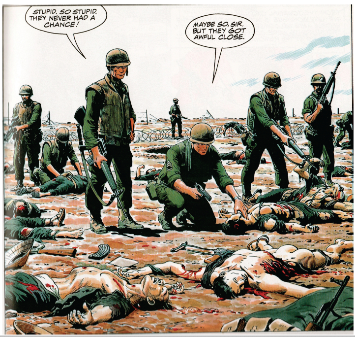
The following image derives from Doug Murray and Russ Heath’s “Hearts and Minds: A Vietnam Love Story.” The panel displays the death and destruction caused by the detonation of a grenade during a battle in the Vietnam War.

Throughout my analysis, I will revisit this image in order to touch upon the overlooked meanings that color specifically reveals.

Color magnifies important details that forward the cartoon’s claim. Though images may appear more realistic, the purpose of color remains for graphics to appear more simplistic. Noting the simplicity of cartoons, McCloud emphasizes that, overall, cartooning is a form of “amplification through simplification” (30). Comics pride themselves in exaggeration, which empowers a point rather than detracts from it. In this sense, color is yet another mouth for exaggeration. Heath’s image exhibits excessive exaggeration due to the use of color. Studying certain features of Heath’s panel, readers must digest uncomfortable truths that the artist is emphasizing. For instance, the two Vietnamese corpses expose gruesome depictions to readers.

In the first image, color contrasts the white bone protruding from the dead man’s neck from the background. Clean and crisp, this bone appears as though it is out of place. Looking as though it were a plastic piece in the board game Operation, the bone could easily slide back into the dead man’s body. Though, in reality, this bone would be muddled with blood and dirt rather than in this immaculate condition. Instead of showcasing visual reality, color emphasizes a statement: Another man’s bullet pierced a bone through another man’s throat. The same argument is displayed in the second image. Here, color bolds the blood that pours from the man’s dislocated torso. Yet this blood is pure red. In reality, such blood would not beam from a corpse; it would be dirtied and dried. Color again simplifies reality, highlighting to readers what happens during war.

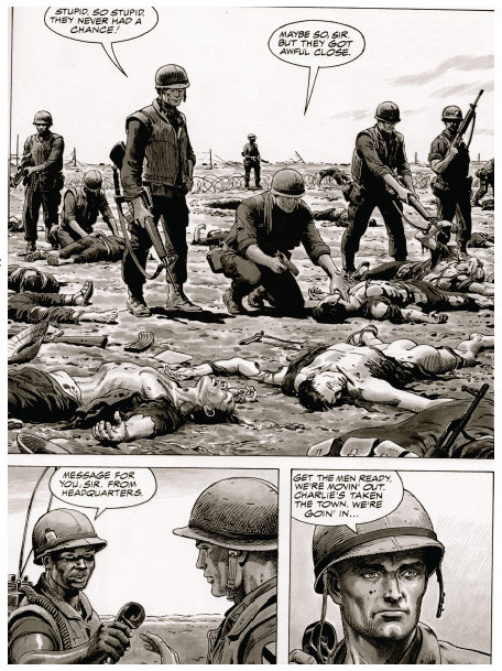
When the same images are displayed in black and white, such an effect is lost. Though readers may understand that the two men are dead, they do not see death’s marks etched in the corpses. The bone is barely visible, and the blood blends with the shading. The colored images are blatant to readers, who inherently understand what each detail represents. Such a technique attests to McCloud’s claim about drawing style: “By stripping down an image to its essential ‘meaning,’ an artist can amplify that meaning in a way that realistic art can’t” (30). Heath’s color truly “strips down” the panel to its bare essentials.

By simplifying a panel to its bare essentials, Heath presents color as an icon. As McCloud defines the term, an icon is an image that represents a person, place, thing, or idea (27). Cartoonists rely on icons to transmit a clear and obvious message to readers. In the case of this panel, the clearest example of an icon is the color red, which represents blood. Readers immediately connect the image of blood with its more powerful meaning: carnage. Heath chooses to depict such carnage through the visual device of an icon, and such an icon is displayed through color.

Beyond functioning as an icon, color breaks the flow of sequential art, emphasizing the subject matter of an image rather than the panel transitions on the page. Referring to the purposeful placement of juxtaposed panels, sequential art stresses the movement from one panel to the next, which, in turn, unconsciously forwards the plot. Looked at as an abridged filmstrip, sequential art carries readers from one important scene to the next. Yet, color seemingly cuts this artificial current.

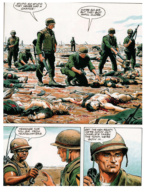
The selected image comes from a page with three separate panels. Despite the wholeness of the story, color slows the sequential flow of these transitions. The first panel encompasses over a half of the page, warranting some sort of inherent importance in its size. Obviously, the artist wants readers to not only look at this image, but to study it in detail. Despite its size, readers may easily browse from one panel to the next. However, Heath installs color to prevent such an easy transition. After reading this page in its entirety, readers are inclined to revisit the first panel due to its colorful graphic content. The secret to such a phenomenon lies in the highlighter-like quality of color.

For example, moving left to right in the first panel, the focus shifts from the line of soldiers to the sprawl of bloodied corpses. Bold outlines of blood and flesh segment each corpse from the next, hinting that each image has a different story to tell. In fact, each body could be a separate panel. In the panel, four separate Vietnamese bodies are macabrely drawn: An American soldier tests the pulse of a clearly lifeless Vietnamese shell; another American soldier picks at a mangled corpse with his gun; and the final two corpses, torn and shattered, lay brutally close to the reader at the front of the panel. Subject-to-subject transitions would individually highlight each corpse and its features; yet, Heath decides to include multiple scenes in one panel, separating them by color. By choosing this method, color simplifies four possible panels (one panel for each corpse) and gift-wraps them for the reader. Realistically, each corpse deserves its own panel in order to communicate its graphic content, but color simplifies such reality into a single cartoonish image.

By segmenting sequential art, color also simplifies the significance of McCloud’s illustrious gutter. McCloud defines the gutter as the space between panels where closure occurs in reader’s minds. Through closure, McCloud suggests that the message of the comic is conveyed to readers. Such a claim raises the possibility that closure could be misconstrued: Reader’s could interpret a different idea than the artist intended from the panels. Color counteracts such discrepancy. Creating its own sense of closure, color illustrates the artist’s message clearly to the reader. Revisiting the panel sequence, I have manipulated the colors to a black and white format.

Reading the page, readers find that it is naturally much easier to follow the storyline in black and white. The first panel describes the recent conflict, and the gutter to the bottom left panel suggests to readers that such a massacre is a daily display for soldiers, as the sergeant plans to move out to another town. But, in color, such a transition is not so smooth. Color isolates the first panel, giving the gutter transition between the first and second panel a much different meaning. Studying the images in color, readers realize that the comic is exposing the absurdity of death through battles in war. The gutter seemingly empowers this statement, as it quickly introduces another future conflict that promises to be just as gruesome. Murray and Heath seem to be showing readers the horrifying realities of war. Graphic imagery, highlighted by color, communicates a “War as Hell” message to readers, who must digest an unnerving panel. Such closure can only be deduced when the panels appear in color. Without the red blood and displaced flesh, which are both only noticeable through color, the comic’s philanthropic message is lost in translation. Clarifying these important details, color simplifies Murray and Heath’s message. Rather than using words to communicate a difficult idea to readers, Murray and Heath rely on the simple but powerful effects of color.

Rather than making comics more realistic, color is highlighting the simple message of the images. Comic artists utilize color to highlight their ideas rather than bring them closer to reality. Magnifying minute details, colors strip down panels to their bare essentials, successfully forwarding the message of the artist. Manipulating the flow of sequential art, color simplifies complex depictions into a single panel. And, transforming the gutter, color clarifies a complex idea through universally understood graphics rather than confusing words. As viewed in a single page of Murray and Heath’s “Hearts and Minds,” a war related comic promises to introduce many ideas to readers. With so many themes floating throughout the comic, some sort of technique should aim to clarify and polish the author’s intended message. With that said, color in comics aims to simplify ideas so that readers better understand the artist’s message. Highlighting death and the absolute brutalities of war, color serves as a trail-marker for the artist, who only hopes to easily communicate some sort of message.

When an artist prepares to finalize his product, he must ask himself the color question: Could color simplify life more so than the comic already does? Heath’s artwork answers such a question. Indeed, even with color, simplification proves to be the root goal of comics. Color thereby is not so much an aesthetic choice to the artist as much as a literary tool.

Comics Criticism 101: An Introduction

This essay was written in my first-year composition course at the George Washington University. University Writing Program faculty draw on a variety of disciplinary backgrounds (my Ph.D. is in American history, with current research on abolitionist visual rhetoric) to teach students to “enter the conversation” of academic research—to do detailed analysis and to engage existing scholarship rather than simply regurgitate it. This particular assignment arose out of the cross-fertilization that Craig Fischer argues is emblematic of comics scholarship, where academics, fans, practitioners, and popular critics seed each others’ ideas and produce more interesting work.

I had been teaching a “five-page paper” version of this exercise, where students analyze specific visual elements of a chosen comic or graphic novel in order to develop a claim in response to Scott McCloud’s Understanding Comics. This served as an introduction to comics (McCloud is great for that) but also to claim-making, because, as a foundational text, McCloud is the perfect foil: authoritative, comprehensive, and eminently fallible. Students always find interesting exceptions to his rules, new categories of panel transition or image/text interaction, and concrete ways to develop his vague generalizations.  But the papers still felt academic in the pejorative sense: they represented a school genre that addressed only the professor as audience.

To move away from that, I consulted the Comix-Scholars Discussion List, fishing for ideas about formal criticism in the blogosphere: hence Noah. Noah was very interested in the project, helped me rethink the genre of comics criticism, and very kindly loaded me up with examples, many of which went onto the assigned reading list as a diverse set of models we read and discussed in class. Students now have a broader range of rhetorical choices to make regarding introductions, integration of images, organization, descriptive language, and analytical tone—not to mention examples of how to make a claim that might matter to someone outside the classroom.

As a final gesture, Noah asked me if he could publish some of the best examples students produced. I am most grateful for his generosity and I hope you enjoy the ones we’ve selected. The students are excited about sharing their work and, I trust, will be watching the comments closely. Please welcome them to the conversation.

_____
Phillip Troutman is Assistant Professor of Writing at The George Washington University, trout@gwu.edu

Through Space, Through Time: Four Dimensional Perspective and the Comics by Eric Berlatsky

Originally presented: Panel on Frames and Ways of Seeing in Modernist Narrative at The Tenth Annual Modernist Studies Association (MSA) Conference, Nashville, TN, November 2008.

Author’s introduction (“disclaimer”)

This paper was presented at the Modernist Studies Association conference two years ago. As such, the audience for the talk was not comics scholars, or, even, necessarily people who were interesed in comics. The paper is pitched to that audience and therefore says quite a number of things about comics that are fairly obvious to the comics scholar (or even just the perceptive comics reader). In fact, it even says things I know to be debatable, and even incorrect, since those things weren’t my primary concern. So, yes, I know that “The Yellow Kid” isn’t the first comic strip in U.S. newspapers (to say nothing of the world at large), but since splitting those hairs wasn’t the point of the paper, I used that as a generally “known” reference point.

I was invited to participate in a panel on “frames and ways of seeing in modernist narrative” after one of the participants in the original panel dropped out. As I recall, all three of the original panelists were from the University of Toronto, studying under/with noted modernist scholar, Melba Cuddy-Keane. Cuddy-Keane got in touch with my dissertation advisor at University of Maryland, Brian Richardson, and asked if he knew anyone interested in frame narration and modernism. Brian got in touch with me, recalling a paper I had written for him many years previous as a graduate student. That paper, however, was already forthcoming in Narrative, and I wasn’t really interested in recycling the material. So, I took the opportunity to apply some of the research I was doing on time, modernism, and comics and to write some of that out, rather than merely having it bounce around in my head. All of this is the long way of saying that the paper was even more rushed and “tossed off” than the typical conference paper, since I was a late addition to the program. At this point, I feel as if there may be nothing particularly revelatory here, as much of this material feels (to me, anyway) as if it’s fairly obvious and straightforward and covered elsewhere in the literature. Since this is a blog (my brother’s no less), I don’t feel quite so guilty about letting it see the light of day, as long as nobody really feels like it reflects the care I generally take in my scholarship. Things that make me cringe a bit, are… a) sources cited, but no bibliography listed. The sources are mentioned, for the most part, in the paper itself, but obviously, a bibliography should be included. Since I was only reading it out loud at the time, however, and I knew the sources, I never typed them up. (At this point, this note may be taking longer than it would take to type the sources… but let’s not ruin a fairly boring and mediocre story). 2) The paper also includes various notes to myself telling me to elaborate on this point or that orally. Obviously, for written publication, I should turn those into more coherent written claims… but I’m just writing a disclaimer instead. [Many of these were references to the images, so I’ve replaced them with “See Fig. X” reference. -ed.] 3) The quality of the scans is sometimes pretty bad, as well. My scanner is just an 8 x 11 and some of my sources were much bigger. I should have gone to the Artist Formerly Known as Kinko’s and done the scans on a larger printer to get things right… but, again, I reveal the generally slipshod nature of my efforts on this particular piece. All of this is why I told Noah and Derik that they could have this conference paper if they wanted it… but that I was generally unsure of its “ready for prime time” (using the term loosely) status. Derik and Noah decided to run it anyway (making me think that they reall need more submissions for this feature [We do! Send us something -ed.]), so, here it is “warts and all.”

“Through Space, Through Time:” Four Dimensional Perspective and the Comics by Eric Berlatsky

Whether pamphlet-form comic books, cramped newspaper comic strips, or more traditionally codex-form “graphic novels,” comics have only recently started to receive serious critical attention as “art objects,” as opposed to mass culture ephemera. The biggest breakthrough in comics criticism is still undoubtedly Scott McCloud’s 1993 book Understanding Comics, a book that makes a bold play for considering comics as “art,” by bypassing the typical starting date for its history. The standard date, particularly in America, is, of course, 1895, marking the beginning of R. F. Outcault’s Hogan’s Alley as a newspaper comics page in The New York World. This date, would, of course, place the origins of the newspaper comic strip in close chronological proximity to the “high art” development of modernism. However, McCloud’s choice to define comics as “sequential art,” or, in the longer version, “juxtaposed pictorial and other images in deliberate sequence,” allows him to include pre-Columbian picture manuscripts, the Bayeux tapestry, Egyptian painting, Trajan’s column, and Hogarth’s “Harlot’s Progress” as comics, along with other, more likely, suspects, like Rodolphe Topfer’s “picture stories” of the mid-nineteenth century (McCloud 10-17). McCloud discards some of the elements of earlier definitions of comics in order to detach the era of comics’ increasing popularity (the twentieth century) from its definition, suggesting that some of the greatest achievements of older “high art” are, in fact, comics. While this has the potential to raise the culture caché of comics as a medium, it also obscures the ways in which the form reflects and takes part in the modernist project and the advent of modernity.

Continue reading

Even so, we love you!

In last week’s thread on definitions in comics, DerikB posed the question whether print advertisements count as comics. Sam Delany makes a convincing case that the question itself is impossible and probably shouldn’t even be asked, but he makes an exception for specific functional contexts where the project of definition works primarily to describe. On a case-by-case basis, examining whether or not a given definition describes a particular print advertisement (or anything else) can illuminate the strengths and weaknesses of the definition as well as the advertisement.

I responded to Derik’s comment by saying that I had a print advertisement I thought should count as comics. I called it a “found comic.” Wikipedia, not nearly as averse as Delany to defining things, observes that “the term found art…describes art created from the undisguised, but often modified, use of objects that are not normally considered art, often because they already have a non-art function.”

My usage recasts this definition for the present context: “found comics describes comics that emerge out of the juxtaposition of elements familiar from comics into material forms and contexts not normally considered comics, often because they have a non-comics function.”

Of course, the two definitions are not truly parallel: a definition of found comics that fully corresponded to found art would require that the elements of the comic be “readymade,” pulled from another context and different use, retaining the traces of that use, and making meaning through the resonance and/or contrast between the original and the artistic use. Found art depends upon that trace of the original context remaining, because the impact of found art is in the dissonant resonance between the original context and the art context.

Found art exposes the ways in which context – not form, not content, but the wall of the museum and the association with the artist – transforms a thing from an object into an art object. The sense of this depends on a cult of “the original” that is very powerful in visual fine art and less so in comics art.

Comics and literature are arts where reproductions retain the artistic value of the original (although not the historical value). They thus depend less on physical materiality and more on the creative generation and juxtaposition of ideas and images. Bricolage in comics, as in literature, pulls “objects” out of their original context and recasts them, and the act of recasting is so powerful that it transforms the meaning.

We don’t really have a concept of “found literature” because literature depends upon the context and presentation to a far smaller extent than visual art. The cut-ups of William Burroughs could be shoehorned into some definition of found literature – but it is essential to note that the conceptual signification of a cut-up novel is very different from that of found art. For this reason, although comics can certainly be made with readymade images using techniques of assemblage and collage and bricolage, I don’t see any particular analytic value in thinking of such comics as found comics.

Comics that can properly be called “found comics,” like found art, are objects whose very existence forces us to re-imagine the varied critical and cultural narratives that demarcate and generate the boundaries of what we think of when we think of comics. In that respect, they gesture toward critical positions and practices that are increasingly more and more inclusive of a broader artistic conversation, more engaged with liminal and marginal comics, more engaged with the normative critical practices of other art forms, while simultaneously allowing us, through comparison, to more finely tune our awareness and understanding of the comics at the center (a center that includes both conventionally defined art comics as well as “mainstream” comics, but not print ads).

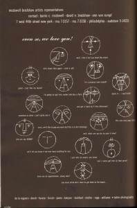
Here’s that advertisement I think qualifies as a found comic. (To read, click and zoom in.)

This advertisement appeared in the rear section of the 1950 New York Art Directors’ Annual of Advertising and Editorial Art. The last section of each year’s annual was a showcase for the trade: everything from ad agencies to typographers to paper companies took the opportunity to link their name and an impressive image in the consciousness of the most savvy and successful advertising and publishing professionals.

The agencies surely put their best foot forward in these ads, but as they were also selling a product, the work represented in that context necessarily reflected the company’s overall brand image. So to no small extent this ad represents the level of craft expected from a major advertising house, and it’s a pretty high level of craft. The faces are cubism in the guise of ‘50s flat-affect; the captions make the art director into a sort of “bogeyman wizard,” equal parts magic and intimidation. Representing the litany of criticisms and complaints the artist hears from the art director every day, each “panel” is so unique that it becomes easy for the viewer to imagine, to narrate, the day-to-day struggles of professional interaction and office life (this even without the suggestive resonance with Mad Men).

So this particular professional context certainly passes the criteria of “not usually thought of as comics.” I think I’m safe calling it “found.”

But does the ad fit any definition of comics previously advanced?
It would certainly be easy to think of it as a “single-panel cartoon.” But Scott McCloud tells us in Understanding Comics that single-panel cartoons don’t count as comics because they aren’t sequential. McCloud’s definition, building on Will Eisner’s simple “sequential art,” is “juxtaposed pictorial and other images in deliberate sequence intended to convey information and/or to produce an aesthetic response in the viewer.” Does my “found comic” fit that?

I think I’d say the intended response is not so much aesthetic as meta-aesthetic, but that could arguably count. It’s definitely not in deliberate sequence. It does, however, in contrast to McCloud’s example of Family Circus, have some of the narratological elements usually associated with sequence.

RC Harvey gives us a slightly more fitting definition (copied from Wikipedia for expedience): “Comics consist of pictorial narratives or expositions in which words (often lettered into the picture area within speech balloons) usually contribute to the meaning of the pictures and vice versa.” But it still doesn’t quite work. In my advertisement, the narrative emerges as a resonance, but it’s not IN the comic, explicitly. There’s no direct reference to it. The advertisement is allusive rather than illustrative.

Both words and pictures contribute to this resonant allusive meaning, which is other than both. So the meaning is not cycling in between the words and the pictures in some interdependent “vice versa” relationship described above; instead it’s located in this third term (which I’m sure narratology has a word for that I don’t know). The text in the ad functions less to “contribute to the meaning of the pictures” as it does to anchor and restrict the meaning of the pictures, preventing a completely visceral resonance with the drawn faces –the simplistic “identification” with cartoons that McCloud talks about – and instead directing the reader to interpret the face, not only as a specific, identifiable expression but also as a moment in a narrative that the reader can fill in from general knowledge. These are clearly cartoons, but they are not “stripped down to their essential meaning” (McCloud, Understanding Comics, p. 30.)

I don’t think this is really a problem with my print ad being considered comics. I think it’s pretty obviously comics. I think this is just a problem with the definitions – they are not functional descriptions of this thing. Yet it’s not news that resonant, allusive meaning is part of comics, or that not all characterization in the cartoon form works via a very personal “identification” with an abstract face. Meaning in The Bun Field for example is located entirely in metaphor and resonance.

If you’re “in the know,” if you’re already a comics reader, it’s clear that Harvey’s definition refers to, well, things that meet Noah’s criteria of “things we all agree are comics.” But if you’d never seen a comic, what does that definition make you imagine? What do you imagine reading Scott McCloud’s definition – or at least, what would you imagine if you encountered the text pulled out of Understanding Comics without the pictures to clarify? Is it possible that comics can only be defined by showing a picture of them? And if that’s the case, why is McCloud’s definitional project so entirely unsatisfying?

Personally, I think that McCloud’s definition is perfectly suitable for describing the interior design of the hotel restaurant where I ate at on my last business trip:

Remember the definition was “juxtaposed pictorial and other images in deliberate sequence intended to convey information and/or to produce an aesthetic response in the viewer.” I realize the obvious response is that the definition doesn’t fit because sculpture – in this case vases, mosaic, and a light differential – are not pictorial or images. But sculpture is visual art, so there is no real reason why someone who wasn’t already familiar with comics would immediately understand this distinction. And that objection becomes irrelevant once the design is photographed. Even if the design doesn’t strictly meet the definition, the photograph does.

Both the design and its photograph are sequential because of the light differential, getting brighter moving to the right in the vases and to the left on the blue lap. There are gutters and panels. You could argue that the sequence is not “deliberate” – but there’s also no way to determine conclusively that the effect wasn’t intentional. And it certainly provokes an aesthetic response.

I’m not implying that this hotel display is comics, or even found comics, necessarily. I feel certain that McCloud didn’t really intend for his definition to include it. Definitions that emphasize the print medium certainly exclude this design outright – but I nonetheless think it’s perfectly illustrative of the inadequacies of McCloud’s definition, and surely of many others.

To come up with a definition that actually fits my “found comic” advertisement, I have to go to the barest pared-down definition: Wikipedia’s page on comics uses the phrase “interdependence of image and text” to describe comics. (Their actual definition replays the “sequential art” line.) But honestly, that’s so vague that it’s not really functionally useful for understanding anything — it’s obvious just from looking at the page, so it doesn’t add any understanding to comics, and a illustrated newspaper article technically fits.

Yet, my advertisement really does look and feel like comics. I’m sure it’s some subset, like the single-panel cartoon, but it surely belongs in the comics universe. There’s definitely something else, something not captured in any of these definitions, that makes comics comics.

No Past, No Present, No Future

Zot! 1987-1991: The Complete Black and White Collection
Scott McCloud
Harper
black and white/ 575 pages
softcover/$24.95

Zot! is timeless. The story of a super-powered, improbably good youth from a dimension very close to ours, its landscape is the landscape of nostalgia — a funnybook past of futuristic wonder which becomes brighter and more exciting the more it recedes. Zot is all the super-hero comics from your childhood as you remember them, rather than as they actually were — with the excitement and the goofy villains and the action; without the fusty clubhouse odor, or the grinding, bleary sound of middle-aged men pandering to children, and doing it badly. Alan Moore and Frank Miller made super-heroes more adult by giving them sexual hang-ups and nasty dispositions. Scott McCloud, contemporaneously, made them more adult through a self-conscious, insistent wonder — the very insistence of which introduced a kind of adult uncertainty, an acknowledgment of illusion and eventual loss.

The Moore/Miller, R-rated path to super-hero maturity is still very much alive in comics like Marvel Zombies, or, for that matter, All-Star Batman and Robin. Zot!’s take, on the other hand is — still, and somewhat surprisingly, very much alive. In its quiet way, Zot! was, if not an inspiration, then at least a forerunner of a whole school of intelligent-naif storytelling. There’s a little bit of McCloud in the Morrison/Quitely All-Star Superman, certainly. And Alan Moore’s Tom Strong even looks like Zot, down to that skin-tight red shirt.

Moore and Morrison both justify their fetishization of the funnybook past through complicated — or, if you prefer, batshit crazy — theories about the mystical significance of fictions. For Moore, dumb super-hero adventures are, literally, magical; for Morrison they’re analogues for the structure of reality. McCloud likes to talk about his formalist and system-building tendencies too – in the volume’s copious notes, he eagerly explains that his characters are based on the Jungian functions of the human mind. But, compared to the Kabbalah-spouting, pomo paranoiac crankiness of his successors, he’s just a piker — or, more accurately, just a humanist. There’s no shamanic, theological reference point for McCloud. Zot!’s too-perfect-to-be-true, sunlit future-past is a story with literary ambitions, but not with cosmological ones.

As a result, McCloud can sometimes be what Morrison and Moore almost never are: low-key. Especially in the black-and-white comics collected here, heroic fantasy has never looked so much smaller than life. Arch-enemies come back from the dead to attend a New Year’s party; friends catch up on small talk while super-battles are waged just off-panel; everybody on earth, it seems, takes interdimensional portals completely in stride. The art, too, is winningly erratic, with detailed, cross-hatched backgrounds populated by frankly stiff figures. In the notes, McCloud frets about his artistic limitations, but to me, at least, the amateurishness is charming, and sometimes more than charming. A half-page picture of Jenny (McCloud’s normal-girl protagonist) asleep in the water, with a diving Zot reflected in the pool that covers her lower belly, is sensual and clunky — sensual, in fact, because it’s clunky. The sexuality of the image is displaced by the mediocrity of the draftsmanship; Jenny really doesn’t look real enough to reach out and touch, and that distance infuses the image with an awkward poignancy.

McCloud’s technical limitations don’t always serve him well, of course. Especially when Zot’s world drops out and we’re stuck on earth, the author’s weaknesses as a storyteller are sometimes painfully apparent. Bereft of super-villains, we’re stuck with nerds with hearts of gold, evil jocks, the closeted lesbian, the alcoholic mother, the divorcing parents, the jerky older brother who comes through in a pinch. Reading the second half of the volume is like going through a YA problem-novel checklist.

When Zot is on its game, though, the amazing and the mundane, the clichéd melodrama and the pedestrian detail, are constantly wrong-footing each other. Zot’s comic-book world and Jenny’s more realistic one bump one another off-course, so that the reader can look at, and appreciate, both from unfamiliar perspectives. The best example of this is probably the moment when Zot, Jenny, and some other friends watch the New Year’s celebration on Zot’s earth. The year changes from 1965 — to 1965. Nobody on Zot’s earth realizes that the new year is the same as the old; only Jenny and the folks from her (or our) world notice that time is essentially standing still. It’s an odd and unsettling metaphor for the way super-hero comics constantly erase their pasts in order to maintain their eternal futuristic presents; a kind of mini-ret-con. Zot’s world suddenly seems much less substantial, its goodness and excitement built on amnesia. But where Grant Morrison would embrace this meta-fictional insight, McCloud just leaves it there; the characters are curious about the oddity of a world without history, but that’s about it. No further apocalyptic revelations follow; it’s just another inexplicable fact about Zot’s world, like space-travel or invisibility. It’s fun to think about, but it doesn’t have to lead anywhere in particular.

The anti-climax of this revelation is nicely done, and certainly fits with McCloud’s general tone. But at the same time, there’s an audible “thunk” as he lets the issue drop which reverberates uncomfortably backwards and forwards through the book. The contrast between history and historylessness seems like it is, or should be, at the core of the series. The past is what gives weight to moral actions; without it there’s no right, no wrong, and no love. Zot’s lack of memory, his innocence and self-certainty should, logically, also be his cruelty and uncanniness. Various characters do pay lip service to Zot’s egotism, but again, McCloud never really follows up — there’s never a moment when Zot does something that could actually be construed as mean. The closest he comes is when he agrees to do a Cola commercial for money. But then he apologizes. And gives all the money to charity.

McCloud does try to “educate” Zot — the hero fails several times in the course of the book, and each occurance is treated as an emotional end-of-innocence. One instance, in which a young girl is introduced and then gratuitously killed off in order to give Zot an excuse for rampant emoting, is particularly unfortunate. But unfortunate or not, none of these episodes really makes any difference; Zot comes back each time as cheerful and self-confident as ever. Moreoever, not only does Zot seem unaffected by his experiences, but the book does as well. The reader is supposed to accept Zot as a moral innocent even as his past is silently and continuously erased.

The difficulty here is not that Zot isn’t sufficiently real. It’s that he’s insufficiently unreal. He’s stuck with the cheerful verisimilitude of Superman, when he needs a bit more of the creepy unhumanness of Peter Pan. McCloud toys with this perspective only once, when Zot asks Jenny casually if she’d like to have sex. The scene has an eerie, prelapsarian tinge — a hint that total innocence has some very disturbing implications. But the comic quickly pulls back; Zot’s just a nice, forthright kid, y’all. He even carries around condoms! Everything’s safe and above-board here.

Zot’s perfecttion should, in short, have a dark side. McCloud isn’t willing to give him one and as a result the series goes subtly but decisively out of whack. A major theme of the last half of the book is that Jenny wants to go live permanently in Zot’s world. This is presented as a terrible idea — running away from her problems, turning her back on the beauty of the world, etc. etc. etc. But all of these counter-arguments sound a lot like special pleading. The fact is that running away is a sound strategy for dealing with one’s difficulties; it’s not foolproof or anything, but on the whole it works better than holding on to them. And if Zot’s world is just a kind of egalitarian paradise — like Sweden with rocket cars — then why not move there? Jenny can even visit home whenever she wants. What, exactly, is the big deal?

Perhaps the big deal has to do with losing your past, and therefore your soul. In his concluding notes, McCloud remarks that Zot! is “a world where looking back and looking forward are one and the same. The far flung future, the distant past, and every moment in between.” That sounds like fairie; eternity is flattened out, nostalgia suffuses reality, and all the happy, super boys never grow up. To be out of time is to be dead. Zot! circles around this insight and then, with a whoosh of rocket boots and an impish smile, it flies away.
________________

This review first appeared in The Comics Journal.

Making Textbooks

This review of Scott McCloud’s “Making Comics” ran in The Comics Journal #280. I’ve added a couple of illustrations, both from the book in question, and both copyright by Scott McCloud.

Making Textbooks

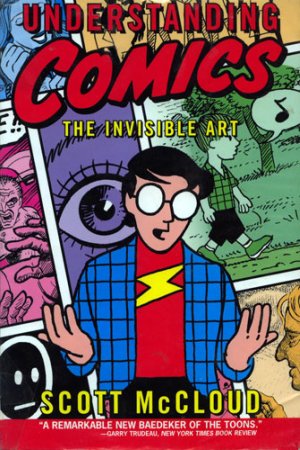
Scott McCloud is comicdom’s leading aesthetician. He’s also responsible for some of the most butt-ugly graphic novels in the business. As my friend art-teacher Bert Stabler put it, reading McCloud’s first book, *Understanding Comics* is “like getting a lecture on sexual titillation from a talking pair of pants filled with lunchmeat.”

The problem here is not that McCloud is a mediocre draftsman: you can criticize an art form without being possessed of a virtuoso technique (or so I like to tell myself). But while you don’t need skill to talk about a medium, you do need a feeling for the form. This McCloud simply does not have. To pick the most obvious example, his cartoon-self is a nadir in the art of self-portraiture. Not realistic enough to be impressive, not hyper-deformed enough to be cute, the Scott icon appears in panel after panel, like some sinister avatar of aggressive mediocrity. After a page or two, I was longing to tear off his pupil-less glasses and shove them down his perpetually gaping mouth.

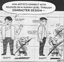
McCloud’s most recent volume pushes the disjunction between theory and practice to the breaking point. *Making Comics* is a how-to book by a man who can’t. The effect is grotesque — as if the talking pair of pants filled with lunchmeat stopped lecturing and began elaborately miming intercourse with the podium. In his introduction, McCloud actually posits his hideous cartoon-self — now fatter, grayer, computer-aided, and even, impossibly, less appealing — as an example of excellence in character design. In another sequence, he tries to demonstrate how to guide the reader’s eye to the important details in each frame. You’re supposed to follow a magic wand as it taps a hat. But the drawings are so generic and presented with so little panache that my eye refused to take them in; they might as well not have been there. I wouldn’t have known I was supposed to be watching anything at all if the text hadn’t laboriously told me to do so afterwards.

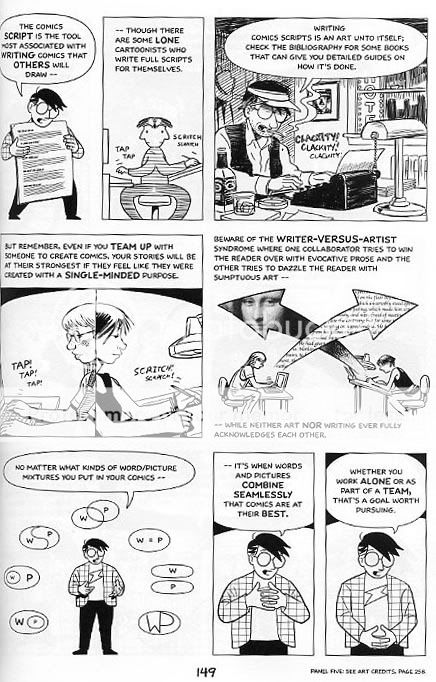
If McCloud’s limitations as a creator merely made it difficult for him to provide good examples, it would be bad enough. But they are so far-reaching that they actually interfere with his ability to understand the material he is putatively teaching. Take the issue of design. McCloud has about as bad an instinct for layout as it is possible for one man to have. Every single page in his book is a cluttered, boring nonentity. As a random example: page 149, like most in the book, is a modified grid. The eye here is drawn to a large, unbordered panel at the middle right, featuring a distinctively ugly graphic of the Mona Lisa’s head trapped in an arrow. The next most prominent panel is in the lower left, showing cartoon-Scott surrounded by a semi-circle of icons demonstrating the possible connections between words and pictures . The overall effect is of a half-assed PowerPoint presentation.

McCloud’s obliviousness to layout has actually been behind some of his most interesting ideas — I don’t think it’s a coincidence that the “infinite canvas” was invented by a man without any appreciation for more finite ones. But however well his blind spot has served him in the past, it’s a huge detriment here. If you’re going to talk about making comics, you really need to discuss how to make pages — and McCloud simply won’t. The closest he comes is a consideration of “flow”: the techniques you use to make sure the reader looks at your panels in the right order. Useful enough, but no substitute for an in-depth discussion of what is arguably comics most important aesthetic unit. Nor can McCloud say he ignored the subject because of lack of room — not when he spends twenty pages telling you how to draw different facial expressions, complete with a diagram illustrating the muscles that control smiling, frowning, raising the eyelids, and so forth. I almost felt sorry for him when, at the end of the explanation, he lamely admits that, for most creators, the bulk of this information is completely useless.

As this indicates, McCloud often seems unsure exactly what it is he’s supposed to be doing. For example, at the beginning of the book he claims his overall purpose is to teach you “storytelling secrets”. But then later he insists — correctly, in my view — that many comics artists are more concerned with visual beauty or formal experiments than they are with storytelling. Or, again at the start, he claims that his ideas are things that “every comics artist needs to tackle before they even pick up a pen.” Then, later, he admits that you don’t really *need* to know a lot of this information, though it might come in handy at some point.

One thing that McCloud *is* clear about is that he is not writing one of those how-to draw books which teach you, step-by-step, to be a shoujo artist or a Jack Kirby clone. But though these books may be limited, they are for that very reason actually able to do what they claim — that is, show you how to draw in a particular style. McCloud, on the other hand, has such diffuse goals that he has trouble explaining them, much less following through. It’s no accident that the best part of his book is a nuts-and-bolts discussion of the pens, papers, and computer tools used by professional artists — a discussion which would fit perfectly into the “how-to” books he slights.

McCloud is right, though — he isn’t writing a how-to book. He’s writing an academic textbook. As it happens, I write textbooks for a living myself, and I must say that, in my experience, it’s a genre badly suited to teach anyone anything. Textbooks are, however, especially ill-equipped to teach art. A textbook relies on lists (“these panel-to-panel transitions come in six varieties”), on sweeping statements (“almost any story can be evaluated on its ability to provoke emotion in the reader”), and on staged, lifeless examples (just read a few pages of “Making Comics” — you’ll find one.) But lists and abstracted examples have very little to do with the visceral ways in which people interact with and/or learn about art. Or, to put it another way, there isn’t any “secret” to being an artist, no complicated formula to learn. Instead, there’s a simple, two step process. (1) Look at a ton of art. (2) Practice copying a ton of art. That’s what all those “how-to” books encourage you to do. It’s how manga artists train in Japan. It’s how I learned about being a writer. And I’d even bet it’s how Scott McCloud picked up the skills he needed to create his charming comic *Zot!* twenty years ago.

If you must write a textbook about art, the least you can do is to include lots of examples from great artists. Yes, of course, if you want to learn how to make comics, you should look at art by Hergé, not a textbook by Scott McCloud which references Hergé. But at least if McCloud included a page of Hergé art in his textbook, there’s a possibility that the reader will get *something* out of it — it’s a chance, in other words, for him to mix some actual medicine with his snake oil.

McCloud does include a lot of art by great creators — Tezuka, Schulz, Ware, and so on. But in almost every case, the images are chopped into bits, tucked into corners, and generally eviscerated. For me, this is where McCloud’s aesthetic clumsiness — in a word, his philistinism — is at its most painful. McCloud claims to love these artists, but he is unable or unwilling to give them space. If you’re going to talk about a Peanuts strip, why not just print it in its entirety? And why not put artists’ credits right next to the panels you’ve chopped from their work, so that a casual reader knows, exactly and instantly, what he or she is looking at, and can start making a mental list of writers and illustrators to check out? The answer could well be simple incompetence; the effect, though is presumptuous, not to mention deadening. “Making Comics” doesn’t present great artists as masters to admire, or emulate, or dismiss, or inspire, or vie with. Rather, it uses them as examples, illustrating particular aspects of one of McCloud’s many esoteric arguments. Talented visionaries are turned into boring footnotes — and this is supposed to inspire the next generation of creators?

McCloud’s attitude toward copying is also wrong-headed. He does mention drawing from life and from photo-reference. But when it comes to imitating the work of other artists, he has little to say, and his few comments are generally negative. For example with those nefarious “how-to” books forever on his mind, he warns against copying facial expressions from other artists since “there are countless ways to draw any expression, and countless artists whose techniques you can study.” True enough — but surely it’s worth pointing out as well that the best way to “study” a technique is not to describe it or think about it, but to copy the damn thing. Like it or not — and McCloud does not seem to — art is a lot closer to being a craft than it is to being an academic discipline. You can burble on all you like about the five kinds of clarity, or Jungian archetypes, or the great potential of the comics form. But at bottom it’s all smoke and mirrors, a worthless and tedious distraction from the hours of imitative practice which are the only real way to master an art form.

When listing the four kinds of comics creators, McCloud likes to posit himself as a formalist — someone interested in understanding and expanding the potential of the comics form. But on the evidence of this book, he isn’t really, deep down, a creator at all. Instead, he’s an educator —here defined loosely as someone who takes in wisdom, knowledge, and beauty, and excretes an odorless gray paste. As a result, and despite the title, “Making Comics” isn’t designed to teach you how to make comics. It’s designed to bore undergraduates. And in that, at least, I am certain it will succeed for many years to come.

*******************************************

When it first ran, this article provoked a heated conversation on the TCJ message board.

In the course of that discussion, cartoonist Jesse Hamm suggested that my own art was relevant to a discussion of this article. I think he’s right, at least to some extent. My own experience learning to draw (which mostly involved copying) had an effect on my reaction to McCloud’s book. In any case, if you want to see my own art (whether to admire or sneer) you can do so here and here. And, finally, here’s me copying a page from Grant Morrison’s Invisibles

Alternately, if you’re in Switzerland in October, some of my drawings will be shown in the huge Lovecraft exhibit at the Maison d’Alleurs this October.