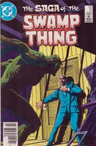
Once upon a time, there was a character called Swamp Thing. He was created by Len Wein and Berni[e] Wrightson in 1971, and then there were some other comics, and then The Anatomy Lesson happened and everyone started paying attention, or at least retroactively turned their attention to that point in time, since not a lot of people were reading it when that issue rolled out.
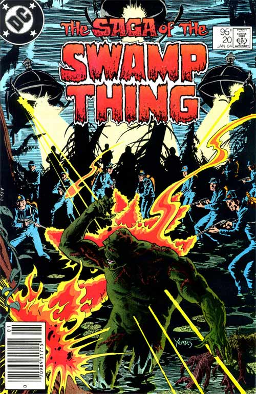
Eventually, that issue — The Saga of the Swamp Thing #21, and holy god what a beautifully portentous title, let’s not let the little things pass us by this week — proved to be such a landmark that it kicked off all of the softcover collected editions of the material I’d come across. For a long while, I didn’t even know that most of the core team had participated in at least one prior issue; artists Stephen R. Bissette & John Totleben started out on #16 (they succeeded Tom Yeates, a former classmate of theirs at the Joe Kubert School of Cartoon and Graphic Art), and writer Alan Moore picked up with issue #20 (following Bronze Age superhero veteran Martin Paskow). To the best of my knowledge, colorist Tatjana Wood and letterer John Costanza had been around since the beginning, and I’m not entirely sure when Rick Veitch showed up, since his initial supplementary pencil contributions went uncredited until I think the first softcover collections.
Of the post-Anatomy stuff, I mean; the rest of it’s still floating around in back issue bins, with its secrets.
I got rid of all but one of the old softcovers a while back, so I’ve been following the new hardcover editions Vertigo has been putting out. Vol. 1 comes with a special bonus: issue #20, the true first chapter of the Alan Moore, typically derided as a desk-clearing exercise. Bissette isn’t even in it; Totleben (who’s actually the one that had the strong notion of an extra-mossy redesign of the title character, and, in an alternate universe, became the series’ regular penciller) inks Dan Day, a fairly nondescript stylist compared to what would come later.
Nonetheless, reading that issue for the first time left me startled by its heavily visual storytelling, or rather, storytelling deepened by purely visual means. If nothing else, it’s very much a crucial piece of imperfect early Moore.
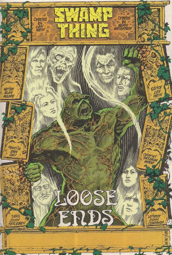
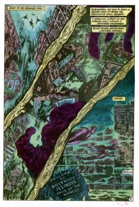
Eh, subtlety isn’t always necessary. This is the true first page of the bold new era, and while it might not involve plump, warm summer rain that covers the sidewalk with leopard spots, or Blood? I like to imagine so. Yes, I rather think there will be blood. Lots of blood. Blood in extraordinary quantities, I will note that it does not have issue #21’s anatomically inclined title housed in the broken outline of a body. No, this one’s almost pure image, with ghostly swirling supporting cast members taunting Our Man as he freaks out in classic monster movie style while alluding to the biblical Samson, de-powered and enslaved, making a sudden comeback to destroy the Philistines along with himself.
The simplest metaphorical reading suggests that maybe someone wasn’t 100% delighted with the Martin Pasko tenure, but look closer – if the supporting cast are ghosts, then Swamp Thing isn’t going to crush anything but himself (presumably with the names of his original creators). Also, what does Loose Ends have to do with toppling a pair of pillars? Realize that Swamp Thing isn’t tying anything up; he’s knocking the ends of the page loose, upsetting the symmetry that cages him. He’ll die, but it’ll free him – this is not an idle joke or a petty irony, it’s a statement of purpose, and the start of a visual motif that will run throughout the issue, to varying effect.
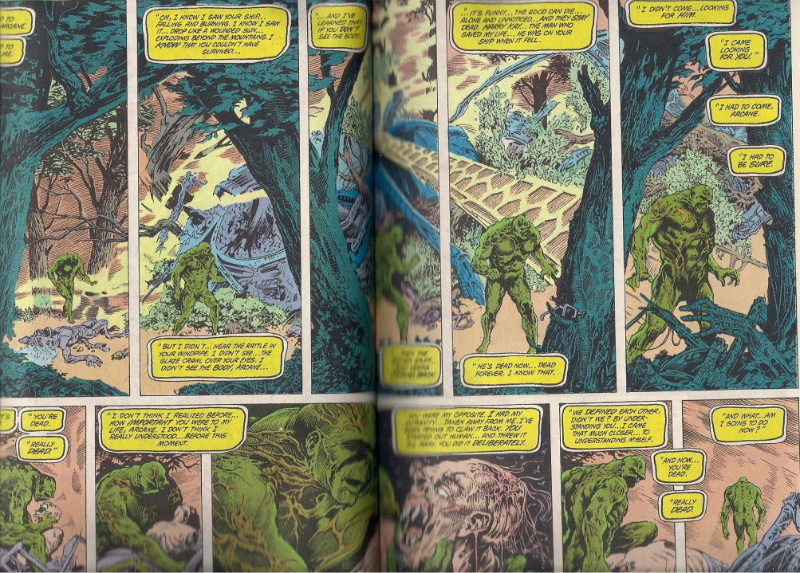
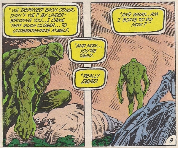
This is what you see next. Excuse the crummy scan — there’s a lot of them, so you’ll want to get started early — but I think the idea comes across: it’s a symmetrical panel layout, variations of which will appear on all but the last three pages of the issue. Swamp Thing is pontificating at length on the apparent death of arch-fiend Anton Arcane, a bisected center bottom panel helpfully presenting his head on one side and the villain’s on the other. Given all this, I suspect the first thing that will come to mind is the symmetrical issue of Watchmen (#5), but remember that it was a whole unit, while this issue is a series of discreet, mirror-like modules. You can’t make it out above, so here’s the final two panels from the spread:
From this, we can anticipate another, in-continuity descendant.
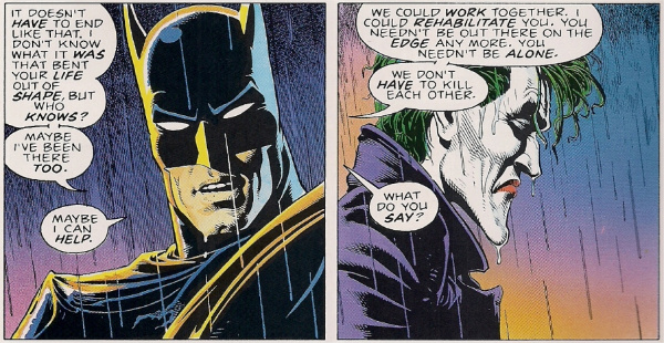
The Killing Joke is not a symmetrical comic, no, but it begins with an extreme close-up of rain striking pavement, pulling back onto the top tier of a nine-panel grid as headlights cut across the splashing surface of the water. At the end of the comic, with Batman and the Joker merrily laughing at how insane they both are, the bottom tier of a final nine-panel grid zooms into splashing rain, headlights killed, then an identical extreme close-up on the last page. It captures the duo, silently assuring us that they can’t change, that these stories will probably continue forever.
Moore has often expressed dissatisfaction over the work, insisting that it’s ‘just’ a story about Batman and the Joker and unfortunately nothing deeper, but I wonder if he’s really upset that he repeated an earlier motif and couldn’t find anywhere to go with it – Arcane, after all, is (temporarily) dead, and the holding pattern Swampy & co. are stuck in won’t last, not while today’s hottest and hungriest comics talents are around, right?
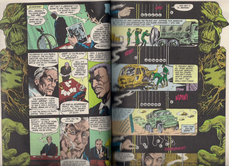
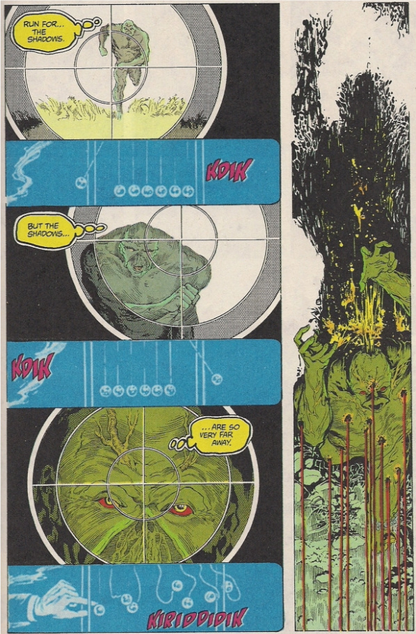
They’re also young talents, though. Here we see villains discussing the imminent destruction of the beloved The Saga of the Swamp Thing cast; their decidedly non-mirrored conversation is merely dominated on both ends by its topic, which registers a little like an indelicate means of preserving the motif while allowing for an easier plot outlay (and this is the most plotting-heavy of the spreads). There is a rationale, however, in that a scene with no supporting cast good guys or sentient bog creatures needn’t convey a sense of entrapment, just preoccupation, and anyway the bit with the clicking balls — itself a representation of perfect action and reaction, upset at the end — will recur when the whole thing breaks down later.
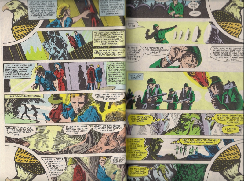
Other spreads in this issue are less sure of themselves, imposing bald eagles on four corners of the spread to represent the arrival of abusive martial forces (one of the aforementioned villains is a wicked General), but then otherwise wrecking the symmetry by adding too many panels, maybe to ease the storytelling along; maybe not everyone on the creative team was on the same page. A sense of construction remains; the bald eagles actually relate to another spread, in which golden birds perch and stare downward at awaking lovers, only for deadly whirlybirds to give pursuit.
This one’s more purposeful, the arrival of violence fucking up the effect at the very end, blasting away the character’s place in prior issues’ plots. You can just barely make out an incorrect movie title in the top panel on the right-hand page – “Don’t Watch Now,” a reference to Don’t Look Now from director Nicholas Roeg, whose works would provide structural guidance and inspiration of issues to come. Another spread later on, where the top two tiers on one page are a different size from those on the facing page, leaves the effect merely sloppy.
But while it’s easy to blame Day for these troubles — the motif being so similar to those spotted in later Moore works — it’s crucial to acknowledge that, barring applicable statements on the record, we don’t really know who exactly does what on a collaborative comic, beyond the broadest attributions of the credits. It can at least be said that Day’s competent, stolid drawings provide an effective enough sense of the holding pattern world Swamp Thing and his cast are mired in, the layouts providing commentary on the panels’ reality from literally outside and in between, an omniscient voice altogether more pleasing than Swampy’s incessant narration.
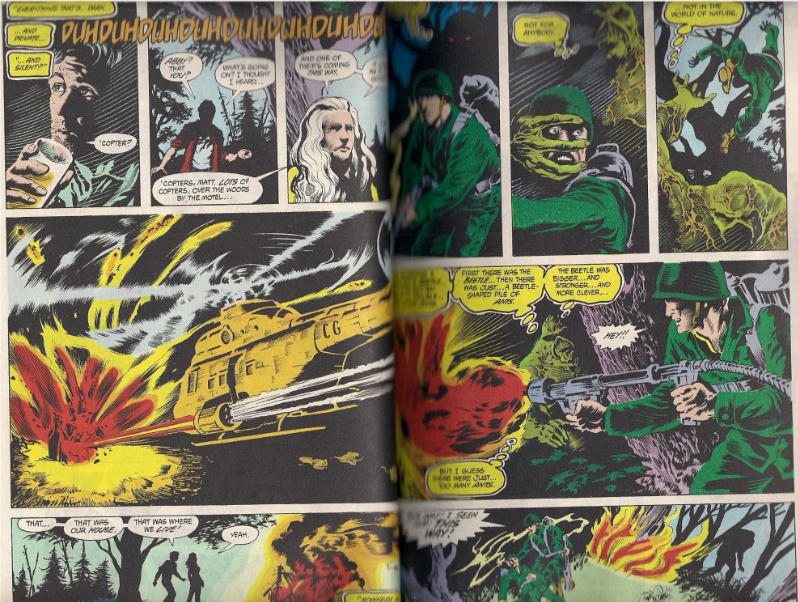
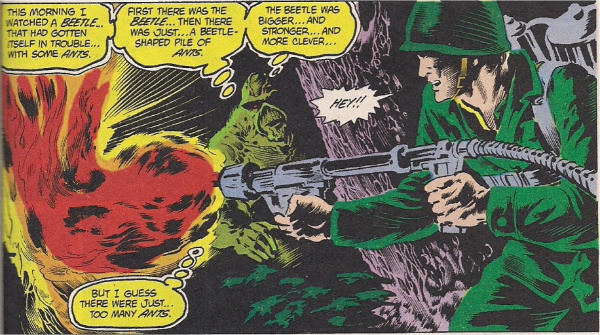
Let’s be fair – this isn’t Alan Moore’s finest moment either. It’s the kind of script where a super-character attracts the attention of a guy with a flamethrower while stuffing the same panel with four thought balloons detailing a highly allegorical incident from that morning where he saw a strong beetle get overwhelmed by a horde of ants.
Then again, there’s some nice shading here, as the forces close in and the symmetry breaks down.
The layout simply repeats, crowded by more panels.
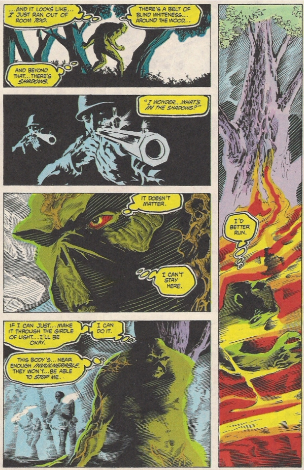
The visuals here seem especially heavy-handed in not just recalling the prior conversation between villains but pasting down hazy details from the spread itself, blurry in the manner of flashbacks, as if we readers can’t be trusted to bring it up on our own. If it’s possible to have too much ‘silent’ narration, this would be the case, although I like the climactic appearance of Swamp Thing’s shadow to append an exclamation point to his nearly issue-length monologue on such.
It does all form an interesting and subtle type of branding, however. Swamp Thing muses at length on how forms of light are driving away the shadows, the places to hide – he’s talking about modernity, casting back the weird mysteries and their small conflicts. “Aren’t they… going to leave any darkness… for us, Arcane?” From his surroundings, we can tell that Swamp Thing cannot escape this incursion. From the first page, we know that he will have to die to escape the confinement. This is a modern comic, says Moore, says Day & Totleben, this is the last stand of the old hero-villain dichotomies, which cannot stand up to the light of scrutiny. It’s 1983, and as the bullets that are blasting open the title character’s head point to, the shadows, the mysteries come from within, not outside.
Look at the thought balloons. This is the last you’ll see of them for a while; their proliferation is partially a flaunting of old-school comics techniques, which will be traded in for ‘sophisticated’ captions starting next issue. Not that Moore hates them or wants them to vanish forever – they’ll reappear in Annual #2, when Swamp Thing visits the land of the dead, and then in issue #33, when devoted love interest Abby Arcane witnesses the occurrence of the Swamp Thing character’s 1971 first appearance.
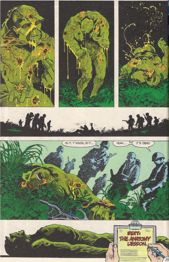
All part of the corpus, all fit for dissection. You don’t need me to tell you how The Anatomy Lesson acts as its own freestanding metaphor for revamping a comic book character, picking it apart and seeing how it stopped working, and how it might miraculously work again. That’s recorded, repeated history, and, interestingly, always ripe for revision. If you go back up to that opening bit of pillar-toppling, you’ll notice that Swamp Thing is also throwing aside the creative team; intended or not, it demonstrates the ephemeral nature of such concept revisions. It only takes one issue to shoot it all down and start over again.
***
This has been part 4 of a roundtable discussion on [The Saga of the] Swamp Thing. The entire feature can be found here.

