Superheroes are supposed to be amazing. They can leap tall buildings, run faster than a speeding whoosh, and see sights that no sighter has ever sighted.
And yet, on film, superheroes are, visually, banal.
That’s a little documentary about Kurosawa’s use of movement. At about 4:30, the video compares scenes from Joss Whedon’s the Avengers —and shows pretty definitively that Whedon does basically nothing with the camera, with his actors, or with his composition. The Avengers might be the world’s most powerful mortals, but Whedon films them with the dynamism of grey, flatulent paint (though I’m sure Kurosawa would film flatulent paint with panache, if he felt like it.)
Whedon is an unusually blah director, but superhero films in general aren’t known for their visual distinctiveness. Look at this sequence from Peyton Reed’s Ant-Man.
There’s some effort to promote visual interest there. The camera beings moving away from Ant-Man, and then flips so you’re moving towards Henry Pym and Hope. Once your close to Pym and Hope, the door slams, and then there’s a zoom towards the keyhole, followed by a shot back to Ant-Man, who races towards the door. The back and forth of the camera, from Scott to Pym to Scott to Pym, could be seen as mirroring the (humorously) repetitious failed attempts. And there’s a nice comic moment when you see him racing towards the door, and then the shot on the other side as he smashes against it, leaving his impact to your imagination.
But while the sequence is workmanlike enough, it’s not exactly impressive or memorable. The back and forth of the camera doesn’t feel especially regulated or meaningful. Notice the last shot of Ant-Man before we switch back to the door closing, for example. The camera is stationary; it’s no longer pulling away from him. the sense of motion is frittered away; the shot doesn’t add to the tension or the sense of motion. It just reminds you that Ant-Man is still standing there. Similarly, the first run at the door doesn’t really use the camera pacing to create suspense. Instead, after all the build-up, there are just a bunch of shots: moving in on the keyhole, cut to Ant-Man closing his mask with a flourish, then running, then watching him run through the keyhole, then a flash of blue, then the sound of impact. It’s haphazard and disjointed; there isn’t a clear rhythm or build, which means that there isn’t a sense of anticipation or failure. As a result, most of the work of the scene is up to the Foley artist, for the thud-into-the-door sound effect.
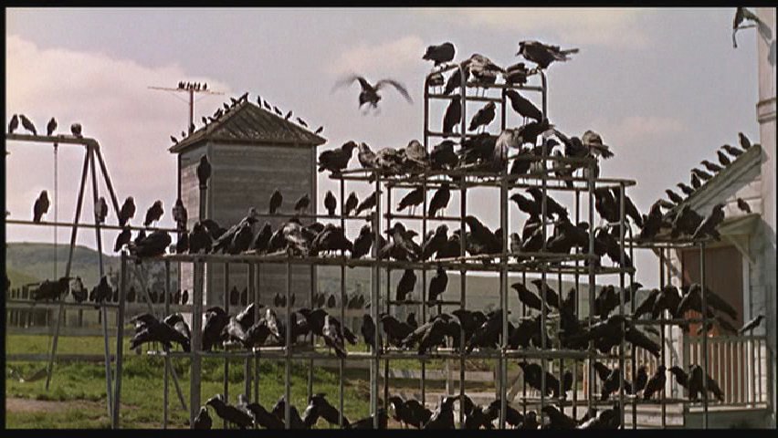
In contrast, the scene from Hitchock’s The Birds uses orchestrates shot/reverse shot movement to build suspense throughout. The cuts come quicker and quicker throughout the scene as the inevitable disaster looms, culminating in what are essentially freeze frame snapshots of Tippi Hedren’s horrified face as the explosion rips through Bodega Bay. And then of course there’s that marvelous move upwards to the bird’s eye view, looking down on the flames forming a slash across the city, with the bird’s squawking in triumph before they swoosh down to do more damage.
It’s kind of cruel to compare a couple of random big-budget hacks to Kurosawa and Hitchcock, obviously. But, on the other hand, Hitchcock, at least, was a Hollywood hack too; The Birds was a suspense picture that was meant for box office success (and did fairly well at that.) Given the buckets of money the studios throw at the Marvel films, it seems like they could find a director with rudimentary visual skill, if they wanted to.
Guy Ritchie’s not one of the all time greats of cinema or anything, but The Man from U.N.C.L.E. has some visual flair. I like the sequence at about :45 where the camera rushes in for a close up at the first car, then pulls back and in the same (presumably digitally enhanced take) rushes forward for a close up of the trailing car. It provides a nice sense of speed and urgency—again, not breathtaking, but fun—which is more than can be said for the direction in Avengers or Ant-Man.
Of course, Man From U.N.C.L.E. bombed, while Avengers and Ant-Man were mega-hits. The sameness of the Marvel films (and the fact that Daredevil, on television, is somewhat more visually adventurous) suggests deliberation. Marvel could have hired Guy Ritchie to direct one of their properties; they haven’t bothered because they figure boring is best. The direction is meant to be bland, because they figure (rightly or wrongly) that audiences wants superheroes who are bland. We want heroes, apparently, who are not too interesting, or surprising, or exciting. We want superadventures that keep to the superconventions.

