Microcombobulated at SPX

When I first came to live in New York City in the early 1980s, I worked for a while as a low-paid xerox temp at the World Trade Center. It wasn’t a job I loved. The WTC elevators were unnerving, the vertiginous stairwells even worse and both towers swayed perceptibly in the wind—and I wasn’t overly thrilled with my fellow laborers, at least not with the male “suits” who tended to elbow past the female workers to direct me to do their copy orders first. But in my off-time, I managed to do a little surreptitious production, of several street posters for bands and of art that would find its home in my roommate Seth’s then-new political comics zine World War 3 Illustrated—and also to print a few minicomics (well, I didn’t call them that, but that is what they were), which I consigned to St. Mark’s Comics for a dollar or two. I was eventually fired for serving secretaries before executives and after the WTC blew up the first time, I never went near the place again. That was the end of minicomics for me for some years.

A few weekends ago, I roadtripped with several cartoonists to Bethesda, Maryland for the Small Press Expo (SPX). Besides my usual occupation of Tom Kaczynski’s Uncivilized Books table to flog the ebbing supply of my collaboration with my son Crosby, Post York, I was there to debut my minicomic called “Daddy” written by the very, very scary Josh Simmons and published in two colors by Oily Comics. Also, I wanted to be present for the premiere of the print magazine Study Group #3D, for which I contributed a way-too-personally revealing essay/comics adaptation of a William Burroughs piece, a project that had its genesis in an aborted posting for this site. And these things I did do.

SPX resembles the MOCCA Festival and Comic Arts Brooklyn in that like them, it is bereft of the fetishistic superheroes that taint the American mainstream comics industry and also of the Hollywood movies, wrestlers and porn stars that tend to drown out comics at mainstream ComicCons. SPX and other alternative/literary comics gatherings are comprised of people who do comics apparently for the sheer love of the artform rather than to advance obviously mercantile impulses. A significant percentage of the audience at these shows is comprised of the vendors, who patronize each other and form mutual support networks. A good part of the product of these shows are minicomics, quite small xeroxed or offset pamphlets much like the ones I made at the WTC, but often printed on a copier called a risograph which allows for multiple colors. Occasionally, these budding talents will print a comic book “floppy” in full color on slick paper just like the slick output of DC, Marvel or Image, but the effect of alt/lit concept in mainstream drag can be disconcerting. As well, many publishers seem to do well with small prints, limited edition silkscreen booklets and also, many surprisingly young artists have completed graphic novels in a variety of styles, genres and formats.

Lord knows that I held back from long-form efforts for many years—I preferred to hone my skills in short stories. However, publishers balk at anthologies these days. “They don’t sell” is the mantra they chant, despite a comics history that includes such anthology “failures” as decades of romance, war and horror comics at many publishers, all of E.C.’s output including Mad, Warren’s Creepy, Eerie and Vampirella, Zap and other underground titles, Heavy Metal, Weirdo, Raw, MOME, Kramer’s Ergot, etc…in other words, many publications that not only sold well for extended runs, but moved the artform ahead. So people are expected to labor for years in isolation (since the default mode in the alternative is for cartoonists to work solo as auteurs) to make 100-page-plus books, for which they have few sounding boards and little or no income in the process.

At any rate, after an period spent in the mainstream in which I drew a few long books but under restrictive circumstances and unhappy with the results, I have forsaken page rates to regain control over my work. In order to immerse oneself in this brave new world of long or short literate art comics for the small press, one needs to frequent shows like SPX, and of course being who I am, I feel the need to share the details with everyone. And so, I present the following set of minireviews of minicomics and books, which represent but a fraction of what I came back with from my trip to Bethesda.
_________________________________________________________________

It Never Happened Again: two stories by Sam Alden
Uncivilized Books $11.99
SPX 006 Alden
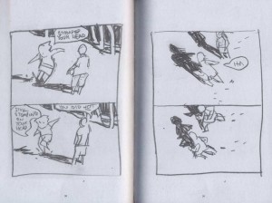
I didn’t buy the book by this young cartoonist that won the Ignatz award at the show, Wicked Chicken Queen from Retrofit, but I got two of his earlier efforts, Haunter from Study Group and It Never Happened Again from Uncivilized Books. Both books have an improvisational feel; the bright yet moody watercolors of Haunter carry a large part of the impact of the narrative and the sweet and loose-appearing, but apparently lightboxed, pencil drawings of It Never Happened Again provide atmospheric effects that enhance the delicacy of Alden’s stories.
_________________________________________________________________

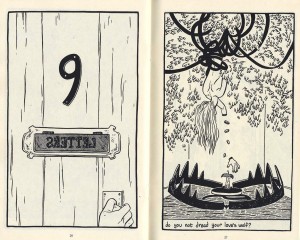
Houses of the Holy by Caitlan Skaalrud
Uncivilized Books $6.00
SPX 003 Houses
This mini is made up of a series of full-page, nicely rendered surreal drawings accompanied by poetic snatches of text and punctuated by regularly-paced numbered panels. They tell an oblique narrative that despite its title, doesn’t seem to have anything to do with Led Zeppelin. It is a dark fever dream, sort of on the order of The Cage, Martin Vaughn-James’s nightmarish masterwork that was recently reissued by Coach House Books. Tom K tells me that the artist of Houses of the Holy was an outstanding student of his at the Minneapolis College of Art and Design and that this is an excerpt from a much longer work that Skaalrud has in process. Uncivilized Books will publish it upon completion and I will be anticipating it.
_________________________________________________________________

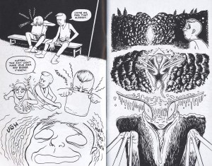
Reptile Museum by Cody Pickrodt
RayRay Books #2: $4.00 #4: $2.00
SPX 002 Cody
Cody Pickrodt’s post-apocalyptic saga Reptile Museum reflects the artist’s knowledge of martial arts and his effective storytelling is comprised of pages that take the form of fluid series of free-hanging vignettes. The precise lines and rubbery high-speed physicality of Cody’s comics remind me of nothing so much as the frenetic crime stories of the tragic Plastic Man creator Jack Cole.
_________________________________________________________________

Eye Sees Eye by Kate Lacour
self-published $8.00

SPX 000 Lacour
One of several people who felt the need to inform me of how fucked-up they found “Daddy” to be (I’m totally aware of this and in fact, it is why one would work with Josh Simmons!), this artist came to the Oily table to eyeball me and give me a creepy body-revulsion pamphlet called Hole/Human. Later I passed by her table and examined this book. I didn’t buy it, but it has stuck in my head enough to include it here because it reveals Lacour to be quite accomplished; her anatomical renderings are striking.
_________________________________________________________________

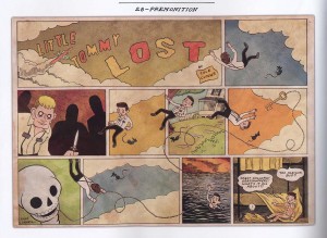
Little Tommy Lost by Cole Closser
Koyama Press $15.00
SPX 015 Koyama
I got a copy of this at SPX, but I had perused it earlier this year when I was an Eisner judge. It ended up as a nominee and deservedly so: Little Tommy Lost replicates the look and tone of clippings of a daily/Sunday strip from the late 1930s quite beautifully. The story of abused urchins does seem as if it might well have been someone’s grampa’s favorite serial strip, now lovingly preserved for posterity.
_________________________________________________________________

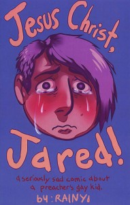
Jesus Christ, Jared! by Rainy
self published $10.00
SPX 001 Rainy
This comic is an example of slick printing applied to alternative content to odd effect, but the cover is a compelling use of Photoshop. Of course I am known to be not much of a fan of digital color; still, if it must be done, let it be used to render tears in such an extremely visceral way! The comic is a highly emotional reaction to the persecution of Middle American gay youth by fundamentalist Christians. It is disconcerting to see teenagers who are drawn to look otherwise hip ostracizing the protagonist for furthering the “gay agenda.” This also reflects a phenomena that I saw at SPX that I hadn’t noted at previous comics events: a preponderance of overtly LGBT participants who are finally welcomed to this most intimate and personal of mediums. Rainy and her also talented partner F. Lee positively glowed at their table. SPX’s aura of inclusivity was extended when later, the Ignatz awards ceremony was officiated by a host in drag.
_________________________________________________________________

Fuff #9 by Jeffrey Lewis
self published $2.50
SPX 008 Jeffrey
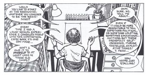
I first met Jeffrey Lewis in the early 2000s, when he would visit my partner Marguerite Van Cook and I in our old studio in our building’s basement, a refuge that we lost when our landlord freaked out after 9/11 and decided that restaurants were preferable tenants. Even then, Jeffrey’s work had a fully developed sense of place and he would draw some of the most carefully-rendered buildings in comics. In the time since, Jeffrey has stayed the course to produce one of the last standing alt floppy comic books Fuff, while simultaneously pursuing a healthy career in music with his band The Jrams. His strong grasp of the urban landscape is on display, as well as an acute ability for self-caricature, as in the current issue wherein he engages in pitched discourse with his drawing table and imparts the complexities of his love life, in the grand tradition of revelatory alternative autobiographics.
_________________________________________________________________

It Will All Hurt #2 by Farel Dalrymple
Study Group Comics $8.00
SPX 010 Farel
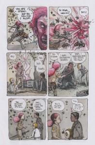
Farel Dalrymple was selling the original art for his First Second book The Wrenchies at SPX and they are very pretty efforts indeed, complete in ink and watercolor. It Will All Hurt is a floppy edition of his ongoing webcomic at Zack Soto’s studygroupcomics.com, also executed in watercolors, but with a very extemporaneous storyline. Farel also did the art for a few of the most effective issues of Brandon Graham’s version of the Rob Liefeld Image Comics title Prophet, or at least I found them so; my feeling is that kids would totally love to pour over these comics again and again, each time finding new details in the densely packed pages.
_________________________________________________________________

Titus and the Cyber Sun by Lale Westvind
self published $7.00
SPX 009 Lale
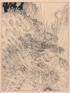
I’m beginning to see other young alternative cartoonists who, like Dalrymple, are not afraid to use the trappings of science fiction and fantasy, as can be seen in the success of Prophet and other genre-ish efforts. The more recent books of Lale Westvind are in color; those brought to my mind something of the psychedelia of Victor Moscoso, but I was mainly drawn to her black and white comic Titus and the Cyber Sun, which in its ornate stipplings is reminiscent of the French cartoonists of Metal Hurlant and the underground works of the seminal graphic novelist George Metzger.
_________________________________________________________________

Captain Victory #2 by Joe Casey, Nathan Fox, Michel Fiffe and Brad Simpson
Dynamite $3.99
SPX 011 Michel
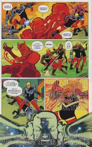
This isn’t a minicomic or even alternative per se, but it is a continuation of a title begun by Jack Kirby in the early 1980s for a fledgling publisher, Pacific Comics—-that just as I was making my little minicomics at the WTC, literally began the direct market in comics that led to the scene I am describing here—and Captain Victory was the final significant expression by that great cartoonist and brilliant founder of so many comics concepts, as I wrote on this site here. An earlier revamp of the title by Dynamite appeared a few years ago, but it was a cheesy regurgitation of Kirby overwhelmed by what I would term “rainbow unicorn barf” art by Alex Ross and others. This slick new version also seems a rehash of Kirby’s ideas, but the art this time out is done in a vigorously explosive fashion by SVA illustration czar Nathan Fox, working in tandem with some of the alt/lit scene’s more adventure-comics-oriented talents such as Jim Rugg, Ulises Farinas and (pictured) Michel Fiffe, maker of the popular sci-fi series Copra.
_________________________________________________________________

Middle School Missy by Daryl Seitchik
? $3.00

SPX 004 Daryl
I’ve found Daryl’s Oily Comics work to be very amusing and well-drawn; this particular issue of her title Missy doesn’t name its publisher, but it manages the neat trick of being both slick and a minicomic at once! I wouldn’t be surprised to see her rolling in bucks like Scrooge McDuck after Missy becomes one of those edgy, not-really-for-kids animated shows on TV at some point.
_________________________________________________________________

Comics Workbook #5
Comics Workbook $1.00
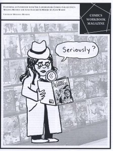
SPX 007 Mendes
For five bucks, I was able to buy all five issues of this fascinating interview zine, which incidentally resembles my only other self-published effort, the xeroxed zine Comic Art Forum from the early 2000s that I produced with Marguerite. Comics Workbook is a by-product of Frank Santoro’s comics-making classes. The various issues include conversations with Sam Alden, Dash Shaw, Lala Albert and others as well as original comics by Derik Badman, Sarah Horrocks and more, plus articles and reviews by Warren Craghead, Nicole Rudick and the list goes on. In particular, I enjoyed Zach Mason’s exchange with “Ladydrawers” Melissa Mendes and Anne Elizabeth Moore about nonfictional activist comics. I also appreciate Melissa’s poignant Oily production Joey, which details a parental disruption and its effect on the children involved; the art is finished in watercolors and the book looks to be printed by color laserjet, pressing the limits of the minicomic format.
_________________________________________________________________

The Tiny Report: Micro-Press Yearbook 2013 by Robyn Chapman
Paper Rocket $3.00
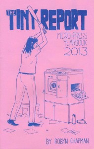
SPX 005 Robyn
Unfortunately, I missed all of the panels at SPX and I especially regret not seeing artist and Paper Rocket publisher Robyn Chapman’s presentation about micropublishing, but her Tiny Report (cover above by Chuck Forsman) provides a well-organized orientation to the world of small press comics and independent publishing. Robyn rode back to NYC with us and so I was able to quiz her on the way about what is perhaps the most serious issue facing micropublishers today: distribution. Diamond distributes most mainstream comics, but they refuse to carry a lot of smaller publishers’ books, which makes their stranglehold on the business look monopolistic. In NYC, for instance, it seems that in Manhattan, minicomics and other products of the alt/lit scene are only carried by Forbidden Planet, Jim Hanley’s Universe and Carmine Street Comics and in Brooklyn, only Desert Island and Bergen Street Comics. Those are distributed mostly by the apparently overextended Tony Shenton. It sure looks from here like there is a void to be filled by some enterprising distributor, given the vitality of the micropublishing scene.

Some of the biggest mainstream comics publishers do not use Diamond for bookstore distribution of their graphic novels and collections; for instance, both DC Comics and Dark Horse have deals with Random House. More recently, the book trade distributor Consortium Books has been placing the graphic novels of alt/lit publishers Uncivilized Books and Koyama Press in major book retailers around the country—and the word is that the British artcomics imprint NoBrow and Françoise Mouly’s Toon Books have now joined with Consortium, which ups the ante somewhat.
_________________________________________________________________


Yearning for Space: a conversation with Tom Kaczynski

I first encountered Tom Kaczynski’s work while delving into the substantial collection of comics-related materials in Columbia University’s Butler Library stacks, where there is a run of Fantagraphics’ anthology title MOME. I very much liked Kaczynski’s deliberately drawn short stories such as “100,000 Miles” and then, when I was lucky enough to get a story of my own in the final issue of MOME (#22)—and having an certain amount of thespian training—I greatly admired his piece “Music for Neanderthals”, an account of an actor who takes his method a bit too far to go completely native. His work often gives the impression that it spans the entire history of the planet, which reminds me a little of another Polish-American I worked with, the late David Wojnarowicz. I definitely feel sympatico with Tom’s use of the potentials of the comics medium to go beyond entertainment and impart information of a philosophical nature, which is not to say that his stories aren’t entertaining, but that they touch on deeper issues as well. He began Uncivilized Books to publish first his own and others’ minicomics and now it produces critically acclaimed hardcover collections by luminaries of alternative comics such as Gabrielle Bell and Jon Lewis. So, at the Brooklyn Comics and Graphics Festival last year I approached Tom at his table and a year later, he published my comic book Post York. Now Fantagraphics has released a collection of his short stories, Beta Testing for the Apocalypse. For HU, I talked with Tom via email.

________________________________________________________________________

CLICK ON IMAGES TO ENLARGE
________________________________________________________________________
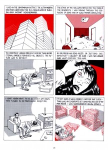
Tom K cover

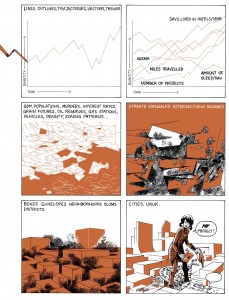
James: You use a single color besides black in the stories, often to great effect. To my eyes, the limited color in your work has a strange feeling, removed from the ostensibly similar use of a single color in a lot of alternative comics, a trend that I think was initiated by Daniel Clowes, Seth and David Mazzucchelli et al. In other words, it is not just for indicating lighting or to hark to old book illustrations. Instead, your single color use at its best is really intrinsic to the storytelling…the color holds or overlays add depth to some images or highlight specific parts of a given drawing to draw attention to something that is going on in the image. Outstanding examples are seen in “100,000 Miles”, “10,000 Years”, “976 Sq. Ft.” and “Million Year Boom”. The color separations can add qualities of delicacy of articulation, or of diagramming, or extradimensional elements. The colors you chose in different stories have varying levels of emotional impact as well. Now, I have to note that in a few of the stories, like for example “Phase Transition” or “Music for Neanderthals”, the color seems to only add lighting, it is almost an afterthought or it isn’t as intrinsic. But in most of the stories, for instance in “The New,” it is absolutely part of how the story is constructed—–and that story may be the most advanced use of the technique, besides being your most ambitious piece to date. Can you articulate why using two colors might sit your purposes more than doing full color artwork, or leaving it in black and white?

Tom: I tend to use color as a storytelling device where in certain instances I can focus-in on certain object or characters. I feel I’m still struggling with color in general. Overall I can cite 3 primary ways I use color in the book.
1. Color as a naturalistic element (as lighting, depth, etc.)
2. Color as pure design element.
3. Color as information.
The three sometimes mix in a single panel, sometimes they don’t. “The New” and “Million Year Boom” are the only two stories that were conceived (and published) with color from the get go and as such work the best for me in that respect. That said, it was fun to go back-in and re-imagine the stories with an added color. Now that I’ve seen the results, I would probably push it a little further next time I have a chance to do that.

James: I note some variations in the stories in Beta Testing the Apocalypse from the way they were originally presented. In the collection, the story “100,00 Miles” has a green overlay that is considerably lighter in shade than the more olive color it is run in in MOME 7.

From "100,000 Miles"

From “100,000 Miles”

The stories “Phase Transition” from MOME 10 and “Music for Neanderthals” from MOME 22 did not have a color in their original printings. In Beta Testing the first page of “Phase Transition” is still black and white, perhaps because it is part of a signature that has pink pages. I see that the olive color goes over zipatone in the other three pages and that the toning is slightly different in the Beta Testing version—on page 4 panel 6 you mottled the tone. I wonder if the color is imposed on some of the stories to unify them for this package, or if, as you suggest in your interview in MOME 10, the lack of color in some stories was a result of not having enough time to do a color separation for them?

Tom: The MOME stories were always vaguely conceived as two-color pieces. But because I often handed in art at the last possible minute ([MOME editor] Eric Reynolds can attest to that!), there was often no time left to think about the color in any meaningful way. I generally focused on having the stories work as black & white pieces (with gray tones) and if there was time, I would add color information. The color changed on the MOME 7 story because the original green wasn’t quite what I wanted. I changed it to the color I originally envisioned, but didn’t get right the first time around. The first page of “Phase Transition” is indeed b&w, partly because it falls on the pink signature (as opposed to the yellow one), but I found that it worked storytelling-wise. The color doesn’t come in until the 2nd page of that story and gradually takes over more of the strip.

James: One of your self-published pamphlets is in full color—-do you think you might do an entire book in full color at some point?

Tom: Maybe… I found full-color very time consuming. I may find a good use for it in the future. I don’t want to rule it out. In the near term I don’t have any specific plans on doing any full color comics.

James: From the example shown in the interview that Gary Groth did with you in MOME 10, the strips from The Drama magazine look to be of a similar level of quality as the work here, along similar lines of subject matter and are also 2-color jobs. Is there a reason why you didn’t include them?

Tom: I didn’t think those strips would’ve worked in the book. They were done at least a year before the 1st MOME story, and they are much more ‘gag’ strips. There are some ‘gag’ strips in the collection (the four 1 page stories from MOME 12) but they work with the larger themes of the book.

James: I also see in that interview that you acknowledge J.G. Ballard as an influence, even if Gary didn’t do any follow up questions about him. I noticed the influence immediately in reading your work.

Tom: Yeah, Ballard is pretty big for me. His earlier books like The Drowned World, Crash, High Rise and The Day of Creation were huge for me. I love a lot of his short stories; “The Ultimate City” may be my favorite. I’ve also come to love his later, post-Empire of The Sun (one of the few I HAVEN’T read) work like Super Cannes and his last novel Kingdom Come.

From "10,000 Years"

From “10,000 Years”

James: There are the obvious correspondences in “100,000 Miles” to Crash, but some of your others like “Million Year Boom” and “976 Sq. Ft.” remind me in particular of a few of his perhaps less-known works such as High Rise and Concrete Island. Both of those books depict protagonists who become subsumed in the constructs of a society that in supposedly advancing has actually broken down, that has taken on the quality of an intolerable new “normalcy”. Is it perhaps that, like Ballard, in transitioning between disparate societies at an early age, you have a unique perspective and are able to remove yourself and see where you are in an overview of sorts, or to see around the corners, so to speak?

Tom: I definitely think that the experience of emigration gives you a different perspective on the idea of society. When you are born into one world (Communist Poland), and then are transplanted into another (USA), and then witness the utter transformation of the first (collapse of USSR & the Eastern Bloc), the idea that society can radically be changed (for better or worse) is not that far fetched. That is one reason that the US (a country of immigrants) has been such a successful and dynamic society. The recent political/economic climate in the US feels like an attempt to freeze and define the US as a specific unchanging idea. History is catching up with us, the US is no longer a ‘young’ undefined country. Even many European countries (not to mention countries in Asia, Africa, the Middle East and South America) have political & economic structures that are more malleable, that may better cope with future challenges (I got away from Ballard here… but it seemed in the end the question was less about Ballard but about ‘society’).

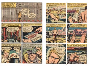
James: I just read another interview with you that Kent Worcester did, where you cited a specific Jack Kirby image from his 2001 comic, a panel of a man walking up to a building that is just a huge wall of windows—it freaked me out because that is one of my favorites of Kirby’s and it is part of a passage that I had actually thought of mentioning to you! The Earth Jack depicts is so polluted and crowded, a world where pure air can only be breathed out of bottles that one must purchase as we do water, an existence so dehumanized that the protagonist feels he must join the space program, to escape in order to realize any sort of life for himself.

Jack Kirby, from "Norton of New York, 2040 A.D.", 2001 #5, Marvel Comics, 1977

Jack Kirby, from “Norton of New York, 2040 A.D.”, 2001 #5, Marvel Comics, 1977

Your work gives me a similar feeling, as if you are dealing with expressing what it is like to live in a world that has gone beyond the point of no return, but with no escape possible, as if all we can do is construct semblances of sanity for ourselves, that work within the insane structures that we must fit into.

Tom: I love that Kirby image! I believe that was from 2001 #5? I agree with what you’re saying here. One of my favorite J.G. Ballard stories is “Billenium” about an overcrowded world where everyone basically lives on top of everyone else. The protagonists in that story find a hidden room and all that new space is an almost unimaginable luxury. They proceed to share the new space with some friends and family until it fills up and becomes indistinguishable from the rest of the world. We need to find these spaces (whether real or imagined) and inhabit them; to create germs of possible and impossible new worlds… hopefully better ones. There’s a danger in that. Things could get worse… but sometimes not doing anything at all, is worst of all. One thing I hesitate doing in my stories is to destroy the world. If “Billenium” was an Italo Calvino story, that room could be a germ of a new city; an invisible city growing in the midst of the old one… and eventually it would grow to replace it. I think we need a better imagination, one that goes beyond wishing for the apocalypse.

James: I appreciate the format of Beta Testing and the way you have manifested your work so far, because I personally have always preferred to work on short stories, at least partially because of the labor intensive nature of comics—-I like to work on things where I have the opportunity for more variety—for instance, it can get very awkward trying not to be repetitive in the angles and compositions when one is drawing the same characters and backgrounds for many pages.

From "The New"

From “The New”

The last story in Beta Testing, “The New”, is the longest and probably the most ambitious story I have seen you do so far. Do you prefer to work on short pieces or are you working your way towards longer stories?

Tom: I really like the short story (in comics and in fiction) and it’s something I’d like to keep doing in the future. There is something satisfying about a good short comics story. There are more opportunities for a tighter structure… it’s easier to get that certain density of narrative. Dan Clowes’ shorts from Eightball (post-Like A Velvet Glove Cast in Iron), the ones that ran concurrently with the serialized Ghost World, are the pinnacle of the form for me. “Blue Italian Shit”, “Caricature”, “Immortal Invisible”…they all have tight structures, a satisfying density of narrative. They’re just perfect comics. That said…

James: Can you see yourself writing and drawing an entire graphic novel eventually?

Tom: I’m often frustrated I can’t get all my ideas into a short piece… In fact I almost always wish my stories had a few more pages to develop this or that germ of an idea. So, I’d like to do longer comics at some point. My upcoming book TransTerra is probably the closest thing to a novel-length narrative, but that was still constructed episodically. I don’t mind repetition so much. I think it works well in comics… whether it’s a 4 panel gag, or 300 page GN. It’s almost necessary to set up a kind of visual/narrative rhythm. It was nice to be able to stretch a bit in “The New” and not have every page be crammed with information. After doing a bunch of short pieces in a row, I’ve been yearning for a bit more space…like the character in that story “Billenium”!

James: I’ve never seen an index that alphabetically listed every sound effect in a comic before. And Ballard’s entry leads to a highway sign in a panel for “Ballard Golf Heaven”, and I liked how the table of contents is figured on a greater timeline, but isn’t much help in locating the stories. Such details play with the new climate in comics where we should try to accommodate future scholarship, by ensuring that page numbers are included, etc.—-you certainly left a lot of room for examining this thing through different “lenses”….we’ve come a long way!

Tom: Ha! Well, it’s something I’ve always wanted to do with comics. Indices, notes, and glossaries are some of my favorite things in books and I didn’t want my book to be left out! This all comes out of lots of conversations I’ve had with cartoonists and writers over the last few years. In the end I wanted the index to be another story in the book. One that comments and explicates the other stories. Some entries are in there for fun. Like the sound effects, or cars. Others alert the reader to concepts or phrases that have been quoted, mutated or just plain stolen. One thing that is often left out of comics criticism are the images. They are often examined in terms of plot or composition, but rarely do writers get into the complex visual references that often show up in comics. One of my favorites pieces of writing on comics is a Ken Parille piece on Clowes’ David Boring that excavated the connections to Hitchcock’s Vertigo among many other things. I hope in some future edition, the book can be published with an index. Other cartoonists have played with this kind of material. Kevin Huizenga comes to mind with fake indices & glossaries. In fact I was just working with Kevin (& Dan Zettwoch) on the index to their next book, Amazing Facts & Beyond. It’s amazing and goes way beyond my index! In fact they called it the beyondex! Maybe we can start a trend! Index wars!

The idea for the table of contents come about organically. A lot of my stories were titled after some kind of measure… “100,000 Miles”, “976 sq. ft.”, “10,000 Years”, etc. when time came I wanted to create a unifying design & organizing principle. Also, I saw all these stories taking place in the same world… in my mind for example, “The Cozy Apocalypse” is a prequel to “976 sq. ft.” In his famous book, SMLXL, architect Rem Koolhaas begins the book with a multipage series of charts that detailed his life: time spent flying, swimming, eating, etc. over a period of a few years. In some ways my chart is much more immodest, spanning from the big bang into the far future and covering vast distances.

James: You wrote and laid out a story that Dash Shaw finished in MOME #17. You also collaborated to some degree with me on Post York—we came up with the cover together; and then at one point you suggested that I delete a few panels on the page with the initial ending and leave white space. I wasn’t sure, but I thought on it for a while—and then I decided to take that idea a lot further. I ended up jettisoning multiple panels on nearly every page that didn’t seem needed and those omissions greatly expedited the storytelling and improved the design of the book. It was great for me to be able to break away from the way that DC, for instance, works, where every inch of what they call the “real estate” of the page must be filled. How do you feel about collaborating with other artists, and do you think you might do more in the future?

Tom: I would love to collaborate more! Too many cartoonists are antisocial! I understand the need to sit alone in a room in absolute focus and work on something. But we’re social creatures and being able to collaborate with someone who’s on the same wavelength is very satisfying. It was really eye-opening to see Dash execute one of my stories. His approach is just so different from mine. I’d love to draw someone else’s story.

James: Your first few full hardcover books have gotten a very encouraging response; Gabrielle’s book was picked as a book of the year by Publisher’s Weekly and both her The Voyeurs and Jon Lewis’ True Swamp were reviewed favorably in PW and elsewhere. Is this resulting in an influx of people wanting to work with you?

Tom: I’m grateful I was able to work with amazing cartoonists almost out of the gate. I’ve admired Gabrielle’s & Jon’s work for a long time (and your work too!) and being able to publish them is an honor. I’ve definitely had an influx of submissions and I have a hard time staying on top of them. At the same time, Uncivilized Books is still a very tiny company and I can’t publish everyone. That also means I have to be very picky and reject projects that I really like. I’m still trying to find my specific publishing groove. I just finished figuring out my third season of books and I think I am maybe getting closer.

James: I know that besides doing your comics, you teach. Do you find that the publishing takes even more time away from your already full schedule, or how do you deal with that issue? I mean, I asked this of Sammy Harkham as well; one can get quite involved in promoting other people’s careers and have to fight to find time to do one’s own work. Particularly when one is young, one is developing in leaps and bounds and so one needs to direct one’s energies carefully.

Tom: This year I had to put teaching on the back burner. I still mentor some students and attend critiques and seminars, but I’m not teaching a full class this year. There just isn’t enough time. My own comics tend to be more esoteric and have made me very little money… So, I’ve always had to have some other job to support my cartooning. I’ve never had the luxury of just focusing on my comics, and I’ve always had to claw back time from other endeavors to create my comics. I pretty much assume I have to do something else… if my comics ever make enough money, I may have to re-evaluate my use of time, but for now I try do projects that are interesting. Uncivilized Books has been very rewarding. I’ve learned so much already and I know there’s a ton of learning left in the future.

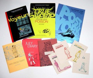
Some of the output of Kaczynski's publishing imprint, Uncivilized Books.

Some of Kaczynski’s publishing output via his imprint Uncivilized Books.

James: Can you give a rundown of the upcoming projects for Uncivilized Books?

Tom: This is the next season of books:
Incidents in the Night by David B. and translated by Brian and Sarah Evenson.
Amazing Facts and Beyond by Kevin Huizenga and Dan Zettwoch
Sammy The Mouse Book 2 by Zak Sally
Over the Wall by Peter Wartman

James: Will you continue to produce minicomics and “floppy comics” such as the one I did for you?

Tom: I want to! I really see mini-comics as my research & development department. I can work with artists on a smaller scale trying out formats and media like flexi-discs [Post York includes a flexi-disc by my son Crosby–JR] that may be more difficult to do in larger quantities. I wish there was a better distribution network for these formats. I think they are vital formats that I hope will live on.

James: How do you see comics developing in the future? I am encouraged to see people like Joe Sacco using comics for journalistic purposes, or you using them to what I would call philosophical ends.

Tom: I certainly hope comics will embrace a variety of genres and formats. I listened to an interview with Gary Groth (disclosure: he’s our publisher) recently (on BoingBoing) and he said that the boom of comics in the wider book market was a strange thing. He said that most people read comics, not because they are ‘comics’ but only because they deal with some subject matter they’re interested in (like Maus by Spiegelman, or Palestine by Sacco, etc.). They’re not interested in comics ‘as comics.’ I think he’s right, but that’s not necessarily a bad thing. We need those people! We need the reader who is interested in a subject, and chooses to read about it in comics form. They may not be interested in them ‘as comics’ but some of them will grow into that ideal reader… especially if there are many good comics on lots of different subjects. I think the same could be said for books, movies and other media. Most people want something very specific from movies: a blockbuster spectacle, something funny, gory, or emotionally engaging. But only a minority is interested in film ‘as film.’ There’s just a lot more of them because there are more movie goers overall. Books…literature in general is an ancient art form that has gone through many of its own crises and mutations over millennia. Comics as such have been around for only a fraction of that time. Comics emerged from an ephemeral medium. All those floppy comics were not supposed to be kept and written about. Comics in service of something other than commercial entertainment have been around for even less time! It’s going to take sometime to develop and find an audience that appreciates them for what they are. We’ve made great strides over the last decade and a half. We need to be patient and keep producing better and better work. I’m pretty hopeful.

_________________________________________________________