Moving books: a tale of two

I’ve been dipping my toes into new comic formats recently.  A friend told me about Lost Girl, saying that the premise resembled some of the tropes of one of my old favorite books, War for the Oaks.  War for the Oaks is an awesome early urban fantasy novel, and if you haven’t read it, I highly recommend it.  Despite its aging cheesiness and eighties pop music references, it’s a fun tale of fairy and rock and roll.

Lost Girl comes in two formats.  Mostly it’s a TV show.  Secondarily it’s a stop motion interactive comic.  It’s the comic part that I’ll be talking about.  I’ve seen some stop motion comics before but nothing memorable.  This was a much bigger budget production, with a clear script and real voice actors and sound effects and even cheesy choose your own adventure options.

Pity it sucked.

The premise is simple. Our heroine, Bo, is a succubus who fights crime.  Good and Evil are both watching her.  When feeling peckish, she kisses men in order to feed on their sexual desire.  Such feeding sucks out their souls (or whatever) and they wind up dead, dried husks.

I found the comic unbelievably creepy, for all the wrong reasons.  It’s clear to me, although it does not appear to be clear to the writers, that Bo is raping these men as well as killing them.  She chooses innocents as well as muggers (yes, it’s an interactive comic, but I went for the nicest options available and she still ate a total innocent).  The setting draws on the rape-fear tropes that plague society: pretty girl in tight clothes walking alone in a dark alley.  Talk about cliche.  She tells her victim to stop her if he doesn’t like it, she says it will hurt her more than it will hurt him, she says that once she starts she can’t stop.  Blah blah blah rape tropes 101.

I suppose it could be argued that by making the rapist a woman, this is somehow turning a story-trope on its head.  Except no, I think it does nothing more than increase the misogyny.  Here we have a strong, kick-ass woman.  And how does she get her power?  By raping men.  There is nothing good or strong or new about that.  Nothing.  She is supposed to be a gray character, but call me crazy, I consider rapists villains.  Weird, I know. But there’s no need for a Good Guy and a Bad Guy to fight over which side she’s on.  Stamp a E for Evil on her and move along, you know?

One of the oldest tropes in the book is that women gain power by using their sexual wiles to control or destroy men.  See, for instance, Aristophanes or Euripides.  It’s an insidious, nasty, icky approach to storytelling.  Blech.

But besides that, Mrs Lincoln, how did you like the play?

Well, it sucks.  The comic’s palette is absolutely dreadful.  For reasons which are known only to marketing deities everywhere, there has been a new resurgence of sepia-toned mucky brown and gray color schemes.  The new Sherlock Holmes movie is a good example.  Practically the whole damn movie was brown, presumably to tell us that this is Ye Olde Tyme History.  Nevermind the Victorian adoration for truly hideous bright colors.  This lousy comic seems to have felt that by moving every normal color down and to the right in the Photoshop box, they’d have made the comic edgy and urban.

I find cities to be ridiculously bright.  Much brighter than suburbs, where beige and tan predominate and brighter even than the countryside, where one finds greens and scarlets.  Cities, in my humble experience, tend towards lots of shiny surfaces and gaudy clothing and banners and neon window displays and advertising and art and graffiti and bright metal newspaper boxes with free papers.  The comic takes place during the rain, but oddly, there aren’t any silly umbrellas and no one is wearing the currently hot Hunter wellies in neon yellow.

Cities, in other words, are a lot more likely to be a jumbo pack of crayons dropped on a sidewalk than a country mud puddle.  But hey, what do I know?

The drawings themselves are angular and psuedo-edgy.  Not good, not dreadful, just…. dull.

Besides the victims, Bo talks briefly to a waitress.  The authors of the comic show that the waitress is dumb but nice by making her fat, freckled, and bedecked in a pink diner uniform.  Gee, I’ve never seen that before.

You know what I would like?  Just once I would like a fat woman to be portrayed as both smart and sexually attractive, dammit.  Not fat and therefore asexual.  Not fat and therefore Despair.  Not fat and therefore dumb.  Fat and sexy and smart.  Is that so much to ask?  Apparently it is.  (And yes, I may prefer my women a bit zaftig.)

Let us not even get started on how boring the composition was.  The poor damn comic only lasted a couple minutes and I’ve already wasted over seven hundred freaking words on the thing.

No, instead I wish to present something else entirely.  Because, see, at the point I watched Lost Girl the interactive comic, I began to think that motion comics just sucked as a medium.  Books are books and movies are movies and really, just move on because the two can’t be combined without sucking the soul out of the work, succubus-Bo-like.

Then I stumbled across something else.  A book trailer (worksafe):

Il etait une fois (Apologies for link instead of embedded video. WordPress isn’t letting me embed today.)

Benjamin Lacombe’s Il etait une fois.

It isn’t intended as a motion comic, but a book trailer, and yet it was far more effective to me than the comic above.  It’s a simple story, just the rabbit entering the pages of the book, but I found it moving and fascinating and a lovely work in its own right.

The colors are much more carefully chosen.  The rich red of the rabbit’s eyes are striking and the soft greens are dreamy.  Each movement flows smoothly.  The music adds instead of detracts.  Overall there is a cohesive feeling of fairy-tale creepiness that the old, dangerous fairy tales had.  Would-be-princesses might lose a toe here or there in their quest for the glass slipper, and monsters might just leap from those shadowy trees.

I found myself shivering in creepy delight, glad it was turning October, knowing that the nights are getting longer and the woods are getting darker.

The video is half as long, the story is twice as simple, and yet it has given me some glimmer of hope of what a moving comic might be.  I hope to see more stories told this way someday.

How To Draw and Paint Anatomy (ImagineFX Presents Series)

Various artists: Ron Lemen, Marshall Vandruff, Justin Gerard, Warren Louw and more.

One of my favorite things in the whole world is figure drawing.  The human form comes in so many wonderful variations: shapes and sizes, proportions, movements, gender differences and similarities, muscle types, ages.  I love to focus on the form and try (and inevitably fail, because human form is like understanding oceans, ever shifting) to reach understanding.

Comics as a medium embraces many aspects of figure drawing, sometimes well and sometimes (stock cape depictions of women, I’m looking at YOU) poorly.  As someone who draws comics for pleasure, I especially enjoy exploring the craft of figure drawing.

The challenge of comics, in part, is to draw a wide variety of people (including different body types, depending on the comic) in many poses, including action poses, from many angles and foreshortenings.  Plenty of traditional artists use references, either live models (if they’re wealthy or good at bribing friends with baked goods) or photographs.  Alphonse Mucha, for instance, had a stunning collection of reference photographs, including the Divine Sarah, for his paintings and prints.  Even I could make a pretty nice drawing out of this photo (half the work has already been done, really, what with the pose and the costume and the pre-existing anatomy).  Drafting a work from a reference is an important skill, and I am not knocking that skill!  It took me years to be able to do that well, and I’m quite proud of it.  However.

Most of us, unlike Alphonse, do not have a cadre of wasp-waist women who are willing to sit in such poses.  And even if we do have them, it wouldn’t do us much good if we were trying to draw an intersex swordsman in mid leap, decapitating someone with a katana.  (Yes, a recent drawing problem I wrestled with.)

One must be able to draw from the imagination in order to draw certain scenes.  Or have a friend in Hollywood with a Peter Pan flying harness and a willing Wuxia actor, I suppose.

Which brings me to my ever-reaching, ever-striving attempts to understand and embrace human anatomy in all its variations and forms.  The difference in approach is much like working from the inside (such as the spine) to the outside (skin), rather than from the outside (skin/clothes in a reference photo) to the inside.

There are many ways to go about the inside-to-outside approach, such as taking cadaver classes, studying Bridgeman, working with bones, and studying sculpture.

The How to Draw and Paint Anatomy piece that I’m reviewing includes a couple of methods.  The first main method is Industrial Design, which is probably to familiar to many artists but which is given a great treatment here.  The basic approach is to divide the figure into shapes and how those shapes function together.  You’ve probably seen some how-tos that say something like: use a circle for the head, use a box for the chest, use a circle for the hips, and so on.  That comes from the industrial design method.  I’ve used this method in variations for many years, and one of my most successful self-taught drawing projects was redrawing an entire ladies underwear catalog in such shapes, page after page.  (Undies=easy to see the body.)  One of the problems I’ve run into is that it can be difficult to get a good feeling of flow.  Making separate shapes is all well and good, but if they’re put together poorly, you kind of get this static feeling.  The figure might appear three dimensional, but it also appears stiff, even with a dynamic pose.

That’s where Ron Lemen’s series especially shines.  His approach to this method goes all the way back to its roots with Frank O’Reilly.  The first part of his series begins with the history of the method, basic how to steps, and some examples.  What I like about the way Lemen approaches the industrial design method is that he uses a lot of gestural flow and interconnects the working parts of the body that so they work as a functioning, smooth, dynamic flow.  Instead of blocky shapes that are frozen, the bodies begin to show movement.

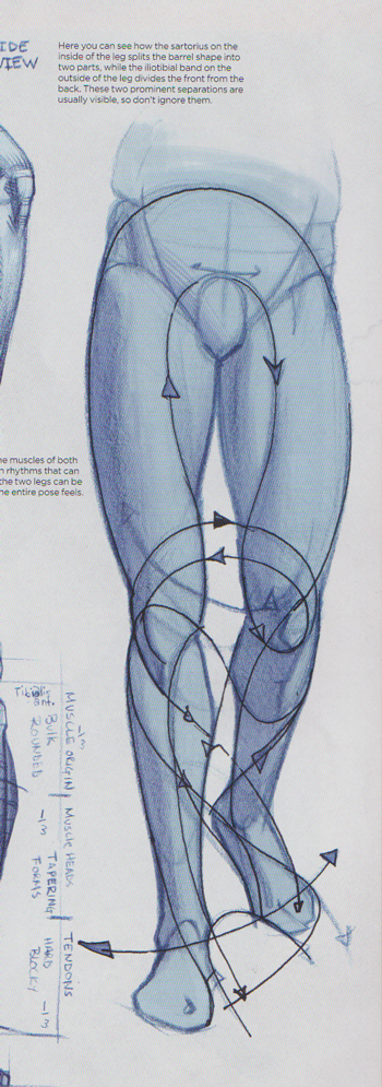
Here’s a nice example from his section on drawing legs:

See how the muscles are balanced and connected?  There’s some lovely movement there, even though as poses go, it is quite static (just standing).

Lemen begins with the whole shape and then takes a deeper look at each of the main body segments: torso, legs, arms, hands, head.  Each section contains illustrations and suggestions for crafting workable poses from various angles and various movements.  Lemen discusses body types (including natural female anatomy, heavy set men, and so on) and how that impacts the shifting of weight, unlike many of the drawing manuals I have read where the best you can hope for is to stick some melons on the chest and call it done (pro tip: breasts, not actually ball shaped!  Who knew?).  I was enchanted to discover that Lemen realizes that breasts are more comma shaped.  Each of the sections also covers the figure in movement–what happens to the torso, for instance, when the body bends to one side?  The outer line of the curve is smooth, and the inner line of the curve becomes wrinkled.

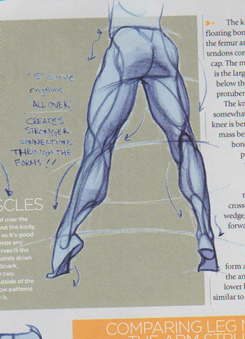
Here’s another example from the legs section:

Again, you can see the connection from the bottom of the feet all the way up to the buttocks.  There is a distinct flow of lines and balance, as the weight is on the ball of the foot and the thigh muscles are tensed.

It’s a great series of articles.  The other aspect that I particularly find useful in this work is that it is not merely a magazine/book.  It comes with a DVD, and on the DVD are multiple files.  Lemen has includes various poses, so that an artist can manipulate, copy, play with, practice from, or study at larger or smaller sizes.  And the creme de la creme, a series of videos.

To me, the video series included in the work is well worth the entrance fee.  The videos are quite simple, but for someone like me, who learns kinesthetically and visually, it is priceless.  They show a plain shot of an artist’s arm and their large drawing board.  Beginning with blank paper and no references, the artist draws, free hand, a variety of lovely poses in the industrial arts style.  (Some of the poses are later shown in the book.)  There is not any time consuming erasing, it’s almost entirely free hand with dark pencil and the drawings do not take a long time (usually about three minutes or so per pose, even the complex ones!).  I found it utterly fascinating, because it is only by watching the actual process that I truly understand where the artist begins with each piece and how the lines become connected and what follows what.

There are over twenty minutes worth of such drawings on the DVD.  I’ve watched some of them more than once, and each time I learn something new.  (If you have access to a good art school and a great set of life drawing courses, you may not find this useful.   Me, I don’t, so.)

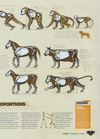
The second half of the book is taken up with Marshall Vandruff’s comparative anatomy series, which is completely different from Lemen’s, but utterly fun.  In it, Vandruff begins with several main body types: human, big cat, horse, and great ape.

(I apologize for the cut-off part in this scan.  I’ll replace it when I’m back to my scanner.)

He compares the bones, joints, and proportions of various types to create a working knowledge of animal anatomy (including human anatomy).  I found myself comparing my foot and my dog’s back foot, bending the joints and pointing my toes, trying to understand how both of us worked.  Ever since reading his articles (and boring my poor, long suffering Pookie), I’ve had a much better understanding of ankles.  My drawings of feet are connected to the legs more properly and no one is wandering around on what would have to be broken ankles.

Like Lemen, this series start with a broad overview and then tackles major muscle/anatomy groups in turn.  Necks, torsos, heads, legs, feet, and so on.  One of the fun parts is the homework assignments, which suggest, among other things, morphing an animal into a human and back again.  Great practice for comic artists doing supernatural works, or for any artist who wants to get a more distinct character feel to their people.   The examples of a woman with more catlike features compared to a man with bearish features was fascinating, even though both at the end had proper human anatomy, the feeling was utterly different.

Unfortunately my me, there are no videos of the artist drawing such pieces off the cuff.  But there are plenty of additional sketches on the DVD.

This work ends with a couple more short workshops and a fun practical Artist Q&A section, where pro artists answer anatomy questions.

It’s hard to say whether this a book or a magazine.  It’s produced by the folks at ImagineFX, the magazine, and I bought it in the magazine section at my Borders.  It does have compilations from earlier ImagineFX issues, but is not itself an issue.  It’s not bound like a book, but a magazine.  I’m hoping it’s still on the stands, because it appears to be out of stock already at its mother store.  I think it’s well worth hunting down, if you’re working on the craft of anatomy.

Might as well be a comic: Percy Jackson and the Olympians

So a couple of weeks ago, I had a nasty cold, and I mainlined all of the Percy Jackson books via Audible.  Yes, all five of them.
For those who don’t know, the Percy Jackson series is a childrens/YA popcorn action-adventure-fantasy series about demigods (children of a mortal and an Olympic deity).  Percy is short for Perseus, naturally, and yes, he battles a titan while riding a Pegasus, but  Sir Laurence Olivier is not involved (alas?).

These are not deep books.  They’re silly and fast paced and filled with summer-blockbuster like explosions and sword fights and classic monsters.  I listened to them all, so I was entertained.  I mean audiobooks ain’t cheap, and the reader, Jesse Bernstein, is kind of terrible.  But they have lots of funny moments and Percy is a really likable, regular sort of kid with the kinds of traits I most enjoy reading about (he’s kind, he has some faults, he gets discouraged but bucks up).  However….

When I was in the last book of the series I finally lost patience with some of the recurring themes that troubled me in earlier books.  As longterm readers probably know, I’m a chick.  As longterm readers might not know, I was a classics major so I could  (and did) do things like read all of Homer in Greek.  (The catalog of ships, by the way, is even more borrrrrrring in the original.  Blah blah blah whatever, I do not care how many warriors came from your little town.)  Which is to say, I’ve got a pretty good grasp on some of the original sources that Riordan had to draw on (mostly he used Pseudo-Apollonius, apparently).  Anyway.

I’m going to say upfront that these books have a ton of cool stuff.  There’s a hilarious pegasus named BlackJack who insists on calling Percy “Boss”, for instance.  He lands on Percy’s stepdad’s Toyota at the beach one day and leaves hoofmarks on the Prius, which cracked me up.  Blackjack is always dragging Percy off to help various sea creatures, which leads Percy to help this strange sea-cow-creature that Percy names Bessie.  (It turns out to be a boy cow sea monster, but hey.  It’s still a cool name!)

When they run into the Circe of legend, you know, the witch who turned Odysseus and company into pigs?  She turns the guys into pigs all right.  Guinea pigs.  They all go Reeet Reeet Reeeeeet in the way of guinea pigs in classrooms everywhere.

But, as I said, by the time I reached the last book, I lost patience with the repeating themes.  This series has some massive problems, and I was strongly reminded of Noah’s theory about the backlash against Twilight.  That it isn’t the poor plot (there’s worse plots) or prose or whatever, but that these books are the embodiment of young teen girls, and our culture kind of hates teen girls with a passion.  Hence the Twilight hatred.

And I think that the Percy series suffers from a lot of that kind of hatred, as well as several other truly depressing choices, and so I thought I would inflict my thoughts on them upon you all.

The basic premise of the story, as I said, is that the Olympian gods are alive and well, and they continue to go around, mating with mortals (as one does), and having kids, who are demigods.  The gods sometimes acknowledge these kids and sometimes not.  Monsters in the world, like Cyclops or Harpies or whatnot, sniff out these demigod kids and attack them.  There’s a camp, run by Dionysos and Chiron, who send out satyrs to find these children and bring them to Camp Halfblood for the summer, so they can train in their special powers and learn how not to get eaten by monsters and so that their parents can, if they wish, recognize them.  The Camp has a cabin for each of the major Olympian gods, and it’s on the East Coast in America, because that’s where the heart of Western Civilization now resides (sorry Greece, you’re just not good enough anymore).

The main character is Percy, from Perseus, Jackson and he’s a son of Poseidon.  Through each book we get a chance to meet other children of the gods, and the gods themselves.  Percy’s girlfriend is a daughter of Athena, his early mentor Luke is a son of Hermes, and his nemesis Clarisse is a daughter of Ares, and so on.  Rivalries between the gods tend to result in rivalries between the kids (Poseidon and Athena never got on) and each kid embodies their parent’s prowess or skills or whatever.  Some gods, like Artemis, don’t bear children but go about things differently (she has a hunting pack of maidens that she adopts).  It’s a straightfoward but pretty cool idea.
Except the execution is telling.  And not in a good way.

Artemis, for instance, is a big problem.  She’s portrayed in the book as a pre-teen, a girl who is about ten or twelve.  She’s a maiden, which, you know, fine.  That’s cool.  But Riordan also portrays her as hating boys like she was in an old-fashioned French lesbian separatist novel.  That’s wrong.  Canonically wrong.  The classic  Artemis vs Aphrodite fight is over a guy, Euripides’s Hippolytus.  Hippolytus is Artemis’s favorite hunting buddy.  (It’s also got my favorite line, by the way, which is Forgiveness is for mortals, vengence is divine. )  The reason, by the way, that Aphrodite smacks down Hippolytus is that he is too chaste, too sworn to Artemis.  The followers of Artemis are not singularly female, and this is a pretty classic, well-known work (one of Euripides’ best).

When the Ancient Greeks are more even handed about gender politics, it makes me go hhhhhm, is all I’m sayin’.

Overall, Artemis and her hunters are portrayed as forces for good.  Sexist jerks, yes, but forces for good.  Except, and I admit to finding this troubling, they’re portrayed as good based on traditionally male ideas of good, that is to say bravery in a fight, prowess with weapons and tracking, and since they do not age, they’re often described in ways that do not display their female sex traits (breats, hips, etc).  They’re very much girls, not women.

Which is fine, so far as it goes.  I like positive portrayals of girls.  But.  The next step in the aging line (for most or many females) is to turn into a sexually active young woman.  Which brings us to Aphrodite and Hera.

Aphrodite is portrayed as might-as-well be evil.  She’s shallow.  She’s caught canoodling with Ares (again).  She tricks people and causes problems for Percy’s lovelife.  She appears to have no good traits besides having Angelina’s boobies.  Her children are portrayed in the same way: they run away from fights, screaming about their hair.  They worry about their nails.  They obsess about appearances and generally are jerks.  Except for Celina, who is portrayed as their leader.

I thought, OK, you know, that does balance it some, since one of the themes in the book is that the demigods are better than their parents, are the good side to any power.  But then we hit the last book of the series (where I lost my patience and hurled the ipod at the wall.) Because Celina is the spy who has been betraying them the whole time and it is her betrayal that gets her own boyfriend killed as well as a whole bunch of other people!

Moving right alone, we hit Hera, who has no children at camp, because she’s the goddess of marriage and family.  She’s portrayed as beautiful, which instantly clued me in to the fact that she’s evil.  Sure, she doesn’t side with the villains, but she’s a villainous jerk all the same.

Lots of people don’t like Hera or Aphrodite, and you know, I’m OK with that.  I get it, and I see it, and I can appreciate it, if there’s appropriate balance with other good characters.  Like, say, Demeter and Persephone.  I mean, Demeter.  She’s the goddess of the famous Eleusinian Mysteries, which only lasted two thousand years and were the most important mysteries of all.  Secret worship!  Big party!  Lots of awesome throwing of phallic shaped pig cookies into pits!  Great fodder for a story, right?  Lots of opportunties to balance the nasty old Aphrodite with a warm, mother figure who controlled that little minor thing called the harvest.

But in this series, Demeter is a nagging mother in law who wants people to eat cereal, and her kids are known for the flowers in their cabins.  And that’s it.  That’s all she gets.  Her daughter Persephone, the wife of Hades, is no better.  She’s portrayed as annoyed that her husband slept around and bored with her mom’s cereal obsession and again, that’s it.  Again, Riordan had choices to make, and he chose a more one-sided view of goddesses than even the Greeks.

We do have one goddess to balance the tide, and that’s Athena.  She’s portrayed as wise, and interesting, and smart, and good.  She’s also sexless.  Her children are children of the mind, born from her head in the way that she was born, and her daughter, Annabeth, Percy’s girlfriend, eventually gets a makeover, but it looks wrong on her.  Because Annabeth wouldn’t wear makeup.  Which is fine, so far as it goes, except that the not-wearing makeup has become a sign of Annabeth’s goodness.  The makeover person is Circe, and she’s hosting a spa for lady visitors and turning guy visitors into guinea pigs who go reet.  And you know what?  ENOUGH.

There are only two choices for women in these books.  1.  You can be a psuedo boy: like to fight, stay youthful without secondary sex characteristics, enjoy battle or science.  That’s the ‘good’ choice.  2. You can be a woman: grow breasts and hips, enjoy broad friendships and romantic relationships, wear makeup.  That’s the ‘bad’ choice, and eventually you will betray someone, steal, nag, lie, fuck around, trick people.

I think those are some remarkably crappy choices.  But you probably shouldn’t listen to me, since I’m currently wearing MAC’s Amplified Cream Lipstick in Blankety.

(I had some other issues with these books, but I’ve decided to cover the parenting problems in another essay, since this one is already ridiculously long.)

Phooey From Me to You: Huh

Back in the day, I used to watch Popeye cartoons.  I liked them OK, although I enjoyed Scoobie Doo more.  Olive Oyl was feisty, and she didn’t wait around to be rescued.  She was a force to be reckoned with.  I never really liked Popeye himself, since he was kind of dumb and kind of violent.

I never got a chance to read Popeye in comics form as a kid, and that’s kind of a shame, I think.  As a youngun I would have really enjoyed the strange story lines and the occasional random slapstick.  The art’s pretty good and the ink is interesting.

As an adult though…  I’m going to admit upfront that I just don’t enjoy slapstick humor.  I like when bad guys get smashed because they’re bad, but I don’t find it funny.  I can’t watch reality TV because it makes me intensely uncomfortable and embarrassed for the people on the show.  I always hated the Three Stooges.  For me, Popeye was an uncomfortable read.  I just didn’t enjoy it much.  I could see why people loved it, because as I said, the stories do go interesting places and the art is pretty good, but I spent so much time cringing because Popeye beat up a cow or a random person.  It’s just…not for me.  I ended up thinking I’m such a girl, but that’s not really it.  It’s not about being a girl and not enjoying this comic.  It’s just not my kind of art.

Like Noah, I would read a bit and realize that what I really needed to do was scrub the bathroom.  Or do laundry.  Or weed the garden.  Get the oil changed in the car.  And once you’re starting to look forward to battling the garden slugs, it’s probably time to set down the comic, no matter how beautifully presented in the Fantagraphics book.

I wish I had something weighty to add, but I don’t.  I can see the appeal, and I didn’t hate it.  I just didn’t connect with it.

____________
Update by Noah: The whole Popeye roundtable is here.

Billy & Blaze

C. W. Anderson, series, focusing on Blaze and the Gray Spotted Pony and Blaze Finds the Trail.

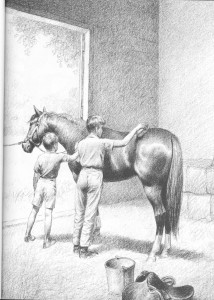
This easy-reader children’s series is from the fifties and sixties.  They have simple, straightforward text and black and white pencil illustrations.  Hands down, they are probably my most favorite books in the entire universe.  When I lost my personal library to a flood, my family instantly Amazoned me the entire set (probably in the hopes that I would stop crying; it worked).

Sometimes, when I read comics or other graphic stories, I find myself frustrated with the art.  For all the options these days in color, from traditional mixed media to advanced Photoshop autofills and filters, there is often, well, a lack of craftsmanship.  There is something to be said for a simple drawing that conveys a straightforward idea in a straightforward way, done well.

I know this may make my tastes dull and boring, but to me, these simple drawings done with nothing more than pencil and paper by one man are more beautiful than many of the creatively mixed media of pencils and ink and Photoshop and InDesign and who knows what all else done by a team of five or more.

One of these books is sixty years old.  So they’re not exactly getting a lot of hot press, but they’re still in print.  Unfortunately, the current reproductions kind of suck.  They don’t do a good job of displaying the subtlety of the pencil drawings’ shades, but they’re also only six bucks each retail.  If you can get your paws on the older, library bound versions, they’re better.

But I wanted to share them, for two reasons.  One, I think they’re lovely drawings that some of the art-focused adults here would enjoy.  Second, I think they’re a great choice for young children, especially if they’re just beginning to read.

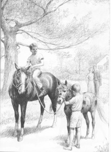
The stories are all about a boy named Billy and his faithful pony Blaze.  Sometimes they include his friend down the road, Tommy, who wants a pony of his own.  Here’s part of Blaze and the Gray Spotted Pony:

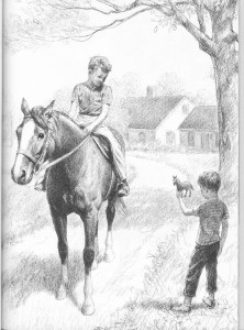
“Tommy was a little boy who loved horses.  Almost all his dreams were about horses–all kinds of horses.”  Tommy makes due with his toy horses and his dreams for a while.  Then we get this, “Whenever Tommy got a new little toy horse, he always showed it to Billy.  Billy said they were very nice and looked real.”

With the charming picture:

Billy shows Tommy how to ride and how to take care of Blaze.

Eventually, Billy and Blaze find Tommy a gray spotted pony of his very own.  (These are not complex, twisty plots.)  Billy and Blaze and Tommy and his Gray Spotted Pony all become best friends.  You can see the bad scanning job and strange pixelations in the reproduction here  (and I thought I was a bad scanner, jeez) , but I also hope you can see the lovely drawing beneath:

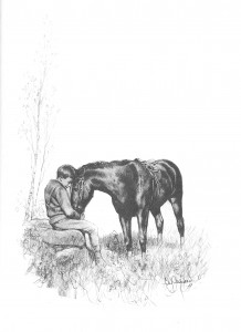
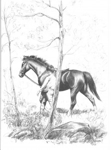
The next story in the series that I wanted to talk about was Blaze Finds the Trail.  As you might imagine, it’s a story about Billy and Blaze taking a ride in the woods, getting lost, and –wait for it!– Blaze finds the trail!  Shocking, I know.  But beautifully drawn and simply told.  We start out with this warming picture of the boy and his pony:

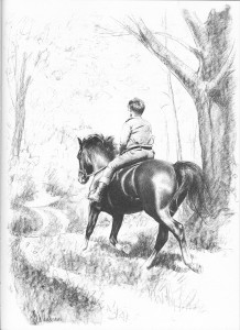
The drawings in this story are especially well-done with the pony rich in shiny coat and detail, and the forest and background rougher and more gestural as they enter the forest for their adventure:

In the tradition of plucky ponies everywhere, Blaze refuses to go the wrong way and eventually leads Billy out of the forest:

They escape the forest and the building storm, just in time.  Simple stories, simple drawings, but lovely.

I hope you enjoy them as much as I have, and perhaps you can enjoy them with a child and instill in them the fiery hunger for drawing with pencils on copy paper that was lit in me.

Face Down In the Mainstream: What if? Astonishing X-Men is Astonishingly Good

What if Ord Resurrected Jean Grey instead of Colossus?  Written by Jim McCann, Art by David Yardin, Ibraim Roberson, and Kai Spannuth.  February 2010 One-shot.  (It contains two other stories, but I don’t care one way or another about them, so I’m leaving them out.)

I admit that I didn’t read the story about Ord resurrecting Colossus (whenever that was…), and I have only vague white-noise understanding of the main plot points here, but it didn’t matter.  I’ve gotten a certain amount of flack for failing to understand continuity plot points in the past, and I maintained then and maintain now that if comics are to get new readers, they’re going to have to accept that some folks won’t have read all 80-gazillion crossover title storylines, and that a good, a strong comic will clue in new readers or find other ways to engage them besides the longer plot throughlines.

And this comic is a perfect example.

We start off with a lovely page explaining the set-up of the one-shot story.  In our world (the main continuity world), Colossus was resurrected instead of Jean Grey, and he united the X-Men.  In this alternate world, it works differently.  Dun-dun-dun.

I’m going to mangle this, because I have bare-minimum knowledge, but it seems to be:  The planet Breakworld has a prophecy about a world-destroying force tied to mutants.  Sensibly, they’d rather not be destroyed, and this ends up in some sort of complex involvement with Jean Grey and Phoenix and the X-Men.  And Emma Frost thinks that Jean Grey is going to kill the planet and–look, it’s all too complicated, I’m sorry.  There’s a baddy named Cassandra who looks like one of those old pickleheadjar people, and a dude/lady named Ord with a white sausage wrapped around their head who they’re interrogating.  Just go with it.

Let the plot flow about your heart like a river, it’s relaxing.  Promise.

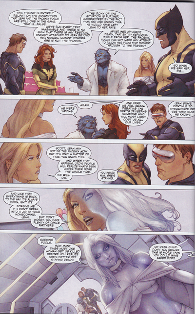
So, we’re following this inner X-Men fight.  Look at this composition:

See how the colors shift from warm, muted tones to icy gray at the bottom?  The figures are lovely, well drawn with interesting poses and good features, but it’s the colors that caught my attention.

While there is linework here, it’s in a very painterly style.  The colors of the lines shift with the colors of the painting–in the top panel, the lines are soft, warm browns but at the bottom, there is cool gray and even white.  Lovely stuff.

That’s a pretty obvious example, and is the one that first caught my eye, but as we move through the story there are other examples.  Flashes of cool gray taking over everything, dark icy eyes turning into fiery hot flames when Phoenix starts possessing Emma.  I wish I could scan the whole darn thing, but there’s those pesky copyright issues, and besides, I want everybody and their cousin to rush out and buy this thing.  (Go, I shall wait right here until you’re done.  Have it in hand?  Good.)

So in the plot, Emma holds hands with three hot blonde schoolgirls in cute preppy schoolgirl skirts, as if this was a twisted porno.  They all channel the Phoenix, and then the power turns the pretty girls into zombie looking corpses.  At which point….

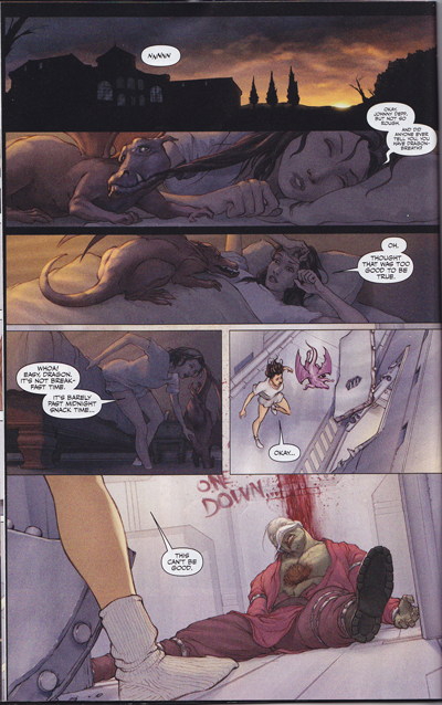
The girl heroine is awoken by her plucky dragon!  And my heart soared.  This is what comics is about folks.  Awesome girl, plucky dragon, great art, cool things happening.  Check out the more subtle color shifts in this one.  We start with darkness, but it’s tinted with the warmth of the sky.  The girl is soft brown and her dragon is soft red, and it’s all sweet and warmth, slowly awakening…and then, as they encounter the horror, the colors shift to pale grays.  Neat!

Also, check out the beautiful painted slouchy socks next to the harsh metal surfaces.  Really, really well done, I thought.

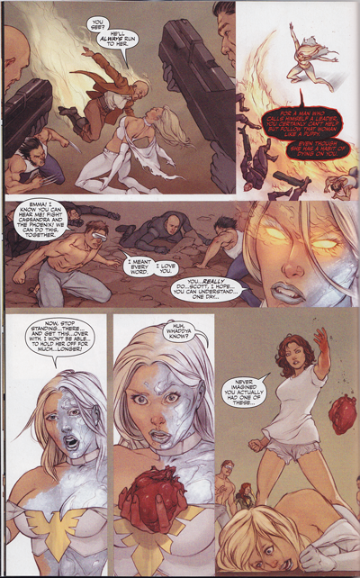
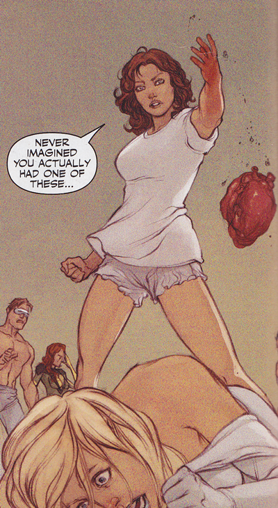
So, this being a comic, Kitty runs to check out the problem, Jean Grey awakens, and there is a big battle with Emma Frost, who is possessed by the Phoenix.  There’s some awesome shots of Jean and Emma fighting, and Jean’s pink power makes for a wonderfully feminine power touch to the fierceness and the battle.  But Jean and Wolverine and the X-Men can’t fight her completely, and Kitty…  Well, let me show you.

She rips out her heart.

It’s gorey and fierce and wonderful.  I was talking a bit about the heroines of comics in my WonderWoman pants rant, and one of the problems I see is that the women aren’t allowed to be as fierce in their defense of worlds as I would like.  Now, I’m not saying that, oh violence is hunky dorey per se, but I am glad to see that in this case, a young woman, with the help of her female mentor, did what needed doing to take out a planet-killing monster.  This particular comic is a battle of females, and it was beautifully done.  Kitty looks powerful and good, strong and young and feminine, saving the world.

There’s a kind of warmth and sweetness in the painting of Kitty.  Powerful, violent, but sweet and tough.  The expression and curves reminds me of the best of the Pepper Project series.

Which means, naturally, that she dies.  Freaking bad villains and their stupid power backlashes, dammit.  (Since it’s the Phoenix that killed her, I’m just going to assume that she gets to come back.  Don’t disabuse me of this notion, OK?)  Anyway, the whole comic really has a lovely feel to it, a warmth and intensity that I deeply enjoyed.  I’m sure that since it’s a painting style that it must have taken a gazillion hours to do, but I hope that more like these come out.  I’d buy them in a heartbeat.  Highly, highly recommended, even if you don’t know the plot.

Bound Beauty by Mick Takeuchi

Bound Beauty, vol 1, by Mich Takeuchi. This manga made me sad.  In fact, it’s fair to say that I’m pouty about it.  The mangaka, Mick Takeuchi, also did Her Majesty’s Dog, which I loved.  This is her new series, and it looked so good.  In fact, it is pretty good, from an objective standpoint, I think.  The art is well done, the composition lovely, the faces and eyes expressive, the humor funny, and the story complex and multi-layered.

And yet, I did not like it.  At all.

The cover is delightful and looks like just my sort of thing.  In fact, I bought a couple volumes in one swoop.  (Oops, but manga have been going out of print like mad recently.  You pays your money and takes your chances, I guess.)

So I thought I was getting a story about a brash high school girl and a hot, angsty tough guy with tats.  Mmmmmm.

Which it is, kind of.  But not really.

See, the heroine, who is a teenager in high school, is in love with one of her teachers, an older man who is handsome and reminds her of a boy who rescued her from a fire.  This, by the way, is a trope I really hate.  I do not buy school teacher / teenager romances, period (and I can’t even watch Card Captor Sakura for that reason).  So she’s got a crush on this guy, which is bad enough, but for magical reasons wot I will not bother to explain in detail, she gets de-aged into the body of a child.  As in like a kindergartener.  Naked.  Yes, naked, because her adult clothes fall off.

They give her very frilly loli style clothes to put on, by the way, which gives me an eye twitch.

There’s kind of a love triangle with her, the teacher, and the angsty cover guy.  There’s romantical stuff sometimes while she looks like a kindergartner, sometimes while she is naked or only covered up by a kimono or sheet, and sometimes when she is a teenager.

I found the snark between her and the angsty guy, when she was in a teenager body, both hot and funny.  Everything else left me kind of squicked out.

There’s a scene where the heroine uses her magical powers to fight some demons, and the Master (that’s the hot older teacher dude) rescues her.  He wraps her injured child body into his arms, and holds her.  She feels warm and safe and loved, and he reminds her that for him, she’s still the same person (still the teenage girl), and that’s the end of the volume.  And you know, some people enjoy that kind of thing, but I am just not one of them.

The main external plot concerns the magical threads of fate, which come in various types (related to the elements, colors, and other complexities I won’t get into here) and how the tyers (the heroine, the teacher, the angsty guy, and another guy in glasses) all manipulate, or tie, the threads.  And of course, they fight crime.  Or magical problems, which amounts to the same thing.

That part was really interesting, and I was starting to get over my utterly squicked outedness when I hit the incest plot.  I know that cultures are different, and I’m cool with that, and I know that there’s plenty of folks who enjoy the occasional brother-sister goings on in comicbook story form, but I am not one of them.  At all.  I find it icky.

I may have said Ewwwwwwwww at full volume at what was supposed to be a heartwarming resolution to the subplot.  *sigh*

I really wanted to read this manga for HU because I love this mangaka so much and her inking is lovely, but this just did not work out.  I am not the reader for this comic.  At all.  Not even a little.

I’m going to admit upfront that I have very, very mixed feelings about just saying that this comic sucks.  It obviously didn’t work for me, and I’m cool with saying that.  What I don’t want to say is that it’s wrong, because I don’t think that the de-aging stories (which I’ve run into before, see also Meri-Puri) are necessarily wrong and sometimes they’re done well.  This is certainly beautifully drawn and well-told.  It just hits a big bunch of cultural walls that I think don’t necessarily translate.  Or maybe they’re story-kinks I don’t share, which can also happen.  *frowns*  But for me, and only me, this comic really squicked me the heck out.  Your mileage may definitely vary.