White Ink: A New Player in Town

Sally Hansen Nail Art Pen, White: recommended

I’m still slowly working on my Great Inking Project wherein I review the black drawing inks in my stash, but in the meantime, I ran across a fabulous white ink and wanted to rush to tell everyone about it.

As some of you know by now, I am wee bit obsessed with ink.  In drawing comics or manga, which admittedly I do only as a hobby, I primarily use black ink on white paper, but like many (most) artists, I also use white ink to add highlights, correct marks, or do various techniques.

The problem is that white ink does not behave like black ink (which dyes paper, among other things).  There are several white ink options available, but most of them are more paint than ink, since it’s very difficult to get good opaque coverage with fine white liquid.  I’ve used the usual White-out, Copic white, and various white inks. There are several problems with these: one must use a brush or sponge and the lay-down of the ink/white-out is gloopy thick and thus makes making marks over it again in black rather difficult or the white ink is smooth but covers not a whit.

I’ve also tried various correction pens in white.  Correction pens are such a lovely idea.  Unfortunately, they either suck or they give me a vicious headache.  Or both.

Which is why when I ran across this nifty little white pen, I was so pleased I had to share as soon as possible.  This is a white ink pen, has no discernable smell (to me), lays down good coverage, creates smooth lines that could easily be covered over (ie, is not goopy whatsoever), and generally behaves like a dream.  You have to buy it in the nail polish section of the drugstore instead of an art supply shop, but such are the trials and tribulations of being an artist.  Unlike many white-pens, the tip is quite fine and it does not have a maximum number of purchases or other anti-graffiti or anti-huffing retail restrictions, at least in my state.

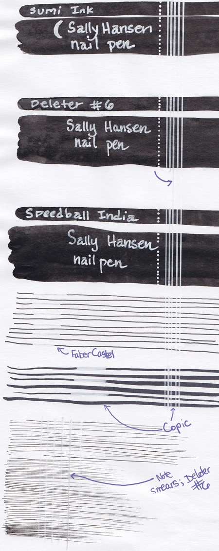
Below you will find the results of my trial.  I took three kinds of ink and laid down thick dark swathes.  I used two kinds of pens and made lines.  Finally, I used a single drawing ink and made very fine effects lines.  Then I used the white pen over each of them.

I used three kinds of ink for the swathes.  The first is a Sumi ink (you can tell it is not rich, extra-dark black).  The second ink is, I believe, alcohol based, but I cannot be certain because it is Japanese; it is however, alcohol soluble when dry but not water soluble when dry.   It’s called Deleter #6 and is my favorite drawing ink.  The final ink is an India type ink, which is not water soluble or alcohol soluble when dry; (this particular India ink is Speedball).

The marker/pen lines are first, Faber Castel pen in size small, black.  The second is a brush-nib Copic.

The effects lines are done with Deleter #6 and my trusty G-nib, because those are my favorites.

Going from top to bottom, you’ll notice that the Sumi ink isn’t all that black, and that the white pen covered it pretty well.

The Deleter #6 is darker ink, but the white covered it OK when writing/highlighting but began to smear, especially during the line marks.

The Speedball India Ink is the darkest of the inks, and the white pen covers it the best.  Unlike the Deleter, there is no smearing whatever.

The first set of marking pens is the Faber Castel and the white pen covered the marks pretty well, but might have benefited from a second coat.

The second set of marking pens is the Copic, and you can begin to see more smearage and poor coverage.

The final set of effects lines shows the worst of the smearing.  That was done with the Deleter.

As far as I can tell, this white pen does very, very well on any ink except that which is alcohol based.  If you use a Sumi style or an India style, you should be just fine.  If you want to do some minor, very fine correction work on an alcohol based ink (because you’re addicted, like me, to Deleter #6 or Copics or for some other reason) you may find it usable with some tweaking. 

xxxHolic: Just the trilogy, A roundtable comment

I’ve seen a couple of comments here and there about choosing to roundtable just the first three volumes of xxxHolic.

Since I’m the person who suggested the roundtable and the three volumes, I thought I’d explain a bit.  (Or at least raise my hand and say, “Blame me!”)

We’d been talking about what to do for the next roundtable and someone suggested the manga Lone Wolf and Cub, but that one is mighty long.  I suggested it would be fun to do a manga and suggested xxxHoLic because I think it is less inherently long-arc-y.  I mean, yes, it does have a lovely long arc, but you’re not just reading an unfulfilled part of a story (which I felt would be unfair to the manga to be roundtabled).

I have long loved it.  I adore Yuko and I really, deeply, truly love the art.  (The ink!  The ink!)  I’ve read a whole lot of xxxHolic but not all of the releases in scanlation.  When trying to decide on a manga to suggest, I looked for one that I liked and which I thought others would enjoy (best laid plans! and sorry to make anyone cry!) but which could be purchased for a reasonable amount.  I’d hate to ask people to drop three hundred dollars on a series only to hate it.  I know that’s kind of a real-world-y reason to not suggest something, but that’s just part of the reality of not being Publishers Weekly or whatever.   I also find that some people who don’t like ‘manga art’ can enjoy xxxHolic.

So those were my reasons.  Sometimes intentions don’t matter, but sometimes they do, and it was not my intent to set up a roundtable that was inherently unfair to the work in question.  For the record, while I do enjoy some of the long-arc stuff, it’s the shorter episodes that I enjoy most, partly because I tend to read manga in a catch-as-catch can fashion, often with long lag times between chapters.

Now, of course people are absolutely entitled be bored silly or to hate it, or what have you.  I’ve, uh, certainly said exactly what I thought about a roundtable item in the past, so I don’t expect any of my fellow hoods to enjoy xxxHolic.    However, I did want to make it clear that I suggested the three volumes, rather than all of them, and so if there’s fault to be had in the criticism for not reading the whole thing, then it lies with me.

Which brings me to my next point.  I can see that several commenters have read the whole manga so far (as well as Tsubasa, which I admit I haven’t read) and so I thought, well, why not open up the discussion a bit more?  I’d love to hear some other thoughts about the manga and about the longer arcs from folks who have read long into it.  I didn’t want to get into a whole lot of the later plot in my intro (also, obviously, I am madly obsessed with the art) since I didn’t know what everyone else had in store and also because I think it’s kind of sucky to put series-long spoilers in intro posts.

So those who have read more, what did you think?  What would you like to see addressed or discussed?

_____________
Update by Noah: The whole roundtable is here.

xxxHolic Roundtable: The Beauty of Ink and the Power of Yuko

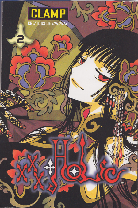
CLAMP, xxxHolic, Volumes 1-3

Introduction:

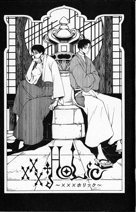
Creators and artists: Since this is the first post for this roundtable, I thought I’d give a quick bit of background on the manga and its creators.  Manga creation works rather differently from American comics; the manga stories and characters aren’t owned by the corporations, but by the artists, and thus the creation of manga from start to finish is done by the mangaka themselves, not divided between draftsmen and inkers and colorists.  (Of course there is some editorial input, but in general, the division of labor is not editorially mandated.)  In this case, CLAMP is a manga studio that has four artists who share the work among themselves.

CLAMP began as a large collective with eleven members, drawing fan comics, and then shortened to its current roster of four artists.  CLAMP does not have assistants (other manga studios usually do; for more info on how this works, I highly recommend How To Pen and Ink), but do all of the work themselves.  The division of labor depends somewhat on the work in question, with main storylines done by one member and character designs by another and so on.

I’d also like to note (as someone who did not attend art school), that CLAMP took art classes in high school, but are otherwise self-taught.

Many people will be more familiar with their other works such as: Cardcaptor Sakura, Chobits, X/1999, Tsubasa Resevoir Chronicles, and RG Veda.  Many of their works have been made into anime.  A complete list is available here and more information about them is available here.

HU is a comics blog and so of course we’ll be focusing on the manga, but buying manga is expensive.  For those who would like a taste of xxxHolic for free or for those who prefer their comics to move on the shiny screen, you can watch the full anime of xxxHolic on the Funimation site here.

Plot and Characters: xxxHolic is about Watanuki, an orphaned teenager who is haunted by spirits and his employer, the powerful witch Yuko.  Yuko protects Watanuki from spirits, and in exchange Watanuki works as her assistant, cook, dogs body, and virtual slave.  There are two other important characters: Himawari, a girl that Watanuki has a crush on, and Domeki, a teenager who is something of a rival and friend to Watanuki.  Both Himawari and Domeki are drawn into the supernatural realm by the machinations of Yuko.   Yuko grants wishes at her magic shop, and Watanuki, as her assistant, helps with the wishes and some of the fallout that wish fulfillment entails.

Which, you know, blah blah blah.  What difference does it make and why should I read this or care about it, you may well be asking.  I will tell you! There are three things that I especially love about this manga and are the reason that I suggested this for our roundtable.  1.  The art.  The style draws on Ukiyo-e prints and Art Nouveau and I can stare at it for hours.  2. The ink.  Which is similar to the style, but different.  I’m talking specifically about the beauty of the lines and the movement and how it creates emotion in the smallest ways.  3.  Yuko.  Who is AWESOME.

Art style:


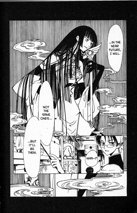
I’m not an expert on Ukiyo-e or Art Nouveau, but as an artist, I’ve always loved both styles and I look at the work often.  The richness of the worlds they create fascinates me, but what I especially adore is the way that they both incorporate the beauty of the natural and everyday world.  Here is a great shot of Yuko smoking:

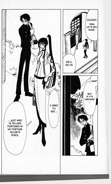
Another aspect of the art is the clothing–the designs are lush or stark, and the bodies are distorted into beautiful shapes much the way Aubrey Beardsley did.  Here is an everyday, simple panel from xxxHolic where Watanuki and Yuko are at a fortune teller’s house:

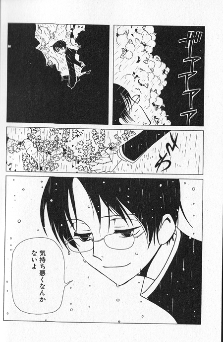
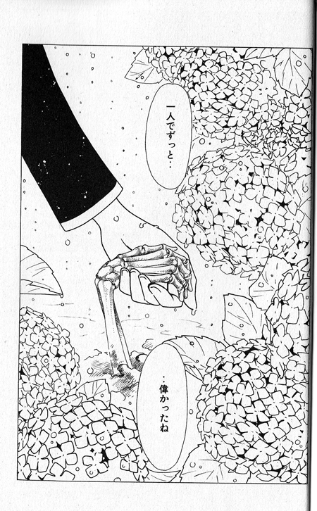
Ink: The untranslated scans below are from a sneak-peak of volume 5.  I wanted to show a piece that conveyed a lot of emotion.  The mood is soft and slow, and the inks are clean and lovely.  All of the mid-tones are created by ink techniques, and the gentleness of the ink adds to the sadness.

The soft lines of the flowers, the long smooth lines of the live hand against the dry and hard bones–it’s so simple and masterful in its simplicity.

I’ve gone on and on, so I’d better move to the last point.

Yuko: I admit I’d kind of like to be Yuko when I grow up.  She’s frivolous and silly at times, likes her pleasures (everything from yummy food to cooling breezes in summer to a good, stiff drink), has the best clothing ever, but she’s also very wise.  She warns her customers about the dangers of powers and wishes, and cleans up problems to save the world, all while looking elegant and stylish. And she’s middle-aged and unattached and sexy and perfectly happy about all of it.

If you’ve ever seen a Disney movie, you’ve probably seen a stereotypical middle-aged woman of magical power as a scheming bitch out to destroy the up and coming young heroine.  That’s rather sad.  It’s pretty rare to find powerful, middle-aged women who enjoy the sinful pleasures of sex and booze and are unashamed about it who don’t turn out to be villains.  (If she was a man, especially if this was a historical, she might be called a rake.)    I love that Yuko is wise while couture and sipping a naughty drink.

She has a great deal to say about personal responsibility measured against fate, and about hitsuzen.  But this post is already a great deal too long, so let me just say: Welcome to xxxHolic week!

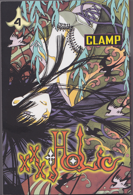
And I’ll leave you with one of my favorite pictures of Yuko:

___________
Update by Noah: You can read all posts in the xxxholic roundtable here.

Poison, Parakeets, Valets, and Ink: Godchild

This week I’m taking a brief break from rooting around in the comic racks for new titles. I need to make a trip to a local comic store rather than Borders because I’d like to take a break from the X-Men. I thought I might pick up the most popular comics and do those instead of just whatever catches my eye; but that’s for the future.

What’s now is Godchild and it is awesome.

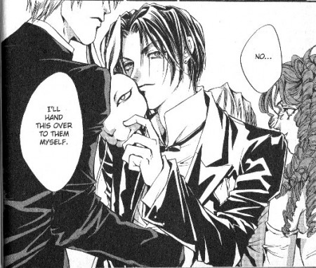
For those who don’t know, Godchild (and it’s sister series Count Cain), follows the story of the young Earl of Hargreaves and his valet, Riff. It’s created by Kaori Yuki and available in its entirety from Viz.

The Count is young and beautiful, as per usual for manga:

But there are a whole lot of manga about beautiful young men and their butlers. Well, OK, maybe not with their butlers. But why is this manga worth talking about? Why am I recommending it?

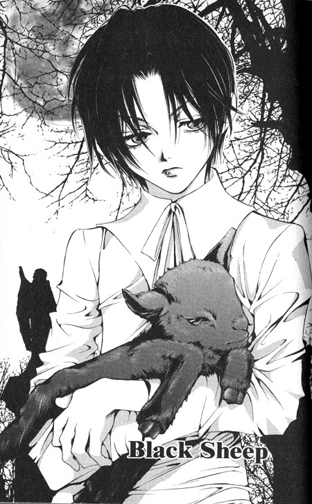
First, I think the art is gorgeous. The style in Count Cain (which was written before Godchild) has the older Kaori Yuki style, but Godchild has a sophisticated, lush, beautifully inked style that makes my heart sing. The negative space and the elegance of the line is often enough for me to just stare at a page for a while:

The layout in Godchild is much more varied than the usual manga. The shots focus on a face, then a place, then a hand or symbol, and then back again. It creates a deep rhythm that adds to the Victorian lushness.

Then there’s the story. Godchild is about the Earl of Hargreaves and his adventures, but to say that is both accurate and misleading. While Cain is a hero, he’s also something of an anti-hero. His personal hobby is poison and in the first story, he uses his dark skills to manipulate a murderer into a vile killing. Cain’s hands are clean of blood, but he’s still very much responsible for the death. He wound up the murderer and pointed him at the target. He is well aware of this and it doesn’t bother him.

This story is dark. It includes abuse and incest, zombies, heads in jars, and death everywhere. One theme in Kaori Yuki’s work is scars. Abuse and violence leave permanent marks that can never be fully washed away. Manipulation is everywhere and reality is often fluid. And dark.

Many beautiful old poems, nursery rhymes, and horror themes show up. This is very much an adult story but it includes many looks back towards childhood and the vulnerability of being a child as well as the trappings of childhood.

The beginning volumes are semi-episodic.  They contain small mysteries which the Count solves, but they slowly add in larger story arcs.  One of the things that makes this such a fun story is the horror elements and the twisty character revelations as time passes.  It also includes girls who eat parakeets, killer parrots, heads in jars, zombies, ominous violin players, Tarot groups, deadly treats, and dolls.

I would like to discuss some of the larger themes, but to do so would constitute a major spoiler for the entire series.  Suffice to say that the story slowly builds an amazing amount of information in the strangest and most fun places that are only understandable looking back.  This series bears up well under rereads.  Highly recommended.

Some other excellent essays on Godchild are here: CoffeeAndInk’s review of Godchild Volume 1; Oyceter’s review of Godchild volume 1.

Face Down in the Mainstream, Illustrated Edition

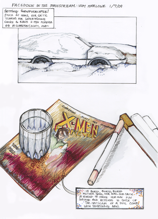
This is my first Face Down in the Mainstream post here at our new home, and I assume there are some new readers.  This column chronicles my attempts to find a mainstream comic to read and enjoy.  Said comic must be currently running, not an older trade, and ideally focus on female superheroes, although I’m not going to ignore the more traditional male heroes.  I read comics more for art than words, and I frequently read manga in Japanese without ever knowing what the words mean. Thus far my favorites have been Detective Comics Batwoman and Marvel Adventures Spider-Man.

For the first column in our new digs, I wanted to do something a little special, but as you will see, my options were limited.  But I did what I could.

So, I crafted a whole bunch more pages, but I won’t bore you all further.  The truth is, this first page is about as much as you need to know about how I felt about this comic.

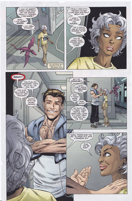
But I do try to do a good job on these little reviews, so here’s the usual textual explanation with images yanked from the comic as examples.  This comic has a nice explanation of the story-up-til this point in the front, and then leaps directly into the action, which is an X-men team battling a giant purple robot.  Despite the purpleness of the robot and the colorful nature of the X-men costumes and faces, this comic is rather bland.  Sure, you have people in  green and yellow tights, but the overall color scheme is simple and in many places, so oversaturated with neutrals that the colors of the suits don’t even pop.

The jungle scene in particular disappointed me.  There was plenty of green and blue, but not much was done with that.  All very flat, alas, and no interesting ink patterns to spice things up.

Here’s a particularly good example of what I mean:

It’s not bad, is it?  It’s just overwhelmingly dull.  A shame.

The story itself chugs along OK.  People do things, other people react, villains plot to take over the world, the X-men try to make sure that the emotionally tender member of their team is OK, and so on.  It’s just—  I didn’t really care one way or the other.

I found the twist at the end utterly predictable, and I’m pretty sure I know where the character foreshadowing is going.  The cute picture of Rogue on the cover, holding the guts of the giant robot, didn’t really come about much in the comic, but it didn’t really not either.  I mean, they do battle the robot and she does win, but there isn’t much struggle to get the victory.  The emotional reactions don’t last much past a single panel (except for Kitty’s, which was caused by events in a previous issue), so it’s hard to take any of them very seriously.  There’s not much sacrifice or bonding or character development, and while the external plot does move forward, I’m not finding any themes or depths.  It’s a villain who wants to take over the world  using giant robots, you know?

So anyway.  Not bad, not good, rather dull.  I’ve got my eye on a few new likely looking suspects in the rack at my local Borders, but first I’ll need to shovel my way out.  *sigh*

How to Draw Manga: Ultimate Manga Lessons, Vol 5: Basics of Portraying Action

Hikaru Hayashi, Go Office

This is a smaller trade sized (6  x 8.5 ) series and contains all new information, drawn by some great artists.  The whole series is good, but I wanted to focus on this volume in particular because it’s a lot of fun and would make a great, fun holiday gift for the budding artist.  It’s kid friendly (no nudity or graphic violence) but far from kid-specific and inexpensive (retails for 13.95 but is much cheaper with the gratuitous Borders coupon).

Each of these volumes covers a similar pattern: focus on a particular topic, pose drawing tips, some ways to express various emotions, practical advice on manga tools (like ink or tone),  a section on using layout as a tool to convey the topic, and some real manga pages analyzed with regards to the topic.

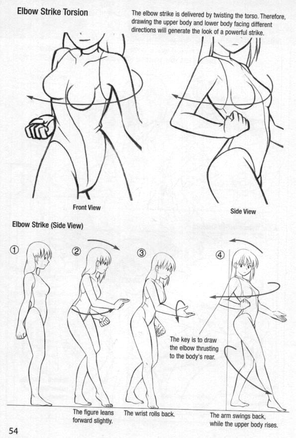
This volume focuses on action poses and expressing action.   One of the things that I love about this series is that they use both male and female bodies as examples.  The other thing they do is show the same pose from different directions.  Drawing the body from different directions really helps an artist understand the underlying anatomy.  This volume does a great job by taking an action and breaking it down into steps like so:

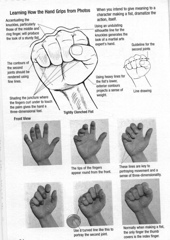
As I mentioned, some of these volumes include reference photos.  Here’s a great example of how to learn to draw hands and how to translate the reality of the shape (hands are darn complex) to a drawn image that works:

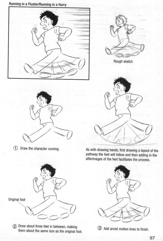
There is a good balance of advanced drawing to stretch the artist and simplified but effective techniques that should be doable even by beginners:

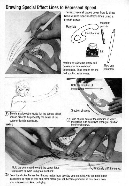
One of my favorite things about this series is the hands on pictures of real artists creating the pictures that are included:


I’ve read and enjoyed each of the volumes in this series.  They’re all good.  This is one of my favorites, however, because it covers how to draw a ninja on water skis and using a blow dart.  Can’t beat that.

Ghost World: Hateable Girls, Part Eleventy-Billion

‘Show, don’t tell’ the saying goes, and that’s what Clowes does here.  Ghost World, as those who’ve been reading along are aware, is the story of two teenaged girls fresh from highschool named Enid and Rebecca.  Ghost World chronicles some episodic interludes in their relationship and Enid’s life.

With its purposefully ugly art, limited color schemes, Satanists, cafe settings, music references, and f-bombs, this comic is painfully edgy.  The whole thing might as well scream: I’m new!  Different!  Hip!

And maybe the art is, maybe the setting is, but honestly I don’t really care.  The story is pathetically old school.

Clowes depicts the two girls, Enid and Rebecca, as being shallow shallow shallow.  They lead boring, directionless lives.  They like to make prank calls.  They pick on each other.  Enid, in particular, is full of loathing towards others.  When Rebecca challenges her to name one guy she finds attractive and would sleep with she says, wait for it!

David Clowes.

No, really, she does.  Self-insert Mary Sue-ism!  Ewww.

It’s one thing to show a set of characters as essentially problematic and unlikeable, but if you’re going to do it, and you’re not one of the group you’re deriding, then you’d better show them accurately and not rig the game in your own favor.

Which is why Ghost World so annoys me.  Clowes’s teenaged girls don’t behave like teenaged girls.  Here we have Enid telling Rebecca a story about meeting an old asshole, Ellis, and his kiddie raper friend.  Ellis ‘humorously’ suggests that the kiddie-raper check her out, since she’s only 18.

Rebecca’s response is shown below:
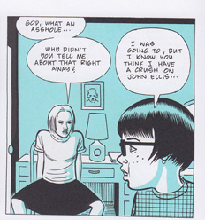
TakeMe

First of all, take a look at that body language.  As someone who wears a skirt from time to time, let me tell you that girls rarely spread their legs like that while wearing a skirt.  For one thing, it’s flat out uncomfortable.  For another, we get nagged about spreading our legs or showing off our panties or what-have-you.  Even in pants, spreading the legs is something that is usually done when one feels very comfortable and safe.  It’s not something that a girl does when she’s just heard some bozo suggest a child-molester hit on her best friend.

This panel is not an accident.  Look, I don’t like Ghost World, but Clowes has some drawing chops and he portrays body language effectively enough when he wants to. So what’s going on here?

A teenaged girl is not going to open her legs wide in a ‘take me big boy’ response, so why is she drawn this way?  I can only assume that Clowes thinks a girl would have that response or because he wants to titillate the reader with Rebecca’s spread legs.  Either option is unpleasant.

Then there’s the “lesbo” masturbation scene.

I’ve noticed that one of the ways Clowes mocks Enid is by having her mock people for something and then later having Enid do that mockable thing herself.  Enid makes fun of a guy who she used to have something of a teen-romance with in high school.  She says that he probably called her and jacked off while she talked.  Mock mock mock ew say Enid and Rebecca.  Then Enid visits an adult bookstore and picks up a fetish Batwoman hat and calls to tell Rebecca about the adventure.  While on the phone with Rebecca, Enid takes off all her clothes and gropes herself while looking in the mirror (but doesn’t tell Rebecca).  Mock mock mock.

It’s this weird circle jerk, but it doesn’t ring true.  It comes off to me as something Clowes wants to think teenaged girls do, much in the same way that the high school boys I knew hoped the girls in the gym showers got up to steamy hanky panky.  Never mind that in reality gym showers were places of horror, shame, body-fat hatred, silent prayers that you weren’t having your period (and if you were, that no one would find out–good luck with that) and tears. To the guys it was all a happy fantasy of hot girl on girl action.

Why is Clowes doing this?  I say it’s to do two things at once: make fun of Enid for being a jerk and to fantasize about her and Rebecca in a sexual way.

Here’s a thought experiment.  Take out the reference to Sassy and replace it with Lucky.  Remove the punk green hair and replace it with a blonde ponytail.  Switch the swearwords from fucking cunts to snooty bitches.  Remove Bob Skeeter the astrologist and replace him with Ned the computer nerd.  Pretty soon, if you took away the hipster faux-literary trappings and replaced them with mainstream teen story trappings, you’d have a boring and cliched tale of a couple of teenage girls who everyone loves to hate (and wants to date).

But maybe it’s not as OK as it used to be to hate girls just because they’re blond and pretty and not fucking you.  So, instead of going that route, make the girls “real” by changing their outfits and the bit characters and the scenery.  Then it’s not a cliched misogynistic screed, it becomes a “true” tale of how girls “really are”.

But it isn’t quite a tale of a guy who can’t get some, is it?  No, because Clowes draws the main character wanting him.  How much more proof could there be that this is a story about girls who are wanted/hated and the line between those two things?

There’s a fine literary tradition all about how women are shallow creatures and female friendships are suspicious and smothering.  But if you’re a old dude perving on the sweet young things when you’re arguing it, it looks a teensy bit suspicious, is what I’m sayin’.

So let’s take a look at the so-called emotional growth and story progression of their relationship.  What do they say and what do they do? Enid is thinking of going to college (to become someone new) and Rebecca decides to travel with her.  What do they say about this?  That it’s unhealthy.

Let’s take a look at that.  It’s unhealthy for a friend to accompany a friend on a quest to become someone new.

Do you think that’s true?  Because I sure as hell don’t.  I’ve gone on several quests to make myself better, move someplace new (emotionally or physically), and been enriched and enlivened by the people who are by my side, traveling those paths with me.  But Clowes, speaking through his characters, labels this as kind of creepy.

So what, exactly, does Clowes display as  Enid’s growth?  What is her progression?

If we take a look at the final pages, we see Enid in a new outfit.  We’ve learned in this comic that changing outfits means changing who you are (at least for Enid), so let’s take a look at what’s she changed into.  She’s well-groomed, with smooth hair done like Jackie Kennedy, and she’s wearing a neat, fifties housewife ensemble and carrying a hatbox shaped purse.  Examine that for a moment.

Does this hark back to a desire on Enid’s part?  Not as mentioned/drawn in the text, so we’re left interpreting the image in the way our society means it.  Nothing says housewife quite the way a fifties outfit does.  Is there anything (besides June Cleaver) that fifties suits and haircuts bring to mind, visually speaking?

Not that I know of.

What is this journey, anyway?  It’s a journey of Enid’s current life, and it ends when Enid steps on a bus.  What does that symbolize, within the context of story that Clowes has built?  Erasure of self.  Clowes likes to talk about it as creating someone new, but again and again he denies that Enid wants to be anyone specific.  At the end, presumably after her emotional change (indicated by the dress, the diner voyeur scene and the bus) he gives her no identity except that of a very stereotypical fifties housewife.

That’s the “growth” that he lays out.

Ponder that for a moment and ask yourself whether it is, in any substantial way, a positive view of Enid.  A positive view of girls, period.  Whether it is anything besides the author saying, “Girls like Enid eventually cease to exist“.  Not only does the author change them (into something trite), the girl herself wants to be anyone but herself.  Herself is so awful she cannot be.

That’s a pretty hateful message when you get right down to it, and I cannot look at that as growth, as anything besides old fashioned misogyny and a desire to turn Enid into, bluntly, a wife.  A person who exists not for herself, but who exists in relation to a man.*

But maybe I’m wrong.  It’s been known to happen, and a single outfit is a small thing to base an entire textual interpretation on, right?

Right.  Let’s look at the diner scene, which is the last line in the book, and the closure of Enid’s relationship with Rebecca.  What does Enid say?

She says, “You’ve turned into a beautiful young woman.”

A beautiful young woman.

Look at those words.  Consider the perspective of them.

Who is saying this?  What is the relation of the woman in those words?  To what aspect of the person are these words referring?

Enid (or Clowes through the character of Enid) considers this the mark of passage for Rebecca, the outside view, the praise.  But what kind of praise is it?

It’s the praise of someone outside the woman, wanting her sexually, and has nothing at all to do with the woman’s internal desires, personal happiness, emotional growth, interests, community, relationships, or personhood.  No, to say ‘She’s a beautiful young woman’ is to say she’s sexually desirable by an outsider.

And you know, as a bland statement of fact, it’s not so bad.  But as a statement of a woman’s journey through a friendship and her creation of a new ideal self?  That’s really fucking shallow, objectifying, and creepy.

This is not a tale of powerful female friendships post highschool.  Nor is it a tale of emotional growth.  It’s the same, tired story of how girls are shallow and their friendships are incestuous and unhealthy and most importantly how they need to become not-themselves.  Gee, that’s deep.  I’ve never heard teen girls and what they care about called shallow beforeHow original!

* Yes, I’m well aware that plenty of women are happily married.  That’s not what I’m talking about, so let’s not go there.  What I’m talking about is defining a woman only as her role in regards to men.

Note number two: I was an odd clothes wearing weirdo who read strange magazines, once upon a time, so I’m well familiar voices and inner worries of this group.  Just so you know.