The world of comics may seem like a pint-sized planet but news still takes some time to travel from one point to another. Often (and almost paradoxically) the more popular a comic, the less likely its fulsome embrace by that monastic order of adjudicators and explainers known as the comics critics circle. We’ve seen this quite recently with the release of Alison Bechdel’s Are You My Mother? where the bulk of interviews and articles relating to the comic were formulated by the mainstream press. One could put this down to the utter insignificance of the comics press when it comes to marketing non-genre adult targeted material.
Another comic which has fallen by the wayside in terms of notice is Randall Munroe’s immensely popular xkcd— a comic which seems to have engendered even less discussion among dedicated comics critics then the much reviled efforts of Scott Adams and Cathy Guisewite; this despite being one of the most popular websites in America (it ranks in the top 1000 U.S. websites). This meant that I had to find out about Munroe’s long running serial, “Time”, from a mainstream site after it was completed.
The exact substance of “Time” is amply explained by the xkcd Time Wiki, a fan-created encyclopedia with a level of detail I normally associate with popular computer games.
A nice discussion of all things “Time” has been written by Jeffrey O. Gustafson at The Comic Pusher. Gustafson lays out the mechanics of the panel changes quite succinctly:
“…it began to change, incrementally, every half hour at first, then every hour. Some panels would feature a small change from the previous one, showing a small fraction of time passing; others contained dialog and events and changes in scenery indicative of minutes or hours passing. Every hour, a new panel would be published over the old one, and this would go on, every hour without stopping… for four months. Time finished last week, after 3099 frames. That is a comic in 3099 panels, with each panel published every hour for 123 days.”
“Time” was serialized over a period of 4 months from March to July 2013. If one desires even more detail concerning the panel transitions (down to ellipses and ephemeral subtitles), one need only read the One True Comic section of the wiki mentioned above which is meticulous and clearly self-mocking in its comprehensiveness.
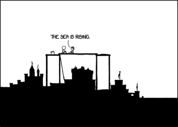
In short, “Time” begins with two individuals building a sandcastle of immense proportions. Upon completing their project, they set off on a journey through a strange wilderness in search of answers to the rising tide of water beside their construction, eventually reaching an actual castle built by a mysterious race with “all” the answers to their questions. Informed of the impending fate of their community, they return to the sandcastle, board a veritable ark (constructed from the remnants of their sandcastle) with their friends and relatives, and soon reach dry land where the story ends.
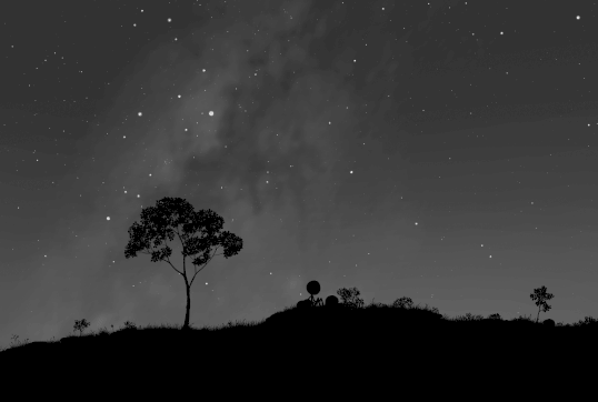
A synopsis like this would suggest concerns about climate change, a chronicle of the cyclical nature of history, and a retelling of the ur-myth of the universal flood—brought in patch work fashion to us by the Mesopotamians, the Jews, and various Mesoamerican cultures etc.—which has since been scientifically put down to episodes of catastrophic localized flooding. A simple survey of articles published on “Time” would however quickly disabuse the reader of such notions. For Munroe’s avid readers have found many other avenues of research, whether they be the accurate chronological placement of the story through a review of the precession and fates of the constellations, the translation of the “Beanish” language used by the mysterious race of answer givers, faunalogical studies of the environment, modern day allusions to theoretical engineering feats like Atlantropa, and so on so forth.
As Gustafson explains in his summary of some of Munroe’s revelations in Wired magazine:
“… the travelers live at the base of the Mediterranean basin. Some geological calamity has caused it to dry out, and it is suddenly, quickly, violently flooding back. This is something that actually happened five million years ago, the Zanclean flood. Except the flood the travelers are encountering isn’t happening in the distant past, but the far future. As revealed in the night sky Munroe meticulously displayed, this journey takes place in April of 13291 CE.”
“Time” is a story stripped down to its most basic elements, forfeiting characterization and even engaging dialogue both of which remain largely functional throughout. This can be seen as a counterpart to the abolition of facial expression in his xkcd strips as a whole and the artist’s moderate reliance on body language. What remains are ideas, environment, plot, and mystery—a narrative soup meant to evoke the beauty of a mathematical equation or in this instance a complicated puzzle. One might even call it a kind of unyielding hard science fiction where the science is not a mere adornment to humanistic concerns but transformed into points of intense focus. If seen as a game, it presents its participants with no obvious demands for a solution or even access to restricted modes of direct interaction. Instead, it harnesses the power of the biological web in its absolute faith that everything can and will be taken apart and put back together again. The net community is transformed into a classroom where your fellow readers are your teachers and where every mistake in analysis is not a moment for reproof but another avenue of study. In certain ways, it brings to mind the video games of old, created in an era of stunted computing power, where exploration of graphic miracles—the creation of an “entire” world—was the be all and end all; where entering a virtual library and being able to open a book was such a thrill and the lure of movement in detailed three dimensional space in games like Myst precipitated the sale of a million box sets.
The emotions and characterizations in “Time” are so sparse that the comic takes on the tone of parable or a fable, one crafted in such broad strokes that it invites all forms of interpretation—autobiographical, scientific, historical and, somewhat improbably, religious. It’s only counterpart in comics might be the interactive comic books of Jason Shiga . Yet beneath the mathematical cunning and distance of Shiga’s best stories often lay a core of emotional loss and meaning. No such mitigating factors are evinced by the author of “Time”—which progresses unrelentingly, its protagonists like ants in the grand scheme of things. The stick figures of xkcd absolve the reader of any need to engage his/her emotions in the frivolous act of fictional narration. I imagine that many of Munroe’s readers will suggest that his figure work conveys a lot of deft emotional touches and his abbreviated dialogue the ennui of a generation twisting and turning in a Beckettian gyre. But this has more to do with his readers’ total investment in the product.
As in all intellectual communities, an element of elitism cannot be far behind. If some film fascists suggest that the only true and correct experience of a vintage movie is on a large screen in a darkened theater, then some true connoisseurs of “Time” might insist (as opposed to the more congenial wiki) that an essential part of “Time” is its methodical pacing—the mental patience, the drawn out cogitation and experience of waiting generated through the act of following the progress of the characters over the course of four months; an experience of time and narrative unavailable to the person watching the Youtube presentation of the story or even those clicking through the stills 1-2 seconds at a time (at Geekwagon)—all this being the equivalent of watching a Bela Tarr movie with your finger firmly pressed on the fast forward button.
In this light, “Time” can be seen as a self-conscious study of the effects of serialization where the the reader’s engagement during the process of serialization is as much a part of the artistic experience as the viewing of the comic; the once indistinct intellectual consequences of reading a long and involved serial like Gasoline Alley or Love and Rockets now compressed and brought to the fore, the essential and fugitive moments not only experienced over days, months, and years but now also over seconds, minutes, and hours. I haven’t bothered checking but one presumes there have been calculations made as to how the duration and pace of serialization corresponds to the duration of travel by the figures in the story.
Still this deliberate act of sluggish serialization seems far from his reader’s minds, and a comics critic like Gustafson seems more concerned that people are labeling “Time” a kind of drawn out animation with little relation to the form and accumulated experience of comics:
“I see the comic described as a slowly drawn out animation, that the experience of reading Time as it was being published was one of a very long, very slowly playing cartoon being displayed one frame per hour over four months. But this is emphatically not the case with Time. With a cartoon…each frame of the work represents a set fraction of time that when played back gives the sensation of movement. By necessity, every frame is transitional and inhabits an identical sliver of time. But Time does not do this. There are certainly transitional panels in Time that take less time to read, but there are just as many unique, illustrative narrative panels that must take more time to read. If it was animation, the panels with dialog or significant events would happen across multiple frames, but they don’t. They happen, without fail, in one frame, one panel.
…Comics are defined by their nature of the reader defining the temporality of the fiction, both the pace at which it is read and how the story plays back in the mind. Munroe dictated the pace of Time‘s consumption at first—like an elaborate live art installation—but now the reader is back in charge of the time of Time.”
That last argument of Gustafson’s seems to do harm to his idea that “Time” should be seen primarily as a comic. By his own definition (which is by no mean inarguable), the initial release of “Time” conforms to a kind of slow animation with frame replacing frame, and the pacing controlled entirely by Munroe. It is only following its first enactment, that “Time” begins to take on the shape of a comic. In any case, the comics sphere hardly seems in a rush to grasp “Time” with both hands, definitional crisis or not.
One might ask why this most popular of web comics seems of so little interest to people who have been enmeshed in the form for decades. Perhaps it is a sign of old age—a precursor to obsolescence—the critics of the Epoch of Paper failing to accede to or embrace this new era of passionate, cold-blooded impersonality.
In fact, xkcd seems of primary interest to people with only a cursory interest in the comics form. Its popularity has led to its share of avid detractors and affectionate side swipes ladling life and tender connections into the autistic aloneness of the strip. Yet virtually every article I’ve read about “Time” has boiled down to information—links to where to see it, links to discussions, and an almost a priori belief in its worth and merit. The Economist, for example, lets us know that the strip is beloved by “geeks and teachers alike” and that “readers of Mr. Munroe’s strips are clever dicks” (said affectionately and admiringly). Tellingly, it begins by comparing “Time” to a science and engineering project, the Long Now Foundation’s 10,000 year clock.
To criticize “Time” would seem to be as worthwhile as criticizing a Twinkie. You might want to dissect a Twinkie, copy a Twinkie, study the cultural history of the Twinkie, make jokes about its place in the annals of law, and enunciate its status in American society but few would question its value—which for all intents and purposes can be summarized in the word, “Mmmm!”
This is not to deny “Time” the status of art. Lord knows, being a Twinkie (or even a lump of shit) hasn’t been a barrier to being art for a few decades. In fact, it’s not hard to see a future where a comic like Watchmen will be dismissed as a bloated, flatulent mess—a kind of in-bred salon art—when compared to the technological simplicity of “Time”; a comic where form, function, and viewership are completely in sync with this age of information and technology: outsourcing emotion to its readers, fostering communality, creating a journey and puzzle without end like the ethereal substance which hosts it and this article you are reading.

