This is a slightly revised version of a post that originally published on The Middle Spaces.
______
The recent #FireRickRemender controversy on Twitter and Tumblr brought to mind a topic that I have given some thought to in the past, but that mostly exists in the form of an evolving question that I do not quite have an answer to yet, nor that I can make any confident assertions about. In fact, even as I write this I am trying to think through the best way to articulate the question itself based on some general observations.
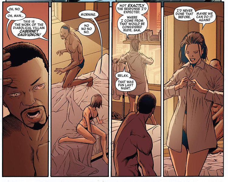
For those who are not familiar with the Captain America #22 controversy, I recommend you read this piece. I think it covers it well, but the short version is Sam Wilson—Falcon—has drunken sex with Jet Black Zola who at the beginning of the current series was just a little girl of undetermined age, but since has spent 10 or more years in another dimension where time moves faster. By her own admission, she is at least 23 years old when her sexual encounter with Falcon takes place—beyond the age of consent in most places that I know of.
There are fans who feel that the ambiguity of her age and the involvement of alcohol in the hook-up suggest the possibility of statutory rape. In addition, Sam Wilson was drunk enough to not remember having sex at all, which means that he must have been clearly drunk enough that no one should be having sex with him if they care about clearly delineated consent. In other words, it is a problematic scene all the way around. (You can read the whole scene here and decide for yourself).
Still, it is not so problematic that I think the writer, Rick Remender should be fired (though I am not a fan of his work and will admit to having a dislike for the guy ever since his “hobo-piss” comment in regards to the reaction to the also controversial Havok “m-word” speech in Uncanny Avengers). The fact is that the age ambiguity—fostered in no small part in these particular issues by John Romita, Jr’s inability to draw children and young adults very well (his art has gotten decidedly worse since the 1980s)—has a long history in Marvel Comics.1
So here is the real question that arises for me from this kerfuffle: It is not about whether Rick Remender should be fired, but instead: How does the flow of time in superhero comics, with its sliding timescales, disproportionate aging, and alternate dimensions confuse and complicate issues of sex and consent in those long-running serials?
Here the thing: There is a pattern in superhero comics of young female characters disproportionately aging so as to make them sexually available for the adult male characters (and ostensibly for their straight male readers). Of course, the nebulous nature of the passage of time in serialized superhero comic books makes any exact determinations impossible, but there are certainly a few examples of transformations that allow for otherwise pre-teen or teen girls to suddenly be the age of consent.
 The most obvious example I can think of is Illyana Rasputin, aka Magik, of the New Mutants and later the X-Men. When she is kidnapped by Belasco, not only does he want to make her his bride, but as soon as she starts to get a little older she is depicted in her Darkchilde form mostly naked with a more developed body, little short shorts and a crop top, and with a come-hither look. When it comes to Ilyana, her arc from seven year old girl to New Mutant to X-Man is one that makes the subtext of uncontrollable dark magic and the dangers of female sexuality quite explicit. The whole Belasco’s bride thing makes it text, not sub-text. The way she is depicted now, after having reverted to her original age and then returned to her young adult form again, (dying and then returning), reinforces the possibilities opened up by her aging. She falls safely into the male gaze, from a position of taboo anticipation for her eventual desirability.
There seems to be a very gendered distinction in how characters are aged in superhero comics. While young Franklin Richards, for example, is temporarily aged in the 1990 “Days of Future Present” crossover event and later as a member of the ill-considered Fantastic Force, he is not depicted as hypersexualized in order to make him seem older and more mature. (He has battle armor he pulls from a pocket dimension for that).
Pre-teen and teen girls like Illyana, on the other hand, come pre-sexualized in the hypersexualized world of superhero comics. A young female character’s maturation seems to most often (if not always) be connected to her sexual availability.
The potentially problematic aging is not always immediate, however. For a character like Kitty Pryde, aging is simply disproportionate to the adult characters, allowing her to eventually “catch up” to the others, while they remain just about the same age. Kitty was introduced to X-Men as 13½ years old. Over the course of 34 years since her published introduction, she has been allowed to age about 10 years, while the other X-Men have not really aged much at all. I made the joke to someone on Twitter not long ago that aging in Marvel Comics allows for eventually every child character to be old enough to have consensual sex while the adult characters remain young enough to have it with them. Except, I guess it is really not all that much of a joke. It’s creepy.
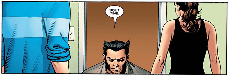
Joss Whedon on his run of Astonishing X-Men wrote a great scene in which Kitty and Peter (aka Colossus) have had sex, and Wolverin acknowledges both the act and the attendant temporal discontinuities. The problem of pedophelia is avoided, since the beginning of the series makes a point of stating that Kitty is returning after a long absence. This indeterminate amount of time is elastic enough to absorb any qualms about Kitty’s youth in relation to Peter who always seemed old for his age. Suddenly, the distance between them seems not so great—certainly less than the nearly seven years when their romance began. For many readers drawn back to X-Men by Whedon’s run after a long absence, that elasticity of time is an especially important way to make the distinction between the Kitty of now and the Kitty of the simultaneously distant and not-too-distant past. Wolverine may quip “’bout time,” but really when else might their having sex really worked in terms of their ages?
Another example of the weirdness of how time passes in the Marvel Universe is Julie Power, formerly of Power Pack. I have not read the issues of Runaways or Avengers Academy that she most recently appears in, but just from what I have read online and the panels I have found by doing a little searching, she has gone from a little 10-year-old girl to a sexually active 17-year old (or so) who wears a halter-top and is posed in erotic ways.
To be clear, it is not that I think aging characters is a problem or that the depiction of sexuality is necessarily a problem—I wish aging were done more often. Rather, I think it is problematic how young female characters are aged especially in relation to male characters.
Another important example is Kate Bishop of the Young Avengers and Matt Fraction’s Hawkeye series. While she first appeared in comics on the verge of being 18 and the most recent Young Avengers series had her turning 21 (so she aged about 3 years in about 9 years real-world time), she not only moved from technically being a minor to being legal adult (whatever that means). Clint, however, has basically stayed the same age in that time (early 30s maybe?) What makes this such a great example is not the sexual component to their relationship, but that writer Matt Fraction had to explicitly address its possibility on his blog.
He wrote:
But i’ll say this: they’re not gonna fuck. [Kate] doesn’t want to fuck him and he doesn’t want to fuck her. It’s not going to happen. They never daydream about it. They don’t wonder about it. They won’t idly pass the time thinking what if. There is nothing sexual in their relationship. Flirtatious? At times. Sexy, even? To a point, maaaybe? I don’t even want to play with will they or won’t they. Because they won’t. So I’ll say, again, unequivocally, as long as I’m on this book, it’s not in the cards even remotely for either of them. I am interested in a love between these two that has nothing to do with sex or physical/sexual attraction. The dog won’t die and they won’t fuck. The end.
Here’s the thing though, despite Fraction’s protests, the Hawkeye title plays with a lot of sexual tension between them. Sure, Hawkeye claims to not want to sleep with her, and she addresses it as creepy, but there is a lot of subtext that this article over at Comic Vine does a great job of illustrating. But even if that weren’t the case, the fact that Fraction felt the need to address it means that Kate reaching the age of legal consent immediately put her character within the realm of possibility for that to happen because unfortunately it seems like that is how disproportionate gendered aging in Marvel Comics seems to work. Let’s put it this way, while I believe Fraction when he claims “they won’t fuck,” I would not be in the least bit surprised if some other writer down the line makes it happen. She is certainly depicted as sexually active in Young Avengers. I don’t think there is anything wrong with that, I just don’t trust comics to not make the leap from her doing the deed with similarly (though statically) aged Noh-Varr in his spaceship and doing it with Hawkeye or Iron Fist.
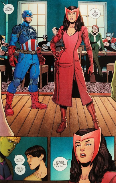
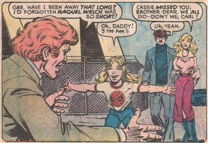 Speaking of Young Avengers, another example of disproportionate aging is Cassie Lang, aka Stature (a superhero name that might even be worse than Iron Patriot). Before she showed up in Young Avengers I am pretty sure she was last depicted as a sickly girl of about 9 years of age. I remember her from Avengers #223 (1982) which featured a great team-up of Ant-Man (her dad) and Hawkeye. But after being a kid for many years, she returned as a teenager of about 16 years old in 2005—ready to start a romance with Iron Lad (a young version of Kang) and later the young version of Vision built around Iron Lad’s brain patterns (it’s complicated). In Cassie’s case, however, despite the romance plot, there is no case of overt-sexualization. The gradual introduction of an older Cassie Lang avoids the discomfort of the suddenly sexually available character. Maybe she appeared in other books in-between at that younger age or an intermediate age, I don’t know. The thing I do know is that while she was closing in on 18 (until she was killed by Dr. Doom), her dad and other Avengers stayed the same age.
 I am not sure what this all means, except as another broad example of problematic depictions of women in superhero comics. The phenomenon seems to suggest that, when it comes to girls and women in superhero comics, age and maturity are overwhelmingly associated with sexual availability, and that is troubling. Disproportionate aging happens all over the genre—for example see Hal Jordan’s whitening hair in post-Crisis Green Lantern while Batman and Wonder Woman stayed about the same—but it seems that when it comes to young women, this pattern takes on a creepy and even potentially predatory cast. As such, I am not surprised that some folks took issue with the Falcon and Jet Black Zola sex scene. At first glance, it seemed like the edges of the veneer of consent and the social mores around sex and age that superhero comics frequently rub up against were being pierced through to reveal the bare truth about the role of women in superhero comics as foremost sexualized objects, whether they are little Cassie Lang, or even Aunt May.
____
1. It could also be an issue in DC and other superhero comics, but as I am not as familiar with them I don’t feel comfortable making that claim. However, as if to supplement my exploration of this topic, on the same day that this piece was originally posted, Bleeding Cool posted an article revealing a plot-line in DC Comics’ Batman Beyond comic involving Barbara Gordon’s (aka Batgirl) miscarriage following being impregnated by Bruce Wayne (aka Batman), so I am by no means trying to let DC off the hook.

