About Domingos Isabelinho

Domingos lives in Borba, Portugal. He fondly remembers TCJ's messboard of yore and the comix@ list on Usenet...

Monthly Stumblings # 21: Stefano Ricci

La storia dell’Orso (the bear’s story) by Stefano Ricci

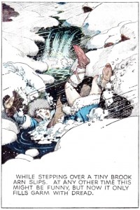
Some comics artists find the word balloons annoying. To them, it’s an intrusion in the purity of the drawings; holes in the composition, so to speak. This pushed them to find solutions to minimize the word balloon’s weight in the panel. Hal Foster, below, for instance, eliminated the word balloon altogether including captions and spoken captions (in italics between quotation marks) in the same caption box.

Hal Foster, "Prince Valiant" Sunday Page, panel 3, December 21, 1952.

Hal Foster, “Prince Valiant” Sunday Page, December 21, 1952. 


Hal Foster, Prince Valiant Sunday Page, January 7, 1956. Another procedure used by Foster: the elimination of the caption box putting the caption in a negative space.

Federico del Barrio, below, used the upper part of the panels, contiguous to the gutters, with a very discreet tail, to put the direct speech, freeing the images from the balloons’ intrusion.

Felipe Hernandez Cava (w), Federico del Barrio (a), Lope de Aguirre, La conjura [Lope de Aguirre, the conspiracy], Ikusager, 1993.

Felipe Hernandez Cava (w), Federico del Barrio (a), Lope de Aguirre, La conjura [Lope de Aguirre, the conspiracy], Ikusager, 1993.

La storia dell’Orso by Stefano Ricci was first published in French as L’histoire de l’Ours (Futuropolis, 2014). The Italian edition, by Quodlibet, followed shortly after four refusals from other publishers. It definitely is, in my opinion, one of the best graphic novels published last year.

Stefano Ricci, La storia dell'Orso [the bear's story], Quodlibet, 2014.

Stefano Ricci, La storia dell’Orso [the bear’s story], Quodlibet, 2014.

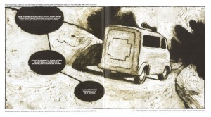
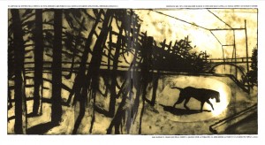
La storia dell’Orso is a graphic novel in cinemascope: every drawing is a double-page spread.  Stefano Ricci has nothing against word balloons (his are computer lettered white fonts on a dark sepia background – the color of the grizzly), but, most of the times, he strategically puts them – single or coupled by connectors  – on the right or on the left hand of his drawings.

Stefano’s innovation is the use of the page margin (see below) to achieve a counterpoint of narrative voices, sometimes diverging and sometimes converging with the images and the word balloons.

Orso3

The bear referred to in the title is Bruno (a name that also means “brown” as in “brown bear”), famous in Italy, Slovenia, Austria and Germany for a while in 2006. Bruno was born in Italy as part of the Life-Ursus project in Adamello-Brenta park. It roamed between Austria and Germany for a while until, in spite of the World Wildlife Fund’s efforts, it was hunted down in Bavaria.

Stefano Ricci was living in Germany (Hamburg) at the time (he is Anke Feuchtenberger’s partner) and so, in his own words, connected with Bruno’s story at some level.

There are five main stories being told in the book: Bruno’s; Stefano’s (a Ricci alter-ego who writes letters to Stella reporting his travels in Pomerania – these are readable on the page margins) and is also a rabbit performing community service in an ambulance; Enrico [Tinti]’s and Sirio [Ricci]’s life stories during the American invasion of Italy in WWII (Enrico and Sirio were fascists who deserted the German army); Manfred’s (during the fall of the GDR). Bruno’s and Stefano’s stories are the only ones being enacted, all the other stories are told in the first person to Bruno or Manfred. Another story was told by boars on one of Manfred’s tapes. Yet another narrating a dream is told to Bruno by Anke (a Anke Feuchtenberger alter-ego).

Anke and Manfred (an alter-ego of Heinz Meinhardt, a GDR ethologist) are the only humans who help Bruno.

Manfred and Anke

Humanized animals (a grizzly bear, a rabbit, a chimpanzee, a dog), boars that talk: we must be in the fable realm. Stefano helps the reader, who expects verisimilitude, to decode the visual metaphor: Renzo, the ambulance driver and Stefano’s co-worker, calls him “the rabbit” because, according to him, Stefano is always scared. So, this is the ages old procedure of disguising people as animals giving them the latter’s humanized character traits. The boars though, are just wild boars, it’s Manfred who understands them. (This isn’t the time nor place to study all the very complex focalizations of this graphic novel, but this is one of the most interesting: the reader reads the boars’ speech balloons with Manfred’s mind.)

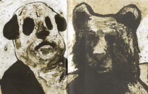
Bruno as man-dog-panda at the beginning of the book and Bruno as bear, after hibernating, at the end.

Bruno as man-dog-panda at the beginning of the book
and Bruno as grizzly bear, after hibernating, at the end.

When characters just tell their stories talking heads were to be expected, but are out of the question for Stefano Ricci. What he shows us are the storytellers talking while they walk in the landscape. Or, even more interesting, in one of the sequences the words have one focalization (Ernesto’s) and the drawings have another (Bruno’s or the ocularizer’s when it’s following Bruno). The landscape, by the way, is a true character. It is one of the most important characters even…

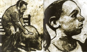
Stefano Ricci’s drawing style reminds its roots in animation — the paint-on-glass technique specifically. It’s interesting to note, as an aside, how many avant-garde European comics artists were seduced by this technique; I mean the Fréon artists Thierry van Hasselt and Vincent Fortemps, mainly). Parts of La storia dell’Orso were also animated.

The dog is detached from the background in order to be animated.

The dog is detached from the background in order to be animated. The trees are constant vertical and horizontal visual barriers.

Stefano Ricci’s drawing style is materic and sensual, but, at the same time, creates a distance that reminds of a strangeness (the feeling that something is not quite right) akin to mute cinema. Not showing the characters’ faces – darkening them – also helps the estrangement.

As I put it above, the humanized animals could be a reference to fables… It’s not exactly what happens here though. Stefano Ricci’s inspiration came from Shamanic culture. Since he admired Heinz Meinhardt’s work he chose him to be the story’s shaman linking the human and the animal world.

Being the original habitat of the grizzly bear, the forest is now humanized: the landscape is punctuated by roads, railroads, houses. Created by a well intentioned human program the bear is not allowed to show its true nature. The humans in the story also mirror the absurd feeling of “not belonging” symbolized by the bear: either because they are being chased (Enrico and Sirio) or because they have to adapt to a completely different set of political circumstances (Manfred when the GDR was united with the West) or because of losing territorial references (Stefano). As Michel Foucault put it (in Le courage de la verité – the courage of truth, 244):

It was by distinguishing himself from animality that the human being affirmed and manifested his humanity. Animality was always a point of repulsion in this constitution of man as a human being endowed with reason.

Stefano Ricci tells us that we may very well substitute “animality” with “being on the wrong side of a war or a revolution,” “belonging to a minority,” “being an immigrant,” you name it… We construct ourselves by not being them… And that’s the root of violence…

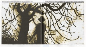
The hunter and his spider web.

The hunter and his spider web.

Pamplemoussi by Geneviève Castrée

The index to the Comics and Music roundtable is here.
______________________

Comics and music may relate in a few ways: musicians and their music may be cited in comics (as seen below); abstract forms and colors, organized in patterns in a comic, may be associated with music as Wassily Kandinsky theorized; comics artists themselves may be musicians (Fort Thunder) linking their two creative activities together like Geneviève Castrée.

1

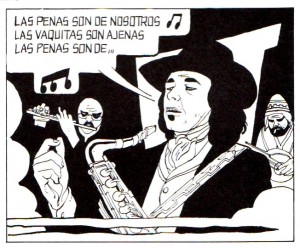
Gato Barbieri in Muñoz and Sampayo’s first album/graphic novel (seen on the background as Changuitos – boys – jujeños – from Jujuy), Perché lo fai, Alack Sinner? (why do you do it, Alack Sinner?) “Viet Blues” episode, Milano Libri, 1976. Famous Argentinian jazz musician Gato Barbieri is singing the lyrics of El arriero (the muleteer) by Atahualpa Yupanqui [“plights and cows follow the same pathway, plights are ours, cows are someone else’s.” By citing Barbieri citing Yupanqui Muñoz and Sampayo make a clear left-wing political statement. You can hear Barbieri playing and singing, here (5.20)].

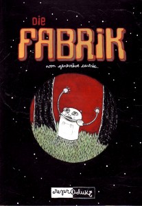
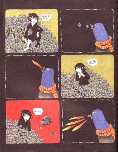
Since her almost wordless beginnings in 2000 with Lait frappé (milk-shake – L’Oie de Cravan) and Die Fabrik (the factory – Reprodukt) that Geneviève Castrée showed little inclination towards the orthodox storytelling so prevalent in the comics industry. Her comics are dreamlike, mysterious, symbolic, barely narrative.

2

Geneviève Castrée, Lait frappé, L’ Oie de Cravan, 2000.

3

Geneviève Castrée, Die Fabrik, Reprodukt, May 2002.

After publishing her third book (Roulathèque Roulathèque Nicolore, L’Oie de Cravan, 2001), Geneviève Castrée published Pamplemoussi (grapefruit). Here’s what she has to say about it:

I wanted to make a book with a record for years. One day I was looking out the window of my studio and I decided to start writing songs for the stories. It took me a lot more time than I was used to and when it came out I went on tour for a few months. I never had enough copies and there are none left. It was published in 2004 by L’Oie de Cravan.

Pamplemoussi is a large square book (obviously, it has the form and size of the vinyl LP record that comes with it – or is it the other way around?). Just for a taste, and because that’s what I found on You Tube, here’s one of the songs:

Geneviève Castrée, “Chanson pour les guêpes,” Pamplemoussi, L’Oie de Cravan, 2004.

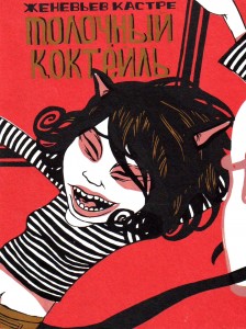
Geneviève’s drawing style could be part of a long tradition of children’s books illustration, but, if we read between the lines, her comics are about abusive relationships, depression, solipsism, etc… In other words, they’re not unlike all good children’s books, of course… In Lait frappé, for instance, a series of episodes with titles in Russian (god knows why!?) describe a journey from low self-esteem and self-hate to the desire of changing people (anonymous black cats) in order to suit them for our purposes (as seen in a dream in which Geneviève portrays herself as an evil sorceress transforming black cats into white milk in order to drink it) to a relationship with a self-defensive abusive cat (she tries to drink from a milk bottle with a broken neck that she finds on the street just to cut her lip). All this told in clever visual figures of speech in 27 pages only. No doubt about it: Lait frappé is a little comics masterpiece that deserves to be reprinted increasing its original print run of 350.

4

Geneviève Castrée, “The Fire In Mr. Pea,” Kramers Ergot # 4, Avodah Books, 2003.

5

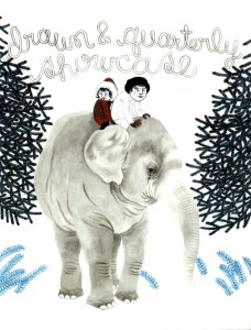
Geneviève Castrée (signing as Geneviève Elverum – her husband’s last name), cover for Drawn & Quarterly Showcase # 3, July 2005. The cover alludes to “We’re Wolf,” another great improv about awkward relationships in a beautifully illustrated story inspired by Hergé’s Tintin in Tibet.

6

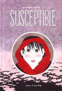
Geneviève Castrée, Susceptible, Drawn & Quarterly, 2012. Geneviève’s more recent book. [Maybe it will be the object of a future Stumbling, who knows?]

Pamplemoussi explores the same themes already mentioned above, but the relations between the song lyrics, the (minimal) music, the incantatory tone and the symbolic drawings are even more allusive and elusive. There’s a song about feeling uncomfortable in one’s body (“Chanson pour la géante” – “Song for the girl giant” [sic]) and another one for vanquishing one’s fears (“Chanson pour les guêpes” – “Song for the wasps” – listen above) and yet another one about how limited we are in the little boxes of our minds; how we futilely dream of escaping (“Chanson pour la hase” – “Song for the hare”). Since solipsism is so important in Geneviève’s work, I’ll let you with the part of this last song’s lyrics in English (as translated in Pamplemoussi) which explains why there’s no escape. I’ll let you also with another song by Geneviève Castrée… just because I like it this time…

some animals dream/ of countries, of planets and stars/ of which they only know details;/ adopted and spied from conversations/ they were not part of/ it is to wonder/ if they know that in other countries/ people are just as mean/ on a different planet/ you suffocate/ and before reaching the stars/ you burn/

Woelv [Geneviève Castrée], “Gris”, from the album Gris, P. W. Elverum and Sun Ltd., 2006. 

The Blind Men and the Elephant

1

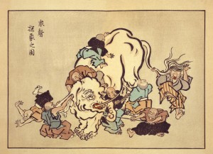
Hanabusa Itcho, Blind Monks Examining an Elephant. Itcho, by the way, not Hokusai, contrarily to popular myth, coined the word “manga.”

Speaking of stories… you know the parable: the blind men feel different parts of an elephant’s body and, afterwards, they disagree on what an elephant looks like. Such is the nature of truth; knowing only part of it we can’t grasp… speaking of pictures, the whole picture. In another version the men and the elephant are in a dark room, so, as the great Mevlana Rumi put it in this version: “If each had a candle and they went in together/ The differences would disappear[.]” If you didn’t get it already, and there are absolutely no reasons for you to know where I’m heading, I’m referring to the Eddie Campbell vs. Suat Tong or the “picturaries” (as I called them) vs. “literaries” controversy. I guess that the differences of opinion can be extended in an “us vs. them” kind of way to The Hooded Utilitarian (the non-essentialists) vs. The Comics Journal (the former Comics Comics – a great name to describe their philosophy echoing Eugeni Dors’ “painting-painting”). As I see it there are really two disputes, not just one: the aforementioned “various ways to look at an elephant” (Eddie vs. Suat) and the essentialist debate (THU vs. TCJ). I’ll try to address the two.

I’m worlds apart from Rumi’s greatness and I don’t believe that the differences will be solved by my saintly intervention, but, in a true meta-critical stance, I’ll try to do my best. I’ll state from the start that, obviously, I’m an interested part in this debate. Coming from a “picturaries” background, I graduated in Studio Art, I pass as one of the literaries. I don’t see myself as one, though. To explain why let me examine the core (as I see it, of course) of the text that started the whole thing: Eddie Campbell’s “The Literaries” at TCJ’s website:

What appears at first to be taking a more stringent view is in fact applying irrelevant criteria. It dismantles the idea of a comic and leaves the parts hopelessly undone.

See that elephant over there? Besides, this is where the two debates converge: essentialist Eddie views literary criteria applied to comics as misguided because the true applicable criteria must be about pictures. And yet, what does Eddie consider to be literary specifically? The story or, the plot. The only problem is that in comics the drawings are the story too. To prove it I don’t need to go any further than Lee and Kirby’s (et al.) case in point below, given to us as an example of non-literary excellency in the aforementioned “The Literaries” blog post:
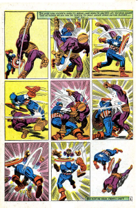
2

 Stan Lee (w), Jack Kirby (p), Frank Giacoia (i), Sam Rosen (l), anon. (c), “The Blitzkrieg of Batroc!,” Tales of Suspense #85, January 1967 (page # 8).

Curiously enough in the above example it’s the words that are self-referential and non-diegetic while the images tell the whole story: two characters beat the crap out of each other. If story equals literature who’s a literary now? Eddie Campbell himself inadvertently acknowledges this when he says:

Now, I am cognizant of the fact that the multitude of kids reading that Captain America were just thinking about what Cap and Batroc were doing to each other.

Exactly so because they were reading a story (the use of the word “reading” is, if you ask me, a co-option by the literary field because those putative kids were interpreting images). Why did this co-option of everything narrative by literature occur? Eddie Campbell didn’t invent it. It’s one of the dogmas of Modernist art of the Greenbergian kind. But Clement Greenberg didn’t invent it either. Here’s what Paul Cézanne said according to Joachim Gasquet, writing in 1912/13 (not exactly a reliable source, but still…):

I don’t like literary painting. […] [T]o want to force the expression of nature, to twist the trees, to make the stones grimace like Gustave Doré, or even to refine like da Vinci, that’s all still literature.

And yet Eddie Campbell doesn’t go that far. What he likes in the above page is clearly the expression (here’s what he says about a performance by Billie Holiday; we can’t compare comics with literature, but, apparently, it is OK to compare comics with literature if in a song; Eddie isn’t much of an essentialist, after all, even if he used the very word “essence” below):

I’m not talking here about technique, a set of applications that can be learned, or about an aesthetic aspect of the work that can be separated from the work’s primary purpose. The performer’s story is the essence of jazz music. The question should not be whether the ostensible “story,” the plot and all its detail, is worth our time; stories tend to all go one way or another. The question should be whether the person or persons performing the story, whether in pictures or speech or dance or song, or all of the above, have made it their own and have made it worthy.

So, Eddie Campbell wants us to pay attention to the artist’s expression (Cézanne/Gasquet would call him a literary I’m afraid). That’s one blind man feeling the elephant and I don’t deny his importance and value. But what about the other blind men? Don’t they feel equally important parts of the beast? Why this rage against the story?

I can’t talk for others, but what I value in a comic isn’t the story per se. What I really value is the meaning. This may be clichéd, but so be it: I believe that great artists reach some kind of truth. (They may be as blind as Itcho’s monks, but they’re very good feeling the little part of reality that interests them.) Doing so I considered already that the technical skills of the artists and writers, their ability to convey feelings (their expression or lack thereof because an artist may choose to convey ideas mainly) were capably handled. This isn’t an either or kind of situation. That’s why the claim that we literaries value Fun Home over Cliff Sterrett doesn’t make any sense (it’s an obvious straw man). Besides, meaning can be found in every mark that the artists and writers create on the page. I don’t see why meaning has to be associated with story and why story has to be associated with literature. By claiming meaning for my main criterion am I calling it the whole elephant? Maybe I am, but I’m as biased as the next guy. Why choose this elephant instead of that one is my next question? 

That leads us to the essentialist problem (counseled reading: Leonardo da Vinci’s Paragone): why can I compare a comic with another art artifact? Because meaning is something that we can find in every work of art. Exalting the comicness of comics to us non-essentialists doesn’t make much sense: yes, a comic is not a piece of music, but can’t we find cadences, internal rhythms in a comic? Again, why do we accept that those qualities are in music alone and not everywhere? Yes a drawing in a comic may be read in a narrative context (so, now the story is important again?; Eddie goes in and out of his philosophies as it suits his arguments), but aren’t these drawings lines and textures and compositions as all other drawings?

I could go on, but I prefer to analyze Lee and Kirby’s (et al.) page above from my point of view. I must acknowledge first the fact that it is a segment of a larger story (ten pages). I never write about stories that I’ve never read or are in progress, so I’m breaking one of my rules here… for now… This is wrong because, I don’t know?, judging a comic by one of its pages is the same thing as judging a book by its cover, isn’t it (that’s what Eddie kind of did in Kurtzman’s case)? Also, doing so, it seems to me, dismantles the idea of a comic and leaves the parts hopelessly undone, right? Gérard Genette said that there are two readings in a comics page:

in [visual] forms of narrative expression, such as the [fumetti] or the comic strip (or a pictorialstrip, like the pre-della of Urbino, or an embroidered strip, like the “tapestry” of Queen Matilda), which, while making up sequences of images and thus requiring a successive or diachronic reading, also lend themselves to, and even invite, a kind of global and synchronic look—or at least a look whose direction is no longer determined by the sequence of images.

(As a side note: it’s interesting to realize that the great critic and theorist, one of the literaries if I ever saw one, acknowledges the existence of visual narratives while Eddie doesn’t or tactically avoids acknowledging them.) The successive diacronic reading (what Pierre Fresnault-Deruelle called the linear reading) of words and images gives the reader the succession of events, the narrative. The global synchronic look (what Fresnault-Deruelle called the tabular reading) gives the viewer more of an aesthetic feeling. Both readings exist in all comics and the latter is what Eddie and Noah are talking about when they speak of “something else” and “ab ex.” I doubt that many will read the above page in a linear way (what’s the point: it’s just two guys in funny costumes fighting), but I will do just that:

What we have here is a nine panel grid, a static page layout if there ever was one, which isn’t bad for the intended purpose: the page layout contrasts with the action going on inside the panels. The first panel shows Batroc in one of Kirby’s famous foreshortenings. Another of Kirby’s tropes is the character invading the gutter as seen subtly here. What’s interesting in these three panels is Batroc’s leg in the air pointing up. In the second strip what’s pointing up are Captain America’s hand (when he receives a blow) and, again, Batroc’s arm and hands. Those who have limbs pointing up are losing balance and, hence, are losing the fight. The last strip is pretty much the consummation of the scene with Batroc falling on his back. The last panel depicts post-action fatigue and domination if you know what I mean. The guy who fell into the passive role in the missionary position was feminized and lost the fight. Also interesting is the back of Batroc in the second panel mirroring Cap’s back in the 7th, but with opposite meanings: powerlessness in Batroc’s case and absolute power for Cap. So, not only do these images tell a story, maybe it’s not exactly the story intended for the frantic one (i. e. the infant reader). 

What does the global synchronic look tell us, then? First of all there’s a rhythm of circular speed lines and straight shock lines (notice how Cap’s are a lot more powerful than Batroc’s sissified ones) constructing a texture that gave Noah the ab ex aspect that he mentioned. These are there to underline the violence and speed of the actions, but, more than that, to unify and create a relentless cadence in the page design. Here, again, the page functions differently in the three strips: a vertical thin speed line is counteracted in the next panel by a more powerful also vertical one. Things begin to change in that very panel though because the rhythm becomes horizontal until, at the end, returning to vertical completing a full circle with Cap’s might (in crescendo) replacing Batroc’s frailty. The full shot is consistently applied, but the feet deny that on panels one, two, five, six, seven, eight (it’s a device used by Kirby frequently: the characters don’t fit – as a curio see here the same effect used in 1109!). Cap starts on the viewer/reader’s opposite side to end up near his/her standpoint inverting positions with Batroc, in a kind of dance, as we have seen above. The 180 degree rule is broken from panel two to three. The point of view changes around the fighters. There’s a curious symmetry in the page with a kind of knot at the center. The last panel has no gutter (or has a virtual gutter) to show that something changed: the positions are now the same as those in the first panel, but Cap circles his prey in triumph (the symbolic order was restored; citizens may calmly eat their freedom fries again – Batroc, if you don’t know, is French and speaks with a heavy French accent – notice also the stereotypical pencil moustache and beard; I know that Europe was a female, so, it’s only natural that Batroc had to lose in combat against a macho American hero). The colors are loud and out of sync at some places. The background colors divide the page in, more or less, a dynamic diagonal. (If you allow me a personal note I always liked the imperfections of the old coloring.) Cap is garbed in white and primary colors (red and blue), Batroc is secondary colored (orange and purple). Looking at their colors alone no one can deny who will win. All this may seem exhilarating to Eddie, but I suspect that nostalgia plays a role also: “for me this page, and others of a similar stripe, opened up a whole new different way of thinking about comics (I was nine; I’d been thinking about them for quite a few years).”

Who are these people though? From now on Eddie will call me a literary, I’m afraid, but I insist, how come?, I analyzed drawings until now, nothing else! When Eddie asks and answers quite absurdly “how does that Marvel comic stand up if you take away the pictures? It doesn’t.” I say it does, a bit, but not that page above and why is that? That’s right: because if the pictures disappear the story disappears too. Storywise it’s interesting to note the micro-use of the known formula of popular tales (identified by Propp) “win-lose-win.”  

“The Blitzkrieg of Batroc!” is a superhero ten-pager with the usual macho boasting, dick waving contest and misogyny of old comics. The plot (oops!) is simple enough: Cap fights Batroc to save Agent 13 of Shield (aka Sharon Carter). After a plot twist Batroc and Cap team up against agents of Hydra to save the mam’selle who, obviously, has an infatuation for the gallant Nationalist hero. How many times do we need to read another damsel in distress kind of story? I want my time back! See how those nine pages did lack for a full appreciation of the comic?

Am I denying all the good compositional things that I said above about page 8? Of course not, but why should I forget everything else either? And isn’t the final product more important than just an aspect of the whole thing? What’s the meaning of this comic according to your truly? Woman, even if they’re agents of Shield, are frail little creatures who need the strong Nationalist hero to save them from the bad bad guys (that Manicheism again! Jeez!). Jack Kirby may have made the superhero genre his own, but he certainly didn’t make it worthy.

Even worse: the apparently good things said above about page 8 aren’t ultimately in the service of a formula as noted already? (As I said elsewhere, the game is rigged: the dashing Nationalist hero always wins.) And how about the innocuous violence? Isn’t it going to give the impression to the frantic ones that it’s OK to beat the crap out of the bad guys (violence is an abstraction, after all)? Are the frantic ones, or their modern day descendents, doing it right now somewhere, on this poor planet Earth, in the holy name of the plutocracy?

Monthly Stumblings # 20: Jochen Gerner

Panorama du feu (a view of fire) by Jochen Gerner
Jochen Gerner was a founding member of the OuBaPo (Ouvroir de Bande Dessinée Potentiele – or, the Workshop for Potential Comics, best represented in the US by Matt Madden, Jason Little and Tom Hart). Modeled after the OuLiPo (Ouvroir de Literature Potentielle – workshop for potential literature) created by Raymond Queneau, the OuBaPo aimed to explore new ground for comics using, paradoxically, constraints as a creative motor. The OuBaPo published four books to date (the last one in 2004) all by the dominating force behind the project, Jean-Christophe Menu and L’Association publishing house. Even if engaged in other projects the work of Jochen Gerner is never very far from OuBaPian creative processes.

1


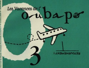
Les Vacances de l’OuBaPo (the vacations of the OuBaPo), Oupus 3, L’Association, October 2000, illustration by Jochen Gerner.

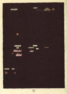
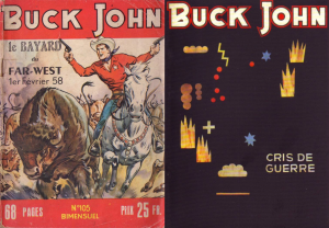
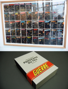
Jochen Gerner views himself as a draftsman who does comics among other things. Represented in France by Anne Barrault Panorama du Feu was part of Jochen Gerner’s second exhibition at said art gallery in 2009 (the first one happened in 2006). The theme of the exhibition was the four elements: earth, air, water, fire. A year later L’Association published Panorama du feu (the “fire” part of the exhibition, of course) in a cardboard box, surrounded by a paper ribbon with the word “Guerre” (war) written on it, containing fifty-one booklets numbered from zero to fifty. Each booklet is the reworking of what’s called in France the “petits formats” (the little formats), cheap, mass art comics imported mainly from the UK (published there by Fleetway) and sold in newsstands from the 1950s (or even earlier) until their decline in sales during the 1980s and disappearance in the early 1990s. The genres included in Panorama du feu are War, of course, but also Western, Espionage, and even a Tarzan look-alike produced in Italy, Akim. In each of these eight page booklets (cover and back cover included; booklet number zero has twelve pages with an introduction by Antoine Sausverd) Jochen Gerner used two creative strategies: (1) the cover was blacked-out with India ink leaving a title formed by expressions found in the book and the name of the collection plus explosions and signs (circles, crosses) in (not so) negative space; (2) the interior retained some didactic essays, advertisements and other paratexts published in the original comic books, plus what Thierry Groensteen called “reduction” in Oupus 1 (L’Association, January 1997): the stories were reduced to four, five or six panels (one per page).

In Panorama du feu Jochen Gerner chose visual rhymes (airplanes or trucks in all the panels, for instance). He also favored more abstract images and close-ups.

1b


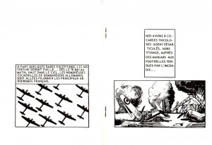
Airplanes (in perfect order and in chaos) in booklet # 40 of Panorama du feu, L’Association, September 2010: visual rhymes.

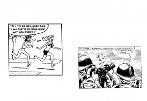
Besides being a non-conceptual reflexion (as Jochen Gerner stressed, saying that his is not a theoretical approach) on violent representations in petit format comics during the Cold War, what I find fascinating in the comic book reductions performed by Jochen Gerner is the contrast between said supposedly entertaining violence and a clear intention to be didactic including in the books many scientific essays. Below there’s an unexpected encounter between something as frivolous as Bettie and Veronica (Archie is here called Robert, by the way) and yet another image of violence. By mixing didacticism and comicality with the violence of war, the violent message was somewhat undermined or, at least, balanced by a variety of things, advertisements included.

Given the fact that Jochen Gerner reduced whole stories to a few panels it’s no surprise that many make little sense letting the reader with the strange sensation that something incomprehensible is going on (cf. below: infra-narrativity).

1c


Betty and Veronica run to join the French war effort during WWII? booklet # 33 of Panorama du feu, L’Association, September 2010: comicality undermines seriousness.

2


Page 38 of TNT en Amérique by Jochen Gerner, L’Ampoule, 2002.

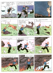
The blacking-out of covers and interior pages (as seen above: a détournement of Hergé’s Tintin en Amérique Tintin in America -, 1946 version) has its roots seven years before. In the above page the word “feu” (fire) appears (twice) and pictographs representing flames and smoke (plus a car and the words “poursuite” – “chase” -, and “route” – “road”) are similar to the covers in Panorama du feu. A look below at Hergé’s page blacked-out by Jochen Gerner in TNT en Amérique helps us to reach interesting conclusions:

3


Page 38 of Tintin in America as published in 1973 by Methuen (originally published in black and white in 1931 /32 and reworked by Hergé in 1946).

Diegetically two things happen in this Tintin page: Tintin escapes a persecution and flees a fire. In the tradition of creating suspense at the end of every odd page Tintin is almost caught by the flames in the last panel. The persecution (by the baddies) is represented in TNT en Amérique by a car and the words “chase” and “road.” In spite of Tintin riding a horse (the stereotype of the American cowboy imposes itself to a formulaic narrative) Jochen Gerner used a car pictogram to update the story. The animals on tiers two and three are almost ignored (the “almost” goes to the star pictograph, a symbol of trouble – emanata would have been more effective, maybe, but who am I to question Jochen Gerner’s choices?, maybe he sees emanata as too blunt a sign?). Most of the attention goes to the fire with an ironic devil chasing the hero: can he be a villain destined to burn in hell’s eternal flames in spite of his virtuous persona?

The general conclusion that we may extract from the TNT en Amérique example is that the two creative tactics described above (blacking-out and reduction) have the exact same result of reducing the deturned story to a skeleton.

4


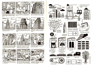
On the left: page from Courts-circuits géographiques (geographical short-circuits), L’Association, 1997; on the right, the same page as reworked for XX/MMX, L’Association, 2010.

The image above shows, on the left, a page of Jochen Gerner’s autobiographical book Courts-circuits géographiques; the image on the right shows the same page reworked for publication in XX/MMX (an anthology commemorating L’Association’s 20th anniversary). As Jean-Christophe Menu noticed in his thesis La bande dessinée et son double (comics and their double, L’Association, 2011), the evolution from representational (even if caricatural) to ideographical is clear, but even the older page shows a tendency to what Thierry Groensteen called, in Bande dessinée récit et modernité (comics, narrative and modernity, Futuropolis, 1988) “the inventory” (a subset of his concept of the infra-narrative).

5


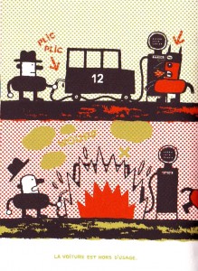
Malus by Jochen Gerner, Drozophile, 2002. A boon to a Ben-Day fetishist like me.

In Malus, as seen above, a silk-screened comic, Jochen Gerner illustrated real traffic disasters reported in newspapers. A creative tension is caused by the caricatural and schematic drawings depicting tragic events. A distance is created by the inadequate relation between form and content, or, to be more precise, the content isn’t exactly what one would expect given the source material. An ironic Dadaistic distance pervades all of Jochen Gerner’s work, but Malus is the height of this propensity. It shows Gerner’s tendency to explore – and short-circuit; cf. the Betty and Veronica example above – violent undercurrents in the mediasphere. TNT en Amérique lays bare, by reduction, how violent Hergé’s stories really are (TNT being, obviously, a reduction of Tintin’s name and an explosive). The same happens in Panorama du feu.

6


Left: Buck John # 105 (Buck Jones, I guess), Imperia, February, 1958; right: a deturned by black-out Buck John comic (not necessarily # 105, of course), Panorama du feu, L’Association, September 2010.

As we can see below Panorama du feu is a dual object corresponding to its two lives in 2009 (in an art gallery) and 2010 (as a series of fifty one comic books):

7


Up: Panorama du feu as exhibited in Anne Barrault’s gallery, September 2009; down: Panorama du feu as a box containing fifty one booklets, L’Association, September 2010.

In 2009 the fifty books were, as Jochen Gerner put it, like a giant battle ground as seen on a big control panel. Seeing the deturned covers behind glass encased comics come to mind. The act of reading is out of the question. On the other hand L’Association’s edition does almost the opposite, readers have access to the booklets’ content, but the ensemble is lost. Can these two forms of presentation be reconciled? I don’t think so, but one of the best solutions, I think, involved Jochen Gerner. I’m talking about Salons de lecture (Reading Rooms), an exhibition at the La Kunsthalle in Mulhouse:

8


Salons de lecture, La Kunsthalle, Mulhouse, February 3 – April 3, 2011.

In Salons de lecture readers /viewers were invited to sit and read, as we can see above. As I said, reading and viewing can’t be reconciled, but I like this Duchampian solution: it’s a visual arts exhibition because the La Kunsthalle is a place where contemporary art is shown. Plus: there’s the design with different colors for the six rooms available.

Here’s Jochen Gerner’s opinion:

Simply to place the boards adjacent to each other in a linear fashion is like trying to reproduce the phenomenon of reading a book. This can’t be right. But the exhibition Reading Rooms plays effectively with the principle of the book on a flat surface. The effect in this exhibition is almost that of a wall placed horizontally on trestles. The exhibition design and the graphic systems used to mark the placement of the books, plus the captions printed on the table propel these books into another dimension.


Monthly Stumblings # 19: Fred

Le petit cirque (the little circus) by Fred.

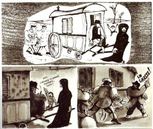
Fred is the nom de plume and the nom the pinceau of Frédéric Othon Theodore Aristidès. You may have heard about him because of Pilote magazine and his most famous series, “Philemon” (or Philemon if we are talking about the albums). Before that though, Fred had a career behind him as a single-panel gag cartoonist and an absurdist comics artist in the pages of several magazines (the Mad inspired Hara-Kiri especially). It was in said mag that Fred published (from issue # 38, April 1964, until issue # 64, June 1966) his masterpiece “Le petit cirque” (or Le petit cirque if we’re talking about the 1973, 1997 and 2012 album editions). The series, in short episodes of two pages each (with the exception of the first three pages), was also reprinted in Pilote magazine (it appeared in twenty eight issues from # 701, April 1973, until # 741, January 1974).

In 2012 an important retrospective of Fred’s work, Le petit cirque included, was shown at the Angoulême comics convention in France (at the Hôtel Saint-Simon, to be exact). To celebrate the occasion Dargaud published a new remastered edition of Le petit cirque directly shot from the existing original art (which means that pages # 8, 9, 26, 27, 36, 37 – three episodes – didn’t receive the same treatment as the rest of the book; there’s no discernible difference between those pages and all the others though; the editors didn’t explain why this is so). Now I’m waiting for a new edition of Le journal de Jules Renard Lu Par Fred (Jules Renard’s journal read by Fred) with the original page layouts recovered. I hope that someone at Flammarion reads my appeal.

1

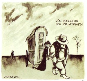
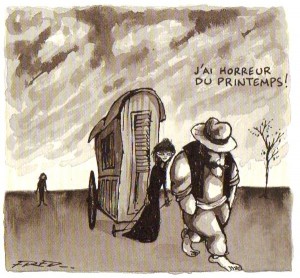
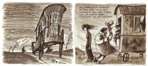
Panel from page 53 of the 1997 edition of Le petit cirque by Fred.

2

The same panel as above from page 51 of the 2012 edition.

Fred himself said, remembering the series’ first album edition in 1973:

I was pleasantly surprised that time! When we took the pages out of the portfolio to print the album, we realized that the original art had yellowed. Time yellows everything, even the mementos hidden in the bottom of a suitcase. Gray had become sepia which added a melancholia of sorts. I love those atmospheres.

As we can see above the 1997 edition reproduced the sepia tones. The lines are far from crisp though and many wash details were lost to resurface in the 2012 edition only. The latter’s matte paper retains some of the beige flavor that pleased Fred. Since Le petit cirque is a comics masterpiece I would say that this edition is one of last year’s most important comics related events. Unfortunately it passed virtually unnoticed.

3

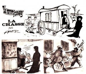
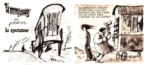
The first two tiers of the first page of the series as it appeared in Hara-Kiri # 38, April 1964.

4

The same tiers published in the albums (in this case, the 2012 edition). As we can see the logo and the episode titles, when they existed, disappeared.

5

The first two panels of episode two (three in the albums) as published originally in Hara-Kiri # 39, May 1964.

6

The same panels as published in the 2012 album edition. The logo and episode title were removed, a paper and pencil texture was added (notice the glue smears captured by the photogravure).

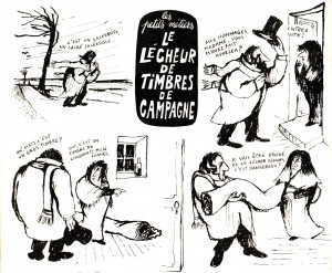
We can find the prehistory of Le petit cirque in a couple of circus related cartoon gags, but we can also find it in a series of strange, imaginative professions created by Fred for Hara-Kiri: the knitter of savage balls; the bearded seller of cotton candy (barbe à papa); the representative of holes; the countryside licker of stamps; the celery grinder; the mirror fixer… In one of his “little jobs” Fred created the human time bomb. That’s where the little circus really started: it was destined to be the album’s second episode.

7

The little jobs: the countryside licker of stamps. Notice the Fredian twiggy tree and the wind.  Hara-Kiri # 23, December 1962.

8

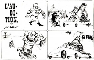
The first half of “L’audition”‘s first page (the audition) with the human cannonball (the human time bomb appears in the page’s second half), Hara-Kiri # 37, March 1964. The little circus before the little circus: it is right there in the second panel.

But we may find the true origins of the little circus not only in time, but also in space, in what Fred calls Constantinople (aka Istanbul). Both of Fred’s parents were Greek living in Turkey when WWI raged on and the war between the two countries was declared in 1919. They both emigrated to meet each other in Paris where Fred was born in 1931.

Fred, again:

It was the first time that I did something solid and everything happened naturally, the ideas, the emotions. Maybe because it’s the story of people without roots, like my parents. After leaving Constantinople they traveled a lot too and it was my father who inspired me to create Léopold. […] The Carmen of Le petit cirque is dark-haired and thin while my mother had brown hair and was rather plumpish, but she inspired me nonetheless.

9

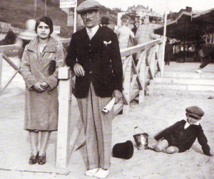
The family that inspired Le petit cirque: from left to right: Eleni (Carmen), Yanis (Léopold), and little Fred (who, in the album, has no name); Trouville, 1930s.

Fred’s iconography is very personal and explains the strange poetical power of Le petit cirque: the wind, the leafless trees, the circus, the peasants, the authorities, the mirror, the landscape, the city, etc… Apart from that what’s great about Le petit cirque is its rhetorical complexity.

10

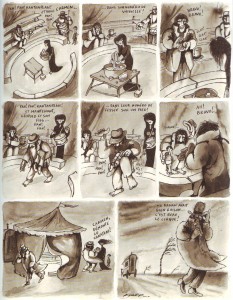
Le petit cirque, page 11 of the 2012 edition.

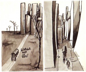
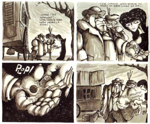
The above page gives the readers one of the keys to read Le petit cirque: the rhetorical reversal of the situations (the daily life of a patriarchal Mediterranean family is shown as circus acts). Another key is what I called, in Monthly Stumblings # 16, the interpenetration rhetorical mode: two distant spaces meet in a third space where both may co-exist at the same time (more about that later). The last panel shows Fred’s leafless trees with the wind blowing strongly from left to right expelling both the reader – the author too in a nostalgic statement about his childhood? – and the character out of the page (the sudden change of point of view from panel five to panel six shows that it’s time to leave already). The overall atmosphere is scrawny and uncomfortable. The vanishing point in the last panel focus Carmen pulling the circus caravan (Fred explained the metaphor: “the caravan symbolizes the family and the head of the family is the wife”; needless to say that this doesn’t convince me at all…). Notice how the horizon line gets lower and lower until we see a towering caravan getting out of reach. On pages 58 and 59 outraged peasants want to argue with Léopold and Carmen, but are overwhelmed when they find out that the caravan, despite its modest exterior appearance, is in reality a palace (not unlike Snoopy’s doghouse). This, of course, is an hyperbole showing Fred’s huge respect for his creatures.

11

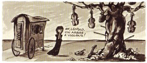
Carmen discovers the violin tree in page 36 of the 2012 edition.

The violin tree is just one of the interpenetrations that I mentioned above. Others link circus people with animals (a clown is a rooster, etc…). The violin tree is the hope and the means to fulfill one’s dreams. The problem is that Léopold, after picking one of the violins from the tree, breaks a string interrupting the process: the family is doomed never to improve their situation no matter how hard they try.

12

The first two panels of page 18 of Le petit cirque‘s 2012 edition. To the circus family the city is a menacing, blocky, empty space. Fritz Lang’s expressionist Metropolis isn’t far; an hyperbole, again.

13

Le petit cirque: second and third tiers of page 48 of the 2012 edition.

In the image above Carmen deflates an overblown bourgeois. The stereotype is a bit blunt, to say the least, but there’s an interesting catch in the sequence: the relation between iconic and verbal expression. Fred puts an idea usually uttered in words (“she deflated him”) into drawings. Something that isn’t that usual in comics. The same thing happens in the rooster/clown interpenetration mentioned above: the clown is visually a clown; we only know that it is in reality a rooster because of what the characters say about him.

I could go on doing close readings of all the episodes of Le petit cirque (like the one in which Léopold and Carmen offer a wheelchair to their son and break his leg in order for him to enjoy his present – which he does, of course), but the above is enough, I guess…

In conclusion: the circus family wanders aimlessly in an inhospitable landscape, is harassed and hated by almost everybody else and they suffer setback after setback, but they continue their journey because they have to, winning a few small victories along the way… We only get to the sense of it all though after decoding the logic of the book which is the nonlinear, oblique logic of dreams.

14

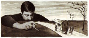
Fred sets his little creatures in motion; second tier of Le petit cirque’s 2012’s edition’s last page. Another narrative device: self-referentiality.

J’Accuse


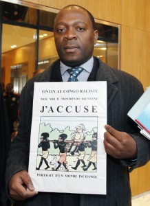
182830-bienvenu-mbutu-mondondo

In July 2007 David Enright was at a Borders bookshop in the UK with his wife and two children when he stumbled upon a copy of Tintin in the Congo by Belgian comics artist George Remi (aka Hergé). The couple couldn’t believe their eyes: was this filth at children’s reach? Worst: was it addressed to them? Here’s what he said:

“So you are married to a monkey and have two little yard apes. Good job. Got bananas?” This is one of the letters and emails that my Ghanaian wife and I received, when we asked that the Hergé book Tintin in the Congo be removed from the children’s sections of bookshops back in 2007.

According to The Telegraph (July 12, 2007), after being contacted by Enright a spokesman for the CRE (Commission for Racial Equality), said:

This book contains imagery and words of hideous racial prejudice, where the ‘savage natives’ look like monkeys and talk like imbeciles.

It beggars belief that in this day and age Borders would think it acceptable to sell and display Tintin In The Congo. High street shops, and indeed any shops, ought to think very carefully about whether they ought to be selling and displaying it.

That same month, on July 27, 2007, a Congolese citizen living in Belgium (see above), Bienvenu Mbutu Mondondo, read an Enright related article in a newspaper and decided to act filing suit in a Belgian court against Tintin’s copyright holder, Moulinsart Foundation. After patiently waiting for three years Mondondo, now supported by a French anti-racist organization (CRAN: Conseil représentatif des associations noires – representative council of black associations), extended his suit against Tintin in the Congo‘s publisher, Casterman. The suit was also filed in France.

Mondondo and the CRAN wanted Moulinsart and Casterman to ban the book or, as an alternative, if the first plaint failed, they wanted a warning to be put on the cover of future editions as well as a foreword inside explaining the colonial context in which the book was created (basically they wanted the French-Belgian editions to follow the British Egmont edition). On February 10, 2012, the Brussels Court of First Instance rejected the applicants’ claims. The same thing happened at the Brussels Appellate Court last December 5.

Here are some of the court’s allegations, according to this site:

If we were to follow the appellants, for whom it would suffice to take into account the simple intent of publishing a book, that would require banning today, for instance, the publication of some of the works of Voltaire, whose racism, notably toward Blacks and Jews, was inherent to his thought, as well as whole segments of literature, which cannot be accepted [as] the passage of time must be taken into account. Hergé limited himself to producing a work of fiction with the sole objective of entertaining his readers. He carries out therein candid and gentle humor.

It is above all a testament to the common history of Belgium and the Congo at a given epoch[.]

The Telegraph, again (February 13, 2012) also translated the following court statement:

It is clear that neither the story, nor the fact that it has been put on sale, has a goal to… create an intimidating, hostile, degrading or humiliating environment[.]

Read here the whole document in French.

I’m not a lawyer or, more specifically, I’m not a Belgian lawyer, but come on! “candid and gentle humor”? How can a book that dehumanizes the Congolese people depicting them as childish and lazy and in need of white peoples’ guidance contain “candid and gentle humor”? Are racist jokes “candid and gentle humor”? And how does the entertainment purpose excuse anything? Plus: how can the environment depicted in this blatantly racist book not be “hostile, degrading [and] humiliating”? The known argument that the book reflects its times’ prejudice doesn’t hold water either as I’ve shown, here. Hergé could not invoke an insanity defense. He was responsible for creating racist imagery and racist writing. Others, like Alan Dunn, for instance, at roughly the same time, didn’t do so.

There’s another reason why Hergé couldn’t invoke the insanity defence mentioned above: he’s dead since 1983. Again, I’m no lawyer, but how can a court judge a dead man (guessing his intentions!) is completely beyond me. I know that the “goal” part above is what matters to the court, but in the dubious case that they are psychic isn’t there something called criminal negligence in the Belgian law? What they should be judging is how can today’s copyright owners ignore the racism in one of their books refusing to do anything about it. I can understand why did the Brussels court mention the banning of a book by Voltaire, but Mondondo and the CRAN didn’t want to ban Tintin in the Congo in their secondary plaint, they just wanted to add some heads up and some informative paratext? Here’s what the court had to say about that:

As for the subsidiary inclusion of a warning it is not only an interference with the exercise of the freedom of expression it also hampers the moral right to the integrity of the work which can’t be contested because the defendants don’t own it [Fanny Rodwell owns the moral rights to Hergé’s oeuvre, not Moulinsart and Casterman].

From now on we’re informed that a foreword constitutes a violation of a “work’s integrity.” I can understand the reasoning behind the idea that such a foreword would be a violation of Moulinsart’s and Casterman’s freedom of expression (as well as Fanny Rodwell’s moral rights) though. Said foreword would be forced on them by the court. You’re wrong if you think that I’m on Mondondo’s side on this. I agree with him only when he says that the court suit was a means to force Moulinsart to seat at the conversation table. I understand the strategy, but it was doomed from the beginning: big corporations don’t deal with the little guy. When I repeatedly say on this post that I’m not a lawyer what I really mean is that I don’t want to discuss matters I know little about. (What I do know, however, is that they are lousy comics critics at the Brussels court.) What’s unfortunate is that the publishers themselves don’t comply with Mondondo’s wish for a foreword of their own free will as they should. It shows that Continental Europe is still way behind America and the UK when these matters surface in the public sphere.

Another quote in the court’s decision (written by De Theux de Meylandt, according to this site), states:

We see in particular that Tintin in the Congo does not put Tintin in a situation where there is competition or confrontation between the young reporter and any black or group of blacks, but puts Tintin against a group of gangsters… who are white[.]

I’ll let a Portuguese anthropologist living in Maputo, Mozambique, José Flávio Teixeira, answer to the above for me (in a review of Deogratias, a book about the Rwandan Genocide by Belgian comics artist Jean-Phillipe Stassen):

Beyond a self-centered gaze (ethnocentric: what interests him, above all, is how “his people” behave themselves elsewhere and how they get astray from the recommended “good behavior”) what the book states (distractedly) are two fundamental points: the perennial (the need for?) European leadership; the inferior malevolent capability of the Rwandan people (the African people). Thus crystallizing the racism, affirming white superiority: “people” (race, because, in the end, the book is about race) who are more in the lead, who are more corrupt, meaner. More human, right?

Going back to the UK, Ann Widdecombe, a Conservative politician, criticized the CRE (see above) for their support of Enright’s views (she said that their claim was ludicrous):

It brings the CRE into disrepute – there are many more serious things for them to worry about.

I don’t know if this is an apocryphal story or not (it probably is), but this reminds me of that officer of justice, after Belgium’s liberation, who refused to accuse Hergé of collaboration with the Nazis under the excuse that he didn’t want to cover himself in ridicule. It’s a well known fact: comics are less powerful, less corrupt, less mean. Less of an art form, right?

Monthly Stumblings # 18: James Edgar, Tony Weare

“The Territory” by James Edgar and Tony Weare

“Matt Marriott” is, with “Randall, The Killer” by Héctor Germán Oesterheld and Arturo del Castillo, the best Western in comics form. This may seem like damning with faint praise because the overall quality of comics Westerns is truly appalling (with the American ones in pamphlets and a newspaper comic strip like “The Cisco Kid” among the worst…). That’s far from being the truth though: both comics series include some of the greatest comics ever published. Unfortunately both share the same disdain from publishers and readers alike. “Randall” (published mainly in the Argentinean comic book Hora Cero Suplemento Semanal [zero hour weekly supplement], issues # 1 – 65: 1957/58, is long out of print; my attempt to bring it back to life failed because there’re problems among some copyright holders, or something…). So, in two words: no Randall. “Matt Marriott” is a British newspaper comic strip that ran in the [London] Evening News from 1955 until 1977. We know who the copyright holders are, but, in a similar attempt, I’ve learned that they can’t find the printing plates anywhere. In view of the fact that the original art was scattered around we just have Edgar’s and Weare’s masterpiece on microfilm in the British Library Newspapers, so, ditto: no Matt Marriott.

That’s how the amnesiac art of comics loses another chunk of its memory. It’s a huge shame that, on top of it all, it is one of its best parts…

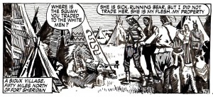
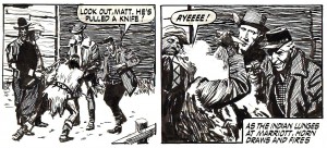
Throughout the series Matt Marriott and his sidekick Jason “Powder” Horn, fulfill their odyssey wandering the West of the United States in a still divided (social wounds not totally healed) post Civil War. It’s a country in which the farmers’ settlements are competing with the ranch owners’ land (the Fence Cutting Wars). Other times the narrative focus is the railroad construction and the decimation of buffalo herds. Still in other occasions the social background is the Indian Wars. That’s the case in “The Territory”; not war exactly, I mean, but serious racial tensions that lead to blood shed.

  Marriott and Horn are expelled for defending the Indians. (I decided to illustrate this Stumbling with original art scans only. The image is a good metonymy of how “Matt Marriott” was barred from the history of comics for not being a children’s comic.) “The Territory,” Evening News, 1973.

But let’s leave the territory (Montana) alone for a while to give a general look at the series first. I’ll start by putting what I don’t like about it out of the way: the usual formulaic nonsense of mass art genre Westerns (the American monomyth, basically, or something even more boneheaded). Unfortunately it exists even in “Matt Marriott” and Tony Weare knew it and abhorred it (Ark, 1990, 47):

I would have liked the characters to have been fallible, but, of course, being cowboys they have to be infallible. If there was a scene where Matt  and Powder were camping out in the bush at night and they heard a noise, Powder would ask Matt if that noise meant there were Indians. Matt would calmly announce that it was an owl, and he’d be right. In another episode, Powder would say it was an owl and Matt would say it was Indians, and Matt would be right again. I always wished that they’d change it around for once. That side of cowboys is very boring. It’s the same with Batman. He can’t make a mistake either. […] In the gunfights the baddies shoot ten bullets and they all miss whilst the goodies shoot one bullet and it’s on target. I hated that side of it.

Me too!

As for the scripter, James Edgar, no one knows what he thought because of two facts: (1) comic fans like Denis Gifford (the only ones writing about comics at the time) suffered from acute childhood nostalgia syndrome: to them only old comics magazines like Comic Cuts were worthy of attention (even so Gifford wrote a 1971 ridiculously sparse “history” of British newspaper comics); (2) scripters weren’t even credited, let alone interviewed.

Anyway, in the International Journal of Comic Art (Vol. 9, # 1, Spring 2007) and elsewhere (Nemo Vol. 2, # 22, June 1996) I suggested the concept of the “absent hero.” A kind of Greek chorus that needs to be there for commercial reasons, but doesn’t intervene much in the action to avoid the cliché of winning the day every time. That’s what happens to Matt Marriott and Powder Horn in some episodes, but not in “The Territory,” or, at least, not completely. Looking at a fight between Marriott and the Miniconjou Indians is like looking at a rigged boxing match.

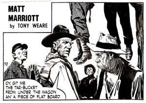
Almost every other narrative aspect in the series differ with more traditional genre tropes. The characterization, for instance, gives us a fresco of 19th century North American people that is unmatched anywhere. I’ll give you a small sample below.

“Nimbus McBride,” Evening News, 1968.

“Trail Drive,” Evening News, 1965.

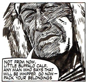
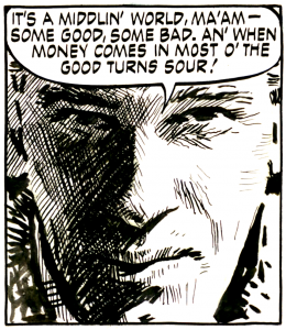
The Indians are no exception as we can see in the following great panel.

In a now familiar procedure (to the readers of the Stumblings, that is), the shadows on the exterior of the face, mirror the characters’ inside feelings. The procedure was first called to my attention by Alain Jaubert in his great Arte TV series: Palettes“When the Bear Runs,” Evening News, 1972. 

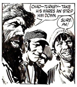
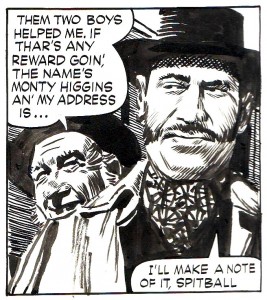
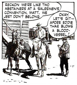
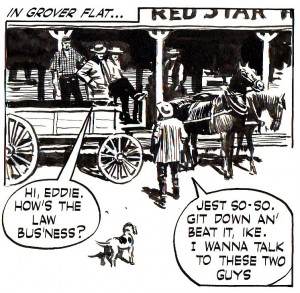
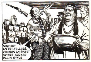
In “Matt Marriott” there are miners and soldiers, hunters and merchants, politicians and businessmen, herd drivers and outlaws, lawyers and doctors, bankers and lawmen, etc… Women are homemakers, sex workers and boarding house keepers. Tony Weare’s great characterizations are only matched by James Edgar’s colorful characters and colorful language. Doc Massey in “Marshall of Fireweed” (1959), said to Matt:  “How now my tall pillar of rectitude. There’s a puritan streak in you that doesn’t sit well with that gun on your hip.” The same Doc Massey described his situation after being mortally wounded as “being a little drunk with valediction.” “Powder” Horn wasn’t that bad with words either, as seen above in fig. 1 and in the below panel (in an old comics tradition the direct discourse is reproduced in pronunciation spelling).

[Untitled], Evening News, 1964. 

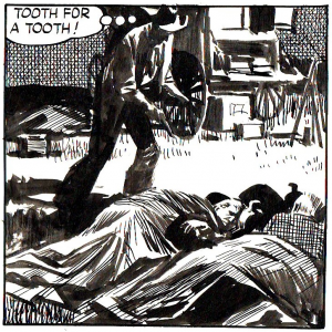
 Tony Weare’s drawing style evolved from a more conventional naturalism to a rough impressionism that’s quite impressive in its mixture of looseness and preciseness. Besides admiring Weare’s uncanny ability to lay out a scene it’s amazing how he could instill life and expression to a couple of brush strokes depicting a face. Ditto for the body language.

Violence had true consequences in “Matt Marriott.” Notice how Tony Weare could convey shock and dismay in the background characters’ faces with just a few brush strokes. “Trail Drive,” Evening News, 1965.

Tony Weare was also a master at shading. He was able to depict any moment of day or night simply by the intelligent use of black, white and the way he did the hatching and cross-hatching. I particularly like his dim lunar light.

“Trail Drive,” Evening News, 1965.

Other times I just like the nice touch of the little dog that no one seems to notice.

[Untitled], Evening News, 1964. 

“Matt Marriott” was a daily strip published six days a week. Most of the strips had three panels which Tony Weare varied from medium shot to close up, varying the size of the panels accordingly (the closer the distance between the picture plane and the “object,” the smaller the panel; this is what Benoït Peeters calls: the rhetorical use of the page). This wasn’t a rigid rule, or anything, of course. Below, for instance, is an establishing shot in a two-panel daily.

“When the Bear Runs,” Evening News, 1972.

Like the Fates of old James Edgar was great at weaving plots. In his stories situations build on situations in a relentless pace. Actions have  (sometimes brutal) consequences. In “The Territory” (a “Matt Marriott” story arc that appeared in the Evening News between May 4, 1973 and August 23 of the same year) a series of unfortunate events lead to the death of a young Indian followed by the kidnapping of “Powder” Horn (the Miniconjou want to punish him) and a hazardous rescue by Matt Marriott and friend Sam Folsom; a man who lives with an Indian woman and knows a lot about Indian culture and the hunger inside the  reservations.

The grin in Horn’s face is explained by the fact that he’s a racist who feels pleasure in killing an Indian. This is one of those occasions in which Tony Weare would subvert the script – in cahoots with James Edgar or not, we’ll never know – going completely against the grain. The narrative implications of this simple drawing are huge. To say it in mass art lingo: the hero’s sidekick is suddenly a villain which means that the hero kills innocent people to save a guilty character. That’s what I call a good drawing (a drawing with meaning): technical skill only seems like a poor “set” of criteria to me. “The Territory,” Evening News, 1973.

Sam Folsom and ‘Relish’: The sexual politics of the “Matt Marriott” series could be a post of its own. “The Territory,” Evening News, 1973.

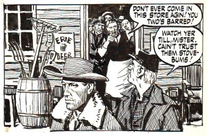
As in any other Western there are lots of evil doers in “Matt Marriott” (in “The Territory” the enemy is racism and the unscrupulous store keeper who sold alcohol to the young Indians), but Manicheism is softened as much as possible because Tony Weare avoided the “bad guy” stereotype and James Edgar gave plausible motivations to his characters. If you want to know “whom” the real enemy is, read below: it’s one of my favorite comic panels of all time.

Light and shadows and shades of gray. “Gospel Mary,” Evening News, 1973.