Dracula and Darcy

This ran in TCJ a while back. Darcy’s one of my favorite comics creators; I should try to write more about her at some point.

Illustrated Classics

The folks at Penguin books have been thinking up some interesting ways in which to take advantage of comics’ increased literary credibility. First there were the Penguin Graphic Classics, a series featuring famous novels with cover designs by Chris Ware, Seth, and other iconic artists. And now, under its Viking imprint, Penguin is bankrolling an even more ambitious project — an Illustrated Classics series, in which each volume includes a full complement of spot illustrations and color plates by a particular comics artist.

For the first entries in this series, Viking has rolled out two Gothic warhorses, *Dracula* and *Jane Eyre* — a canny decision given the success of goth comics. Viking’s also moved a bit afield from the strictly high-brow Raw mafia. For Dracula, they’ve chosen Jae Lee, a mainstream artist with wicked skills. His compositions are lovely, and the slick, airbrushed finish of his color plates work well in this setting — Dracula’s basically a Victorian exploitation flick, after all. But though the pictures are pretty, they’re marred by a curious tentativeness. Where’s the blood? The fangs? Why are the vampire wives just standing there like clothes-horses? Lee doesn’t even bother to draw the most startling image in the book: the moment when Dracula crawls head-first down the side of his castle. Restraint can be fine and all, but, it’s not what Dracula is about. Thus, though the project isn’t a disaster, it doesn’t really stand up to the great film visuals of the legend. Even Coppola’s 1992 film seems more fully realized, to say nothing of Nosferatu.

Dame Darcy, on the other hand, was born to illustrate Jane Eyre. Her stylized, twisted bodies perfectly capture the novel’s air of choked and stifled passion. The book is filled with great drawings, but I think my favorite is an illustration in which Jane kneels before Rochester, who is cross-dressing as a gypsy. His hand is inches from her face, her giant almond eyes seem frozen, as does the fire behind her. A mermaid tschotskes sits almost mockingly on the mantel above her head. The whole image throbs with mystery, unhealthy dominance, and repressed sex. It’s as masterful as one of Berni Wrightson’s classic drawings for Frankenstein — and I can’t think of higher praise. In an online interview, Darcy said she’d like to try *Wuthering Heights* next. Hopefully Viking will continue to demonstrate its good taste by paying her to do so.

Posted in Noah | Comments Off on Dracula and Darcy

If You Read This Blog And Conclude That I Hate Comics…

As both of my regular readers have probably noticed, I’m occasionally using this blog to write about things other than comics. Since consistency is the soul of marketing, this is probably not a great idea.

Unfortunately, the idea of writing about comics and comics only makes me a little queasy. In part this is just because I’m twitchy. But in part its because I have serious reservations about where comics is as a genre and where it’s going.

In art and in life, it’s somewhat of a truism to say, “there’s good and bad in everything”. Sure there may be bad art comics…but there’s also good art comics. There may be bad super-hero comics, but there are good super-hero comics too. And so forth.

Obviously, it’s always possible for someone to take a given form and do something interesting with it. I’m sure that if I listened to the entire output of mainstream Nashville radio over the last 20 years, there’d be something that was at least mediocre. But the fact is, genres can be healthy, and they can be the reverse. Sometimes a medium or a part of a medium is at a point where artists working within it are encouraged to do exciting work. Elizabethan drama was just a lot more interesting than mid-18th century drama, for example. Victorian literary novels as a whole are better than literary fiction at the moment. R&B in the oughts is a lot more interesting than R&B was in the 90s (see here for an explanation of why). And so forth.

All of which is a prelude to saying that I think American comics have some serious problems. Most of these have to do with insularity. The direct market super-hero titles (as Dirk Deppey often points out in his blog Journalista) are aimed at an extremely narrow demographic — thirtysomething white guys who have been reading comics for twenty years, basically. They exist (like, say, neo-bop) mostly as nostalgia fetish objects rather than as art, or even entertainment. As a result, the point is not so much quality as knee-jerk formula. The craftsmanship in most is laughable — the fact that hideously ugly computer coloring is standard throughout the industry tells you all you need to know about professional standards and aesthetics.

Alternative comics don’t have those problems — and yet, at the same time, they kind of do. There is certainly a wider imagined audience for non-super-hero titles. But super-heroes still hang over the art comics like giant, four-color, cadavers. Alt comics seem to be constantly looking up nervously at these suspended, bloated monstrosities, feebly protesting, “What that…oh, no, *that* doesn’t have anything to do with me. We just came in together accidentally.” Or to put it another way, alt comics have a huge chip on their shoulders, and they have responded by rejecting everything super-hero in favor of Serious Art — which, alas, often means seriously boring art. Why on earth is autobio and memoir the standard for art comics? Is there an imaginable genre which makes less use of comics’ inherent strengths — the ability to represent fantastic, magical situations with charm and ease? The answer’s pretty clear: it’s the very boringness which appeals. Alt cartoonists are desperate not to be associated with super-heroes, and the best way to do that is by becoming literary fiction. God help us.

Which isn’t to say that comics are (like contemporary poetry) unredeemable or absolutely doomed. Fort Thunder, which looks to visual art rather than to literary fiction, is great. And there’s a whole generation of potential cartoonists growing up who see manga, not super-heroes, as the standard. In moments of hope, I think that in twenty years Chris Ware and Dan Clowes and the Comics Journal will all be seen as a quaint detour in the history of the medium, and comics will be a hugely popular, aesthetically vital medium mostly created by women in a manga style. That’s not because I hate Chris Ware or the Comics Journal ( I don’t). It’s just because I think, overall, it would be a better direction to go.

So, anyway, if you read this blog and conclude that I hate comics, its only because I kind of do.

Posted in Noah | 8 Comments

Underrated Overground

This article about contemporary R&B first appeared in a slightly altered form in the Chicago Reader. At the end I’ve included a somewhat snarkier take on the same material, which didn’t quite make it to the final draft.

Underrated Overground

LeToya’s self-titled debut is packed with distorted beats, oceanic harmonies, production values that make it feel as if the music is being broadcast from the precise center of your skull, and miraculous songwriting. “Tear Da Club Up” nicks a perfect Outkast sample, combines it with skittering Aphex-Twin-worthy beats and and adds a stuttered opening that’s both propulsive and sexy; “All Eyez on Me” features a titanic pseudo-Bollywood loop that pretty much defines “fat”. Even the tossaway bits — like a gorgeous, easy-going duet with a Yolanda Adams recording on the Outro — are spectacular. In other words, this album struts. To say it’s pefect pop is a disservice — it’s one of the most accomplished and creative recordings I’ve ever heard, in any genre.

Alas, this is a minority opinion. LeToya’s album has been certified platinum, but the critical response has been, um, tepid. Most outlets haven’t even bothered to review it. Those that did, like RollingStone.com, had little to say, and even less that was laudatory.

Not that this is a big surprise. Few musical genres are as critically despised as contemporary R & B. Read a review of any random urban diva and you’ll learn that her street-posturing is laughable, her lyrics monotonous, and her voice an embarrassment. Even positive assessments have a defensive air — a write-up of “Kelis Was Here” on PopMatters provides the singer’s fans with talking points so they can fight back against their friends’ inevitable skepticism. And last week in the Reader, Jessica Hopper praised Ciara’s latest . . . because it wasn’t quite as bad as Gwen Stefani’s.

Different strokes for different folks, of course — but many of the criticisms leveled against contemporary R&B are confused enough to be actively misleading. Take one of the most common contentions — the argument that the performers’ voices are lousy. I’ve seen this said of Ashanti, Ciara, Kelis, Teairra Mari — even, bizarrely enough, of Mariah Carey. And it’s undeniably true that few of those performing R &B can belt out a tune like Aretha. The thing is, they’re not supposed to. Contemporary R &B has very little to do with classic 60s Southern Soul. Instead, it’s rooted in the high-gloss production and intensive harmonies of Motown and Gamble and Huff. There are a couple of exceptions: Shareefa’s debut deftly combines old school grit with new school gloss, and Faith Evans unbelievable“Mesmerized” sounds like Stax on steroids. In general, though, a big voice and giant production add up to a faux- Broadway disaster (hello, Christina.) Contemporary R&B just works better with less dramatic singers. Tweet and Monica, for example, both use smooth, creamy deliveries that swirl languidly into the backing tracks. And then there’s Cassie, whose vocals might be kindly described as wispy. That doesn’t hurt her a bit, though; on her debut, her voice is so processed and multi-tracked that the singer becomes just one more electronic blip among many — part of a robotic, flawless glucose-delivery system that makes Pizzicato Five sound clumsily robust.

Even if every singer in the genre could holler like Marion Williams, though, I doubt that it would matter. Critics want scrappy; they want subversive —or at least not ingratiating. As Jim DeRogatis puts it in his chronicle of 90s music, “Rock’n’roll is a spontaneous explosion of personality and it is an attitude.” That just doesn’t describe R &B at all. In the first place, the female-dominated world of contemporary R&B doesn’t really do misogyny —still the easiest way for rock, hip hop, punk and country artists to demonstrate their edginess. And besides, it’s impossible to pretend that a pre-packaged product of reality-TV like Danity Kane is in any way scrappy. Thus, though divas do occasionally talk about keeping it real, the ambivalence about success and selling-out that is the signal of authenticity in hip hop and alternative barely exists in R&B. On the contrary, performers tend to cultivate a girly, XXXOOOO relationship with their fans. That’s why Beyonce can cheerfully shill for her latest Hollywood movie, Dreamgirls, on B’day and present it as an extraspecial bonus moment for her listeners.. And it’s why she and her rivals all shorten their names into diminutive, corporate one-word brands.

I must admit that, personally, I find this straightforward willingness to embrace all things commercial rather refreshing. Even if you’re wedded to the dubious concept of mass entertainment as subversion, though, contemporary R&B does have something to offer. In the first place, it’s largely performed by lower-class, teen-aged women of color. Indeed, its perhaps the only way these women have to reach a large audience . Sure, sometimes what they have to say isn’t any more thoughtful than “the junk in my trunk’ll put a bump in your pants,” as Brooke Valentine quips. But you don’t have to listen to too many tracks before you’ll find songs that tackle more demanding material.

In fact, the common thread running throughout contemporary R&B is neither drippy sentiment nor mindless partying. Instead, the performers insist on self-worth, independence and strength, even as they acknowledge the importance of close relationships. Like classic country (or classic R &B for that matter ) the music is about love, joy, loss and — most of all — about dignity.. Thus, in “No Daddy,” Teairra Mari expresses sympathy for and solidarity with sex workers without lapsing into moralism or pity; no mean feat. (No I don’t strip in the club/ Don’t trick in the club/ But I got friends that do/ So my girls that’s getting the dough/ The best way that they know/ No hate girl, I got you). Mya’s “Late” is a hilarious account of an accidental pregnancy — with some useful tips on proper condom care thrown in. Cherish’s “Oooh” is about teen abstinence. Kelis’ “Ghetto Children” with its heart-breaking refrain, “no matter what teacher say to you/ ghetto children are beautiful” is about the best two-line condemnation of our educational system you’re likely to get.

The best thing about contemporary R&B isn’t the lyrics, though. It’s the music. Sometime in the late 90s, R&B moved away from the groove-based vibe of TLC and Timbaland’s early work and towards extremely complex song-writing. At the same time, production capabilities, already phenomenal, went into the stratosphere. The result is music of painstaking craft; layers of sound morphing and twisting through bridges and intricate arrangements, while a multi-tracked vocalist sings rings around herself. Often it’s impossible to even tell what instruments are playing, if any, just as it’s difficult to know who’s responsible for the final product — most songs seem to have three to five writers, not to mention the producers and executive producers. It’s a bit like the shoegazing pop of the nineties and a little like the most polished Philly Soul, though in many ways its more intense than either. Certainly, it can tip over into bombast or undifferentiated mush. At its best though it’s unearthly. LeToya and her peers are pushing against the boundaries of how music can be made and what it can sound like even as they remain firmly in a popular idiom. In this, they’re not unlike the first great swing or rap performers. And like those models, it may take a decade or two before critics start to fetishize them. In the meantime, everybody else has the opportunity to listen to some of the best American music ever made, right there on the top-40 station of your choice.
——————

The following was originally intended as the beginning of the article, but didn’t quite make it for one reason and the other….

In his much-lauded book Lipstick Traces, rock critic Greil Marcus celebrated the revolutionary power of pop music — with some notable caveats. Elvis, the Beatles, and the Sex Pistols, Marcus gushed “raise[d] the possibility of living in a new way” because they “”assaulted or subverted social barriers.” Michael Jackson’s album Thriller, on the other hand, “crossed over [social barriers] like kudzu.” Marcus then goes on to sneer at Jackson because his audience was largely composed of white people. Marcus does not state, but I suppose we are meant to presume, that Johnny Rotten was some sort of hero to black youth.

Marcus’ comments dredge up some ugly truths. Like America itself, American music is, (A) segregated, and (B) in deep denial. For at least 30 years now, top 40 has been dominated by black-derived dance-pop, and (especially recently) black artists. Yet white rock critics (that is to say, almost all rock critics) have never really accepted this. Instead, as the complexion of pop music has changed, critics have grumpily declared mainstream to be crap, and gone out desperately looking for some “alternative.”. But when you take into consideration everything from the hysteria of anti-disco record burnings to the fervent hallelujahs which greeted the release of “Elephant”, the much-touted alternative to mainstream fare looks suspiciously like a desperate search for a great white hope.

To be clear, I am not saying that it is racist to like rock music or to dislike black music, or any combination of the two. Aesthetic preferences aren’t political positions, and I’d personally rather listen to Led Zeppelin than Muddy Waters, for what that’s worth. But Marcus and his sort go beyond a simple statement of aesthetic appreciation. For them, some middle-class white dude strumming a guitar he doesn’t even know how to play is a revolution on disc, upsetting the very fabric of our social order. And, conversely, a working-class black guy singing his heart out over a computer-generated rhythm track is a sell-out, demonstrating the — ahem — pale monotony of our popular landscape. Liking a genre is one thing. Claiming transcendent moral superiority because you like a genre is another.

________________

Posted in Noah | 1 Comment

Re-animator

I just saw this 1985 movie (thanks, Netflix!) I’ve been thinking about Lovecraft adaptations recently ( I wrote a long review of the graphic classics Lovecraft volume for the last Comics Journal.

Anyway, Wikipedia claims this is true to Lovecraft’s original, which I think is not quite the case. Yes, Lovecraft’s story “Herbert West:Reanimator” was intended to be a goofy parody of sorts. But it didn’t really work: Lovecraft’s tongue is much too ponderous and unspeakable an organ to be placed in his cheek. Certainly, the zombie scenario is goofy, but its also macabre and slow; less a parody than a poor imitation. The movie, on the other hand, is pitch perfect, from the day-glo reanimating serum to the Herbert West’s uber-nerd portrayal to the gleefully disintegrating body parts to the puncturing of academic pomposity to the gratuitous sexual exploitation. Even the soundtrack is great. It’s smart and accomplished — which means that it shares little with Lovecraft except a few clever ideas and a title.

Which isn’t to say that the movie is better than the book. Lovecraft’s surface clumsiness was always part and parcel of an inner, lumbering anxiety. His writing, in other word, had an overwrought emotional core, which is what made them both ridiculous and compelling. The re-animator story (as I argued in my TCJ review) is powered by a deep, Puritan distrust of/fascination with bodies, sensuality, and (possibly) homosexuality. The film plays with these tropes to some degree (any zombie film has to) but it’s mostly committed to having a good time. Nothing wrong with that — it’s just not where Lovecraft was coming from. Even when he tried.

Posted in Noah | Comments Off on Re-animator

Making Textbooks

This review of Scott McCloud’s “Making Comics” ran in The Comics Journal #280. I’ve added a couple of illustrations, both from the book in question, and both copyright by Scott McCloud.

Making Textbooks

Scott McCloud is comicdom’s leading aesthetician. He’s also responsible for some of the most butt-ugly graphic novels in the business. As my friend art-teacher Bert Stabler put it, reading McCloud’s first book, *Understanding Comics* is “like getting a lecture on sexual titillation from a talking pair of pants filled with lunchmeat.”

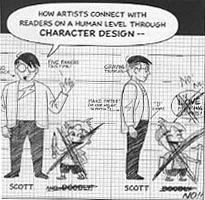
The problem here is not that McCloud is a mediocre draftsman: you can criticize an art form without being possessed of a virtuoso technique (or so I like to tell myself). But while you don’t need skill to talk about a medium, you do need a feeling for the form. This McCloud simply does not have. To pick the most obvious example, his cartoon-self is a nadir in the art of self-portraiture. Not realistic enough to be impressive, not hyper-deformed enough to be cute, the Scott icon appears in panel after panel, like some sinister avatar of aggressive mediocrity. After a page or two, I was longing to tear off his pupil-less glasses and shove them down his perpetually gaping mouth.

McCloud’s most recent volume pushes the disjunction between theory and practice to the breaking point. *Making Comics* is a how-to book by a man who can’t. The effect is grotesque — as if the talking pair of pants filled with lunchmeat stopped lecturing and began elaborately miming intercourse with the podium. In his introduction, McCloud actually posits his hideous cartoon-self — now fatter, grayer, computer-aided, and even, impossibly, less appealing — as an example of excellence in character design. In another sequence, he tries to demonstrate how to guide the reader’s eye to the important details in each frame. You’re supposed to follow a magic wand as it taps a hat. But the drawings are so generic and presented with so little panache that my eye refused to take them in; they might as well not have been there. I wouldn’t have known I was supposed to be watching anything at all if the text hadn’t laboriously told me to do so afterwards.

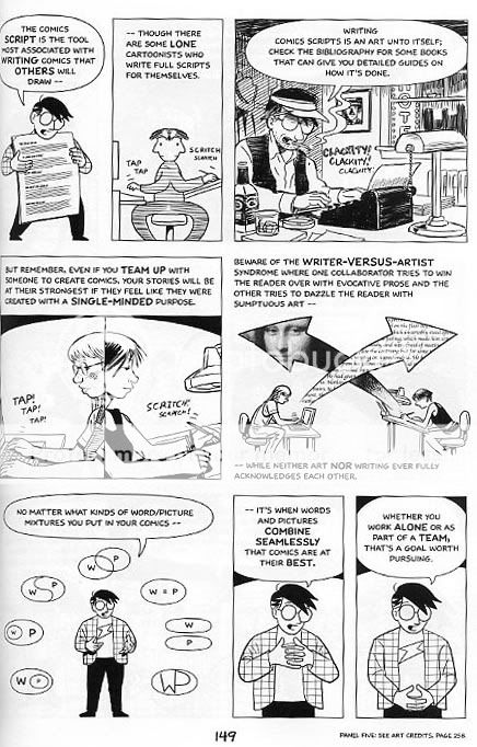
If McCloud’s limitations as a creator merely made it difficult for him to provide good examples, it would be bad enough. But they are so far-reaching that they actually interfere with his ability to understand the material he is putatively teaching. Take the issue of design. McCloud has about as bad an instinct for layout as it is possible for one man to have. Every single page in his book is a cluttered, boring nonentity. As a random example: page 149, like most in the book, is a modified grid. The eye here is drawn to a large, unbordered panel at the middle right, featuring a distinctively ugly graphic of the Mona Lisa’s head trapped in an arrow. The next most prominent panel is in the lower left, showing cartoon-Scott surrounded by a semi-circle of icons demonstrating the possible connections between words and pictures . The overall effect is of a half-assed PowerPoint presentation.

McCloud’s obliviousness to layout has actually been behind some of his most interesting ideas — I don’t think it’s a coincidence that the “infinite canvas” was invented by a man without any appreciation for more finite ones. But however well his blind spot has served him in the past, it’s a huge detriment here. If you’re going to talk about making comics, you really need to discuss how to make pages — and McCloud simply won’t. The closest he comes is a consideration of “flow”: the techniques you use to make sure the reader looks at your panels in the right order. Useful enough, but no substitute for an in-depth discussion of what is arguably comics most important aesthetic unit. Nor can McCloud say he ignored the subject because of lack of room — not when he spends twenty pages telling you how to draw different facial expressions, complete with a diagram illustrating the muscles that control smiling, frowning, raising the eyelids, and so forth. I almost felt sorry for him when, at the end of the explanation, he lamely admits that, for most creators, the bulk of this information is completely useless.

As this indicates, McCloud often seems unsure exactly what it is he’s supposed to be doing. For example, at the beginning of the book he claims his overall purpose is to teach you “storytelling secrets”. But then later he insists — correctly, in my view — that many comics artists are more concerned with visual beauty or formal experiments than they are with storytelling. Or, again at the start, he claims that his ideas are things that “every comics artist needs to tackle before they even pick up a pen.” Then, later, he admits that you don’t really *need* to know a lot of this information, though it might come in handy at some point.

One thing that McCloud *is* clear about is that he is not writing one of those how-to draw books which teach you, step-by-step, to be a shoujo artist or a Jack Kirby clone. But though these books may be limited, they are for that very reason actually able to do what they claim — that is, show you how to draw in a particular style. McCloud, on the other hand, has such diffuse goals that he has trouble explaining them, much less following through. It’s no accident that the best part of his book is a nuts-and-bolts discussion of the pens, papers, and computer tools used by professional artists — a discussion which would fit perfectly into the “how-to” books he slights.

McCloud is right, though — he isn’t writing a how-to book. He’s writing an academic textbook. As it happens, I write textbooks for a living myself, and I must say that, in my experience, it’s a genre badly suited to teach anyone anything. Textbooks are, however, especially ill-equipped to teach art. A textbook relies on lists (“these panel-to-panel transitions come in six varieties”), on sweeping statements (“almost any story can be evaluated on its ability to provoke emotion in the reader”), and on staged, lifeless examples (just read a few pages of “Making Comics” — you’ll find one.) But lists and abstracted examples have very little to do with the visceral ways in which people interact with and/or learn about art. Or, to put it another way, there isn’t any “secret” to being an artist, no complicated formula to learn. Instead, there’s a simple, two step process. (1) Look at a ton of art. (2) Practice copying a ton of art. That’s what all those “how-to” books encourage you to do. It’s how manga artists train in Japan. It’s how I learned about being a writer. And I’d even bet it’s how Scott McCloud picked up the skills he needed to create his charming comic *Zot!* twenty years ago.

If you must write a textbook about art, the least you can do is to include lots of examples from great artists. Yes, of course, if you want to learn how to make comics, you should look at art by Hergé, not a textbook by Scott McCloud which references Hergé. But at least if McCloud included a page of Hergé art in his textbook, there’s a possibility that the reader will get *something* out of it — it’s a chance, in other words, for him to mix some actual medicine with his snake oil.

McCloud does include a lot of art by great creators — Tezuka, Schulz, Ware, and so on. But in almost every case, the images are chopped into bits, tucked into corners, and generally eviscerated. For me, this is where McCloud’s aesthetic clumsiness — in a word, his philistinism — is at its most painful. McCloud claims to love these artists, but he is unable or unwilling to give them space. If you’re going to talk about a Peanuts strip, why not just print it in its entirety? And why not put artists’ credits right next to the panels you’ve chopped from their work, so that a casual reader knows, exactly and instantly, what he or she is looking at, and can start making a mental list of writers and illustrators to check out? The answer could well be simple incompetence; the effect, though is presumptuous, not to mention deadening. “Making Comics” doesn’t present great artists as masters to admire, or emulate, or dismiss, or inspire, or vie with. Rather, it uses them as examples, illustrating particular aspects of one of McCloud’s many esoteric arguments. Talented visionaries are turned into boring footnotes — and this is supposed to inspire the next generation of creators?

McCloud’s attitude toward copying is also wrong-headed. He does mention drawing from life and from photo-reference. But when it comes to imitating the work of other artists, he has little to say, and his few comments are generally negative. For example with those nefarious “how-to” books forever on his mind, he warns against copying facial expressions from other artists since “there are countless ways to draw any expression, and countless artists whose techniques you can study.” True enough — but surely it’s worth pointing out as well that the best way to “study” a technique is not to describe it or think about it, but to copy the damn thing. Like it or not — and McCloud does not seem to — art is a lot closer to being a craft than it is to being an academic discipline. You can burble on all you like about the five kinds of clarity, or Jungian archetypes, or the great potential of the comics form. But at bottom it’s all smoke and mirrors, a worthless and tedious distraction from the hours of imitative practice which are the only real way to master an art form.

When listing the four kinds of comics creators, McCloud likes to posit himself as a formalist — someone interested in understanding and expanding the potential of the comics form. But on the evidence of this book, he isn’t really, deep down, a creator at all. Instead, he’s an educator —here defined loosely as someone who takes in wisdom, knowledge, and beauty, and excretes an odorless gray paste. As a result, and despite the title, “Making Comics” isn’t designed to teach you how to make comics. It’s designed to bore undergraduates. And in that, at least, I am certain it will succeed for many years to come.

*******************************************

When it first ran, this article provoked a heated conversation on the TCJ message board.

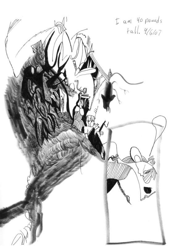
In the course of that discussion, cartoonist Jesse Hamm suggested that my own art was relevant to a discussion of this article. I think he’s right, at least to some extent. My own experience learning to draw (which mostly involved copying) had an effect on my reaction to McCloud’s book. In any case, if you want to see my own art (whether to admire or sneer) you can do so here and here. And, finally, here’s me copying a page from Grant Morrison’s Invisibles

Alternately, if you’re in Switzerland in October, some of my drawings will be shown in the huge Lovecraft exhibit at the Maison d’Alleurs this October.

Posted in Noah | 4 Comments

Filth blurb

Not that I want this to turn into the all-Grant-Morrison-all-the-time blog, but…this is a blurb about “The Filth” I wrote for the Comics Journal a few years back (2004, I think?), just in case anyone’s interested.

Grant Morrison’s first two popular series — “Animal Man” and “Doom Patrol” — were notable for, of all things, their elegance. Dreamlike, addled, bursting with ideas, they nonetheless unfolded with an inevitable grace, akin to the best movies of Buñuel or David Cronenberg. Since then, though Morrison has largely forsaken his idiosyncratic sense of pacing, . These days he relies half the time on relatively conventional super-hero plots, and the other half on an aesthetic of one-damn-thing-after-another. The Filth is an example of the second of these, but if the whole isn’t quite the sum of the parts, the bits and pieces still form some of the trippiest debris floating through comics, mainstream or otherwise. Marxist assassin chimpanzees, psychic-defense toupees, porn stars spurting black semen, plus standard Morrison themes like pulp-comics-as-metaphor-for-reality and the sadness of pet owners — like, what does it all mean, man? Something about the deliberate destruction of utopias? The insanity lying beneath the surface of the workaday world? And is the Weston/Erskine art really meant to look like Hanna-Barbera’s take on H.R. Giger? Who cares? I’ll plop my money down as long as I can open the thing at random and find characters spouting lines like, “I learned to read the intestinal weather and correctly guess the lifestyle and habits of the people around me from their stifled farts.” Morrison doesn’t really do beauty that well anymore, but God (or whatever) bless him, he’ll always have dada.

Posted in Noah | 2 Comments

Speaking of shitty art….

Since I was talking smack about Grant Morrison’s collaborators, I thought I’d put my money where my mouth was and look after I leapt (or something like that.) Below is an image by (and presumably copyright by) Steve Yeowell from Invisibles #22.

And here is an abstraction I drew based on that image:

I think we can all agree that at least one of these images is lousy.

Incidentally, the text on mine says, “I am 40 pounds tall,” which is something my son said the other day. I’m thinking about doing a series (maybe 4 or 5) of abstractions based on comics from my youth, with pithy sayings from my son added. If this thing is your cup of tea, you can see a much longer similar series I did here

Posted in Noah | Comments Off on Speaking of shitty art….