Outside Crumb

There’s a style of talking about the Christian God that you find in rural corners of the American South where there are Free Will Baptists and Pentecostal Holiness churches. Imbued with images and rich with metaphor, it’s also thickly oral, repetitious and rhythmic – reading transcripts of sermons aloud is like holding pebbles of words in your mouth:

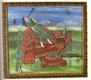
I was voted in to pastor a church away down in southeast Alabama. I felt like I was drifting into a paradise opportunity to work for God, but really I was headed for the jaws of a vice on the Devil’s workbench. What I didn’t know what that the young people outvoted some of the old-time goatheads which was trying to bring in an older minister. They had future trouble up their sleeves…[they said] we are going to bring our minister to church and he is going to take the pulpit.

“When the other people at the church heard this, they were ready for a fight. One rough sinner-man came to me and said “I have a real sharp knife and I ate peas and cornbread in prison before and I can do it again. Don’t worry, no one is going to take your pulpit. My knife is sharp and I’ve been in trouble before.” So I woke up in a vice between a prospering church and a blood-shedding fight. I wanted to preserve peace, but that ain’t easy, because the Devil has got me in that vice time after time…Preachers think they got power just by preaching and that sinners will get saved. You can’t run sinners out of church. You have to run them into church and make it a soul-saving station for God.”

The Devil's Vice (click to enlarge)

Howard Finster (who wrote and drew the above) was a particularly strong example of this way of talking about God. It was common, among people of his generation, in the Pentecostal sects of his part of the south, where the Holy Spirit gets a seat at the table and the church elders speak in tongues, but even there his imagination was more vivid than most.

Click and zoom to read

His paintings, which I linked to briefly a few days ago, share the same sensibility as his sermons – a mixing up of images and metaphors from sacred and secular life, mixing that he thought was essential to his evangelical purpose.

In these places, deep in the rural South, where the nearest town of any size is hours away and the churches have had the same families in the same pews for 100 years, religion stops feeling like a choice, because culture is so saturated with faith it’s not something you believe, it’s just the way things are. “Ashes to ashes, dust to dust” isn’t just a phrase in a funeral: it describes that sense that everything in the world is made of the same stuff and that stuff is God: the trees and the fish and the people and the boards of your porch and the bricks of your church.

Howard Finster draws the psyche of that place.

It’s come up several times that asking R.Crumb to “have some imagination, damn it,” (in Genesis, at least) is somehow tied up with asking him to be more religious, or that seeing his imagination as falling short is somehow due to mistakenly looking for signs of belief. I think, though, that it does Howard Finster’s imagination a great disservice to attribute it to his faith. There are too many faithful people who don’t have it. I wish faith did automatically produce it: then we’d have more art like his.

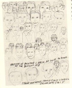
Annotated Sketch (c. 1978 click to enlarge)

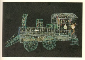
Wire Train (click to enlarge)

click to enlarge

============

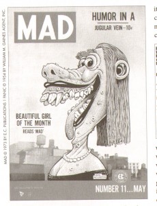
Cartoonist Basil Wolverton was also a believer when he began illustrating Bible stories and verses for evangelist Herbert Armstrong in the early 1950s. Wolverton had been drawing comics since 1925 and was drawing for Mad at the time he started illustrating the Bible. His cartoons influenced Crumb and other underground cartoonists – he drew grotesque, weird, exaggeratedly humourous characters that, despite his protestations about intent, were viewed as highly sexually suggestive.

Mad Cover Illustration (click to enlarge)

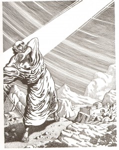
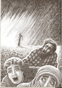
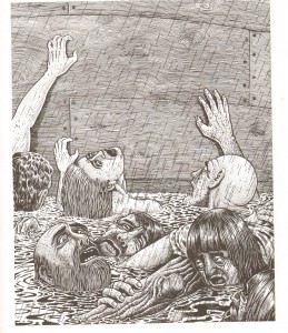
His Biblical illustrations, unsurprisingly, are more straightforward and serious, although the exaggerated sensibility sneaks through. In the introduction to “The Wolverton Bible,” his son Monte observes:

Wolverton’s challenge was to portray the Biblical accounts accurately without tramautizing children too much. Yet from his background in comics, he understood that children actually enjoy a certain amount of violence (how it effects them is another topic.) In this way he was a pioneer for later comic artists, beginning in the 1970s, who would bring a more realistic interpretation to graphic depictions of the Bible…he never backed down from his position that the Old Testament needed to be depicted for what it was.

(Sound familiar?) Like Finster’s, Wolverton’s approach is consistent with the declamation style practiced in his church, but Wolverton’s church was very different. Monte Wolverton describes Herbert Armstrong’s preaching style as “newscaster-like” and “devoid of churchy language.” Although essentially a one-man-show when Wolverton first became involved, Armstrong’s church, called the Worldwide Church of God, had become extremely rule-bound and institutionalized by the end of the 1960s – members who disagreed with church teaching were “disfellowshipped.” (It was not a typical fundamentalist church, however, as it did not prevent drinking, dancing or other social activities.) Wolverton himself was a jovial, congenial and funny man who loved to entertain. His drawings reflect this mixed vantage point: the serious, “newscaster-like” declamation with a great appreciation for humanity and personality.

Creation (click to enlarge)

God speaks to Noah (click to enlarge)

Lot's wife turned to salt (click to enlarge)

Victims of the Flood (click to enlarge)

It seems obvious that Wolverton’s treatment of the Bible was more influential on Crumb than Finster’s, although I have no evidence that Crumb saw these Biblical drawings before beginning his work. Crumb’s Bible strikes me as very much the literal Evangelical Bible, though, so it wouldn’t surprise me if there was genealogy through this path.

What’s more difficult to account for, for me personally, is the greater aesthetic impact I feel from the Wolverton drawings, since they are in many respects so very similar to Crumb’s. In comparison, I think much of my dissatisfaction with Genesis does in fact come from two formal elements of the comic idiom: the grid, which provides a repetitive overarching composition even when the in-panel composition is varied, and the transformation of the prose text from its familiar, “native” graphic presentation in the columnar numbered pages of the Bible, into the comics idiom of captions and balloons. Text is, for all its abstraction, also a visual medium, and the flow and sound of the text in normal prose presentation is governed by different interactions than the ones in Crumb’s comics version.

My lack of appreciation for this – my sense that more is lost than is gained – is without doubt my limitation, not Crumb’s, and in this particular matter, an issue of personal aesthetic preference. But the comparison raises questions about the impact and effect of “sequential art”: I think because most people who read comics have an affinity for these elements of the idiom, they’re often accepted unquestioningly, without critical challenges or evaluation. A “nothing left out!” illustration job is a translation of sorts – normally the prose Bible is very aural; in Crumb’s book that aurality is replaced with the visual. The oft-described effect of “making the pictures narrate” is very palpable here – Crumb is without doubt successful at that effort – but to what end? Is it really just a “translation” into the comics “language”?

I think it may be — while Finster in particular can stand up against the more elite Biblical art that Suat drew on in his comparison and Wolverton’s approach is at least highly representative of his particular individual reading, Crumb’s is much less an individual reading than either. His very successful effort to humanize the Biblical characters resulted in a dehumanization of the experience overall. This perhaps shows us Alter’s error: it is not the concretization of images that marks the limit of the comics form at this moment in history, but instead the lack of imagination regarding the ways in which illustration can be fully literary without being tied relentlessly to sequence, grid, and narrative. Some experimental cartoonists are working to imagine new notions, but the far-more-common reliance on sequence to capture the spirit of literature – well, it only “captures” it, like a wild animal kept in a tiny cage.

Howard Finster described himself like this: “To do art like them fellas do in the books, it would take months. I’m a cartoonist. I don’t fool with details like that.” Without those details, an imagination like Finster’s makes all the difference.

============
Images and quotations in this post are taken from: “Howard Finster, Man of Visions: the Life and Work of a Self-Taught Artist” by J.F. Turner (Knopf, 1989) and “The Wolverton Bible: The Old Testament and Book of Revelation through the Pen of Basil Wolverton,” Monte Wolverton, compiler (Fantagraphics, 2009).

History for the Future: Henri Langlois’ Cinémathèque Francaise

Comics needs an Henri Langlois.

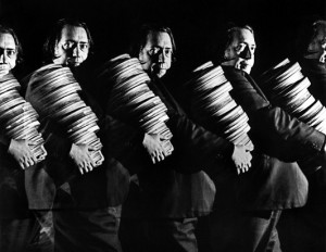
As collectors, most comics geeks have nothing on Langlois. I don’t care how many storage units you have. I know the longboxes block the closet. But from the ‘30s through the ‘70s, back in the days when a single film could take up several cans and a couple square feet of space, Langlois and his wife accumulated and preserved over 60,000 films, using primarily their own money, creating out of his collectors’ obsession the institution known as the Cinémathèque Francaise.

His scope was omnivorous: “People, intent on triage, who think they have taste, me included, are idiots. One must save everything.” He rescued numerous nitrate prints of silent movies and the only existing negative of The Blue Angel; he saved early Soviet cinema and “decadent” films from the Nazis; he stole film prints from the back rooms of movie houses that were about to destroy them (theaters destroyed their film prints to prevent piracy). For decades, he screened three films a day in his house in Paris, carefully selecting the films for the resonance of their justaposition. His screenings introduced the auteurs of the French New Wave to the American cinema that would define them and to the early European art cinema that would inspire them to transcend Hollywood.

But his archival impulse, and even his passion for sharing his films, are not why comics needs a Langlois. (Bill Blackbeard has all that mostly covered.) Comics needs a Langlois because of his particular inspired belief, poetic, imaginative, and non-didactic, about how cinema’s history should inspire its future:

An art form requires genius. People of genius are always troublemakers, meaning they start from scratch, demolish accepted norms and rebuild a new world.

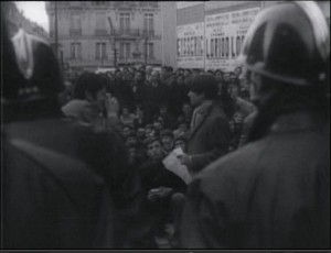
An odd sentiment for an archivist – to “start from scratch, demolish accepted norms.” Especially an archivist so intent on screening and programming, whose model for training in cinema was to organize one’s life around watching films, to complete immerse oneself in cinematic heritage and in conversation with other people who are equally immersed. This is the man who comforted Buñuel after the disasterous premiere of El at Cannes (and who introduced the film to Lacan), the man selected to pin the Legion of Honor on Alfred Hitchcock’s lapel. When protests broke out after the French government shut down the Cinematheque in 1968 for bad bookkeeping, Godard took a punch from a policeman on Langlois’ behalf (it broke his glasses, not his face, but still…)

Leaud speaking to the protesting crowd, 1968


How can we reconcile the historian archiving the past with the poet advocating the genius’ new world? Langlois himself suggests the answer in a story he tells about his childhood experience viewing Mèliés’ 1899 film Jeanne d’Arc:

As a boy in Turkey, they told me Joan of Arc took Paris. Knowing my dad was posted there, when I saw Jeanne d’Arc, I believed he was living in Joan’s Paris. Told that was wrong, I began to imagine parallel Parises: Joan’s, my father’s, etc. Hence, in my somewhat odd view, time isn’t time: it’s space.

Although the concepts are surely related, Langlois is not describing the relation of time and space found in Chris Ware – Ware’s use of space to evoke time, to transform our sense of time, and to highlight both pointed and sequential continuity through time, is still ultimately an exploration of temporality and its effects: of an experience living in history. Langlois’ formulation is the denial of time: an idea of history not as something past, things having happened and remembered, but something entirely now, aggregated all together, present – meaning both presence and in the present tense.

This idea of “history in the present tense” — omnipresent history — is both very French and very characteristic of Langlois’ time and his circle of friends. Forming in the years after WWII, the idea was influenced not only by Surrealism and Dada but by Sartre and Levi-Strauss and Lacan and their project of reimagining realism without materialism – the bloody, painful materialism of the wars and their aftermath. Structuralism’s forgetting of “history in the past tense” was an effort to find inspiration and humanity despite that trauma, and the result of their efforts was a concept of history that serves human imagination rather than subordinating imagination to the dictates of history and materialist historical thinking.

This sensibility is nowhere more apparent than in the Museum of Cinema that Langlois assembled in the last decade of his life.

An exhibit room at the Musée du Cinema


Langlois’ curatorial choices, although rich with minute historical detail, were almost completely non-chronological and non-genealogical. He cared about establishing composite effects among the films and artifacts, emphasizing thematic contiguity, resonance and suggestion. The result was a Museum that was itself a work of art, not of history, an experience that inspired questions and curiosity rather than a lesson that offered canned, approved answers. The 2004 documentary Henri Langlois: Phantom of the Cinematheque (from which these English translations of the Langlois quotes are taken) posits convincingly that the museum itself was as much the work of an “auteur” as any New Wave film.

Notions of resonance and suggestion and composite seem very at home in comics, even more so than film. Images accrue meaning through juxtaposition far more than in the dynamic cinema or even in prose text, which always retains at least some small echo of the temporality of spoken language. Langlois’ approach to history – never for its own sake but always in the service of imagination, not the trace of the past but the texture of the present, always pointing toward the future – is particularly inspirational as an antidote to nostalgic minutiae, the biggest obstacle to the troublemaker’s new world:

There are cinéphiles and cinéphages. Truffaut is a cinéphile. A cinéphage – a film nerd – sits in the front row and writes down the credits. If you ask him whether it’s good, he’ll say something sharp. But that’s not the point of movies: to love cinema is to love life, to really look at this window on the universe. It’s incompatible with note-taking!

The documentary from which the quotes and stills in this essay were taken is worth every minute of the time spent watching it. It’s currently available on DVD and Netflix on Demand.

The Interview as Criticism: Gil Kane

“One cannot overstate how significant [Gil Kane’s] 1969 interview in Alter Ego(conducted by Benson) was to those of us floundering around trying to make some critical sense of comics. I’ve spoken to literally dozens of people over the years who read that interview when it was originally published and they all had pretty much the same reaction: Kane’s was a jaw-droppingly invigorating way of looking at comics. He took the only intelligent path a critical mind could given the comics he had to work with; he dismissed the scripting out of hand and focused on the distinctive but theretofore recondite visual virtues of specific artists. He articulated what many of us impressionistically loved about Jack Kirby and John Severin and Alex Toth but couldn’t put into words — or even into cohesive thought. He provided a ray of hope that comics could indeed be admired without abandoning one’s brains.” Gary Groth

“To be more concrete, some of the best comics criticism has come in the form of interviews done by artists like Gil Kane, Robert Crumb, Art Spiegelman.” Jeet Heer

“FWIW, I also tend to agree with Jeet that, in practice, much of the best comics criticism has been through the interview form…just because of the history of comics criticism (which has been pretty spotty).” Eric B.

“I agree, Noah, but notice how much communication interference there continues to be: the assumptions that led to the interference in the original post go very deep. And they’re the same, deep assumptions that lead to the point you originally noticed: the valorization of interviews over analytic essays… The comments thread here has largely been about decoding the resistance to the ideas in both your original post and here, rather than decoding the ideas. Although I think your explication is indeed productive, I think the resistance is still pretty strong…this is a resistance deeply tied to nostalgia and to nostalgic identification — the “retrospective idealization” of the author or creator as the anchor and truth of meaning. That’s one thing you lose if you topple the interview from its pride of place. I think this is probably the mechanism by which the art comics subclique has managed to reproduce the dynamics of the larger superhero subculture: they’ve simply replaced the superhero with the Author, without actually disrupting the nostalgic relationship to the comic art form. That’s how you get the “fetishization of interviews” you reference in the original post.”  Caro

Continue reading

Oddbox Bookshelf: Vassos Redux, Ultimo

What with the vast quantity of words spilled on Hooded Utilitarian’s fertile soil this week, I thought I’d go with an image post.

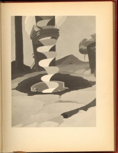
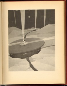
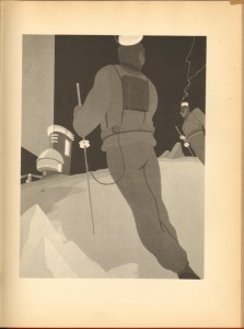
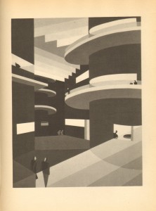
A couple of weeks ago I wrote about John Vassos’ Phobia. This post shows some of the highlights from his previous book Ultimo, a 1930 collaboration with his wife, writer Ruth Vassos. The story is a fairly typical Wells-inspired science fiction narrative about life in an underground city, after humans have been run off the surface of the planet by an encroaching ice age.

(Click on any image other than the front cover for a larger view. In captions, italics indicates a direct quote from the text.)

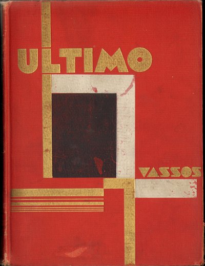
Front Cover (First Edition without jacket)

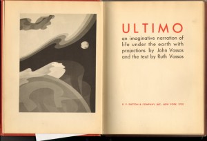
Frontispiece and Title

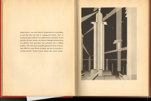
First Plate, with text

The images, with a couple of exceptions including the one shown below, don’t illustrate the facing text. They frequently don’t illustrate specific text at all but are atmospheric or supplemental.

Into the frozen earth bored the huge electric drills.

Cities like gigantic mushrooms

Inhabitants

In the underground city

In the Caves

Possibilities of future happiness

Oddbox Bookshelf: John Vassos’ Phobia

John Vassos is best known among mid-century scholars like me for designing the RCA Phantom – the see-through lucite television set on display at the 1939 New York World’s Fair that convinced skeptical visitors that, indeed, the pictures on the television were generated from within the machine.

A more opaque version eventually became the first mass produced TV set.

He’s also known as a defender of the streamlined Art Deco aesthetic: according to his 1959 correspondence with furniture-maker Hollis Baker, he removed the fins from his mid-‘50s Cadillac in protest of the “more is better” populuxe taste of the post-war decade and as early as 1938, he criticized Hollywood’s subtle semiotic derogation of modern design – they gave nice girls Colonial homes, while less virtuous women lived in Deco flats.

In Hollywood’s defense, there is something sensual and decadent about Deco. Although the eroticism was more overt in Art Nouveau, French Deco in particular tried to reimagine the same themes in a mode more comfortable for bourgeois sensibilities. In the United States, in the 1920s, as the modern consumer economy was forming, Deco was taken up by designers, like Vassos, who were working in advertising and industrial design and who believed that Deco’s “modern aesthetics” would elevate ordinary objects. From this, Deco became America’s iconic aesthetic of bourgeois luxury.

Mostly prior to going to work at RCA in 1933, Vassos illustrated a number of books – several by Oscar Wilde, some Thomas Grey – but he also created illustrated books on his own and in close collaboration with his wife, the writer Ruth Vassos. Most scholarly discussions of the Vassos’ books have focused on 1929’s Contempo: This American Tempo and Ultimo: An Imaginative Narrative of Life Under the Earth, released in 1930. Both books confront head-on the dehumanizing effects of the machine age, and deviate from much Deco advertising and design in that their representations of people are less stylized and impersonal, more like the sensual figures of Art Nouveau. This ambivalence about Deco’s modernity and that modernity’s dehumanizing edge is perfectly embodied by Vassos’ plates.

[Click here for an example of several plates from Contempo.]

1931’s Phobia continues this theme of dehumanization but with psychology’s inward-looking focus. The volume contains 23 plates illustrating various psychological phobias, preceded by descriptive/explanatory text that is often poetic but of inconsistent quality. Vassos explains in the introduction:

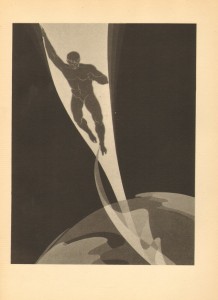
A phobia is essentially graphic. The victim creates in his mind a realistic picture of what he fears, a mental image of a physical thing. The sufferer from acrophobia, for example, sees his body hurtling through space, the aichmophobiac projects an image of himself in the act of stabbing; in this mental picture the thing that he fears becomes actual, for all that its projection is purely imaginative. It is this mental picture that I have endeavored to set down – the imaginal, graphic annihilation that the phobiac experiences each time his fear is awakened…they are intended to be inclusive – that is, to depict both worlds of the phobiac’s existence: the physical and the imaginary, the actual and the projected. The real world is replaced by the unreal as the pictorial pattern of the sufferer’s destiny parades ceaselessly through his mind.

Although influenced by the psychologist Henry Stack Sullivan, Vassos’s particular understanding of phobia’s graphic anchor appears to be his own. (Sullivan scholars can correct me!) But it remarkably prefigures the post-Freudian/Lacanian understanding both of the role of images in psychology as well as the abnegation and de-centering of the psychological subject.

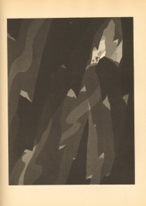
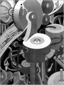
When combined with the dehumanizing effect of industrialization, these themes become particularly palpable in the panel for Mechanophobia, which juxtaposes the fear of machines with the Machine Age’s emblematic aesthetic.

This connection of pre-war visuals with the psychology of the post-war era, when futurism and Deco had been left behind due to their associations with fascist propaganda, creates an aesthetic time-shift worthy of Philip K. Dick. It’s one of those rare and immensely satisfying moments where a postmodern ethos leaps out fully formed from a Modern work supposedly created decades before postmodern was first thought. But there are also visual displacements – can they be allusions if the referent hasn’t happened yet? – referencing the art of the 1960s, particularly in the lower left quadrant. These only further the disorienting out-of-time effect of the panel.

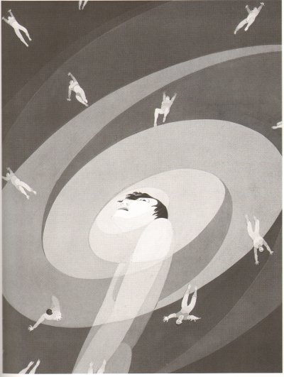
Similarly, the use of a vortex

to depict the generalized pantophobia (fear of everything) is also reminiscent of mid-century design to a present-day viewer. Saul Bass put the swirling imagery to the same purpose in the credits to Hitchcock’s Vertigo and psychedelic art used it to represent the disorientation and sometimes-paranoia of drug experience. It’s hard to tell whether the images are so culturally prevalent because they really do resonate psychologically at some unconscious level, or whether they’re simply so culturally pervasive that we unconsciously grab onto them to depict these experiences.

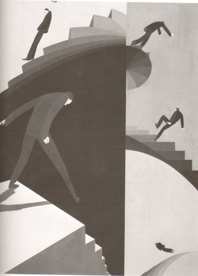
Of course, there are plenty of panels that are just palpably from the 1920s: Climacophobia (fear of falling down stairs) is particularly so.

But nonetheless there is in this volume an overwhelming sense of having encapsulated something vital about the 20th century before it actually happened. The argument can be made that America’s 20th century was dominated with the struggle between the needs of industrialization and the needs of the psyche. Vassos’ brilliant work embodies the tension between the two.

Hooded Polyp: Beyond the Binary


Much has been said, this past week—not to mention and this past year or so—about David Mazzucchelli’s Asterios Polyp, and I feel I don’t have much to add to the discussion of the work itself that I haven’t already said in my earlier examination of the book. However, I think much of the discussion in the present forum has highlighted how excitingly—albeit also frustratingly—open discourse on comics is in these times of redefinition. My contribution, thus, will at least initially concentrate on this discourse rather than on the book, which is perhaps fitting in that Asterios Polyp itself can be seen as meta-discourse on comics.

I agree fully with Caroline’s Sunday post that the binary of visual and literary is ultimately a false one, not the least in comics, but it remains central to contemporary comics discourse, and critical approaches that do the form justice as a synthesis of word and image have yet to develop beyond pubescence. Caroline rather cavalierly accuses Mazzucchelli and his critics of missing the point by perpetuating this pernicious binary, while bluntly claiming that the book “pays disproportionate attention to one side of the binary, the “visual.”

I see Mazzucchelli’s aspiration precisely as the “performative enactment of the ways in which comics defies the binary between literary fiction and visual art” that Caroline solicits from progressive comics. As she rightly points out, ‘literature’ does not necessarily equate ‘words only’, and Mazzucchelli follows that insight in order to craft comics as literature. Reducing Asterios Polyp’s thematic core to a set of trite literary clichés, as several of the present pundits have done, is symptomatic of how vigorously said false binary animates comics criticism—like so many important works of art, Asterios Polyp’s originality lies exactly in how it presents these common tropes in highly sophisticated comics form.

Furthermore, Asterios Polyp is hardly a manifestation of “delayed modernism”—I don’t believe there is such a thing: comics as we know them are gloriously a creation of modernity and they experienced ‘modernism’ along with all the other art forms, long ago. Rather, Mazzucchelli’s project is emphatically post-modern, in that he addresses the modern(ist) legacy of comics in an attempt to assert its value, as well as to suggest its current limitations. His choice of protagonist, plot structure, and symbology is patently deliberate and highly self-reflexive—in order to examine the notion of comics as literature, what could be more natural than approaching some of the most tried tropes of modern literary fiction in the exaggerated, simplified form developed and refined historically in comics?

As I wrote in my essay, Mazzucchelli reveals his post-modernist hand in a crucial feat of obfuscation. Presenting us with a self-consciously heavy-handed refutation of his protagonist’s dualist worldview in lucid, fully-realized comics form, he leaves unstated essential aspects of his story. When probing these, his “formalism” takes on literary meaning in the broad sense of the term, and the book ends up, on one level, as a deconstruction not only of its constitutive tropes—literary as well as cartoony—but of comics as literature in the narrower modernist sense.

As metadiscourse, Asterios Polyp as bold and sophisticated as anything in comics, but its success ultimately might have to be gauged elsewhere and on more uncertain terms. The readings made here of the main characters, Asterios and Hana, have tended toward the ungenerous, and this is no doubt in part Mazzucchelli’s own problem for miring them in this seemingly prescriptive construction of a story, which threatens his larger ambition of transcending the limitations of his form. It’s arguable how well he succeeds, but I, for one, find the lives they live beyond what he makes visible recognizably affecting. Asterios’ worldview doesn’t provide a satisfying framework for understanding his actions, but we can try by going beyond it. And for Asterios, and therefore the reader, the true Hana remains intuited rather than stated. But they are both there, beyond the binary.

Hooded Polyp: Parallax Review

Following links from Noah’s kickoff post through Matthias’ earlier essay on Asterios Polyp and on into the plethora of reviews gives a tour de force of puzzle-book annotation: Hellenistic references, astronomy, symmetry, architecture and fine art, the metaphorical/symbolic use of color and styles of linework, the yin-yang, and so forth. All of this clever, creative, and well-executed formalism works in the service of the book’s themes, which, the critics tell us, are myriad permutations on emotional naturalism and the limitations of duality – pretty much every duality you can think of.

What this emphasis on parsing the puzzle pieces and tracking the themes all adds up to is another tour-de-force: this time of modernist reading. Matthias sums up it up when he asserts, beautifully and certainly accurately, that the “graphic representation happens on a narrative level above that directly experienced by the characters, directing the reader’s understanding of their inner lives and states of mind.”

I’m going to pick on Matthias here, kindly I hope, because I found his essay to be far and away the most sophisticated and compelling articulation of this approach to interpreting Asterios Polyp — but it’s an approach that I find neither sophisticated nor compelling. With attribution to Bart Beaty (although Doug Wolk also makes the point), Matthias describes all this meaning-rich formalism as a “delayed Modernism,” and to some extent it is – particularly the Joycean puzzle-box elements and the self-conscious effort to push and expand the ways the form can make meaning. But for whatever motivation, this Modernism is small in a way that the more timely Modernisms of the early- to mid-20th century were not: it is primarily a modernism of technique rather than a modernism of ideas. Pound’s dictum of “Make it new!” finds its manifestation here not in new ideas about the world, but in new ways of representing and documenting old ideas about the world using the comics medium. Taking on the project of modernism 75 years after its time has passed is art in the defensive mode: starting from the assumption that comics has something to prove rather than something to offer.

I want to posit for the sake of argument that Asterios Polyp is in fact not a work of Modernist fiction that yields its greatest insights and makes its strongest contribution through this puzzle-box formalist reading but that it is a work of Postmodernist fiction that yields equally well to readings of its “deep structure.” This is, I think, somewhat inaccurate: Mazzucchelli clearly intended all those clever references and allusions and manipulations of formal elements, and it is unarguable that they form the most impressive and coherent texture of meaning in the book.

But there is content in the form overall: it’s apparent when we redirect the attention we’ve been paying to Asterios and Hana as archetypes of gendered characters and instead abstract them into archetypes of cultural genealogy and influence: the Hellenistic and the Japanese. The book works passably well – although it is difficult to knit all the elements in – as an allegory for the gradual shift of Western culture (particularly art culture) away from rigid Hellenism to incorporate the more fluid and holistic perspective of the East. Read diachronically, it is a representation of the history of this evolution across the 20th century; read synchronically, it depicts their aggregated and therefore simultaneous presense in contemporary art and culture. (This reading accounts for all those niggling elements that felt anachronistic, but renders many of the specifics of the formalism irrelevant.)

I’m going to pick on Matthias again – I think this is extremely literary. But I want to take a fairly passioned exception to the assumptions about literary meaning – and even to the definition of “literary” – implicit in sentences like this one: “A textbook example for the literary crowd if one is needed — and it might well be — that graphic novels are not, actually, novels with pictures in them.”

There are two obvious ways to respond to the contempt for the “literary crowd” that drips from this sentence. The first is to point out that any literary-minded person who has been paying attention to graphic novels enough to have an opinion at all by now should be fully aware of this fact. The second is to point out that the main reason why a literary-minded person who is paying attention would agree with the statement “graphic novels are not, actually, novels with pictures in them” is that graphic novels are not, yet, consistently rising to the level where a literary person would grant the appellation “novel.” (Asterios Polyp indeed comes closer than most.)

For “literary” people, “literary” entirely stopped denoting “tightly constructed narrative story” sometime between Joyce and Coover. The deconstruction of that idea, of the very concept of narrative coherence as a “literary” attribute, was the project and product of literary Modernism. Statements like these miss that entirely:

Furthermore, the centrality of autobiography as a genre to the development of the European comic book is almost by default primarily a literary achievement. And, almost without exception, the artists who have found greater audiences – the Satrapis, the Sfars and the Trondheims – work within relatively traditional visual idioms and privilege their storytelling over graphic experiments.

“The point being, firstly, that most of the visual innovators of the last couple of decades have primarily explored the already existing visual tropes and strategies of narrative cartooning, rather than go beyond them, and secondly, that they have predominantly done so in service of a tightly constructed, “literary” narrative.

Both the quotes and my stock responses reproduce a contrived and unnecessary distinction — even a hostility — between the literary and the visual. Both ignore the extent to which that binary – that particular binary – is not only just as false as any of the binaries in Asterios Polyp, but specifically, and inherently, and inescapably false in comics more than in any other medium. Claiming that comics are a visual medium and not also a literary one is not only misunderstanding what literature is after Modernism, it is using as the model for “art comics” a “formalism” more like what literature espoused before Modernism.

And that is the great failure of both this book and its critics: this subject matter and medium in the hands of our greatest literary figures would not be just a meditation on history or emotional naturalism or the limitations of binaries; it would be a performative enactment of the ways in which comics defies the binary between literary fiction and visual art. Cartooning by definition deconstructs its “constitutive binary logic.”

The formalist instantiation of that deconstruction is the great opportunity for “metafiction” that is missed here.

As Noah rightly pointed out, this book pays disproportionate attention to one side of the binary, the “visual.” Neither Mazzucchelli nor his reviewers learned the book’s lesson – at least not as anything more than an aphorism. The result is the reiteration – on the level of performance if not assertion – of a hierarchical division between “the literary” and the “graphical”: a dichotomy that is aggressive and dismissive in precisely the same way as Asterios’ treatment of Hana. It is completely uninformed about how literary fiction works. It creates a destructive incoherence at the center of the book.

The “delayed Modernist” project in comics, especially insofar as it describes a formal project focused on making the medium’s visual components more fully saturated with meaningfulness, arrogantly rejects – against the spirit of Modernism – any exploration of the ways in which the experiments in prose conducted in literary modernism and postmodernism are applicable to the graphic form. This disciplinary prioritization of the visual is not delayed Modernism. It is delayed Enlightenment. But comics were always already postmodern. So this is also nostalgia, in academic’s clothing.

Comics rightly should stimulate conversation between the best of literary post/Modernism and the best of visual post/Modernism, with the aim of generating increasingly subtle and sophisticated hybrids and an increasingly subtle and sophisticated understanding of the possibilities and internal logics of those hybrids. For whatever reason – be it the technical demands of drawing, the training of art school, or just plain imaginative disposition – the dominant trend is to privilege and prioritise the “visual” over the “literary” – a category which critics and cartoonists seem incapable of understanding as anything other than a synonym for “well-wrought prose storytelling.” I hope comics won’t have to lose an eye before you figure out how stupid that is.

Note: updated for clarification June 6 1:20pm.

Update by Noah: You can read the entire Asterios Polyp roundtable here.

Update by Noah 6/20/10: This comments thread was damaged in a blog outage. I have manually restored the damage, but time stamps are off and one or two comments may be out of order. Please let me know in comments if you notice errors.